Some experiments influence attention within the first 3 seconds. Others improve trust near the moment of conversion. Some only matter after the visitor is already convinced.
If you test low-impact elements first, you may spend weeks optimizing details while the biggest conversion leaks remain untouched.
The framework below prioritizes the highest-leverage landing page tests based on where they influence user psychology in the conversion journey.
Note from our CRO team: If you only have time to run 3 tests this month, pick just Tier 1. Over the last year, these variables alone have yielded 20%+ lifts in conversion rate for our customers.
Testing your headlines is one of the essential things you can do for a landing page.
Because the headline is the only thing a visitor reads before deciding to stay or bounce, even a small tweak can lead to massive swings in conversion rates.
1. Feature-led vs. Benefit-led
This is the classic marketing test. One focuses on what the product is, the other on what the product does for the user.
A — Feature-Led: "The Only CRM with AI-Powered Lead Scoring."
B — Benefit-Led: "Close 30% More Deals Without Working More Hours."
2. The "Negative Reverse" Pain Point
Sometimes, people are more motivated by avoiding pain than by gaining a reward. Try highlighting the problem they’re currently facing.
A — Positive: "Get Healthier, Glowing Skin in 30 Days."
B — Pain-Focused: "Stop Wasting Money on Skincare That Doesn't Work."
3. The Specificity Test
Vague promises feel like "marketing speak”, don’t they? Specificity builds trust and curiosity.
A — General: "Our Software Helps You Save Money Every Month."
B — Specific: "The Average Household Saves $142 a Month Using [Product]."
4. The "How To" vs. The "Result"
Test whether your audience wants a roadmap or just to see the finish line.
A — Process-Oriented: "How to Build a High-Converting Landing Page from Scratch."
B — Outcome-Oriented: "Everything You Need for a 10% Conversion Rate."
5. The Radical Clarity Test
Sometimes, cleverness is the enemy of conversion. Test a "boring" headline that explains exactly what the service is against a "clever" one.
A — Clever/Brand: "Your Team's New Superpower."
B — Clear/Functional: "Project Management Software for Remote Creative Teams."
A/B Testing Ideas for Images
Images are the fastest thing on the page for a visitor to process. Here are a few ways to test what yours are communicating.
6. The "Product in Action" vs. The "Human Result"
A—(SaaS focus): A clean, high-resolution screenshot of your software interface (the "Dashboard Shot").
B—(Human focus): A photograph of a person looking immensely relieved or triumphant while using a laptop.
The Logic: The idea is to test whether users want to see the tool itself or the feeling of having solved their problem.
7. Directional Cues (The "Look Here" Test)
A: A hero image of a person looking directly at the camera.
B: The same person, but cropped so they are looking toward your signup form or CTA button.
The Logic: Humans are like sheep; we instinctively look where others are looking.
8. Literal vs. Metaphorical
A: If you sell security software, show a literal shield or a sturdy lock.
B: Show a serene mountain landscape or a sleeping baby.
The Logic: Sometimes the brain responds better to a feeling (safety/peace) than a literal object (a lock).
A/B Testing Ideas for Banners
The banner is often the first full impression a visitor gets of your page. A few ways to test what it should be doing.
9. The Video Background vs. Static Image
Test: A subtle, looping background video of your team or product (Version A) vs. a high-quality static photograph.
The Logic: Movement catches the eye, but if it’s too busy, it can distract from your goal by burying the headline.
10. The "Social Proof" Ticker vs. The "Offer" Bar
A (The Ticker): A thin bar at the very top saying "Join 10,000+ others who improved their workflow this week."
B (The Offer): The same bar saying "Limited Time: Get 20% off your first 3 months."
The Logic: You’re testing whether "Belonging" or "Saving" is a more potent motivator for your specific crowd.
11. Illustration vs. Photography
A—"Tech-style" 2D illustrations
B—Real-life photography of people.
The Logic: Illustrations can make complex A/B testing for landing pages easier to explain, whereas photos build more immediate human trust.
12. The "Problem" Banner vs. The "Solution" Banner
A—(Dark/Aggressive): A banner highlighting the mess of spreadsheets and missed deadlines.
B—(Light/Aspirational): A banner showing a clean, sunny workspace and a "Done" list.
The Logic: This tests "Loss Aversion" (avoiding the mess) against "Benefit Gain" (getting the peace).
A/B Testing Ideas for Ad & Email Message Match
Traffic doesn't arrive cold — it arrives primed by an ad or an email. When the landing page breaks that promise, visitors bounce even if the page itself is well-designed.
13. Retargeting Ad Visual Match
A: Landing page hero uses different imagery/colors than the ad that drove the click.
B: Hero visually mirrors the ad creative (same product shot, same color treatment).
14. Retargeting Ad Copy Match
A: Generic landing page headline.
B: Headline that echoes the exact promise or offer language used in the ad copy.
15. Email Subject Line → Headline Continuity
A: Landing page headline unrelated to the email subject line that drove the click.
B: Hadline that directly continues the subject line's thought.
16. Email Design → Landing Page Design Continuity
A: A landing page with a different visual style than the email.
B: A shared color palette, button style, and imagery between email and page.
Case Study
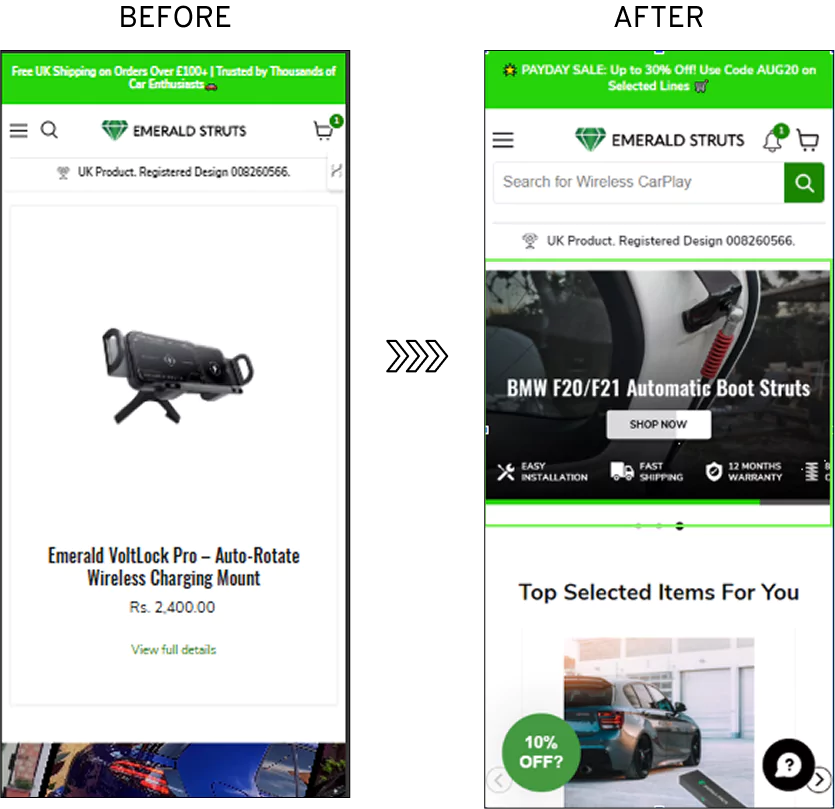
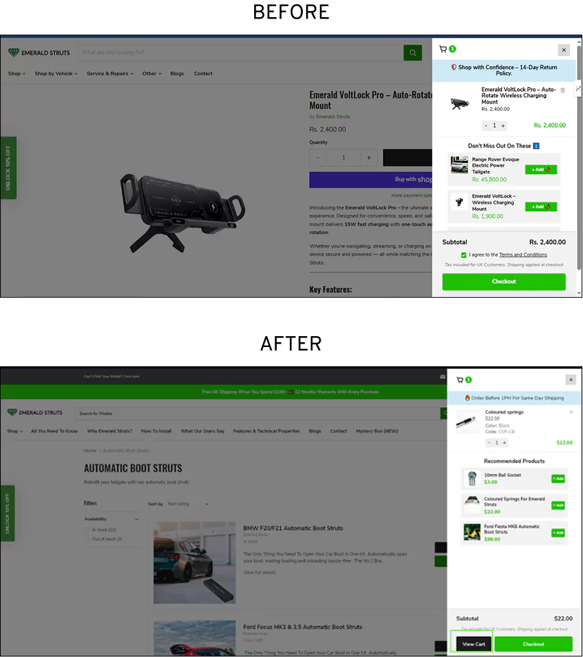
How Convertcart Helped Emerald Struts Win Big With A/B Testing
Problem: Emerald Struts' mobile site wasn't pulling its weight; visitors were landing and leaving without engaging.
Hypothesis: A prominent hero banner would grab attention faster, and a repositioned "View Cart" CTA would make the next step impossible to miss.
A/B Test: We ran a hero banner on mobile against no banner. Then we redesigned and repositioned the "View Cart" CTA against the original.
Result: The banner drove a 39.57% campaign gain and 11.25% website gain. The CTA test added a further 10.75% campaign gain and 8.39% website gain. Read the full case study.
Product discovery – barriers that prevent shoppers from finding items
Category/collection pages – improvements that drive deeper product exploration
Product page – what to optimize to convert 2–3x more buyers
Cart – ways to ease hesitation and speed up purchase decisions
“The report was deep and super insightful. Can’t believe it’s free.”
Logan Christopher CEO, Empire Herbs
Tier 2 — Clarity: Reduce Confusion
A/B Testing Ideas for Bodycopy
Body copy is where you build the bridge between the curiosity of the headline and the action of the CTA. While the headline grabs attention, the body copy wins the argument.
When testing body copy, you aren't just swapping words; you are testing psychological triggers.
17. Formatting: Bullets vs. Narrative
Different users consume information differently. Some "skim," while others "read."
A — The Skimmer (Bullet Points): Focus on 3–5 punchy bullets that highlight the "What’s in it for me?" Use icons or checkmarks to make them pop.
B — The Reader (Narrative): Use 2–3 short, persuasive paragraphs that tell a story or explain the "Why" behind the product.
C — The Hybrid: A short intro paragraph followed by bullets (often the winner).
18. Direct vs. Narrative Voice
Test your brand's "persona". Does your audience want a professional consultant or a helpful friend?
A — The Professional (3rd Person): "Our platform provides robust solutions for enterprise-level data security."
B — The Personal (1st/2nd Person): "We built this tool because we were tired of losing sleep over security leaks. Now, you don't have to."
19. The "Cost of Inaction" (Loss Aversion)
Most copy focuses on what the user gains. Try testing a version that focuses on what they’re losing by staying the same.
A — Gain-Frame: "Upgrade your workflow and get home earlier."
B — Loss-Frame: "Every day you wait, your team is losing 2 hours to manual data entry."
A/B Testing Ideas for Page Design
How you arrange your elements determines the path of least resistance for the visitor. Here are a few layout tests worth running.
20. A—The "F-Pattern" vs. B—The "Z-Pattern": Test a layout that follows a vertical scan (F-pattern) against one that zigs and zags across the page (Z-pattern). The former is often better for information-heavy pages, while the latter excels for minimalist, visual-first designs.
21. A—The "Single Column" vs. B—"Multi-Column" Content: Try a long, scrolling single-column page that builds a narrative against a multi-column "bento box" style that presents various features simultaneously.
22. A—Sticky vs. B—Static Navigation: Test a header that follows the user down the page (keeping the CTA in view) against one that stays firmly at the top. This is a classic A/B test for Google Ads landing pages to determine whether "constant availability" increases conversion.
A/B Testing Ideas for Mobile-Specific Layouts
Mobile traffic often converts differently than desktop — a layout that works scrolling with a mouse doesn't always work with a thumb.
23. Thumb-Zone CTA Placement
A: CTA placed in the hero, requiring a scroll or reach on mobile.
B: CTA pinned to the bottom of the viewport, within natural thumb reach.
24. Collapsed/Accordion Content vs. Full Scroll
A: All content displayed in a long mobile scroll.
B: Secondary content (specs, FAQs, details) collapsed into expandable accordions.
25. Mobile Image Crop & Aspect Ratio
A: The same wide desktop hero image scaled down for mobile.
B: A purpose-cropped vertical or square image designed for the mobile viewport.
A/B Testing Ideas for Page Flow
A landing page is a journey, and the order of the stops matters immensely. That’s why these tests matter:
26. A—Problem-First vs. B—Solution-First
Test a flow that starts by agitating the user's pain points before offering a cure, against a "Direct-to-Benefit" flow that leads with the glorious end result.
27. The "Education Gap"
Test a long-form page that explains the how of your product before asking for a signup, against a "Skip the Fluff" version that gets to the form immediately.
A/B Testing Ideas for Product Positioning
This is not about what you sell, but the "hole" in the user's life that your product fills.
28. A—The "Time Saver" vs. B—The "Money Maker"
Does your audience want more hours in their day or more decimal places in their bank account? Test these two core promises against each other.
29 A—The "Status" vs. B—The "Safety" Angle
For luxury or high-end SaaS, test positioning the product as a "Secret Weapon for Elites" vs. an "Essential Tool for Smart Teams."
A/B Testing Ideas for Tables & Charts
Data is the great anchor of a persuasive argument, provided it doesn't make the reader's head ache. Let’s take a look at some A/B testing ideas for tables and charts in your landing pages.
30. The "Progressive" Chart
Use a chart that shows the (A) projected growth or savings a user will experience over 12 months, vs. a (B) static chart showing current performance.
A/B Testing Ideas for Icons
A well-placed icon can do the work of a paragraph. Two ways to test yours.
31. A—The "Outline" vs. B—The "Solid" Icon
Test thin, elegant line-art icons against bold, filled-in "solid" icons. Solid icons often draw the eye faster, whereas outlines feel more modern and "premium."
32. A—The "Human" vs. B—The "Abstract" Icon
For a feature like "24/7 Support," test an icon of a person wearing a headset against a more abstract icon, such as a clock or a telephone.
TIER 3 — Action: Increase Clicks
A/B Testing Ideas for CTAs
The CTA carries a disproportionate share of the page's success. Don't treat it as an afterthought — here are the experiments worth running.
33. The Power of "My" vs. "Your"
One of the most curious quirks of the human brain is its response to ownership. We’ve found that switching from a second-person command to a first-person possession can have a startling effect on conversion.
A —"Start Your Free Trial"
B —"Start My Free Trial"
It shifts the perspective from the company telling the user what to do to the user taking ownership of the benefit. It's a subtle bit of mental gymnastics, but it works.
34. Specificity vs. The Generic "Submit"
In A/B testing words like "Submit" or "Register" are dreadfully dull. They sound like paperwork. You want to test copy that describes the value waiting on the other side of the click.
A — Generic: "Sign Up"
B — Value-Linked: "Get My Custom Marketing Plan" or "Start Saving Time Today"
Remember that the goal is to remind the user why they are providing their email address in the first place.
35. Reducing "Click Trigger" Friction
When A/B testing Google Ads landing pages, where every click carries a price tag, you want to remove any hint of anxiety. Sometimes the best CTA copy isn't just the button itself, but the tiny "click trigger" text right beneath it.
A — Standard: "Join Now"
B — Low-Friction: "Join Now" (with a sub-note: "No credit card required" or "Takes 20 seconds")
Don’t forget that you need to preemptively answer the nagging "What if...?" questions that cause a finger to hesitate.
36. The "I Want To..." Framework
This is one of the best practices for A/B testing landing pages when you find your copy feels a bit stiff. Imagine your visitor is finishing the sentence "I want to..."
A — Download Whitepaper"
B — "See the 2026 Trends"
The Logic: It forces you to write copy that aligns with the user's actual desire rather than your internal jargon.
37. The "Contrast" Test (The Squint Test)
One of the best practices for A/B testing landing pages is what I like to call the squint-test. If you squint at your page until everything is a blur, your CTA should still jump out like a bright red cardinal in a snowstorm.
A — Control: A button that matches your brand’s primary color (e.g., a blue button on a blue-themed page).
B — Challenger: A "complementary" color one from the opposite side of the color wheel (e.g., an orange button on that same blue page).
The Goal: To ensure the path to conversion is visually unavoidable.
38. The Visual Cue (The "Look Here" Effect)
You are often dealing with visitors in a hurry. You can use design to physically point their eyes toward the button.
A—Control: A standard button sitting alone in the hero section.
B—Challenger: A button accompanied by a directional cue, perhaps a subtle arrow or a photograph of a person looking directly at the CTA.
The Logic: We are social creatures; if we see someone else looking at a button, we feel an irresistible urge to look at it too.
39. The Psychology of "Stop" vs. "Go"
We are conditioned from birth to associate certain colors with certain actions. And that’s why this test works too!
A—(Green): Suggests "Go," safety, and growth. It’s a very "low-friction" color.
B—(Red/Orange): Suggests urgency, energy, and "Stop and look at this!"
The Insight: Interestingly, red often outperforms green in A/B tests simply because it demands more attention, even if it carries a subconscious "warning" signal.
40. The Brand Consistency vs. Action Test
Marketing departments often insist that the CTA must match the brand guidelines. However, A/B testing often reveals that being "on-brand" can be a conversion killer.
A—Control: A button that perfectly matches your logo and brand palette.
̆B—Challenger: An "Action Color" used nowhere else on the page.
The Goal: To designate one specific color as the "money color" whenever the user sees it, they know it’s the place to take action.
41. The "Muted" vs. "Vibrant" Test
When optimizing A/B testing for Google Ads landing pages, you’re often dealing with a "hot" audience looking for a quick solution.
A: A sophisticated, muted pastel button (feels premium, calm).
B: A high-vibrancy, neon, or "saturated" button (feels urgent, digital, fast).
The Result: Often, the louder color wins for quick-decision products, while the muted tones win for high-ticket, luxury, or "trust-based" services.
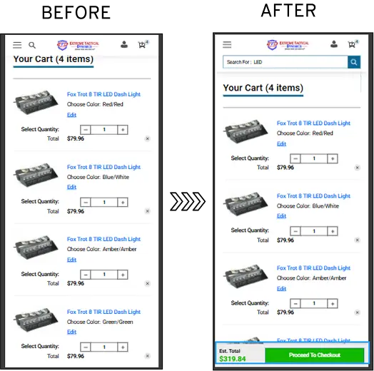
Case Study
How Convertcart Helped Extreme Tactical Dynamics Reduce Cart Drop-Offs With A/B Testing
Problem: Nearly 64% of mobile cart visitors were abandoning before buying a haemorrhaging checkout page that was costing real revenue.
Hypothesis: A cleaner layout with sharper CTAs and upfront pricing would remove the confusion, sending shoppers away.
A/B Test: We tested a redesigned mobile cart page with clearer CTAs and transparent pricing against the original cluttered layout.
Result: Cart drop-offs fell 4%, and campaign gains rose 3.79%. Modest numbers, perhaps, but on a page losing nearly two-thirds of its visitors, every percentage point counts. Read the full case study.
A/B Testing Ideas for the Colors
Color testing is really testing which emotional register resonates with your audience right now.
42. The "Action Color" Isolation
A—High-energy color for conversion goal
B—High energy color for various accents
Test a page where a high-energy color (such as a vibrant orange) is used exclusively for the conversion goal, against a page where that color is used for various accents.
43. A—Monochrome vs. B—High Vibrancy
Test a sophisticated greyscale design with a single-color pop against a page that uses a full, bright palette.
In this case, you’re testing if "minimalism" or "energy" drives the click.
TIER 4 — Trust: Remove Hesitation
A/B Testing Ideas for Social Proof/Testimonials
Social proof is what tells a visitor they can trust you with their details — and their money.
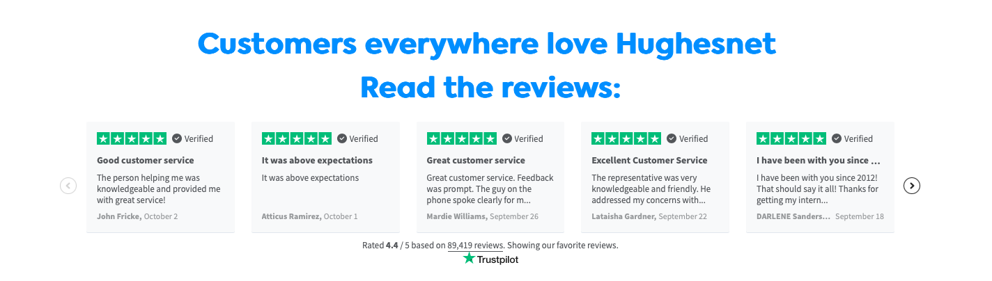
44. A—The "Celebrity" vs. B—The "Peer"
Test a testimonial from a recognizable industry "authority" against a quote from an everyday user who shares the visitor’s specific job title.
45. A—Video vs. B—Text
A 30-second "selfie" video of a happy customer often carries more weight than a polished paragraph that looks like it was written by a copywriter from her basement.
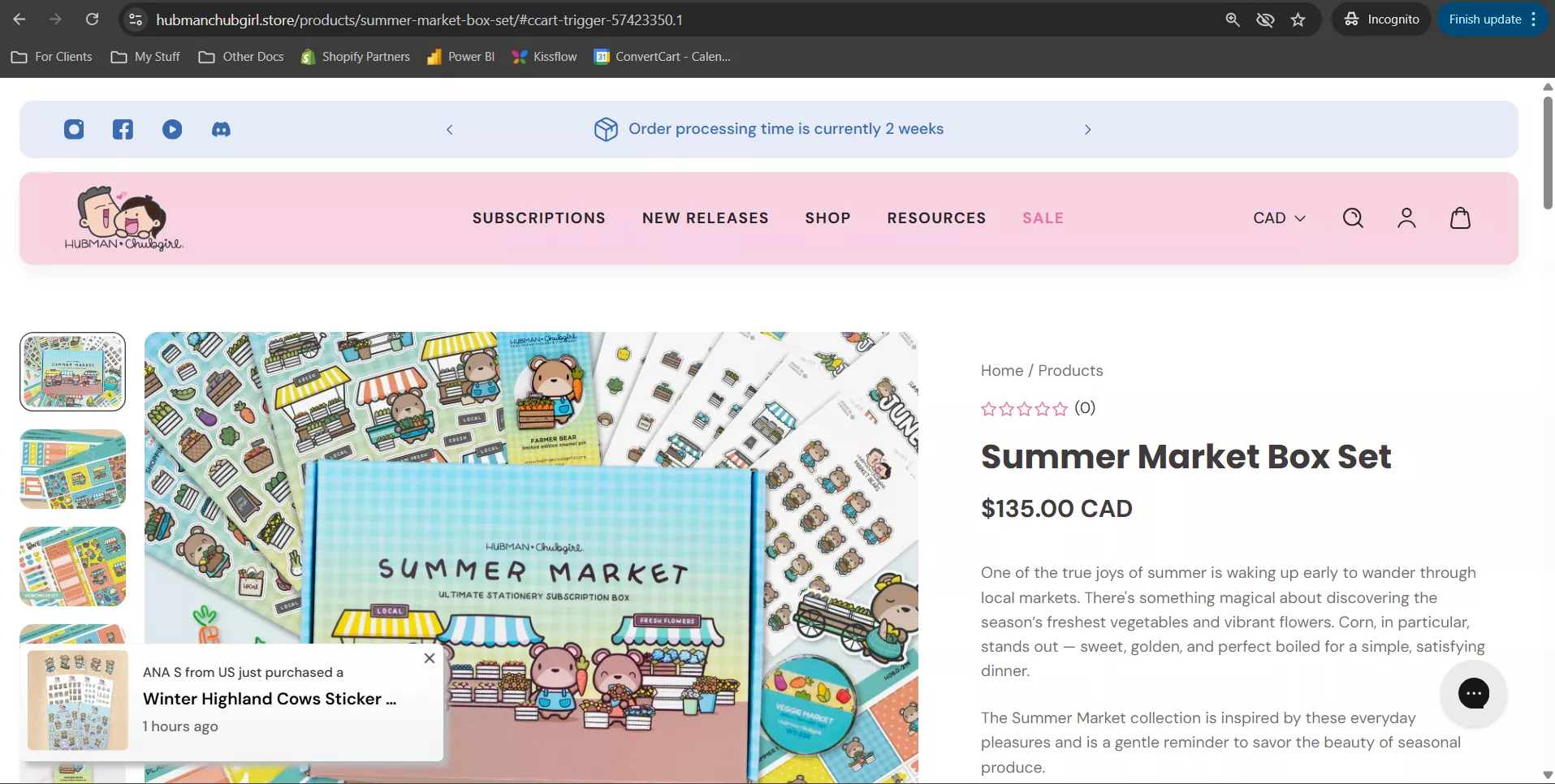
How Convertcart Helped Hubman & Chubgirl Double Mobile Orders Through A/B Testing
Case Study
Problem: Shoppers were browsing but not buying, hesitating at the moments that mattered most, and abandoning before reaching checkout.
Hypothesis: Adding social proof at key decision points would build enough trust to push hesitant shoppers over the line. And making the Add to Cart button sticky would keep the purchase action within reach at all times.
A/B Test: We tested social proof elements at key decision points across desktop and mobile. Then we tested a sticky Add to Cart button against the standard layout on mobile PDPs.
Result: Social proof drove a 29.64% campaign gain on desktop and a 103% jump in mobile orders. The sticky button delivered 66% more orders, a 57% lift in add-to-cart clicks, and a 7.89% drop in abandonment. Read the full case study.
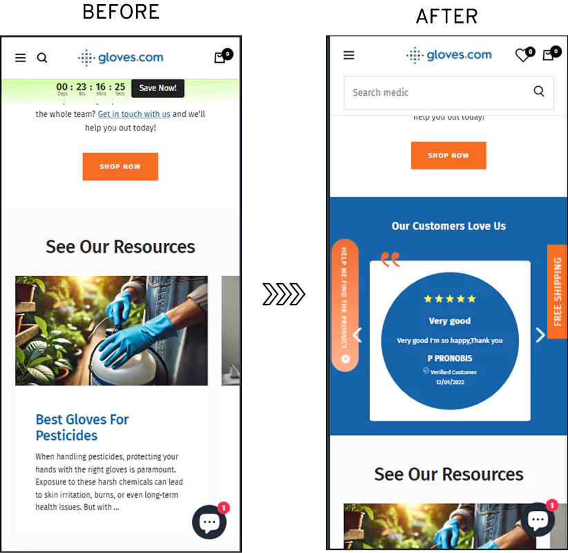
Case Study
How Convertcart Helped Gloves.com Stack Three A/B Testing Wins Into a Conversion Surge
Problem: Shoppers weren't convinced enough to buy and weren't moving purposefully through the site — trust was low, and urgency was absent.
Hypothesis: Trust seals and testimonials would reassure hesitant shoppers, while a shipping countdown timer would give them a concrete reason to buy now rather than later.
A/B Test: We tested trust seals on mobile product pages, a testimonial carousel on the mobile homepage, and a daily shipping countdown timer on desktop — each against their respective controls.
Result: Trust seals pushed campaign gains up 23.10% and website gains 6.71%. The testimonial carousel drove a 26.74% campaign gain and moved 46% more visitors from the homepage to the product page. The countdown timer delivered a 30.76% campaign gain, 13.68% website gain, and 22% more completed purchases. Read the full case study.
A/B Testing Ideas for Trust Badges and Certifications
Trust badges are small, but their placement and framing meaningfully affect hesitation at the point of conversion.
46. A—Security vs. B—Authority: Test a "Secure Checkout" badge (G2, Norton, SSL) against "As Seen In" logos (Forbes, TechCrunch). One asks, "Will I be robbed?" while the other asks, "Are these people legitimate?"
47. The "Money-Back" Shield: Test a prominent (A) "30-Day Guarantee" badge directly next to the CTA vs. (B) placing it in the fine print at the bottom of the page.
TIER 5 — Friction: Simplify Completion
A/B Testing Ideas for Forms
The form is the final hurdle. Treat every field as a potential point of friction.
48. The A—"Multi-Step" vs. B—The "All-at-Once"
Try splitting your form into two or three steps (e.g., Step 1: Email; Step 2: Company Details) compared with a traditional single-page form.
The Logic: Multi-step forms often win because they don't overwhelm the user initially, and once they’ve started, they feel a "sunk cost" urge to finish.
49. The Field Deletion (Less is More)
A—a comprehensive form
B—a minimalist form
The Test: A "comprehensive" form (Name, Email, Phone, Company, Job Title, Budget) against a "minimalist" version (just Name and Email).
The Logic: Every field you remove typically increases the conversion rate. You must test to find the "sweet spot" where you get enough data to be useful, but not so much that you scare everyone away.
50. The A —"Inline Validation" vs. B —"Post-Submit Error"
Nothing curdles the spirit quite like clicking "Submit" only to be told in angry red text that you’ve forgotten a character in your password.
The Test: Testing "Inline Validation" (where a green checkmark appears the moment a field is filled correctly) against the standard method of checking for errors only after the button is pressed.
The Logic: Real-time encouragement acts as a friendly guide, walking the user through the process, framing A/B testing for landing pages as a journey of "micro-wins."
51. The "Social Proof" Footer
When you need to establish trust in seconds, the area directly beneath the form is prime real estate.
A — A blank space beneath the "Submit" button.
B — A tiny line of text or a row of small logos saying, "Join 5,000+ professionals" or "Your data is 100% secure."
A/B Testing Ideas for Countdown Timers
Countdown timers create urgency but their overuse makes them feel manipulative rather than helpful. Test placement and honesty of the deadline.
52. The "Fixed Deadline" vs. The "Evergreen" Timer
This is a test of honesty and persistence. A fixed deadline is tied to a specific calendar event (such as the end of a sale), whereas an evergreen timer resets for each visitor.
A—The Fixed Deadline: "Sale ends in 03:14:22"—tied to a specific date (e.g., Midnight on Friday).
B—The Evergreen: "Your 15-minute discount expires in 14:59"—a personal timer that triggers the moment the page loads.
53. The "Sticky Header" vs. The "In-Line" Timer
Location, as any estate agent will tell you, is everything. You must decide if the ticking clock should follow the user or wait patiently for them.
A—(The Persistent Reminder): A thin, brightly colored banner at the very top of the screen that "sticks" as the user scrolls.
B—(The Contextual Reminder): A timer directly above or below the CTA button or the pricing table.
The Logic: A sticky timer ensures the "reason to act now" is never out of sight, whereas an in-line timer provides a final nudge when the user is weighing the cost.
A/B Testing Ideas for Popups & Sticky Bars
Popups can be an irritation or a save — timing and trigger decide which.
54. A—The "Exit-Intent" vs. B—The "Timed" Popup
Test a popup that only appears when a user’s mouse moves toward the "X" button, against one that appears after 30 seconds of reading.
55. A—The "Slide-In" vs. B—The "Overlay"
Test a subtle box that slides in from the corner against a full-screen "Welcome Mat" that demands attention.
A/B Testing Ideas for Page Speed & Performance
A perfectly designed page can still lose the conversion if it loads too slowly — speed itself is a testable variable, not just a technical fix.
56. Lazy-Loaded vs. Preloaded Hero Media
A: The hero video/image loads immediately, delaying time-to-interactive.
B: The hero loads lazily behind a lightweight placeholder while critical content (headline, CTA) renders first.
57. Compressed/Next-Gen Image Formats vs. Standard
A: standard JPEG/PNG assets.
B: compressed WebP/AVIF assets at the same visual quality.
58. Third-Party Scripts vs. Full Stack
A: The page runs its full set of chat widgets, trackers, and embeds.
B: A stripped-down version with only essential scripts, deferring or removing the rest.
Money is a sensitive subject, and how you present the bill can change everything for your prospects.
59. A—The "Monthly" vs. B—The "Annual" Toggle
Test showing the lower "effective" monthly price of an annual plan as the default, against the actual month-to-month cost.
60. The "Decoy" Price
Add a third, "Pro" tier that makes your "Standard" tier look like an absolute bargain, a classic bit of psychological anchoring.
A/B Testing Ideas for Audience Segments
Not every visitor is looking for the same thing; treating them as a monolith is a recipe for mediocrity. So, here are some audience experiments for your landing page.
61. The "Role-Based" Entry
Test a hero section that asks "Who are you?" (e.g., A—"I'm a Marketer" vs. B—"I'm a Developer") and directs them to a tailored sub-page.
62. A—The "Expert" vs. B—The "Beginner" Copy
Test a version of the page filled with industry-specific jargon against one that has plain, simple English.
A/B Testing Ideas for Campaign Concepts
Sometimes, you need to test the entire "vibe" of your campaign. Here’s stuff you can try:
63. A—The "Rebel" vs. B—The "Established" Voice
Test a bold, slightly cheeky campaign ("Stop doing it the old way") against a conservative, reliable one ("The industry standard for 20 years").
64. A—The "Scarcity" vs. B—The "Abundance" Hook
"Only 50 seats left" vs. "Join the growing community of thousands."
FAQs about Landing Page Testing
What is landing page A/B testing?
In its simplest form, A/B testing for landing pages is a controlled experiment in which you show two versions of a webpage to similar visitors to determine which performs better.
Think of it as a digital "taste test." Version A (the control) is compared against Version B (the challenger), which contains one specific change, perhaps a different headline or button color.
By observing which version leads to more clicks or signups, we move away from the fallible world of "gut feelings" and into the sturdy, reliable realm of data-driven certainty.
How to create an effective landing page A/B testing strategy?
An effective strategy begins not with a paintbrush, but with a question. You must first identify a "leak" in your funnel using a heatmap analysis. Once you spot where users are faltering, form a hypothesis:
"If I change the CTA to be more benefit-driven, then signups will increase."
A proper strategy requires testing one variable at a time, ensuring a statistically significant sample size, and most importantly, having the patience to let the experiment run its course without meddling like an anxious gardener.
Why are landing pages the best place to run A/B tests?
Landing pages are the laboratory of the internet because they are purposefully isolated.
Unlike a cluttered homepage, a landing page has a single goal, making it the ideal environment for A/B testing to drive higher signups.
Because there are fewer distractions, any change in user behavior can be more directly attributed to the variable you’ve tweaked.
It is where the "moment of truth" occurs; by optimizing this specific junction, you gain the highest possible leverage over your entire marketing budget and conversion rate.
What are the types of landing page testing?
Beyond the standard "Split Test," there is "Multivariate Testing," which examines how multiple variables, such as a headline and an image, work together.
Then there is "Redirect Testing," where you compare two entirely different page designs on different URLs.
To put it simply, split tests are for fine-tuning details, while redirect tests are for radical redesigns to see if a completely new direction resonates better.
What to A/B test on landing pages?
One should always begin with the "high-impact" elements that catch the eye first. Start with the headline and the primary hero image, as these dictate whether a visitor stays or flees.
Next, move on to CTA testing, covering both its copy and visual prominence.
Finally, experiment with form length, social proof placement, and pricing displays.
The goal is to systematically remove "friction," anything that makes the user hesitate or feel a twinge of anxiety.
How to do landing page testing for different marketing channels?
A visitor arriving from a frantic "buy now" search on Google requires a different touch than one drifting in from a leisurely scroll on social media.
When conducting A/B testing, focus on "message match" to ensure the page mirrors the ad's exact promise.
For email traffic, you might test a shorter, "warm" page since the trust is already established.
Success lies in tailoring the experience to the "temperature" of the lead, ensuring the landing page meets them exactly where they are.


.avif)
.svg)

.svg)

.svg)
.svg)
