If you’re building or running a telecom brand, you already know the digital journey can feel overloaded with plan pages, complex pricing, and endless verification steps. I
t’s a frustrating reality that many customers vanish somewhere between “View Plans” and “Activate Now,” leaving your telecom conversion rates hovering lower than they should be.
To move the needle, you need more than just traffic; you need a sharper telecom sales optimization strategy.
The goal is to turn a high-friction buying experience into a clear, trustworthy path that helps users choose the right plan, port their number, or book an installation without hesitation.
So, we’re here to walk you through 31 of the most effective, field-tested tactics designed to increase your telecommunications website's conversion rate and turn window shoppers into long-term subscribers.
TL;DR: Conversion Rate Optimization for Telecom Companies
Telecom websites are notoriously complex and packed with features such as plan details, pricing layers, identity checks, and multi-step activation flows.
That’s why telecom CRO is essential: it simplifies the customer journey, reduces bounce rate, and helps more visitors complete key actions, such as buying a plan, upgrading a device, booking broadband installation, or porting their number.
The most effective tactics include mobile optimization, clear plan comparisons, trust-building signals, faster page load times, simplified checkout, transparent coverage information, streamlined KYC, and personalized plan recommendations.
Plus, If you are looking to increase your telecommunications website conversion rate, start by identifying where the 'technical' jargon is strangling the 'human' desire to just get better internet.
To measure progress, telecom founders and marketers should track conversion rates, funnel drop-offs, checkout abandonment, porting completion rate, activation timelines, and mobile performance.
When you improve clarity, speed, and transparency across the funnel, customers make decisions faster and with more confidence.
In short, strong CRO turns your telecom website from a confusing maze into a smooth, trustworthy path that boosts activations and sales.
What are the Best CRO Tactics for Telecom Websites?
Improving telecom conversions isn’t about guesswork; it’s about applying proven tactics that build trust at every step of the customer journey.
Below are the best CRO tactics for telecom websites that consistently lift activations, plan purchases, and upgrade rates.
1. Mobile Optimization
For telecom companies, mobile optimization isn’t optional; it’s the backbone of a smooth and high-converting digital experience.
Most users browse plans, compare data packs, check network coverage, and complete purchases directly from their phones.
Here’s a quick mobile optimization checklist for your telecom website:
a. Can users check network coverage on mobile without pinching, zooming, or squinting?
b. Is your primary CTA visible above the fold on mobile without scrolling gymnastics?
c. Are plan comparisons readable on small screens without turning into a spreadsheet nightmare?
d. Does your checkout or KYC flow work smoothly with one hand?
e. Can users quickly check SIM, number, or broadband availability on mobile?
f. Do pricing, taxes, and monthly costs remain clearly visible on mobile screens?
g. Is your mobile page speed fast enough for low-network conditions?
h. Are trust signals (network stats, security badges, reviews) visible without endless scrolling?
i. Can users easily contact support via tap-to-call, WhatsApp, or chat on mobile?
j. Does your mobile experience make upgrading, porting, or recharging feel effortless?
A mobile-optimized telecom site improves conversion rates simply by reducing the tiny irritations that cause users to abandon the journey.
Make sure your plan pages, broadband availability forms, and checkout flows adapt beautifully to smaller screens.
Good mobile UX is really just good manners, delivered through design.
2. Compelling Headlines
In telecom, your headlines do much of the heavy lifting.
A compelling headline can instantly clarify what a plan offers, how a bundle saves money, or why your network coverage is worth switching for.
Users land on a page with a question: “Is this the right provider for me?” Your headlines should answer that question in plain, reassuring language.
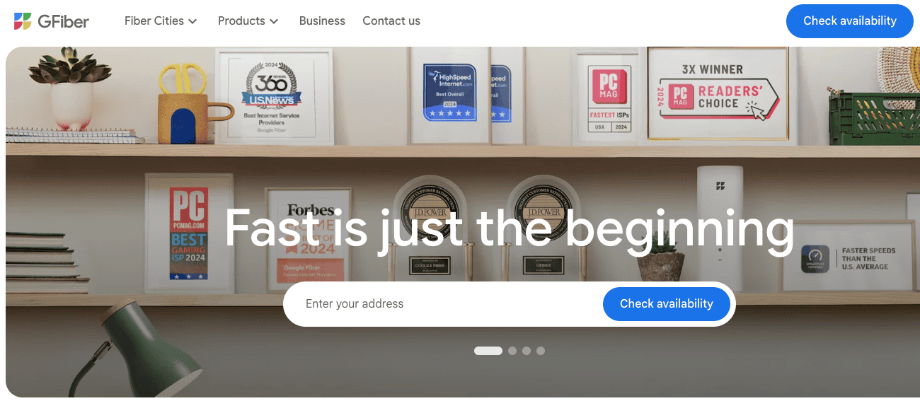
Avoid buzzwords and focus on the core value: faster speeds, better coverage, simpler billing, and lower costs. Strong telecom headlines trade hype for clarity.
Instead of promising “cutting-edge infrastructure,” say “fast internet with no data caps.” Instead of “seamless digital experiences,” say “reliable coverage at home and on the move.”
GFiber does this well. Their messaging focuses on clear outcomes rather than technical jargon.
When your headlines lead with clarity and relevance, users instantly understand the benefit and continue exploring instead of bouncing.
Strong telecom headlines also improve SEO by naturally including terms people search for, such as “Unlimited Data Plans,” “Fastest Fiber Broadband,” “Easy SIM Porting,” and so on.
It’s a small change with an outsized impact; the correct headline can turn curiosity into conversion.
3. Trust Signals and Social Proof
Telecom customers are naturally cautious; they’ve been burned before by hidden charges, patchy coverage, and fine-print surprises.
That’s why trust signals are essential for telecom CRO.
Add genuine customer reviews about network reliability, testimonials from specific cities, transparent coverage maps, and security badges during checkout, on plan comparison pages, pricing pages, coverage check pages, and hero sections.
Show proof of awards, independent speed tests, and any certifications you hold.
Display average uptime guarantees and customer satisfaction ratings clearly on your website pages.
This builds credibility before users even scroll. Social proof works exceptionally well in telecom because people want reassurance that they’re switching to something better, not repeating a mistake.
When customers see authentic voices and real numbers, they feel safer.
4. Website Analytics and A/B Testing
Telecom websites have complex funnels, plan selection, coverage checks, number portability, device comparisons, and billing.
A/B testing and analytics help you understand where users hesitate and why they abandon.
For example, you might discover that users spend time scrolling back and forth between two plans but rarely click “View Details,” a sign that there’s scope for you to explain your plans more clearly.
Or you may notice that most users never scroll far enough to see your broadband speed explanation or installation timeline.
Next, use analytics to identify high-intent drop-offs.
A typical example: users start an MNP (number portability) flow but abandon it when asked for too many details up front.
Hence, if you reduce the number of form fields at this step, you’ll see a rise in the rate of conversions.
Similarly, you can run A/B tests on headlines, plan comparison layouts, CTA buttons, pricing displays, and support modules to see which variants are getting you better results.
5. Analyze Call Tracking Data to Optimize Your Website Pages
Telecom customers often call because something on your website wasn’t clear enough, a confusing plan detail, inconsistent pricing, unclear MNP instructions, or vague installation timelines.
Call tracking data is essentially a map of friction points.
Analyze what people ask most: coverage doubts, billing confusion, hidden fees, or documentation required for porting.
Then fix those questions directly on your website.
Add content and copy that directly answers your audience’s most common questions.
This way, you can make your pages more helpful for your users, improve time on site, and get more conversions.
Call tracking also highlights high-intent leads, people ready to switch or sign up but unsure about one small detail.
Understanding these patterns helps you offer products and bundles that are better suited to your audience’s needs and drive more sales.
6. Optimize Hero Sections to Improve CRO
Your hero section is the first digital handshake; make it count.
For telecom brands, the hero area should communicate your most substantial value instantly: faster fiber speeds, a high-coverage mobile network, best device + plan savings, or a painless switching experience.
Use simple headlines, clean visuals, and a single action-focused CTA.
Many telecom sites clutter their hero with scattered offers, confusing numbers, and too many choices.
Instead, lead with the benefit users care about most: reliable coverage, honest pricing, or clear savings.
For example, a fiber broadband provider might lead with “Gigabit speeds with installation in 3 days” instead of generic promises about “next-gen connectivity.”
A mobile network might say “Strong coverage where you live and work”, paired with a simple coverage check.
If you personalize by city or device type, even better.
A strong telecom hero section sets expectations early and reduces bounce rates.
It’s more like a signboard outside a mountain lodge; if the sign is confusing, no one comes inside.
7. Personalize Telecom Landing Pages by City
Telecom needs personalization more than most industries because network quality, roaming, pricing, and offers vary by region.
A user in Chicago shouldn’t see the same promises as someone in Denver.
Create city-specific landing pages that showcase local coverage strength, average speeds, regional offers, and installation timelines.
This improves SEO and boosts conversions because you’re speaking to a user’s exact reality, not a national average.
Add local testimonials, city-wise network maps, and contextual plan recommendations.
City-level personalization turns generic telecom pages into reassuring, hyper-relevant experiences that build trust with prospective customers.
Quick Fact: While mileage varies, telecom brands often see a 15-20% lift in conversion rates when they transition from generic national landing pages to localized pages (e.g., 'Best Fiber in [City Name]'). When a user sees their own neighborhood mentioned, the 'patchy coverage' anxiety vanishes.
8. A/B Test Your Key Conversion Pages
Telecom websites have several high-stakes pages: your plan comparison page, device + plan bundle pages, broadband availability checker, and the checkout or MNP flow.
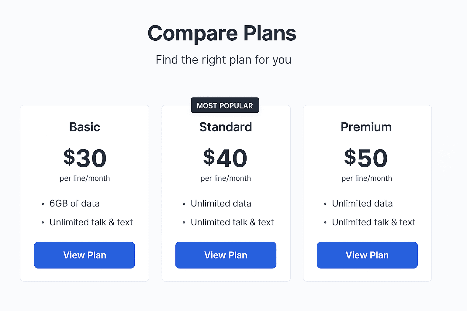
a. For example, on a plan comparison page, you can A/B test a dense table layout versus a card-based layout that highlights one “Most Popular” plan. Many telecom brands discover that users convert faster when one option is visually recommended instead of presented as an equal list.
b. On device + plan bundle pages, test showing monthly total cost upfront versus breaking it into device EMI + plan price.
c. In a broadband availability checker, test asking for a full address versus just a postcode or pin code first. Reducing early friction frequently increases completion rates.
d. For checkout or MNP flows, test shorter forms versus progressive disclosure, or placing reassurance copy like “Takes under 2 minutes” near the CTA.
These pages decide whether a user commits or bolts. A/B testing helps you discover what actually moves conversions.
Also, telecom visitors can behave differently depending on region, device type, and whether they’re switching, upgrading, or buying broadband.
You can test one change at a time: button size, layout, copy, icons, or trust signals. Sometimes, a tiny tweak, such as showing the estimated monthly cost earlier, can significantly boost sign-ups.
9. Optimize Your Main Call-to-Action Buttons
Your CTA buttons are the tiny signposts that guide users through the telecom funnel: “Check Coverage,” “Compare Plans,” “Port My Number,” “Continue to Billing.”
These must be clear, intentional, and easy to tap on mobile.
Avoid vague CTAs like “Learn More,” which leave users wondering what comes next.
Be direct: “See Plans Near You,” “Start Number Transfer,” “Check Installation Availability.” In telecom, clarity beats cleverness every time.
Use contrasting colors, adequate spacing, and predictable placement so users never hunt for the next step.
a. Contrasting colors don’t mean neon or aggressive. They tell the CTA stands apart from the rest of the page.
If everything on your plan page is blue and grey, your primary CTA shouldn’t quietly blend in as another blue button. It should be instantly recognizable as the next step.
b. Adequate spacing matters because telecom pages are information-heavy. When CTAs are crammed between pricing tables, disclaimers, and plan details, users miss them.
Giving buttons breathing room visually signals importance and reduces accidental taps, especially on mobile.
A great CTA is like a friendly guide on a hiking trail. It isn’t supposed to be flashy; it’s supposed to guide the users in the right direction.
10. Simplify Billing and Checkout
Telecom checkouts tend to get complicated fast. Things like address verification, identity checks, plan details, device payments, contract terms, and sometimes even installation scheduling can feel chaotic.
A simplified billing and checkout flow improves conversions by eliminating unnecessary steps that make users second-guess their decision.
a. Keep form fields minimal,
b. Clearly explain charges (especially activation fees)
c. Break the flow into clean, predictable steps
d. Use auto-fill wherever possible
e. Let users edit plan selections without restarting the entire process
f. Show a clear order summary with monthly cost, taxes, contract duration, and any promotions applied
A simpler telecom checkout reduces drop-offs and gives customers that rare, magical feeling that signing up for a new connection isn’t a bureaucratic ordeal.
11. Use The Best Payment Options to Reduce Failed Transactions
Telecom purchases often involve higher ticket values or recurring monthly payments, making failed transactions a common conversion killer.
Offer multiple payment options, such as cards, digital wallets, EMIs, carrier financing, and auto-pay. For device bundles, highlight installment options early in the flow.
Use card validation (like Luhn checks), clear error messaging, and instant confirmation of successful payment. The easier it is to pay, the fewer users abandon the process.
Failed payments aren’t just a tech issue; they're lost conversions sitting inches from the finish line. Optimizing payment methods ensures those inches disappear.
12. Be Transparent About Your Network Coverage
Coverage is the single biggest decision-driver in telecom. If users don’t trust your coverage, they won’t convert, no matter how irresistible your pricing looks.
Display accurate, interactive coverage maps that show signal strength, 4G/5G availability, and broadband access by neighborhood.
Add region-specific testimonials and performance data for extra reassurance.
Avoid vague claims like “Great Coverage Nationwide.” Users want specifics: “Better indoor coverage in downtown areas,” or “Fastest 5G speeds in the North region.”
13. Showcase Real Network Performance Data
Telecom customers crave certainty, especially when choosing between providers.
Show real numbers: average download speeds, peak-hour performance, latency tests, and independent rankings from trusted agencies.
Present the data visually so users don’t feel like they’re reading lab reports. When customers see real performance metrics, not marketing fluff, they feel
confident about switching or upgrading.
This is particularly impactful for broadband website pages, where performance matters the most.
You shouldn’t forget that good data sells; vague claims stall conversions.
14. Highlight Savings in Your Device + Plan Bundles
Bundles are a big CRO opportunity in telecom, but only if customers immediately understand the savings.
Show the exact monthly and overall cost difference between buying a device outright vs. bundling it with a plan.
Use simple comparison cards that highlight total savings, upgrade perks, free add-ons, or financing benefits. Do it well, and showcasing savings in your bundles can turn out to be an excellent sales optimization strategy.
15. Make Sure Your Number Portability Flow is Idiot Proof
Switching networks (MNP) is notoriously painful, so your digital flow must feel as simple as ordering a pizza.
Spell out the required documents, expected timelines, porting charges, and steps involved before users begin.
You need to break the flow into small, predictable steps with clear guidance at each stage. Add FAQs and tooltips right where people hesitate.
A frictionless MNP flow is a massive conversion booster because users switch networks only when they feel safe and informed.
16. Make Your Customer Support Easy to Access
Telecom users often have that one burning question before they convert: “Will I get coverage in my basement?” or “How soon can I get the broadband installed?”
Make live chat, callback options, or WhatsApp support easily accessible from plan pages, coverage checkers, and checkout.
You need to avoid burying support inside menus; they’re the lifeblood of the CRO engine.
17. Allow Users a Quick Number Availability Check
A quick number-search tool is an underrated CRO gem.
Whether customers want a premium number, a fancy pattern, or simply availability confirmation, instant results prevent frustration and keep them in the flow.
Make the checker fast, mobile-friendly, and clear about pricing. Users love the feeling of “claiming” a number; it’s a small moment of delight that often leads to a sale.
18. Create a “Help Me Choose” Assistant
Telecom plans can overwhelm the best of us with data limits, OTT add-ons, contract terms, roaming benefits, and speed variations.
A “Help Me Choose” quiz simplifies it beautifully. Ask a few thoughtful questions about usage patterns, work-from-home needs, travel frequency, and device count.
Then recommend the perfect plan. This reduces decision anxiety and boosts conversions, especially for new visitors who don’t yet understand your offerings.
It’s CRO wrapped in kindness.
19. Explain Plan Inclusions Clearly
If you want to reduce website bounce rates, start by clearly explaining what’s included in each telecom plan.
No more mysteries, footnotes the size of a termite, or vague promises like “Unlimited* Data.” Lay out everything: speed caps, fair-usage policies, roaming limitations, hotspot allowances, OTT perks, installation charges, and upgrade eligibility.
It’s ideal to use icons, brief explanations, and expandable sections for deeper detail. When users feel informed rather than tricked, they convert at much higher rates.
20. Create a Customized User-Friendly Plan Builder
A plan builder is essentially a “Have it your way” engine for telecom shoppers.
Let users toggle data limits, calling minutes, international add-ons, family lines, and devices to generate a price instantly.
Each adjustment should update live on the screen, no loading, no guessing, no surprises.
Telecom users love control, and a plan builder gives them precisely that. It also reduces analysis paralysis and nudges shoppers toward higher-value upgrades without feeling pushy.
21. Optimize Your Post Checkout Experience
CRO doesn’t end at the payment page; it extends into the post-checkout universe, where many telecom journeys fall apart.
It’s best to send instant order confirmations, show clear next steps (SIM dispatch, activation timing, porting instructions), and add real-time order tracking.
Provide FAQs right inside the confirmation email and give customers an easy way to contact support if something doesn’t look right.
A well-designed post-checkout experience builds trust and dramatically cuts support tickets.
Plus, it’s a great moment to upsell accessories, add-ons, or device protection.
22. Display Roaming Benefits Clearly
Roaming costs remain one of the great unsolved mysteries of the modern world.
To boost conversions, clearly and early on your plan pages, spell out the roaming benefits.
Use simple language: where users can roam, how much data they’ll get, what calls cost, and where they save money compared to pay-as-you-go.
Travelers want certainty, not nasty surprises.
Make this section scannable, mobile-friendly, and linked to real examples (“A 7-day trip to the UK typically uses X data”).
When users feel confident about international usage, they convert more often and choose higher-value plans.
23. Make Your Terms and Conditions Accessible and Easy to Understand
In telecom, the Terms and Conditions page has long been considered a sort of digital haunted house, dark, dense, and full of unexpected jump scares.
But for strong conversion rates, you need to make it human-friendly.
Break long paragraphs into digestible chunks, use simple language, and highlight critical points like cancellation rules, installation fees, throttling policies, and contract duration.
Add tooltips, summaries, and expandable sections for legal details.
Search engines love clarity, and your users love honesty, so make your T&Cs feel less like a legal trap and more like a straightforward guide.
When shoppers understand what they’re signing up for, they’re far more likely to hit “Proceed.”
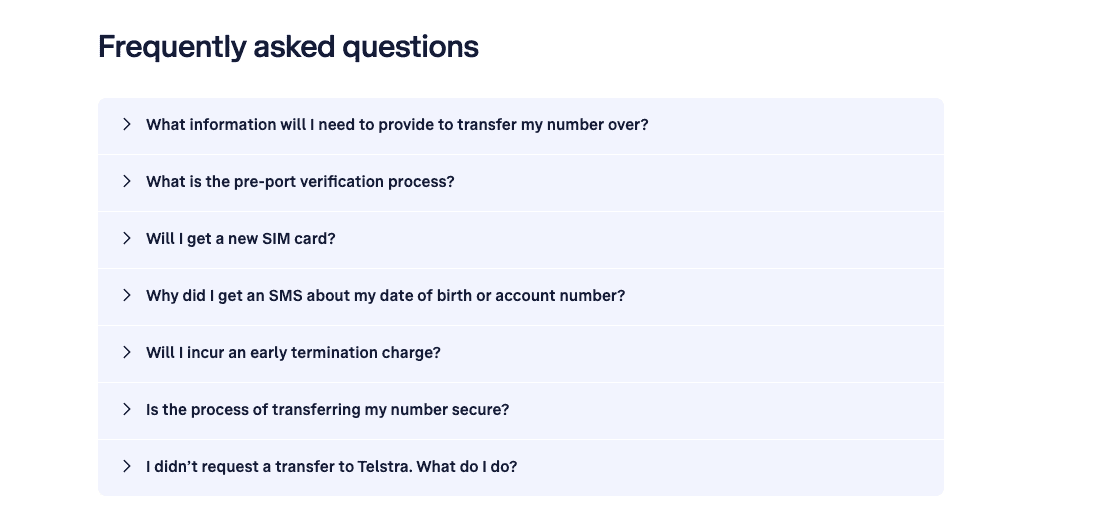
24. Have an FAQ Section on Your Product and Porting Pages
A robust FAQ section is the telecom equivalent of giving customers a reliable compass before they set off into uncharted territory.
Include common questions about SIM activation times, number portability issues, plan limits, roaming, broadband installation, data rollover, and contract renewals.
Keep answers short, skimmable, and SEO-optimized with natural search terms (“how to port a number,” “activation time,” “broadband installation timeline”).
FAQs reduce support queries, clear up confusion, and are often the hidden incentive that pushes a hesitant customer towards conversion. If you want fewer drop-offs, give customers fewer unknowns.
25. Make It Easy for Customers to Track Activation Post Purchase
The moment after purchase is when most telecom customers transform into amateur detectives; refreshing inboxes, checking SMS updates, and wondering, “What happens now?”
Ease their anxiety by offering a clear activation tracker.
Whether it’s SIM activation, broadband installation, or number porting, show progress in real time with timestamps and simple status updates.
This reduces post-purchase doubt and keeps customers from second-guessing their decision.
The smoother the activation journey feels, the higher your retention and the more likely customers are to upgrade or recommend you later.
26. Simplify Your Online Identity Verification Process
Online identity verification is where many telecom conversions tragically perish. Make the KYC process as swift and friendly as possible.
Offer multiple verification options (document upload, OTP, or eKYC), use auto-capture document tech, add real-time error detection, and show a progress bar.
Most importantly, reassure users about data privacy with clear messaging.
A fast, transparent, mobile-optimized verification flow can dramatically reduce abandonment rates.
The goal: make verification feel less like airport security and more like renewing a library card.
27. Display Your Customer Support Response Times
When customers see that your support replies in “under 2 minutes on chat” or “within 1 hour via email,” it instantly boosts trust.
Telecom shoppers crave reliability, and showing real response times is one of the quickest CRO wins available.
Add this information near your CTAs, in your help widget, and on your support landing page.
It signals competence, transparency, and empathy qualities that directly improve conversion rates.
When users know they won’t be stranded if something goes wrong, they buy with far more confidence.
28. Highlight Upgrade Eligibility Rules for Existing Customers
Telecom customers love upgrades, but only when they understand the rules. Make upgrade eligibility obvious on account dashboards, plan pages, and renewal flows. Explain contract timelines, device trade-in options, costs, and benefits in transparent language.
Use eligibility checkers that allow users to see upgrade options instantly.
It’s CRO through clarity, pure and simple.
29. Make Your Broadband Speeds Easy to Understand
Most broadband pages read like technical manuals designed for electrical engineers. To improve conversions, ditch the jargon.
Explain speeds using everyday scenarios: video calls, 4K streaming, gaming, multiple devices, or smart home usage.
Use charts, icons, and quick comparisons like “Good for families” or “Best for heavy streamers.” Include average real-world speeds where possible, not just the theoretical maximum.
When you translate Mbps into human terms, customers decide faster and bounce less.
Google rewards clarity, too, so this doubles as an SEO win.
30. Personalize Plan Recommendations on Your Website
Telecom shoppers don’t want to scroll through 17 plans like they’re reading a restaurant wine list. Use personalization to guide them.
Tailor recommendations based on location, browsing behavior, device type, past purchases, usage patterns, or number of connected devices.
Use phrases like “Best for you” or “Popular in your city.” Personalization reduces cognitive load and makes the buying process feel intuitive.
31. Showcase Expected Installation Dates Upfront
Few things delight telecom customers more than knowing exactly when their broadband will be installed.
Display expected installation dates right on the product page, and, if possible, include a real-time slot finder.
This prevents last-minute drop-offs and gives your CRO a solid lift.
Being upfront about timelines also signals that you’re not hiding delays or playing guessing games. Clarity is currency in telecom, and installation transparency is one of the best investments you can make.
Final Thoughts
In the end, conversion rate optimization for telecom companies is about making the customer journey feel less like navigating a maze of cables and more like walking down a well-lit, clearly signposted hallway.
When you simplify choices, clarify pricing, speed up your funnels, and communicate like an actual human, customers respond with trust, and trust is the real engine behind higher activations, more upgrades, and fewer abandoned carts.
Telecom may be a complex industry, but improving conversions doesn’t have to be.
A few thoughtful CRO fixes, applied consistently, can turn your website into a place where shoppers don’t just browse, they buy.
Subscribe for more articles like this!
Thank you - we'll see you in your inbox soon!
Oops! Something went wrong while submitting the form.
Read by 5000+ ecommerce store owners
Subscribe for more articles like this!
Thank you - we'll see you in your inbox soon!
Oops! Something went wrong while submitting the form.


.svg)

.svg)

.svg)
.svg)
