eCommerce Website Optimization: 36 Proven Strategies to Increase Conversions

Insights in this post come from our CRO team's decade of experience working with eCommerce brands. Edited by our in-house content team.

Insights in this post come from our CRO team's decade of experience working with eCommerce brands. Edited by our in-house content team.

After working with more than 500 eCommerce stores across the United States, we've noticed something that doesn't get said enough: eCommerce website optimization isn't a checklist.
It is the process of improving your online store’s performance by reducing friction across acquisition, navigation, conversion, and retention to increase revenue per visitor.
It's a system. And understanding the difference between those two things is, frankly, the whole game.
This guide will walk you through the system, what it is, how to use it, and what to do first.
This post covers:
The 4-Layer eCommerce Website Optimization Framework
How to Prioritize What to Optimize (The Part Nobody Talks About)
Layer 1: Acquisition Optimization
Layer 3: eCommerce Conversion Optimization: How to Turn Visitors Into Buyers
Layer 4: eCommerce Retention Optimization
Layer 4 Continued: Technical Foundation

In our work with hundreds of stores, we've found that eCommerce UX optimization efforts fall into four distinct layers, and problems in one layer can't be fixed by tinkering in another.
Getting them in the right order matters enormously.
Layer 1—Acquisition: This is where shoppers find you through search, ads, social, or a recommendation from someone who enjoyed their purchase enough to mention it. Optimization here means being discoverable, credible, and relevant to the right people.
Layer 2—Intent: Once visitors arrive, they need to find what they came for. Navigation, site search, category pages, and filtering all live here. A visitor who can't find the thing they want will simply find it somewhere else, with no particular ill will toward you; they just won't be back.
Layer 3—Conversion: This is the layer most people mean when they say "optimization": product pages, cart experience, checkout, trust signals, and pricing psychology. It's where browsers become buyers. Or don't.
Layer 4—Retention: The purchase isn't the end. It's the beginning of the next one. Email flows, post-purchase experience, loyalty mechanics, and feedback loops all live here. Retention is where the real economics of e-commerce are decided.
Most stores, when they decide to optimize, dive directly into Layer 3. They add urgency badges, rearrange buttons, and wonder why revenue hasn't budged. The answer is usually that they have a Layer 2 problem or that they're spending heavily to bring the wrong visitors through Layer 1.
Fix the right layer, and everything downstream improves.
%2525202.jpeg)
Here’s something we've learned the hard way: the highest-traffic pages are rarely the highest-priority pages.
It sounds obvious when stated plainly. And yet almost every store we audit is optimizing its homepage with great enthusiasm while its checkout page leaks revenue like a garden hose with a nail through it.
The right question isn't "where do the most visitors go?" It's "where does revenue die?"
Here's a simple prioritization model we use:
1. Revenue Per Visitor (RPV) by page: Calculate what each page contributes to eventual revenue. A category page with a million sessions that leads nobody to checkout has an RPV close to zero. That's your problem.
2. Intent drop-off analysis: Where in the journey are people stopping? The answer is almost always: earlier than you think. Cart abandonment gets all the attention because it's the most visible. But most abandonment decisions are made on the product page, not in the cart.
3. Behavioral signals: Heatmaps, session recordings, rage clicks, scroll depth. These tell you where the friction is. Combine them with drop-off data, and you know both where and why.
4. Fix-to-impact ratio: Some problems are hard to fix and barely move the needle. Some are a forty-minute job that doubles conversions. Prioritize the latter with unseemly enthusiasm.
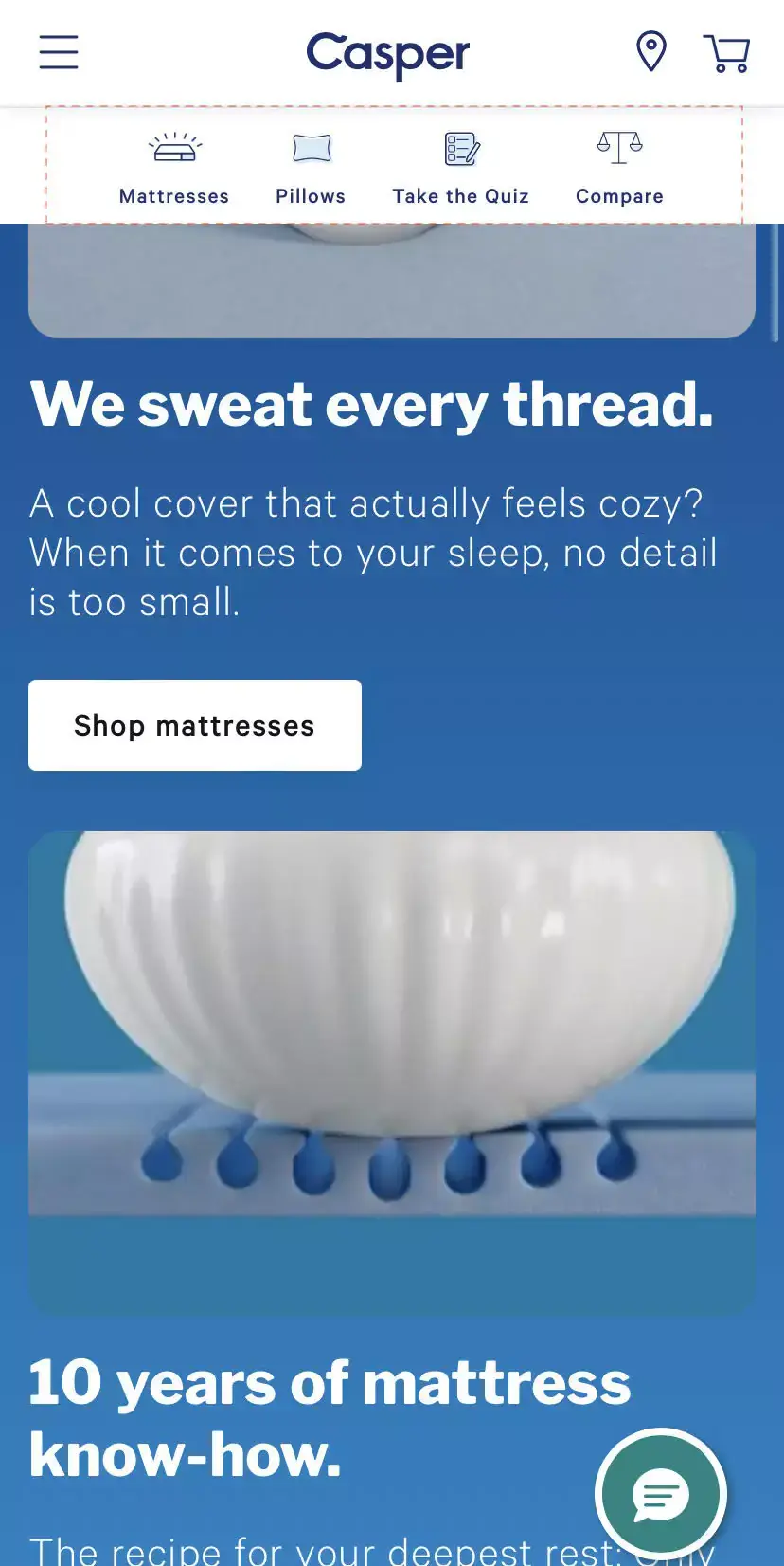
Researching products on mobile before purchasing on desktop is now the norm, not the exception. An optimization strategy geared toward mobile users looks like this:
Make search return results within the same category: if a shopper types "shoes for women," show them "shoes for women casual," "shoes for women gifts," and so on. Place the primary CTA in a sticky navigation bar at the bottom of the screen; that's where thumbs live.
Highlight callouts to your app (60% of shoppers say they'd rather use an app than a mobile site, which is either alarming or an opportunity, depending on your disposition).
Feature the most-used actions as clickable icons in a sticky menu, minimize pop-ups, optimize forms by reducing the number of fields, and ensure voice search is addressed in your SEO strategy. If conversational queries aren't in your keyword plan, they should be.
Further Reading: eCommerce Mobile UX: 27 Ways to Get More Conversions
Average website loading times are around 2.5 seconds on desktop and a somewhat dismal 8.6 seconds on mobile. The goal is under 2 seconds, either way.
To get there: use lazy loading (but exempt your first fold), work with a CDN, remove inactive plugins, and arrange navigation menus to reduce depth.
Club similar categories rather than leaving loose sub-categories trailing around like lost luggage.

Whether visitors arrive via paid ads, social, or referrals, what they see needs to match what they were looking for.
Study what's ranking to understand the intent behind searches, take Google's suggested keywords seriously (they reflect real behavior), and ensure your highest-intent keywords appear on your highest-intent pages.
Keyword clustering, connecting related terms to related content, is underused and undervalued. When done well, it builds topical authority that compounds over time.
Image SEO is one of those topics that gets nodded at and then quietly ignored. Don't ignore it. Use WebP format for product images (it compresses without sacrificing quality).
Add descriptive alt text. Name your images meaningfully: "strawberry-gelato-almond-cream" beats "product_image_47" in ways that matter both to search engines and to the visually impaired.

Search engines now synthesize answers rather than simply ranking pages. To appear in those synthesized answers, your content needs to define entities and relationships (not just keywords), implement structured data comprehensively, answer direct questions in clear language, and use a natural expert voice.
Nearly 58% of Google searches now result in zero clicks. Being in the AI overview isn't a bonus. It's where visibility lives.
Almost 70% of storefront visitors head straight to the search bar. If your search is weak, you've lost them before you've begun.
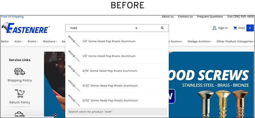
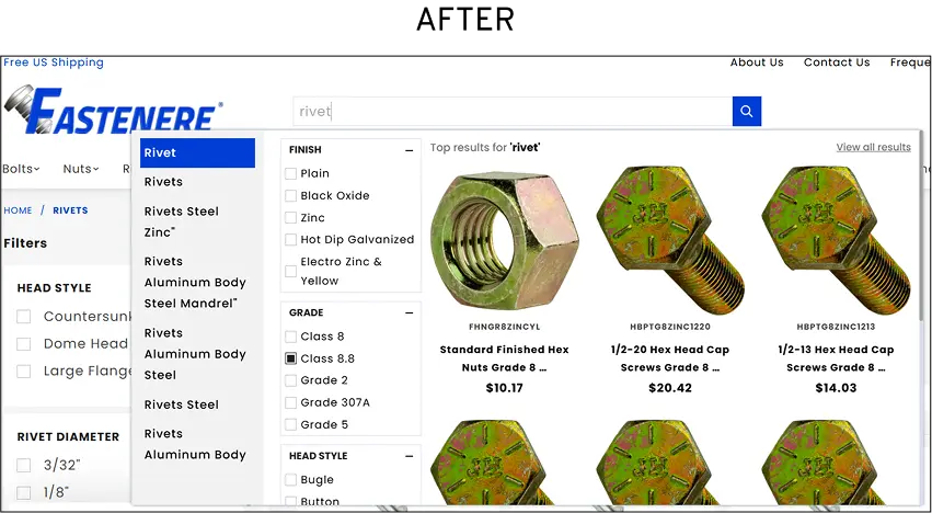
Use dynamic hint text ("What are you looking for today?"). Feature trending searches for top-of-funnel visitors. Show relevant results even when there's a typo, a good mix of auto-correct and auto-suggestion is what we mean. Allow "Add to Cart" directly from search results. These aren't complicated changes. They're just uncommonly implemented.
At Convertcart, we helped one of our clients in the industrial and commercial fasteners industry to improve their conversion rate by 1104.8% by introducing smart search with advanced filtering options (by category, specs, availability), predictive suggestions, and prioritized high-converting queries. You can read the full case study here.
Every unnecessary step in the purchase path is a polite invitation to leave. Feature "Quick Add" CTAs on the homepage. Stack available offers on the product page before shoppers reach the cart.
Feature popular payment methods as secondary and tertiary CTAs in the cart with saved details; they become one-click shortcuts. Auto-apply discounts at checkout, and do away with coupon codes wherever humanly possible.
Low-performing stores tend to share one characteristic: they are full of things competing for attention. Auto-play carousels. Overloaded notification bars. Typography from five different font families. Pop-ups with no apparent relationship to what the visitor was doing.
Cognitive load is the enemy of conversion. Every element that makes a visitor think harder reduces the chance they'll buy something.
Audit your site for distractions with genuine ruthlessness. Remove anything that doesn't serve the purchase journey.

Micromoments are the split seconds when a consumer turns to a device to learn, compare, or buy. Optimize for "best of," "how to," and "near me" queries. Ensure your mobile pages load price, reviews, and stock status above the fold. Make sure "Add to Cart" is visible and functional the moment someone arrives.
And be present wherever curiosity takes your customers, such as social search, Google Images, and YouTube.
REI does this particularly well, integrating shopping directly into expert editorial content. The gap between "I want to know" and "I want to buy" collapses when the content handles both.
The product page is where most purchase decisions are actually made, not in the cart, not at checkout, but here, in the moment a visitor is trying to decide whether this thing is worth their money.
An image gallery that creates an experience (not just a row of thumbnails). Video content that processes information faster than copy can. Reviews positioned where the eye naturally goes. Recommendations that add rather than distract.
Pricing and delivery information that makes the value obvious. And descriptions that help shoppers visualize the product in use, not just describe what it is.
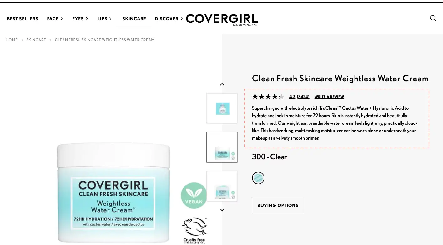
Since 87% of shoppers are unlikely to make a repeat purchase when product information is unclear, this is not a stylistic consideration. It's a commercial one.
Lead with a scannable snippet for those moving across multiple product pages. Follow with a relatable problem statement and how the product solves it. Include sizing, material, and delivery details.
Feature returns and refund information close to the purchase decision, not buried in a footer.
A significant portion of what we call cart abandonment actually happens at checkout. The principles are simple, though the execution requires restraint: feature only what drives the purchase, nothing more.
Skip or minimize upsells at this stage. Use a progress indicator. Feature policies as microcopy. Create trust at every micro-step.
Use a drawer cart that appears when an item is added. Offer a popular payment method as a secondary CTA.
Display a threshold bar for free shipping or a gift. Feature clear microcopy about taxes and additional charges; hidden costs at checkout are, by a significant margin, the most common reason for abandonment.

Average cart abandonment sits at around 70%. What you do with those 70% determines a remarkable amount of revenue. Create trust across product, cart, and checkout pages. Use live chat with a trigger question.
Time pop-ups appear when shoppers open their cart. Build an email flow around abandonment that inspires, rather than simply reminds.
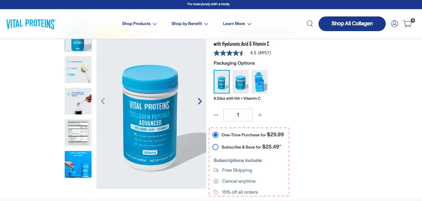
It's not just what you charge. It's how you present it.
Use "subscribe and save" models and clearly show the savings. Offer quantity discounts and bundles.
Apply limited-time offers with genuine windows "available for 24 hours" means something. "Sale" means almost nothing anymore. Offer exclusive pricing to long-term customers. Make them feel seen.

Nudge marketing discount labels, back-in-stock alerts, "limited edition" language, flash deal updates work not because customers are gullible but because they provide decision-useful information at exactly the moment it's needed.
Feature third-party social proof in the first fold. Tie a quality guarantee to your brand values.
Associate with a cause that means something. Use "frequently bought together" with an editable cart, so shoppers feel in control. Lead upsells through a benefit, not just a product.
Further Reading: 30 Best Examples of Nudge Marketing in eCommerce
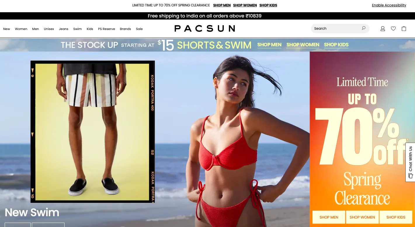
Deep discounts offered constantly are trusted by nobody. The psychology of scarcity requires genuine scarcity. Run a yearly clearance event and let it become anticipated. Set a free gift threshold to introduce new products.
Announce anniversary discounts. Run a pop-up for a current sitewide offer with urgency, and be honest about its window.
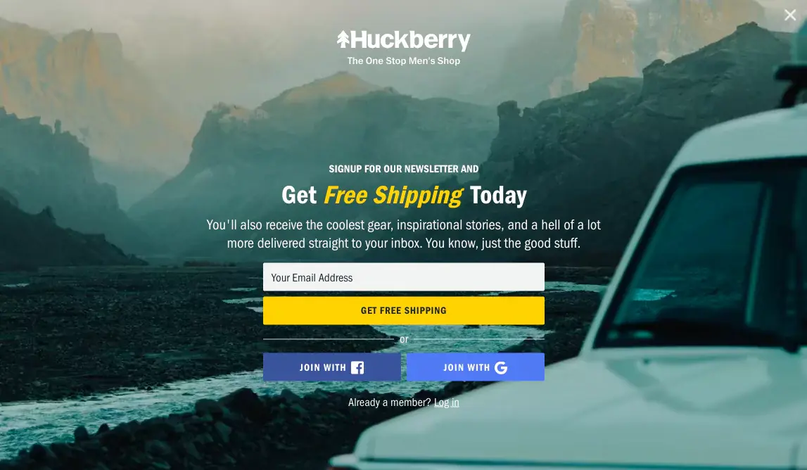
"Shop Now" and "Buy Now" are not wrong. They're just insufficient on their own. Highlight subscriptions through secondary CTAs. Make pop-up CTAs inspire rather than demand.
Back informational CTAs with a descriptor. The CTA is not a label on a button. It's a micro-argument for why the next click is worth making.
Further Reading: CTA Button Examples (+ 50 Call to Action Phrases)
Scarcity and urgency work when they're real. Announce early access to drops and events. Make "members only" messaging visible across the site, not just on dedicated pages.
Use comparison charts for exclusive products. Show how many people are viewing a product alongside a "low stock" label. Clarify the window on time-limited offers; vagueness breeds distrust.
Customer reviews are necessary but not sufficient. A social wall makes proof visual. A note from the founders makes it personal. A third-party review platform lends credibility.
Mixed reviews, including less glowing ones, make it believable. The goal is not the appearance of trustworthiness. It's actual trustworthiness, made visible.
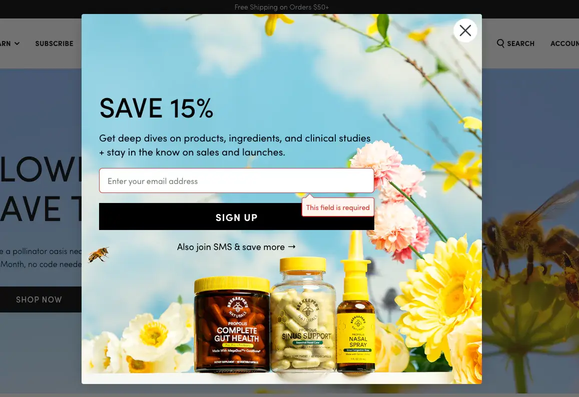
The average pop-up conversion rate sits just above 3%, which is not inspiring. But the stores doing it well are doing something different: they're creating highly contextualized, well-timed pop-ups with CTAs that go beyond "sign up." Segment visitors by interest.
Wait at least fifteen seconds before firing. Give them a reason that's specific to where they are and what they've been looking at.
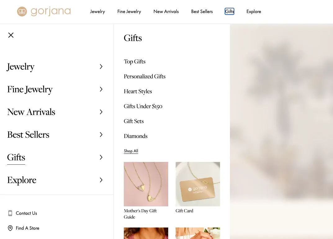
Gifting is not a seasonal tactic. It's a year-round purchase motivation that most stores address only in November. Add a dedicated gifting section to the primary navigation.
Offer exclusive deals on the gifting page. Allow gift customization, packaging, message, and wrapping. Maintain a blog sub-section on gifting that can be linked in email campaigns year-round.
At Convertcart, we helped one of our clients, The Million Roses, improve conversions by adding a unique messaging feature on their website.
Before: Decision paralysis was happening because multiple occasions required a unique messaging point.
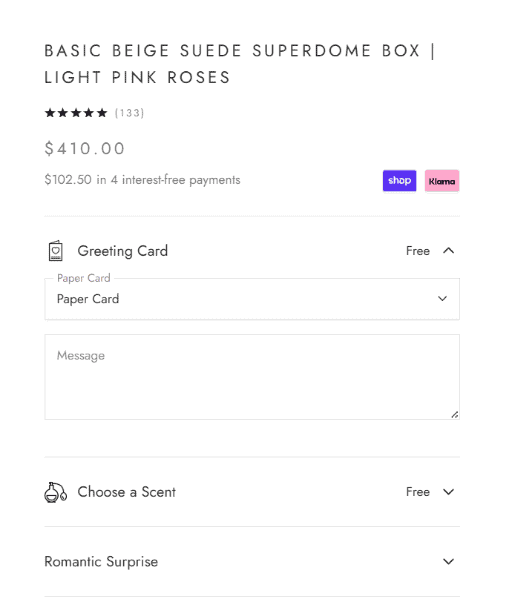
After: Added unique messages and mapped them with the occasion so that it becomes easy for a user not to think much before adding a greeting card with the gift.


Once someone has decided to buy, the worst thing you can do is make them hunt for their preferred payment method. Show express checkout options in the first fold, at least two, ideally three.
Feature BNPL prominently for higher-ticket items. Continue offering PayPal and traditional methods for the segment of your audience that prefers familiarity to innovation.
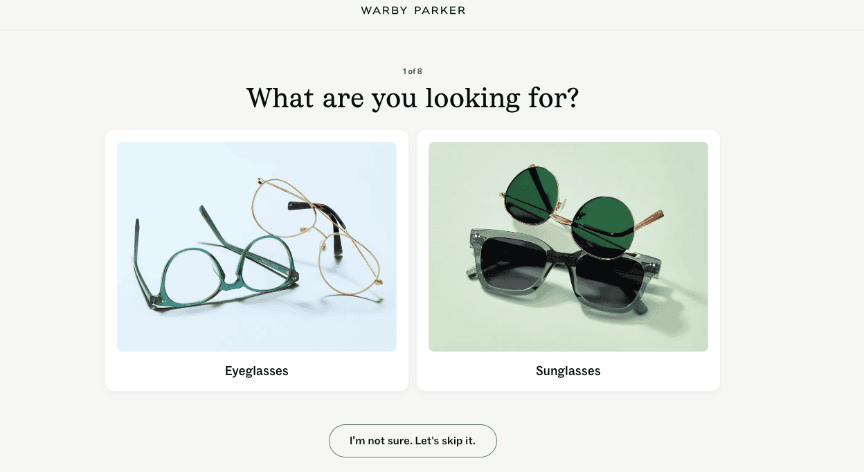
Style and fit quizzes serve as digital personal shoppers while simultaneously gathering zero-party data. ROI calculators reduce hesitation on high-ticket items. Virtual try-ons close the tactility gap. Gamified elements, progress bars, and interactive wheels transform routine visits into memorable brand interactions.
Interactive content that genuinely helps a shopper decide is also, quietly, one of the strongest SEO signals available.
Dynamic homepages that respond differently to first-time and returning visitors. "Recommended for You" sections are based on actual browsing behavior rather than generic bestsellers. Geo-targeted shipping offers and seasonal displays.
Contextual triggers based on real conditions. Companies that excel at personalization generate 40% more revenue than those that don't. The gap is not closing. It's widening.
Professional photography is beautiful. Real customers using your product are convincing. Embed short UGC clips on product pages. Highlight video testimonials. Use UGC to answer unspoken objections: How does this fabric move? How loud is this gadget?
Pull tagged videos from Instagram and TikTok to show the community. Product pages with UGC convert 74% higher than those without.
Offer one-tap payments via Apple Pay, Google Pay, and PayPal. Making guest checkout the default mandatory account creation is a first-order conversion killer.
Use a simple progress indicator. Implement address autocomplete. On mobile, every additional keystroke is a small act of friction. Minimize them.
At Convertcart, we helped one of our clients, Lighting and Supplies, achieve significant CRO improvements by adding trust badges, reviews, social proof, and secure payment icons. You can read the full case study here.

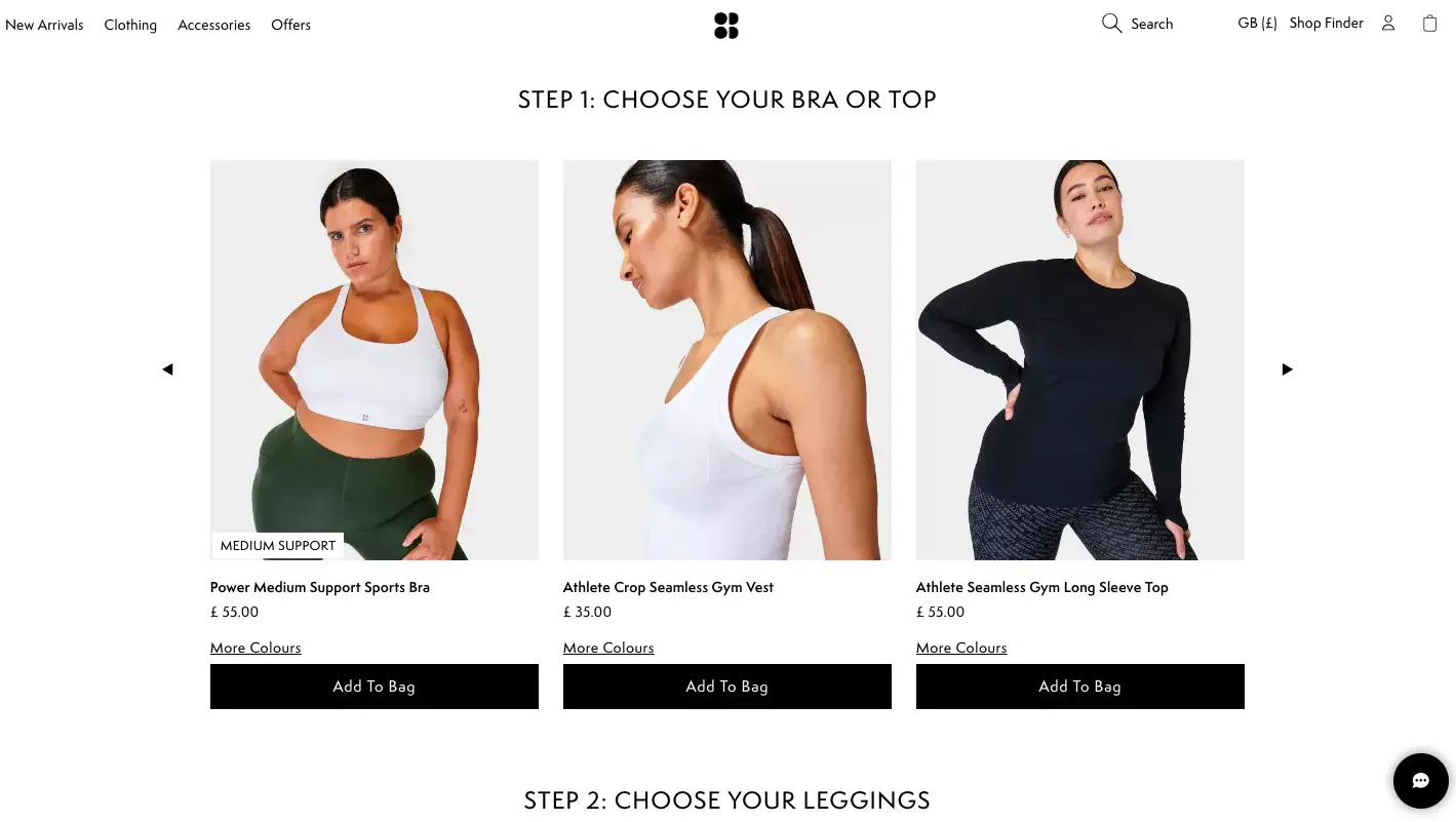
78% of shoppers become repeat buyers after a single excellent personalized experience.
Apply localized recommendations based on weather and season. Help shoppers build a "set" through personalized suggestions. Seek post-purchase feedback on the
Thank You page itself. Make product discovery quizzes available without overwhelming visitors with questions; five or six is plenty. Send email-only discounts to loyalty program members that genuinely aren't available elsewhere.

Customer support information should be effortless to find. Feature the primary phone number and email in the top-right of navigation.
Give your FAQ page a search bar with helpful hint text.
Add a support nudge beneath product page descriptions so shoppers don't have to hunt for it. Being easy to reach is a trust signal that no badge or certification can replicate.
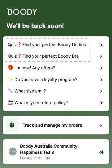
52% of shoppers will remain loyal to a business that gave them effective live chat support. Feature FAQ on shipping, returns, and order tracking from within the chat. Give visitors the option to leave a message, and clearly state the operating hours.
Offer access to the personalization quiz directly from the chat widget. Highlight product-related questions and subscription management options.

84% of businesses that actively work to improve customer experience see a rise in revenue, a statistic that sounds obvious until you notice how few stores have a systematic feedback practice. Segment audience data to identify where complaints originate.
Review your best and worst customer feedback for emerging patterns. Monitor social comments. Use email surveys with an incentive, and treat the conversation as genuinely two-way.

Most Thank You pages do the minimum. They confirm the order and say goodbye. The stores that treat the
Thank You page as an opportunity to make it do much more: clearly feature the order number, show thumbnail images of purchased products, highlight the returns policy, and selectively nudge toward social sharing, referrals, or the next purchase.

Email delivers a 42x return on investment, which remains one of the more remarkable statistics in commerce. Collect sign-ups beyond the exit-intent pop-up, wishlists, gated content, and Pinterest.
Build robust flows for thank-you, cart-abandonment, and win-back sequences. Segment and personalize the send time, subject line, and offer. Use email-only tactics: pre-orders, exclusive discounts, and early access.
No amount of optimization is permanent. Consumer behavior shifts, product ranges change, and the competitive landscape moves.
A systematic, phased, hypothesis-driven testing practice is what separates stores that improve continuously from stores that had a good year once and then wondered what happened.
Test in phases. Cover high-intent sections. Always begin from the user's perspective, not the store owner's. The question is never "what do I think would work?" The question is "what do customers actually do?"
Core Web Vitals are not a technical nicety. They are both ranking signals and conversion factors. Prioritize Largest Contentful Paint main content should appear within 2.5 seconds.
Minimize layout shifts; elements that jump around as pages load frustrate users in ways they rarely articulate but almost always remember. Use next-gen image formats. Leverage a CDN. These are table stakes.
INP measures the snappiness of your site during user interaction the gap between a click and a visible response. An 80% reduction in INP was associated with a 36% increase in conversions in one notable case study.
To improve it: reduce input delay, audit third-party scripts, provide immediate visual feedback on clicks, and ensure product filters and sorting update without full page refreshes.
A few things are becoming clear about the direction of travel.
AI-driven personalization is moving from "nice to have" to "table stakes." The stores that win in 2027 will be the ones building personalization infrastructure now, not in response to falling conversion rates.
Search generative experience is fundamentally changing what it means to rank. Appearing in an AI overview isn't a different version of ranking on page one. It's a different game with different rules.
The stores investing in entity-based SEO and structured data today are building an advantage that will compound.
Video and authenticity are replacing polish as the primary trust signals. A slightly wobbly video of a real customer is worth more than a perfectly lit studio photograph in ways that weren't true five years ago and will be even more true five years hence.
Mobile-first isn't mobile-optimized. The stores that will lead the next decade are designing for mobile first and adapting for desktop, not the other way around. The checkout experience on a thumb is the checkout experience that matters.
Convertcart has worked with 500+ US eCommerce stores to identify and fix the conversion issues costing them revenue. If you'd like an expert eye on your store, get a free audit here.
The systematic practice of reducing friction between a visitor's intent and a completed purchase across acquisition, navigation, conversion, and retention and then improving the experience enough to bring them back.
The layer with the most revenue leakage. Start by calculating revenue per visitor by page and identifying where the drop-off is sharpest. That's your problem. Fix it before anything else.
Industry benchmarks typically run between 1–4%, though this varies considerably by category, price point, and traffic source. A more useful number is your own baseline and the gap between where you are and where the math says you should be.
Structural fixes, checkout friction, page speed, and navigation clarity can show results within days. Content and SEO improvements compound over months. Retention and email improvements take a full purchase cycle to evaluate properly. The honest answer is: it depends on what you're fixing, and whether you measured carefully enough to know.
No. Consumer behavior changes, competition shifts, and products evolve. The stores that treat optimization as a continuous practice rather than a project will always outperform those that don't.
Related Reading:
eCommerce Pricing Strategies: 20 Smart Examples To Help You Sell More