Most Shopify product pages don’t have a traffic problem. They have a layout problem.
Too many templates prioritize aesthetics over buying behavior, which is why even well-designed PDPs often struggle to convert.
Let's explore how your Shopify PDP can convert better:
How to Choose the Right Shopify PDP Template
Before you pick a Shopify product page template, make note of which PDP template works best for your Shopify store:
PDP Strategy Table
PRODUCT TYPE / BUSINESS MODEL
BEST SHOPIFY PDP TEMPLATE
PRIMARY KPI
Fashion & apparel brands
Visual-first
Conversion rate
Beauty & wellness brands
Trust-heavily
Checkout completion
Electronics & technical products
Comparison-driven
Reduced abandonment
Mobile-first DTC brands
Mobile-optimized
Mobile CVR
Consumables & subscription-first brands
Bundle & subscription
AOV + LTV
High-SKU catalogs
Comparison-driven
Reduced decision fatigue
Single-product Shopify brands
Visual-first
Conversion rate
High-AOV products
Trust-heavily
Checkout completion
TikTok & paid social traffic brands
Mobile-optimized
Mobile CVR
Fashion & apparel brands
Visual-first
Conversion rate
Beauty & wellness brands
Trust-heavily
Checkout completion
Electronics & technical products
Comparison-driven
Reduced abandonment
Mobile-first DTC brands
Mobile-optimized
Mobile CVR
Consumables & subscription-first brands
Bundle & subscription
AOV + LTV
High-SKU catalogs
Comparison-driven
Reduced decision fatigue
Single-product Shopify brands
Visual-first
Conversion rate
High-AOV products
Trust-heavily
Checkout completion
TikTok & paid social traffic brands
Mobile-optimized
Mobile CVR
Here’s how to architect your Shopify PDPs based on your business model and conversion goals.
Template #1: The Visual-First Shopify Product Page Template
This Shopify product page template works best for:
fashion, beauty, jewelry,
home decor,
luxury products, and
visually driven DTC brands where aesthetics and emotional appeal heavily influence purchase decisions.
Why this Shopify PDP template works
Visual categories rarely convert on their own, even with detailed product education. Shoppers first want to imagine ownership.
That’s why high-converting Shopify product page designs in these categories prioritize:
large product galleries,
lifestyle imagery,
clean spacing,
and minimal buy-box friction.
In a visual-first Shopify product template, the image gallery becomes the focal point while the purchase section stays simple and highly scannable.
Product title, variants, pricing, reviews, and add-to-cart controls remain visible without competing against excessive copy.
The layout also mirrors how mobile shoppers behave.
Since most Shopify traffic is mobile-first, shoppers tend to scan visuals before reading product details.
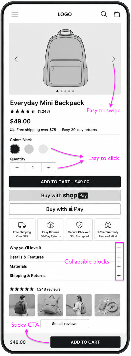
Swipeable galleries, sticky add-to-cart buttons, review snippets, and FAQ accordions reduce friction while keeping the experience immersive.
My team at Convertcart futher noticed that visually rich Shopify product pages often underperform. This happens because shoppers are trying to find some near the CTA.
Trust indicators like shipping clarity, easy returns, and customer reviews appear close to the CTA instead of being buried lower on the page.
Visual-first product page template works especially well with Shopify themes like:
Prestige
Impulse
Motion
Dawn
These Shopify themes support flexible media layouts, modular sections, sticky CTAs, and mobile-friendly product galleries.
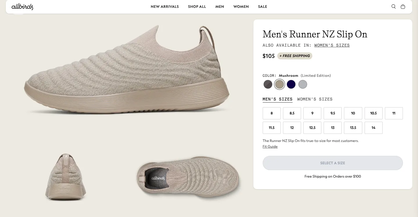
Real Store Example: Allbirds
Allbirds' product pages barely try to sell you. The photography does that. Large lifestyle shots sit above a buy box that stays minimal: name, price, three color swatches, one CTA.
That restraint is the whole point of a visual-first layout: nothing competes with the image.
What to notice:
Full-bleed lifestyle imagery above a stripped-down buy box
Swatch-first variant picker (color before size)
Sticky Add to Cart appears only after the hero image scrolls out of view
Product discovery – barriers that prevent shoppers from finding items
Category/collection pages – improvements that drive deeper product exploration
Product page – what to optimize to convert 2–3x more buyers
Cart – ways to ease hesitation and speed up purchase decisions
“The report was deep and super insightful. Can’t believe it’s free.”
Logan Christopher CEO, Empire Herbs
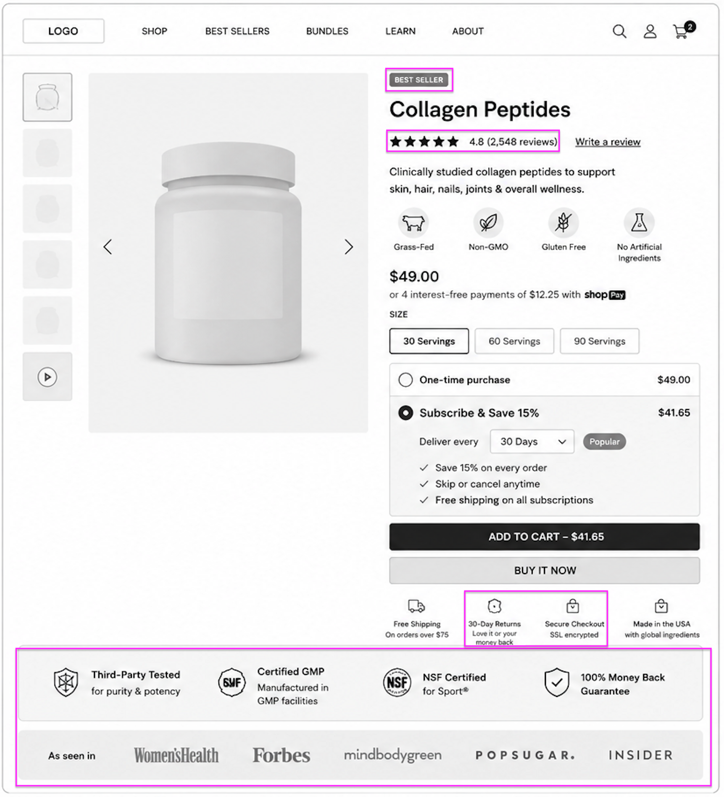
Template #2: The Trust-Heavy Shopify Product Page Template
This Shopify product page template works best for:
supplements,
skincare & wellness,
baby products, and
other high-consideration categories where shoppers need reassurance before purchasing.
It’s especially effective for subscription-first Shopify brands and products involving health, ingredients, or long-term usage.
Why this Shopify product page template works
While auditing Shopify product pages, my CRO teams often see that trust-sensitive categories (like wellness/supplements) convert differently from visual or impulse-buy products (like fashion/jewelry).
Shoppers don’t just ask, “Do I want this?” They ask, “Can I trust this?”
In this Shopify product template, reassurance is embedded throughout the buying journey.
Customer ratings, trust badges, guarantees, delivery information, and review content appear close to the purchase area instead of being hidden lower on the page.
The subscription module also plays a major role.
Shopify stores in wellness and consumable categories often increase LTV by making recurring purchases feel lower-risk and easier to manage.
Messaging around cancellation flexibility, savings, and delivery frequency reduces hesitation significantly.
We have noticed that FAQ accordions outperform long-form product education on mobile.
Instead of overwhelming shoppers with dense copy, the layout lets customers explore objections naturally while keeping the page scannable.
This Shopify product page template works especially well with:
Prestige
Broadcast
Impulse
Dawn
These Shopify themes support modular sections, subscription integrations, FAQ accordions, and review-heavy layouts effectively.
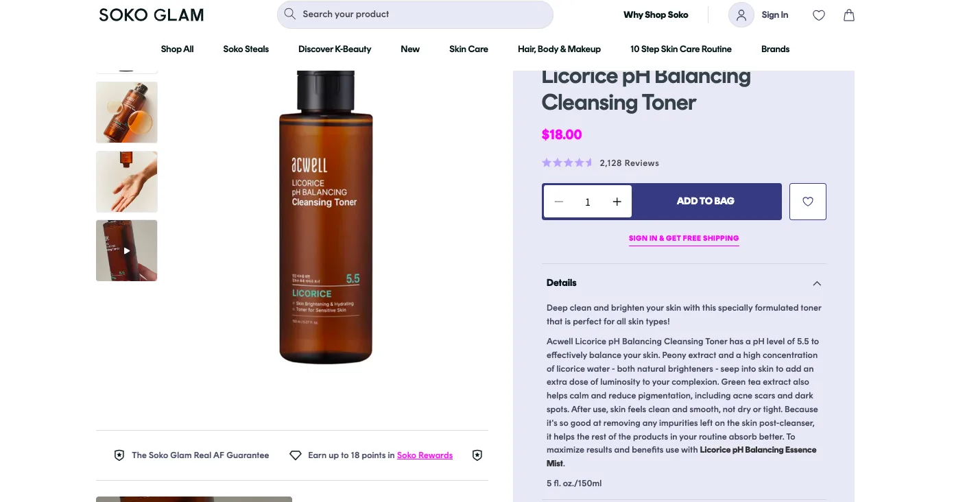
Real World Example: Soko Glam
Soko Glam sells skincare, a category where shoppers want to know what they're putting on their face before they buy.
The PDP leans into ingredient callouts and routine guidance, with review counts sitting directly under the product name so reassurance shows up before the price does.
What to notice:
Ingredient / "what it does" tabs placed above the fold
Review count anchored right under the product title
Routine-step badges that answer "where does this fit in my routine"
Case Study
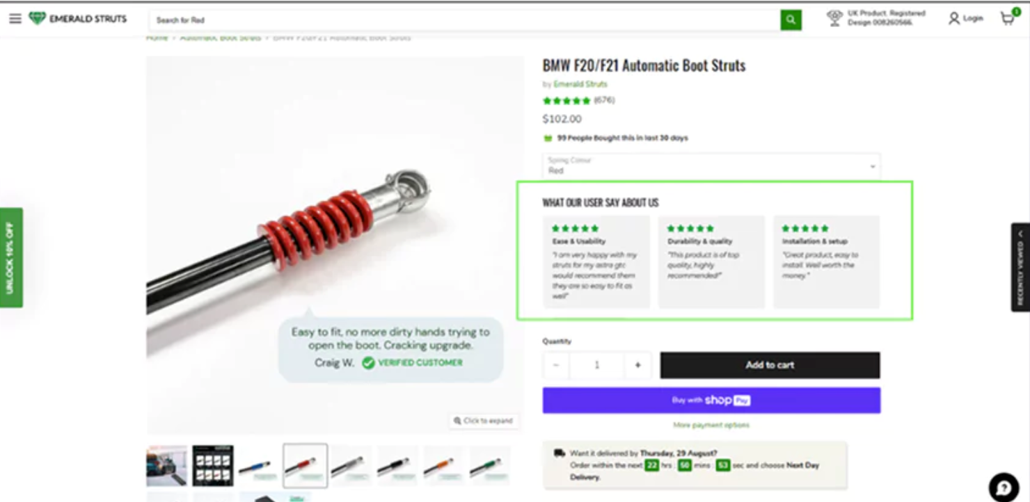
̌How Did Convertcart Help Emerald Struts Fix a Trust Gap in Its Reviews?
Emerald Struts, an automotive parts store, had healthy traffic but conversions that wouldn't move. When Convertcart's CRO team audited the product page, the reviews section was the first flag.
The reviews existed, but they read as an unstructured wall of text, and shoppers were bailing before finding anything reassuring enough to act on.
The fix: rebuild the review section into factor-based summaries (quality, durability, and installation experience) and place them directly beside the Add to Cart button instead of scrolled far below it.
Result: a 2.8% lift in conversions within one week, driven almost entirely by faster trust-building at the exact moment shoppers were deciding. Read the full case study here.
Template #3: The Comparison-Driven Shopify Product Page Template
This Shopify product page template works best for:
electronics,
outdoor gear,
appliances,
furniture, and
technical products, where shoppers compare multiple variants or models before purchasing.
It’s especially effective for Shopify stores with large catalogs, configurable products, or high-AOV purchases requiring more evaluation.
Why this Shopify PDP template works
Technical categories often lose conversions because shoppers feel overwhelmed by similar SKUs and scattered product information.
That’s why high-converting comparison-driven Shopify product page designs focus on reducing decision fatigue instead of adding more persuasion.
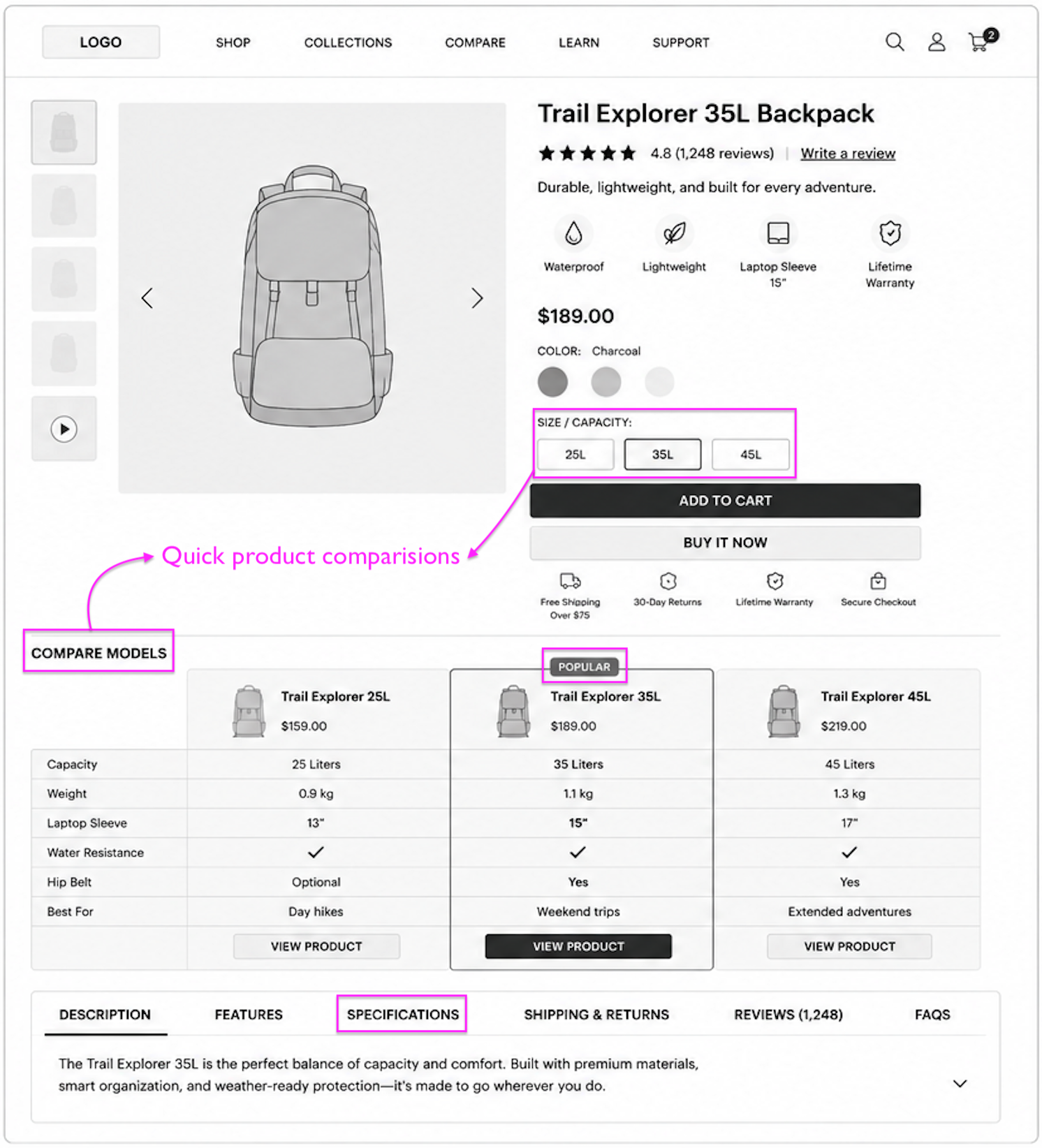
In this Shopify product template, comparison modules become part of the buying experience itself.
Feature tables, variant comparisons, and structured specifications help shoppers understand differences quickly without jumping across multiple tabs or collection pages.
The layout also keeps key purchase information visible while supporting deeper product research lower on the page.
Instead of hiding specifications behind dense content blocks, the template organizes details into tabs, accordions, and side-by-side comparisons that feel easier to scan, especially on mobile.
During Shopify PDP audits, my team at Convertcart saw that too many similar SKUs often create decision fatigue. Simple product comparisons work so much better.
Shoppers buying technical or utility-driven products usually want clarity more than storytelling.
That’s why this Shopify product page design prioritizes feature visibility, comparison clarity, and purchase confidence.
This Shopify product page template works especially well with:
Warehouse
Empire
Prestige
Dawn
These Shopify themes support comparison tables, large catalogs, variant metafields, and structured product information effectively.
Real World Example: PopSockets
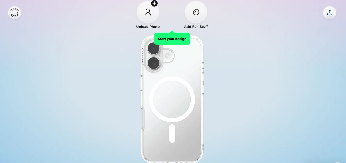
PopSockets sells a lot of near-identical SKUs: same base product, dozens of finishes and customization options.
Instead of making shoppers guess, the page builds comparison and customization directly into the buy box so people can see differences without leaving.
What to notice:
Side-by-side finish/variant comparisons in the buy box
Live customization preview instead of static swatches
Spec-style breakdowns replacing long descriptive paragraphs
Template #4: The Mobile-Optimized Shopify Product Page Template
This Shopify product page template works best for:
mobile-heavy Shopify stores,
TikTok brands,
impulse-buy products, and
fast-growing DTC brands where most traffic comes from smartphones.
This product page template is especially effective for products with shorter consideration cycles and high mobile checkout intent.
Why this Shopify PDP template works
Many stores still design product pages for desktop behavior even though most of the traffic is now overwhelmingly mobile-first.
The problem is that mobile shoppers don’t browse the same way desktop users do.
They scan, interact with fewer sections, and abandon faster when purchase friction appears.
In this Shopify product template, the entire layout is built around speed and scannability.
Product imagery, pricing, reviews, shipping reassurance, and purchase controls appear immediately within the first mobile viewport.
Instead of forcing shoppers through long-form product education, the page progressively reveals information through accordion sections and compact content blocks.
My team at Convertcart has observed that many Shopify stores lose mobile conversions because the PDP is often cluttered. Too much content competes for attention at once and the shopper often gives up.
The highest-performing mobile PDPs simplify navigation, minimize distractions, and keep the buying journey continuously accessible as users scroll.
This Shopify product page design works particularly well because it aligns with modern mobile shopping behavior rather than adapting desktop layouts to smaller screens.
This Shopify product page template works especially well with:
Dawn
Refresh
Sense
Motion
These Shopify themes support sticky buy buttons, mobile-first layouts, swipeable galleries, and collapsible product sections effectively.
Real World Example: Fashion Nova
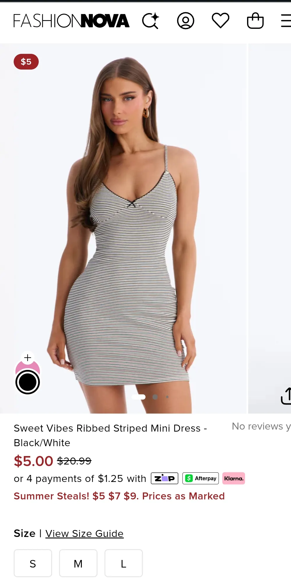
Fashion Nova's traffic comes overwhelmingly from Instagram and TikTok, and the product page is built like it knows that. Image, price, size, and Add to Cart all sit in the first mobile screen; no scrolling required to buy.
What to notice:
Sticky add-to-cart bar visible at all times
Swipeable gallery optimized for thumb scrolling
Condensed size grid and minimal above-the-fold copy
In this Shopify product template, shoppers are guided toward higher-value purchases naturally instead of through aggressive upselling.
Bundle options, subscription pricing, and product add-ons are integrated directly into the buying flow, making larger purchases feel simpler and more cost-effective.
The subscription section also reduces hesitation by emphasizing flexibility.
Messaging around skipping deliveries, cancelling anytime, and recurring savings makes subscription purchasing feel lower-risk and easier to commit to.
Across subscription-first Shopify brands, we have noticed that clear savings callouts often increase bundle purchases, instead of aggressive upsells.
Instead of simply offering discounts, the layout frames bundles as smarter purchasing decisions.
This Shopify product page design works particularly well because Shopify’s ecosystem already supports subscriptions, bundle builders, quantity breaks, and upsell merchandising natively through apps and OS 2.0 sections.
This Shopify product page template works especially well with:
Prestige
Impulse
Broadcast
Dawn
These Shopify themes support subscription widgets, bundle sections, upsell blocks, and modular merchandising layouts effectively.
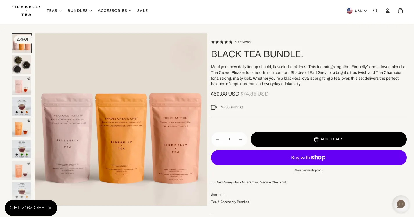
Real World Example: Firebelly Tea
Firebelly Tea is built around repeat purchases, so the PDP does more work than a typical one-time-buy page. Subscription pricing sits right next to one-time pricing with the savings spelled out, and bundling is part of the main flow instead of an upsell popup.
What to notice:
Subscribe-vs-one-time toggle with the savings % visible, not hidden
Delivery frequency selector built into the buy box
Bundle builder embedded in the main flow, not a separate upsell step
Which Shopify Product Page Template Should You Use?
Visual-First
Built for fashion, beauty, jewelry, home decor, and other visually driven luxury brands, where the image gallery does most of the persuading before a shopper reads a single word of copy.
Success here is measured primarily by conversion rate, and it pairs best with the Prestige, Impulse, Motion, or Dawn themes, all of which support large, flexible media layouts without extra app overhead.
Trust-Heavy
The right fit for supplements, skincare and wellness, baby products, and other high-consideration categories where shoppers need reassurance before they'll commit.
The metric that matters most is checkout completion, and it works especially well on Prestige, Broadcast, Impulse, or Dawn, which all support the modular trust badges and FAQ accordions this layout depends on.
Comparison-Driven
Suited to electronics, outdoor gear, appliances, and furniture, categories with large catalogs of similar SKUs where shoppers need to weigh options against each other.
The layout is judged by how much it reduces cart abandonment, and it's best supported by Warehouse, Empire, Prestige, or Dawn, each of which handles comparison tables and variant metafields natively.
Mobile-Optimized
The default choice for TikTok and paid-social-driven brands, impulse-buy products, and any mobile-heavy DTC store where most traffic never touches a desktop screen.
Mobile conversion rate is the north star metric here, and Dawn, Refresh, Sense, or Motion all ship with sticky add-to-cart and swipeable galleries out of the box.
Bundle & Subscription
Built for consumables, food and beverage, supplements, and grooming brands, anywhere repeat purchases matter more than a single transaction.
Success is tracked through AOV and LTV rather than one-time conversion, and it performs best on Prestige, Impulse, Broadcast, or Dawn, which all support native bundle and subscription merchandising.


.jpg)





.avif)
.svg)


.svg)

.svg)
.svg)
