Even in 2022:
- pages are cluttered
- copies look uninspiring, and
- pop-ups are still gimmicky
Even worse: many of those happen on product pages (aren’t product pages supposed to be like “perfect”?!)
Let’s uncover some *common* mistakes merchants make on their Shopify product pages.
22 most common mistakes in Shopify product pages
Here are some common mistakes eCommerce businesses make and end up putting off potential Shopify customers and conversions.
1. Choosing a non-responsive Shopify store theme
This is not necessarily an issue for eCommerce stores that are just starting out. However, growing businesses will need to customize Shopify product pages to suit the needs of a wider audience shopping through different devices.
Unfortunately, online stores are slow to make that switch and lose out on potential sales.
How to effectively implement on product pages?

Choose a responsive Shopify theme that allows you to customize fonts, colors, and other aspects of your store and automatically takes care of the mobile and tablet view of your site – creating a friendly experience across the board.
Have a look at Shopify’s list of responsive eCommerce website themes and choose the one that works best for your products.
2. Running too many plugins on product pages
eCommerce founders love Shopify for the plethora of plugins that they have in store.
But they get too excited about it and end up having a plugin for every small thing they want to achieve.
The result – slow website, broken links, and multiple glitches. Overall, a poor shopping experience.
How to effectively implement on product pages?
Have a look at the plugins you currently run and identify which ones slow down your website. Get your developers to hard code the feature as an alternative or find a better plugin to replace the same.
3. Cluttering product pages with too much information
Most Shopify store owners either go overboard or write unnecessary details for product descriptions.
When the product page is filled with product description details, it only tends to overwhelm shoppers. On the other hand, with fewer details, the product description doesn’t help shoppers to make a decision.
How to effectively implement on product pages?

Hover on image text is a brilliant way to deliver product details without making shoppers hunt for information.
You can place information such as how to wear the product, price, product names, or different patterns without having to take up space elsewhere on the page.
Compress product images before adding them to the recommendations to maintain quality without slowing down the page.
4. Bad copies - all product talk, no emotion
Wherever we shop online, we are immediately drawn towards brands with relatable and interesting copies. There are two ways product page content fails to make an impression:
- Most eCommerce online stores post copy that is purely factual or fails to connect at a deeper emotional level, completely missing out on achieving its primary purpose – converting visitors into loyal customers.
- Chunky and exhaustive paragraphs of product descriptions lend readability issues and overwhelm the customer.
How to effectively implement on product pages?

The solution is straightforward – write to a human and not a robot. Don’t be shy to show your wit and humorous side.
One look at the Somnox website and you’ll know what a good copy can do. Talks about science but in a fun way. The copy also works hard enough for people to relate to the quite common state of sleeplessness.
Also, to make it easy for people to understand the benefits of the product, create short descriptions in the form of bullet points.
5. Underutilizing product cards
Product cards are a clean way to display a snapshot of an item that is linked in some way to similar items.
However, where most eCommerce businesses fault is the way they use these product cards. They add little information about the product, not enough images of the product, and clear CTAs.
How to effectively implement on product pages?

Essentially, product cards need to be treated as importantly as the eCommerce product pages themselves. It’s a great infrastructure to upsell and cross-sell products.
One clear product, a short headline, a one-line description, the price, and a simple CTA – and you have a good product card for your page.
SHORT ON TIME? HERE'S A QUICK SUMMARY OF THE AREAS TO LOOK AT:
6. FAQs are not prominent enough on product pages
Shopify customers often don’t reach out to someone and clear their queries about a product. Especially, when they want to purchase multiple products.
FAQs on the product page design can offer an easier user experience. FAQs also help Commerce stores with SEO benefits while clearing a few pressing doubts about functionality, manufacturing, and more.
How to effectively implement on product pages?

Some eCommerce brands push customers to subpages to get more information. Otherwise, they dump all the FAQs on the same page which might slow down the page speed.
Use a vertical collapsible format to add relevant FAQs and save screen space while achieving the purpose.
7. Using a plug and play approach
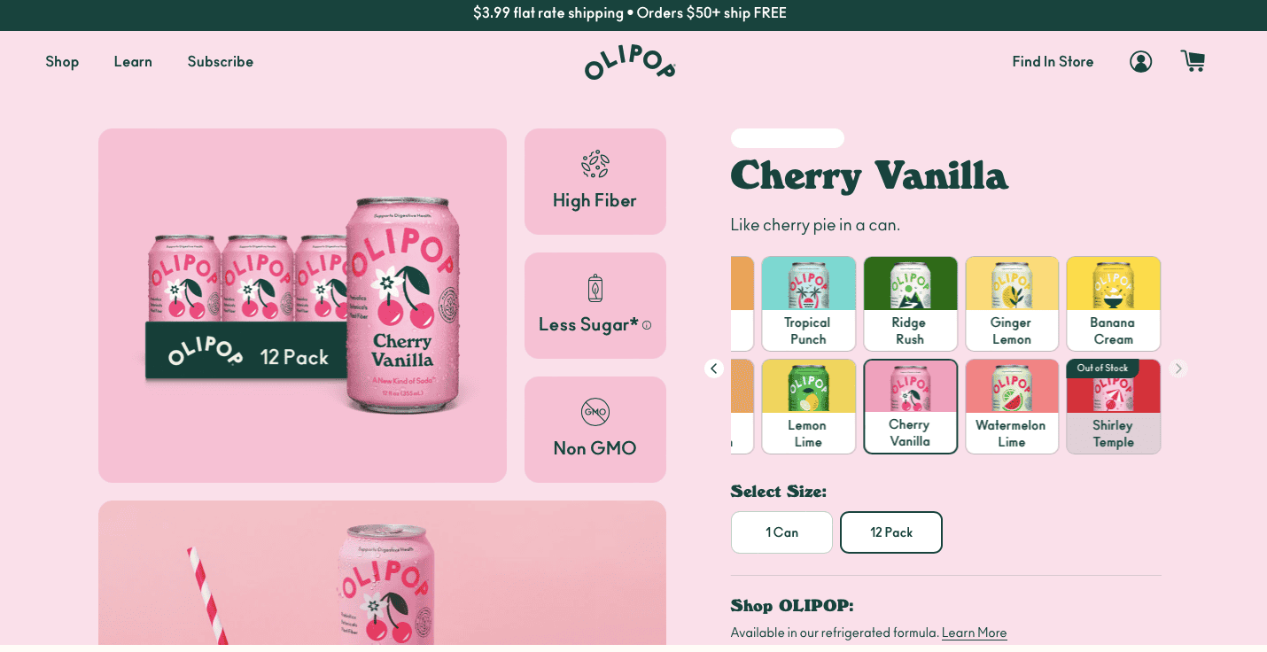
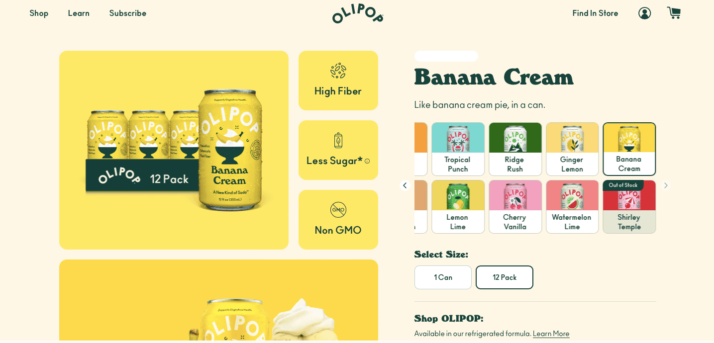
Many eCommerce entrepreneurs use a one size fits all model for all of their product page designs. If something works for product X, it's bound to work for product Y. Unfortunately, that’s not true.
Every product has different uses and customers require a different set of details for each of them. Understanding those differences and letting that drive each page will help to attain consistent growth in conversion rates.
How to effectively implement on product pages?
For instance, you sell drones as well as some cool drone bags. For the latter, you might not need to demonstrate how it functions but for the drone itself, you would need to.
In that case, the product page for the drone will require a video which would not be necessary for the bag, which needs multiple images to give a better idea of the item.
Try A/B testing different layouts, copies, images, and other aspects and find out the handful of elements that have worked across the boards and retain them. However, everything else aside, keep it as unique to each product as possible.
8. Forgetting to enable image zoom on eCommerce product pages
Many eCommerce stores find this to be very trivial but it affects the shopping experience, especially for senior shoppers.
If you sell products such as clothing, customers feel insecure about the material and the color of the product when they can’t get a closer look.
How to effectively implement on product pages?

Adding a zoom feature to every product image helps the customer get a sense of how the product looks and might feel up close.
This in turn helps them make a confident purchase improving their Shopify shopping experience.
9. Failing to harness social proof well
While most eCommerce stores add reviews and ratings to their product pages, however, they position it below the first fold. Furthermore, they highlight generic reviews that look made up and don’t resonate with the online store visitor.
How to effectively implement on product pages?

Most visitors scroll through the page quickly but focus on the important aspects on the first fold. Highlight your ratings right below the description or right beside the headline and offer them an option to read those reviews.
And avoid highlighting reviews like “Amazing product, love it very much”. Instead display a review that is longer and relates to the customer more.

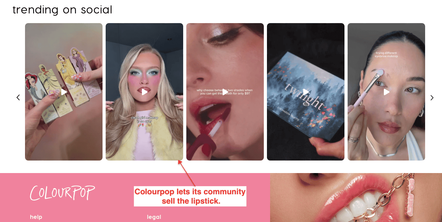
Reviews are just scratching the top of the surface. Top eCommerce stores leverage user-generated content on the product page, including certifications, sample test results, and more to convince visitors to buy.
For example, in the above image Casper showcases social media posts from current customers.
You can also integrate reviews from other sites like Google, Facebook, and third-party listings.

Ubuntu Baba imports reviews across all marketing channels for more diverse feedback. There’s also an option to read more for lengthy reviews with a structured layout.
10. Interrupting user experience with gimmicks
What was once an attention-grabber is now considered distracting and even annoying. The reason – customers see how generic it is nowadays. Unfortunately, most eCommerce sites, either while starting out or when they’re in a growth phase, make the mistake of trusting that it still engages the customer and drives more purchases.
Similarly, many sites throw a discount popup at the user to entice them to buy the product. But all this does is distract them from the details of the item and annoy them in the process.
How to effectively implement on product pages?

A better approach? Hyper-personalized features and discounts. According to Accenture, 75% of consumers are more likely to purchase if they are offered personalized recommendations.
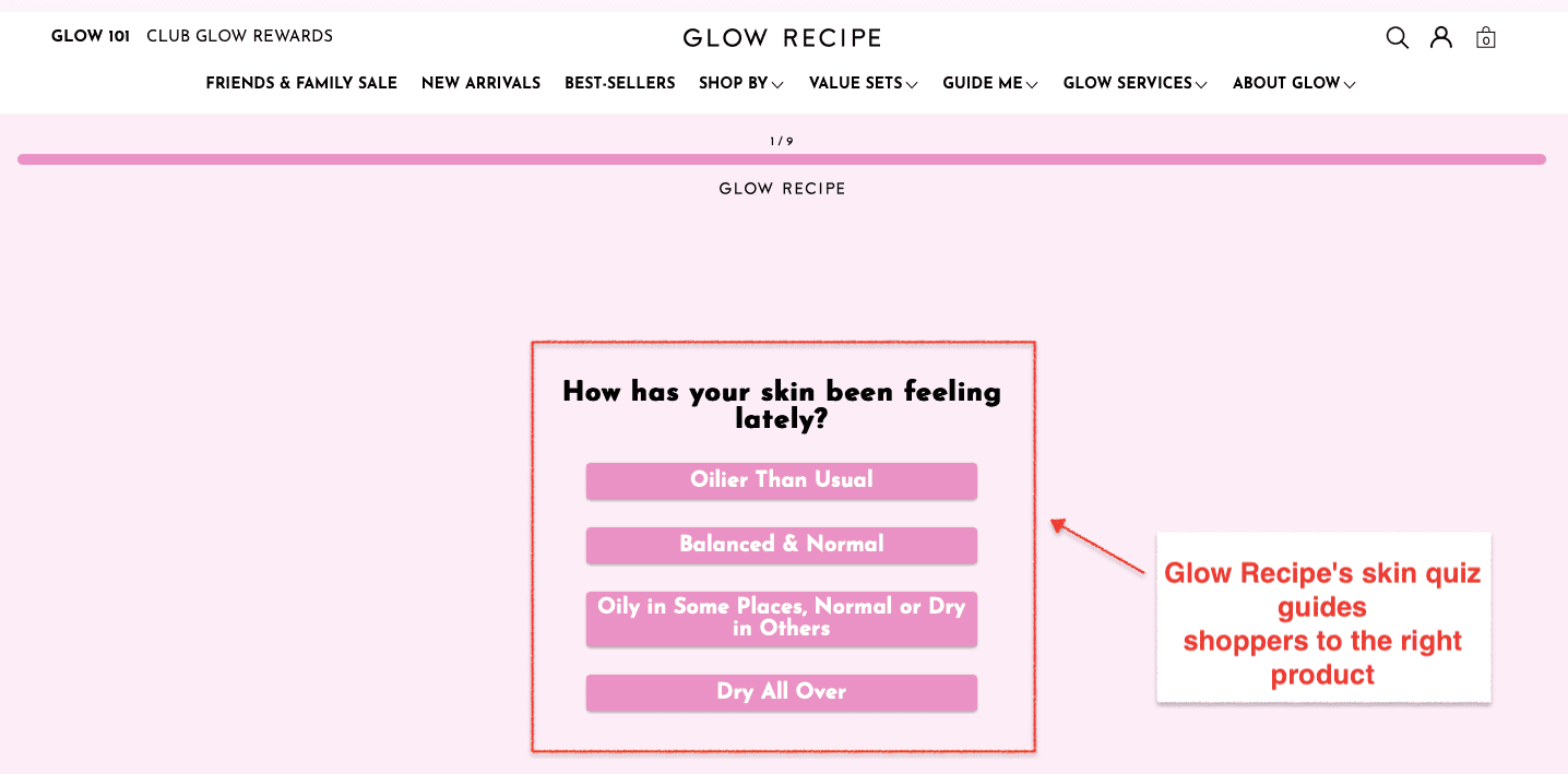
Like the example above, eCommerce store Care/of, which sells vitamins and supplements leverages hyper-personalization to grow their business.
The customers can take a quiz about their needs and goals and get suggested products based on the results. It builds trust, enhances ease of use (since the customer feels their preferences are already known by the eCommerce brand), and naturally paves the way for sales.

And ditch the popups – use the existing page infrastructure to pitch a discount. If not, try a Hello Bar instead, it takes up less real estate and isn’t that distracting to the visitor.
Like the example above, the bar on top lets the visitor know that they can avail free shipping if they shop for above $80. The message is the same as any other but the way it's displayed is less annoying and compelling at the same time.
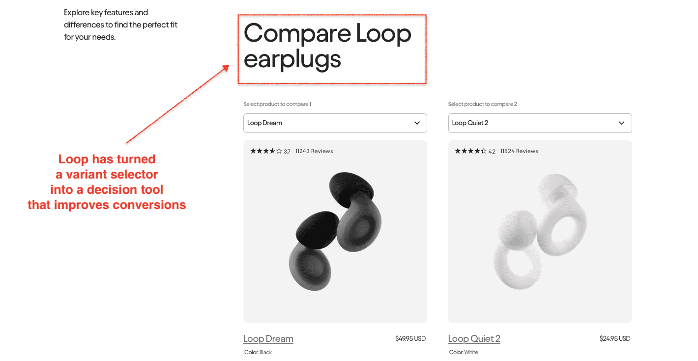
11. Adding confusing comparison charts
eCommerce stores often have multiple options for a product. However, they often fail to add clear comparison charts.
Perhaps, a customer is looking for similar products with a particular specification such as ‘battery powered’ but the comparison chart doesn’t show these differences. Then the customer is forced to go to different product pages and then come back to purchase the product. However, this interrupts user- experience and causes loss in sales.
How to effectively implement on product pages?

Product comparison charts instantly create ease of experience because customers find the most relevant information they need on the same page – helping them decide to buy a lot faster.
Keurig Coffee does the comparison chart bit especially well. They have a site that’s functional yet informative, and when you click on any of the coffee makers, you can instantly access a ‘brewer comparison’ along with product details, FAQs, and reviews.
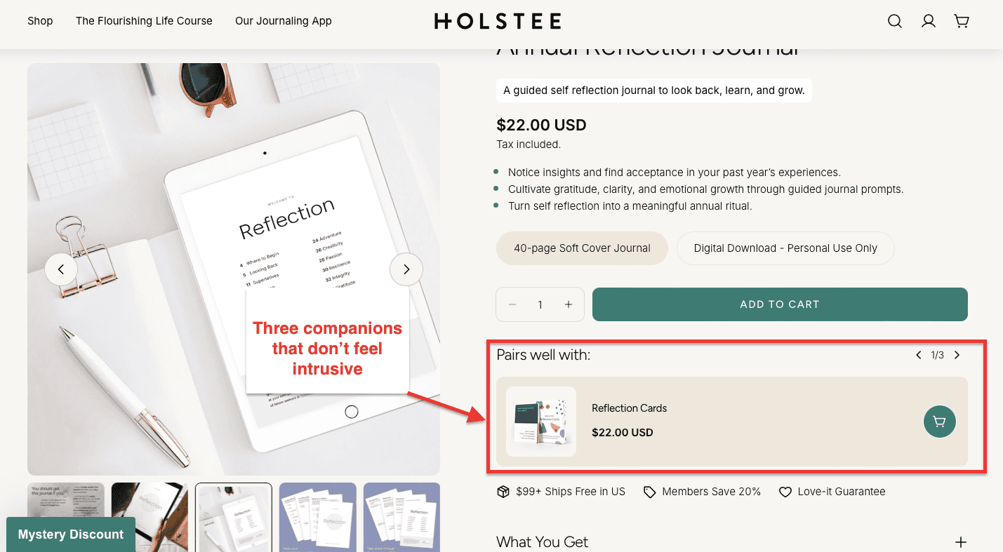
12. Being too pushy with up-selling nudges
Upselling is a necessary strategy to increase average order value.
And it often works.
However, most eCommerce brands tend to go overboard.
This leads to three scenarios:
- feel frustrated due to multiple options,
- ignore all the nudges, or
- get paralyzed by too many options
How to effectively implement on product pages?

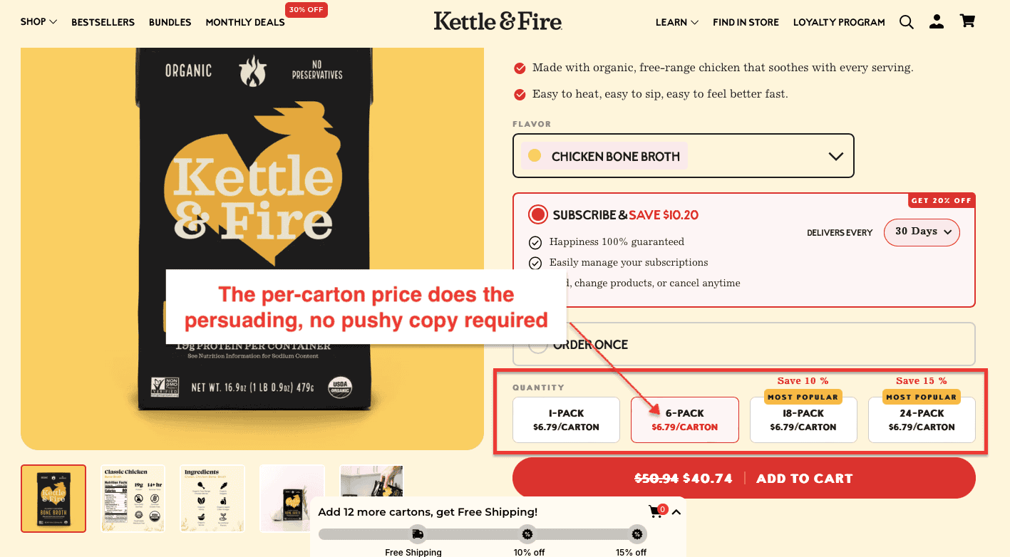
As per Hick’s law, 3 is the balanced number of options to offer. You can show information that lets shoppers view the products quickly.
When benefits are pitched and customers’ needs are focused on, the upsell nudge will surely pay off.
Let’s take the example of how ProFlowers does it.
For any bouquet, they have multiple options that can be selected from, and when a visitor has selected one of them, they get to see why they are paying a price differential in the ‘Details’ section right below.
13. Trying to cross-sell irrelevant products
Bundling is a great way to upsell and increase your average order value. Customers are compelled by the option of buying 2-3 products at a lower price per unit. This is an untapped region for the majority of eCommerce stores. The most common excuse is the thin spread of products.
How to effectively implement on product pages?

Even if there are few products, product bundling is possible. All you need to do is analyze what is commonly purchased together or can add the most value to a potential customer and that's it.
Take the example of a creative product bundling strategy by Dollar Shaving Club. Even though they have few products, they still bundle products that appeal to customers.
14. Your shoppers keep seeing “out of stock”
While the reality is that eCommerce stores won’t have every product available throughout the season, for various reasons, just a simple out-of-stock message might not cut it. Online stores make this mistake and lose their customers to a competitor.
How to effectively implement on product pages?

Show a product countdown to show how many customers have already purchased the product.
You can also add nudge such as the ‘product is already in X number of carts’.
Redirect customers to explore other categories or product ranges.
However, which redirect should you apply?
404 Redirect - This redirect is a server response code informing the website visitor and search engine that the web page cannot be found since it no longer exists. You can prompt customers to explore products that closely the URL or search query.
302 (Temporary Redirect) - You can use this type of redirect if you want to send users to a new site or page, only for a short time. For instance, when you're redesigning or updating your website. Therefore, only use the 302 redirects if you're planning on eventually bringing the old page back or setting up a new one.
301 (Permanent Redirect) - In case the product customers are looking for has a new or upgraded version. Then you can apply a 301 redirect which sends website visitors who have typed in the previous URL to the product’s current location in the eCommerce store.
Unavailable after meta tag - If you happen to have too many out-of-stock webpages, then look towards the ‘unavailable_after META tag’. This tag tells Google in advance that the product page is going to be discontinued on a certain date. Google will show the product page in search results until the given expiry date. Approximately 24 hours after the expiration date, the product page will simply disappear from search results.
If you’re trying to fine-tune the eCommerce product page experience, read more on how to use out-of-stock to your immediate advantage.
15. Not being transparent about additional charges
While eCommerce stores are quite clear and transparent about the discounts they offer, often mention taxes, shipping, and packing fees—only at checkout. And shoppers drop off. In fact, as per Baymard, over a fifth of the US adults have abandoned their shopping stating this reason.
While revealing such information on the product page doesn’t change the price itself, customers are more aware of what they are paying. It builds a sense of trust and visitors don't feel cheated when they’re about to checkout.
How to effectively implement on product pages?

Apart from mentioning the product’s price, Walmart allows customers to view estimated shipping costs based on their location. You can edit the zip code and it’ll show the approximate shipping costs.
This gives visitors a better understanding of what they’ll pay and are not taken by surprise.
16. Random pricing
A Baymard Institute comparative study shows about 7% of customers abandon their e-carts because they didn’t find enough payment options. Sometimes, bank servers are down or specific payment gateways are out of order. eCommerce stores often ignore this aspect, losing potential customers.
How to effectively implement on product pages?

Take the example of the above product page for how to offer multiple payment gateways.
Offer as many payment options as possible on product pages to suit each customer’s preferred mode of payment. The more options you feature, the more the chances are that customers will convert their interest into a purchase.
Shopify simplifies this by offering its payment gateway. eCommerce businesses need to pay a small fee but Shopify takes care of the integrations, letting you focus more on your business and less on setting things up.
17. Making them ‘work hard’ to pay
Many visitors just want to buy one item. However, they go through the same cart page and then the checkout process as someone who is browsing for more items.
Over 20% of the visitors drop off because of a long checkout process. Every single step added is losing you a potential customer. Having customers add to cart, navigate, and then checkout can frustrate visitors who know what they want.
How to effectively implement on product pages?

The biggest eCommerce store - Amazon does it well.
Add a simple ‘buy now’ CTA button along with other CTAs – the subliminal message you’re sending out is this: we care for your time so you get to choose what you want right away and then come back later when you feel like it.
It is a simple yet powerful method, try it!
18. Not lazy loading images
When the store takes time to load, they immediately focus on site speed.
In fact, 57% of consumers will abandon a site that doesn’t load within three seconds.
And 80% of those people will never come back.
How to solve the problem?
Most Shopify stores reduce image file size while maintaining the quality of the image to improve site speed and increase conversion rates.
Here’s where lazy loading comes into use.
So, what exactly is lazy loading?
Lazy loading is a technique that consists of delaying the initialization of a website element until it is needed.
By implementing lazy loading, content such as images load once the shopper scrolls to the image.
This results in benefits such as:
- Lighter and faster site
- Improves Google rankings
- Increase mobile load time
- Reduce server requests
- Decrease weight on the web page
Remember: One way to make sure your product page load speed is up to par is by using the Google PageSpeed Insights test.
Pro tip: Push responsive images for different devices
Combined with lazy loading, make sure images are responsive for different devices. Take note of making the images responsive for device resolution, orientation, screen size, network connection, and page layout. Furthermore, the browser should not stretch the image to fit the page layout, and loading it shouldn't result in time & bandwidth wastage.
19. Making navigational difficult
While navigating your eCommerce store, shoppers might be at a loss on how to proceed or what you expect from them.
For example, shoppers are adding details in the checkout fields and if they are not offered the directional cue that an input is invalid right away, they’ll not be able to submit the form when the time comes. Even worse, they wouldn’t come to know what the real problem is.
How to effectively implement on product pages?

Here are a few things to remember while incorporating directional cues:
- Implement simple cues to avoid unnecessary distractions.
- Use white spaces to make the cues more effective.
- Add visual cues with color contrast.
- Align cues to the page’s design
- A/B test directional cues to learn the ones that work best for you. For example, you could use eye-tracking tools or click heatmap for the test.
20. Not extending the product variant limit
Product variants are a great way to offer shoppers options and grow more sales.
In Shopify, you can create up to 100 variants for a product.
However, Shopify gives you only 3 options per product.
While the Shopify 100 variant limit might seem like infinity to some store owners, to others, this is a huge obstacle.
For example, as a Shopify store owner who sells scrunchies with personalized options, you will quickly reach Shopify’s variant limit. This means that if you have an ever-increasing SKU inventory, Shopify won’t allow it.
How to effectively implement on product pages?
There are two ways you can skip the product variant limit:
a. Divide your product variants into separate product pages with internal linking. In this scenario, when you open any of the product variant pages, product variants will be displayed as a swatch-like selector to change between variants.

However, in this case, Shopify stores need to add canonical tags so search engines don’t think there are duplicate pages.
So how do canonical tags work for product variant pages?
For example, there will be one webpage that’ll act like the “parent” page. The variations will be the "child" products, with each of them containing a canonical tag that points to the parent product.
b. You can use a Shopify app to remove the variant limit. These apps will allow you to add as many product options as needed:
iii. Infinite Options
iv. Textbox ‑ Text Product Options
21. Not adding structured data for product pages
An SEJ experiment found implementing schema markup for one of their clients increased their clicks by 43% which boosted impressions by close to a percent, and improved average ranking positions by 12 percent.
So, what exactly is a schema?
Schema is an advanced markup code that’s added to a Shopify store. Webpages with Schema markup make it easier for search engines to index. Consequently, once search understands your store content, it’s easier to show it to more relevant people.
How to effectively implement on product pages?
Implement these 5 eCommerce schema markups to stay ahead in the SEO war:
- Product schema
- Rating and reviews schema
- Local business schema
- Price schema
- Product availability schema
- FAQ schema
- Breadcrumbs schema
Pro tip: Use Google Structured Data Markup Helper to quickly markup your category and product pages.
22. Not offering payment options
Credit Cards Or Buy Now, Pay Later?
According to research, 38% of users think Buy Now, Pay Later services will eventually replace their credit cards, and more than half (56%) say they prefer to Buy Now, Pay Later compared to using credit cards for purchases.
A survey found that low-cost purchases were most common among Gen Z, nearly half of which have used BNPL services to pay for expenses of $100 or less. On the sustainable front, 62% of Gen Z, who will begin entering the workforce this year, prefer to buy from sustainable brands.

How to effectively implement on product pages?
Shopify saw a clever opportunity to combine and let eCommerce store owners implement Shop Pay as a BPNL payment getaway. With every purchase, Shop Pay plants trees at no extra cost to reduce the environmental impact of deliveries from your store.
Improve overall customer retention through data
A higher customer retention rate is indicative of the fact that the business has managed to build a sustainable relationship with customers and they will continue to come back.
Did you know that only 18% of businesses invest in customer retention marketing?
And — those who do — don’t do it right.
A majority of them implement these strategies without even understanding user behavior and experience.
You can use Customerly to track only the key retention metrics such as:
- customer LTV
- repeat purchase rate
- purchase frequency
- revenue per customer
- purchase latency
- customer retention
The app also lets you set up weekly reports so it’s easier to understand shopping behavior, accordingly customize your Shopify store and win repeat customers!
How many apps is too much for Shopify?
Shopify apps are great at improving functionality and style.
But they can also make stores slower.
This means longer loading times, poorer visitor experience, and lost sales.
Why? Because every Shopify app comes with its codes. And they need to load their resources every time they need to work.
Also, app conflicts reduce store performance. And they can cause many problems to a store theme even after you uninstall apps.
Therefore, when you install too many apps, you will lose shoppers due to the store’s poor performance. And it will be much harder to fix those issues.
While there’s no set number of apps you should install, evaluate and see which will maximize conversions.
Ready to Increase your eCommerce Product Page Conversions?
Most eCommerce store owners make these mistakes. However, there can be other reasons why Shopify store conversions may be suffering. A full site audit from the ground up can help you change tracks and give your eCommerce product pages a much-needed refresh.