Conversion Optimization
Optimize your Shopify Store for Mobile: Proven ideas + Examples
May 30, 2023

Insights in this post come from our CRO team's decade of experience working with eCommerce brands. Edited by our in-house content team.


Insights in this post come from our CRO team's decade of experience working with eCommerce brands. Edited by our in-house content team.

The number of US mobile shoppers is expected to grow beyond 187 million people but the Shopify conversion rate on mobile is abysmally low at 1.2%. The problem—what works great on the desktop doesn’t equally do well on mobile.
With these 16 hacks, you can optimize your mobile Shopify site for higher conversions.
Vertical navigation helps in Shopify mobile optimization since it is scalable. The number of items displayed in the menu isn’t limited to view port width. View port refers to the visible area of a webpage on a screen.
It naturally aligns with mobile usability since it can easily adapt to small screen sizes. A vertical navigation bar makes it easy to scan on mobile since users look at the left side of the screen 80% of the time.
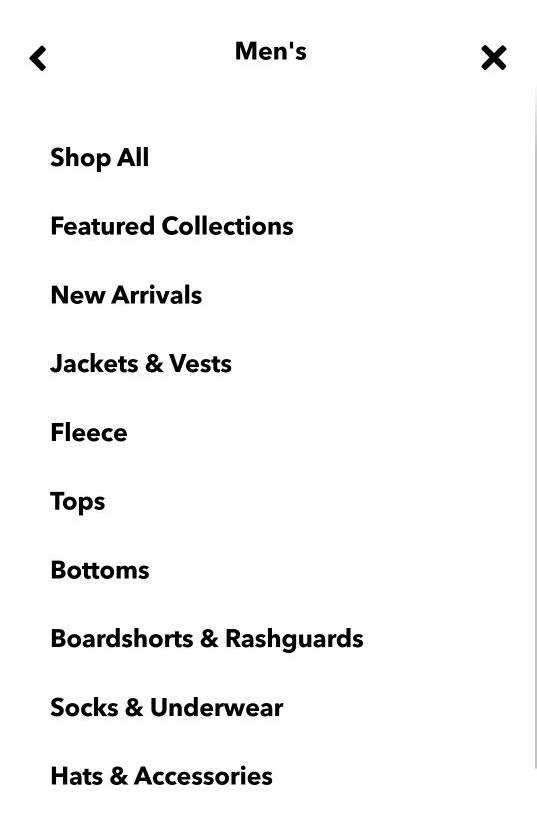
It has a low interaction cost as it is easy to go to popular categories without going to the intermediate category page. Adding new categories does not require major redevelopment.
How to do it on Shopify
Go to Shopify admin, click Online store, and Navigation. Click the link next to the menu and click Edit. As the page with the menu items appears, click the particular link you want to change and select save from the dropdown menu.
Search is intuitive and carries easily on the mobile. With 76% of customers using mobile for convenience, it's critical to make the search bar the first thing they see.
Use a microcopy as a prompt. Microcopy is a short text snippet that guides website users to perform actions. Using it in your search bar provides a directional cue to perform a search.
Use Autocomplete suggestions to decrease the time taken to search for the product and decrease drop-offs.
How to do it on Shopify
Head to Shopify admin, find Online store and > themes > actions > edit code. Go to the Shopify Community for the next steps.
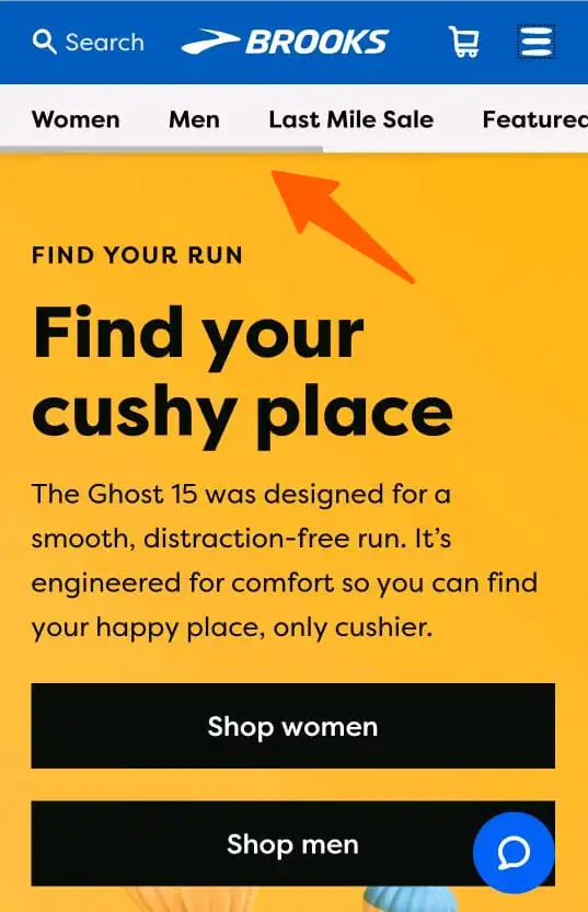
A top navigation bar presents an opportunity to feature your important categories in a horizontal manner. This ensures high visibility as it's there above the fold. An easy way to do this is through a slider in the header.
Brooks Running does this on its homepage by creating a slider featuring main categories.
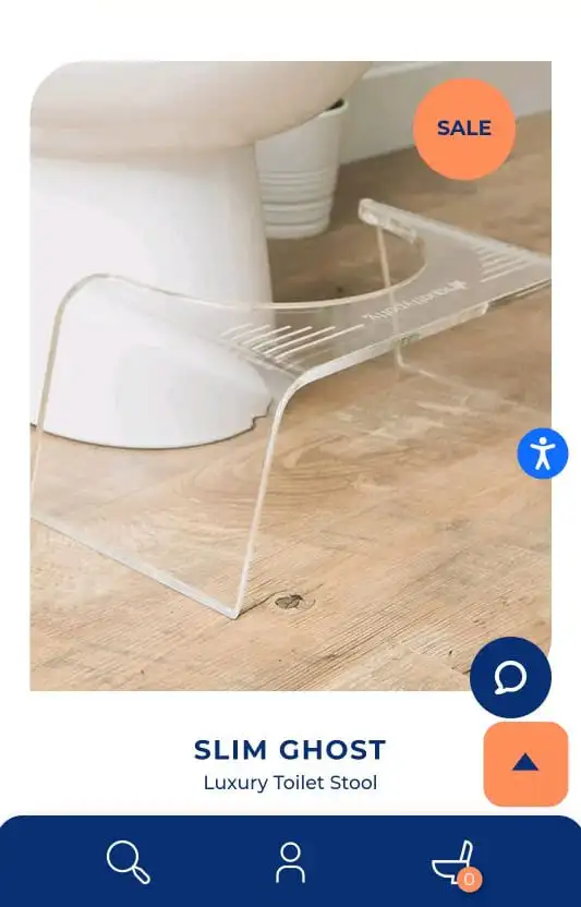
Right after, a sticky navigation bar helps users navigate their way around the site without much struggle. It encourages scrolling and reduces the chances of drop-offs. If the header is crowded, a bottom navigation bar is equally effective.
Squatty Potty uses a downward sticky bar plus a back-to-top navigation option making scrolling easier.
How to do it on Shopify
To create a menu slider, refer to the solution here. For the sticky header menu, find the solution here.
You might also like: In-depth Guide to Shopify conversion rate optimization:Answers to 30 most searched questions
Breadcrumbs on your product page consolidate the site structure to rank on Google.
To make your breadcrumbs easy to navigate, leave negative space. Keeping the links too close together makes it difficult to click. The tap size shouldn’t be less than 1cm x 1cm. Yeti uses negative space faring well for usability.
Adding visual cues to breadcrumbs makes it interactive. Colors work well plus lines and arrows make for directional cues. It helps users find their way out easily. Ulta Beauty highlights the page in bold as a cue.
How to do it on Shopify
Head to Shopify Admin, and click Online store>Themes. Click the specific theme you want to edit by clicking Action>Edit code. Read this DIY tutorial for more information.
Cognitive overload is the mental effort required to process new information for decision-making. Your mobile product page on Shopify must have a copy that flows naturally.
57% of users spend their time viewing above the fold and this is the right place to grab their attention. Use copywriting frameworks such as Problem, Agitation, and Solution(PAS), Before-After-Bridge, and Star-Chain-Hook to invoke the right emotions.
Joymode makes optimum use of its above-the-fold portion to communicate the value through its copy.

Include hand-specific mobile gestures. Hand gestures like swiping and scrolling are intuitive. Swipe gesture helps in interacting with product images and product categories. The ideal size for a CTA button is 10mm x 10mm, as per a study by MIT Touch Lab.
Further, a touch and expand feature helps customers take a closer look at the product images. This is a vital cog in the user experience but 40% of eCommerce businesses don’t support this function for product images.
We recommend you to read: 30 Mobile Optimization Tips For eCommerce (+ Examples)
Load indicators signal users that the action performed has been successful. Without load indicators, users will be continuously tapping, and restarting the loading process repeatedly.
This causes a disturbance during the shopping process leading to high drop-offs. 84% of eCommerce mobile sites lack load indicators affecting heuristics—mental shortcuts that help in decision-making and problem-solving.
For load indicators to perform well, it must activate in less than 1 second of the user’s action. It must be updated after 10 seconds as a cue to the users.
How to do it on Shopify
You can do it using Polaris. Follow the Shopify tutorial for the same.
Tappable elements serve no purpose when it is difficult for users to tap them. This is entirely due to insufficient hit areas. 88% of eCommerce mobile sites lack tappable elements large enough to click.
With a hit area of 7mm x 7mm on your mobile Shopify store, users can go to the right spot without any friction, such as incessant tapping, accidental clicks, and drop-off.
Here are a few practices you can implement:
How to do it on Shopify
You can create buttons like Shop Now, Add to Cart, etc using Polaris.
Using the wrong keyboard layout increases the time taken to complete the purchase on your mobile eCommerce site. Yet, 60% of the sites don’t have them.
When the user is in the email address field, the @ option must appear. If users find it hard to type the email address, it could lead to form abandonment on the checkout page.
Second, customers tend to take a lot of time while typing their credit card information since they want to confirm every digit. A specialized keyboard has large keys to ensure no wrong typing occurs.
With a keyboard for credit cards, users can easily know when to validate the details. Interestingly, 23% of users type and verify their credit card details after every 4 digits.
A phone number is essential for communication of shipping updates. Include a numeric keypad with special characters such as * and # so users don’t have to switch keyboards.
How to do it on Shopify
Here’s an article by Baymard for more information.
Autocorrect is helpful when the information isn’t objective. The autocorrect feature should be turned off while typing objective form fields such as street names, email address, phone numbers, and brand names that are not a part of the dictionary. This disturbs the checkout flow and increases the checkout effort.
Here are the form fields where autocorrect must be turned off:
How to do it on Shopify
Add this code in your code editor <input type="text" autocorrect="off" />
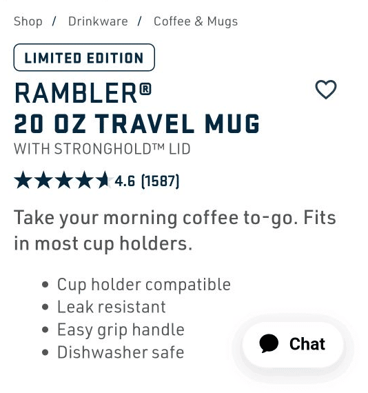
Product descriptions that are to the point help in persuading customers better. It serves its purpose if it's under 450 words on your Shopify mobile site. When writing product descriptions for mobile ensure you address the problem and solution.
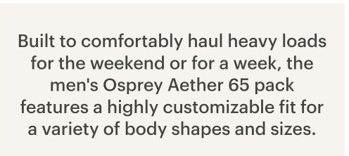
Write the problem followed by the solution. It must make their lives easier. Mobile shoppers have short attention spans and must find information quickly. REI demonstrates the same in the product description for one of its backpacks.
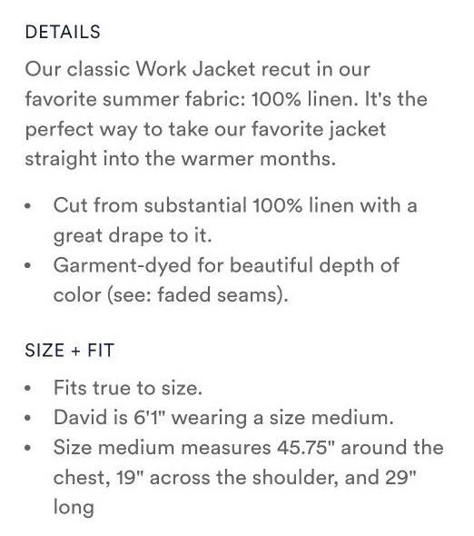
Focus on details. Use bulleted points to improve readability while mentioning specifications, measurements, etc to invoke heuristics. Alex Mill follows this practice on its Shopify mobile site.
Use sliders to feature FAQs as they save space and the swipe gesture comes naturally to the users. Add arrows and pointers to ensure content discoverability.
50% of customers use images to make a purchase decision.
Resizing images takes less than 50% of the bandwidth. A smaller image takes less bandwidth and is great for mobile user experience. You can use Shopify’s free image resizer tool.
Converting your images to WebP offers a lossy and lossless compression for images on the web. It offers 30% more compression compared to JPEG and 26% smaller in size compared to PNG.
Lazy loading helps in reducing the initial web load time by minimizing the total size of the resources. It also helps in saving the user’s bandwidth on mobile phones.
How to do it on Shopify
The easiest way to do lazy loading is use a theme that supports the same. Another way is to do it manually, for info read more.
The cart abandonment rate for mobile is astonishingly high at 85.65%. The first thing is to include all the shipping costs, taxes, and other expenses.
Next, confirm using images. Using images on your Shopify mobile cart page consolidates the purchase appeal. This affirms their trust, reducing the chance of last-minute backing out.
Add functional CTAs. The Add to Cart and Checkout buttons must be 44 x 44 px on iOS and 48 x 48 px on Android. This makes it easier for all fingers and rules out the fat finger syndrome.
A free shipping progress bar is a visual cue for customers to qualify for the same. It nudges customers to complete the AOV covering the shipping costs. A cart expiry message creates a sense of urgency driving customers to purchase before the items expire.
Offer single click payments. It increases conversion rate significantly since there are zero interruptions. It saves payment information and comes in handy during future purchases. Shop Pay has helped brands achieve a 70% checkout rate.
Offer various payment options like slide-to-pay, QR codes, fingerprint payments, and eWallets. BNPL options are the reason 45% of customers buy products that are otherwise unaffordable. It splits the financial burden into interest-free payments.
Make the checkout process ‘low effort’. When it comes to form fields:
How to do it on Shopify
For complete information on Shopify Mobile checkout, know more.
Do check out: Why Is Your Shopify Conversion Rate Low?
Mobile CTA buttons need to convey emotions effectively. Use action words that nudge users to act. One tip to drive attention is to bold or capitalize the letters to grab the attention of the users.
Decide which button you want to choose—Rounded vs Rectangular buttons. Rounded buttons communicate openness. They drive attention toward the CTA copy and are easier to process.
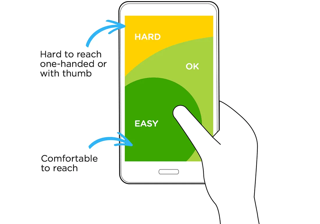
Place your CTAs in the thumb zone where they can reach easily. View the below image for reference.
When the font size is too large or small, it leads to cognitive strain. The heading should be 21 px while the body must be 16 px. The subheadings should either be 18px or 16 px. Use a light color for the subheadings to maintain visual contrast.
The best fonts for mobile include Open Sans, Roboto, Lato, and Montesserat. Before you select the typography, it should align with your brand personality and voice enabling users to scan through the content.
Mobile popups convert nearly 4x compared to desktop. Certain CRO best practices can help accomplish the former.
Make sure the popup doesn’t take up the entire screen. Leave some space so the user is aware of the background. The exit icon should be big enough so that the user can close them on the first tap.
The value must be communicated in tangible terms such as discounts. Mobile popups with a single form field convert better. If you expect more insights, options like checkbox, dropdown, and selecting options making the user experience pleasant.
Limit the use of the images because what works on desktop might hurt user experience on mobile.
How to do it on Shopify
Creating mobile pop ups is easier with apps like Seguno, Poptin, and Privy.
When you implement these 16 hacks your Shopify traffic is going to improve but there's a problem.
98% of visitors who visit an eCommerce site—drop off without buying anything.
Why: user experience issues that cause friction for visitors.
And this is the problem ConvertCart solves.
We've helped 500+ eCommerce stores (in the US) improve user experience—and 2X their conversions.
How we can help you:
Our conversion experts can audit your site—identify UX issues, and suggest changes to improve conversions.
How to Customize your Shopify Checkout Page: 23 Proven Ideas
Prevent Shopify Cart and Checkout Abandonment: 24 Tested Ideas
Shopify Product Page CRO: Unique ideas for improving conversions
Shopify Homepage CRO: 21 proven ideas to boost conversions
40 Shopify product page templates (+ stunning real-world examples)
How do I boost my Shopify conversion rate? (45 effortless strategies)
Shopify landing page design: 22 amazing examples + proven ideas
24 Shopify marketing strategies to build a 6-figure business (+ examples)
22 Shopify product page mistakes that drive customers away
Shopify email marketing: The complete guide (top strategies & apps)
Subscribe for more articles like this!


Read by 5000+ ecommerce store owners
.svg)

.svg)

.svg)
.svg)
2026 Convertcart, All Rights Reserved
33/1, Castle Street, Ashok Nagar, Bengaluru, India
