Designing a Shopify homepage can feel like a breeze at first, until you realize it’s also one of the trickiest pages to get right.
It’s the front door to your online store, the first impression shoppers get of your brand, and the make-or-break moment where they decide whether to explore… or bounce.
In fact, most visitors leave from the homepage more than any other page on a Shopify store.
That means your homepage isn’t just about looking good, it’s about converting curiosity into clicks, and clicks into customers.
So, how do you ensure your Shopify home page design not only looks stunning but also performs like your best salesperson?
In this guide, we’ll walk through proven CRO homepage strategies, real Shopify home page examples, and Shopify homepage best practices that’ll help you create one of the best Shopify homepages, the kind that instantly grabs attention, builds trust, and gets shoppers to stay (and shop).
Let's dive in!
Above the fold on the Shopify homepage design
The "above the fold" section of your Shopify homepage refers to the content that is visible to visitors without having to scroll down.
This section plays a crucial role in capturing visitors' attention and encouraging them to explore further.
Here are some key elements to include above the fold on your Shopify homepage:
1. Invite the right customers with clear shipping thresholds
Around 66% of customers expect free shipping for every online purchase.
Once you highlight your shipping thresholds, it’ll be easier to draw in interested customers.
Often it doesn’t matter if your threshold is high, the word “free” has a lot of magnetic appeal.
Communicating your shipping thresholds helps customers judge their ability to meet that threshold.
How to apply this Shopify homepage CRO tip:
Communicate your shipping thresholds right on top of your homepage to help customers decide their budget comfort levels right away.
They will thank you for the transparency and not feel cheated once they land on the checkout page and realize it’s out of their budget.
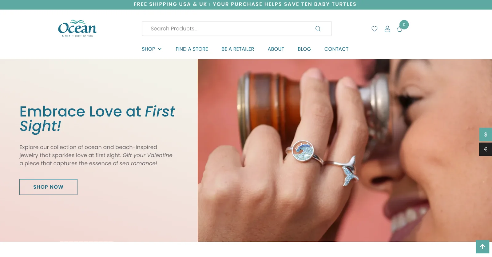
Ocean & Co. uses the first banner strip on its homepage to communicate its free shipping threshold to customers.
Shopify easily allows you to customize your shipping profiles, rates, and locations as per your requirements.
If you’re a brand that ships to multiple locations, you can create separate shipping profiles for each and set individual shipping rates under each.
This will offer you greater control over your shipping policy.
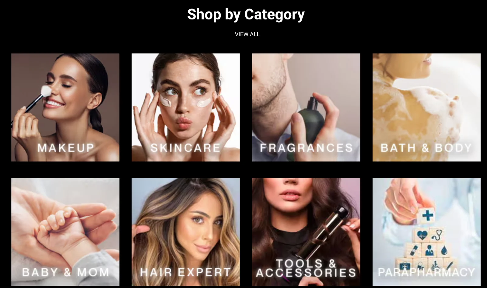
2. Make your categories easy to find
When a shopper lands on your Shopify store, don’t make them hunt for product collections.
Here’s how to promote collections on the Shopify homepage:
✔️ Feature collections on your main navigation menu
✔️ Highlight key collections on your homepage with attractive visuals and direct links.
✔️ Use banners or slideshows to promote specific collections, especially for seasonal or special events.
See how Velasca features its product collections on the main header:
3. Don’t make users second-guess your navigation elements
A memorable impression customers acquire from your Shopify homepage shouldn’t just end there—it should carry over to your other pages too.
After all, your customers need to buy from you.
Navigation acts as the catalyst that transports customers—based on their intent—to where they need to go.
Your homepage is the best suited to perform this role. One of its primary jobs is to guide the visitor to the site and make them purchase.
On the Shopify store, you’ll find 2 default menus: the main menu and the footer.
The main menu comprises both the homepage and the catalog/category page.
You have the option to add additional menus on the platform based on your requirement.
Here's how to apply this Shopify homepage CRO tip:
Allow your users to find options fast. Use icons on your menu that are universally used. Some icons may mean different things in different industries. You should do extensive research before planning to add them to your site.
Let users know they’ll be clicking on a link. You can choose any of these options to make your visual link stand out: change its color, add an underline, turn the mouse arrow into a hand, etc. It’s the little things that make all the difference. This is pretty fundamental but then many sites still don’t get this right.
Decide which menu to go for based on your product catalog. It’s easy to be confused about which one to go for vertical or horizontal navigation. There are studies on both sides to vouch for. Eye-tracking studies reveal that while the top menu is easier to locate and use, it’s not as helpful for brands with a huge product list. However, if you’re going ahead with a vertical menu, keep it left-aligned.
4. Avoid intrusive cookies and tracking policies
Excessive cookies and tracking policies on eCommerce stores can lead to distrust and dissatisfaction.
Here’s how to apply this Shopify homepage CRO tip:
Allow users to choose which types of cookies they consent to, promoting transparency and giving users control over their data.
Use cookies only for essential functionalities, such as cart management or login sessions, reducing the reliance on non-essential tracking cookies.
Gather zero-party data through short surveys or polls to personalize the shopping experience.
Use encryption and secure data handling practices to protect user data collected through cookies or tracking mechanisms.
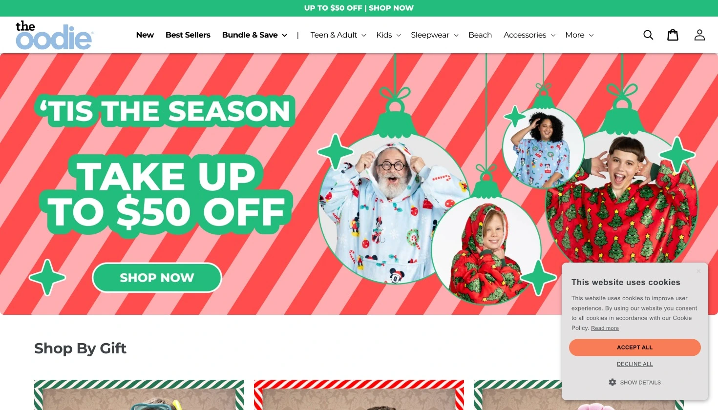
See how The Oodie has a cookies pop-up that arrives without interrupting the shopping experience:
5. Upgrade your pop-ups
A few years ago, Google announced how “intrusive interstitials” or aka “popups” on mobile sites would hinder ranking.
Most eCommerce store pop-ups usually fill the entire area and obstruct a shopper’s experience.
Here’s how to apply this Shopify homepage CRO tip:
Display a pop-up teaser that expands when clicked
Ensure the pop-ups take minimum screen space
Make it easy to dismiss the popup
Use a contrasting color scheme
6. Use other alternatives to image carousels
There was a time when image carousels wowed customers. Now, they’re just bad conversion elements.
eCommerce image carousels are too fast, too confusing, and too difficult for customers to control and use to find what they’re looking for.
So should you stop using them altogether? Well, you have 2 options:
If you have to use them, make necessary optimizations so that they aren’t as intrusive.
Use other alternatives to image carousels
Some of the image carousel optimizations you can make are:
Avoid auto-playing slides. Offer visitors complete control over browsing the carousels.
Experiment with touch-friendly sliders. This is all the more helpful for mobile devices.
Limit slider number to 5. If you don’t want users to become impatient and drop off, keep only 5 or fewer sliders on your homepage.
If you don’t want to go ahead with sliders, consider using content blocks, segmented homepages, or adding a video or a strong value proposition in the space.
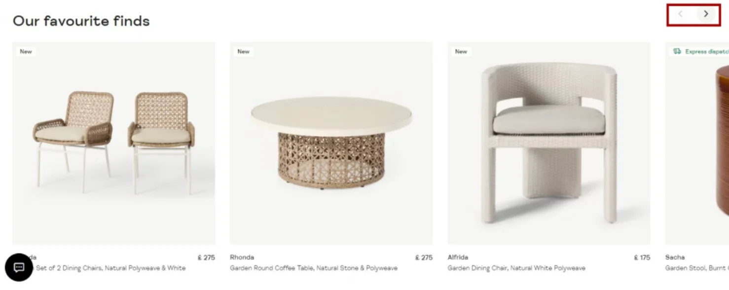
See how Made presents its product list horizontally by adding arrow navigation on top instead of letting the product slide on its own.
7. Include social proof in your information hierarchy
When shoppers land up on your Shopify homepage, they’re looking for a bunch of good reasons to not drop off.
Give them relevant social proof right at this stage, and it’s likely you’ll lower bounce rates and improve the chances of conversion.
Social proof actively displayed on a homepage means a number of things including:
The brand is confident about what it is putting out there in the world. And have existing buyers vouch for it.
Others in the social system are familiar with the brand’s products, and hence, someone new can easily put their trust in them.
Here’s how to apply this Shopify homepage CRO tip:
Introduce media mentions. When you explicitly display some big media names that have carried news or articles about your products, shoppers breathe a sigh of relief.
Crunch some seriously impactful numbers. Statistics prove that you’ve done your homework around data and gathering insights from them. Also, people generally like to buy into anything that creates a large scale impact - it makes them feel like they’re making a difference too!
Carry customer reviews and ratings. A good idea is to especially pull out a few that reflect a trustworthy brand experience. The more product specific reviews can be embedded into the respective product pages.
Link to the page that features case studies. This can be especially relevant for those looking into the details and perhaps wondering if a long-term engagement with your brand and its products is possible.
8. Ensure customer service is accessible
While shoppers often gain trust reading and watching what buyers have said, they also look for a step closer home: one where their real-time queries are attended to.
This is where customer service comes into the picture on your Shopify homepage.
The idea is to ensure customers don’t have to enter a special “help” zone or get into a product page to seek help.
Here are a few ways you can ensure your Shopify homepage becomes an instant source of customer support:
Introduce a “support” section in the footer. Make sure your contact information, FAQs, and any other information around policies & registration figure here.
Clearly mention a phone number. And ensure someone human is assigned to take calls at the end of it.
Empower the “help” section with a virtual assistant option. This is just in case a shopper isn’t able to have their questions answered through a FAQ section.
9. Make copy & visual work together to drive home the USP
While it may not be immediately obvious to shoppers, a brand conveys its USP in the hero banner both through visual and copy.
Typically, while the visual works to create an emotional response, the text clarifies or informs or entices and so on.
Since the USP is the key messaging that a shopper needs to get to know the moment they step on to your homepage, it’s ideal that copy & visual work hand-in-hand to deliver it.
Here are a few important considerations to keep in mind while you’re working on this aspect:
Keep the brand at the center of the messaging. This will ensure your header visual(s) and the tone you communicate with in your copy, are aligned to the big picture.
Identify a clear benefit or point of recall. For example, if you’re selling a lifestyle product, the USP may be in conveying a certain aspect of the lifestyle you promise to shoppers.
Help your buyers imagine a new reality. Quite obviously, that’s why your brand and your products exist.
10. Humor sells (even if you have a boring product)
Your homepage copy plays a serious role in converting visitors into paying customers. However, that doesn’t mean it shouldn’t have fun.
Humor in your copy will help engage customers, consume more content, browse products, read descriptions, and checkout.
Here are some pointers to help you add humor to your Shopify homepage copy effectively:
Find out if your audience has an appetite for it. Test it out, in the beginning, to see how our audience is responding to it. Also, it’s important to make your humor relatable. They’ll connect to it only when they’ll relate to it.
Don’t go off-brand to be humorous. Your humor will fail if it stands out from your overall brand personality. Hence, try to lace your humor as part of your brand image.
Avoid offending anyone. Evaluate your copy from all perspectives to ensure it doesn’t offend anyone. Be sensitive towards race, gender, and culture.
11. Display country-specific messaging
Country-specific messaging is an integral part of a comprehensive localization strategy.
This strategy can help to improve relevance and boost your store's trust and credibility.
Here’s how to apply this Shopify homepage CRO tip:
Use geolocation detection to automatically identify the visitor's country based on their IP address. Shopify apps like GeoIP Country Redirect can help redirect visitors to the appropriate country-specific homepage based on their location.
Customize the homepage content to reflect the language and currency of the visitor's country. Use Shopify's built-in language and currency settings or apps like Langify or Weglot to translate your website content and display prices in the visitor's local currency.
Customize homepage content, imagery, and messaging to resonate with the cultural preferences and interests of each country. Use country-specific imagery, testimonials, and references to local landmarks, holidays, or traditions to create a personalized and relatable experience for visitors.
Ensure compliance with country-specific legal requirements, such as privacy policies, terms of service, and tax regulations. Display relevant legal disclaimers, VAT information, and GDPR compliance notices based on the visitor's country to build trust and credibility.
Within the next 2-5 scrolls on the Shopify homepage design
Below the fold on your Shopify homepage, you want to showcase content that entices visitors to continue exploring your website and ultimately make a purchase.
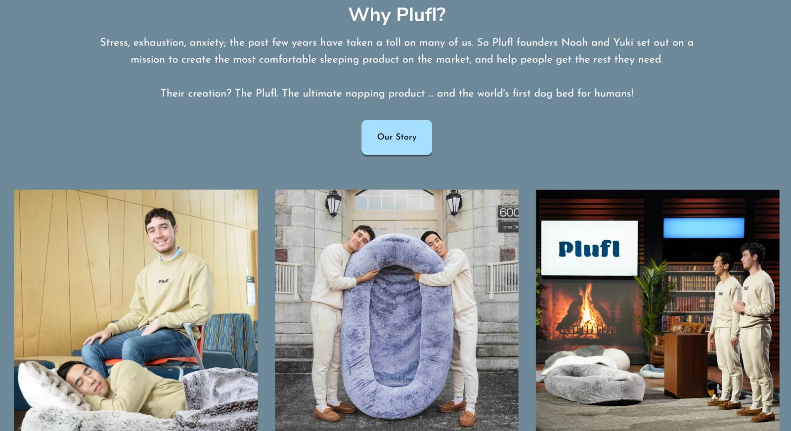
12. Reveal more about the brand journey
It’s true that shoppers may not be as convinced by what a brand says about itself as they’d be by customers.
Nevertheless, a brand still retains the accountability of informing shoppers why it exists, what its approach is and how it is going about making a difference.
Here are a few ways you can establish credibility by featuring important pieces of company information on your Shopify homepage:
Share your brand’s story. Since most buyers love the human touch, inviting them to learn about your company has its special appeal.
Introduce shoppers to your brand values. After all the values you produce and deliver become equivalent to the experience, customers can expect from you.
Featured blog posts or other content. Showcase recent blog posts, articles, or multimedia content related to your products, industry trends, or customer stories. Use this space to educate and engage visitors, positioning your brand as an authority in your niche.
13. Expand on social proof
Social proof can be further emphasized to build trust and credibility among visitors.
Here’s how to apply this Shopify homepage CRO tip:
Display a carousel or grid of customer testimonials and reviews below the fold. Include snippets of positive feedback, star ratings, and customer photos to provide authentic social proof of your product's quality and customer satisfaction.
Embed a feed of your latest social media posts or customer interactions below the fold. Showcase user-generated content, testimonials, and engagement on platforms like Instagram, Facebook, and Twitter to demonstrate your brand's popularity and social influence.
Showcase before-and-after photos or testimonials from customers who have experienced positive results from using your products or services.
If your brand has been endorsed by influencers or celebrities, feature their testimonials or endorsements below the fold. Include quotes, photos, or videos of influencers using and recommending your products to add credibility and appeal to your brand.
14. Think more SEO
Sometimes, Shopify store owners overlook homepages and try to focus their SEO strategies more on product pages.
However, Shopify homepages can bring in as much traffic if optimized for search engines.
Here’s how to apply this Shopify homepage CRO tip:
Use keyword-rich headings and subheadings below the fold to organize content and improve readability. Incorporate target keywords naturally within headings to signal the topic and relevance of the content to search engines.
Use long-tail keywords and natural language that align with user search intent to improve the discoverability of your products in search results.
Incorporate internal links to relevant product pages, category pages, and blog posts below the fold to enhance website navigation and distribute link equity throughout your site. Use descriptive anchor text that includes target keywords to signal the relevance of linked pages to search engines.
Regularly update and refresh below-the-fold content to keep it relevant and up-to-date with current trends, industry news, and product offerings. Fresh content signals to search engines that your website is active and authoritative, which can positively impact search rankings.
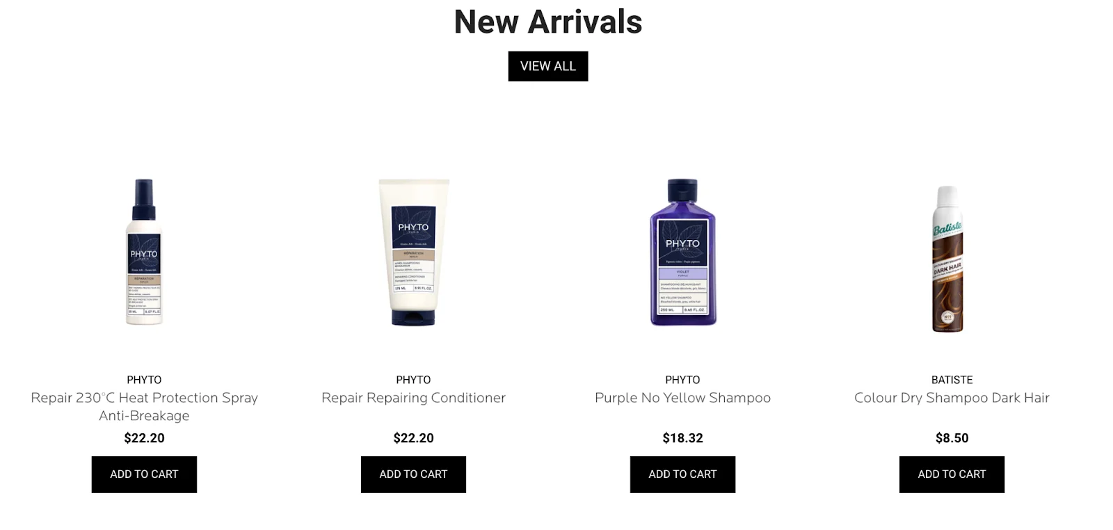
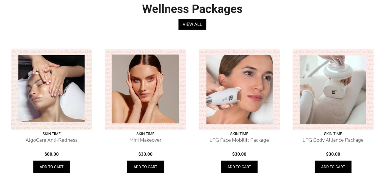
On Shopify homepages, showing additional product recommendation below the fold can create a more immersive shopping experience for visitors and drive engagement.
Here are some effective ways to present product recommendations below the fold on your Shopify homepages:
Highlight a selection of best-selling or top-rated products below the fold to capitalize on social proof and encourage conversions. Use badges or labels to indicate products with high ratings or popularity, and provide links to individual product pages for more information.
Curate a selection of customer favorites or staff picks below the fold to provide social proof and curated recommendations.
Implement interactive product discovery tools such as quizzes, product finders, or style quizzes below the fold.
Showcase bundled product sets or package deals below the fold to encourage visitors to purchase multiple items together at a discounted price.
Integrate virtual try-on or product visualization tools below the fold to allow visitors to preview how products will look or fit before making a purchase. Use augmented reality (AR) technology or interactive 3D models to provide immersive and engaging shopping experiences.
See how Skin Society has listed their wide range of products in different formats for easier product discovery:
16. Kill infinite scrolling except on mobile
Infinite scrolling is a UX technique where content loads continuously as you scroll down a webpage.
However, there are certain limitations. Google does not crawl all of the content on a webpage because the crawler has a limit called a crawl budget.
If there are more web pages on your store, then it takes more time to index them all.
On desktop, you can implement:
Pagination - the products are listed on separate product listing web pages. Once a shopper scrolls to the bottom of the webpage, they need to click on the next page number to see more products.
Load more button - online stores can show fewer products upfront, so that the results page generates quickly. Once a shopper clicks on the load more button, more products can appear.
This means, there’s a high chance that customers are coming to your online store from social media through a link, post, or organically.
On mobile and touchscreen devices, infinite scroll creates a more seamless experience for shoppers. Moreover, mobile shoppers also instinctively use swipe and button features.
Alternatively, pagination can limit and interrupt a mobile shopper’s shopping experience.
17. Feature relevant links in the footer section
Make your footer add to the overall efficiency of navigation.
After all, the reason your footer exists is to take the information burden off your top nav bar.
To heighten your homepage UX through the footer:
Make sure it does not contain broken links.
It is not cluttered. (If there’s too much information, see if you can club sections under specific categories.)
Ensure all links open in new tabs.
2X your Store Conversions
98% of visitors who visit an eCommerce site—drop off without buying anything.
Why: user experience issues that cause friction for visitors.
And this is the problem ConvertCart solves.
We've helped 500+ eCommerce stores (in the US) improve user experience—and 2X their conversions.
How we can help you:
Our conversion experts can audit your site—identify UX issues, and suggest changes to improve conversions.
Subscribe for more articles like this!
Thank you - we'll see you in your inbox soon!
Oops! Something went wrong while submitting the form.
Read by 5000+ ecommerce store owners
Subscribe for more articles like this!
Thank you - we'll see you in your inbox soon!
Oops! Something went wrong while submitting the form.


.avif)
.svg)

.svg)

.svg)
.svg)
