At Convertcart, we have worked with hundreds of stores with bounce rate problems.
And here are the top reasons that keep coming up:
Why Do Shoppers Bounce Off Without Buying - Learnings From Real Audits
a. Stores Deploying High-Pressure Sales Tactics
Many Shopify brands feel like they’re doing it smartly by showcasing their latest offers through pop-ups, banners, real-time customer activity, and countdown timers.
But when shoppers see these the moment they arrive, they feel let down.
Such aggressive tactics create mistrust among shoppers and increase bounce rates.
We recently audited a leather store that was displaying "542 people viewing this exact item right now". It felt like a high-pressure sales tactic straight from a dropshipping template.
b. Multiple Layers of Exploration
An apparel store we audited earlier this year had too many exploration layers. Consider this: the shopper wanted a black hoodie, but the site asked them to: explore new arrivals, discover the collection, browse best sellers, shop the look, view the style guide, find your fit, compare fabrics, before they ever see a black hoodie.
Isn’t that a waste of time and effort? Most shoppers who land on a Shopify store find it really hard and time-consuming just to find what they’re looking for. And that becomes a reason for them to bounce off.
c. Too Many Recommendations
Personalizing a store experience is one thing, but if you bombard your visitors with too many such suggestions, you’re in for trouble.
A jewellery brand we audited showed too many personalized recommendations to its returning customers: recently viewed items, products similar to this one, trending now, frequently bought together, and customers in your area also purchased.
In our experience, stores that overwhelm visitors suffer because they’re not helping customers in any way by doing so.
d. Poor Mobile Experience
In our mobile audits, we regularly find a poor mobile UX becoming a cause for a high store bounce rate.
A fashion brand we audited had a beautifully designed desktop experience, but on mobile, the checkout button was partially hidden behind a cookie banner.
Most visitors never made it to checkout, not because they didn't want to buy, but because the experience made it harder than it needed to be.
e. Traffic-to-Page Intent Mismatch
A skincare brand we audited was running a Meta ad specifically promoting their Vitamin C serum, strong creative, solid targeting, and decent click-through rate.
But the ad was sending traffic to the homepage, where visitors landed to find a full product catalogue with no clear direction. The serum was three scrolls and a category filter away.
Do you see the gap in the user experience here? This is what causes a high bounce rate.
We work with such stores day in and day out to help them come out of their bounce rate issues. And so we’ve put our experience into this guide so you can reduce your Shopify bounce rate and achieve your store conversion goals.
Are you ready? Let’s get started.
Before We Move Ahead: Find Out If Your Current Bounce Rate Is Good or Bad?
Bounce Rate Benchmark Table
Page type
Average
Good
Excellent
Homepage
40–50%
30–40%
Under 30%
Product pages
35–50%
25–35%
Under 25%
Collection pages
30–45%
20–30%
Under 20%
Blog posts
65–80%
55–65%
Under 55%
Paid ad landing pages
50–70%
40–50%
Under 40%
Fashion and apparel stores typically see bounce rates of 40–60%. Beauty and cosmetics run slightly lower at 35–55%. Electronics stores often fall between 35–60%.
Remember that your own historical trend matters more than any benchmark: a bounce rate that has risen from 45% to 60% over three months is worth investigating regardless of industry averages.
Next Step: Find What's Causing Shoppers To Bounce Off Your Shopify Store
a. Watch Out For These Anomalies In Your Session Replays
Visitors repeatedly click on an element that is not interactive, expecting it to do something it was never designed to do.
Visitors scrolling back to the top of the page mid-session is a sign that they lost context or could not find what they were looking for.
Sessions that drop off immediately after a pop-up appears, particularly on mobile, where dismissing it is not straightforward.
Visitors spending significant time on the shipping or returns section before abandoning, a sign that what they found there did not meet their expectations.
b. Look For These Patterns In Your Heatmaps
Heavy click activity on a product image with no zoom or expand functionality, suggesting visitors want a closer look that your store is not offering.
Clicks concentrated on a non-linked element: a category label, a decorative banner, or a brand logo, indicating a navigation expectation your store is not meeting.
Scroll maps showing the majority of visitors dropping off above your reviews section, meaning social proof is present but never actually seen.
Cold zones on your primary call-to-action button suggest it is either poorly placed, visually weak, or not compelling enough to draw attention.
High engagement at the top of the page followed by a sharp drop-off midway, pointing to a layout that loses momentum before reaching the conversion point.
c. Run On-Site Surveys And Look For These Patterns
A single well-placed question can surface what no analytics tool will tell you, the reason behind the behaviour. These responses are the symptoms worth paying attention to:
Repeated mentions of shipping cost as a dealbreaker, appearing only at checkout, suggest the issue is not the price but the timing of when the cost is revealed.
Visitors citing trust concerns, no reviews, unfamiliar brand, and no clear return policy are pointing to gaps in your credibility signals rather than your product.
Responses indicating visitors could not find the specific variant, size, or option they needed, a fulfilment or filtering problem disguised as a bounce.
Feedback referencing confusion about what the product actually does, suggesting your copy is not doing enough work on the page itself.
Visitors who say they want to compare options but find it difficult are a sign that your store is making the decision harder than it needs to be.
To get a deeper understanding of your bounce rate problem, run your store through the following checklist.
The Most Crucial Step In Fixing Your Bounce Rate - Run These Reality Checks
Most bounce-rate discussions start with solutions. That's thinking backwards. A high bounce rate is usually a symptom, not the problem itself. Before redesigning pages, changing headlines, or launching CRO tests, you need to run these checks to understand what's causing visitors to leave.
1. Stop Looking at the Blended Bounce Rate
A site-wide bounce rate is one of the least useful metrics in analytics because it combines visitors with completely different intentions.Visitors from different traffic sources behave differently.
The best way is to segment bounce rate by traffic source, device type, and landing page. This strategy will help you identify which audience is abandoning and where they're doing it.
2. Test Speed Where Revenue Actually Happens
Many stores obsess over homepage speed while their product pages carry the real conversion load. Run a mobile PageSpeed audit on your highest-traffic product page, collection page, or landing page.
That's where shoppers are making stay-or-leave decisions.
3. Watch 10 Visitors Leave Before Forming Any Opinion
Analytics data tells you what happened. Session recordings tell you why it happened. The right way is to pull replays of visitors who exited within the first sixty seconds and analyze at least 10 such visitors before concluding. Look for repeated patterns:
Rapid scrolling
Hesitation near navigation
Rage clicks
Opening multiple tabs
Returning to search results
The tenth recording is often more valuable than the tenth analytics report.
4. Compare Every Campaign Promise Against the Landing Page
Many bounce-rate problems start before the visitor even reaches the site. Open every active ad, email, influencer promotion, and paid campaign. Then compare the promise being made with the first thing visitors see after clicking.
If the ad promises "Waterproof Hiking Boots" and the landing page opens with a lifestyle banner about adventure, you've created immediate friction. The fastest way to increase bounce rate is to force visitors to reconnect the dots themselves.
5. Audit the Store on a Real Mid-Range Android Device
Most teams review their stores on high-end laptops and flagship phones connected to strong Wi-Fi. Many customers don't use those devices. The right way is to open your site on a mid-range Android device using normal mobile data. This often reveals issues that teams never see internally:
Sticky elements covering content
Slow image rendering
Awkward tap targets
Excessive scrolling
Popup conflicts
A store that feels smooth on an iPhone Pro may feel exhausting elsewhere, and you need to fix that.
6. Trace the Visibility of Your Trust Signals
Store owners often say, "We have reviews." The real question is whether shoppers see these reviews before doubt appears.Check your product page and identify exactly where trust signals become visible:
Customer reviews
Return policies
Shipping information
Security assurances
Payment options
Satisfaction guarantees
Trust signals only work when they appear at the moment uncertainty is at its highest.
7. Measure the Distance Between Discovery and Purchase
Every extra click on a page consumes attention. Pick your best-selling product and count the number of actions you require to reach it from the homepage.
If visitors must navigate categories, subcategories, filters, and merchandising layers before reaching a product, you're optimizing for exploration rather than decision-making. For hero products and top sellers, two clicks should generally be the ceiling.
8. Check Your Popups Like You Would Judge a Salesperson
Most popups aren't evaluated often enough after launch. Look beyond whether the pop-up exists and examine:
When it triggers
Which pages does it appear on
Which devices see it
Whether it blocks critical actions
Whether it interrupts visitors before they understand the offer
We've seen stores where a pop-up generated email signups while simultaneously increasing bounce rate because it appeared before visitors had any reason to engage.
9. Spend Time With Your Worst Page
Every analytics account has a page that quietly leaks visitors. Find the page with the highest bounce rate among meaningful traffic pages and review it as if you've never seen it before.
Ask:
Why did visitors land here?
What were they expecting?
What is the page asking them to do next?
Is that next step obvious?
The page with the worst engagement often contains the clearest clues about the broader customer experience.
10. Run the Stranger Test on Your Headline
Your homepage headline should answer three questions within seconds:
What do you sell?
Who is it for?
Why should someone care?
Many brands unintentionally write headlines for insiders instead of shoppers. If someone unfamiliar with your business cannot explain what you sell after five seconds on the homepage, visitors are spending cognitive effort on understanding rather than buying.
And the confusion is one of the fastest paths to a bounce. The biggest mistake we see is treating bounce rate as a page problem. In reality, bounce rate is often the result of a chain reaction involving traffic quality, page speed, message match, trust, usability, and clarity.
Fixing any one of those can help. Identifying which one is responsible usually helps much more.
Let’s now learn how some real-world brands are reducing the bounce rate on their Shopify stores.
Let's Go Beyond Best Practices: See What Real Brands Do To Reduce Their Bounce Rate
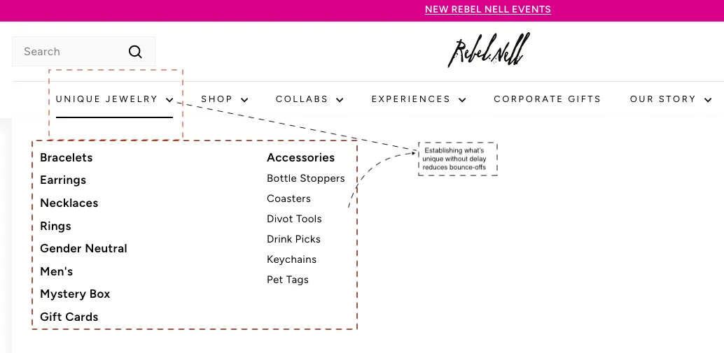
1. Rebel Nell: Put Your 'Why Us' In The Navigation
Rebel Nell sells jewellery, and so do approximately four million other Shopify stores. What they do not sell is jewellery handcrafted by Detroit women using reclaimed graffiti, and they make sure you know it before you scroll once.
Their navigation's first item is not "Shop" or "New Arrivals." It is Unique Jewelry. It immediately signals to a first-time visitor that this is not another generic accessories store.
Most Shopify founders bury their differentiation in an About page. Rebel Nell put theirs where eyes actually go: the top-left corner of every single page. If your brand has a genuine point of difference, your navigation is prime real estate.
It’s best to lead with what makes you you, and let curiosity do the rest.
2. Emma Bridgewater: Make Shoppers Feel Something Before They Buy Anything
Studies show that visually appealing websites have a 38% lower bounce rate than sites that mainly feature plain text. Emma Bridgewater sells mugs.
Their collection pages show mugs being held, styled against books, flowers, and breakfast trays. Real life, warmly lit. The homepage then pulls a smart one-two: a seasonal banner with lifestyle imagery followed immediately by a free shipping offer on personalised orders.
Remember that if you give your audience what they’re looking for, they’re likely to stay.
3. Made In: Seed Trust Signals Before Shoppers See a Price
Most visitors who come to your store are looking for reasons to trust your business. Made In gives them those reasons on the category page. They showcase a tight editorial block that conveys what the cookware is made of, where it is made, and three crisp proof points: five-ply construction, Italian or US manufacturing, induction compatible.
If you can display that you have what it takes to build world-class and high-quality products, customers will think twice before bouncing off your Shopify store.
4. Beardbrand: Hook Them With a Line, Keep Them With Everything Else
"Beardbrand is a fragrance house disguised as a beard care company."
That is the headline that greets Beardbrand’s site visitors. It is unexpected, slightly mysterious, and does exactly what a great opening line should: it makes you want to know more. As Shopify, the point for you to note is that writing something that sounds like a LinkedIn bio will be of no interest to your prospective customers.
Beardbrand presents a line that sounds like the beginning of a good story, and that’s why it works. But the headline is just the entry point. If you hover over any product tile, it flips to reveal the name, price, and a one-line descriptor.
That’s enough information for a customer to stay interested. The Deals section is prominently nav-linked with clear "Limited Offer," "Value Kit," and "Ships Free" badges offering stuff that customers are looking for.
Don’t forget that if you can manage to engage your site visitors, you can easily control your bounce rate. And engagement is a result of a few carefully chosen page elements. Get them right, and you’re already winning.
5. Stumptown Coffee Roasters: Give Browsers a Reason to Invest
Most eCommerce stores are optimistic that visitors will buy once and somehow find their way back. But that doesn’t always happen. Stumptown has a more sensible plan: give people three reasons to subscribe before they think about leaving.
Their subscription section segments without overwhelming. Roaster's Pick for the adventurous type who wants the freshest single-origin drops. Blend Shuffle for the loyalist who loves their classics.
Favourite on Repeat for the person who found their coffee and simply never wants to run out. You can see three tiers, three distinct personalities, all on one page.
The homepage hero earns its place: "Worth Repeating" frames the subscription conversation. The best thing is that they’re doing all it takes to inspire their customers to commit to a unique experience.
6. Neom Wellbeing: Make 'Free' Feel like a Gift, Not a Gimmick
The word ‘free’ has been so thoroughly devalued that most shoppers scroll past it without registering it. Neom figured out that the problem is not the free offer, but its placement.
Their announcement bar leads with a clear, specific offer: a free candle and wick trimmer with orders over a certain threshold. But the homepage then dedicates an entire hero section to it: "A Gift of Happiness, On Us." It’s a full content section with a product image, the word FREE in bold, and a gift badge showing its retail value.
When you place your offers where they matter, customers have a reason to learn more about them and to stay longer on your store.
7. Fashion Nova: Build Categories Around How Shoppers Actually Think
Most fashion stores organise their navigation the way a warehouse manager would: by product type, by size, maybe by colour if they are feeling adventurous.
Fashion Nova organises its products the way a shopper thinks at 11 pm on a Thursday, wondering what to wear on Saturday.
Open the Jeans dropdown, and you get four distinct ways in: Shop by Style (High Waisted, Booty Shaping, Barrel), Shop by Fit (Baggy, Wide Leg, Flare), Shop by Trend (Cargo, Embellished, Denim on Denim), and Shop by Colour.
If you understand that your store has to work like a helpful assistant rather than a loud salesperson, you’ve won half the bounce rate battle.
Don’t forget that everything that shows or says on your site should feel like a conversation. If it does, shoppers have a reason to stay and interact with you.
Final Thoughts
Your bounce rate is telling you something — most stores just never stop to listen. If you'd like us to do the listening for you, get a free CRO audit from Convertcart and we'll tell you exactly what's sending your visitors away.
Frequently Asked Questions
What is Bounce Rate?
A bounce is a single-page session. It signals that someone landed on your store, viewed one page, and left without clicking anything or navigating anywhere.
Shopify calculates your bounce rate by dividing those single-page sessions by total sessions.
Why Does Your Shopify bounce Rate Matter?
Your Shopify bounce rate matters because every visitor who leaves without engaging represents a lost sale, wasted ad spend, and a sign of deeper issues hurting your business.
How to Find Your Bounce Rate in Shopify?
From your Shopify admin, navigate to Analytics, then Reports. Under the Acquisition section, look for the Sessions report. Your bounce rate sits there alongside other session metrics.
For a more granular analysis, you can compare mobile versus desktop bounce rates on a specific product page, or segment by traffic source. For this, you will need Google Analytics 4.
In GA4, go to Reports, then Engagement, then Pages and Screens. The engagement rate column is the inverse of bounce rate (GA4 defines an engaged session as one lasting over 10 seconds, having a conversion, or viewing multiple pages).
What is a Good Bounce Rate for a Shopify Store?
For most Shopify stores, a bounce rate between 20% and 45% is healthy. Rates above 55% on product or collection pages typically signal a problem worth investigating. But context matters more than the absolute number. A blog post bouncing at 70% is normal; a paid landing page at 70% is expensive.
What is the Difference Between Bounce Rate and Exit Rate?
Bounce rate measures sessions where a visitor views only one page and leaves without any engagement. Exit rate measures the percentage of visitors who leave from a specific page, regardless of how many pages they viewed before it.
A high exit rate on a thank-you or order confirmation page is completely normal. A high bounce rate on a product page is not.
Does Bounce Rate Affect Shopify SEO Rankings?
Bounce rate itself is not a confirmed Google ranking factor. But the problems that cause high bounce rates, slow load times, poor mobile experience, and thin or mismatched content do affect search visibility through Core Web Vitals and page experience signals. Fixing your bounce rate problem and fixing your SEO problem are often the same work.
How Do I Check Bunce Rate in Shopify Without Google Analytics?
In your Shopify admin, go to Analytics, then Reports, then look under the Acquisition section for the Sessions report. You will see a bounce rate figure there. For page-level or traffic-source segmentation, GA4 is worth setting up it is free, and the additional diagnostic detail is substantial.
Why is my Bounce Rate High Even Though My Ads are Performing Well?
High-performing ads and high bounce rates are a common and frustrating combination. The most likely culprit is intent mismatch: your ad creative sets an expectation that your landing page does not immediately meet.
Check whether your top ads link to the specific product or offer shown in the creative, not to a generic homepage or collection page. Also, check your landing page load time. Paid traffic is impatient.
Can Shopify Apps Increase Bounce Rate?
Yes. Every installed app adds JavaScript that loads on every page, increasing load time. Apps that trigger intrusive popups on page load are particularly damaging. Audit your installed apps periodically, remove anything you are not actively using, and check whether your remaining apps have options to load asynchronously or only on pages where they are needed.
Subscribe for more articles like this!
Thank you - we'll see you in your inbox soon!
Oops! Something went wrong while submitting the form.
Read by 5000+ ecommerce store owners
Subscribe for more articles like this!
Thank you - we'll see you in your inbox soon!
Oops! Something went wrong while submitting the form.


.svg)

.svg)

.svg)
.svg)
