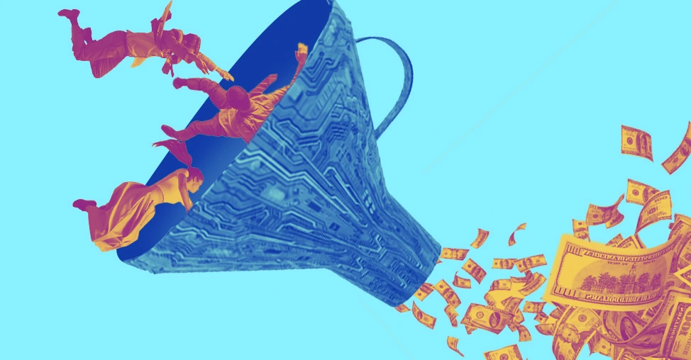
The modern eCommerce funnel no longer works like a straight line. Shoppers bounce between TikTok videos, Reddit threads, AI search results, and mobile sessions before finally purchasing.
That’s why high-performing brands optimize the entire customer journey, not just isolated pages.
We designed a framework to help you understand the modern eCommerce conversion funnel; showing:
what shoppers are thinking at each stage,
what causes drop-offs,
and what high-converting brands do differently to move customers toward purchase and retention.
The 5-Stage eCommerce Conversion Funnel Framework
This framework breaks down the 5 critical stages of a modern eCommerce conversion funnel, from first discovery to repeat purchases, along with the core mindset, conversion goal, and optimization lever that matters most at each stage.
Ecommerce Conversion Funnel 2026
How top brands are winning at every stage of the customer journey
Funnel Stage
Customer Mindset
Core Goal
Biggest Conversion Lever
What High-Converting Brands Do in 2026
Key Metrics
1. Awareness
“Hmm, this looks interesting.”
Get discovered by the right audience
Visibility where customers already spend attention
Build presence on Reddit, TikTok, Pinterest, AI search results, and micro-influencer ecosystems instead of relying only on SEO + ads
Stage 1: Awareness (From "Hm, interesting” to "Okay, I need to check this out")
Even a year ago, as part of your eCommerce marketing funnel, you could rank your online store with solid SEO and some smart paid ads.
Traffic would flow in, like it was Black Friday every day.
Fast-forward to 2026, and now Google’s AI overviews get more attention, decreasing organic clicks, and TikTok Shop and Pinterest have turned product discovery into a whole vibe.
Even Reddit threads with real conversations outrank polished brand content.
How can you elevate at this awareness funnel stage?
Stop chasing every trend that comes along. Instead, start showing up where your customers hang out and chat.
Dive into Reddit threads, TikTok/Pinterest comments, and answer questions and offer real insight.
Remember, people can sniff out inauthenticity, but they love someone useful.
Our CRO audits show the customer conversion funnel rewards realness over reach.
On the other hand, a few years ago, influencer marketing was all about a macro celeb posting a sponsored post.
Micro and nano influencers (with 10K-100K followers, or even smaller) are crushing it with way higher trust and actual conversion rates than any glossy celeb endorsement.
When you build your micro-influencer seeding program, send your products along without any structured script or brief.
Just let them react honestly. This way, you will get genuine awareness through user-generated content.
Stage 2: Consideration (From "Just Browsing" to "This Might Be the One")
Picture this like the second act of a classic heist movie (Ocean's Eleven style).
The crew has scoped the joint, but now they're deep in the planning phase, comparing tools, checking if the safe's worth cracking, and bailing if anything feels off.
On your online store, that's shoppers poking around, using search, reading specs, and deciding if you're the reliable partner or just another tab they close.
Fast-forward to 2026, and the plot twist is huge.
Shoppers show up knowing things.
They've already researched on Reddit, TikTok, or those AI chats (ChatGPT, Perplexity, Google AI Overviews).
They know exactly what bolt, screw, or widget they need
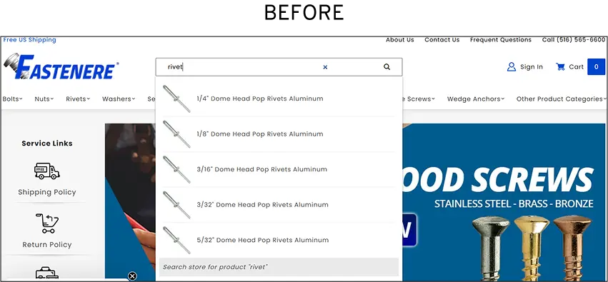
So, their first move? Hit your on-site search bar.
If it flops, irrelevant results, no smart suggestions, zero filters, they're out in under 10 seconds. No do-overs.
Recently, we ran a full site audit on Fastenere, a U.S.-based fastener giant with over a million products.
Our reports showed that only about 1% of users even bothered with site search.
Which was strange, because 69% of shoppers go directly to the search bar when visiting an eCommerce site.
So we dug deeper. And found that the site search had poor relevance, and no predictive typing, which put off returning visitors.
That's when, we ran IntelliSearch with predictive magic, better visibility for hot searches, and category/spec/availability filters.
And just like that, search felt like a helpful buddy, not a chore.
Our experiments resulted in the search engagement to jump from ~1% to 3.07% of users.
And the same search users became 11X more likely to convert and generated 20X more revenue per user.
Stage 3: Desire (From "Maybe" to "I Need This")
In 2026, this isn't about flashy hero images or endless testimonials anymore.
Desire dies (or explodes) right on the product page, not at checkout.
Shoppers hit your page with high intent, but if you fumble the emotional handoff, they will ghost you.
Your product page has to be precise and accurate.
No vague "ships soon" BS or stockouts that feel like rejection.
In today's world, with AI summaries stealing clicks and shoppers expecting Amazon-level certainty, the old playbooks are collecting dust.
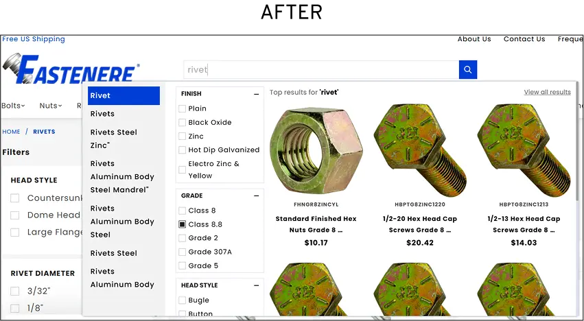
Uncertainty around delivery is a silent killer.
When we ran a CRO audit on a brand, we saw almost 87% drop-offs purely from timeline hesitation.
Our team hypothesised that a real-time countdown timer on product pages showing the daily cutoff for next-day or fast shipping.
We A/B tested copy like "Order in the next 3 hours, arrives Thursday by 5 PM" ticking away on desktop (and mobile, because duh).
The experiments resulted in +13.68% site-wide lift, and crucially, 22% more shoppers actually placed orders once they saw a timer for same day shipping.
Furthermore, we have noticed through our A/B tests, that bundles accelerate the ecommerce conversion funnel.
Curated kits solve the full problem, flipping "Do I need this?" to "This is everything I want," cutting decision fatigue.
Data shows bundles boost desire-stage conversions significantly.
If you have products out of stock, transform them into a waitlist capture:
"You're #47, join for first dibs + ETA alert."
Peak intent turns frustration into commitment, often yielding higher restock conversions.
Stage 4: Action (From "I Want This" to "Order Placed")
One-click checkout (Shop Pay style) is the bare minimum baseline now.
But friction's sneaky, hiding in janky mobile flows, missing payment prefs, post-add-to-cart ghosts, and those unanswered "Wait, is this right?" moments right before buy.
Old tricks (trim forms, toss trust badges) feel prehistoric.
Today's common hurdles to conversion in the eCommerce funnel spike hardest on mobile, where abandonment often hits 80%+.
Through our conversion rate audits, we have core four fixes you should make to improve speed and trust:
Mobile-native checkout (not just "compatible"): Thumb-friendly, lightning-fast, no pinch-zoom headaches.
BNPL front-and-center: Affirm or Klarna as a prime CTA for $100+ orders (US BNPL volumes exploding to $128B+ in 2026, with Klarna/Affirm leading adoption).
Real-time chat right at the cart: Nail those last-minute questions before they kill the vibe.
Post-add-to-cart recovery flows: Your biggest fixable leak. Shoppers add items, but bail before checkout; targeted pop-ups, SMS, or emails recover high-intent abandons (strategies show 10-30% lifts in strong setups).
And localization's gone hyper-local for US folks.
Real-time state sales tax calc, zip-code-specific shipping ETAs shown early (no final-page shocks), auto-prioritized BNPL based on device/location signals.
It's expected now, so deliver it, or lose to someone who does.
Stage 5: Retention & Re-engagement (From Casual Visitor to Your Most Valuable Customer)
The highest-intent moment isn't the product page anymore.
It's those golden 60 seconds right after purchase, when dopamine's still pumping, and the buyer's high is real.
Think of it like the credits rolling on Avengers: Endgame, everyone's buzzing, ready for the next scene.
Don't just show a boring "Thanks for your order" screen.
Make the confirmation page work overtime: drop a one-click upsell (relevant add-ons convert at 4-8% for targeted offers vs. 1-3% generic), sneak in a referral mechanic ("Share for $10 off next"), or invite to your VIP community.
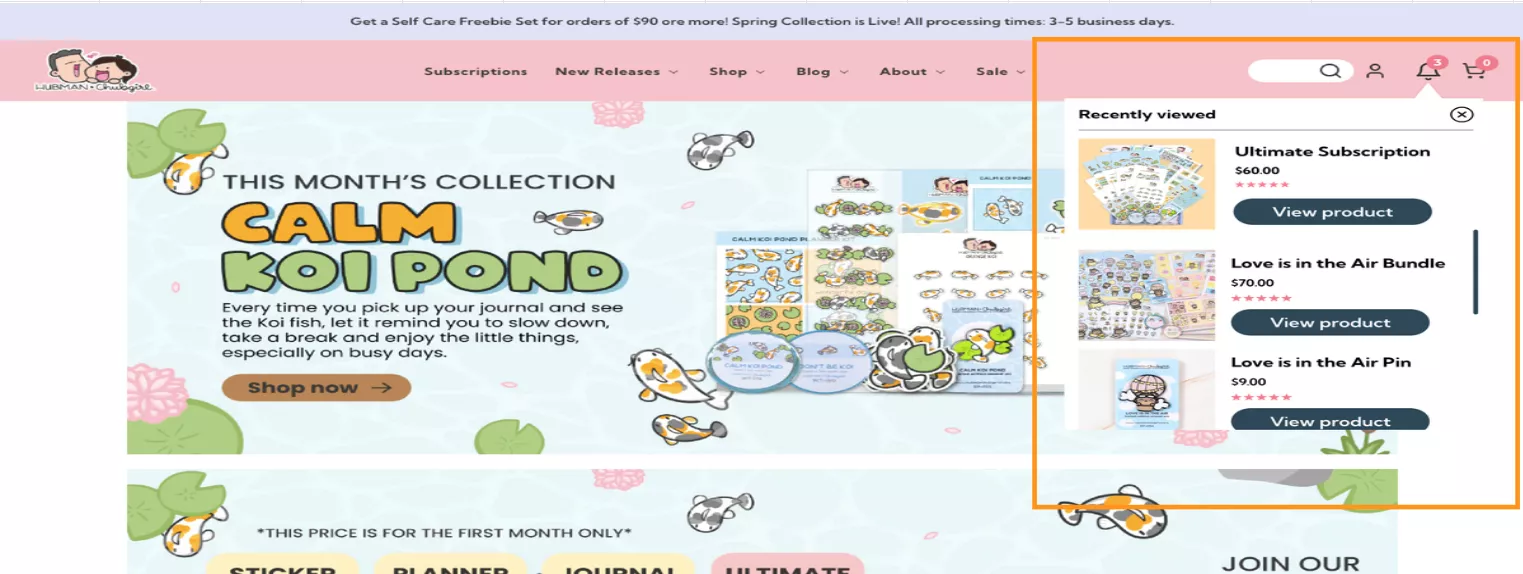
When we audited Hubman & Chubgirl store, reports saw that returning shoppers forgot what they had looked at, with people abandoning around 49% of sessions from repeated searches.
To help returning visitors, we tested a Recently Viewed module to kill that "Where'd I see that?" friction.
And bam!
The tests resulted in +6.45% site-wide conversions, and browse abandonment dropped to 4%.
Run a smart 72-hour post-delivery sequence (not salesy blasts):
Day 1 usage tips ("How to get max life from your gear")
Day 2 community invite
Day 3 review nudge
If you time it properly, this builds loyalty, spikes reviews, and primes repeats (post-purchase flows can boost second buys 40%+ in strong setups).
The order confirmation page is prime real estate for upsells, referrals, and loyalty, if you design it right.
Here's What That Page Should Include.
The Self-Audit: Is Your eCommerce Conversion Funnel Actually Ready?
Most founders assume their funnel works because revenue is coming in.
But revenue coming in despite a broken funnel is not the same as a funnel that scales.
Run this audit before you spend another dollar on growth.
Below are 7 signs your funnel is still living in the past:
1. Your awareness strategy is 90% paid search and SEO, with zero AI or community presence
When a shopper asks ChatGPT or Perplexity for a recommendation in your category, your brand simply doesn't exist. AI-driven discovery is now a primary buying trigger, especially for considered purchases.
2. Your consideration layer lives entirely on your website, nowhere else
Buyers research across 5–8 touchpoints before purchasing.
If your comparison content, reviews, and product education only live on your own domain, you're invisible during the critical evaluation phase that happens off-site.
3. Your main desire trigger is still a discount pop-up
Exit-intent discounts train your audience to wait for a deal, erode margin, and attract the lowest-intent buyers.
Worse, they signal to customers that your stated price isn't your real price, which permanently damages price trust.
4. Your checkout hasn't been rebuilt for mobile-first in the last 12 months
In eCommerce, 78%+ of traffic is mobile.
A checkout designed even 18 months ago is likely missing auto-fill, one-tap pay options, and the thumb-zone layout patterns that reduce drop-off on a 6-inch screen.
5. Your retention is one welcome email and a monthly newsletter
A welcome email captures the moment of peak excitement, then a monthly newsletter re-engages people who've almost certainly forgotten you.
There's nothing in between that nudges, educates, celebrates, or reactivates the customer relationship.
6. Your post-purchase experience ends at the shipping confirmation — no review ask, no upsell, no community pull-through
The moment a customer receives their order is your highest-trust, highest-attention moment. Most brands send a tracking link and disappear. That silence is a conversion opportunity left entirely on the table.
7. You have zero first-party data strategy, no quizzes, preference centres, or behavioural segmentation beyond "bought once."
As third-party cookies disappear and ad costs climb, brands that own rich first-party data will out-personalise and out-retain everyone else.
If your entire customer picture is name + email + last order, you're flying blind on the most important lever in eCommerce.
Most Asked Questions on eCommerce Conversion Funnel
1. Should I optimize the top of funnel or the bottom of the funnel first?
It’s not a simple “pick one” answer, and that’s exactly why most generic advice falls flat.
Here’s the truth most experts (including the Convertcart team) agree on -
“Chasing top-of-funnel (TOFU) growth first when the bottom leaks is like pouring water into a bucket with holes. You burn budget, CAC rises, and growth stalls fast.”
If you already have decent traffic but conversions are leaking, optimize the bottom of the funnel (BOFU) first. Why?
Because the people at the bottom have already voted with their clicks, they’re warm, high-intent, and one or two friction points away from handing over money.
Fixing those leaks adds a few sales and multiplies the value of every visitor you’ve already paid for (or will pay for in the future).
Quick decision rule our teams often suggest (based on your analytics):
Start BOFU if you have traffic but high cart/checkout drop-off (session recordings will show the friction instantly).
Prioritize TOFU only if traffic is tiny, you’re unknown, or branded search is near zero—and even then, target high-intent keywords to warm the audience.
2. How does funnel optimization differ for mobile vs desktop?
Mobile and desktop users interact with your site differently. And they often enter the funnel at different stages, with fundamentally different mindsets and constraints.
Mobile users frequently browse on-the-go (commutes, waiting in line, evenings on the couch), favoring quick, low-effort tasks and heuristic/intuitive decision-making.
Desktop users tend to be stationary, more focused, and analytical, investing deeper cognitive effort in research and comparisons.
This leads to mobile driving the majority of traffic but significantly lower conversion rates, while desktop punches above its weight in revenue per session.
That’s why your optimization must treat the two as parallel but distinct funnels. So, treat them as two separate funnels.
Stage 1. Awareness / Top of Funnel
Mobile: Prioritize ultra-fast load, big thumb-friendly taps, visual hero sections, and one-tap login/social proof.
Desktop: Use richer navigation, mega-menus, and more detailed introductory content.
Stage 2. Consideration / Research Stage
Mobile: Simplify with infinite scroll, prominent filters, swipe galleries, quick-view modals, and progressive disclosure.
Desktop: Offer detailed summaries, full trust badges, optional account creation, and richer payment options.
Stage 5. Retention / Post-Purchase
Mobile: Focus on push notifications, one-tap reorders, and quick abandoned-cart SMS.
Desktop: Leverage detailed order history, rich email guides, and easier loyalty program management.
3. What are some common eCommerce conversion funnel leaks to watch out for?
The deadliest conversion funnel leaks aren’t flashy bugs, but the mismatch between shoppers’ expectations and reality.
Traffic arrives but bounces quickly when the site feels generic or doesn’t match how they found you (e.g., Instagram vs. Google).
Product pages leak interest when images, reviews, or details fail to build confidence, especially on mobile, where small screens amplify doubt.
Carts get abandoned most often because of surprise shipping fees or taxes that appear late, the #1 reason, cited by nearly 40% of shoppers. Forced account creation and long forms make it worse.
Checkout is the biggest obstacle with complicated steps, missing preferred payments, or slow loads on mobile pushes buyers away.
Many stores also bleed after the sale by treating the “thank you” page as the finish line, missing easy chances to upsell, gather reviews, or start a relationship.
The deeper issue? Today’s buyer journeys aren’t linear. People research on one device and buy on another.
If your site doesn’t remember them across sessions, you force restarts that kill conversions.
How can we help you 👇
98% of visitors who visit an eCommerce site, drop off without buying anything.
Why: user experience issues that cause friction for visitors.
And this is the problem Convertcart solves.
We've helped 500+ eCommerce stores (in the US) improve user experience and 2X their conversions.
Our conversion experts can audit your site → identify UX issues, and suggest changes to improve conversions.
Subscribe for more articles like this!
Thank you - we'll see you in your inbox soon!
Oops! Something went wrong while submitting the form.
Read by 5000+ ecommerce store owners
Subscribe for more articles like this!
Thank you - we'll see you in your inbox soon!
Oops! Something went wrong while submitting the form.


.svg)

.svg)

.svg)
.svg)
