We’re a team of CRO professionals who work closely with eCommerce brands across industries. Many of the ideas in this article emerged from recurring conversations with founders, marketers, and growth teams over the last year.
One question we frequently ask is: “What’s actually working for your store right now?”
The strategies below are patterns, experiments, and UX trends we’ve repeatedly seen discussed, tested, or implemented across modern eCommerce brands.
Here is a truth universally acknowledged by anyone who has ever shopped online: filters are terrible.
You click "running shoes," select your size, tick "men's," add a price range, and somehow end up staring at a photograph of a sandal. It is, in its own quiet way, maddening.
Which is why the smartest eCommerce stores have ditched the filter maze and replaced it with something almost embarrassingly simple: a box that says "describe what you're looking for." You type: "Running shoes for flat feet under $150."
The store thinks for half a second and hands you exactly what you need. No sandals.
It works because it mirrors what actually happens in a good shop, a knowledgeable assistant who listens.
Many eCommerce brands now embed these AI matchers directly on product pages, and the results, rather pleasingly, speak for themselves.
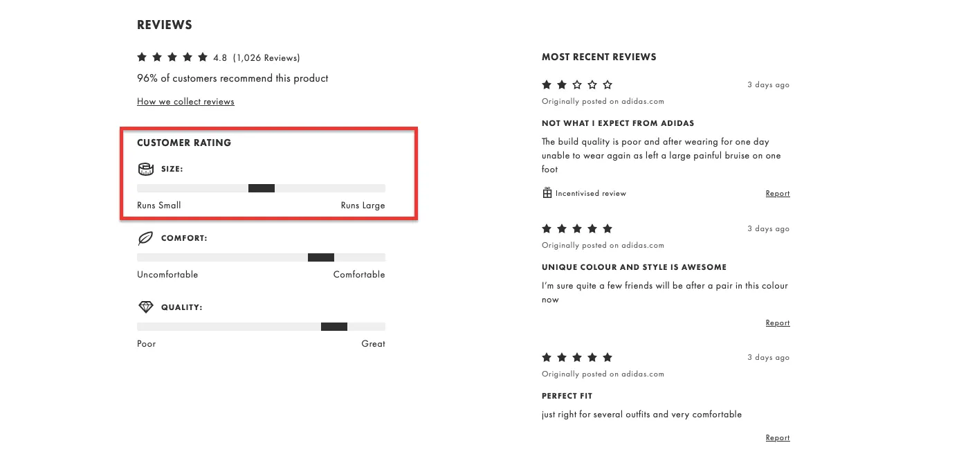
2. Variant-Level Social Proof
Reviews, as a concept, are wonderful.
The problem is that most online stores deploy them in a way that, if we're being honest, is almost completely useless. You find a jacket you like, read forty-seven glowing reviews, order it in green, and discover that the green version looks nothing like the photograph and fits like a bin bag.
The reviews, it turns out, were all about the navy one. Sensible stores have started fixing this with something called variant-level social proof, which sounds technical but is really just common sense wearing a lanyard.
Instead of one blended rating, each colour, size, or style gets its own score:
Black ⭐ 4.7 from 92 buyers Red ⭐ 3.9 from 17 buyers
Suddenly, you know exactly what you're getting. Hesitation drops. Confidence rises. People buy things. Everyone, more or less, wins.
3. Real-Time Demand Signals
There is a particular type of restaurant that always seems full. You walk past, see the bustle and clatter through the window, and immediately want to eat there, despite having no idea whether the food is any good.
Humans, it turns out, are remarkably easy to influence when other humans are visibly doing something.
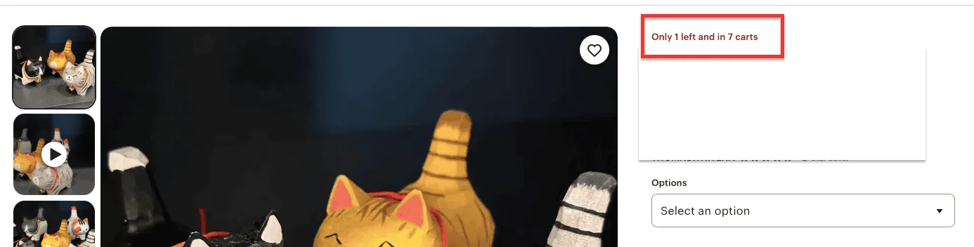
eCommerce stores have worked this out. Not with the old, faintly desperate scarcity popups — "Only 2 left!!!" — which everyone learned to ignore, but with something more honest: real-time demand signals.
"54 people viewed this product today.""18 orders placed in the last hour.""Popular in California right now."
These aren't tricks. They're genuine, live-updated signals that tell a shopper something useful: other people are interested in this thing. It’s like showcasing a restaurant full of people.
4. "Why People Buy This" Sections
Most product descriptions, if we're being charitable, read as though they were written by someone who had never actually used the product, or indeed met a human being.
"Premium quality. Exceptional craftsmanship. Elevate your lifestyle." It is, as a genre of writing, essentially meaningless.
Which makes it all the more refreshing when a store simply tells you, in plain English, why real customers actually bought the thing.
Comfortable for long flights. Fits wide feet. Lightweight for travel.
These snippets, pulled intelligently from review data using AI summarisation tools, cut straight to what a shopper actually wants to know. Not the marketing version. The true version, assembled from hundreds of genuine opinions.
The effect is immediate. Doubt shrinks. The internal monologue shifts from "but will it work for me?" to "oh, that's exactly me."
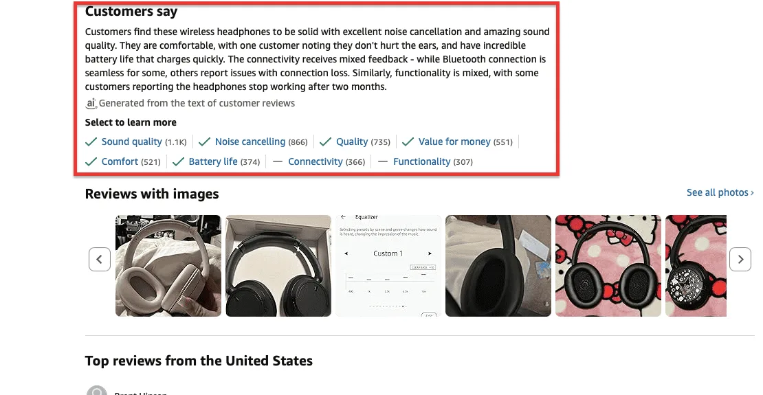
5. AI-Summarized Reviews
Two hundred reviews sounds like a good problem to have. And it is, right up until the moment a shopper has to actually read them. At that point, it becomes an endurance sport.
Page after page of opinions, contradictions, the occasional baffling non-sequitur about shipping, and somewhere buried in there, the one detail the shopper actually needed.
The fix is elegant in its simplicity. Before the reviews, a short AI-generated summary:
Extremely comfortable. Runs slightly large. Great for daily wear.
Three lines. Fifteen seconds. And it’s so much easier to decide.
The reviews still sit below for the thoroughgoing types who genuinely enjoy reading two hundred opinions, but most shoppers get everything they need from the summary alone. It almost feels like a friend who has already done the research and says, simply: "Get it, but size up."
6. "Frequently Bought Instead Of" Sections
The "Frequently Bought Together" section is a staple of online retail and a perfectly fine one. But it answers a question most shoppers aren't actually asking.
The question most shoppers are actually asking, at the precise moment they're hovering over a product, is: "Is this the right one, or should I get the other one?"
That is the question this clever little pattern answers directly.
Customers chose this over Product B. Key differences: lighter, simpler, better for beginners. It is, in essence, the store doing the comparison shopping on the customer's behalf, which is exactly what a good salesperson would do.
7. Dynamic Product Page Sections Based on Traffic Source
Consider two shoppers landing on the same product page within minutes of each other. The first arrived via Google, having typed "best noise-cancelling headphones under $200," they want specs, comparisons, and technical reassurance.
The second tapped through from an Instagram Reel showing someone looking terrifically relaxed on a sun-drenched terrace, they want atmosphere, story, and feeling.
Showing both shoppers an identical page is, if you think about it, a little odd.
Smart brands have started fixing this. Arrive from Google, and the page leads with specs and comparisons. Arrive from Instagram, and it leads with visuals and lifestyle context. Arrive from a paid ad, and you see direct buying triggers fast.
The technology, once complicated, is now accessible through AI personalisation tools. Same product, same page; just wearing slightly different clothes depending on who walked through the door.
8. Pre-Purchase Fit Predictions
Online clothing returns are, by any measure, a spectacular problem. Shoppers order three sizes, keep one, send two back, and somewhere, a warehouse operative sighs and adds it to the pile.
Billions of pounds worth of clothing is returned every year. It is, from almost every angle, a tremendous waste of everyone's time. The solution, it turns out, was hiding in the data all along.
"Based on 1,243 purchases, people with your profile prefer size M."
That single sentence, generated by analysing body measurements, past purchases, and return patterns across thousands of transactions, does something remarkable. It removes the guess. The shopper stops agonising, places one order, and the right item arrives.
9. Post-Add-to-Cart Product Explainers
The moment a shopper clicks "Add to Cart" is, in retail terms, rather wonderful. They've decided. The battle is largely won. And yet most stores respond to this small triumph by doing absolutely nothing, leaving the shopper to wander off, doubt creeping quietly back in, wondering if they've made a terrible mistake.
Smarter stores have started filling this moment with something genuinely useful.
"Here's how to get the most out of this product.""Most customers pair this with…"
A short, well-placed explainer that arrives at exactly the right moment not before, when it overwhelms, but after, when it reassures. It answers the questions the shopper didn't know they had, nudges average order value upward, and sends people to checkout feeling confident rather than vaguely anxious.
A small intervention. A surprisingly large effect.
10. Micro "Proof Blocks" Instead of Testimonials
The full-length testimonial has had a good run. A photograph of a satisfied customer, a paragraph of enthusiasm, a name, and a city.
Heartwarming, in its way. Also, if we're being honest, something almost nobody reads anymore. Which is precisely why micro proof blocks work so well.
320,000 units sold. Featured in GQ. 4.8 rating from 9,000 buyers.
Three facts. One line. Positioned right where the doubt lives directly beside the button. Doubt, at that point, has very little left to work with.
11. Compare With Your Last Purchase
Returning customers are, we all know, the very best kind. They already trust you.
They've navigated your checkout once and survived. They are, in every meaningful sense, most of the way there, and yet most stores don’t greet them like strangers. The smarter move is to remember them.
"Similar to what you bought last time."
Six words that do something powerful: they collapse the entire decision journey. The returning shopper doesn't browse from scratch, doesn't re-establish their preferences, and doesn't wonder if the sizing runs the same.
They see something familiar, recognise it as relevant, and move straight to checkout. It is, essentially, the digital equivalent of a shopkeeper who remembers your name. Which, as anyone who has experienced it knows, is rather lovely.
12. "Shop the Problem" Navigation
Nobody, in the history of online shopping, has ever woken up and thought: "I need to browse the Accessories category. "People don't think in categories. They think in problems. They think: I have a long-haul flight on Thursday and my feet are going to be miserable. Or: I need something that survives a British autumn without looking like I've given up.
And yet, for decades, online stores have organised themselves around the warehouse logic of the people selling things, rather than the actual mental state of the people buying them.
"Shop by Need" navigation fixes this with disarming simplicity.
Travel. Work. Everyday Comfort. Rainy Weather.
The shopper arrives, sees their problem listed plainly, clicks once, and finds themselves exactly where they need to be. No rummaging. No wrong turns. No accidentally ending up in Accessories.
13. AI Shopping Concierge on High-Traffic Stores
Many large online stores can feel exhausting. You arrive knowing roughly what you want, click into a category, and find yourself confronted with 470 products, a sidebar of filters, and the dawning realisation that you will be here for some time. It feels like an overstocked department store without any staff.
The AI shopping concierge is, essentially, a member of staff.
"Tell me your use case, and I'll recommend the best product."
The customer explains their situation in plain language. The assistant listens, thinks, and hands them three sensible options. For high-traffic stores carrying hundreds of products, it is less a luxury than an act of basic courtesy toward the shopper.
14. Decision Speed Indicators
One of the sources of online shopping misery is the paralysis of infinite choice. Not the choosing itself, but the nagging suspicion that choosing should take longer.
Decision speed indicators gently dissolve this anxiety.
"Most shoppers decide on this product in under 30 seconds.""Chosen by 1 in 3 visitors."
These signals do something subtle but powerful: they grant the shopper permission to trust their instincts. Apparently, other people didn't agonise. Other people looked, decided, and got on with their day. Perhaps you can too. It’s more like a quiet word from someone sensible, saying: "This one's straightforward; you'll be fine."
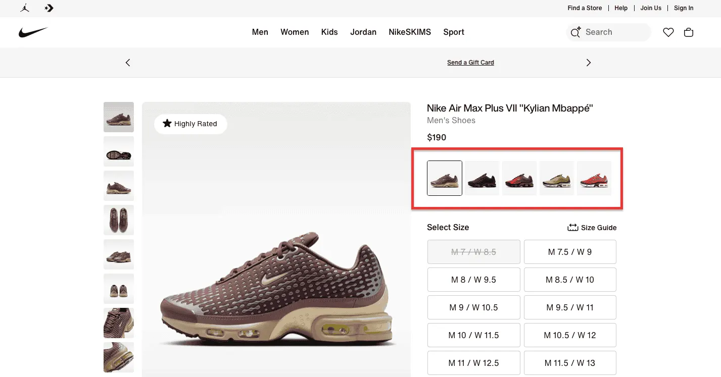
15. Variant Visualizers
The dropdown menu is one of those design decisions that made perfect sense to someone, somewhere, at some point in history, and has been failing shoppers ever since.
The customer clicks a little arrow, scrolls through a list of colour names Midnight Teal, Dusty Rose, Classic Mocha, and attempts to make a purchasing decision based on a word. A word that, in the case of Midnight Teal, could mean almost anything.
Variant visualizers fix this by doing something almost radical in its simplicity: they show you the thing.
Colours, styles, and finishes appear as actual visual panels, side by side, immediately comparable without a single click of a dropdown. The difference between options becomes obvious rather than theoretical.
Uncertainty, which had been doing rather well up to this point, runs out of material. The shopper sees, decides, and buys. Exactly as it should be.
Final Thoughts
There’s a temptation, when faced with a list like this, to feel that one must implement all fifteen ideas simultaneously to tear apart the store, rebuild it from scratch, and emerge triumphant sometime around next spring.
This would be, in the kindest possible terms, a mistake.
The stores that have seen the most meaningful gains over the last six months didn't overhaul everything at once. They picked one friction point, fixed it thoughtfully, watched what happened, and moved to the next. Small, considered improvements, compounding over time. It is, as approaches go, deeply unglamorous and extraordinarily effective.
The ideas in this post aren't theoretical. They're working right now, in real stores, for real shoppers who’re buying more confidently.
The question, really, is simply: which one do you start with?
Not sure where your store is losing sales?
We offer a free eCommerce audit, a plain-English look at where shoppers are dropping off, hesitating, or leaving through the back door. No jargon, no pushy sales call. Just an honest assessment of what's working, what isn't, and where the quickest wins are hiding.


.avif)
.svg)

.svg)

.svg)
.svg)
