Conversion Optimization

Order Confirmation Page: 25 Best Practices (+ Great examples)

Most order confirmation pages are dull. Let's change that. Here are 25 great examples, and best practices for eComm stores.

Order Confirmation Page: 25 Best Practices (+ Great examples)

Your eCommerce site has a low-hanging fruit that you’re oblivious of. 

When your focus is on the homepage and product pages, you’d likely miss this. 

Enter the dark horse of eCommerce sites, the Order Confirmation page can be optimized for more conversions, customer retention, and loyalty. 

Here’re 25 order confirmation page best practices backed by great examples to help create your own. 

1. Start the conversation by confirming the transaction 

Confirming the transaction provides reassurance that the payment has been successful. 

And, that’s the basic purpose of an order confirmation page. It eliminates panic among customers by sending a trust signal that their money has reached the right destination. 

An order confirmation is a vital cog in the overall user experience. Shockingly, 88% of customers won’t return to a site after a bad user experience. 

Marks & Spencer has an order confirmation page that is simple yet effective. It conveys the message that the order has been confirmed. It informs the user that an email has been sent to their email address. 

order confirmation page: Mark & Spencer

Takeaways

  • Cognitive ease: Cognitive ease is the measure of how easy it is for our brains to process information. The font size is big for Thank you for your order compared to the rest of the page. This makes it easier for the customers to read. 
  • Color combination: The font color complements the whitespace effectively conveying a positive image about the brand. Colors shape a  customer’s perception of a brand. Marks & Spencer scores big in user experience and that’s a great win.

Pro Tip — Use the 60:30:10 rule, a principle that uses a balanced and visually appealing color palette. A dominant color constitutes 60% of the palette. The secondary color makes up 30% while the accent color occupying 10% is used for emphasis. 

2. Give a quick overview (Include order summary)

Right after you confirm the order, jump right into the order summary. 

Order summary breaks down the total amount of the purchase order.  It is essential as customers get to know that the pricing offered is transparent. It helps your buyers feel assured that there are no hidden costs. 

In short — Offer what was promised 

49% of the shoppers abandon carts because the additional costs are too high. The rates are further going to increase if you’re not going to be honest with your pricing.  

American Eagle lists the order summary on its order confirmation page. It breaks down the entire pricing right from the order number, the price for the merchandise, shipping, and tax. 

order confirmation page design: Quick overview

What makes it stand out is the promise that the credit card won't be charged until the order ships. 

Takeaways 

  • Rules out buyer’s remorse: Mentioning the customer support details under Have a Question? makes it easy to access customer support. It mandates printing this order to use it as a receipt for returns. This effectively rules out buyer’s remorse.
  • Honesty: The tax has a question mark that hovers mentioning the tax charged. It is being upfront about the tax being calculated. This is honesty and ethical on part of American Eagle. 

Pro Tip —  Put up a 30-day returns day or price match guarantee to send better trust signals on your checkout and order confirmation pages. 

3. We all appreciate smart copy but keep it simple here

You’ve done the hard bit: the customer has made a purchase.

All they need to know now is how, where, when, and what they will receive.

So, keep it simple. Use clear and concise language.

Avoid jargon and make sure the page is easy to understand.

There are a few key things that your copy for the order confirmation page should include:

1. A clear headline that states what the page is. For example, "Thank you for your order!"

2. A summary of the customer's order, including item names, quantities, and prices.

3. The customer's shipping information, so they know where their order will be sent.

4. The customer care contact information, in case there are any issues with the order.

5. A strong call-to-action to encourage the customer to complete their purchase.

6. A thank you message and/or an incentive for the customer to shop with you again in the future.

Check out how H&M structures its copy to be simple and yet on brand with its ethos.

confirm your order: Simple copy

Takeaways

  • Copy hierarchy: Try creating an order for your copy. Structure it in a way that flows naturally and answers customer questions right as they occur.
  • Use minimal copy: Talk only as much as is necessary and avoid the rest. You don’t want repetition and unnecessary jargon to burden the customer.

Pro Tip — Always stick to your brand voice. Remember brands like Quip, Chewy, and Poo Pourri? Know why they stand out? Because they’ve tuned their brand voice to be that memorable. The minute their page pops up, you know it’s them.

4. Encourage account creation for a 1:1 relationship

Account creation enables a better opportunity to connect with your customers. Unfortunately, it isn’t easy. 24% of customers abandon carts because of the compulsion to create an account. 

Well, things don’t change for the better after purchase. Your odds of customer retention are bleak unless you create personalized relationships with first-time buyers. 

Staples encourages account creation by listing out the benefits that come with it. 

order confirmation page examples: Account creation

First, it emphasizes one click which makes account creation easy. With faster checkout, easy reordering, and access to order history, it is offering a better customer experience. 

Takeaways

  • Reciprocity: The principle of reciprocity states that human beings are wired to return favors when they have received. In this case, Staples is providing benefits in return for account creation. 
  • Offering an upgrade: By offering the Staples Plus membership, it communicates irresistible benefits such as no minimum order, 10% back in rewards on ink and toner, and guaranteed lowest prices on 5 favorites, is a smart way to encourage account creation through the way of upgrade. Thus, there’s no room for choice paralysis. 

Pro Tip — Allow users to log in using a one-time password or biometric login 

5. Don’t keep them guessing (Offer information on delivery & shipping timelines) 

The payment has been made, and the order has been confirmed, but what else are you missing out on? 

Delivery & shipping timelines, it is. 

Letting your customers know upfront the estimated delivery time makes them assured. 

Late deliveries aren’t something eCommerce customers tolerate. As per an Oracle study, 13% of customers would never order from an eCommerce store in the event of late delivery. 

In a nutshell — If faster delivery isn’t possible, don’t mess it up with a late delivery and deliver on time. 

Walmart mentions the expected delivery date and an option to track the order status. It makes tracking  easy by sending an email to the customer once the item starts shipping. 

confirmation page: remove guesswork

Takeaways 

  • Typography: Typography is more than just font. Walmart has chosen varying sizes and colors for fonts, remarkably contributing to a positive UI. When used effectively, typography increases usability and  garners users’ attention thereby increasing conversion rates
  • Smooth customer journey: Post-purchase decision is a crucial bit in customer retention. By including a link to order status, customers can view the status without having to contact customer support. 

P.S. —  On average, the US customers check their order status 3.9 times post purchase

Pro Tip — Include FAQs on your order confirmation page can educate customers and help reduce return rates

Understandably, eCommerce businesses might be hit with problems, and if you’re skeptical of making on-time deliveries, be honest with your customers. 

If it isn't obvious, honesty is an important factor when it comes to customer experience.

Here is an order confirmation page from Hayneedle informing customers about the possible delay due to internal problems. 

purchase confirmation page: FAQs
Thank us later: Free Shipping: Still a Conversion Driver in 2022? (+ Brands Nailing It)

6. Address the elephant in the room (Include cancellation and return policies)

Returns and cancellation policies are things most eCommerce brands simply find hard to address. 

But, the hard truth is both of these are inevitable realities. Just a heads up, 44% of US customers have returned an item bought online. 

Including cancellation and return policies build trust, loyalty, and a positive opinion about your brand. 

Case in point, Everlane hits the nail on the head by including cancellation and return policies on its order confirmation page. 

order complete page: cancellation and return policy

Well well,  what have we got here?

Allows cancellation within an hour of purchase

Easy cancellation. Check 

Returns are accepted within 30 days of purchase if the price tag and the item are intact. It even adds a link to the returns page making it easy to make a return. 

Fair return policy? Double-check 

This is an order confirmation template that you must take inspiration from and your customer satisfaction levels will soar high. 

Takeaways

  • Customer centricity: By including cancellation and return policies, Everlane has demonstrated that it values its customers. 
  • Sustainable marketing: Everlane subtly conveys its sustainable efforts in building a transparent and eco-friendly supply chain. In a recent poll, 77% of customers opined that sustainability and eco-friendly initiatives were the deciding factors in being loyal to the brand. This deserves kudos. 

Pro-Tip — Add testimonials of pleasant customer experiences featuring returns on your order confirmation page. Social proof advocates brand credibility quite convincingly. 

You'll love reading Reduce eCommerce Returns with Intelligent UX (+ Smart Handling ideas)

7. Highlight contact information for customer support

81% of customers opine that a positive customer service experience increases the odds of making a second purchase. 

While the cost of poor customer service is devastating beyond comprehension. 

Shockingly, US eCommerce brands lose $62 billion every year solely due to bad customer service. 

This is where you can step up and take corrective actions. 

Including your customer support information on your order confirmation page template can help you build a pleasant post-purchase customer experience. 

order confirmation page template: customer support

Musician’s Friend includes the contact information and FAQs on the mid-page. This makes it easy for customers to reach out to customer support. Ease of access is crucial when it comes to customer experience. 

In case you weren’t aware, 61% of customers switch to a competitor after poor customer service. 

Build for convenience, and optimize for gains. 

Takeaways

  • Contact info: Musician’s Friend has included the customer support phone number and offers convenience. Contrary to common practice, eCommerce brands include it at the bottom of the page which hurts your customer retention rates. 

         Besides, the phone is the preferred mode of communication for 76% of customers

  • Customer Support Center: By directing customers to use the knowledge base, it is ensuring customers find a solution by themselves. This increases the average page on time leading to higher engagement rates. 

Pro Tip — Prioritize human interactions. While the world is pro automation, human interactions are better when it comes to resolving problems. Interestingly, 75% of customers would still prefer to talk to a real person even as the automated solutions technology improves.

8. Make it memorable (bring in fun visuals)

If you want to ensure that your eCommerce customers have a positive experience with your brand, it's important to have a well-designed order confirmation page.

And that does not mean it needs to be the same boring templated pattern available on the internet.

Instead, make sure the page is visually appealing.

Use your brand's colors and logo, and make sure the layout is easy to navigate.

Incorporate fun visual elements that will leave a lasting impression on your customers.

Something as simple as what Chewy does below.

confirm order page: GIFs

Takeaways

  • Incorporate a brand mascot: Everyone loves a mascot. If you have one for your brand, make it a point to have them say ‘thank you’ or a close equivalent in your brand language.
  • Stick to your brand palette: Remember to maintain consistency even when you’re trying to be creative. That often makes the most impact.

Pro Tip — Be careful with animation: It may look great but it can hamper speed. Instead, incorporate quick-file animations that load at half the speed with a slightly lower resolution quality

9. Entice customers with a loyalty/reward program

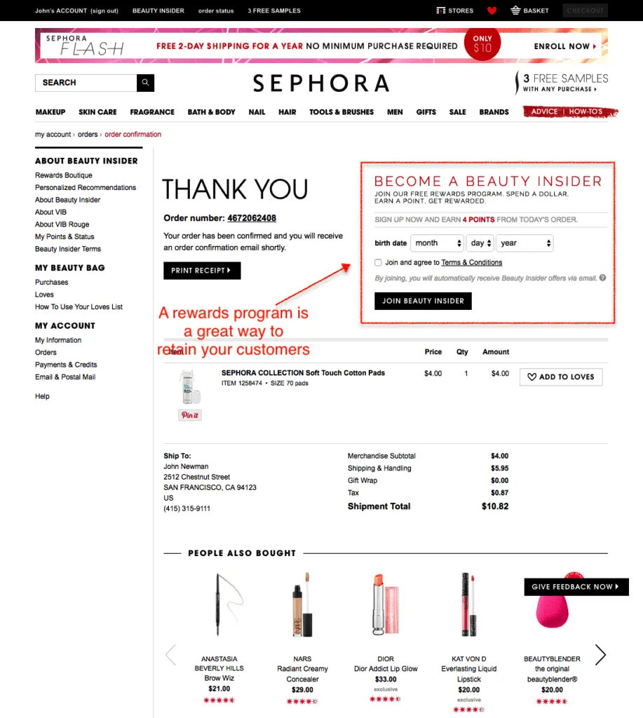
Loyalty and reward programs are often underutilized. Blame it on lack of awareness or simply ignorance, loyalty/reward programs have substantial benefits. 

Purely from a customer retention perspective, 84% of consumers are more likely to stick to a brand that offers loyalty programs. 

Your order confirmation page is the best place to show your loyalty or rewards program. 

Why?

It offers better visibility and helps build a positive post purchase experience

GAP talks about its Gap good rewards program by conveying the value in numbers. For every $1 spent, the customer gets 2 points. With 500 points, the customer gets a $5 reward. 

confirm order page: loyalty program

The loyalty program is a thumbs up — 

  • It doesn’t have hard math 
  • Mentions the places where redeems can be claimed
  • Applicable brands like Banana Republic, Old Navy, and Athleta

With enough information, this sells quite compellingly. In fact, 66% of customers state that the ability to earn rewards increases their spending behavior. 

Takeaways 

  • Color combination: The colors used complement each other highlighting the content well. This is going to make heads turn. 
  • Fewer form fields:  Shorter form lengths significantly have higher conversion rates. As per a study, reducing the form fields to four or less can significantly improve conversion rates by 160%.

Pro Tip — Adding customer testimonials for your loyalty reward program can boost your conversion rates 

Here's your gift: 14 eCommerce Loyalty Programs Backed By Science (Examples)

10. Keep the conversation going (include social media buttons)

The order confirmation page does not need to be the end.

Instead, tell customers how they can continue to keep in touch. A great way is with social media.

This not only helps build some level of social proof but also works in line with a comprehensive marketing plan.

Cover them on all grounds, right?

Check out how Bombshe does that here.

order confirmation ux: Social media buttons

Takeaways

  • Enable social sharing: Make it easy for your customers to share their purchases on social media. Include social media sharing buttons on your order confirmation page.
  • Reward customers for engagement: Top that off with a loyalty program that rewards customers for engaging with your social media. A good example is Jones Soda Co.

Pro Tip — Use your social media page as a landing page. When customers move there from the order confirmation page, it’ll have a greater impact if they can immediately see user-generated content, social proof, store policy, influencer content, etc. (Helps keep the buyer remorse at bay!)

11. Make a nudge (cross-sell & feature related recommendations) 

 Vying for your customer’s attention is a tough task to pull. Being pushy only makes matters worse. 

This is where nudge marketing can turn around things. For the uninitiated, Nudge Marketing is a long-term strategy encouraging visitors to make quick decisions using subtle or direct prompts. 

In simple words, sell it to customers without making it obvious. 

Overstock uses a simple nudge on its order confirmation page.

Forget something? It’s not too late to add these items to your order 

It doesn’t force customers to buy and the price marked in red works as a persuasion tactic to increase the average order value (AOV). 

order confirmation ux: cross-sell and upsell

It also offers product recommendations and shows social proof. Customers only consider buying from a business that has a minimum 3.3 star rating.  

Takeaways 

  • CTA Button: Colors have a larger impact on the conversion rates. In this case, the green CTA button for the cross-sell nudge enables cognitive ease helping understand information easily. 
  • Return Policy: Overstock mentions that the product is sold by Unique Bargains and the returns policy might differ from theirs. It provides the contact information of the retailer enabling transparency.

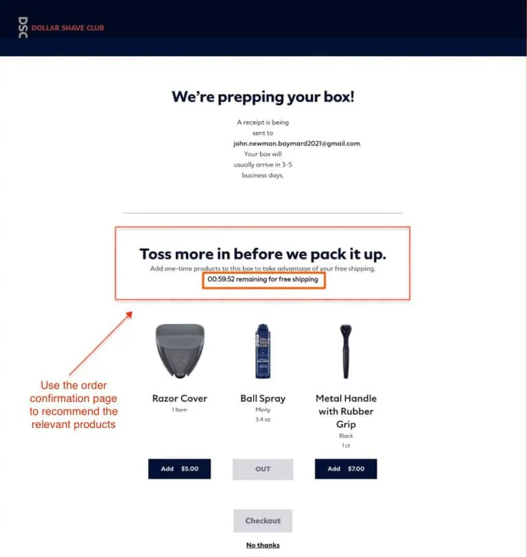
Pro Tip — Including a timer on the order confirmation template can increase conversions. Dollar Shave Club offers free shipping and uses FOMO to drive customers to add complementary items. 

This is a landmark eCommerce order confirmation page that raises the bar high for nudge marketing. 

confirmation page examples: countdown timer
Learn how successful nudges work: 25 Best Examples of Nudge Marketing in eCommerce

12. Use a promotion to incentivize the next purchase 

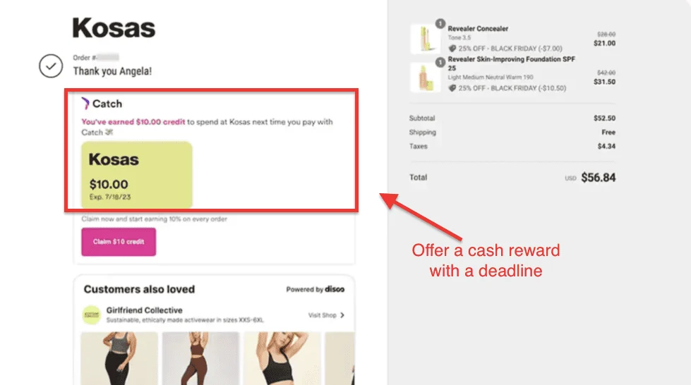
Promotions are an evergreen tool to use as an incentive to compel customers to make a second purchase. 

While they have been used since time immemorial, do you know why they work? 

Here’s the science behind it.

a) Coupons equal happiness 

In a study by Claremont Graduate University, researchers were keen on studying how coupons influenced people’s happiness. 

During the study, it was discovered that respondents who received a $10 coupon experienced a 38% increase in oxytocin levels and were 11% happier than those who didn’t receive it. 

b) Discounts encourage new experiments 

Buying products from an unfamiliar brand (for the first time) without any personal recommendations puts customers on tenterhooks. 

Discounts remove this apprehension aka buyers remorse. In a study by RetailMeNot, 4 in 5 customers opined that they feel encouraged to make a first-time purchase from a brand that offered a discount or a coupon. 

c) Promotions trigger impulsive purchases 

Promotions convey an emotional appeal which leads to impulsive shopping behavior. 

Backing this up, a study by Retailmenot found that two-thirds of customers made a purchase they had never planned. 

Hayneedle gives a 12% discount on the next purchase on its order confirmation page. It provides a coupon code to avail the same. 

order page: impulse tri

Takeaways

  • Placement: The coupon code is placed just below the order details which makes it highly likely for the customer to see the promo coupon. The 30-day validity period works well to drive a sense of urgency.
  • Delivery Method: The order confirmation page mentions the delivery method used here. FedEx ground delivery is a low-cost shipping service and has a reputation for being efficient. This sends trust signals to customers expecting the delivery. 

Pro Tip — Drive your app installs by offering a discount on a minimum order value purchase. For instance, offer $10 off any purchase above $25 on your app.

13. Enable email opt-ins for newsletters

Email lists are a golden goose. Agree to disagree.  

While email marketing has a staggering ROI of $38 for every penny spent, the number is only going to increase. If these stats are anything to go by, the number of emails sent and received per day is expected to reach 347 billion by 2023. 

While order confirmation pages are not the first choice for email conversions, you’re simply conforming to norms. 

Crate & Barrel offers a discount as an incentive to get eCommerce buyers to subscribe. 

This is unique and takes a fresh approach to email optins. 

confirmation page ui: email optin

It doesn’t stick to cliches such Subscribe to get more coupons in your inbox or Find the latest deals only for you 

It uses numbers and numbers speak louder than words. It communicates value. 

Save 10% today is a clear effort-to-reward incentive. 

Simply put, numbers displace vagueness over value. 

Takeaways

  • Color distinction: Save 10% today* is marked in red which helps in easily processing the information. That’s brownie points for a good user experience. 
  • Directions to its other site: Crate & Barrel has listed its other site CB2 which is an effective way to ensure high visibility thereby creating brand awareness. 

Pro Tip — Provide options frequency for customers to choose the frequency of emails they would like to receive in a week. If GDPR applies to you, have a trust badge certifying the same ensures security and assurance. 

14. Offer resources that support their purchase (eg: guides on how to use a product) 

Product recommendations are the only way to get customers to discover our products aka product discovery. 

Or so you thought. 

Using resources like blogs and videos can help in nurturing your first-time buyers into returning customers. 

It helps fill in the gaps in your eCommerce customer journey. While the majority of eCommerce sites have educating content, unfortunately, they’re limited to their product pages

By including educational content on your order confirmation pages, you’re building a road to a holistic post-purchase customer experience. 

Here’s how Fitbit does it astutely.  It works because it doesn’t sound like a typical sales pitch. It conveys two value propositions — Making a healthy habit and a better sleep experience. 

Serves its purpose, doesn’t it? 

checkout confirmation page: educational content

Takeaways 

  • Visuals: The visuals are high-quality and work in catching the attention of customers. There’s a science to it. Visuals are easy for the brain to understand. It can be felt in less than 1/10 of a second. The human brain processes images 60,000x times faster than plain text. 
  • Free premium upgrade: The top of the page mentions that users can access free premium content during Covid. Allowing users to experience your product beforehand can help them in product discovery. 

Pro Tip — Using user-generated content on your order confirmation page can help you persuade well. Content from real customers  drives more conversions because of authenticity and relatability. 

15. Bring in social proof (fight off buyer’s remorse)

Social proof works on the principle of conformity. It states that people will behave according to socially accepted standards and conventions that help them gain acceptance and validation from society. 

In eCommerce, it works similarly albeit with a twist — If others are recommending it, it must be good. 

Research has shown that 70% of the customers trust a recommendation from some they don’t personally know. 

Williams Sonoma uses social proof for its product recommendations on its order confirmation page. The key reason why this makes it to our list is due to product recommendations being shown vertically. 

payment confirmation page: Social proof

As per UX principles, if you want to present the information in a way that users can see everything, vertical alignment works best. 

Not many order confirmation templates have this.

Takeaways 

  • Usability: This page scores high on usability. The CTA buttons, font, and white space make interactivity smooth for users. 
  • Page Feedback: The page has a feedback option so users can suggest improvements. This is user-centricity. 

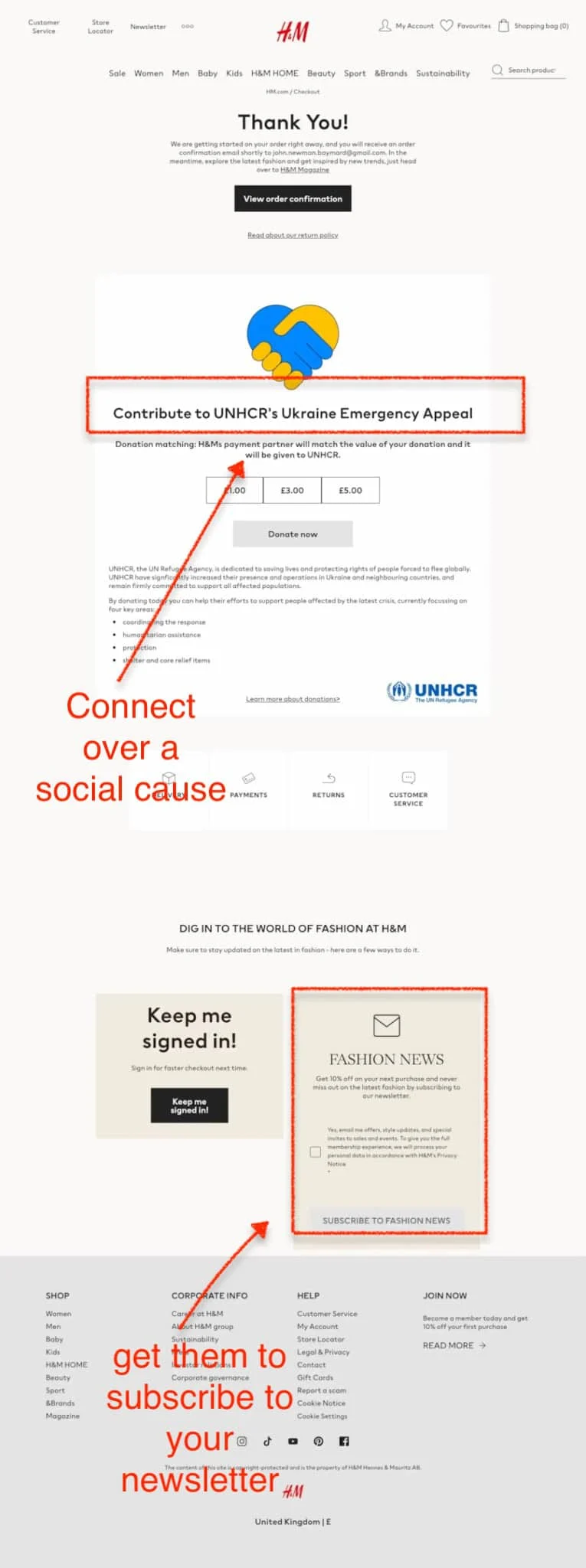
Pro Tip — Mentioning the social cause that you contribute to is a form of social proof as it shows brand credibility. 86% of customers buy from brands that are purpose driven. That’s the power of cause marketing.

Check out  eCommerce social proof: What, why & how (with proven examples)

16. Get one foot in the door (ask for feedback)

Another thing your eCommerce order confirmation page can come in handy with is collecting feedback.

Use surveys, like Crate & Barrel has done below, to get customer insights on your brand behaviour.

ecommerce order confirmation page: feedback

Takeaways

  • Have one simple form with MCQs: When it comes to getting feedback on your eCommerce order confirmation pages, you want to make sure that your customers have an easy and intuitive way to submit their feedback.
  • Don’t be afraid to ask the big stuff: Is there something more you could be doing to improve conversions? Is there something off-putting about the brand? What kind of content do customers want to see? Just ease their way into it.

Pro Tip — Build customer surveys into your larger engagement program. Keep customers moving through levels with questions becoming increasingly intimate so you can weed customers based on interest and only target the most interested ones with the important questions.

17. Bring in UGC with social media

User-generated content is content made by the customers of a brand. It includes photos, videos, reviews, social media posts, product demos, and unboxing. 

The benefits of user-generated content include:

a) Outsourcing the strenuous work to customers

Content creation is a back-breaking task. You need to loosen your purse strings because of the high production costs. You can entrust the content creation to your customers and focus your efforts on things that need desperate attention. 

b) Sends better trust signals than any other form of advertising 

72% of customers have a belief that reviews and testimonials by customers are more credible than brands talking about their products. 

This captures user attention faster than sponsored ads.

Personalization builds a better customer experience. 77% of customers opine that the odds of buying a product from brands offering a personalized experience are astronomically high. 

Moreover, 63% of customers believe that video testimonials are more trustworthy than written testimonials. 

So, why would you not use user-generated content?

c) Builds a positive brand image 

Humans don’t like self-centered people who brag too much. 

This holds true for brands as well. 

Gut instincts are better bluff detectors. 45% of the online customers unfollow brands that do excessive self-promotion

And, customers can identify when brands are advertising, however subtle it might seem. 78% of customers can feel and tell when a brand is advertising to them.

Here is an example of how Wayfair encourages the creation of user-generated content on its order confirmation page. It asks users to upload images using the hashtag #wayfairatHome on Facebook, Instagram, and Twitter and get a chance to be featured. 

confirmation pages: UGC

Using social media for featuring user-generated content is a great way to unlock higher engagement. As per a study, 58.6% of customers stated that they would prefer to interact with content on social media

Content preference

Takeaways 

  • Community building: Asking customers to create user-generated products is a great initiative for community building. Online communities deliver an overall ROI of 4, 530% for brands, leading to an average value of $682 per member per annum. 
  • FOMO: The upcoming sales and featured sales contain FOMO lines such as Ends in 4 days and starts tomorrow at 9 AM which create a sense of urgency to act. 

Pro Tip —  Do social media account takeover for a day featuring your customer. This will drive awareness and engagement. 

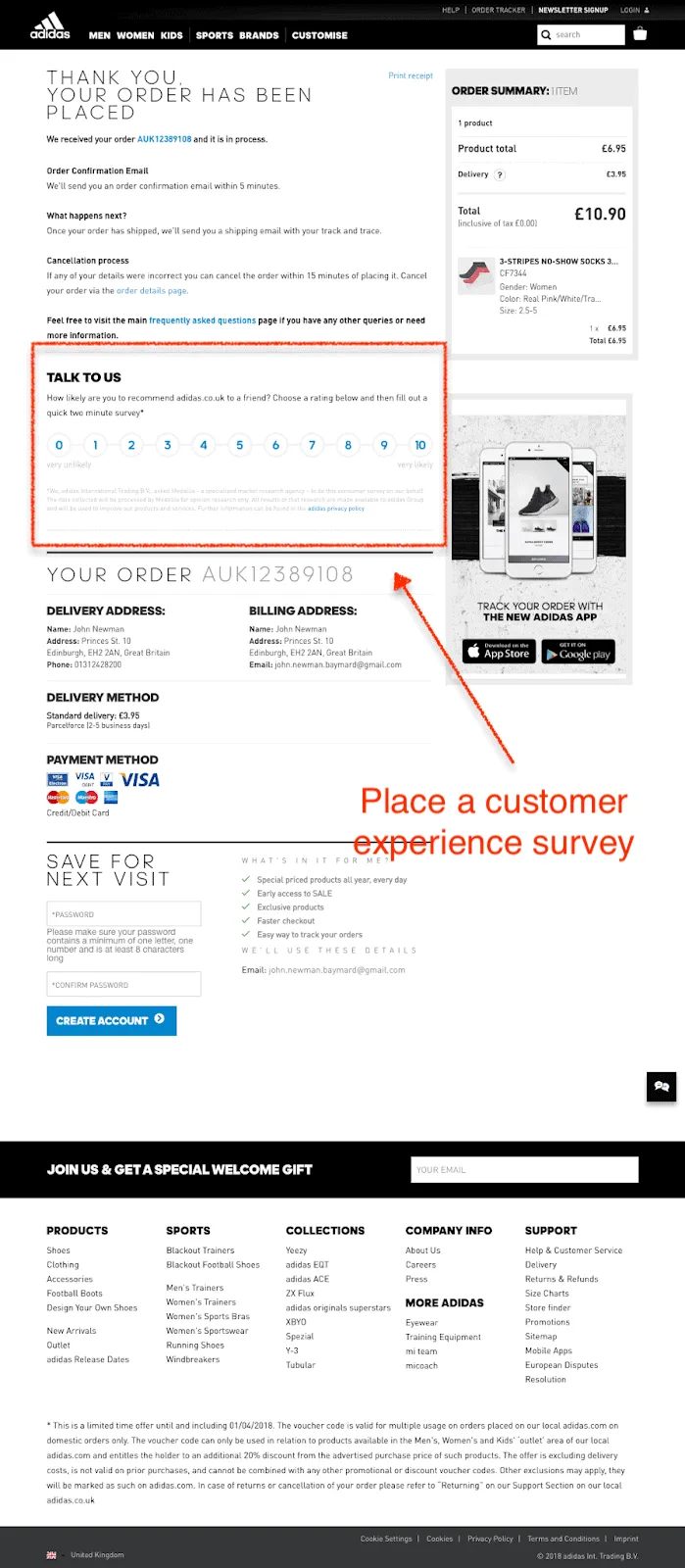
18. Run a survey to gather insights & feedback 

Running a survey after purchase can help you understand the satisfaction levels of your customers. It can help you collect insights and use them to keep improving the customer experience. 

Here’s how running a survey on your order confirmation page can help your eCommerce brand: 

a) Identify the gaps in customer experience

Humans for the larger part don’t like confrontation. The reason why for every one customer who complains, 26 others keep mum. They say nothing and leave. 

Ouch! 

By measuring the customer satisfaction levels throughout the purchase experience, you can find the areas that are lacking. It could be your product pages, customer support, product recommendations, or your payment gateway. 

You’ll know where to find the chinks in the customer journey. 

b) Recognize brand advocates 

Your customer surveys can tell one thing clearly — what makes your loyal customers stay. 

These are the customers who recommend your products to friends and family. From mentions on social media to updated reviews on third-party websites, they’re the pulse of your eCommerce brand. 

c) Demonstrates value for customer opinions

Asking for feedback conveys that you value your customers. By asking their opinions, you’re walking the extra mile to provide a hassle-free experience. 

This makes customers come back, reducing your customer acquisition costs by and large. 

ASOS includes a two-minute survey on its order confirmation page. It is placed on the right-hand side of the screen ensuring high visibility. 

order confirmation ui design: Survey

Takeaways 

  • Keeping it short: ASOS has a two-minute survey that entices customers to participate. Long surveys make customers lose interest and that’s a wasted opportunity. 
  • Sustainability: ASOS mentions that its bags and cardboards are 100% recyclable. This demonstrates its commitment to reducing the use of plastic and its efforts to contribute to an eco-friendly environment. 

Pro Tip — Incentivize surveys so that customers are motivated to fill the surveys. Offering a gift card or other incentives can increase your response rates.

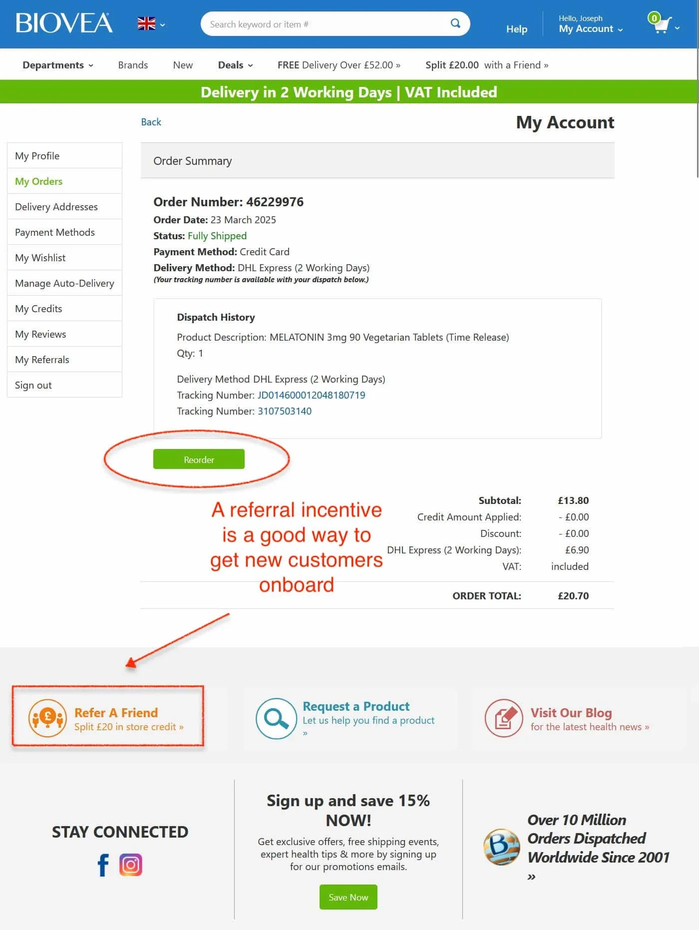
19. Reward to refer (Highlight the referral program) 

Your referral program is an economical way to drive traffic to your eCommerce store. 

It incentivizes your current customers to recommend your product to their friends and family. It's a word-of-mouth recommendation with an incentive for both parties. 

Since the order confirmation page marks the start of the post-purchase experience, your referral program can get high response rates. 

As product recommendations from a referral program, come through contented customers, you’re highly likely to see 5x referrals from satisfied customers. 

KiwiCo includes its referral program on its order confirmation page. The message is simple and clear. Every time a customer refers to their brand, and the other person makes a purchase through the link shared by the customer, both of them get $10 each. 

This is effective since the copy works like a jingle. This gets imprinted in the brain, ensuring high recall. 

payment confirmation page design: referrals

Takeaways 

  • Easy to refer: With easy-to-copy links, it makes it easier for customers to refer. The efforts required to do a task correlate with its completion rate. 
  • Share buttons: By providing share buttons for email, Facebook, Messenger, and Twitter, KiwiCo is making it easy for customers to share on channels. This ensures convenience. 

Pro Tip — You don’t always have to offer credits. Using products as rewards work as well. Using milestone rewards can help your referral program become successful. 

20. Get more with less (include the store icon)

Fun fact: You can use the order confirmation page to drive more sales.

How? By encouraging customers to keep in the loop.

There are three things you can do here:

  • Use a clever Call To Action
  • Offer a sweet Limited Time Offer
  • Make 2nd checkout SUPER easy

Run through these three steps and you’re bound to bring in a few rebound leads from customers who have already checked out.

Remember: the shopping spirit can be a real game-changer. Cash in on it.

order confirm page:

Takeaways

  • Build contrast: Whether it’s a store icon, CTA button, or quick pop-up, ensure it has enough contrast to stand apart from the rest of the content on the page.
  • Upsell or cross-sell with LTOs: The best way to bank on a last-minute LTO is with a great discount on a product that is complementary in nature to the product just purchased. 

Pro Tip — Free shipping is still a big conversion driver in 2022. When offering it here, either reduce your threshold or offer a program with zero lower value.

21. Provide enough time to edit the order 

Adding an edit option to your eCommerce order confirmation page provides customers ample time to review their orders and make changes. 

This reduces your eCommerce returns significantly since customers can remove or add to the order to their liking. 

Tesco includes an edit order option on its order confirmation page where customers can amend or cancel their order till a stipulated time. This is a major UX plus point because 91% of disappointed customers simply leave without giving feedback and never return. 

confirmation page design: Edit order

Takeaways 

  • Visual cues: The order confirmation page design includes green visual cues for the progress bar above and the order confirmation message. Studies have shown that visual cues guide the users’ attention, improve visual search, effectively improve learning speed and reduce the load of extraneous cognitive load.  
  • CTA: The CTA button for order editing is blue making it highly visible and drawing the users attention effectively. 

Pro Tip — Include a link to your returns page to educate customers about the returns process, duration, exchanges, and refund. 

22. Use tweets to create brand advocates  

UGC humanizes a brand on social media. It reinforces the purchase decision while driving a 28% engagement rate on social media. 

People love to talk about their experiences on social media. You can leverage this opportunity and create a positive brand perception. 

According to a Nosto study, the following findings were discovered—

  • 89% of customers would post about a memorable traveling experience
  • 85% of customers would put a post after a great dining experience 
  • 65% of customers are highly likely to post after a satisfying health, beauty, and spa experience 

 AWAY has an option for customers to tweet on its order confirmation page. 

order confirmation page: Tweet option

Takeaways 

  • Copy: The copy is conversational and different from the typical order confirmation messages. It uses the AIDA framework effectively leading users to the Tweet CTA. 
  • Order Summary: The order summary specifies the color, size, and quantity leaving no room for ambiguity. The total cost is calculated after giving the breakdown of costs clearly. 

Pro Tip — Include a consent checkbox for customers to encourage faster checkout in the future

23. Flaunt your certification 

As an eCommerce brand, are you socially responsible?  

Well, your customers would want to know. 77% of customers are seriously concerned about the environmental impact of their purchases. 

Backdrop adds a Climate Neutral certification, a non-profit organization working to eliminate carbon emissions. This demonstrates credibility and trust as 86% of customers choose authenticity as the factor in determining which brands to buy from. 

order confirmation page design: Standard Certification

Takeaways  

  • Customer information: Including the customer information, allows the customer to verify them. It allows them to validate the shipping and billing address and more importantly the shipping method. 
  • Order tracking: Order tracking informs the customer about the estimated delivery time and the order status via text and email. This keeps your customers in the loop. 

Pro Tip — Make sure to include information about upcoming product launches, early access, or pre-order sales to boost visibility

24. Provide order tracking options 

Providing accurate information and providing channels for information sharing is critical to your eCommerce brand’s customer retention. 

Surprisingly, 62% of Americans want brands to send texts on a regular basis in case of shipment delays or otherwise. 

Twice provides order updates via text and Route—an order tracking app. 

Takeaways 

  • Risk coverage: Providing shipping protection assures the customers of reimbursement in case orders get damaged, stolen, or lost during transit. This provides risk coverage and sends trust signals to customers. 
  • Google Maps integration: Adding Google Maps to your eCommerce order confirmation page inspires confidence in customers that their order will be shipped to the correct location. 

Pro Tip — Add a referral link to your order confirmation page incentivizing customers to drive customer acquisition 

25. Don’t be afraid to ask questions and offer pro tips 

Your eCommerce order confirmation page has plenty of real estate. So, why not make the most of it? 

Here’re two things you can do—Ask survey questions and offer pro tips 

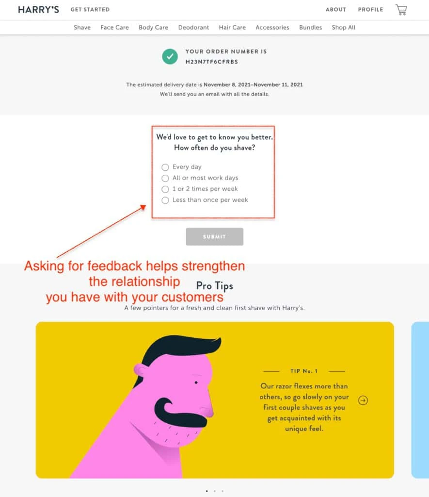
Survey questions help in data collection, improve customer experience, refine your marketing strategy, and more. Pro tips educate customers on how to make the most out of your products. 

Harry’s in its order confirmation page includes these two serving as a reminder that the post-purchase experience is just as important. 

order confirmation page examples: ask questions/offer tips

Takeaways 

  • Objective-type questions: Objective-type questions demand a single and specific answer. It helps in wide sampling leading to improved business outcomes. 
  • Carousels: Carousels enable multiple pieces of content to appear on the page without taking up too much space. Moreover, they are visually appealing, making customer interaction interactive. 

Pro Tip — Include your cause marketing and social responsibility initiatives to develop a positive brand image 

Order Confirmation Page 101 

1. Is an order confirmation page a receipt? 

Yes, the confirmation page is a receipt of the transaction made by a customer on eCommerce sites or other online sites. It consists of an acknowledgment that your payment has gone through and the order has been placed. 

Followed by this, an order confirmation email or acknowledgment is sent to the customer’s email address. 

It contains the pricing details such as shipping charges, and taxes, in other words, called the order summary. 

Not to forget the order details consisting of the items purchased. It has an option for customers to print.

Here is the order confirmation page of Walgreens which has all the basic information. 

confirmation page: Is it a receipt

2. How do you write an order confirmation? 

Writing an order confirmation includes the following prerequisites: 

a) Order Confirmation message

The order confirmation is to inform the customer that their payment has been successful and their order has been placed. 

 A typical order confirmation message goes like this — 

Thank you for your order! 

You can go ahead and add the names of the customers for personalization. 

b) Order confirmation email message

The second prerequisite includes a message notifying that an order confirmation email has been sent to the customer’s email address.  

This is the common template most eCommerce brands use. 

A confirmation email has been sent to trevorbanks09@gmail.com 

This ensures there’s a record of the transaction made. 

c) Order ID 

Mention the order ID which serves as a reference for the purchase made. This order ID serves as a reference whenever the customer faces issues with the product. The customer care representatives ask for the order ID to begin the troubleshooting process. 

d) Include the billing address

The billing address refers to the customer’s name and address mentioned during entering the credit card/other payment methods. 

e) Shipping address 

The shipping address refers to the recipient’s address such as residence or office. In some cases, the billing address and the shipping address may be different. This helps the customers cross-check and report in case of any errors. 

f) Order Summary 

The order summary includes such as the name of the product, stock keeping unit (SKU), quantity, color, size, unit price, shipping charges, taxes, and discount offered. 

g) Mode of payment 

The mode of payment mentioned helps customers whether they opted for credit card payment, net banking, or Amazon Pay. 

h) Shipping method and estimated date of delivery 

Mentioning the shipping details and the estimated delivery date helps customers feel assured. 

Details such as carrier, shipping method, the date of departure from the warehouse, and the date of arrival to the shipping address are non-negotiable. 

Adding a tracking link can help customers keep track of the shipment.

i) Mention customer support details 

Add customer support contact details so customers know whom to reach out to in case of problems. Customer support is an indispensable part of customer service. 

Unresolved problems lead to customers posting negative reviews which can severely damage your brand’s credibility. 

3. What’s the difference between an order confirmation page and an email?

An order confirmation page refers to the page on an eCommerce website that includes order confirmation message, order summary, order details, shipping and billing address. It isn’t static as it will be redirected later. 

An order confirmation email is an email sent right after the order is confirmed as soon as the payment is successful. It lands in the customer’s inbox. Unlike the order confirmation page, this will stay as it is and can be bookmarked for future reference. 

Here is an order confirmation email from Homesalive

purchase confirmation page vs email
For email inspiration: 29 easy-to-copy confirmation email templates (+ best practices & FAQs)

4. What are pre-order notes in order confirmation? 

Pre-order notes are a message informing the customer about the order being placed. The customer will be notified when the order is shipped. 

Here are the pre-order notes from The Home Depot order confirmation page. 

order complete page: Pre-order notes

5. How long does order confirmation take?

Order confirmation takes anywhere between 5 to 10 minutes. While in some cases, it could take up to 60 minutes but be warned, a customer expects an order confirmation email within 30 minutes from the time of purchase. 

Any delay will only result in a loss of trust in a brand. 

6. Is an order confirmation legally binding? 

The order confirmation serves as proof of purchase certifying that the eCommerce brand(seller) is obligated to ship and deliver it to the customer. In case, the eCommerce brand fails to fulfill the order, the customer is entitled to seek legal action against the former. 

7. What is the purpose of an order confirmation? 

The order confirmation is proof of purchase in writing. This is to inform the customer that the payment has been processed and the order will be shipped within the estimated time. 

The order confirmation serves as a reference containing order ID and order summary backing up as acknowledgment of the eCommerce brand. This is a declaration that the brand has to fulfill its duty of shipping the product to the customer. 

8. Why is order confirmation important? 

An order confirmation page is a communication by the brand to the customer that the order has been accepted. It informs the customer that the order ID, order summary, customer information like shipping and billing information, and location are accurate. 

The customer can raise a ticket with the help of the order confirmation if the product hasn’t been delivered yet. 

9. What is the difference between a purchase order and an order confirmation?

The purchase order is an administrative document issued by the importer that explicitly mentions the quantity, quality, the unit, and total price of the supplies that the supplier or vendor is obligated to provide. It contains additional information such as payment, payment terms, delivery, and delivery terms. etc. 

On the other hand, the order confirmation is a receipt of purchase and payment by a  customer to a seller or brand. It outlines the estimated delivery time and other details like order summary, order ID, shipping/billing information, and order tracking information. 

10. What is the difference between order confirmation and invoice? 

The order confirmation is a receipt of the money paid by the customer and is not helpful in the accounting process. An Invoice, on the contrary, is a time-stamped commercial document for payment(in most cases) or the original receipt that arrives with the shipped products in case of eCommerce. 

X
Conversion rate optimization
x
x
Free Guide 👉 👉

42 Irresistible Email CTAs for eCommerce Stores

DownloadGET A PRODUCT PAGE AUDIT