Lead with the "Gift": Don’t make them hunt. Put that discount, freebie, or big benefit right at the top where they can see it instantly.
The 2-Line Handshake: Briefly tell them who you are and why you’re worth their time. A strong brand hook beats a generic "Welcome" every time.
Curate the Selection: Don't dump your whole catalog on them. Show off 2–4 of your absolute bestsellers to give them a clear place to start.
Leverage the Crowd: People trust people. Drop in a review or a "Join 10,000+ happy customers" signal to build instant credibility.
Lower the Guard: Ease their anxiety with a simple "Free Returns" or "Money-Back Guarantee" mention near the footer.
The "Don't Miss Out" Nudge: A 48-72 hour expiry on their welcome offer creates a healthy reason to act now rather than "later."
One Job, One Button: Use a single, high-intent CTA. "Claim Your 15% Off" is much more enticing than a boring "Shop Now."
Design for the Thumb: Most of your customers are reading this on a phone. If it doesn't look great and tap easily on mobile, it’s not finished.
Missing even one of these is like leaving a door half-closed—conversions drop faster than you think.
Welcome emails generate 320% more revenue per email than standard promotional sends. They get 4x more opens and 5x more clicks. And yet most eCommerce stores treat them as an afterthought, a polite "thanks for signing up" fired off by an automation they set up once and never looked at again.
That is a remarkable waste of arguably the highest-leverage email in your entire marketing stack.
The problem isn't execution. It's architecture.
Most welcome emails are designed as a single moment when they should be designed as a system, a deliberate sequence built around strategic pillars.
Below, you'll find four real eCommerce welcome email examples drawn from brands that are doing this exceptionally well, each one illustrating a different conversion framework.
1. The Psychology Behind Welcome Emails (Why They Work So Well)
Before you look at a single example, it's worth understanding the psychological machinery that makes a welcome email so disproportionately powerful. These aren't just first impressions; they’re behavioral triggers, and knowing which lever you're pulling makes all the difference.
Reciprocity
When you offer a discount, a free resource, or even a warm piece of founder-written copy in your first email, you create an instinctive desire to give something back. The subscriber didn't ask for a gift. You gave one anyway. That asymmetry is surprisingly durable
Scarcity
A discount with an expiry date is not the same as a discount without one. The ticking clock activates a different part of the brain, one concerned with loss rather than gain. Loss aversion is roughly twice as powerful as the equivalent anticipation of gain, which is why "expires in 48 hours" converts better than "enjoy this whenever you like."
Social Proof
New subscribers don't yet know whether your brand is trustworthy. Peer-level validation, real reviews, real numbers, and real names collapse that uncertainty faster than any amount of brand copy can. One thousand five-star reviews in a subject line is doing a lot of heavy lifting before the email is even opened.
Authority
Expertise signals compress the sales cycle. A brand that explains why its product works with specificity, with science, with sourcing transparency earns trust that a brand relying solely on beautiful photography never quite manages.
Commitment and Consistency
Once a subscriber has signed up, they've made a small act of commitment. A well-constructed welcome email reinforces that decision, nudges them toward a slightly larger one (browsing a category, using a discount code), and begins building the habit of opening your emails.
These principles don't operate in isolation. The best welcome emails layer two or three of them together, which is exactly what you'll see in the examples that follow.
2. Elements of a High-Converting Welcome Email
Whatever pillar your welcome email is built on, these five structural elements need to be present or deliberately and thoughtfully absent.
Immediate Value
This is the first thing a subscriber should feel upon opening your email: that they've gained something. It might be a discount code, a piece of genuinely useful content, or simply the reassurance that they've made a sensible decision in signing up. "Immediate" is the operative word. Value deferred is value halved.
Brand Positioning
Your welcome email is frequently the first time a subscriber experiences your brand in a considered, designed context. It should answer, without being asked: Who are you? What do you stand for? Why does it matter? This doesn't require a lengthy manifesto. A single line of sharp, confident copy can do more work than three paragraphs of corporate boilerplate.
Product Discovery
Give new subscribers an on-ramp into your catalogue. Not the entire catalogue — a curated, confidence-inspiring selection that lowers the friction between "I signed up" and "I bought something." Think of it as a guided tour, not a warehouse.
Social Proof
Trust is not assumed; it is earned. A well-placed testimonial, a review count, or a simple "join 50,000 customers" line borrows credibility from your existing community and transfers it, almost effortlessly, to your newest subscriber.
A Clear Next-Step CTA
One email, one primary action. The subscriber should never finish reading your welcome email and wonder what they're supposed to do. The CTA should be obvious, benefit-led, and visually unmissable. "Shop Now" is fine. "Claim your 15% off" is better.
3. eCommerce Welcome Email Examples (And the Strategy Behind Each)
Pillar 1: Establishing Brand Identity & Narrative
Strategic Goal: Immediate Trust Through Story
The most common mistake in welcome emails is treating the subscriber like a customer before they feel like a member. The brands that do this exceptionally well lead not with product, but with identity, a clear, distinctive sense of who they are and what joining their world actually means.
Example: Wildwonder
Subject line: A wild and wonderful welcome
This eCommerce welcome email example from Wildwonder shows how a founder-led narrative can do more conversion work than any discount.
Example Breakdown: Why This Welcome Email Works
Wildwonder's welcome email is, at its core, a piece of founder-to-subscriber storytelling. It doesn't lead with a discount or a product grid. It leads with a letter, the kind that feels handwritten in spirit, even if it wasn't.
Behind-the-scenes photographs, a frank articulation of the brand's values, and the specific, careful language of community-building all combine to make the reader feel they've joined something, rather than merely subscribed to something.
This distinction matters enormously. "Subscribing" is passive. "Joining" is an identity act. Brands that frame their welcome email around belonging create a different kind of customer, one with higher lifetime value, higher emotional attachment, and a much greater propensity to tell others.
The conversion logic here is slower but deeper: I know who these people are. I like them. I want to buy from people I like.
What to replicate:
Open with a founder message or brand origin story, keep it specific and human, not corporate
Use imagery that shows the people behind the product, not just the product itself
Frame the subscriber as a participant in something meaningful, not just a recipient of marketing emails
Set expectations for future communications, so the relationship starts with honesty
Pillar 2: Value Reciprocity — The Economics of the First Discount
Strategic Goal: Converting Curiosity into a First Purchase
The welcome discount is not a gimmick. It is a scientifically defensible application of reciprocity, the deeply human tendency to respond to a gift with a gift. The question isn't whether to offer a discount; it's how to deploy it with enough craft and conviction that it feels like generosity rather than desperation.
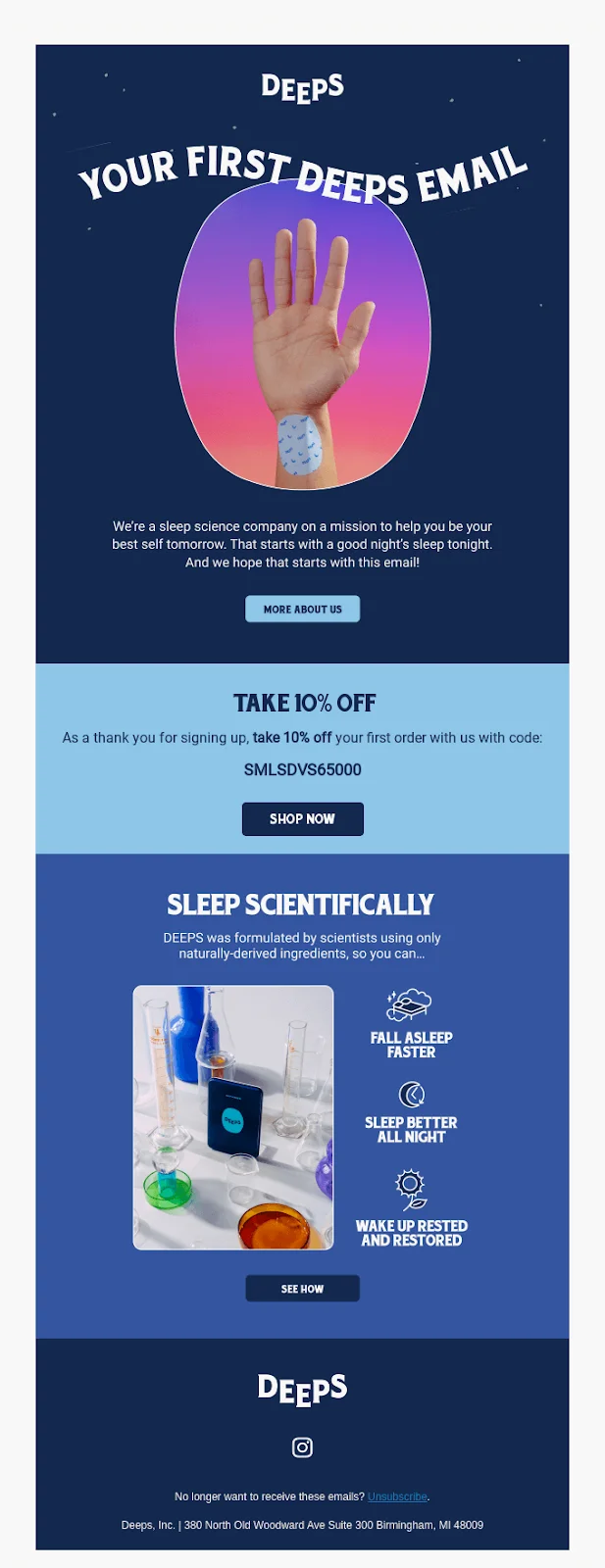
Example: Deeps
Subject line: You won't regret this
This welcome email sequence example from Deeps shows exactly how to make a discount feel like a premium gesture rather than a markdown.
Example Breakdown: Why This Welcome Email Works
Deeps' subject line is doing something interesting before the email is even opened: it is pre-emptively validating the subscriber's decision. "You won't regret this" is not a discount announcement; it's a confidence gesture. It says, in effect, we know what you're about to experience, and we're certain you'll value it.
Inside the email, the discount is positioned with intentional prominence near the top, impossible to miss, but it's immediately followed by substance: the brand's science-backed USPs, its positioning around quality and innovation, and enough specificity to make the offer feel earned rather than reflexive.
The effect is a discount that reads not as a markdown but as an invitation into a premium experience.
This is the economics of the first discount done well. The goal isn't to discount your product; it's to lower the activation energy for a first purchase while simultaneously elevating the perceived quality of what's being purchased.
What to replicate:
Position the discount offer where it will be noticed immediately above the fold, with visual emphasis
Pair the discount directly with your most compelling USP, so value and quality reinforce each other
Use scarcity (expiration date, limited-time framing) to activate loss aversion
Let your brand values, sustainability, innovation, and quality sourcing do as much conversion work as the discount itself.
Pillar 3: Psychological De-risking — Social Proof That Shortens the Sales Cycle
Strategic Goal: Collapsing Trust Deficits at Scale
New subscribers are, by definition, uncertain. They've given you their email address, a small act of faith, but they haven't yet decided whether they trust you with their credit card. The job of a de-risking welcome email is to make that leap feel less like a leap and more like an obvious next step.
Example: Material
Subject line: 1,000+ 5-star reviews
This eCommerce welcome email example from The Glenlivet shows what behavioral segmentation looks like when it's built into the very first touchpoint.
Example Breakdown: Why This Welcome Email Works
Material puts its entire conversion case in the subject line. "1,000+ 5-star reviews" is a complete argument before the email is opened. It deploys peer-level social proof, not celebrity endorsements, not brand authority, but the accumulated verdict of people who paid money and were satisfied, and it does so at the very first point of contact.
Inside the email, that argument is reinforced and expanded. Named testimonials with photographs. A clear articulation of what distinguishes the products. And critically, a risk-reversal mechanism: a money-back guarantee or easy return policy that removes the financial anxiety from a first purchase decision.
This is the architecture of trust built deliberately rather than assumed. The brand isn't asking the subscriber to take a leap of faith. It's removing the need for faith altogether by substituting evidence.
What to replicate:
Lead with your most credible social proof signal review count, star rating, press mentions, even in the subject line
Use testimonials that are specific and concrete, not generic praise ("I've used five different kitchen brands, and this is the only one I've kept")
Name real customers; ideally, include photographs, anonymised testimonials carry a fraction of the weight
Include a risk-reversal element (money-back guarantee, free returns) to eliminate the final friction point before purchase
Pillar 4: Behavioral Segmentation — Collecting Data at the Welcome Stage
Strategic Goal: Personalization That Pays Dividends Across the Entire Relationship
The previous three pillars are about what you give the subscriber. This one is about what you learn from them, and the brands that execute this well build a competitive advantage that compounds with every email they send thereafter.
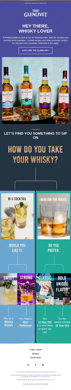
Example: The Glenlivet
Subject line: Scotch news is the best kind of news. Welcome!
This eCommerce welcome email example from The Glenlivet shows what behavioral segmentation looks like when it's built into the very first touchpoint.
Example Breakdown: Why This Welcome Email Works
The Glenlivet's welcome email does something most brands never think to do at the welcome stage: it asks a question. A short, genuinely interesting quiz about the subscriber's whisky preferences, approachable enough not to feel like work, specific enough to yield useful data, turns the welcome email into the opening move of a two-way conversation.
The strategic logic is elegant. Every subscriber who completes the quiz self-segments. They tell you what they like, what they know, what they're curious about. That information then powers every subsequent email, curated recommendations, relevant content, and personalized offers in a way that a generic email sequence simply cannot match.
There's a secondary benefit, too. The act of completing a quiz creates micro-commitment. The subscriber has invested a small amount of effort in the relationship. Psychologically, that investment makes them more likely to engage with the next email, and the one after that.
What to replicate:
Keep the quiz or preference survey to 2-3 questions maximum. Friction kills completion rates
Focus questions on preferences that directly inform your product recommendations (flavour profiles, use cases, budget ranges, experience levels)
Close the loop: send a follow-up email with quiz results, curated recommendations, and any promised incentive
Use the data to build audience segments that drive every subsequent campaign
4. eCommerce Welcome Email Examples at a Glance
If you're looking for a quick reference before diving into your own welcome email sequence, here's what each example illustrates:
Example
Brand
Strategic Pillar
The Core Move
#1
Wildwonder
Brand Affinity
A founder-led letter and community framing replace the generic discount as the primary hook.
#2
Deeps
Value Reciprocity
A discount paired with science-backed USPs makes the offer feel earned rather than desperate.
#3
Material
Psychological De-risking
Using "1,000+ five-star reviews" in the subject line collapses trust deficits before the email is even opened.
#4
The Glenlivet
Behavioral Segmentation
A quick preference quiz self-segments the audience to power highly personalized future sends.
5. How to Build Your Own Welcome Email (Practical Checklist)
Having absorbed the strategy, here is the practical sequence for building a welcome email or sequence that actually performs.
Step 1: Define Your Value Hook
Before you write a word of copy, answer this: What is the single most compelling thing your brand can offer a new subscriber right now?
It might be a discount. It might be a piece of genuinely useful content. It might be access to a community, or the reassurance of a risk-free guarantee.
Whatever it is, it needs to be immediate and specific. "Great products and amazing service" is not a value hook. "15% off your first order, valid for 72 hours" is.
Step 2: Choose Your Sequence Length
A single welcome email is better than nothing. A sequence is almost always better than a single email. The standard recommendation is 2-3 emails, spaced 2-3 days apart:
Email 1: The value hook your discount, your brand story, your social proof. Immediate, warm, high-energy.
Email 2: Deeper brand education, your values, your process, your best content. This is where you build the relationship.
Email 3: The conversion nudge is a reminder of any expiring offer, your strongest testimonials, and a clear CTA to purchase.
More than three emails risk fatigue. Fewer than two leaves on the conversion table.
Step 3: Map Content to Stages
Not every subscriber is at the same point in their decision-making journey. Some are ready to buy immediately. Others are browsing. Others signed up for a discount and have already forgotten why. Your welcome sequence should anticipate this variance:
Use urgency and social proof for subscribers who are close to a decision
Use brand narrative and education for subscribers who need more time
Use re-engagement logic (a stronger offer, a different product angle) for subscribers who haven't opened your second or third email
Step 4: Optimise Your CTAs
One primary CTA per email. It should be visually prominent, benefit-led, and frictionless. Test the following variables:
Button copy ("Shop Now" vs "Claim Your 15% Off" vs "See What's New")
Button placement (above the fold vs after social proof vs at the end of the email)
Urgency framing ("Sale ends Sunday" vs "Limited stock remaining" vs "Your discount expires in 48 hours")
The goal is not to trick subscribers into clicking, it's to remove every possible reason not to.
Frequently Asked Questions
What is an eCommerce welcome email?
An eCommerce welcome email is the first email a customer receives after subscribing to your mailing list or creating an account.
It is, statistically, the highest-performing email you will ever send and the most consequential first impression your brand makes in the inbox.
Why are welcome emails so important?
Because the subscriber's interest is at its peak the moment they sign up. 74% of customers expect a welcome email immediately after subscribing, and 45% of first-time purchases by new subscribers occur within 24 hours of opting in.
The window of maximum receptivity is narrow. A well-designed welcome email walks straight through it.
What should a welcome email include?
At minimum: a value offer, a clear brand statement, a product discovery element, some form of social proof, and a single, unambiguous CTA. The weighting of these elements depends on which strategic pillar you're building on (see above), but all five should be present in some form.
What's the best time to send a welcome email?
Immediately, or within the hour. Automation handles this reliably. Any delay longer than a few hours risks losing the subscriber's attention entirely — they've moved on, the inbox has refilled, and your email is competing with everything that arrived after it.
How do I write a welcome email subject line?
The best welcome email subject lines do one of three things: they create curiosity ("You won't regret this"), they lead with a specific benefit ("Here's your 15% off"), or they establish immediate social credibility ("1,000+ five-star reviews and counting"). Avoid generic pleasantries. "Welcome to our newsletter" is the subject line equivalent of a limp handshake.
How many emails should be in a welcome series?
Two to three, as a baseline. The first delivers immediate value and brand introduction. The second builds the relationship with deeper brand education. The third nudges toward conversion with urgency and testimonials. Some brands run sequences of five or six with great success — but the quality of each email matters far more than the quantity.
How do I measure welcome email success?
Track open rate, click-through rate, conversion rate, and — if your ESP allows — revenue attributed directly to the welcome sequence. Benchmark against your own historical data first, then against industry averages. A welcome email open rate below 40% is a subject line problem. A click-through rate below 5% is a content or CTA problem. A conversion rate below 2% is a value proposition problem.
What are the most common welcome email mistakes?
Sending a generic, impersonal email. Leading with product before establishing a brand. Offering a discount without any supporting brand narrative. Including five different CTAs and thereby effectively including none.
Not optimising for mobile (more than 60% of email is now read on a phone). And perhaps most costly of all, treating the welcome email as a one-time send rather than the opening of a multi-email sequence.
How do I A/B test my welcome email?
Isolate one variable at a time: subject line, CTA copy, discount amount, image versus no image, short copy versus long copy. Run each test for long enough to achieve statistical significance (most email marketing platforms calculate this for you).
Implement the winner, then test the next variable. Over time, this iterative process produces a welcome email that is meaningfully better than the one you started with.


.svg)

.svg)

.svg)
.svg)
