Ecommerce Growth
What Is A "Good" Funnel Conversion Rate In eCommerce?
April 29, 2025


Even seasoned eCommerce businesses don’t always see the difference between overall conversion rate and funnel conversion rate.
While the former is more popularly used and considered, the truth is that it is a single, more generic metric assessing the % of visitors who completed a desired action.
Funnel conversion rate, on the other hand, breaks down the customer journey and focuses on how users “move” to the next stage of the funnel.
For the above, some key metrics like product page views, add-to-cart instances and checkout completions become critical.
We thought of answering “what is a good funnel conversion rate?” for eCommerce businesses that seek our help through free audits and long-term CRO interventions.
But first, we need to understand…
When you’re attempting to figure out the sales funnel conversion rate in eCommerce, you must first account for the total number of visitors who enter the funnel for a given period of time.
Next, you’ll need to look at the number of people who complete the desired action for that stage of the funnel—for example, in the awareness stage, this desired action could be a micro-conversion like signing up for your newsletter in exchange for a 15% discount.
And that brings us to how to calculate funnel conversion rate for a specific stage:
Number of visitors who complete the desired action at a specific stage / Total number of visitors who entered the funnel x 100
So, what also becomes critical in funnel conversion rate calculations, is to track the “desired” steps that you’re assessing visitor data by—they often include:
→ Site visit
→ Product view
→ Add to cart
→ Checkout initiation
→ Completing checkout
In a way, if you’re calculating the funnel conversion rate between the various stages, it can look like this:
→ Visit to View Rate: Product Views / Total Visits x 100
→ Views to Cart Addition Rate: Add to Carts / Total Product Views x 100
→ Cart to Checkout Rate: Checkout Initiations / Add to Carts x 100
…and so on.
Alongside the above, of course, you’ll need to check on the conversion rate of other key touchpoints across your conversion funnel, including marketing channels, individual page conversions (which product pages are converting more or which category pages are getting more “quick add”), ad conversions (to see which ads are doing well, plus what kind of messaging / discount seems to be flying) and finally, keyword conversions (a great SEO exercise to ensure you identify the best performing keywords).
You may also want to read: 5 Stages of an eCommerce Conversion Funnel (+Examples)
While a “good” eCommerce funnel completion rate is often regarded to be about 3%, different businesses set different benchmarks based on how long they’ve been in business, what kind of product mix they offer and what their product purchase lifecycle is like.
Here, we’ll look at some of the most popular eCommerce niches and see how they’re faring:
✔ Food & Beverage: F&B is the highest grosser as far as eCommerce funnel conversion rates are considered across niches, clocking an average of 5.86% month on month - great product photos, ability to enjoy free shipping and seasonal offers seem to be key factors in this.
✔ Fashion & Apparel: With an abandonment rate of more than 77%, this niche sees a lower funnel conversion rate, which generally hovers around 3% - the top 10% stores see about 4.7% though - stores with superior navigation, mobile optimization, sizing content and product visualization see better rates!
Further Reading: 24 High-Converting Apparel Product Page Examples
✔ Luxury Goods: Amongst the not-so-great funnel conversion rates in eCommerce belong with luxury goods, with high-end fashion recording only about 0.8% - and most stores agreeing that a “good” rate is one that exceeds 1% - stores that are able to create trust, authenticity and a great brand experience see better funnel conversions.
Further Reading: How to Sell Luxury Products: 18 Unique Strategies to Boost Conversions
✔ Health & Wellness: Wellness brands can potentially see much higher funnel conversion rates at around 8.2% (whereas those in the healthcare space see about 4%) - factors that we’ve noticed to have a great bearing on this include quality of messaging, email marketing effectiveness as well as personalization (especially over email).
✔ Beauty & Cosmetics: Despite having a cart abandonment rate of around 67%, this niche sees an overall conversion rate around 4.61% - so a “good” funnel conversion rate would be anything above 5% ideally - factors that seem to bear maximum weight are personalization, UGC and free shipping.
Further Reading:
i. 40 High-converting Health/Beauty "Product Page" Examples
ii. How To Improve Healthcare eCommerce Stores’ Conversion Rate – 47 Amazing Ideas
In working with eCommerce businesses across segments spanning health & wellness, fashion, food, luggage, adult toys and more, we’ve noticed 10 key touchpoints being absolutely critical to improve funnel conversion rates:
👉 Hero header: Pay special focus on testing visuals, value propositions and microcopy at this touchpoint.
👉 Primary menu: Test various category structures and also see what happens when you alter the placement & type of featured collections.
👉 Site search: From autocomplete suggestions to visual search results and how many discounted products to show through search results, this one’s high on the funnel conversion rate transformation list - after all, site searchers are up to 3x more likely to convert!
👉 Product page hierarchy: Image size & placement as well as content sections can do with intensive testing to arrive at combinations that best serve sales funnel conversion rates.
👉 Product description form & function: Test the layout, sections, dropdowns, bullets as well as feature-focused vs. benefit-focused copy to find out what flies!
👉 Social proof elements & placement: Test review snippets and snapshots as well as how you position UGC across the homepage and product page, and make them shoppable versus not.
👉 Cart functionality: Take note whether a full cart page works or a slide-in drawer does, as well as what kind of last-minute add-ons you feature.
👉 Shipping options: Are you going to timebox free shipping or show a shipping calculator on the product page? Or would you rather show a list of shipping options including expedited ones?
👉 Payment method callouts: Whether it’s a series of logos on display right under the primary product page CTA or a single popular method shown as a secondary CTA, this is a key touchpoint to improve conversions across the eCommerce funnel.
👉 Order confirmation page: Does a discount for a next purchase work better? Or is it a short survey asking the shopper about their experience? How prominent are the social sharing prompts (and how many handles are shown)?
👉 First post-purchase email: While it’s important to test your entire email marketing sequence, the first communication post purchase can decide if the shopper will move in for repeat purchases - since reducing buyer’s remorse is the key goal at this point, test between showing reviews about the product they’ve just bought and a personal note on the product / collection from the founder.
To make the tests effective, make sure to:
Set up A/B testing for every stage with clear KPIs—for the awareness stage, focus on bounce rate, time on site and click-through rate - for the consideration stage, track product page view duration, product information engagement rate, wishlist addition rate and of course, add-to-cart rate - for the decision stage, focus on cart to checkout rate, checkout initiation rate and cart abandonment rate - for the purchase stage, focus primarily on checkout completion rate and average order value - and for the post-purchase stage, check return rate, review completion rate and email open rate.
Set up funnel analytics—choose a funnel analytics tool that doesn’t just capture user flow but also analyzes behavior at every step - focus on creating dashboards that look at behevaior and data around micro-conversions.
For a deep-dive, read: 153 A/B Testing Ideas for eCommerce (Homepage, PDP, Cart, Checkout)
This is a crucial exercise to ensure you pick the right pages as landing pages for your search traffic—landing pages, after all, average a conversion rate of 4.2% across niches.
It also reduces a lot of conversion bleed because with this you help your most high-intent traffic spend time across pages they truly love.
To identify the most high-intent pages:
👉 Keep track of analytics: Check for highest time spent on product pages, lowest bounce rates, highest conversion rates and pages that come right before a purchase is made on GA4.
👉 Keep track of the purchase funnel: The pages that fall under this including product pages, cart page and checkout page can throw up key indications on direct purchase intent, higher abandonment intent and possible friction points, which when resolved, can turn in quicker conversions.
👉 Keep track of search queries: Those with search intent definitely have higher purchase intent - so pages that result from search queries reveal this quality - also check for product comparison engagement across product pages as well as if there’s a separate tool or page for it.
To run an audit on these pages, focus on:
👉 User experience: Page load speed, navigation, mobile responsiveness and key elements like CTAs are key aspects.
👉 Content, cues & persuasive signals: It’s about asking, “When they see what they see, are they a step closer to buying?” - if your social proof placement & type, product descriptions, images and pricing structure aren’t answering this question, it needs a deeper investigation.
👉 Technicalities: Device compatibility, broken links, form validation issues and checkout errors all need to be audited to make your high-intent pages highly functional.
Further Reading: eCommerce Website Optimization: 28 Improvements You Can Make Today
While you try to optimize your funnel conversion rates across the stages, it’s worthwhile to remember the drop-offs that could have been conversions in a different scenario.
In Convertcart’s experience, this different scenario is usually improved UX.
And here are 3 key areas you’ll have to consider seriously across the stages:
💪 Product Discovery: Whether it’s about giving more prominent space to your bestsellers, optimizing search to bring out the most relevant results or letting shoppers search by need or concern, this aspect of UX needs to be unfailing for great funnel conversion rates.
Further Reading: 33 Scientific Ways To Improve eCommerce Product Discovery
💪 Trust Signals: Real-time inventory, security badges including certifications and payment methods, snippets on process transparency, updated reviews and guest checkout amongst others, take care of doubts that shoppers may have across the funnel.
Further Reading: 30 Ways to Build Trust FAST (On Your eCommerce Store)
💪 Smooth Checkout Flow: This will include having your shipping, returns and privacy policies accessible, progress bars to indicate the time needed to complete an action and number of payment methods plus checkout options to really cut it at the big picture level.
Further Reading: Why Are Shoppers Dropping Off My Checkout Flow?
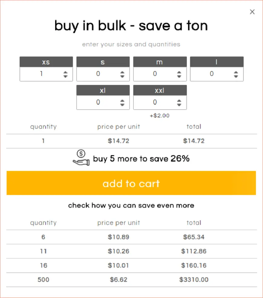
When Apliiq came to Convertcart for enhancing UX, among other things, we noticed they have features that will help shoppers save more, but which weren’t optimized visually—we identified the “bulk purchases" nudge to be key to their conversion success and improved the UX on it, leading to conversions growing by 32%:
🚀 Convertcart Pro Tip
Pay special attention to cross-device experiences—this includes making way for persistent carts, forms that are accessible and simple to fill (with a few taps for best effect) and cart abandonment mails that allow shoppers to checkout through the email itself.
Because if you can win them over beyond the first purchase, that’d be a win-win in terms of their brand loyalty and your profit margins.
But for your funnel conversion rate to sustain and improve, this has to be strategic:
👉 Drive low-cost starter products & sets—once these start to pick up traction, you can also apply a healthy discount, which attracts further funnel conversions - and if further tie up with a cause and contribute $X towards it, this also becomes a good hyping point on social media.
👉 Feature a mix of relatable social proof—a bit of the founder’ philosophy, how your process is trying to, let’s say, cut down on wastage, detailed reviews from loyalists plus UGC content depicting use cases, can be ideal.
👉 Make sure the “landing” is valuable—no matter where first-time visitors land, whether it’s a homepage or a product page, they need to see why a specific product trumps all others or see multiple alternatives that match their preference.
This is what Sephora does by introducing product comparisons on their product landing pages, which also double as product recommendations:
🚀 Convertcart Pro Tip
Lead first-time visitors to resources based on how they discovered your store—if it’s organic search, you may want to show them product comparisons instead of individual products whereas if it’s Instagram, a landing product page showcasing something they clicked on is the way ahead.
Further Reading: 18 Brilliant Ways To Convert First-Time Visitors Into Buyers (eCommerce)
By answering how more people will discover your eCommerce business, you’re already a little ahead in the good funnel conversion rate game.
At Convertcart whenever we’ve audited site copy as part of our CRO strategies, we’ve seen the following work:
👌 For the awareness stage—Research broad informational queries and look for "what is," "how to," "best ways to," and problem-based queries - tools like Ahrefs, Google Keyword Planner and SEMRush can help. Focus on landing pages, homepage and the blog section.
👌 For the consideration stage—Focus on comparison terms: "best [product] for [use case]," "[product] vs [product]" and identify specific feature-related searches that indicate that they are researching & comparing. Integrate these into your category pages, specific collection pages as well as buying guides.
👌 For the decision stage—Target high-conversion terms like "buy," "discount," "shipping," "reviews" and look for specific model numbers or product specification searches. Optimize these across the product pages and highlight them as radio buttons across review sections.
The truth is that there have been incidents where businesses have recorded a 140% increase in sales with the integration of social proof.
While this is highly desirable, many businesses we’ve worked with either use too much of it and too little.
Here’s what you need to do to display just the right amount and drive trust & personalization:
👉 Fetch social proof based on behavior—use AI to fetch reviews from other “lookalike” shoppers and for example, if they click on shipping & delivery multiple times, show them review snippets that speak about quick delivery times.
👉 Create a ticking “sales” counter as a sticky widget—make it a clickable feature that once accessed shows top-of-the-pile purchase updates like “Sarah in Ohio just bought a <linked product name>” and “Jonathan in Kansas just bought a <linked product name>” - the product name linking simply makes it easier for interested folks to find the associated product pages.
👉 Use more varied social proof on product pages—whether it’s a social wall, a ticker with the number of happy customers who’ve bought from you or a highly detailed reviews section, a combination works best at this stage of the funnel as it takes care of “desire” in shoppers to buy.
Further Reading: 31 Brilliant Examples of eCommerce Personalization
Product content is the holy grail of eCommerce conversions.
But most stores we’ve met run most of their content optimization efforts on content that features on product pages—and in our humble opinion, that’s not enough.
💪 Talk about features BUT with outcomes—while benefits are great, they can come off as vague to shoppers who’re especially on a comparison journey - this is why technical specs are great as long as you can suggest exactly how it helps (Our 3-in-1 pre-, pro-, and postbiotic to support a balanced gut microbiome).
💪 Think more content in terms of real-life scenarios—and we aren’t just talking about UGC, we’re also talking about how you help shoppers make sense of a category (where the banner description does the job) or nudge them with inspiring stories from the blog.
💪 Back claims with facts—every time you say “this is the best <product type> you will come across because….” you’ve got to either bring in authoritative social proof or snippets from actual customer experiences.
That’s what eCommerce brand Golde does by featuring press mentions right about the main product description:

eCommerce shoppers almost always love a great photo—before they actually decide to buy what’s shown on it.
That’s why higher funnel conversion rates in 2025 demand product visuals that are interactive.
Here are a few ways to optimize this aspect on your website, which is critical for the consideration stage:
👏 Explore creating “hotspots” for visuals—reveal more info, like materials, features and anything else you’d want shoppers to know while they’re visualizing - is a great hack especially for fashion, skincare and furniture.
👏 Activate tap-to-zoom as part of mobile optimization—ditch pinch-to-zoom completely as this often interferes with other common hand gestures like swiping.
👏 Use navigable videos with action prompts—you want to create videos where CTAs can sit across major time stamps, helping shoppers choose shades or variants and later, add-to-cart.
🚀 Convertcart Pro Tip
Consider AVIF and WebP formats only for lighter images that take up less space and reduce loading speed—additionally, serve images in 2X resolution for retina screens.
Videos help eCommerce brands convert faster—but now that most brands are leaning into this method, you’ve got to strategize differently to make your funnel conversions soar.
👌 Prioritize those micro-explainers that topple objections—“Will this fit me?”, “Will this break after a month?”, “Can I wear it in the rain?” - attempt to answer questions like these in your super short videos, which also makes it more justified to promote them.
👌 Show more before/after scenarios with storytelling—make it relatable and non-boring by creating a timeline, and feature hooks like social media status updates to drive it further.
👌 Create more “Buyer’s POV” videos—”Shop with me” videos exploring a category section, or showing the influencer’s indecision / decision to buy can create a surprisingly great emotional connection!
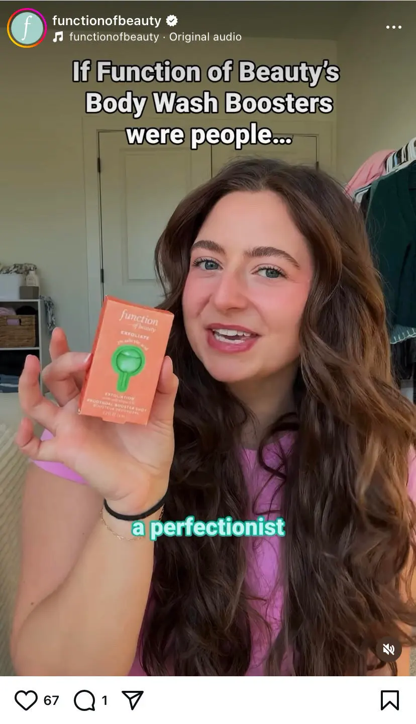
eCommerce beauty brand Function of Beauty covers a lot of native content but with themes many other brands don’t even think of—a case in point is them making a reel on “if these body washes were human beings” making it memorable and sticky:
Further Reading: eCommerce Video Marketing Ideas That Actually Improve Sales
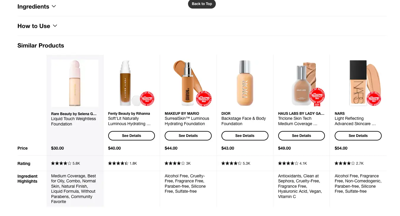
Once shopper awareness starts growing, one of the best ways you can pull them into consideration and desire is to show them comparison charts.
This MoFu and BoFu technique are meant to trigger higher funnel conversion rates:
👉 Place several different "comparison hooks” across the site—create a call-out for the main navigation if you have an extensive comparison tool or page but also show a chart on the homepage that elaborates a brand-level comparison as a differentiator.
👉 Highlight recommended products differently—use a different color shading in the background and be obvious about any badge that’ll authentically make it stand out - like “Trending since <year / month” or “#1 Bestseller on <press logo>”.
👉 Integrate “Shop Now” buttons within the chart—this is a crucial to prevent back and forth for shoppers who’re serious about buying right away - this also helps you project any pricing benefit more favorably against other options
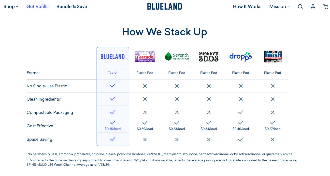
Blueland shows clear brand-level comparisons on its product pages—the criteria they choose to focus on, are critically important to high-intent shoppers who can see how different the brand is:
Most shoppers in the top of the funnel prefer to analyze an eCommerce brand to decide if they want to engage any further—and this is why optimizing your socials becomes one of the key funnel conversion rate improvement strategies.
Here are some key aspects you’d want to leverage:
👀 Focus on creating “shareable” content—use your products and drop tips, advice or even suggestions that shoppers can use even without buying - but having your brand at the back of their minds!
👀 Use influencer content that looks native to your brand—use this alongside user generated content if you will, but know that native content creates a sort of relatability that polished ads struggle to - and this helps more followers engage with your brand at the awareness stage.
👀 Maintain “informative” content pillars—like Gymshark maintains pillars for “education”, “product” and “motivation”, which also helps the brand create a consistent posting schedule and improve funnel conversions.
Where there are eCommerce carts, there will be abandonment.
So when you’re considering funnel conversion rate strategies, you’ll have to look beyond the usual:
👉 Reinforce product value in cart recovery emails—why a product really matters is a reminder most shoppers need when they have to face a sea of branded emails everyday - this can remind them of their original intent of adding the item to the cart, increasing the chances of a conversion on-the-spot
👉 Reward beyond % discounts for reclaiming the cart—saying something “add in the next <countdown timer” to receive a FREE mystery gift of a product you’ve been eyeing!” - this gamifies the reward beyond the usual discount, which often creates a numbing effect on shoppers these days
👉 Show social proof in retargeting ads—use tools like Loox, Okendo, or Videowise to automatically pull customer content tied to specific SKUs and plug them into retargeting ads.
🚀 Convertcart Pro Tip
Create variant / size / color specific urgency in your cart recovery communication—like it or not, shoppers mostly don’t register “<product name> is going off the shelves FAST”. So, to make it more personal, you have to tap into the part of them that identifies with loss aversion. And “only 2 more left in size M” is enough!
Further Reading: 27 Powerful Ways To Reduce Shopping Cart Abandonment (w/ Examples)
The numbers are telling, like how just by adding live chat to your eCommerce website, you can improve conversions by 20%.
So, what is it that still prevents this feature from being fully effective on most stores? And what can you do to do it differently?
👌 Initiate intent-based messages—for example, if shoppers have been viewing a product page but not adding to cart, initiate a message saying,”Need help choosing a size or color?”
👌 Use an “expert” hook to draw attention—just a collapsed chat symbol isn’t particularly attractive to shoppers, unless they’re already in the process of buying and have last minute questions - to draw shoppers from across the funnel, label the chat as “Talk to Our Styling Expert” or “Chat for Expert Advice”.
👌 Send urgency-based checkout messages—your chat should be actively helping close the sale, not just hanging around - so consider sending a message like “Need help finishing your order? Here’s a last-minute 10% off that we feel like you deserve!”
Your checkout flow represents every step the shopper needs to take from the point of deciding on a purchase to actually completing it.
So, optimizing it is a great idea to improve the funnel conversion rate across the stages:
👉 Use subtle cognitive reassurances—the truth is shoppers need this even if they’ve loaded themselves with the right info - so consider featuring “30 day satisfaction guarantee” or “30 day hassle-free returns” product page onwards.
👉 Make autofills smarter for returning customers—Collapse billing + shipping if they're usually the same - auto-detect and prefill the country/state via IP - use smart postal code lookup to autofill city/state.
👉 Create more impetus to checkout—be it that secondary CTA on the product page that shows them their favorite express checkout option or urgency messages like “only 2 left in your size” in the mini cart.
Trust earns, but the lack of it burns.
And it couldn’t be truer as far as low funnel conversion rates in eCommerce is concerned.
Through our work with varied eCommerce customers, we’ve found this aspect to be absolutely vital to conversion success:
💪 Introduce increasingly specific trust signals as you move along the funnel
Awareness Stage
Consideration Stage
Decision Stage
Purchase Stage
💪 Personalize trust signals based on traffic source—while first-time visitors may be looking for more branded mentions and third-party reviews, referrals may want reviews from similar customer segments.
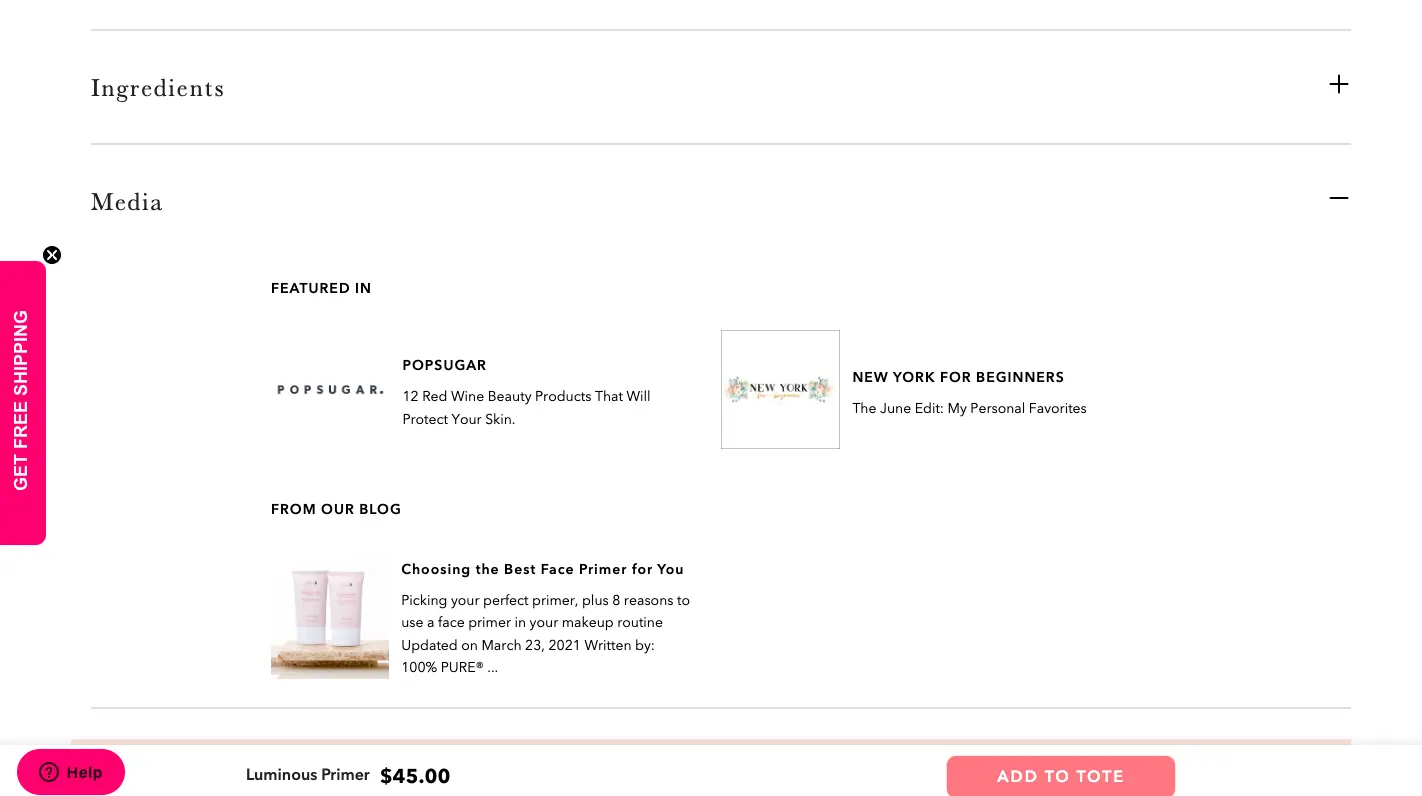
When we went looking for “pregnancy safe makeup” and landed up on 100% Pure’s luminous primer product page, here’s what we found for social proof as first-time visitors:
How well you handle the post-purchase stage decides if you can retain more customers in your funnel.
And that means, you’ll have to optimize aspects besides the usual post-purchase email:
👉 Create prep & check-in emails—while the order status flow is great, creating an informative prep email that lets the shopper know the best ways to use the product - and engaging them with a check-in email two weeks after the purchase, makes for great brand recall.
👉 Insert a “next purchase discount” with the packaging—having them hold it in their own hands instead of seeing it within the folds of an email, is what makes the difference.
👉 Invite shoppers to private communities for sharing—whether it’s about them meeting other parents or fitness enthusiasts, this opens up a whole new loop of sustained engagement.
Considering 70% of all purchases happen on mobile these days—and mobile is where your replenishment customers hang out most, this is a huge opportunity.
Creating a great UX for replenishment on mobile (and desktop) for high funnel conversions means:
👌 Create a permanent “Refills” category section—and on mobile, don’t hide this behind the hamburger menu - keep it as an accessible radio button across the site for higher usability.
👌 Leverage “seasonal reminders” for products based on past behavior—and don’t forget to push smaller samples or product variants based on these.
When it comes to figuring out the right benchmarks for eCommerce funnel conversion rates, it’s literally impossible without accounting for the factors that define them.
👉 Industry type: For example, when it comes to eCommerce, funnel conversion rate seems to improve in the later stages of the funnel—in comparison to B2B, which sees a much higher rate within the lead to MQL stage than to the MQL to SQL stage
👉 Product type & mix: Take the many instances of retail stores that feature multi-brands and you’ll typically see a higher funnel conversion rate of about 4% thanks to the competitive pricing and product variety. On the other hand, apparel and accessories see anywhere between 1.01% and 3.56%, with sizing issues and higher returns playing spoilsport.
👉 Website quality: From poor loading speed to primary navigation issues to lack of product clarity, the way your eCommerce website performs (or doesn’t 👀) can be one of the key factors influencing funnel conversion rates.
👉 Traffic quality: Whether it’s a lack of effective SEO or marketing, when visitors with lower intent enter your funnel, they drop off earlier or don’t engage as deeply with your content so as to be able to convert.
👉 Marketing efforts & effectiveness: For example, visitors that interact with some form of UGC, convert 102.4% higher than those that don’t - going by this, relatable and personalized UGC can improve funnel conversion rates across the stages
While almost every eCommerce brand deals with leaks across all the stages of the funnel, the most successful ones round up leaks that cause maximum conversion damage.
And by this, we mean “leaks” that cause high-intent shoppers to pull away—and mind you, these are the folks who get you 80% of your conversions.
So, let’s look at the leaks that tend to cost eCommerce stores more and what you can do to plug them and maintain high funnel conversion rates:
👀 Lack of a clear value proposition
The fix: Use clear headlines that are benefit driven and UGC that’s labeled by “use” or “concern solved”.
👀 Weak personalization hooks
The fix: Remind them if they have an active wishlist (also giving them active reminders when prices of wishlisted items fall) and create “so you’re back?” pop-ups that feature their most-browsed items.
👀 Unclear product compatibility info
The fix: Create a “Goes really well with” hook above-the-fold across product pages, which can also serve as an upsell strategy.
👀 No pricing / value reinforcement
The fix: Show “You save X% with this purchase” in-cart and even declare auto-applied discounts at the cart and checkout stages very clearly.
👀 Long & complex checkout
The fix: Smart auto-fills, collapsed sections and a color-coded progress bar to show movement.
👀 Lack of familiar payment options
The fix: Distinguish quick pay options clearly and even maintain the most popular payment as a separate CTA (base this on the location the shopper picks).
👀 Weak retargeting & remarketing
The fix: Set rules about promoting only those products that have been viewed multiple times - and not just random products or even bestsellers.
The numbers don't lie: 98% of visitors who visit an eCommerce site—drop off without buying anything.
Why: user experience issues that cause friction for visitors.
And this is the problem Convertcart solves.
We've helped 500+ eCommerce stores (in the US) improve user experience—and 2X their conversions.
How we can help you:
Our conversion experts can audit your site—identify UX issues, and suggest changes to improve conversions.
Subscribe for more articles like this!


Read by 5000+ ecommerce store owners
.svg)

.svg)

.svg)
.svg)
2026 Convertcart, All Rights Reserved
33/1, Castle Street, Ashok Nagar, Bengaluru, India
