In the fast-paced world of health and beauty ecommerce, your product page is make-or-break.
It's where hesitation turns into "add to cart" or a quick bounce.
After analyzing dozens of high-converting pages from top brands in ecommerce beauty, we've pulled together the real lessons that actually drive sales, without gimmicks or fluff.
From curating trends smartly to turning your page into a trust-building education hub, these proven tactics help you connect authentically, reduce buyer anxiety, and boost conversions in health and beauty ecommerce.
Ready to level up your product pages? Let's dive in.
How to Increase Conversions on Health/Beauty Product Pages
1. Use Trends Wisely (Tailored to Your Target Audience)
Trends move FAST in beauty, one day it’s the matcha craze for that antioxidant glow, the next it’s full-on K-beauty glass skin routines blowing up on TikTok, or a celeb posts about a product and suddenly everyone’s searching for it. The temptation is to slap every hot thing on your page to ride the wave.
But jumping on every trend can make your product page feel scattered, inauthentic, or like you’re just copying everyone else.
Shoppers (especially Gen Z and younger crowds) sniff that out quickly. They want brands that feel true to themselves and actually speak to them.
So, curate trends selectively and weave them in only when they genuinely align with your target group (TG) and product lineup. This approach shines in best skincare website design and top beauty ecommerce websites.
Ask yourself first:
Who are your shoppers?
Are they Gen Z shoppers (18–27ish)? Then lean into fresh, viral, fun, affordable trends like K-beauty-inspired glassy looks, multi-use products, or clean/viral ingredients (snail mucin, centella, or even matcha for calming + brightening).
Or are your products targeting 40+ or more mature skin? Skip the hyper-trendy TikTok stuff and focus on timeless-but-updated trends like “skinimalism,” barrier repair, or gentle anti-aging with proven actives (peptides, ceramides) that feel elevated and results-driven.
Highlight trend-aligned messaging subtly. Add a small “Trending Now” badge, a dedicated “Why This Fits the Glass Skin Trend” blurb, or a quick “Inspired by K-Beauty Routines” section under benefits/ingredients.
If you have a green tea/matcha-infused serum, call out the antioxidant hype naturally (“riding the matcha wave for calm, bright skin”) without forcing it.
Use UGC or styled shots that nod to the trend (dewy glass skin finish for K-beauty vibes), but keep it authentic to your brand voice.
Shoppers want emotional appeal and personal fit, a trend that matches their age, skin concerns, or vibe makes them think “this is for ME right now.” It builds excitement without alienating your core audience.
2. Put a Product Quiz Right Above the Add to Cart
Generic product pages often dump info on shoppers, overwhelming them. But when you drop an interactive tool, you’re basically saying: “Hey, I see you. Let’s make sure this is actually for YOU before you buy.”
Shade finder quiz (questions on undertone, current foundation, selfie upload, or even AI scan) or virtual try-on turns guesswork into confidence.
A skin quiz (a few questions about dryness, acne, sensitivity, age, goals) recommends the right product or routine. Shoppers feel seen, not sold to. It’s like having a mini consultation without leaving the page.
An “Ask Our Expert” live chat or advisor button lets them ask real questions (“Does this play nice with tret?”) right when doubt peaks. It’s instant reassurance, and it often closes the sale on the spot.
We love how CoverFX does it on their product page:
Placement matters a ton. Putting it above Add to Cart is key because that’s the decision moment. If it’s hidden, people bounce before they engage.
When it’s prominent (sticky, bold CTA button, maybe with a little “Recommended for you” teaser), engagement shoots up, hesitation drops, and conversions follow in ecommerce beauty.
3. Make Customer Support Super Accessible
As we mentioned earlier, shoppers are already in that high-anxiety zone, no touch, no smell, no trial.
They want trust signals and education fast, and if they hit a wall, they bounce. That’s where making support dead-easy comes in.
A real, quick support right on the product page, often as a floating chatbot, a big “Chat with Us” bubble, an “Ask Our Expert” button near the add-to-cart, or even a prominent “Message us on WhatsApp” link or button can help to reduce your bounce rates.
Let them ask questions instantly. “Hey, is this serum okay with retinol?” → Boom, answer in minutes. That instant reassurance turns “maybe later” into “add to cart now.”
We have seen WhatsApp support instantly lend a human (or smart bot) touch right on the product page.
Shoppers can send a selfie for shade advice, describe their skin concerns, or get routine tips.
It feels like a mini consultation, exactly what builds confidence in buys within health and beauty ecommerce.
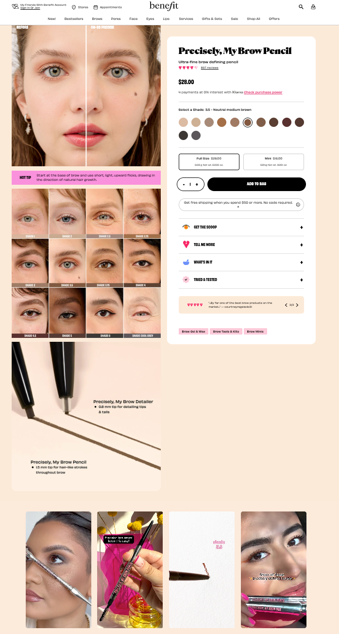
4. Load Your Product Pages with Social Proof
In health & beauty, claims are everywhere (“glowy skin!”, “longer lashes!”, “bye bye acne!”), but shoppers are skeptical. They’ve been burned by overhyped products before.
The beauty ecommerce websites that convert like crazy don’t just say “it works,” they show it with real people, real results, and real voices.
Shoppers scroll the gallery first, so don’t just show pretty packaging shots. Mix in real before-and-after photos (ideally UGC from actual customers, not just models).
Use sliders, carousels, or side-by-side comparisons so people can swipe and see the transformation instantly.
This directly tackles “proof of efficacy” and “will this work for me?” as it’s visual evidence that screams, “yes, look what happened to someone like you.”
You can label them with timeframes (“after 4 weeks”) and skin types for extra relevance.
Highlight punchy one-liner reviews right under (or near) the Add to Cart button, like:
“My acne scars faded so much in 3 weeks, I’m obsessed!”
“Best foundation match ever, no flashback!”
“Finally a serum that doesn’t pill under makeup.”
Pull these from your highest-rated reviews, maybe add the reviewer’s first name + skin type/age if it matches common concerns.
Placing them super close to the buy button catches people at the peak decision moment, it’s that last nudge of “everyone else is loving this, I should too.” It amps up trust signals and social proof without overwhelming the page.
Benefit does it well on their product pages in best skincare website design.
5. Go All-In on Deep Ingredient Transparency
Shoppers are obsessed with full ingredient lists and explanations of key actives. The pages that really convert don’t just dump a wall of Latin names, they make ingredients the hero.
Put the full list right there (no collapsing it), but highlight the stars: “10% niacinamide for brightening + pore-refining,” “2% salicylic acid to unclog pores,” with simple “why this matters” blurbs or icons.
Flag potential irritants/allergens upfront so sensitive-skin folks don’t freak out.
Curate it as Drunk Elephant does on their product pages:
You can take it up a notch with unique tools:
“Ingredient scanner” or compatibility checker (“Does this mix with your retinol routine?”)
“What’s in it” pop-ups or accordions that explain sourcing (e.g., “sustainably sourced hyaluronic acid”)
Clean/cruelty-free/vegan badges with real certifications
This transparency is key in health and beauty SEO for skin care ecommerce.
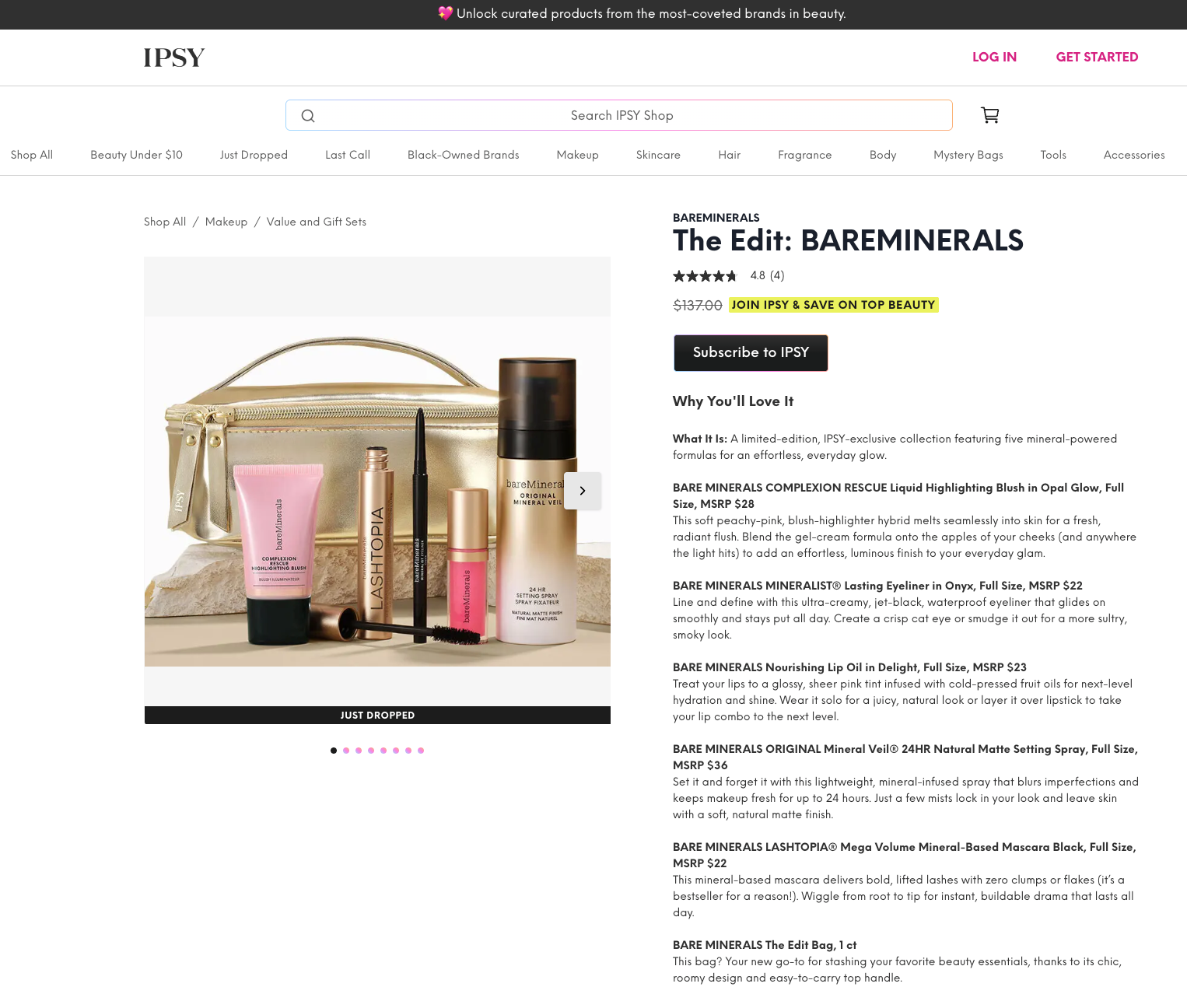
6. Prioritize Subscriptions First to Maximize Recurring Revenue
If your products are the kind people actually want to use every day (think serums, moisturizers, cleansers, setting sprays, mascara, basically anything repeat-purchase), stop treating subscriptions like a hidden little add-on. Flip the narrative and make subscription the hero option right from the jump.
Show the subscription price first and most prominently, e.g., “$32/month – Save 20%” sitting bigger/bolder than the one-time “$40” price.
Use language that makes it feel like the no-brainer choice: “Most Popular: Subscribe & Save 20%” or “Join thousands who get this delivered every 60 days, pause or cancel anytime.”
Highlight the perks right there in the pricing area, free shipping, flexible delivery, maybe a small welcome gift or loyalty points on the first box.
Often, the “Subscribe” button is the primary CTA (bigger, brighter, or even pre-selected), with “One-time purchase” as a smaller, secondary link below it.
This way, you can boost your lifetime value while lowering cart abandonment, as people who subscribe are way more committed. The risk feels lower because they know they can pause or cancel if it’s not perfect.
A great example of promoting beauty products in action is IPSY. On their product pages (especially for bundles or edit sets), they lead hard with “Subscribe to IPSY” as the main CTA, often with a big button and messaging like “JOIN IPSY & SAVE ON TOP BEAUTY.”
You don’t need to be a box service to do this, tons of direct-to-consumer brands (skincare lines, haircare, even makeup staples) are now putting “Subscribe & Save” as the headline price and seeing higher conversions because of it.
Test making the subscription discount feel generous (15–25% is sweet spot) and add a little social proof like “Over 8,000 subscribers love this routine.”
If your audience are repeat buyers, this one change can quietly become one of your biggest revenue drivers in ecommerce beauty.
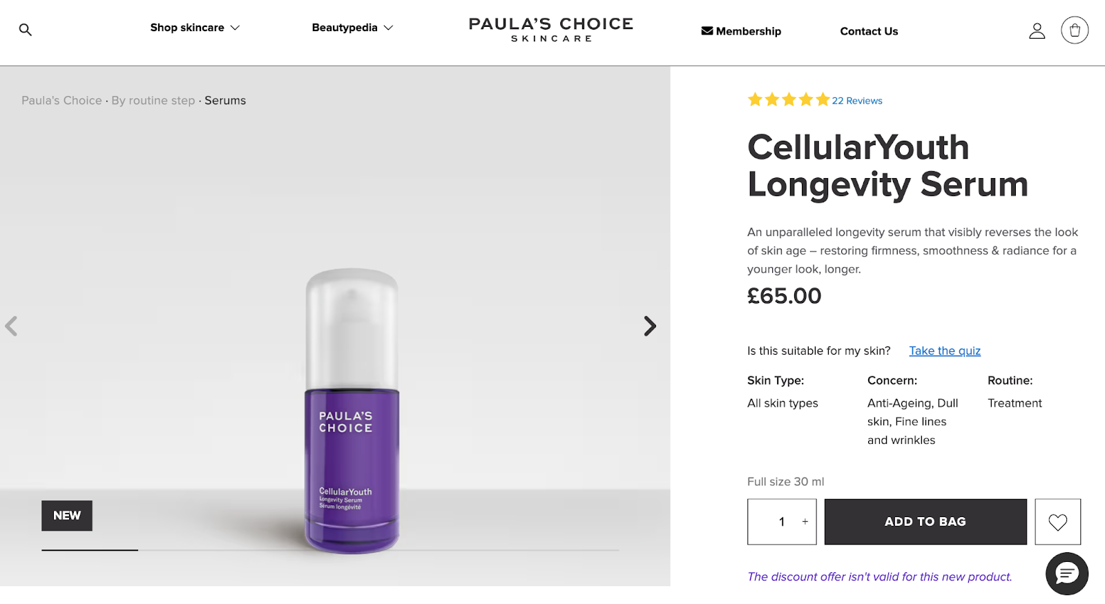
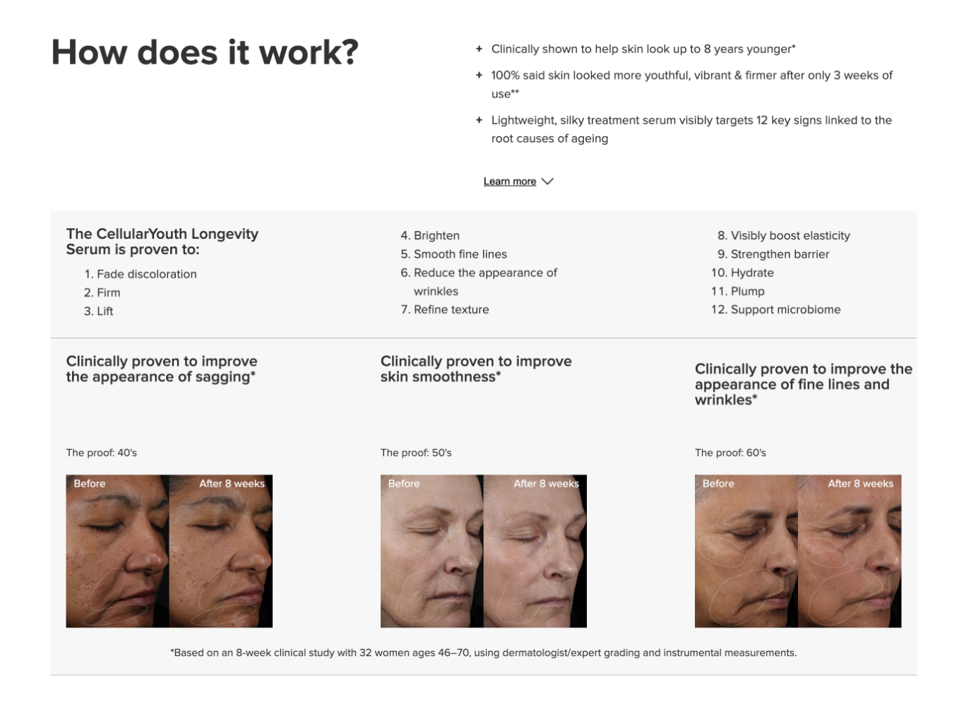
7. Turn Your Product Page Into an Education Hub
Your product page isn’t just a sales flyer. It’s the perfect real estate to build trust, answer questions before they’re asked, and make shoppers feel smarter and more confident about buying from you.
Most product pages do the bare minimum with pretty photos, bullet points, add-to-cart button.
High-converting ones treat the product page like a mini masterclass. They use the extra space to educate, share the “why behind the what,” and show the research and care that went into the product.
Right after the main benefits or ingredients list, drop a few concise paragraphs or bullet points explaining the research or thinking.
Example: “We use 5% niacinamide because clinical studies show it reduces inflammation and pore size in 4-8 weeks. Here’s what that means for your skin.”
Instead of just listing “niacinamide, hyaluronic acid, peptides,” add tiny tooltips, accordions, or a clean grid: “Niacinamide – brightens + calms redness (backed by 20+ studies)” or “Multi-weight hyaluronic acid – hydrates every layer of your skin, not just the surface.” This hits that deep transparency shoppers crave.
Share a quick line or two: “Formulated with dermatologists over 18 months of testing on 200+ people across skin types” or “We ran stability tests for 12 months so the vitamin C stays potent from first drop to last.” It screams credibility without needing a full white paper.
Sprinkle in a dermatologist quote, a quick “what our formulator says” blurb, or a real customer journey (“How Sarah went from flaky to glowy in 6 weeks”). It feels personal and educational at the same time.
We love how Paula’s Choice does it on their product page:
8. Bring VR/AR Try-On Tools Right Onto Your Product Page
If you’re selling makeup, foundation, lipstick, blush, eyeshadow, anything where color, finish, or fit matters, integrating virtual reality or augmented reality try-on tools directly on the product page is no longer just a gimmick. It’s one of the fastest ways to kill that massive uncertainty shoppers feel when they can’t physically test stuff.
In the beauty industry, product mismatches are the #1 return reason. Brands see 30–90% higher conversions and fewer refunds when AR/VR try-on is in play.
Shoppers get instant, personalized proof instead of guessing from static swatches or model photos. When they see it working on their face, hesitation drops, and they’re way more likely to hit add-to-cart.
Put a big, inviting “Try It On” or “Virtual Try-On” button right above or next to the shade selector/add-to-cart, to make it impossible to miss.
Use live camera mode for real-time magic, plus selfie upload for quick tests.
See how MAC Cosmetics uses it on their product page:
For more immersive stuff, add options to layer multiple products (e.g., lipstick + blush + eyeshadow) to show full looks in health and beauty ecommerce.
9. Feature Vertical Videos in Prime Real Estate
Static photos are great, but nothing beats short vertical videos for making a beauty product page feel alive, trustworthy, and actually exciting.
Shoppers are already living on their phones, scrolling Reels and TikToks all day. When they hit your product page, they want that same quick, native, authentic energy, not just another flat gallery.
Vertical videos (15–60 seconds, 9:16 format) are perfect because they feel like content they already trust and watch, not forced advertising.
Place them strategically, right below the main product description, or in a dedicated “Real Results” / “See It In Action” tab/section.
Don’t bury them at the bottom where no one scrolls. Make sure the first video autoplays (muted) or has a big play button so it’s impossible to miss.
See how Elf Cosmetics does it:
Quick before/after time-lapses (e.g., skin texture improving over 4 weeks). Application demos showing texture, how it blends, finish (dewy vs matte), and layering without pilling.
Feature UGC-style testimonials like real people talking to the camera: “This is day 1 vs day 30,” “Here’s how it looks under makeup,” “My honest morning routine with this.”
These clips directly hit shopper priorities: proof of efficacy (“I can actually see the glow”), education (“Now I know how to apply it”), social proof (real people, not models), and emotional appeal (“That could be my skin”).
They reduce the “what if it looks weird / feels gross?” doubt better than any written description in an example of promoting beauty products.
Are you struggling to write replenishment sequences that hit exactly when a customer's product runs out? Learn how to time your flows and build loyalty with these beauty eCommerce email marketing tips.
10. Write Short, Skimmable Product Descriptions
Shoppers don’t read walls of text, especially on mobile.
They skim fast, looking for answers to “What does this actually do?”, “Is it for me?”, and “Any catches?”.
The smartest product pages turn the description section into something quick to digest, visually friendly, and still packed with the info people need.
Lead with the hero benefit in the first sentence, then hit the must-knows: key ingredients, texture, finish, who it’s for, and one realistic result. Make it feel exciting but honest, no fluff.
Instead of plain bullets, add light emojis to make benefits pop at a glance. Right after the short description, you can drop a clean accordion or “+ Tell Me More” button that expands to reveal deeper info.
Here’s a solid makeup product description example from Tower28 that keeps it concise yet informative.
We also like how they have also add collapsible FAQs to build trust and education without clutter.
This way, they reduce hesitation, boost confidence, and make the product page feel thoughtful and user-friendly.
Pro tip: Test mobile view obsessively, that’s where 70%+ of beauty shopping happens. If the emojis look weird or the collapsible is hard to tap, simplify. And keep language warm and approachable like you’re chatting with a friend, not lecturing.
Beauty shopping is overwhelmingly mobile, with almost 70%+ of traffic and purchases happening on smartphones, where shoppers scroll fast, tap impulsively, and abandon if anything feels clunky.
High-converting product pages build mobile-first, starting with small screens and scaling up, so the experience feels effortless and natural on the device most people actually use.
Prioritize thumb-friendly design. So that everything important should live within easy reach of thumbs. This mobile optimization is crucial for health and beauty SEO.
Use large, tappable CTAs (minimum 44x44px for comfort), like a sticky "Add to Cart" or "Subscribe & Save" button that stays pinned at the bottom of the screen as users scroll.
Make shade selectors, quiz launches, "Try It On" AR buttons, and review expanders big, spaced out, and easy to tap without zooming or fat-finger errors.
Here’s how you can position key elements strategically for mobile flow:
Hero product images + primary swatches at the very top (above the fold).
Price, main CTA, and subscription option right below, often in a fixed bottom bar for instant access.
Quick-tap tools (shade finder, skin quiz, "Ask Expert" chat) are prominent and tappable early, ideally as floating icons or bold buttons near the buy zone.
Vertical videos, UGC carousels, and before/after sliders are optimized to autoplay muted and swipe smoothly without horizontal scrolling issues.
Collapsible sections (ingredients, FAQs) with clear tappable "+" icons so info is one tap away, not buried.
Remember to get the basics right. Keep layouts clean and vertical: stack benefits, reviews, and education in a scannable, single-column format.
Compress images aggressively for lightning-fast loads (under 3 seconds is ideal, every extra second kills conversions), and test obsessively on real phones to catch pinch-zoom annoyances or misaligned taps.
We’ve all been there, scrolling through a beauty page, loving a product, but then… hesitation hits. “Should I buy now or later? What if it’s not that good?” That’s where gentle urgency can be your best friend on a product page.
The trick is to keep it real and subtle, not pushy.
Think “Only 12 left in stock” right next to the Add to Cart button, or a quiet “Limited Edition – Flying Off Shelves” tag. For seasonal drops or those viral serums everyone’s talking about, a little countdown timer tied to a real promo works wonders.
Pair it with honest social proof like “1,200+ bottles sold this week” or “Back in stock for now!” so it feels authentic instead of manufactured FOMO.
For everyday repeat buys like moisturizers or cleansers, try slipping in a “Frequently Bought Together” bundle with a nice little discount to nudge them toward a bigger cart without pressure.
Create that small spark of “I don’t want to miss this” that actually matches real demand, whether it’s low stock, a restock alert, or “trending and sold out last drop.”
Place those signals right above pricing or the CTA, where eyes naturally land when they’re deciding.


.svg)

.svg)

.svg)
.svg)
