Treating everything equally — no clear focal point
More clarity Higher conversion Less hesitation
Revenue Intent
What business outcome are we optimizing for?
Whether display drives conversion, AOV, or urgency
Designing for aesthetics instead of revenue goals
More conversions Higher AOV Better design ROI
Pillar 1: Decision Stage – Meet Your Customer Where They Are
Start by asking: What decision is this shopper trying to make right now?
A great product showcase page begins with the visitor’s mindset.
Early in their journey, they might be discovering and comparing options. Later, they need proof they can trust the product and reasons to act now.
Structure your page like a conversation that evolves with them.
Above the fold, focus on instant emotional connection, a powerful hero image, a clear benefit headline, and one strong call-to-action.
As they scroll, gradually introduce evaluation details (specifications, comparisons), trust signals (reviews, user photos), and finally urgency elements (limited stock, shipping promises).
When you align your product display with their decision stage, shoppers feel understood instead of sold to.
Pillar 2: Cognitive Load – Make It Effortless to Understand
Now ask yourself: How easy is this page to process?
This is where most product display pages lose customers. Too many tabs, endless scrolling, or competing elements create mental fatigue.
Design with intention. Use generous whitespace so products can breathe.
Create clear visual paths that lead the eye from the main image to key benefits, then to supporting details.
Group related information logically, color options together, sizing guides nearby, and reviews in one dedicated section.
Interactive product showcase elements like smooth zoom, 360° views, or color swatches should feel natural, not overwhelming.
The goal is to reduce friction so the shopper’s brain can focus on deciding, not deciphering.
Pillar 3: Information Priority – Show What Matters Most, First
At every point on the page, you need to ask yourself one critical question:
What matters most to the shopper at this exact moment?
This is the pillar that separates average product showcase pages from truly persuasive ones.
It’s not about showing everything. It’s about showing the right thing at the right time.
Start strong. Right at the top of your product display page, the hero image and the primary benefit should dominate the screen. This is the emotional hook.
Everything else supports it.
Supporting angles and lifestyle shots come next, building desire. Only then should technical details and specifications appear, and even then, they must never compete with the main story.
Smart product display design uses size, contrast, color, and positioning to create clear visual priority. The most important information stands out immediately, while secondary details stay accessible but out of the way.
One of the best ways to achieve this is through clean, expandable sections.
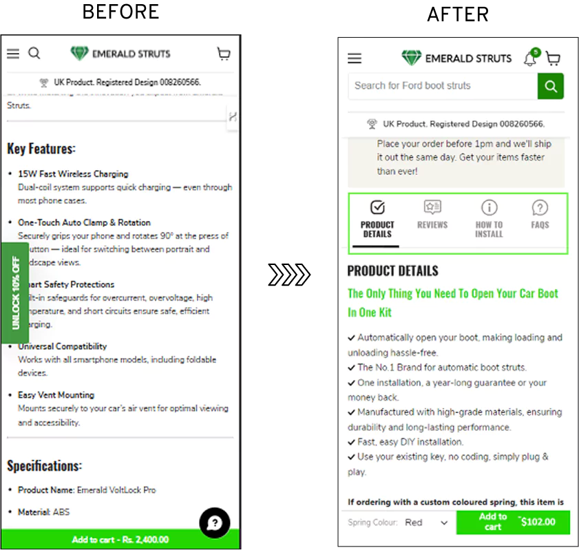
Important details were buried deep inside long product descriptions. Customers had to scroll and hunt for information, which created friction and lost sales.
We hypothesized that making the information more scannable would help.
So we redesigned the product showcase page with smart collapsible accordion sections for Product Details, Reviews, How to Install, and FAQs.
On mobile, where most of their traffic comes from, they saw a 12.12% increase in website conversions.
Pillar 4: Revenue Intent – Design With Business Outcomes in Mind
Finally, ask the most important business question: What outcome are we actually optimizing for on this page?
This is the pillar that turns a beautiful product showcase page into a profitable one.
Every image, every piece of text, every interactive element should intentionally drive toward a clear revenue goal, whether that’s lifting conversion rate, increasing average order value, encouraging repeat purchases, or reducing returns.
For example, if your goal is higher AOV, you might present thoughtfully curated bundles or “complete the look” suggestions exactly when the customer is most engaged.
If trust is the bottleneck, you place authentic reviews and strong guarantees right next to the add-to-cart button so hesitation melts away.
Convertcart Case Study - Lighting & Supplies
We saw this principle in action with Lighting & Supplies, a leading online lighting retailer.
Their customers often browsed multiple products but struggled to find items they had viewed earlier, leading to lost sales and abandoned decision journeys.
We hypothesized that a smart “Recently Viewed” section would help re-engage these users and shorten their path back to purchase.
So we implemented personalized recommendations, including a Recently Viewed carousel on both the homepage and individual product display pages.
The results were powerful. The desktop experiment delivered a 17.05% increase in website conversions, while significantly boosting repeat engagement across devices.
By intentionally placing this feature where it served the customer’s natural behavior, we aligned the product showcase directly with revenue outcomes, helping shoppers rediscover products they already liked and turning hesitation into confident buys.


.avif)
.svg)

.svg)

.svg)
.svg)
