Apparel product pages don't fail because of bad design. They fail because shoppers arrive with one burning question will this fit me? and leave without an answer.
And yet apparel is one of the biggest categories in eCommerce. The stores that convert consistently, the ones where shoppers click Add to Cart, have figured out how to close the fit gap before the shopper even thinks to ask.
We analyzed five brands that are genuinely good at this. We scored them using the Apparel Conversion Scoring Matrix, a five-pillar framework built around the questions shoppers need answered before buying clothing online.
By the end, you'll know what separates an elite product page from an average one and have a way to score your own.
Here's the framework we used to evaluate every brand in this post. Each pillar is scored 1–5.
Pillar
What it solves
What "good" looks like
Fit Certainty
"Will this fit me?"
Model specs, size tools, fit notes ("runs large")
Visual Sensory Replacement
"How does this look and feel IRL?"
Zoom that shows texture, video, and fabric close-ups
Social Proof Specificity
"Will it work for my body?"
Reviews with height, weight, and size bought
Aspirational Context
"How will I look wearing this?"
Lifestyle imagery, styled outfits, "Complete the look"
Frictionless Action
"Can I buy this without effort?"
Sticky CTA, size selector above the fold, and mobile speed
A score of 20–25 is elite. 15–19 is competitive. Below 15, you're leaking conversions in at least two places.
Quick Comparison: How the Top 5 Brands Score
What's striking here is that no single brand dominates every pillar. The highest total score (ASOS, 21) belongs to a brand that doesn't post the most beautiful photography.
The lowest total (Gucci, 18) belongs to a brand whose imagery is arguably the most stunning.
Strategy matters more than aesthetics, and each of these brands is playing a fundamentally different game.
Nike's product pages have a quality that's surprisingly rare in apparel eCommerce: they feel fast. Not just in load time, though they are quick, but in cognitive speed. You land on the page, you understand what you're looking at, the size selector is right there, and the path to checkout is a straight line with nothing in the way.
The sticky Add to Cart bar follows you as you scroll through colorways and product details. Size selection happens above the fold, with half-size options clearly laid out. On mobile, where Nike's traffic skews heavily, the interface reorganizes itself sensibly rather than collapsing into a squinting exercise.
What Nike does less well is social proof. Reviews exist, but the level of specificity you'd want from a running shoe, such as foot width, arch type, and whether it runs narrow, is inconsistently present. For fit-sensitive categories, this is a gap.
Quick takeaway: Make buying feel instant. Sticky CTAs and above-the-fold size selectors are not optional polish. They're conversion infrastructure.
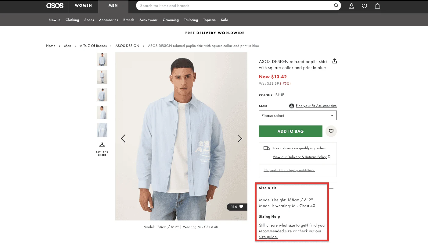
2. ASOS — Eliminating Fit Uncertainty
Score: 21/25 | Standout pillar: Fit Certainty (5/5)
ASOS has put more serious engineering effort into fit than almost any fashion retailer at its scale. Their size recommendation tool cross-references your measurements against brand-specific fit data. Their model diversity is intentional; they shoot items on multiple body types, not just a standard sample size, so shoppers have a reasonable chance of seeing the garment on someone who looks like them. Fit-specific search filters let you narrow by "petite" or "tall" or "curve" before you've even opened a product page.
This matters because fit uncertainty is the primary driver of returns in apparel eCommerce. ASOS has, by many estimates, above-average return rates. The category is inherently return-heavy, but they've made a systematic bet that reducing doubt upfront builds long-term customer value. The data appears to bear this out.
The product photography is solid if not spectacular. Reviews are plentiful and frequently include size-specific detail, which is partly a function of how ASOS prompts reviewers to leave feedback.
Quick takeaway: Invest in fit intelligence. A size recommendation tool, model diversity, and fit-specific filters are not expensive features relative to the return costs they prevent.
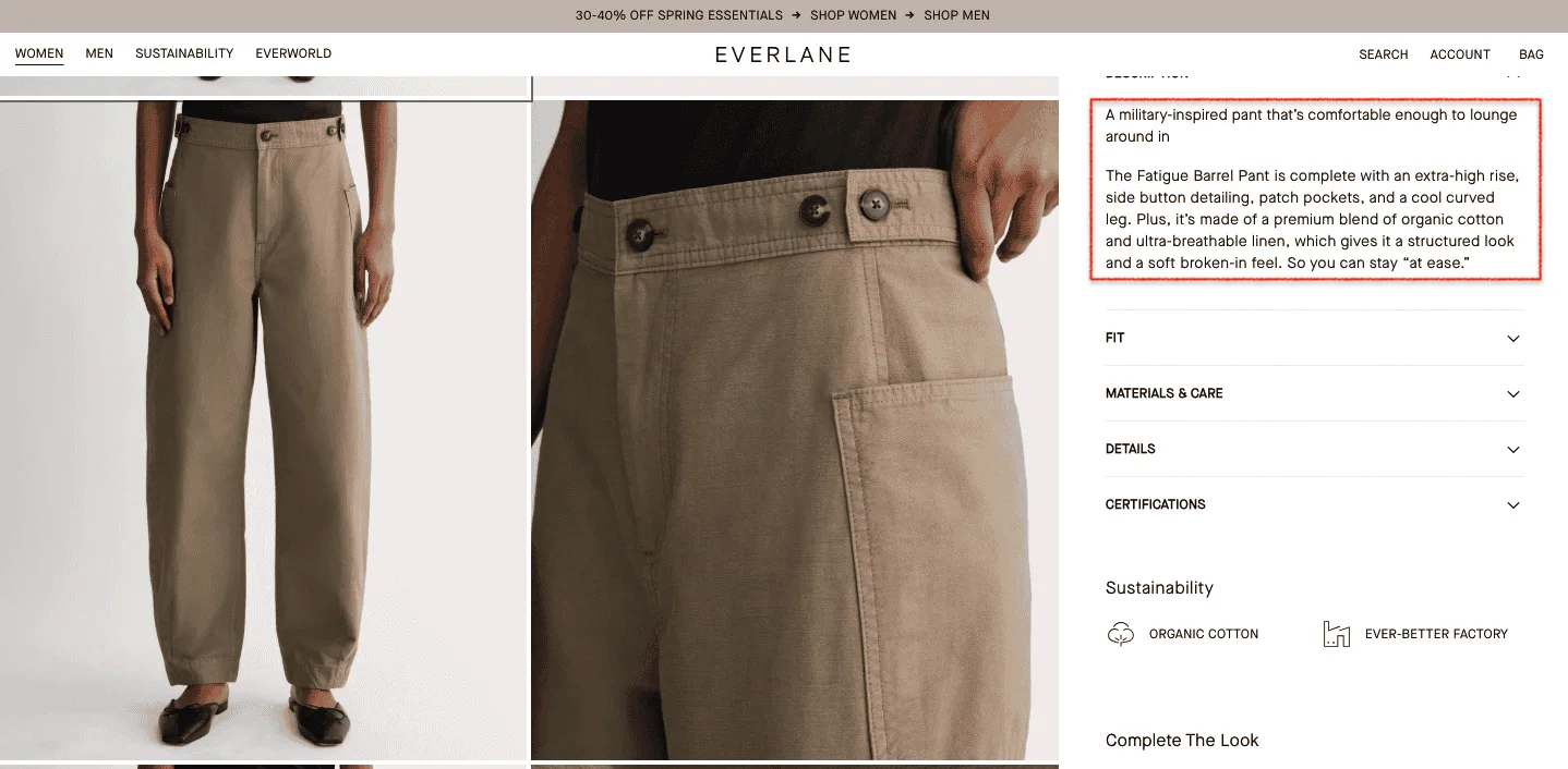
3. Everlane — Trust Through Transparency
Score: 19/25 | Standout pillar: Social Proof Specificity (4/5)
Everlane built an entire brand on radical transparency, publishing the cost breakdown of every item, naming the factories they work with, and explaining their pricing philosophy in plain language. This extends to their product pages in ways that quietly do conversion work.
Product descriptions are honest in a way that stands out. When a garment runs large, they say so. When the fabric is stiff rather than drapey, they say that too. Model specs, height, and size worn are listed consistently. The fabric composition and care instructions are written like a human wrote them, not a compliance form.
This level of honesty is, counterintuitively, a powerful sales tool. It signals that the brand trusts you to make up your own mind. Shoppers respond to that trust by converting.
Where Everlane scores lower is in the aspirational context.
The photography is clean and honest rather than aspirational, which is on brand, but does less of the emotional selling that lifestyle imagery achieves.
Quick takeaway: Clarity converts better than persuasion.
Honest fit notes and transparent product descriptions reduce doubt in ways that polished marketing copy cannot.
⚠️
Find why your online apparel store is not converting
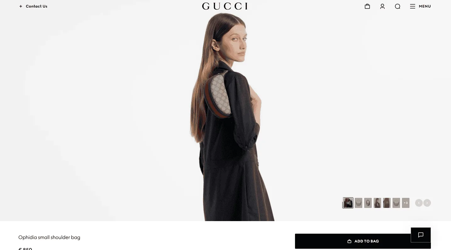
Gucci's product pages contain, in an objective sense, less information than any of the other brands in this roundup. There are no "What's my size?" tools. Reviews are sparse. The UI is restrained to the point of austerity. By every rational measure of conversion optimization, Gucci's pages are under-built.
And yet they work because Gucci is selling something different. They're not selling a jacket. They're selling membership in a cultural moment. The editorial-grade photography, the deliberate white space, the sense that the page itself is a curated object rather than a retail mechanism, all of this is the product. The friction is, to a degree, intentional. Luxury has always understood that ease and exclusivity don't fully coexist.
This is not a strategy to import wholesale. It works for Gucci because of what Gucci means. For most apparel brands, Gucci's approach, applied naively, produces merely sparse pages. The lesson isn't minimalism, it's coherence. Every element on Gucci's page is in service of one feeling.
Quick takeaway: Don't over-optimize premium products. If your brand positioning depends on desire and aspiration, an overly CRO-engineered page can undermine the very feeling you're trying to create.
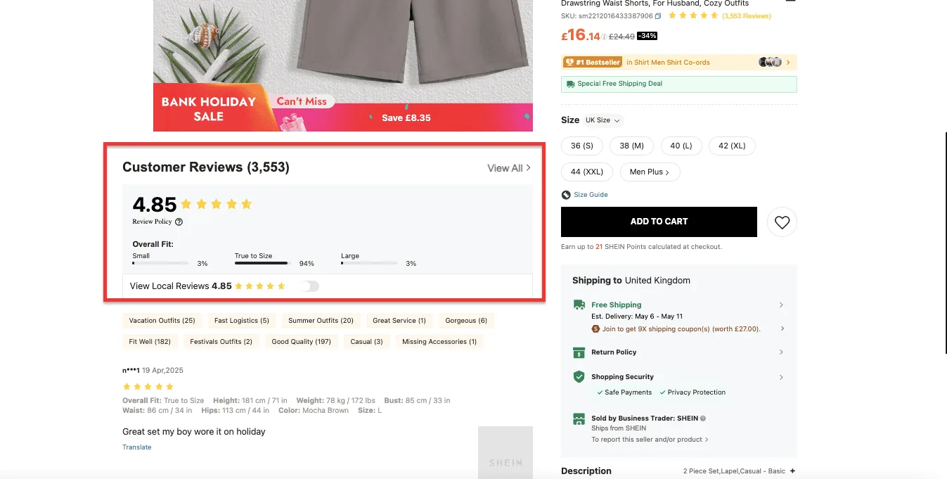
5. Shein — High-Conversion Density
Score: 20/25 | Standout pillar: Social Proof Specificity (5/5)
Shein's product pages are, by the standards of the other brands here, visually overwhelming. Hundreds of reviews. Grids of real customer photos. Size charts, measurements, stretch ratings, and fabric weight indicators. Urgency signals. Discount stacking. It is a lot.
It works because Shein has understood something important about its customer base: they are buying from a brand they can't yet fully trust, at a price point that makes them suspicious, for an item they can't touch. The volume and specificity of social proof is the answer to that trust deficit. When you can read 400 reviews and see 150 customer photos of a dress being worn by people of wildly different body types, the question of whether it will look good on you becomes somewhat more answerable.
The photography is functional rather than beautiful. The aspiration score is low because Shein's pages are built for decision-making rather than desire-building a perfectly defensible choice at the price point.
Quick takeaway: When brand trust is low, volume and specificity of social proof can compensate. Reviews with height, weight, and fit feedback from real customers do more conversion work than studio photography.
How Does Your Apparel PDP Score? (Self-Audit)
20–25: Elite. You're doing what the best brands do. 15–19: Competitive, but there's a leak somewhere. Find it.
Below 15:You're losing sales in more than one place. Start with Fit Certainty; it's the highest-impact fix.
Score yourself 1–5 on each pillar:
Score
Fit Certainty — Do you list model specs, offer a size tool, and include fit notes?
/5
Visual Sensory Replacement — Does your imagery convey texture, movement, and fabric quality?
/5
Social Proof Specificity — Do your reviews include height, weight, and size bought?
/5
Aspirational Context — Do you show the garment being lived in, not just worn?
/5
Frictionless Action — Is your CTA sticky? Is size selection above the fold?
/5
Total Score
/25
Quick Wins by Pillar
If you want to improve fast, here's where to start:
No model specs? Adding height and size to product images is a single-day task with measurable conversion impact. Do it today.
Weak imagery? Fix your photography before touching your layout or copy.
A better layout with mediocre images still loses to a simple layout with excellent ones.
Generic reviews? Change your review prompt to ask specifically: What's your height and weight? What size did you buy? How does it fit? You can't go back and fix old reviews, but you can change what new ones look like.
No size tool? Even a simple "How to measure yourself" guide with a clear chart beats "see our size guide," which is a link most people don't click.
Friction at checkout? Add a sticky Add to Cart bar on mobile. Test it. It is consistently one of the highest-ROI changes in apparel eCommerce.
More Apparel Product Page Examples Worth Studying
Beyond the Elite 5, these brands offer specific lessons worth borrowing:
Zara is worth studying for visual pacing. They use short video loops to show garment movement in a way that static imagery simply can't match. The fabric comes alive.
H&M does something underrated: consistent visual branding across thousands of SKUs.
When everything looks like it belongs to the same world, shoppers spend longer on the site. Coherence is a conversion tool.
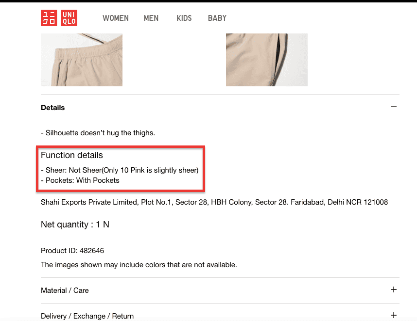
Uniqlo is the master of functional product description. Fabric weight in grams per square metre.
Heat retention ratings. Stretch direction.
For a brand whose clothing is designed to be worn and worn again, this specificity is the brand voice and it converts.
2X Your Apparel Store Conversions
The highest-converting apparel product pages don't just look good. They systematically dismantle doubt.
Fit certainty tells the shopper what size they are.
Visual sensory replacement tells them how it feels. Social proof specificity tells them it worked for someone like them.
Aspirational context tells them who they'll be when they wear it. Frictionless action gets out of the way so they can buy.
Get all five right, and you have a page that does its job. Miss even one and you're trusting luck to cover the gap, which is, in a category as competitive as apparel, a reasonably expensive gamble.


.avif)
.svg)

.svg)

.svg)
.svg)
