Shopify checkout optimization isn’t about adding more elements.
It’s about removing the exact friction that stops users from completing a purchase.
At this stage, users are no longer just browsing, they’re deciding.
From our audits, high-converting Shopify checkouts consistently get four things right: they remove friction, create clarity, build trust, and accelerate completion.
The tactics below are grouped across these four areas so you can focus on what actually moves conversions.
The Shopify Checkout Conversion Framework
If your checkout isn’t converting, the problem usually isn’t your product, it’s the experience.
Most brands jump straight to tactics like upsells, discounts, or urgency. But that’s backwards.
High-performing checkouts follow a clear progression: remove friction first, then guide users clearly, build trust, and finally accelerate completion.
When you get these four stages right, your checkout stops fighting against conversions and starts working for them.
1. Friction Removal
Make it easy to start and impossible to stall.
Before anything else, your checkout needs to feel effortless. Every extra click, field, or decision creates resistance, and resistance kills conversions.
Focus on offering guest checkout so you don’t force account creation, along with autofill and Shop Pay to reduce typing and speed things up.
Why this matters: Most drop-offs happen in the first 30 seconds of checkout. If it feels like work, users leave.
2. Clarity & Flow
Guide users so they never feel lost
Once friction is reduced, the next barrier is confusion. If users don’t know what’s happening or what comes next, they hesitate.
Focus on a clean, mobile-first layout with logical structure, clear progress indicators that show how close they are to finishing, and full transparency by revealing costs, shipping, and timelines early.
Why this matters: Uncertainty creates hesitation. And hesitation leads to abandonment.
3. Trust & Reassurance
Answer the silent doubts in the buyer’s mind
Focus on clear and confident microcopy, easy-to-find policies for returns, shipping, and privacy, plus strong localization signals like the right currency, language, and region-specific details.
Why this matters: After friction, trust is the biggest conversion driver.
4. Completion & Acceleration
Make finishing the easiest decision
At this point, the user wants to buy. Your job is to make finishing fast, simple, and repeatable.
Focus on offering familiar and trusted payment methods, smart default options that reduce decisions, and saved information to enable faster future checkouts.
Why this matters: Even small delays at the final step can cause drop-off.
How to Customize Your Shopify Checkout Page (Using the 4-Stage Framework)
1. Make Guest Checkout the Hero to Remove Friction
If you fix just one thing, start with guest checkout and Shop Pay.
Consider that a shopper is excited, cart full, ready to buy, then bam, “Create an account to continue” stops them cold.
That single friction point kills more sales than you think.
When it comes to Shopify checkout page optimization, the smartest first move is removing every barrier.
Head to settings, go to checkout, click on customer accounts and set it to “Accounts are optional.”
This single change instantly enables guest checkout and eliminates one of the biggest sources of friction for first-time buyers.
This way, guest checkout becomes the hero of your Shopify checkout customization.
Take it further by turning on Shop Pay. Now returning customers enjoy near one-click magic while you still get all the details you need.
With Shopify’s latest updates, they can save addresses, auto-fill instantly, and glide through checkout without hesitation.
This is exactly how to customize Shopify checkout page the right way, especially powerful with Shopify Plus checkout customization options.
Pro move: Add this reassuring line right below your checkout button: “No account needed. Checkout as a guest, we’ll email your receipt instantly.”
Less typing, fewer drop-offs, and more completed orders. Simple, but it works wonders.
2. Localize Your Checkout by Market
Once friction is reduced, the next barrier is personalized localisation.
We have seen this often happen on global Shopify stores.
A customer from Canada reaches your checkout, only to see U.S. shipping options, confusing duties, and unfamiliar formats.
That sudden confusion makes them pause… and hesitation at checkout is deadly.
This is exactly why smart Shopify checkout page optimization goes beyond speed, it needs to feel personal.
With Shopify Markets, learning how to customize the Shopify checkout page by location becomes effortless.
You can now deliver a truly localized experience: region-specific shipping rates, local currencies, clear duty information, and messaging that matches each market.
Canadian shoppers see familiar carriers and transparent duties, while U.S. customers get the delivery expectations they know and trust.
Shopify has also upgraded local pickup, automatically showing the nearest location first with a clean, intuitive modal for alternatives.
Your Shopify checkout customization stops feeling like a generic form and starts feeling like it was built just for them. When checkout feels local and intuitive, customers don’t hesitate, they buy.
3. Turn Doubts into Confidence
If shoppers are reaching checkout but not converting, the issue is almost always friction or trust, not traffic.
Imagine reaching the payment step, cart full, excited to buy, then suddenly doubt hits:
“Is this secure? What if I need to return it? Can I really trust this brand?”
That exact moment is where most sales quietly die.
Here’s why trust signals work to reassure shoppers.
Embed live chat (Shopify Inbox or your favorite app) so questions get answered instantly.
Add trust badges, security seals, and a crystal-clear returns policy right above the “Pay now” button.
Make your returns policy impossible to miss, something like “30 days to return | Easy & free on orders over $X” sitting right next to the order total.
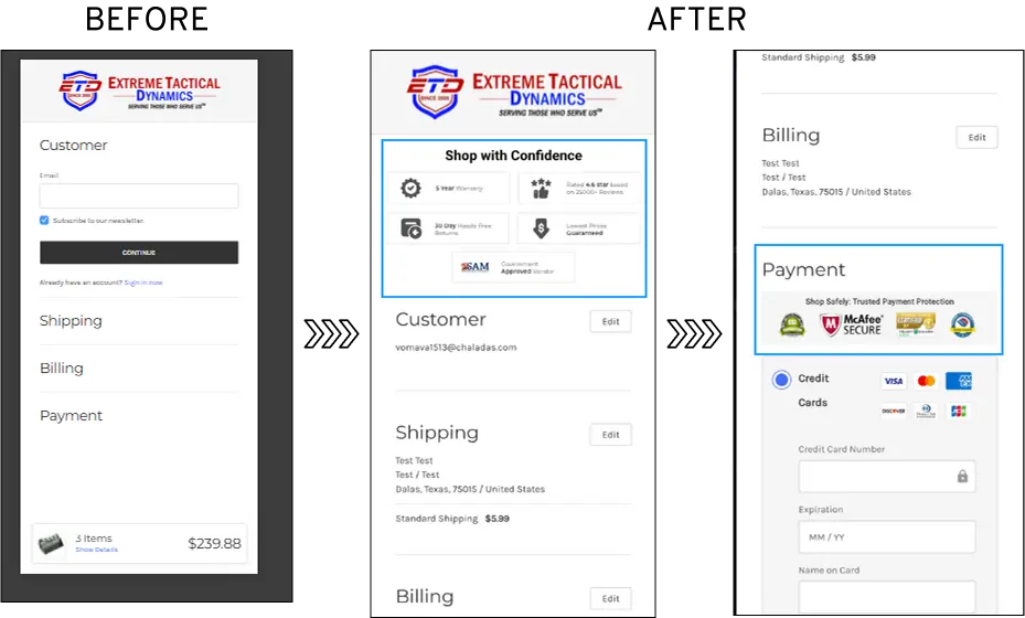
Convertcart Case Study - Extreme Tactical Dynamics.
41% of their customers were abandoning the checkout page, not because of price or product, but because trust was missing at the critical moment.
We didn’t redesign everything.
Through smart checkout customization, we simply added visible security badges, clear return and warranty messaging, and real customer ratings right where doubts appear.
The results were impressive, with almost 10.67% increase in revenue on desktop and 5.10% increase on mobile.
But most of all, the store saw 11% reduction in checkout abandonment. (Read the full case study here.)
That’s the real power of learning how to customize the Shopify checkout page effectively, especially with Shopify Plus checkout customization tools.
When customers see these reassurances exactly when they need them, hesitation disappears.
4. Give Real Choice with Shipping & Payments
Your customer has made it this far. You have removed friction, established trust, and personalized the experience.
Now your checkout needs to get rid of any lingering confusion.
At this final stage, clarity and speed are everything. This is where smart Shopify checkout customization makes all the difference.
Give them a real choice. Offer multiple shipping options, standard, express, and local pickup, with clear delivery dates and upfront costs. Highlight the fastest or best-value option so they don’t have to guess.
For payments, make it effortless. Prioritize Shop Pay, Apple Pay, and Google Pay while keeping all major cards visible and easy to spot.
The fastest methods should feel like the obvious choice.
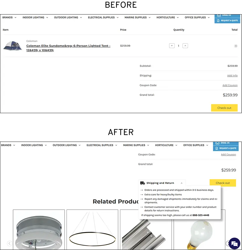
Convertcart Case Study - Lighting & Supplies
We saw this firsthand with our client, Lighting & Supplies.
42% of users were dropping off and 14% felt confused about shipping.
By adding clear shipping badges, estimated timelines, and transparent costs straight into their Shopify checkout page, we created instant trust.
The transparency built instant confidence.
And resulted in a solid 4.41% website-wide conversion gain, with many customers moving through checkout faster because they knew exactly what to expect. (Read the full case study here.)
Give them a choice without friction, and they’ll happily complete the purchase.
Put It All Together: A Clean, High-Converting Shopify Checkout Page
The best Shopify checkout customizations feel invisible. They remove friction without adding clutter.
Keep the design clean and mobile-first (most checkouts happen on phones).
Use progress indicators so customers know they’re almost done.
Place trust elements and return info strategically throughout.
Test everything. Shopify Plus users can especially use Checkout Extensibility to add custom sections, banners, or even conditional logic.


.svg)

.svg)

.svg)
.svg)
