How Do You Optimize Shopify Collection Pages for Conversions?
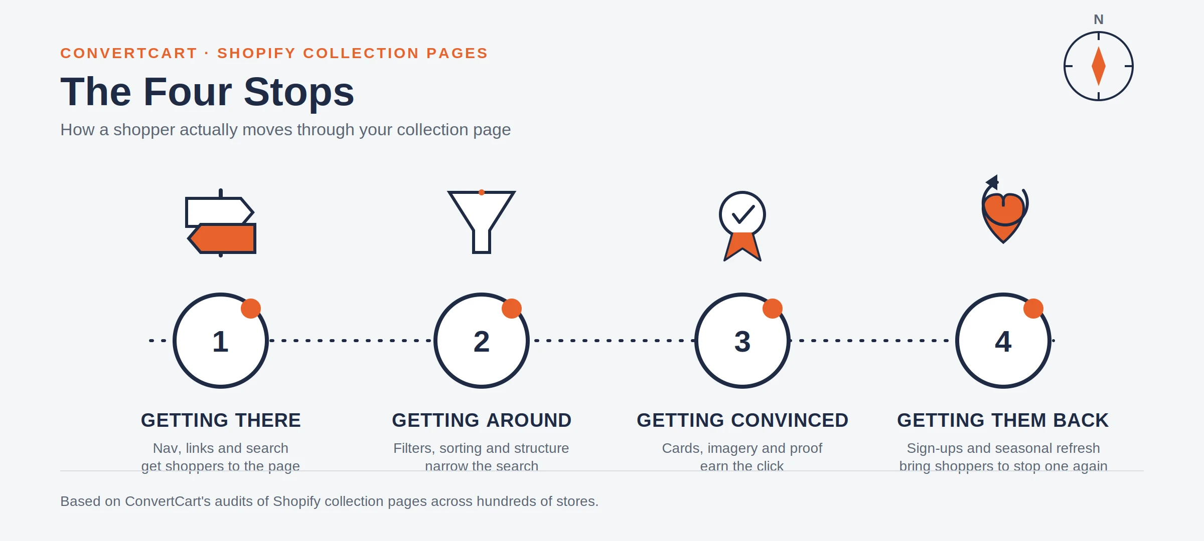
To optimize your Shopify collection pages for conversions, you need to fix all four stops of the shopper journey together.
The best way is to get shoppers to the page (navigation, SEO), help them narrow the results (filters, sorting, hierarchy), convince them at the product grid (photography, badges, trust signals), and give them a reason to come back (sign-ups, saved items, seasonal refresh).
In our audits, we have learnt that isolated fixes tend to produce a 3 to 8 percent lift.
But fixing all four stops together tends to produce 35 to 55 percent, because the page stops fighting itself.
What if the one fix you keep meaning to make on your collection page is something that barely moves the needle?
Here’s what we have observed across collection-page experiments and audits we've run: Isolated tweaks rarely change shopper behaviour.
In this post, we show you experiments that taught us what works for Shopify collection page optimization.
We also take you through the Four Stops framework we’ve built from what we’ve learnt through those experiments.
What We Found Auditing Shopify Collection Pages
Before we ran a single experiment, we audited hundreds of Shopify collection pages to see what was missing.
What we observed was that the same gaps showed in many of our experiments. And we’ve put them together in the framework below.
Problem We Found
Share of Collection Pages Audited
Stop It Breaks
Left on Shopify's default sort order instead of a deliberate one
61%
Getting Them Around
No collection description, so the page has nothing to rank for
74%
Getting Them There
No filters, or filters that don't match how the catalogue is actually shopped
43%
Getting Them Around
Inconsistent product photography across the grid
38%
Getting Them Convinced
No way to save, wishlist, or sign up from the collection page
52%
Getting Them Back
What Our Collection-Page Experiments Actually Taught Us
We ran three collection-page experiments on live Shopify stores, each testing a single, specific change. Here are the results:
Experiment
What We Changed
Collection Impact
Site-Wide Impact
What It Taught Us
Improvia
Let shoppers self-select by situation instead of filtering by attribute
+70%
+3.2%
Intent-based navigation can outperform attribute filters
Wolfworthy
Surfaced key ingredients on the collection page instead of the product page
+18%
+1.3%
Some product-page information belongs upstream, on the collection page
Millican Pecan
Added a bestseller tag to the collection grid
+7%
+1.19%
A small decision shortcut can outperform a full redesign
Two ideas from that table are worth pulling out on their own, because they go further than any single tactic later in this piece.
Filter by intent, not just attributes: Improvia's shoppers weren't looking for a specific size or colour. They were looking for a situation: who they were buying for, and why.
Letting them self-select on that basis skipped several steps of conventional filtering entirely.
Move decision-critical information upstream: Wolfworthy's ingredient list didn't change. Its location did.
Shoppers were making a trust decision on the collection page and getting sent to a product page to find the one detail that would have settled it there.
Why Most Single Collection-Page Fixes Produce Single-Digit Gains
A collection page usually sits between two teams, and the issue most often is that neither one owns it. The merchandiser picks the products. The marketer writes the homepage copy.
Whoever eventually touches the collection page borrows five minutes from a longer to-do list, so the fix is almost always small.
Across the collection-page work we've analyzed, isolated UI changes typically produce modest gains, often in the 3 to 8 percent range, because they remove friction at one interaction point while leaving the rest of the browsing journey unchanged.
A full overhaul that restructures cards, standardises badges, pins the right filters, and fixes image ratios feels like magic. Why? Because it removes friction across the whole path rather than one point on it.
Fix Strategy
Primary Impact
Typical Conversion Lift
What's Actually Happening
Isolated Fix (a quick-buy button, a reordered filter)
Marginal gain at one interaction point
3 to 8%
Shoppers notice the tool, but overall friction stays the same
Holistic Overhaul (cards, badges, filters, and images fixed together)
Systemic drop in browsing friction
35 to 55%
Shoppers scan and evaluate without the small pauses that add up to decision fatigue
That range isn't a hard ceiling, and the experiments above prove it.
Improvia's single change returned 70 percent, not 8, because it happened to unblock a stop that was badly broken rather than polish one that already worked.
The exception matters as much as the rule: a single fix can outperform an overhaul if it hits the right bottleneck, but you can't know which bottleneck is right without diagnosing the page first, which is what the next section covers.
Shoppers can scan ten products in the time it used to take to process three. That compounding effect is the whole case for a full pass, and it's why the framework below covers every stop together instead of one at a time.
That's the framework we built: four stops every shopper moves through on a collection page, mapped below. Miss one, and the other three can't fully compensate.
The Four Stops Audit: What to Check in Five Minutes
Before changing anything, spend five minutes checking whether each stop is even working. This is the same pass we run at the start of an audit.
Stop
60-Second Check
If It Fails
Getting Them There
Is the collection in your primary nav within two clicks of the homepage?
Fix navigation before touching anything else on the page
Getting Them Around
Open the page on a phone. Can you filter and sort without pinching to zoom?
Fix mobile filtering before adding more filter options
Getting Them Convinced
Do product cards show a price, a rating, and a consistent image crop?
Fix card consistency before adding badges or copy
Getting Them Back
Is there any way to save, wishlist, or sign up from this page?
Add one retention mechanic before optimizing the others
This five-minute version covers collection pages only.
How We Diagnose a Shopify Collection Page Before Changing Anything
A checklist tells you what's missing. It doesn't tell you what's actually broken. Before recommending a specific fix, we look at five signals, each of which points back to one of the Four Stops.
Collection-to-Product Click-Through Rate: Are They Clicking The Products?
A low click-through rate from the collection page to product pages usually means shoppers aren't finding anything worth a closer look.
This points back to Getting Convinced: the cards themselves aren't doing their job.
Filter Usage Against Conversion Rate: Are They Buying?
High filter usage paired with low conversion suggests an assortment or relevance problem rather than a discoverability one.
Shoppers are finding the filters. They're just not finding what they're filtering for, which points back to Getting Around.
Products Viewed Before a Product Click: Are They Browsing Too Much?
If a shopper inspects twenty or more products before clicking on one, the problem is usually product differentiation or missing information on the card, not the number of products available.
That's a Getting Convinced signal too, but a different one than click-through rate alone.
Collection Exit Rate: Are They Leaving?
A high exit rate straight from the collection page, with no filter use and no product click, usually means the shopper landed in the wrong place.
That's a Getting There problem: a navigation label or search result promised something the collection didn't deliver.
Mobile Versus Desktop Click-Through Gap: Are There UX Issues?
A large gap between mobile and desktop click-through rates usually isn't a content problem, it's a density and filter-usability problem specific to the smaller screen.
That's a Getting Around issue, worth checking before assuming the mobile shopper simply wants something different.
Run these five checks before touching the page, and you'll know which stop to fix first instead of guessing. These signals are specific to collection pages.
A diagnosis tells you where to look. But the next step is to understand what to fix.
The four sections below tell you what to actually do once you're there, in the order a shopper actually experiences them.
1. Getting Them There
A collection page only works if shoppers land on it, and most stores make that harder than necessary.
Put Collections in Your Main Navigation: Make Them Visible
If a shopper has to open a menu, then a submenu, then guess which label matches what they want, you've already lost some of them before they've seen a single product.
Put your key collections in the primary nav, with clear labels rather than a generic "Shop" link.
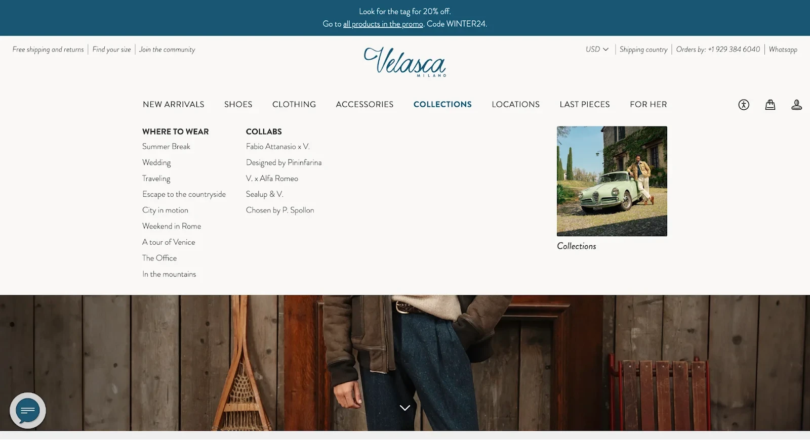
Velasca pins a lifestyle-based dropdown, sorting collections by occasion instead of just product type, so shoppers self-select the path that fits them.
Build Landing Pages for Seasonal Promotions: Catch Them When They Are Ready
If your only home for a holiday sale or a product drop is a homepage banner, the promotion disappears the moment something else takes its place.
Build a dedicated landing page instead, link it from your nav and homepage both, and give it a life span. Once the promotion ends, redirect the URL rather than leaving a dead page indexed.
Write Titles and URLs Around What Shoppers Search: Make Your Collections Searchable
If your collection titles read like internal names, "The Edit," "Curated Picks," rather than search terms, you're asking Google to guess what the page is about.
Structure titles around what people actually type into Google, something like "Women's Running Shoes." Keep URLs short and readable too.
A page at /collections/womens-running-shoes gives search engines a clearer signal than a page at /collections/c-4471-b, all else being equal.
Turn New Arrivals Into Their Own Collection: Create Excitement
If new products only show up buried inside the full catalogue, returning shoppers have no reason to check back. Give new arrivals a dedicated collection instead.
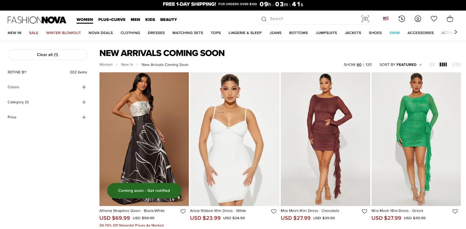
Fashion Nova lets shoppers sign up for notifications on pieces that haven't launched yet, turning a coming-soon page into an email capture.
⚠️
Find out what's stopping your store visitors from buying
Product discovery – barriers that prevent shoppers from finding items
Category/collection pages – improvements that drive deeper product exploration
Product page – what to optimize to convert 2–3x more buyers
Cart – ways to ease hesitation and speed up purchase decisions
“The report was deep and super insightful. Can’t believe it’s free.”
Logan Christopher CEO, Empire Herbs
2. Getting Them Around
Once a shopper lands on the page, the job changes. Now it has to help them narrow a wall of products down to the handful that fit.
Keep Your Collection Hierarchy Three Levels Deep: Keep Them Informed
If a shopper can't guess which menu holds what they need within a couple of clicks, the hierarchy is costing you twice, once in lost sales and once in diluted SEO authority.
Build collections the way a department store organises floors: broad category, then sub-category, then a specific type.
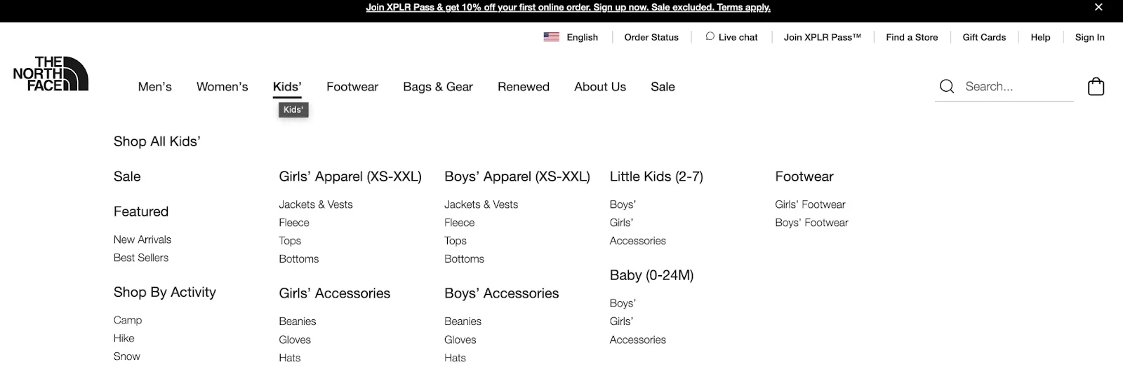
The North Face nests kids' apparel by age and size right in the navigation, so a shopper never has to guess which menu holds what they need.
Add Filters That Match How Shoppers Actually Search: Make Filters User-Friendly
If shoppers are scrolling for a while before finding something relevant, filters aren't optional; they're the fix. Keep the list short: price, size, colour, and availability cover most catalogues.
Show a product count next to each option, and default the sort to bestsellers rather than whatever Shopify ships with.
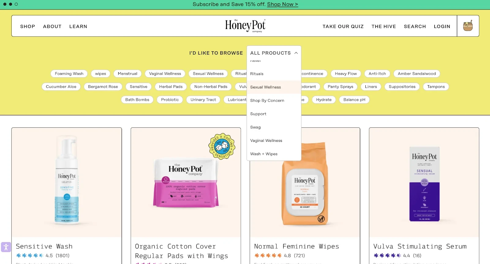
The Honey Pot filters by lifestyle need instead of just product type, which shortens the path for a shopper who knows their concern but not the product name.
Add Search Suggestions That Point to Collections: Make Searching Easier
If your search bar only returns individual products, a shopper looking for a category has to already know a product name to find it.
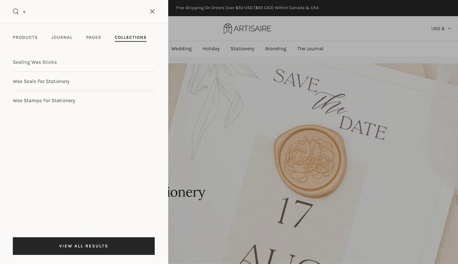
Build autocomplete that surfaces collections alongside products, so a shopper typing "wax seals" lands on the whole range instead of one item.
Artisaire's search drops shoppers straight into a matching collection before they've even finished typing.
Design the Filter Panel and Grid for Mobile First: Focus on Mobile UX
If most of your collection traffic arrives on a phone and your filters were designed for a desktop sidebar, that mismatch is likely showing up in the mobile-versus-desktop click-through gap flagged above.
Use a two-column grid rather than a single column, which shows more products without shrinking them past readability.
Convert the filter sidebar into a slide-out panel with a sticky button, and keep image files light enough to load fast on a mobile connection.
Let Shoppers Filter by Who They're Shopping For: Give Them Enough Choice
Sometimes the fastest way to narrow a search isn't a filter sidebar at all, and Improvia's experiment above is the clearest proof we have of that.
We tested a "Caregiver Choice" feature on Improvia's adults collection page, a Shopify store selling washable underpads for incontinence care.
The feature let shoppers self-select their situation instead of sorting through every product. It lifted conversions on that collection by 70 percent and moved site-wide conversion by 3.2 percent.
Protect Your Filters from Wrecking Your SEO: Technical SEO Matters
If every filter combination creates its own indexable URL, you can end up with thousands of thin, near-duplicate pages competing for the same crawl budget.
Filter through JavaScript where you can, so the URL stays clean and only the handful of filtered views worth ranking gets indexed.
If you run infinite scroll, keep a crawlable paginated version underneath it, since Googlebot typically loads one screen and stops.
3. Getting Them Convinced
A shopper who has found the page and narrowed the results now stands in front of a grid of tiles, deciding which one earns a click.
Keep Product Photography Consistent Across the Grid: See How It Looks
If crops and backgrounds vary from product to product, the collection reads as cheap even when the individual items are well made.
Shoot every product the same way, on the same background, at the same angle.
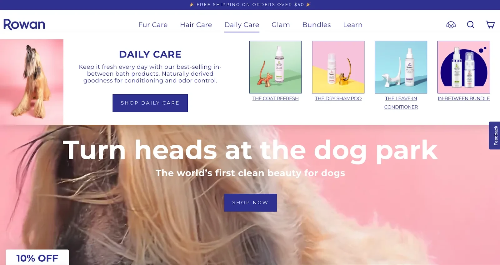
Rowan pairs consistent product shots with lifestyle imagery around them, so the grid feels curated rather than assembled.
Add Real Badges and Genuine Urgency Cues: Make Them Authentic
A badge only earns trust if it's true. "Only three left" works the first time a shopper sees it proven right, and it stops working the moment they catch you in the lie.
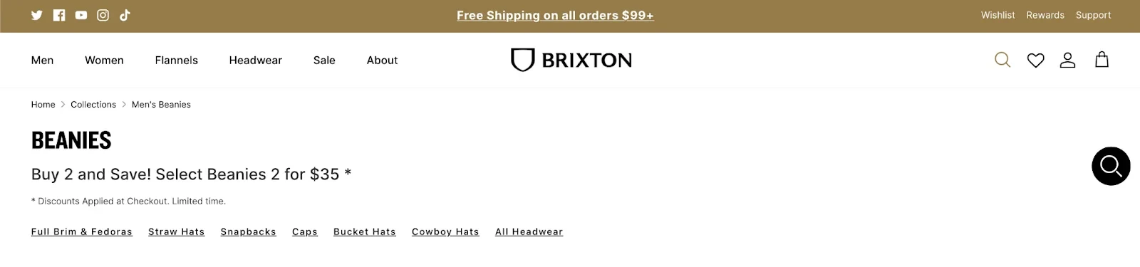
Brixton pairs a real, time-boxed discount with a clear call to action on its beanies collection, and never leaves the badge up after the promotion ends.
Brixton's beanie discount is time-boxed and genuine, which is why it works.
Surface Trust Signals Shoppers Look for First: Social Proof Matters
If shoppers are viewing a lot of products before clicking through, per the diagnostic signal above, the missing information might not be on the card at all.
It might be one click too deep, sitting on the product page instead.
We ran a test for Wolfworthy, a UK dog food brand, making its key ingredients more prominent on the category page instead of leaving that detail on individual product pages.
The change lifted conversions on that collection by 18 percent and moved site-wide conversion by 1.3 percent, the same pattern the experiments table above shows.
Tag Bestsellers So Shoppers Don't Have to Guess
If a shopper has no way to tell which product other people actually buy, they end up doing the social proof research themselves, by reading reviews or asking someone else.
For Millican Pecan, the fix was a simple bestseller tag on the pecans collection page.
It added a 7 percent lift on the collection and a 1.19 percent site-wide gain, without any new photography or layout work, proof that the smallest intervention in our experiments was also one of the most reliable.
Break Big Collections Into Sub-Sections Shoppers Can Scan: Make Them Easy to Browse
If a single collection holds hundreds of products with no internal structure, you're asking a lot of a shopper's patience before they even reach a filter.
Break it into sub-sections shoppers can scan at a glance.
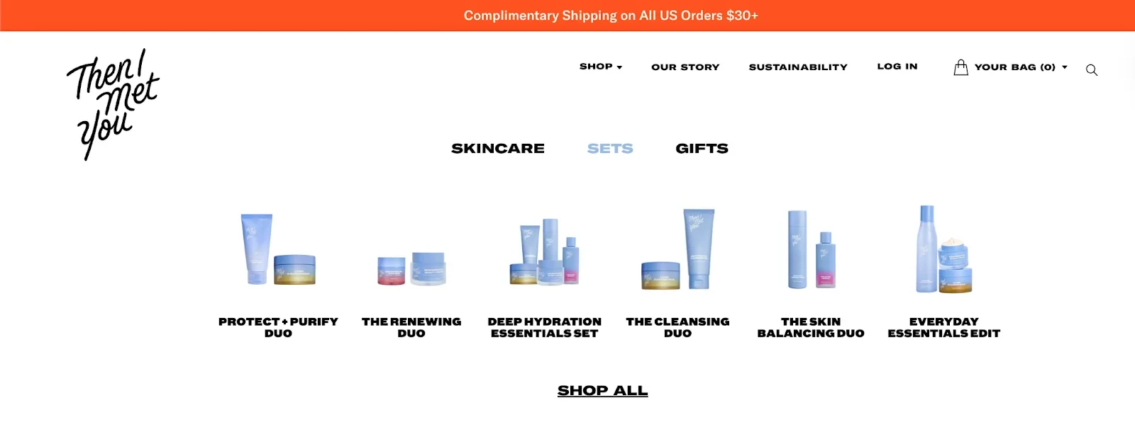
Then I Met You splits its range into Skincare, Sets, and Gifts right at the top of the page, so a shopper never has to scroll through the whole catalogue to find the format they came for.
Curate Collections Around Themes and Occasions: Catch Their Attention
A broad category like "Skincare" helps a shopper who's undecided. A shopper who already knows what they want, a gift, a holiday, a specific occasion, needs something more specific than a category.
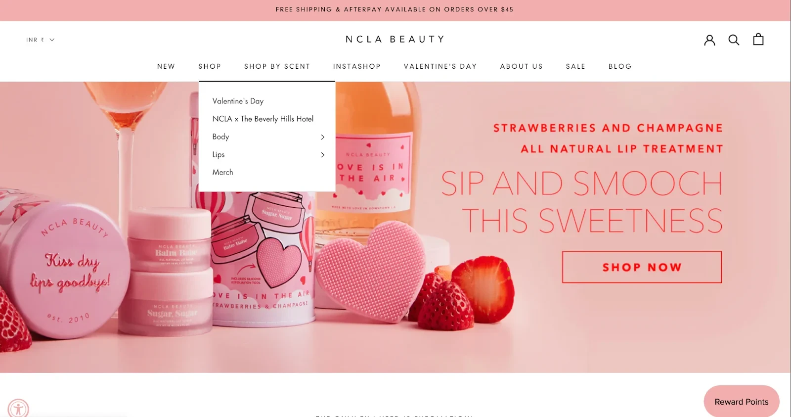
NCLA Beauty builds a Valentine's Day collection every year, pulling relevant products out of the general catalogue and giving them a reason to be seen together.
⚠️
Find out what's stopping your store visitors from buying
Let Shoppers Save Products for Later: Offer Convenience
If a shopper leaves without buying and has no way to save anything, that visit produces nothing you can act on later.
Save-for-later, wishlists, and share links all work because they turn a browsing session into a small commitment.
Make the save action visible without requiring an account first, and ask for the email only once the shopper has already saved something, when the request feels like a convenience instead of a toll.
Trade a Little Friction for an Email or Account: Find Ways to Engage
Gating a collection only works if the shopper can see why the trade is worth it.
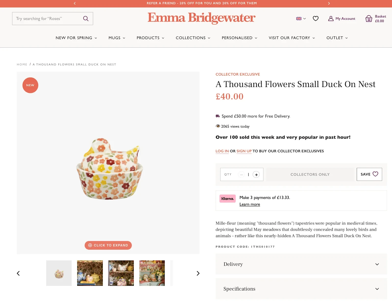
Emma Bridgewater reserves a handful of collector-exclusive pieces behind a sign-up, and pairs that friction with real proof it's worth clearing: genuine view counts and a note on how many sold that week.
Personalize Collections for Gifting and Subscriptions: Make Them Feel Cared
If a shopper buys the same category of product on a cycle, size, flavour, or refill, a static collection makes them start from scratch every time.
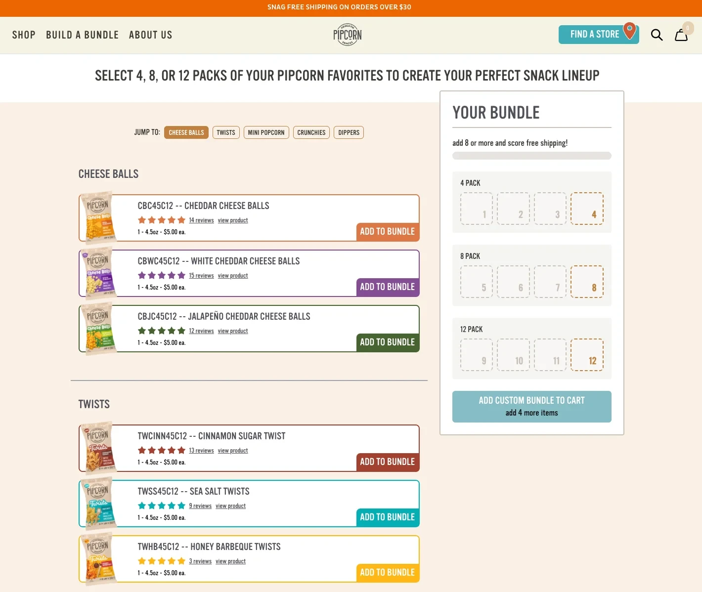
Pipcorn lets shoppers build a custom snack bundle from its full collection, choosing pack sizes and flavours instead of buying a fixed set.
The same logic works for subscriptions: let the shopper set it up once, and the collection page becomes a page they don't need to revisit every month.
Keep the Collection Fresh for Return Visits: Showcase Variety
If a collection looks identical on a shopper's second visit as it did on their first, you've given them no reason to look twice.
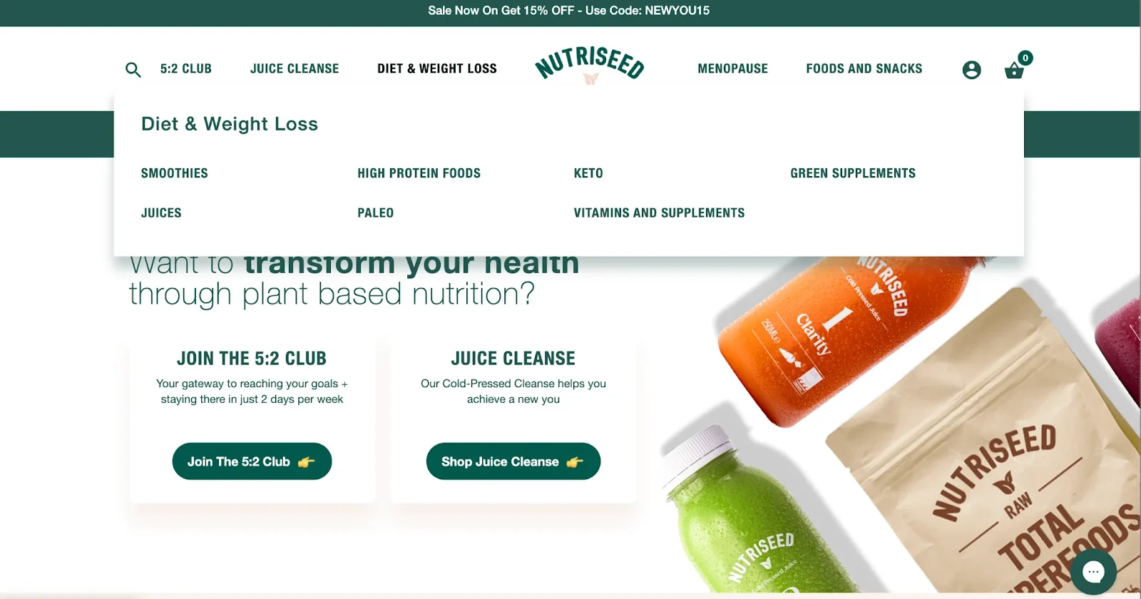
Reorder collections seasonally, or regroup products around a new need, the way Nutriseed organises its range by goal (weight loss, menopause, energy) rather than just product type.
A returning shopper finds something that feels current, even if half the catalogue is the same as last month.
Whoever Owns This Page Needs to Own All Four Stops
Read back through those four stops and a pattern emerges. Getting There is a navigation and SEO problem.
Getting Around is a filtering and technical SEO problem. Getting Convinced is a trust and content problem. Getting Them Back is a retention problem.
Different teams usually own different pieces of that list. That's exactly why the page falls through the cracks in the first place, and why most fixes that do happen only ever touch one stop instead of all four.
The three experiments earlier in this piece make the cost of that concrete. Improvia, Wolfworthy, and Millican Pecan each moved the needle with a single change, but none of those changes would have worked without first diagnosing which stop was actually broken.
Whoever owns your collection pages needs to own the diagnosis as much as the fix, and all four stops, not just the one closest to their job title. Collection pages are one piece of a bigger picture too.
A collection page will never get the attention a homepage gets, and it probably shouldn't.
But it carries more of your traffic and more of your revenue than most teams give it credit for. That's usually the first thing that changes once someone finally looks.
Run the five-minute audit, check the five diagnostic signals, and walk your own collection pages through the Four Stops this week.
You'll likely find at least one stop nobody has touched since the store launched, and that stop is where an hour of work tends to pay for itself.
Frequently Asked Questions
What Is a Shopify Collection Page, and How Is It Different from a Category Page?
A Shopify collection page groups related products together, the way a clothing store might group everything under "Men's Jackets."
Shopify uses the word collection instead of category, but the two mean the same thing.
The collection page's job is to bridge the gap between a shopper landing on your site and finding the specific product they came for.
What's the Difference between an Automated and a Manual Shopify Collection?
An automated collection fills itself based on rules you set, such as product type or a tag, and it updates on its own whenever you add matching inventory.
A manual collection only includes products you add by hand, which gives you full control but means you maintain it yourself.
Automated collections suit most catalogues. Manual collections work better for small, hand-picked sets, like an influencer's curated picks.
How Do I Link a Shopify Collection to a Page in My Navigation Menu?
Go to your Shopify admin, open Online Store, then Navigation. Select the menu you want to edit, add a menu item, and choose the collection from the link type dropdown.
The collection appears in your navigation as soon as you save, with no theme code required.
How Many Products Should a Shopify Collection Page Show at Once?
In the stores we've audited, somewhere between 24 and 48 products per page tends to balance browsing with speed, though the right number depends on your catalogue and image weight.
Fewer forces excessive pagination, and many more slows the page down under the weight of all those images.
Does Infinite Scroll Hurt Collection Page SEO?
It can, if you're not careful. Googlebot typically loads one screen and stops, so products further down the page can go uncrawled unless a paginated version sits underneath the infinite scroll.
Infinite scroll works fine for the shopper as long as search engines still have a paginated path to follow.
Does Every Collection Need Its Own Description?
Every collection benefits from one, but your top ten collections by traffic deserve the most attention.
A short paragraph above the grid and a longer one below it gives search engines the content they need without pushing products out of view.
We Sell in Multiple Countries. Does Collection Page Optimization Change for a Global Store?
The core framework stays the same, but Getting There and Getting Convinced need local detail. Show pricing in local currency, translate the collection description instead of running it through autotranslate, and merchandise seasonally by region, since a "summer sale" collection means something different in July depending on which hemisphere your shopper is standing in.
Subscribe for more articles like this!
Thank you - we'll see you in your inbox soon!
Oops! Something went wrong while submitting the form.
Read by 5000+ ecommerce store owners
Subscribe for more articles like this!
Thank you - we'll see you in your inbox soon!
Oops! Something went wrong while submitting the form.





.avif)
.svg)


.svg)

.svg)
.svg)
