Note: This isn't a collection of generic 'best practices.' This is the exact 10-stage diagnostic framework our team used to audit 100+ eCommerce stores in the last 12 months to identify hidden revenue leaks.
Today, we'll help you audit your eCommerce store. The audit covers 10 key stages, and each one includes real-world examples as well as actionable fixes, so you’re not just spotting problems, you’re solving them.
eCommerce UX Audit: Critical Problems, How To Spot Them & Their Fixes
Symptom
What's Happening & How to Spot It
Key Elements to Optimise
High Bounce Rate
What's happening Visitors leave before exploring the store further.
High homepage exits, short session duration, low scroll depth.
Primary Area: Homepage UX
Above-the-fold value proposition
Hero image clarity and loading speed
Homepage navigation and visual hierarchy
Low Product Discovery Rate
What's happening Shoppers struggle to find relevant products quickly.
Low search engagement, shallow category browsing, high navigation exits.
Primary Area: Navigation UX
Navigation labels and category structure
Search bar visibility and effectiveness
Filters, breadcrumbs, and product discovery paths
Low Category Page Engagement
What's happening Users browse category pages briefly without interacting deeply.
Low filter usage, weak click-through to PDPs, rapid category-page exits.
Primary Area: Product Listing Page UX
Product card clarity and quick-scan elements
Filter usability on desktop and mobile
Pagination / infinite scroll behaviour
Low Product Page Conversion Rate
What's happening Visitors view products but hesitate to buy.
Strong PDP traffic but weak add-to-cart rate and low buying intent signals.
Primary Area: Product Page UX
Product imagery and visual cues
Product descriptions and benefit communication
CTA consistency, pricing visibility, and trust information
High Add-to-Cart Drop-Off
What's happening Users add products but abandon before checkout.
High cart activity but weak progression to checkout.
Primary Area: Cart Page UX
Cart editing experience and real-time updates
Checkout CTA visibility and mobile usability
Transparent pricing and trust signals
High Cart Abandonment Rate
What's happening Shoppers begin checkout but fail to complete payment.
Checkout starts remain high while completed purchases lag far behind.
Primary Area: Checkout Flow UX
Number of checkout steps and form fields
Guest checkout and social login availability
Payment trust signals and mobile checkout UX
Low Mobile Conversion Rate
What's happening Mobile users browse but convert far less than desktop users.
Strong mobile traffic paired with weak mobile revenue contribution.
Primary Area: Mobile UX
Tap targets and mobile readability
Mobile menu structure and navigation clarity
Mobile checkout usability and order summary visibility
Low Repeat Purchase Rate
What's happening Customers buy once but rarely return.
Low returning customer revenue and weak retention metrics.
Primary Area: Post Purchase UX
Order tracking and shipping communication
Loyalty and account creation nudges
Post-purchase cross-sells and review requests
Low Search Conversion Rate
What's happening Users use search but still fail to find the products they want.
High search usage but poor search-to-purchase conversion.
Significant drop-off between shipping, payment, and order confirmation stages.
Primary Area: Checkout Flow UX
Form validation and payment error prevention
Mobile checkout responsiveness
Ability to edit cart during checkout
Low Average Order Value (AOV)
What's happening Customers purchase fewer or lower-value items per order.
Orders contain very few products and limited bundle purchases.
Primary Area: Cart Page UX
Frequently bought together modules
Relevant cart upsells and bundles
Product recommendations near checkout
Low Trust / High Exit Rate on PDPs
What's happening Shoppers leave product pages without feeling reassured.
High PDP traffic with weak add-to-cart activity and high exits.
Primary Area: Product Page UX
Reviews, guarantees, and shipping FAQs
Pricing visibility and reassurance elements
Consistency between images, copy, and CTAs
Poor Mobile Engagement Time
What's happening Mobile visitors disengage quickly during browsing.
Low mobile session duration and shallow mobile scroll depth.
Primary Area: Mobile UX
Mobile page speed and multimedia optimisation
Swipe-friendly reviews and content layouts
Touch-friendly product browsing experience
High Support Queries During Purchase
What's happening Customers require assistance before feeling confident enough to buy.
Frequent pre-purchase chats, support tickets, or checkout-related complaints.
Primary Area: Technical UX
Chatbot responsiveness and clarity
Form usability and error messaging
Payment reliability and technical stability
Accessibility Complaints
What's happening Some users struggle to navigate or interact with the store comfortably.
Accessibility feedback, usability complaints, or friction during assistive navigation testing.
Primary Area: Accessibility UX
Color contrast and readable typography
Alt text, captions, and multimedia accessibility
Keyboard-only navigation and focus states
Bookmark this checklist; it’s most useful when revisited every quarter.
This post covers your complete store experience. If you're looking to optimize a specific standalone landing page or paid campaign page, use our Landing Page CRO Checklist instead.
Here's a list - in case you'd like to jump to a section of your interest:
Your homepage is the digital equivalent of a storefront window. It sets the tone for everything that follows.
If the first impression is slow, cluttered, or confusing, most visitors won't stick around long enough to find out what you actually sell.
This homepage UX audit checklist will help you make those first few seconds count.
Does your homepage communicate your value in under three seconds? If a first-time visitor can't tell what you sell and why they should care within the time it takes to blink, you've already lost them.
Your hero section should have a clear, benefit-driven headline and a single, prominent CTA, such as Shop Best Sellers or Browse Collections, right above the fold.
Is your hero image earning its place? A hero visual isn't just decoration. It should reinforce your brand message, match the copy, and load fast enough not to tank your Core Web Vitals.
Test whether your hero image or video supports the story you're trying to tell, or whether it's just taking up space.
Do new visitors immediately trust your store? First-time shoppers arrive with doubt, not intention. That's why it's essential to display trust signals early: customer reviews, star ratings, security badges, or "As seen in" logos.
These elements do quiet but powerful work, especially when someone's visiting your store for the first time.
Is your navigation making it easy for users to get where they want to go? The homepage should act as a launchpad, not a maze. Make sure your menu labels are clear, your categories are logically organized, and your search bar is prominent and easy to spot.
A confused visitor almost never becomes a buyer.
Is your page fast enough to hold attention? Page speed isn't just a technical concern; it's a UX one. A slow-loading homepage feels unreliable, and unreliable stores don't convert.
Check your Core Web Vitals regularly and aim for a load time that keeps visitors engaged, not waiting.
Does the layout guide the eye naturally? A good homepage UX is almost invisible. Shoppers should move from the hero to featured products to promotions without thinking about it.
Use whitespace, visual hierarchy, and directional cues to create a flow that feels effortless.
Are you featuring the right products above the fold? Bestsellers, trending items, or curated collections that are surfaced early give visitors an immediate reason to keep scrolling.
Don't make them hunt for what's popular.
⚠️
Why do shoppers start but never finish their purchase?
Product discovery – barriers that prevent shoppers from finding items
Category/collection pages – improvements that drive deeper product exploration
Product page – what to optimize to convert 2–3x more buyers
Cart – ways to ease hesitation and speed up purchase decisions
“The report was deep and super insightful. Can’t believe it’s free.”
Logan Christopher CEO, Empire Herbs
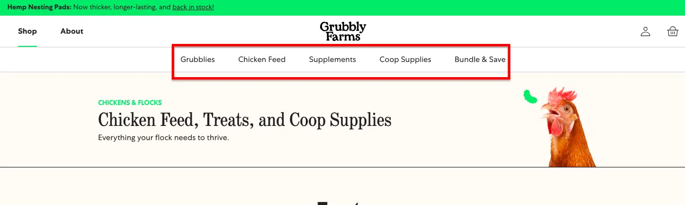
2. eCommerce Navigation UX Audit Checklist
An eCommerce store navigation is a map that guides users through your store and its products.
You’d want the navigation experience to be so seamless that users can keep moving forward without stopping to think about what they’re doing.
This navigation audit checklist will help you get there.
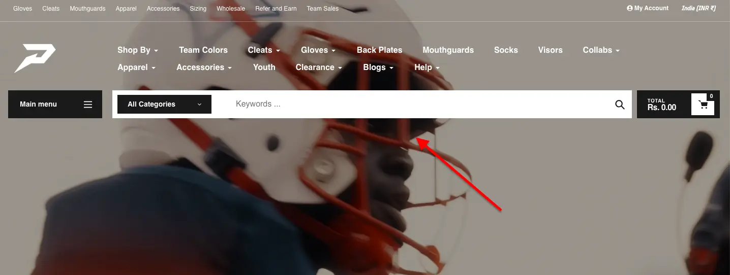
Make sure your labels don’t require a decoder ring. If your customers need a PhD in your product line to navigate your menu, you’ve already lost them. Use category names that are simple and easy to understand.
Take a look at this example:
❌ Lower-body performance apparel
✅ Leggings
Parent categories should always be clickable. You need to ensure there’s a proper intermediary category page that gives users a sense of direction.
If someone clicks “Furniture,” don’t drop them straight into a chaotic grid of 800 products. Give them intermediary pages that break the world into “Sofas,” “Beds,” “Tables,” and “Storage.”
Fewer categories, happier customers. Your customers’ minds are more like carry-on luggage, so there’s a limit to how much they can consume.
Make sure you limit the main navigation bar to 5-7 categories.
Are your filters doing their job? Take a good, honest look at your faceted navigation. Does it actually help users to narrow things down by price, size, brand, color, etc.?
How many clicks does it take to find a product, 2? Or an entire afternoon? If it takes more than two steps to reach a product from your dropdown menu, then something’s off track.
Does your navigation nudge your buyers toward something interesting? You’d ideally want your navigation to whisper helpful things like “Psst… everyone’s buying this one.” Your navigation should gently guide shoppers to bestsellers and trending items.
Have you checked all your navigation links lately? It’s best to test your navigation links regularly. You’d want to make sure they go where they’re supposed to; there should be no dead ends and no surprise detours.
Do your product cards mumble into the void? A good product card should have quick scanners and careful browsers alike.
It’s ideal to ensure that prices, discounts, reviews, and variants are all right there.
Check visual cues on your product listing page. Things like low stock alerts, lightning-fast shipping are things that shoppers actually care about. So don’t make them hunt for these features like it’s some buried treasure.
Are your key filters playing hide and seek? It’s best to make them as easily accessible as possible.
Don’t forget that high-intent buyers are there on your site right now; you need to make their buying experience a breeze.
Is your search bar standing tall or tucked away in a corner? The best strategy is to make sure that your search bar is easy to spot. Also, make sure it is bold and inviting.
Are you using breadcrumbs to help users understand where they are on the site? A breadcrumb is a tiny map that says: “You’re here, here’s how you got here”. That’s why it’s such an essential part of an easy-to-navigate eCommerce store.
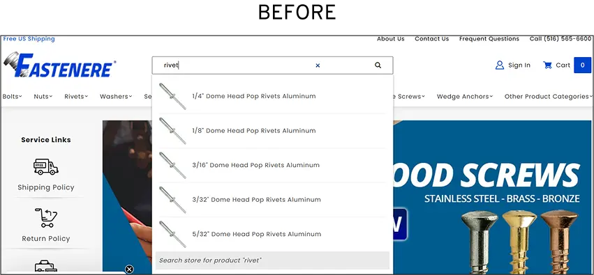
Case Study
How Convertcart Helped Fastenere 3X Search Engagement and Drive 1,107% More Conversions
Fastenere, a high-traffic store, was seeing plenty of visitors but far fewer conversions than its traffic numbers suggested. When we audited the store, we found that only ~1% of visitors were actually engaging with site search, which meant most shoppers were struggling to find the products they came for.
The fix? We implemented an advanced, AI-driven search experience with predictive suggestions, category-based filtering, and results tailored to high-converting queries.
The results were hard to ignore: search engagement jumped from 1% to 3.07% of visitors, that small but highly engaged group delivered a 1,107.8% increase in conversion rate and a 1,975% increase in revenue contribution.
It's a good reminder that a search bar isn't just a box on your page. When it works well, it's one of the most powerful discovery tools your store has.
Product listing pages are where visitors decide whether to dig deeper or leave. They're the gatekeepers of your catalog.
If users can't quickly filter, scan, and evaluate what's in front of them, they'll bounce long before they ever reach a product page.
Use this checklist to audit how well your listing pages are doing their job.
Is your page title instantly telling visitors they're in the right place? A heading like Women's Running Shoes is clear and reassuring. A heading like Footwear is not.
Use descriptive, specific headings so shoppers feel oriented the moment they land.
Are your product cards pulling their weight? Every product card is a mini pitch. Make sure they show high-quality images, prices (with strikethrough discounts where applicable), star ratings, stock indicators, and quick-add buttons.
Shoppers shouldn't need to click into a product just to answer the question, "Is this worth my time?"
Are your filters actually working? Filters are the most important UX tool on a listing page, and they're also the easiest to get wrong.
Check that your price, size, color, brand, and rating filters are intuitive and visible on both desktop and mobile, and that applying them doesn't cause a slow reload or a broken page.
Popular shortcut filters like Best Sellers, New Arrivals, and On Sale are worth surfacing prominently.
Have you thought carefully about pagination vs. infinite scroll? Neither is universally better; it depends on your audience and catalog size.
What matters is that you're monitoring where users drop off. If they disappear after the first page, that's a signal worth investigating.
Are you providing helpful guidance when filters return no results? A blank screen is one of the most demoralizing things a shopper can encounter.
If a filter combination returns nothing, give users a path forward: Try removing a filter or Here are similar products you might like.
Are breadcrumbs helping users stay oriented? A clean breadcrumb trail, like Home > Women's > Running Shoes, lets shoppers move between categories without hitting the back button repeatedly.
It's a small detail that makes navigation feel effortless.
Is the mobile listing experience as good as the desktop one? On mobile, filters should be tucked into an accessible drawer, product images should be touch-friendly, and the grid should adapt cleanly without forcing horizontal scrolling.
Most shoppers are on phones. Your listing page should feel built for them, not adapted for them.
Case Study
How Convertcart Helped PeachSkin Sheets Fix a Filter That Was Sending Shoppers Away and Lifted Category Page Conversions by 2.30%
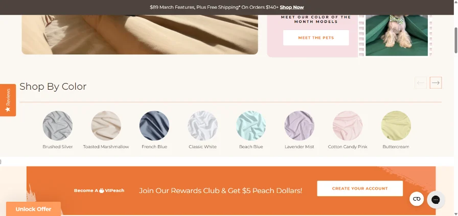
PeachSkin Sheets ran into a problem that's surprisingly common: shoppers were browsing by color to match their bedroom decor, but the "Shop by Color" tab was sending them to a separate page entirely.
Most of them just kept hitting the back button, which added friction and pulled them out of the buying flow.
The fix was simple but effective. Instead of redirecting shoppers to a new page, we added a pop-up that showed color previews right on the listing page. Visitors could browse colors in context and only click through to a product page when something genuinely caught their attention.
The result was a 2.30% overall lift across category pages a meaningful number at scale, especially for a store with high traffic volume.
The lesson: when a filter makes shoppers leave the page to get an answer, that's friction. The best filters bring the answer to them.
4. Product Page UX Audit Checklist
Your product pages are where the real action happens. It’s where curiosity turns to real buying intent and intent often turns into a purchase, hurray!
But, wait, is something stopping users from hitting the buy button?
A solid eCommerce UX audit looks closely at how each element on your product pages earns its keep across your entire catalog: the images, the copy, the CTAs, even the whitespace.
This quick product page UX audit checklist will help turn your product pages into memorable experiences for your customers.
Do you have high-quality images on your product page? You’d want to ensure that you are using high-resolution, multi-view images that give shoppers the confidence to stay and buy on your website.
The same holds true for your product thumbnail images. It’s best to make sure they are detailed and crisp.
Are your product titles and descriptions dancing to their own tune? Consistency in titles and descriptions isn’t just a design nicety; it’s a sanity saver.
When your text and images are aligned, they look visually appealing to your users. And that’s why it’s so important for UX success.
Can shoppers understand the product without playing ping pong? It’s ideal to give users a clean snapshot of the product description.
The idea is to use bullets and showcase the key uses and benefits of your product in a few concise sentences.
This is basic product page hygiene and keeps your prospects informed and engaged.
Are you pushing your prospects to an endless scroll marathon? Check your default number of products per page.
Too few, and shoppers spend half their time clicking “Next.”
Too many, and they’ll be scrolling like they’re training for a finger endurance test. Find a healthy balance, and you’re on your way to keep shoppers happy.
Quick fact: The optimum number of products per page is 10–24 for desktop and 9–15 for mobile.
Do your product images drop helpful hints? Visual cues like Bestseller, Trending, and Low Stock guide your users into making an informed decision.
Ensuring these are there helps your customers figure out which products are worth their time.
Are your CTAs giving out a consistent message? Ensure your primary and secondary CTAs are consistent across products.
For instance, if one product card says “Add to Bag,” another says “Buy Now,” and a third says “Get It,” your shoppers start to wonder if each button means something different.
Instead, you’d want to keep your primary CTA “Add to Bag” everywhere and let your secondary CTA follow the same pattern, like “View Details.”
You’d want to ensure that your CTA copy drives action. Use action-driven, specific language like Add to Bag or Buy Now.
Things like Click Here are vague and never tell the user what to do.
Can shoppers find what fits their wallet without much effort? The ideal way to ensure that your price range filter is clearly and easily toggleable.
Are your product descriptions to the point and friendly? Your user experience shines if you keep your product descriptions focused and free from fluff.
Because your customers quickly wish to know what’s in it for them and see if a product is a good fit. Here’s a good example:
❌ Our 100% cotton T-shirt features superior breathability, optimized stitching, and high-grade fabric density suitable for diverse weather conditions. ✅ A soft, breathable cotton tee that feels good in any weather. Comfortable, durable, and easy to wear every day.
Don’t forget that your goal isn’t to impress your target audience but to make them understand the feeling of owning a specific product.
Is your pricing easy to spot? When shoppers have to hunt for the price, it feels a bit like being at a restaurant with no menu.
You’d want to use a contrasting background and a big, bold font to make it stand out on your product display.
Can shoppers find all the relevant information without leaving the page? Good UX means reducing friction, and nothing says friction like opening three tabs just to learn when the package might arrive.
FAQs, guarantees, and shipping details shouldn’t feel like fine print hidden in another universe.
You won’t keep them easily available to your customers.
Are there expandable sections that make customers dig deeper? The right way is to include expandable sliders and carousels to make your products more lifelike.
Only high-intent shoppers make it to the cart. The hard part of earning their interest is already done.
But the cart page is where that intent can quietly collapse, thanks to hidden fees, clunky editing, or a checkout button that doesn't inspire confidence.
This checklist will help you make sure nothing gets in the way.
Can shoppers update their cart without friction? Letting users change quantities, remove items, or adjust options without a full page reload is a basic expectation, not a bonus feature.
Real-time updates signal that your store is responsive and in control.
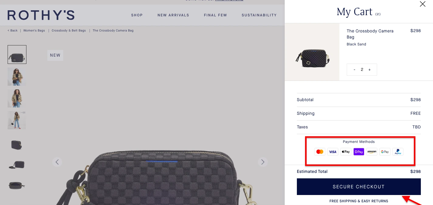
Is every cost visible before shoppers hit "checkout"? Surprise fees are one of the top reasons carts get abandoned. Display item prices, subtotal, estimated shipping, taxes, and the final total clearly.
If a shopper discovers an extra charge at the payment step, you've likely lost them for good.
Is your "Proceed to Checkout" button impossible to miss? The primary CTA on your cart page should be large, high-contrast, and sticky on mobile, so it's always in view while scrolling.
Don't make shoppers search for the next step.
Are trust signals present at the cart stage? By the time someone adds a product to their cart, they're close to buying. A well-placed security badge, money-back guarantee, or reassuring return policy near the checkout button can be the final nudge they need.
Are you using the cart page for gentle upsells? A cart is a good moment to surface Frequently bought together or Complete the look suggestions.
The key word is gentle. These should feel helpful, not like a distraction from completing the purchase.
Do shoppers know guest checkout is available? Forcing account creation at the cart stage is a conversion killer. Make it clear that guest checkout is an option, and make it the path of least resistance.
Have you tested the cart experience on mobile? Large touch targets, easy scrolling, fast load times, even with multiple items: these aren't nice-to-haves on mobile. They're table stakes.
If your cart page is clunky on a phone, you're losing a significant portion of your most motivated shoppers.
⚠️
Find the top reasons for lost revenue on your store
Why visitors don’t trust your store within 3 seconds
Why shoppers can’t find what they’re ready to buy
What’s stopping 2-3x more shoppers from clicking “Add to Cart”
Where buyers hesitate right before purchase
Why high-intent shoppers still drop off
“The report was deep and super insightful. Can’t believe it’s free.”
Logan Christopher CEO, Empire Herbs
6. eCommerce Checkout Flow UX Audit Checklist
Remember, only high-intent customers enter the checkout page; hence, fixing issues in your checkout flow should be high on your list of priorities.
A strong website user experience audit checks for moments of hesitation, such as extra fields in form fill-ups or glitches in the payment process.
So, in this section, let’s learn to find gaps in your eCommerce checkout process and what you need to do to fill each one of them.
Is your checkout swift enough to keep up with buyer intent? A smooth, flowing checkout process is the hallmark of a great user experience.
That’s why it’s ideal to keep a single-page checkout layout. Similarly, you’d rather have simpler and fewer form fields through the checkout process.
Do you have social logins for customers who might be in a hurry? Social logins let hurried shoppers skip the tedium of forms and passwords.
And that’s what you want to do: make it as easy as possible.
Does every tap, button, and field feel hassle-free on mobile? You shouldn’t forget that many shoppers are using mobile devices to shop in your eCommerce store.
So, it’s ideal to thoroughly test your checkout UX on mobile devices.
Are you making your customers feel empowered? Users feel helpless if they can’t add or remove products at checkout.
It’s good to ensure this feature is a part of your checkout experience.
Does your checkout offer a sense of reassurance about personal data? What you want to do is put trust seals and social proof on your payment page to calm the last flicker of doubt in the minds of your customers.
Are your password rules protecting accounts or annoying your customers? Remember that strict password rules in account creation is a big reason why many customers abandon their carts.
Hence, the fewer the password requirements, the better.
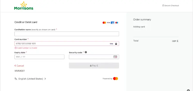
Does your site use a Luhn validation for a customer’s credit card number? This feature spots simple entry errors before they cause payment failures, leading a customer to panic and leave before completing the purchase.
It guides a user to make the correction before submitting the payment form.
7. eCommerce Post Purchase UX Audit Checklist
A thoughtful eCommerce UX audit doesn’t stop at checkout. It follows the trail through shipping updates, delivery confirmations, returns, and support.
Here’s a quick checklist to fix your site’s post-purchase user experience.
Review your order confirmation page. Make sure you’re offering the exact order summary and tracking details on this page.
Is your return process as painless as your purchase flow? What you need is a clear, self-serve return experience.
Are you communicating the right updates at the right time? The ideal way is to share timely and accurate shipping information with your customers.
How are you engaging with customers after checkout? You shouldn’t forget that the sale is the start of a relationship, and your UX must reflect that.
For instance, you could ask users to submit photos and reviews of the product they purchased, not without an incentive, of course.
Are you telling them the benefits of creating an account? The right strategy is to communicate why creating an account would be beneficial for your customers.
Clearly state these advantages, such as “faster checkout time on next purchase,” or the “ability to participate in a rewards program,” or the “ease of order tracking”.
Have you added a nudge for your loyalty program signup? . A gentle prompt like “Earn points on your next order” or “Members get early access to restocks” can turn that warm glow into long-term loyalty.
Are you using the post-purchase window to cross-sell? A thoughtful cross-sell (“You might also love…” or “Pairs perfectly with…”) can feel helpful rather than pushy when it’s relevant and well-timed.
8. eCommerce Mobile UX Audit Checklist
Quick fact: There are 1.65 billion mobile shoppers globally.
More than half of all eCommerce traffic now comes from mobile, but not every site treats mobile shoppers like first-class citizens. But you can; how?
Use this checklist to conduct a simple mobile UX audit and make all the necessary changes to your site!
Does your site feel effortless on a phone? A mobile-first design isn’t just a checkbox; it’s where most shoppers actually live. On a small screen, even minor friction feels amplified.
That’s why you need to test everything: touch targets, text legibility, scrolling comfort, and viewport setup.
Are your interactive elements big enough for human fingers? You’d want to make sure that buttons, links, and form fields are comfortably tappable.
Don’t forget that cramped spacing can turn simple actions into accidental misfires.
Do your videos and slideshows play well on mobile? The right way is to ensure that your multimedia content loads quickly without testing a user’s patience.
It’s best to remember that optimizing for mobile isn’t just fitting your site on a small screen; it’s about keeping sound, motion, and story perfectly in sync with a shopper’s pace.
Is there enough breathing space in your mobile menu? When your site has a mountain of product info, a collapsible or hamburger menu can bring order to the chaos.
Are your key product categories visible right in the first layer of your mobile menu?
Keeping your most important product categories right in the first layer of the menu means shoppers can get their bearings instantly.
Are you featuring trust seals right on top of your category page? It’s a small, reassuring signal that says, “You’re safe here,” which can be enough to reduce hesitation and keep them moving deeper into the shopping journey.
Do you have a chat icon on your product pages? It’s a small tool that carries big weight: reassurance, clarity, and support right at the moment they’re deciding whether to buy.
Are you showcasing side-scrolling reviews on your product pages? Side-scrolling reviews offer the best of both worlds: rich feedback presented in a compact, swipe-friendly format.
Make sure you feature a “show order summary” dropdown on the checkout page. During the checkout process, shoppers crave a quick re-check about what they’re buying, how much it costs, and whether their discount actually applied.
Hence, it's ideal to ensure that this feature is in place.
9. eCommerce Technical UX Audit Checklist
Even the most elegant eCommerce UX design can crumble under the weight of slow load times or clunky code.
That’s where a technical UX audit steps in. At this step, you need to test how well your site performs under real-world conditions.
Here’s a quick checklist to test your site for technical UX issues.
Are you guarding sensitive data the way it deserves? You’d want to ensure that every customer’s personal information travels under lock and key.
If your customers feel safe, they are more likely to shop on your eCommerce site.
Have you integrated with a rock-solid payment gateway? The right way is to ensure that your payment systems fully comply with PCI DSS standards.
Are you actively hunting for weak spots before hackers do? Regular security checks, both automated scans and hands-on testing, help uncover cracks in your code, configuration, or third-party tools.
Because security is such an essential part of a site’s user experience, checking your site for data leaks is an essential part of every eCommerce UX audit.
Are your chatbots working? The ideal way is to keep testing your chatbots to see if they are working. Also, ensure that your chatbots sound human and helpful.
Are your forms doing their job or just looking pretty? You’d want to be rigorous about your forms and signups and ensure they’re working properly.
Make sure they provide helpful error messages if a user makes a mistake.
A remarkable website user experience is one that welcomes everyone, irrespective of their abilities or the device they are using.
Here’s a quick checklist to audit your eCommerce website for accessibility.
Is your site playing by the accessibility rules? It’s ideal that you check that your store aligns with WCAG 2.2 standards.
From color contrast and keyboard navigation to readable text and alt tags, these guidelines aren’t just about compliance; they’re about inclusion.
An exceptional eCommerce UX is one that everyone can use comfortably.
Can everyone understand your site, even without the colors? Pair color with text labels or icons so no one’s left guessing.
Can shoppers zoom in without breaking the page? Your text should scale up to 200% without the layout falling apart.
We need to empathize with all such users who need larger text to read comfortably.
Are you explaining what’s there in your multimedia content? The right way is to check whether captions and descriptive alt text are present for all your multimedia content, including videos and images.
This is a non-negotiable step in any e-commerce accessibility audit checklist, as it ensures that visually or hearing-impaired users can navigate your purchase journey without missing vital product details.
Beyond inclusivity, providing text alternatives makes your content more user-friendly for everyone and helps search engines better index your store.
Is your store navigable for customers who don’t use a mouse? The right way is to perform a "Keyboard-Only" checkout test to ensure every step of your purchase journey is accessible via the Tab and Enter keys.
This is a critical component of a professional eCommerce usability audit, as many shoppers rely on assistive technology or keyboard navigation to complete transactions.
If a user gets stuck in a "keyboard trap" at the checkout or cannot "focus" on the payment button, they will abandon their cart, making this one of the most easily avoidable yet costly CRO mistakes on your e-commerce accessibility audit checklist.


.avif)
.svg)

.svg)

.svg)
.svg)
