What Are the Most Important eCommerce CRO Metrics to Track?
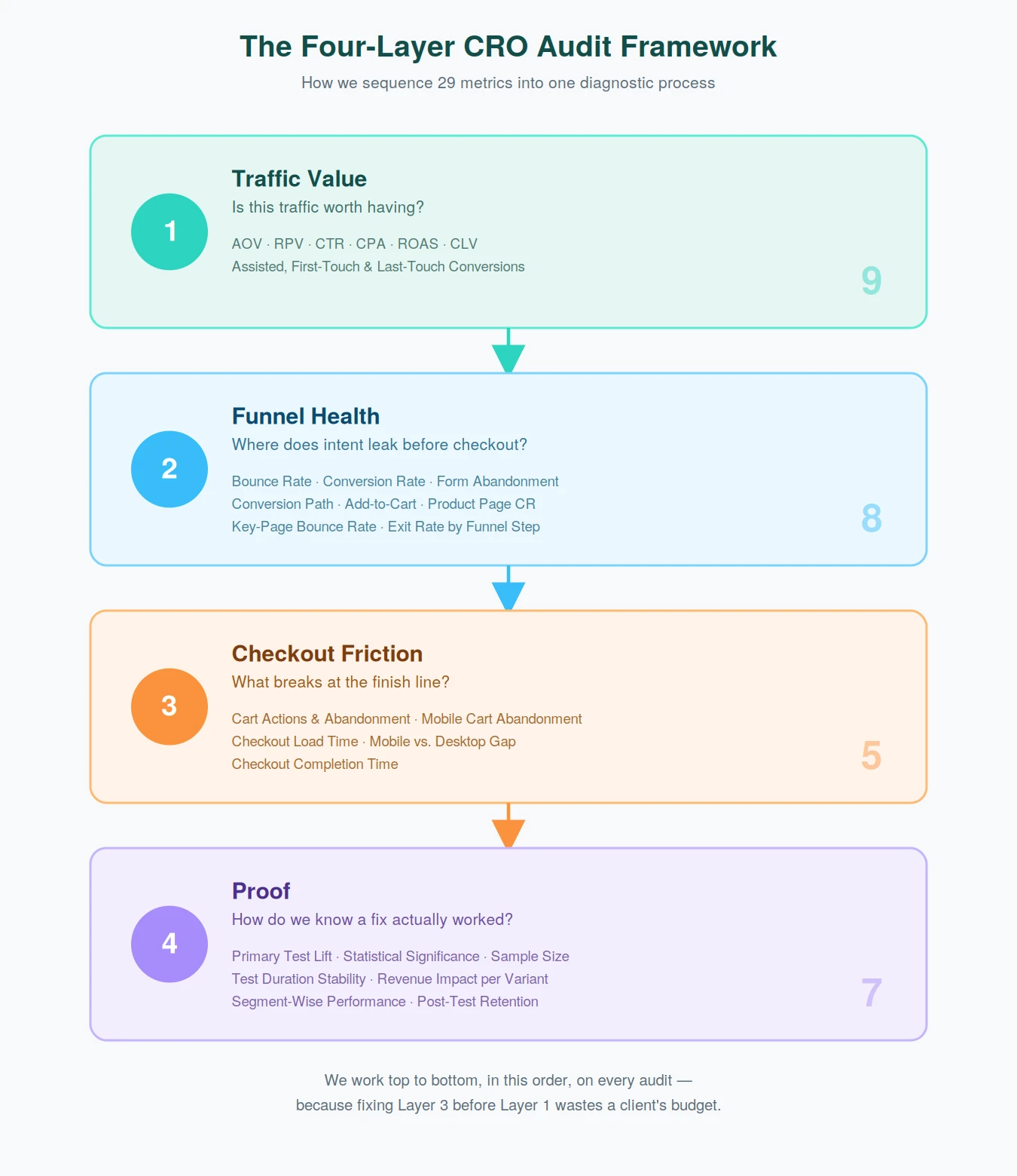
Most eCommerce teams already track more metrics than they know what to do with. The problem is rarely volume. It's sequence: knowing which four questions to ask, and in what order, before you touch a single page. Start with whether your traffic is worth having (AOV, RPV, CPA, CLV), then trace where intent leaks before checkout (bounce rate, conversion rate, add-to-cart rate), then fix the friction at checkout itself (cart abandonment, checkout completion time), and only then confirm the fix actually held (statistical significance, post-test retention). Skip a layer, and you'll spend budget solving a problem your data hasn't even confirmed exists yet.
What do an average customer and your Average Order Value have in common? Neither one tells you the whole story.
Every eCommerce dashboard is full of numbers, but during our audits, we rarely find stores missing data.
We find stores reading the wrong metrics, or reading the right ones the wrong way.
Over a decade of auditing eCommerce sites, we built a framework that sorts every metric into four layers: is the traffic worth having, where does intent leak, what breaks at checkout, and how do we know a fix worked.
We never open a dashboard and start scrolling. Every audit moves through these layers in order, because fixing Layer 3 before Layer 1 just wastes a client's budget on the wrong problem.
Key Takeaways
CRO metrics fall into four layers: traffic value, funnel health, checkout friction, and proof. Diagnose them in that order.
Averages hide the real picture. Split RPV, CPA, and conversion rate by device, source, and customer type before drawing conclusions.
Cart and checkout friction is rarely about price. It's usually about anxiety, confusion, or a slow, cluttered checkout page.
A test result only counts once it passes 95% statistical confidence and the sample size the test was designed for.
A winning test can still fail six weeks later. Re-check performance retention before calling anything a permanent win.
The Conversion Rate Optimization Metrics Framework We Use in Every Audit
Layer 1: Traffic Value. Is the traffic hitting your site worth having in the first place?
Layer 2: Funnel Health. Where does intent break down before a shopper ever reaches checkout?
Layer 3: Checkout Friction. What's stopping people at the finish line?
Layer 4: Proof. How do we know a fix worked, and does it keep working?
This order matters more than any single metric on the list. We regularly see teams jump straight to A/B testing button colors while their checkout sits broken underneath. That's optimizing the wrong layer.
Friction data only tells you what to prioritize once you already know which layer it's coming from. If you're staring down a long list of open issues, our landing page A/B testing guide walks through that exact decision.
This four-layer approach sits inside a broader eCommerce conversion framework we use across every audit, if you want the fuller strategic picture.
What follows is how each layer breaks down, metric by metric, with real numbers pulled from real audits.
Layer 1: Traffic Value (Is This Traffic Worth Having?)
Before we touch a single page or button, we check what the existing traffic is worth. Everything else gets measured against this baseline.
This is also the layer to check first if your store gets plenty of visitors but very few sales. Our high traffic, low sales diagnostic walks through that specific symptom.
Average Order Value (AOV)
Nobody gets excited about AOV at a dinner party. It just measures how much each order is worth.
Plenty of brands still chase it with blunt tools: a nagging free-shipping banner, a “customers also bought” widget wedged in wherever it fits.
Eco-friendly homeware brand Cyclotricity took a different route.
Automated recovery workflows and smarter recommendations lifted their AOV by 26% and their conversion rate by 6.8%. A bundle built on real behavior does more than a banner ever will.
If AOV is where you're starting, our AOV diagnostic playbook walks through this same diagnostic process in more depth.
Revenue Per Visitor (RPV)
RPV is one of our favorite metrics, and also one of the easiest to get wrong. It blends conversion rate and AOV into a single number.
That sounds efficient until you realize the healthy-looking average can be hiding a store that's badly underperforming for half its traffic.
Before we draw any conclusions from RPV, we split it by device, by source, and by new versus returning customers. The average rarely tells the whole story.
Click-Through Rate (CTR)
A CTA either earns the click or takes up space until someone scrolls past it.
Drone and FPV equipment retailer GetFPV had shoppers adding products to their view history but stalling before the cart.
We added a small, urgency-driven nudge on the product page banner: “X people also viewing this.”
That single change drove a 42.8% campaign ROI and generated over $710,000 in additional revenue. The click was already there. It just needed a reason to happen sooner.
Cost Per Acquisition (CPA)
A low CPA feels like a win right up until you ask who it bought you.
We never look at it alone. We check it next to CLV, since a $40 CPA is a bargain for a customer worth $800 over two years and a poor trade for one who never orders again.
There's a quieter lever too. Every unnecessary checkout field acts like a small tax on CPA. Removing one lowers the cost of every customer already sitting in your funnel.
⚠️
Find out what's stopping your store visitors from buying
Product discovery – barriers that prevent shoppers from finding items
Category/collection pages – improvements that drive deeper product exploration
Product page – what to optimize to convert 2–3x more buyers
Cart – ways to ease hesitation and speed up purchase decisions
“The report was deep and super insightful. Can’t believe it’s free.”
Logan Christopher CEO, Empire Herbs
Return on Ad Spend (ROAS)
ROAS can make a shrinking business look healthy if you're only measuring gross revenue.
We push clients toward a profit-first version of the same math, because a strong ratio on a low-margin product is often just an expensive way to lose money slowly.
Where it's possible, we also run hold-out tests. They're the most honest way to check whether a “converted” shopper would have bought from you anyway.
Customer Lifetime Value (CLV)
A one-time sale and an actual relationship look identical on the day of purchase. CLV is the metric that tells them apart.
For gourmet snack brand FunkyChunky, we built shopper-behavior email flows, including a purchase-anniversary email, and saw a 59% increase in revenue from email alone.
That kind of lift rarely comes from obsessing over the first purchase. It comes from paying attention to the second and the third.
If email is doing some of that work, it helps to know what a good open rate for eCommerce emails actually looks like before you judge a flow's performance.
Assisted Conversions
Last-click attribution works like a popularity contest. It hands all the credit to whichever channel happened to be there at the end and erases everything that built the trust to get there.
We look instead at which blog posts, guides, or emails keep showing up in the middle of a conversion path.
Those are usually the ones doing the heavy lifting, even when they never take the final click.
First-Touch Conversions
First-touch data shows what sparked the curiosity. It doesn't show what closed the deal, and it's tempting to give it more credit than it earns.
We use it to match the next step to wherever a shopper is.
Someone who lands on you through an educational blog post isn't ready for “Buy Now.” A low-friction next step works better than a hard sell.
Last-Touch Conversions
Last-touch credits whichever channel happened to be standing closest when the sale closed.
That's not the same as the channel that earned it. We use this data to smooth out the final step of the journey, not to hand out gold stars.
It's also worth checking whether that last click is consistently a coupon site.
If it is, you've probably trained shoppers to wait for a discount rather than converting them at all.
Layer 2: Funnel Health (Where Intent Leaks Before Checkout)
Once we know the traffic is worth having, we look at where it leaks before checkout. This is usually the largest gap between a store's self-image and its actual funnel. For a broader pass across your whole site, not just this funnel, our UX audit checklist covers the rest of what we look for.
Bounce Rate
Not every bounce deserves a panic. Someone who reads a 2,000-word guide for three minutes and leaves shouldn't count the same as someone gone in two seconds, but plenty of dashboards lump them together anyway.
We reconfigure analytics to separate genuinely engaged visits from true bounces.
Then we check whether the page's promise matches what brought the visitor there in the first place.
Conversion Rate
Everyone stares at conversion rate. Almost nobody diagnoses it correctly on its own, because it tells you something is wrong without saying what.
For custom-printing brand 4over4, a year of ongoing optimization work took their conversion rate up by 50%.
That kind of gain rarely comes from one clever fix. It comes from working through the funnel layer by layer, which is the whole point of this framework.
Form Abandonment
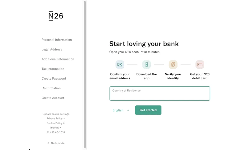
When a shopper vanishes partway through a form, the field they stopped on usually tells you what scared them off.
It's hardly ever a mystery once you look field by field: a phone number request here, a missing explanation near pricing there, a field nobody expected to fill in.
We fix these one at a time. Clarify the field, move it, or cut it entirely. It sounds small, but it's one of the most reliable wins in an audit because the fix targets a specific hesitation instead of a general guess.
Conversion Path
The conversion path seldom behaves like the tidy diagram you drew for it.
For contact lens brand Misakicon, we noticed something specific: shoppers who went straight from the homepage to a product page converted noticeably better than everyone else.
We optimized that one path to help people narrow their search faster, which generated 39 additional orders.
Small, path-specific fixes like this beat forcing every visitor down one “ideal” route.
Add-to-Cart Rate
An add-to-cart spike feels like a win worth celebrating. It's a leading indicator, not a finish line, since plenty of carts fill up and never convert. We never read ATC rate on its own.
Pairing it with cart abandonment tells a fuller story. A spike in one without movement in the other often means the cart page itself is the problem.
Product Page Conversion Rate
This is the moment browsing turns into a decision. It's also where we most often find pages stuffed with every spec and disclaimer a legal team ever demanded.
Shoppers don't convert faster because they read a data sheet. They convert because they can picture the product in their own life.
Short video loops and real customer photos earn more trust than static images and walls of text, which is why we push for dynamic visual storytelling wherever we can.
This matters even more in categories where shoppers compare closely before buying.
Our guide on improving conversion rate for online cookware stores breaks down exactly how that plays out on the product page.
Bounce Rate on Key Pages
Your site-wide bounce rate is a mood. Bounce rate on one specific landing or category page is a diagnosis.
For automatic boot struts brand Emerald Struts, the issue was a navigation panel that had grown into a maze of nested menus.
We simplified it into one clear hub for the most common paths, so shoppers no longer had to hunt or scroll to find what they came for.
Exit Rate by Funnel Step
A single funnel-wide number tells you people are leaving. Exit rate by funnel step tells you exactly where they gave up, which is the only version of this metric worth acting on.
For the client we call Gloves in our case studies, we traced 87% of drop-offs back to uncertainty around delivery timelines.
We introduced clear shipping microcopy and a real-time countdown. Orders picked up because we'd fixed the actual source of hesitation instead of guessing at one.
Layer 3: Checkout Friction (What Breaks at the Finish Line)
Everything up to this point gets a shopper to the cart. This layer is about what happens in the final stretch, where the smallest friction costs the most revenue.
Cart Actions and Abandonment
Cart abandonment gets blamed on price more than it deserves. Most of the time it's about anxiety at the exact moment a shopper is about to commit.
For women's lifestyle brand Rock Flower Paper, we ran customer surveys to find out exactly where that anxiety was coming from, then layered in exit-intent messaging and social proof at the moments that mattered.
Cart abandonment dropped by 65%. Guessing at friction gets you nowhere close to that. Asking shoppers directly does.
If you want to see where your own rate stacks up first, our cart abandonment calculator does the math for you, and our guide to high-converting cart pages covers the design patterns that hold once the immediate fix is in.
Mobile Cart Abandonment
Most mobile cart abandonment has nothing to do with a lack of interest. It's thumb fatigue.
Tiny buttons, forms that demand typing on glass, payment fields asking for a card number nobody wants to enter on a phone; it adds up fast, one tap at a time.
We push hard for Apple Pay, Google Pay, and other one-tap options to be the default. They shouldn't be an afterthought buried below a manual entry form.
Checkout Page Load Time
Few things burn money as directly as a slow checkout page. Every unnecessary tracking script and oversized image adds seconds a shopper doesn't have to spare.
We recommend auditing your checkout page separately from the rest of the site. It tolerates far less bloat than a homepage or blog post ever will.
The Mobile vs. Desktop Gap
A wide gap between mobile and desktop conversion typically means one thing: you designed for desktop and shrunk it down, instead of designing for mobile at all.
For solar marketplace Greentoe, improving search bar visibility on both platforms lifted mobile gains by 12.17%, against a more modest 2% gain on desktop.
Same fix, two very different results. One device mattered far more than the other.
Checkout Completion Time
How long it takes to finish paying is a metric most teams never bother to isolate, even though it's one of the easiest to fix.
For LED emergency light brand Extreme Tactical Dynamics, we streamlined checkout on both desktop and mobile and added trust seals at key moments.
Checkout abandonment dropped by 11%. The fix really was that straightforward.
⚠️
Find out what's stopping your store visitors from buying
Product discovery – barriers that prevent shoppers from finding items
Category/collection pages – improvements that drive deeper product exploration
Product page – what to optimize to convert 2–3x more buyers
Cart – ways to ease hesitation and speed up purchase decisions
“The report was deep and super insightful. Can’t believe it’s free.”
Logan Christopher CEO, Empire Herbs
Layer 4: Proof (How We Know a Fix Actually Worked)
This is the layer most audits skip, and it's the one that protects every other layer's results. A fix that isn't validated properly is just a guess with better production values.
Primary Test Metric Lift
Lift only means something once you've isolated one variable.
Change the headline, the button, and the hero image all at once, and you'll learn nothing about which one did the work.
For industrial fasteners retailer Fastenere, we focused a single test on smart search with advanced filtering. Nothing else changed.
Conversion rate rose 1104.8%. That's what happens when a test targets one clear bottleneck instead of five unrelated hunches.
Statistical Significance and Confidence Level
We won't call a test a winner below 95% confidence, and we won't judge results before the pre-calculated sample size is hit.
The biggest source of false wins we see has nothing to do with bad tooling.
It comes from teams checking results every twenty minutes and reacting to noise that would have resolved itself by the end of the week.
Small numbers are convincing liars. A test can show a 20% lift after 100 visitors and quietly settle back to zero after 1,000, by which point someone has already told the CEO.
Before a test even starts, we calculate the sample size it needs, based on baseline conversion rate and the smallest lift worth detecting. A low-traffic store shouldn't declare victory on what's really a coin flip.
Test Duration Stability
We never conclude a test in under seven days, and we'd rather run fourteen.
A Sunday browser and a Tuesday-afternoon buyer behave differently, and a short window only captures whoever happened to show up that day.
Running longer also lets the novelty effect wear off. A new button often wins for the first few days simply for being new, not for being better.
Revenue Impact Per Variant
A variant that lifts clicks but not revenue isn't a winner.
It's a vanity metric with a good publicist. For GetFPV again, roughly a fifth of their traffic visited the blog regularly but seldom converted. We added a simple pop-up promoting new product launches across blog posts.
That single variant drove an 18% campaign ROI, 1,310 additional transactions, and over $130,000 in additional revenue. The traffic was valuable all along. It just needed a path to a sale.
Segment-Wise Performance
A test can win on average and still be quietly failing half your audience.
For air purifier brand Air Oasis, the buying decision often splits along gender lines within one household, so we tested browse-recovery subject lines specifically across that segment.
Open rates improved by 145.6%, and click rates improved by 872%. An average-only view would have missed both entirely.
Post-Test Performance Retention
A winning test doesn't stay won just because you implemented it. Plenty of “lifts” are just a novelty effect wearing off six weeks later.
We re-measure the new baseline about six weeks post-implementation and check whether the win actually improved long-term value, or just boosted short-term revenue at the cost of returns and repeat purchases.
The Bottom Line
None of these 29 metrics matter in isolation. That's the mistake we see most in eCommerce dashboards.
A metric only becomes useful once you know which layer it belongs to and what question it's actually answering.
Work through traffic value, funnel health, checkout friction, and proof, in that order, and you'll stop optimizing the wrong thing at the wrong time.
Validating a fix properly protects more than a single metric. It protects your overall eCommerce ROI.
The entire playbook comes down to that: not more data, just the right sequence for reading the data you already have.
CRO Metrics at a Glance
A quick reference for what each metric actually measures, organized by the layer it belongs to.
Layer 1: Traffic Value
Metric
What It Measures
Average Order Value (AOV)
How much each order is worth, on average
Revenue Per Visitor (RPV)
Revenue generated per visitor, blending conversion rate and AOV
Click-Through Rate (CTR)
The percentage of shoppers who click a specific CTA or banner
Cost Per Acquisition (CPA)
The cost to acquire one converting customer
Return on Ad Spend (ROAS)
Revenue generated for every dollar spent on ads
Customer Lifetime Value (CLV)
Total revenue expected from a customer over the full relationship
Assisted Conversions
Conversions where a channel contributed but wasn't the final click
First-Touch Conversions
Credit given to the first channel a shopper interacted with
Last-Touch Conversions
Credit given to the final channel before purchase
Layer 2: Funnel Health
Metric
What It Measures
Bounce Rate
The percentage of visitors who leave after viewing only one page
Conversion Rate
The percentage of visitors who complete a purchase
Form Abandonment
The percentage of shoppers who start but don't finish a form
Conversion Path
The sequence of pages or touchpoints a shopper follows before buying
Add-to-Cart Rate
The percentage of visitors who add a product to their cart
Product Page Conversion Rate
The percentage of product page visitors who purchase
Bounce Rate on Key Pages
Bounce rate isolated to one specific landing or category page
Exit Rate by Funnel Step
The percentage of shoppers who leave at each specific funnel stage
Layer 3: Checkout Friction
Metric
What It Measures
Cart Actions and Abandonment
How shoppers interact with the cart, and how often they leave without buying
Mobile Cart Abandonment
Cart abandonment isolated to mobile shoppers
Checkout Page Load Time
How long the checkout page takes to become usable
The Mobile vs. Desktop Gap
The difference in conversion rate between mobile and desktop shoppers
Checkout Completion Time
How long it takes a shopper to finish paying once checkout begins
Layer 4: Proof
Metric
What It Measures
Primary Test Metric Lift
The measured improvement in your main test goal
Statistical Significance and Confidence Level
How confident you can be that a result isn't due to chance
Sample Size Adequacy
Whether a test has enough visitors to produce a reliable result
Test Duration Stability
Whether a test ran long enough to account for day-of-week and novelty effects
Revenue Impact Per Variant
The actual revenue difference a test variant produced
Segment-Wise Performance
How a test performed across specific audience segments, not just on average
Post-Test Performance Retention
Whether a winning test's results hold up weeks after launch
FAQs
What Is CRO in eCommerce?
Conversion rate optimization (CRO) is the practice of improving how many website visitors take a desired action, typically completing a purchase, without increasing traffic or ad spend.
It combines analytics, UX, and structured testing to close the gap between people who show up and people who actually buy.
What Is a Good Conversion Rate for an eCommerce Store?
Most eCommerce stores convert somewhere between 1% and 4%, though this varies heavily by industry, price point, and traffic source.
Rather than chasing an industry benchmark, we recommend comparing your rate against your own store's history, segmented by device and traffic source, since a single average can hide big swings underneath it.
How Is CRO Different From SEO?
SEO brings more visitors to your site. CRO makes sure more of the visitors who arrive actually buy.
The two work best together: better SEO traffic without CRO just means more people leaving without converting, and CRO without SEO means optimizing a funnel that too few people ever reach.
What Are CRO Metrics?
CRO metrics are the numbers that show how effectively your website turns visitors into customers.
They help you understand what people are doing on your site, where they engage, and where they drop off.
Common examples include conversion rate, average order value, revenue per visitor, bounce rate, and cart abandonment rate.
Each one tells a different part of the story: conversion rate shows how many users buy, while cart abandonment shows where friction exists.
What Are the Benefits of Tracking CRO Metrics?
Tracking CRO metrics shows you what's working instead of relying on assumptions.
It highlights where users struggle, which pages perform best, and which changes drive real impact, so you can prioritize the improvements that matter most rather than redesigning everything blindly.
Over time, consistent tracking builds a culture of experimentation, and you stop guessing and start measuring.
Which CRO Metrics Should We Track First for an eCommerce Site?
Start with conversion rate, since it shows how many visitors actually buy.
Add revenue per visitor to understand the overall value of your traffic, and average order value to see how much customers spend per purchase.
Then bring in cart abandonment rate and checkout completion rate to check whether your checkout experience is creating friction. Together, these five give you a clear picture across the funnel.
If you're running on Shopify specifically, our Shopify CRO playbook covers platform-specific fixes worth layering on top of these.
How Do We Calculate Revenue Per Visitor Versus Conversion Rate?
Conversion rate is purchases divided by total visitors, multiplied by 100.
A hundred purchases from 5,000 visitors gives you a 2% conversion rate. Revenue per visitor is total revenue divided by total visitors. Two hundred thousand dollars from 5,000 visitors gives you an RPV of $40.
Conversion rate shows how many people buy; RPV shows how valuable each visitor is. We find RPV more useful for CRO because it accounts for both conversions and order value together.
How Do We Calculate Customer Lifetime Value for CRO Analysis?
A simple formula is Average Order Value multiplied by Purchase Frequency multiplied by Customer Lifespan.
If your AOV is $2,000, customers buy three times a year, and stay for two years, your CLV is $12,000.
This number changes how you approach optimization. Instead of chasing short-term conversions, you start optimizing for retention, onboarding, and the experiences that build a more profitable long-term relationship.
Which Metrics Indicate Problems in the Checkout Funnel?
A high cart abandonment rate usually signals uncertainty, surprise costs, or friction. A low checkout completion rate suggests the checkout experience is confusing or too long.
Step-level drop-offs, meaning users exiting specifically on shipping or payment pages, often point to pricing shock or missing payment options.
A long checkout completion time can indicate a usability problem worth isolating on its own.
How Do We Set Primary Versus Secondary Metrics for a Test?
Your primary metric is the main goal of the test: conversion rate for a product page, revenue per visitor for a pricing test.
Secondary metrics protect against false wins, things like average order value, bounce rate, refund rate, or engagement metrics.
A test might raise conversion rate while quietly lowering order value, which hurts overall revenue.
Setting both ensures you measure success holistically.
Which Experiments Most Reliably Increase Average Order Value?
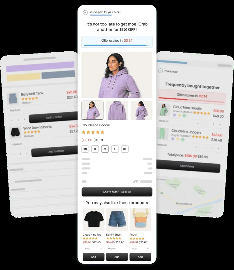
Product bundles that encourage related purchases, upsells that highlight premium versions before add-to-cart, and cross-sells placed in the cart at the right moment all perform consistently in our audits.
Free shipping thresholds motivate one more item, and tiered “buy more, save more” discounts make a larger basket feel like better value.
The best AOV experiments feel helpful, not pushy. They guide a better choice rather than force a bigger one.
Subscribe for more articles like this!
Thank you - we'll see you in your inbox soon!
Oops! Something went wrong while submitting the form.
Read by 5000+ ecommerce store owners
Subscribe for more articles like this!
Thank you - we'll see you in your inbox soon!
Oops! Something went wrong while submitting the form.







.avif)
.svg)


.svg)

.svg)
.svg)
