It is a remarkable thing to observe the modern internet user in their natural habitat, attempting to navigate the thicket of "Subscription Services."
We live in an age where one can have everything from artisanal sourdough to healthcare to insurance and telecom services delivered to one’s door on a recurring schedule.
However, most subscription landing pages are strangely dismal affairs, designed with the aesthetic charm of a damp parking garage.
To truly convince a stranger to enter into a long-term relationship with your brand, you must move beyond the transactional.
It requires a blend of psychological wizardry, impeccable clarity, and just enough human warmth to prove you aren't a robot.
The TLDR: A Brief Guide for the Impatient
If you are currently pressed for time, perhaps you are waiting for a kettle to boil or a train to arrive; here is the essence of the matter.
A successful subscription page is built on three pillars: the promise of a better future self, the absolute removal of "What if I hate it?" anxiety, and a user interface so simple that even a bewildered traveler could navigate it.
You must justify the recurring cost by proving the value grows over time, keep your exit doors clearly marked to build trust, and speak like a human being rather than a corporate manual. Now, go forth and convert.
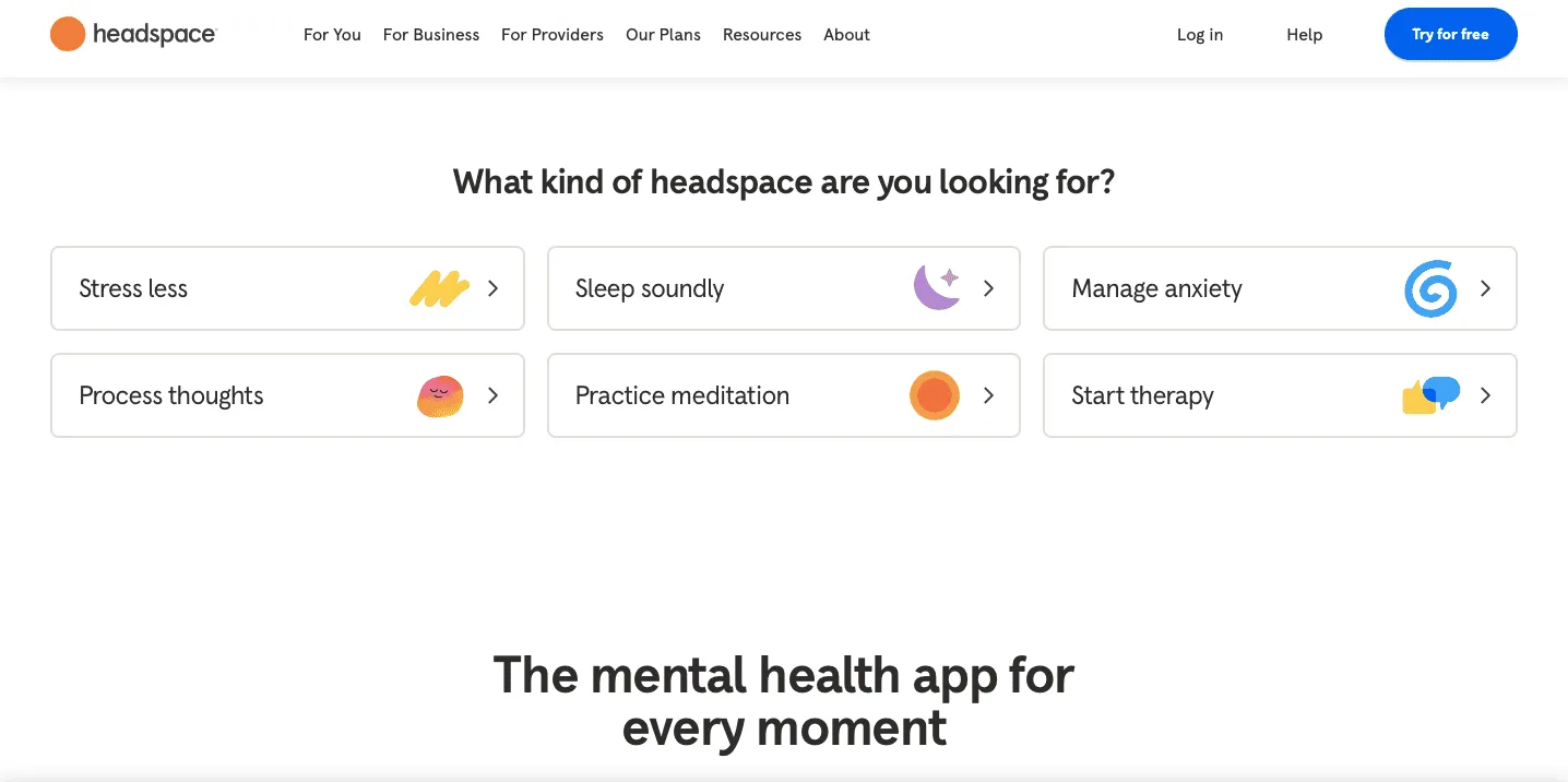
1. Does your Headline Promise a Genuine Transformation?
In the grand theater of commerce, a subscription is rarely about the object itself, but rather about the person the customer hopes to become.
If your headline simply announces "Monthly Vitamin Deliveries," you have missed the opportunity to describe the revitalized, spring-heeled version of the reader who no longer slumps over their desk at four in the afternoon.
You are not selling a bottle of pills; you are selling the exuberant feeling of being alive and alert, and your headline must sing that song with gusto.
2. Articulate the Ongoingness of the Value
A subscription is, at its heart, a recurring raid on a person’s bank account, which is a prospect most people view with the same enthusiasm as a root canal.
To counter this, your copy must explain, with absolute clarity, why the value doesn't happen just once but compounds over time.
You must convince them that month three will be even more delightful than month one, transforming a "cost" into an "investment" in their future happiness or productivity.
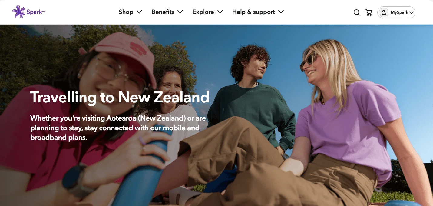
3. Is Your Hero Image a Window Into a Better Life?
The primary image on your page should not merely be a sterile product shot, which is about as evocative as a photograph of a brick.
Instead, it should be a "lifestyle" image that captures the aftermath of your service, the contented sigh, the organized desk, or the joyous unboxing.
It should be a visual representation of a problem having been solved so entirely that the customer can finally turn their attention to more pleasant things, like birdwatching or eating a really good sandwich.
There is a profound psychological difference between being a "user" and being a "member."
One suggests you are a data point in a server in Virginia; the other tells you that you are part of a curated fellowship with shared tastes and exclusive access.
By using words like community, insider, or fellowship, you elevate the subscription from a cold transaction to a warm relationship, and humans are notoriously loath to end a relationship that makes them feel special.
5. Scrub the Recurring Friction From Your Forms
In the world of one-off purchases, a slightly long form is a nuisance; in the world of subscriptions, it is a deal-breaker.
Every extra field you ask for, your middle initial, your fax number, your feelings about the color mauve, is a tiny hurdle that gives the brain a chance to ask, "Do I really need this every month?"
You want the sign-up process to be so frictionless and swift that the customer is finished before their inner skeptic can even clear its throat.
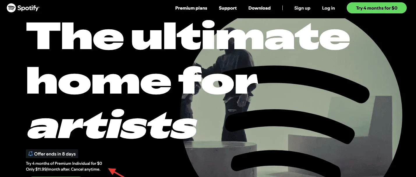
6. Is the Price Per Day Visible to the Naked Eye?
The human brain is an extraordinary organ, but it is remarkably easy to fool with basic arithmetic.
A $30 monthly charge can feel like a significant commitment, a "bill" that must be managed. However, $1 a day is the price of a single, rather disappointing apple.
By breaking the cost down into "daily bites," you move the subscription from the "Major Financial Decisions" category into the "Negligible Daily Luxuries" category, where it is much more likely to be approved.
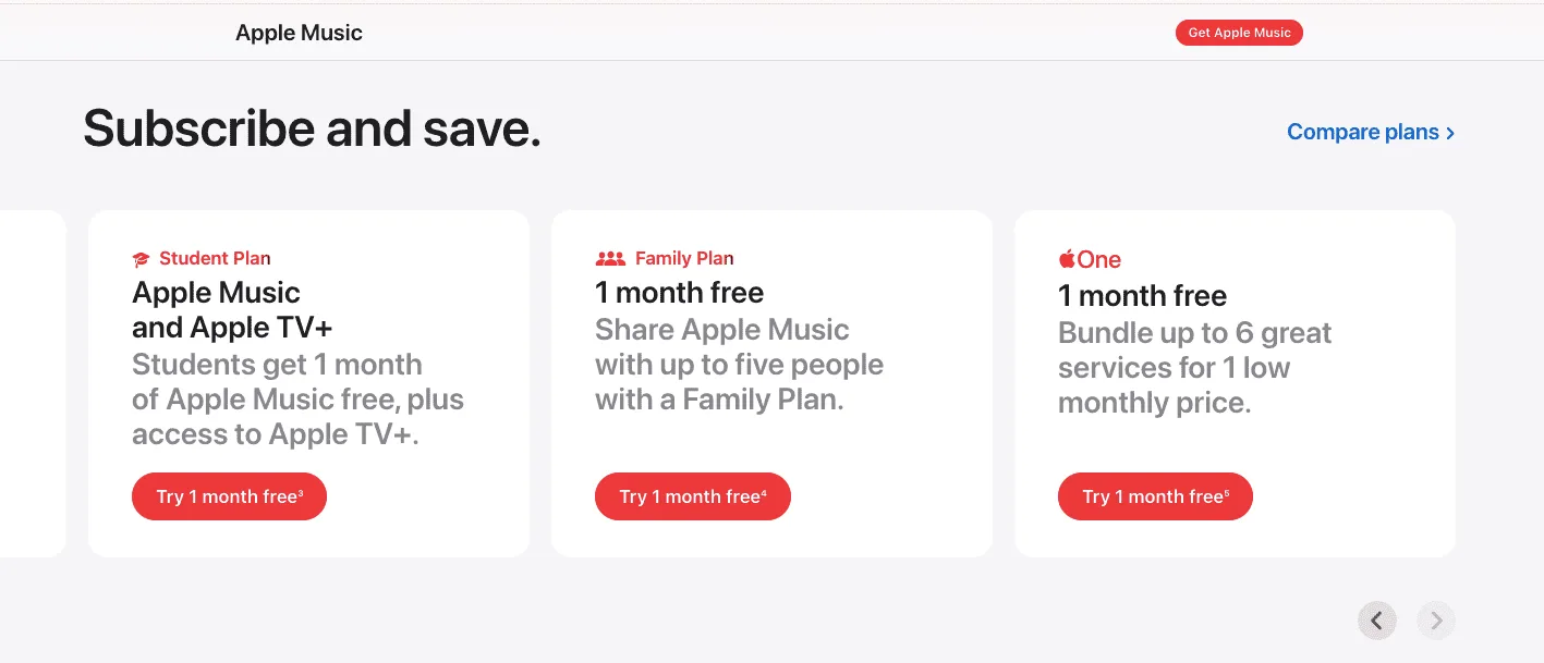
7. Use Anchor Pricing to Guide the Hand
If you offer only one price, the customer’s only decision is "yes" or "no." But if you provide three prices, the decision becomes "which one?"
By placing a "Premium" tier at a dizzyingly high price point, your "Standard" tier suddenly looks like a remarkable bargain.
It is a classic bit of psychological theater that allows the customer to feel they have made a shrewd, sensible choice by picking the middle option.
I have spent a significant portion of my life baffled by technology, and I can tell you that if your subscription website requires a degree in computer science to navigate, most people will simply walk away.
Your subscription page should be so intuitively laid out that my grandmother, a woman who once tried to "scroll" a physical newspaper, could sign up without having to call for technical assistance. Clarity is not just a virtue; it is a primary driver of revenue.
9. Highlight the Welcome Gift or the First Box
The beginning of a subscription is a moment of high drama. Whether it is a physical box of cheeses or a digital "Starter Pack," you must make that first delivery feel like a celebration.
Show them exactly what they will receive in their first week; the vivid anticipation of that first "unboxing" is often the nudge that pushes a hesitant browser into becoming a committed subscriber.
10. Is Your Social Proof Focused on Long-Term Satisfaction?
A testimonial that says "The website looks nice!" is utterly useless for a subscription service. You need voices that speak to the duration of the relationship, people who have been members for six months, a year, or a decade.
You want to prove that the novelty doesn't wear off like a cheap gold plating, but rather that the service becomes an essential and beloved part of their daily existence.
11. Proactively Address the Overload Anxiety
One of the most common reasons people cancel a subscription is the "guilt of the unread." They fear that a mountain of unread magazines or a cupboard full of unused spices will pile up, mocking them.
Your landing page must reassure them that they are in control and can "pause," "skip," or "downsize" their subscription whenever life gets a bit too crowded.
12. Are You Using Loss Aversion to Spur Action?
It is well documented that humans hate losing things twice as much as they like gaining them.
Instead of merely listing what a subscriber gets, remind them of what they are currently missing: exclusive content, "member-only" pricing, or the peace of mind their neighbors already enjoy.
Frame the subscription as a way to stop a leak in their current quality of life.
13. Audit the Micro-Copy for Human Warmth
The tiny bits of text on buttons, the error messages when a zip code is wrong, are the places where your brand’s personality truly lives.
Instead of a cold, robotic "Invalid Input," try a gentle "Oops! It looks like a digit went astray."
These "micro-moments" build trust and rapport, making the recurring payment feel like a friendly agreement rather than a cold, automated extraction.
14. Is the Subscription Premium Clearly Justified?
You must answer the fundamental question: "Why shouldn't I just buy this once?"
If your subscription doesn't offer a clear advantage over a one-time purchase, whether through a lower price, exclusive access, or the sheer, blissful convenience of never having to think about it again, then you are asking for a commitment you haven't earned.
Make the "Value Delta" so apparent that it would be foolish to refuse.
15. Translate Features into Human Benefits
A feature is a technical fact; a benefit is a human result. "256-bit encryption" is a feature that most people find roughly as exciting as a lecture on concrete. "Your private photos will never, ever be seen by a stranger" is a benefit.
On a subscription page, you must relentlessly translate the "what" into the "why it makes your life better," focusing on the relief, joy, or time saved.
16. Why is There a Leaky Navigation Menu?
A landing page is a specialized tool designed for one purpose: to get a subscription. If you have a menu at the top with links to your "Blog," "Careers," and "History of the Company," you are effectively handing your visitor a map to the nearest exit.
Remove the navigation entirely.
Once they are on the page, the only way out should be through the "Subscribe" button or by closing the browser entirely.
17. Check the Legibility of Your Text
I have reached an age where I find that many web designers seem to have a personal vendetta against contrast.
They use tiny, ethereal grey fonts on white backgrounds that are almost impossible to read in anything other than perfect light.
If your visitors have to strain their eyes to read about your "Membership Benefits," they will conclude that you are either incompetent or trying to hide something.
Use bold, sturdy, high-contrast type.
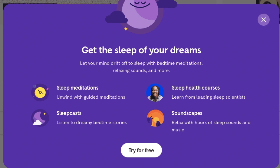
18. Does the Vibe Match the Product?
If you are selling a subscription to a "Deep Sleep" app, your page should not be bright yellow and filled with jagged shapes.
It should be a serene, tranquil space that begins the "calming" process before they’ve even signed up.
The aesthetic of the page is a promise of the experience to follow; if the "look and feel" is jarring, the customer will instinctively pull back from the commitment.
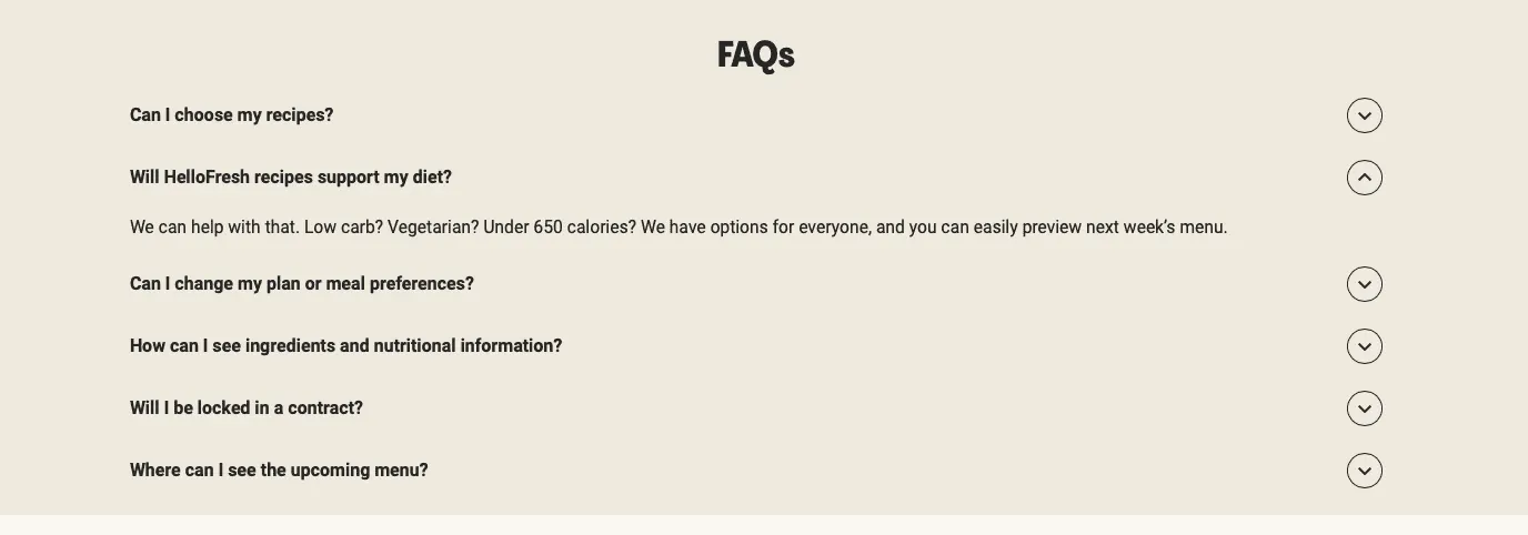
19. Include a Doubts-Be-Gone FAQ Section
A good FAQ is not a place for "Frequently Asked Questions," but rather "Questions I Know You Are Using as an Excuse Not to Buy." Address the "Is it safe?" "Can I change my mind?" and "What if I’m not tech-savvy?" head-on.
By answering these questions clearly and prominently, you are systematically removing the psychological barriers that stand between a browser and a subscriber.
20. Is your Call to Action a Constant Companion?
As a visitor scrolls through your testimonials and benefit lists, they may be convinced at any moment. They shouldn't have to go back to the top of the page to find the button.
Use a "sticky" header or footer that keeps the "Join Now" button visible at all times, standing by like a helpful, quiet waiter ready to take an order the moment it is placed.
21. Verify Your Mobile Speed on a Slow Connection
It is a sobering thought that most people will view your meticulously crafted page while sitting on a bus or waiting for a kettle to boil, likely on a spotty 4G connection.
If your page takes five seconds to load all its high-resolution videos and animations, the visitor will have moved on to a more efficient competitor before your logo even appears. Speed is the most underrated form of marketing.
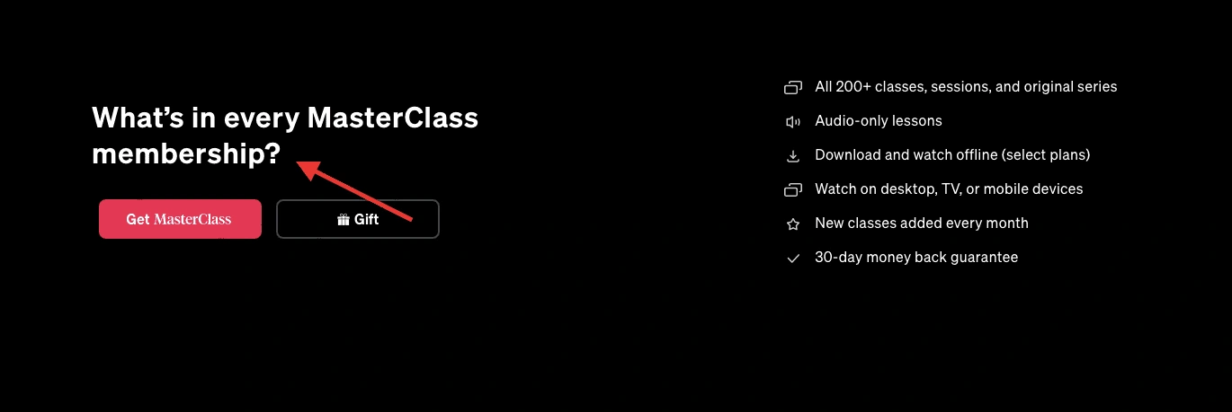
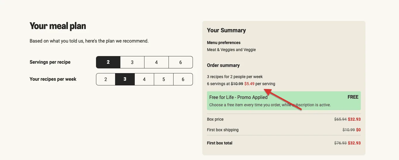
22. Are you Using Visual Direction to Lead the Way?
The human eye is remarkably suggestible. If you include a photograph of a person looking toward your sign-up form, or a subtle arrow pointing toward the pricing table, the visitor’s gaze will follow.
It’s a gentle, subconscious way of saying, "Look here, this is the important bit," ensuring that the most persuasive parts of your page aren't ignored in a flurry of scrolling.
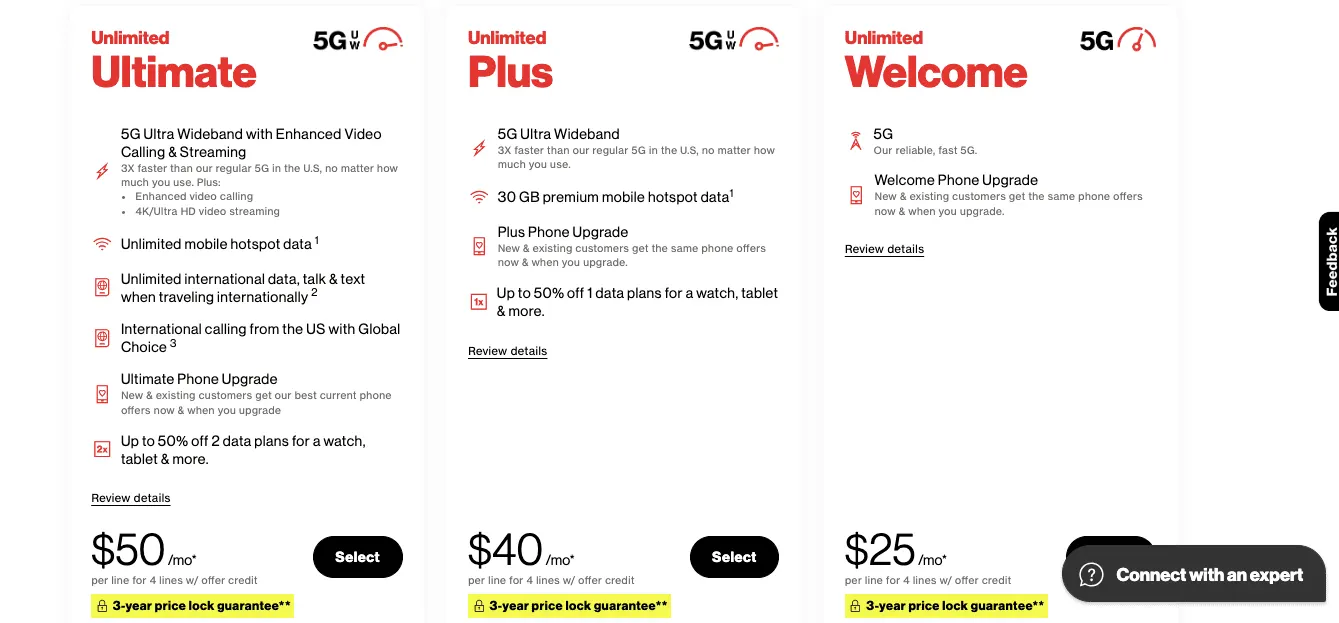
23. Show a Comparison Table That Simplifies the Choice
If you offer more than one subscription tier, a comparison table is essential for the logical mind.
It allows the customer to tick off the features they need and realize that the "Pro" plan is only a few dollars more for a lot more "stuff."
A well-organized table turns a confusing array of choices into a clear path toward the "correct" decision.
24. Is the Annual Discount Framed as a Gift?
Most subscriptions prefer annual payments because it reduces "churn."
To encourage this, show the annual price as a dramatic saving. Don't just say "15% off"; say "Get Two Months Free."
The idea of getting something for nothing is a powerful motivator, making the larger upfront payment feel like a savvy, money-saving move rather than an expensive one.
25. The Privacy Promise Should be Front and Center
In an age where our data is traded like 19th-century commodities, people are understandably nervous about giving out their email address.
A simple, bold statement near the form, such as "We hate spam as much as you do and will never sell your data," can significantly improve your conversion rate.
It’s a small handshake that says you are a decent, trustworthy outfit.
26. Do You Have a Human Face on the Page?
A subscription is a long-term commitment to a company, and people find it much easier to trust a person than a logo. Whether it’s a short "Letter from the Founder" or a photo of the team that curates the boxes, showing the humans behind the curtain makes the business feel accessible and accountable.
It reminds the customer that their monthly fee is supporting real people, not just a faceless algorithm.
27. Use Checkmarks to Signify Completion
There is something deeply satisfying to the human psyche about a checkmark. By including them in your list of benefits, you subtly suggest that these problems have already been "solved" by your service.
It feels more "active" and "final" than a simple bullet point, reinforcing the idea that your subscription is the definitive answer to the user’s needs.
28. Is Your Guarantee a Bold Safety Net?
If you offer a "30-day money-back guarantee," it should be one of the most visible things on the page. It’s the ultimate "de-risker."
It tells the customer that they aren't making a permanent, potentially regrettable decision, but rather starting a trial where they hold all the cards.
If you believe in your service, you should shout your guarantee from the digital rooftops.
29. Check for Orphan Lines and Embarrassing Typos
Nothing ruins the carefully constructed illusion of a professional, world-class subscription service like a glaring typo in the middle of your sales pitch.
It suggests a lack of attention to detail that makes a visitor wonder if you’ll be just as careless with their credit card security or their monthly deliveries.
A final, slow proofread is the cheapest and best insurance you can buy.
30. Are You Using Video as a Tour Guide?
A short, 60-second video can demonstrate a complex digital interface or the tactile joy of a physical product far better than any wall of text. It allows the visitor to "see it to believe it."
Just ensure the video doesn't "autoplay" with sound. Nothing makes a person click away faster than a website that suddenly starts shouting at them in a quiet room.
31. Is Your Personalization Quiz the Main Attraction?
If your subscription is tailored to the individual, like personalized vitamins or clothing, the "Quiz" is your most powerful tool. Humans are pathologically incapable of resisting a quiz that promises to tell them something about themselves.
Make "Take the Quiz" your primary button; it feels like a fun game rather than a marketing funnel, and the results provide the perfect justification for subscribing.
32. Use Power Words That Spark an Emotion
Certain words have been proven over decades of advertising to trigger a response. Essential, Effortless, Exclusive, Uncomplicated. These aren't just adjectives; they are "mood setters."
Use them in your subheadings to paint a picture of a life that is significantly more pleasant once the subscription begins, but use them sparingly—too many and you sound like a carnival barker.
33. Why Not Offer a Digital Sample?
If you are selling a subscription to content or software, let people see a "sneak peek" of what’s behind the curtain. Show them a locked version of a premium article or a video tour of the "Member’s Only" dashboard.
It creates a "Gap" in their knowledge that can only be filled by subscribing to the digital version of a "cliffhanger" at the end of a television episode. You can also offer users a free trial of your service.
34. Audit Your White Space for a Premium Feel
A page that is packed with text and images feels "cheap" and chaotic, like a discount bin at a clearance sale.
A "premium" subscription service should have a page with plenty of "white space" room for the eyes to rest and the ideas to sink in.
White space isn't "empty" space; it is a sign of confidence and clarity.
35. Is the Current Month's Special Highlighted?
For recurring services, the "Now" is a powerful hook. Show exactly what is happening in the community this month: the guest speaker, the limited-edition item, or the seasonal theme.
It creates a sense of "FOMO" (Fear Of Missing Out) and makes the visitor feel that if they don't join today, they'll already be missing the best part of the party.
36. Ensure Voice Consistency Throughout the Journey
If your headline is witty and conversational, but your pricing table is dry and bureaucratic, the visitor will feel a strange "disconnect," as if they are talking to two different people.
Your brand’s "voice" should be consistent from the first word of the headline to the last word of the "Thank You" page, building a coherent and trustworthy personality.
37. Are You Leveraging Expert Credibility?
If your wine subscription is curated by a Master Sommelier, or your coding app was built by former NASA engineers, you would be a fool not to mention it.
We are a species that looks to "experts" to save us the trouble of thinking for ourselves.
Mentioning your pedigree provides a "reason to believe" that no amount of fancy web design can match.
38. Implement Exit-Intent Pop-ups With a Heart
If a visitor moves their mouse to close the tab, a gentle, well-timed pop-up can be a lifesaver.
Don't just say "Wait!"; offer something of value, a free guide, a 10% discount on the first month, or a simple question asking why they’re leaving.
It is your last chance to turn a "No" into a "Maybe," and eventually a "Yes."
39. Is Your Social Media Presence a Sign of Life?
If you link to your Instagram or Twitter, ensure that you have posted something in the last week.
A "dead" social media link, with the previous post in 2021, suggests that the company is either struggling or indifferent, neither of which is a quality to look for in a long-term subscription partner.
40. Use Physical Analogies for Digital Products
The human brain evolved to understand rocks, trees, and other tangible things, not "cloud-based storage."
If you are selling a digital service, use analogies that people can relate to. Instead of "10GB of storage," say "Enough room for a thousand high-resolution family photos."
It turns an abstract number into a concrete benefit that the reader can actually visualize.
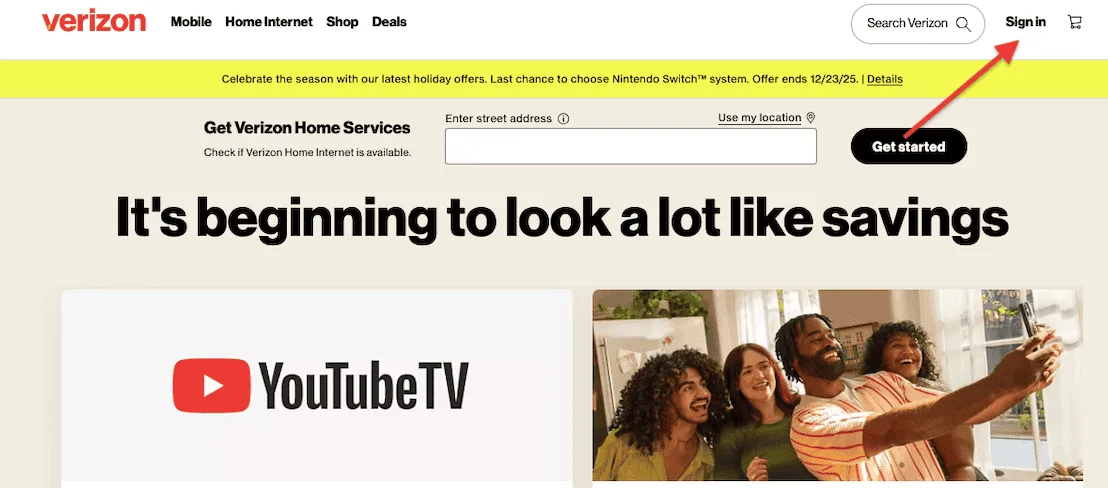
41. Is the Login Link Easy for Existing Members to Find?
It is a common mistake to forget about the people who have already subscribed. If an existing member visits your landing page to find the login button and has to hunt for it among the sales copy, they will feel neglected.
Keep a small, clear "Member Login" link in the top right corner.
It shows you care about your current customers just as much as you do about your new ones.
42. Verify your Browser Compatibility Across the Board
I once spent a very frustrating afternoon trying to click a button that refused to work in my version of Firefox.
Don't let your subscription be thwarted by lazy coding. Test your page on Chrome, Safari, Edge, and even those obscure browsers used by people who live in remote cabins.
If it doesn't work everywhere, you are leaving money on the table.
43. Are You Using Scarcity That is Actually True?
"Only 20 spots left for this month’s cohort" is a powerful motivator, but only if it’s true.
People have a keen sense for "fake urgency," and once they catch you in a lie like a countdown timer that resets every time the page is refreshed, your credibility is gone forever.
Use scarcity honestly, and it will serve you well; use it dishonestly, and it will sink you.
44. Have a Visual Path to the CTA
Your landing page should be designed so that every visual element, every photo, every bullet point guides the eye toward the "Subscribe" button.
It should be the most colorful, most prominent thing on the page. If a visitor has to look for the button, you have failed the most basic rule of digital design: "Don't make them think."
45. Is Your Founder’s Story Relatable?
People don't subscribe to corporations; they subscribe to missions. A short, personal section about why you started this service, perhaps you were frustrated by the lack of quality coffee, or the complexity of project management, creates an emotional bridge.
It transforms the subscription from a bill into a way to support a vision that the customer also believes in.
46. Offer a Gift for the Holidays
Subscriptions make excellent gifts because they "keep on giving" throughout the year.
By adding a small "Give as a Gift" link, you’ve just opened your service to a whole new market of people who might not want it themselves but know someone who would love it.
It’s a simple addition that can significantly boost your revenue during the holiday season.
47. Does the Post-Purchase Experience Look Organized?
Show a screenshot or a video of what happens after they click the button. Show the "Member Dashboard" or the "Welcome Email."
If the "After" looks clean, professional, and easy to use, it reinforces the idea that the subscription will bring order to the customer’s life, not more digital clutter to manage.
48. Do the Final Sanity Check From a Fresh Perspective
Before you launch, step away from the screen, walk around the block, and perhaps have a nice cup of tea.
Come back and look at the page as if you were a total stranger who has never heard of your company.
Does it feel like an invitation to a better life, or just another attempt to get a credit card number? If you can honestly say it’s the former, then you are ready to open the doors.
Don’t forget that a subscription is less about a credit card transaction and more about a promise of reliability. In an increasingly chaotic digital world, your landing page should be a beacon of straightforwardness and charm.
If you’ve followed these fifty steps, you’ve done more than "optimized a funnel"; you’ve built a front porch where people actually want to stay.
Now, go ahead and launch; the world is waiting for what you’ve built.
FAQs
What is a subscription landing page?
It is a peculiar and highly specialized corner of the internet. Unlike a standard webpage, which might be content to simply show you a picture of a toaster and hope for the best, a subscription landing page is designed to initiate a long-term relationship.
Its sole purpose is to convert curious visitors into recurring members by articulating the ongoing value of the service, whether a monthly box of exotic teas or a software suite.
Through a blend of persuasive copywriting, strategic CTAs, and social proof, it navigates the delicate psychological boundary between a one-time whim and a lasting commitment.
What are the things to consider when setting up a subscription landing page?
When setting up a subscription landing page, one must approach the task with the meticulousness of a cartographer.
The primary consideration is the value proposition; you must explain why your service is an essential recurring delight rather than a fleeting luxury.
Next, focus on User Experience (UX), the path from curiosity to checkout should be as smooth as a polished pebble.
You must also consider Price Transparency and Trust Signals, such as secure payment badges and clear cancellation policies, to soothe the "subscription jitters."
Finally, ensure the page is mobile-optimized, as most explorers will discover your brand while squinting at a pocket-sized screen.
How can I improve the conversion rate of my subscription landing page?
To improve your conversion rate optimization (CRO), treat your page like a polite conversation rather than a digital billboard.
Start by sharpening your call-to-action (CTA); a button that says "Join the Fellowship" is far more magnetic than a cold "Submit."
Reducing form friction is equally vital; the fewer boxes a human must fill, the more likely they are to finish the journey.
Finally, sprinkle in high-quality social proof and a "cancel anytime" guarantee.
When you remove the perceived risk, you transform a hesitant browser into a loyal subscriber, effectively lowering your customer acquisition cost.
Why is mobile optimization critical for subscription landing pages?
In the modern age, a mobile-responsive landing page is not a luxury; it is the very bedrock of your business.
Most visitors will encounter your brand on a device no larger than a biscuit tin, often while the world around them fractures their attention.
If your page load speed is sluggish or your "Subscribe" button is so small it requires the precision of a diamond cutter to press, your bounce rate will soar.
By prioritizing mobile-first design and ensuring a seamless checkout experience on smaller screens, you accommodate the "on-the-go" subscriber and capture conversions that would otherwise vanish into the digital ether.
Subscribe for more articles like this!
Thank you - we'll see you in your inbox soon!
Oops! Something went wrong while submitting the form.
Read by 5000+ ecommerce store owners
Subscribe for more articles like this!
Thank you - we'll see you in your inbox soon!
Oops! Something went wrong while submitting the form.


-Blog-Covers-Duo-tone.png)


.avif)
.svg)

.svg)

.svg)
.svg)
