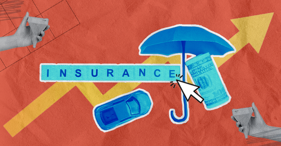
If there’s one industry where customers desperately want clarity but rarely get it, it’s insurance.
Whether you’re an insurance founder or marketer struggling to get your website visitors to convert, you’re not alone.
Conversion rate optimization for insurance companies is a hard nut to crack.
That’s why we’ve put together this conversion rate optimization guide that unpacks the best CRO strategies for insurance websites: from quote flow optimization to micro-conversion tracking, trust signals, mobile-first design, comparison tables, and everything in between.
If your goal is to boost leads, improve quote funnel performance, and sharpen your customer journey, you’re exactly where you need to be.
TL;DR: Conversion Rate Optimization For Insurance Websites
Insurance customers crave clarity, speed, and trust, and CRO is how you deliver it.
The biggest wins come from simplifying complex journeys, reducing friction during the quote process, and showing transparency at every step.
Start by tracking micro-conversions such as form engagements, coverage comparison clicks, and add-on selections.
Make your messaging audience-specific and rewrite jargon-heavy pages into plain English.
Next, focus heavily on mobile-first experiences, as most insurance shoppers now research and generate quotes on their phones.
Build trust early by showcasing reviews, success stories, awards, ratings, and a clean, distraction-free hero section.
Streamline the insurance quote flow with shorter forms, autofill, sticky CTAs, progress bars, and upfront disclosure of exclusions and claim timelines.
Conversion rate optimization for insurance companies is about guiding customers toward informed decisions.
By offering comparison tables, “Help Me Choose” wizards, transparent pricing, bundling benefits, and quick support options like chat or callbacks, you dramatically increase quote completions and policy conversions.
In short: simplify, humanize, reassure, and reduce resistance. That’s how insurance websites convert.
What are the Best Conversion Rate Optmization Strategies for Insurance Companies?
Conversion rate optimization for insurance companies isn’t about tricks or techno-wizardry; it’s about removing the small, irritating obstacles that make sensible people give up and wander off.
From confusing quote forms to trust signals hidden like family secrets, most insurance sites lose conversions for reasons that are entirely fixable.
So, here are practical strategies to help insurance websites turn more curious visitors into confident policyholders, without frightening them or their browsers.
1. Track Micro-Conversions Like Your Growth Depends on It
If there’s one truth about insurance websites, it’s this: people rarely leap straight from “I’m just looking” to “Please take my money.” They tiptoe. They prod.
That’s why tracking micro-conversions, quote form starts, brochure downloads, coverage comparisons, and “check premium” clicks give you a front-row seat into how buyers warm up.
As an insurance founder, you want to know precisely which small behaviors predict bigger ones so that you can optimize the buyer journey with real data, not guesswork.
Think of micro-conversions as the breadcrumbs that lead you to higher insurance lead conversion rates.
When you track them well, you can tighten weak spots and improve your funnel.
Product discovery – barriers that prevent shoppers from finding items
Category/collection pages – improvements that drive deeper product exploration
Product page – what to optimize to convert 2–3x more buyers
Cart – ways to ease hesitation and speed up purchase decisions
“The report was deep and super insightful. Can’t believe it’s free.”
Logan Christopher CEO, Empire Herbs
2. Speak to One Audience, Not Everyone: Make Your Messaging Ultra-Specific
Insurance is one of those industries where everyone needs you, but no one wants to slog through generic copy.
That’s why audience-specific messaging is your best CRO weapon.
Whether you sell term life insurance, health coverage, or motor insurance, your copy needs to feel like it’s written for one person, not a stadium.
When you create messaging tailored to young parents, freelancers, seniors, or small business owners, your conversion rates climb.
Use specific scenarios, relatable examples, and risk stories that match the user segment.
Google loves this kind of intent-driven, high-relevance content, and so do humans.
You’ll see lower bounce rates, higher quote requests, and far more engaged visitors.
Hence, speaking to a specific audience is an excellent strategy to improve your insurance website’s conversion rate optimization.
3. Go Mobile-First or Get Left Behind
If your analytics dashboard were a movie, mobile traffic would be the star.
For most insurance websites, over 70% of visitors show up on their phones, usually on the go, occasionally in mild panic, and always short on patience.
A mobile-first insurance experience means readable policy summaries, large tappable CTAs, simplified quote forms, lightning-fast load times, and zero pinching-and-zooming.
Here’s a quick mobile optimization checklist for your insurance website:
👉 Is your primary “Get a Quote” CTA immediately visible on mobile without scrolling, and does it stay accessible as users move down the page?
👉 Have you reduced mobile forms to the absolute minimum number of fields required to start a quote or inquiry?
👉 Are critical actions and buttons placed within natural thumb-reach zones on most mobile devices?
👉 Does your mobile site load in under 3 seconds on average, even on slower mobile networks?
👉 Is your mobile copy free of insurance jargon and written in plain, scannable language that works on small screens?
👉 Are all buttons, checkboxes, and form elements large enough to tap comfortably without accidental clicks?
👉 Do trust signals (reviews, ratings, security assurances, customer counts) appear early in the mobile experience, before users are asked to commit?
👉 Does your mobile navigation clearly prioritize the top user goals: getting a quote, managing a policy, and contacting support?
👉 Is click-to-call enabled, clearly visible, and easy to use for high-intent mobile visitors who prefer speaking to an agent?
👉 Have you tested the whole mobile journey from ad or entry point through quote completion to ensure there are no friction points or dead ends?
When your mobile UX feels effortless, you reduce drop-offs in the most fragile stage of the journey: the insurance quote funnel.
Plus, Google rewards mobile-first sites with better rankings, which means cheaper acquisition.
In a world where insurance shoppers compare plans between traffic lights, you cannot afford to feel like a 2009 website.
That’s why a mobile-first approach is such a critical part of your insurance conversion rate optimization process.
4. Sweeten the Deal: Offer Smart Incentives for Higher Lead Conversion
Insurance shoppers are a curious species; they’re interested but cautious, motivated but hesitant.
That’s why offering small, well-placed incentives can dramatically increase insurance lead optimization.
Think along the lines of: free add-on coverage for the first year, instant quote PDF, a quick risk report, or a no-spam promise paired with a callback guarantee.
These micro-incentives reduce the psychological cost of taking the next step.
When a visitor feels they’re getting something useful for free, they’re far more likely to start a quote or book a call. Just keep the incentives authentic and relevant.
5. Trust Badges: The Small Icons That Calm Big Fears
Insurance may be the only business where customers start their journey already suspicious.
That’s why trust badges like IRDAI number, certifications, compliance icons, and secure payment seals are so essential.
When customers see official proof that you're legitimate, compliant, and safe, their anxiety deflates.
Trust badges improve conversion rates by validating your authority and reducing fear around claims, payments, and data security.
Sprinkle them strategically across your homepage quote pages, and payment steps.
They’re tiny, but they carry the weight equivalent to a thousand reassuring words.
In CRO terms, trust badges are the cheapest and most reliable way to boost customer confidence.
6. Show Customer Reviews & Claim Success Stories
If trust badges lower fear, customer reviews and claim success stories eliminate skepticism. People don’t buy insurance, they buy reassurance.
And nothing provides reassurance like real stories from real customers explaining how your insurance actually helped them.
It’s ideal to show reviews, NPS excerpts, video testimonials, WhatsApp screenshots, and even snippets of claim turnaround experiences.
These act as powerful forms of insurance social proof, reducing dropout rates and increasing form completions.
Your visitors aren’t just evaluating your premiums; they’re considering your reliability in a crisis.
When they see others saying, “They processed my claim in 48 hours” or “The coverage saved me $90,000,” their mental barriers crumble.
Conversions climb when fear goes down, and reviews are your strongest fear-reducing asset.
7. Flaunt Your Awards Like They Matter
Insurance buyers love signals; anything that tells them, “This company won’t disappear when I file a claim.”
Awards, media mentions, and industry rankings are trust multipliers.
When placed intelligently on your key landing pages, they improve insurance website conversion rates by making you look established and dependable.
Awards work particularly well near CTAs and quote buttons, where last-minute fears usually sabotage conversions.
And let’s be honest, founders and marketers often hide these achievements like they’re modest.
Don’t. This isn’t the time for humility; it’s the time for higher CTRs. A little bragging is healthy when it increases trust and nudges hesitant users to fill out that quote form.
8. Display Claim Settlement Ratios Like They’re Olympic Scores
If there's a single stat that insurance buyers cling to, it’s your claim settlement ratio. Show it clearly.
Don’t tuck it away in a PDF. This metric is the consumer’s version of a lie detector test.
A high settlement ratio instantly builds trust and increases insurance conversions because it tells visitors: “We don’t abandon you at claim time.”
Add a short explanation (in human language, not actuarial dialect) about what the number means and why it matters.
Bonus points if you compare year-over-year improvement.
The transparency boosts credibility, reduces perceived risk, and makes your brand feel both honest and confident. Here’s a quick claim settlement ratio display checklist:
👉 Place it where decisions are made: Show the claim settlement ratio on product pages, quote results, and near primary CTAs, not buried in an “About Us” PDF graveyard.
👉 Explain the number in plain English: Add a one-line explainer like: “This means we paid 97 out of every 100 claims filed last year.” No footnotes. No fine print gymnastics.
👉 Show the latest year and the trend: Display the most recent data clearly and, if possible, include a simple year-over-year comparison to signal consistency, not a lucky spike.
👉 Make it visually scannable: Use bold typography, icons, or badge-style treatments so the stat is absorbed in seconds, not studied like a balance sheet.
👉 Reinforce trust near the CTA: Pair the ratio with reassuring copy like “Claims paid quickly and fairly” just before “Get Quote” or “Buy Policy.”
For insurance conversion rate optimization, a well-placed settlement ratio is one of the highest-impact elements you can add to any product page.
9. CTAs That Behave Like They Actually Want to Be Clicked
Most CTAs on insurance websites look like they were designed during a power outage, unassuming and barely visible.
But your call-to-action buttons are the spark plugs of your conversion engine. Make them bold, focused, and delightfully obvious.
Use action-driven text like “Get My Premium,” “Check My Coverage,” or “See My Savings”; phrases that feel personal and urgent.
When CTAs are laser-focused and tied to user intent, click-through rates rise, and insurance lead conversion improves dramatically.
Place them strategically: in the hero section, after coverage explanations, and near comparison charts. And do give them breathing room.
A CTA squeezed between walls of text is like a lifeguard buried in sand: technically present but useless.
Treat your CTAs like they have feelings, and you’ll see your conversions thank you.
10. Fix Your Quote Flow Before It Fixes Your Bounce Rate
If there’s one place where insurance websites lose the most revenue, it’s the quote flow.
This sacred corridor between curiosity and commitment is where users either glide through or flee, as if you just offered them a tax form.
To reduce abandonment, simplify every step: fewer fields, autofill, real-time error checks, and a progress bar that tells people they’re not signing up for a mortgage.
Break long forms into bite-sized segments and keep jargon in a locked box where it belongs.
When you optimize your insurance quote journey, you shrink drop-offs and boost lead quality.
CRO-wise, nothing delivers more ROI in insurance than fixing your quote flow, because a customer who starts a quote is already halfway to conversion.
You shouldn’t squander that momentum. Here’s a quick checklist for optimizing quote flow on insurance websites.
👉 Ask only what you truly need (for now): Strip the form to its essentials. If a field doesn’t change the quote immediately, it can wait until later.
👉 Break the journey into short, human-sized steps: Use multi-step forms with clear progress indicators so users know they’re 2 minutes away from a result, not 20.
👉 Enable autofill and smart defaults: Leverage browser autofill, saved data, and preselected options to reduce typing and mental load.
👉 Fix errors as they happen, not after: Use real-time validation with plain-English messages. No one enjoys being scolded by a red banner at the end.
👉 Translate insurance into normal language: Replace jargon with explanations, tooltips, or examples. Confused users don’t convert they escape.
11. A/B Testing: The Closest Thing You Have to Superpowers
Most insurance founders rely on hunches, but hunches rarely increase conversions (unless you’re unreasonably lucky).
The real magic lies in A/B testing your insurance quote funnel, headline variants, CTA placements, form steps, hero designs, and product explanations.
Testing shows you what your audience actually responds to, not what you assume they will.
Start with high-impact, high-traffic pages and test one variable at a time. It’s ideal to keep tests hypothesis-driven and straightforward.
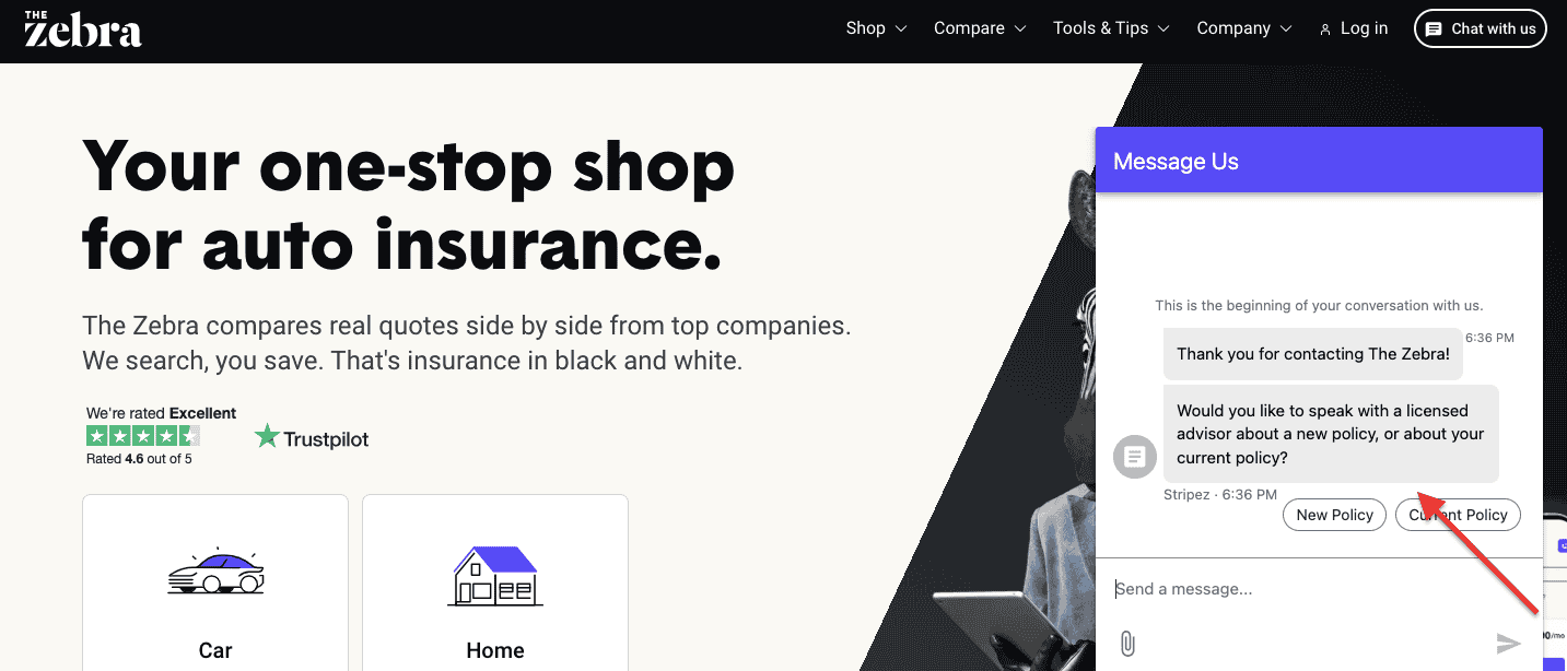
12. Upgrade Your Live Chat From Passive Ornament to Conversion Engine
A live chat widget is only useful if it behaves like a helpful concierge, not a sleepy doorman.
Insurance shoppers often need clarification about premiums, exclusions, and claim processes; questions that, if unanswered, lead directly to abandonment.
Optimizing your insurance live chat tool with pre-filled prompts, quick-reply options, and human backup can dramatically improve conversions.
You need to place chat windows on product detail pages, comparison pages, and quote flows, anywhere doubt tends to sneak in.
Train your chat team to use simple language, fast responses, and micro-scripts that reduce friction.
A well-optimized chat tool shortens decision time, improves trust, and increases quote completion rate.
Hence, it’s a must-have in your insurance conversion rate optimization strategy.
13. Tell a Story or Lose the Sale: Brand Storytelling for Insurance CRO
Insurance decisions are emotional long before they’re logical.
That’s why brand storytelling can transform your conversion rate.
Instead of leading with features, lead with human stories: why your company exists, who you help, the families you’ve supported, and the claims you’ve resolved.
Stories shrink psychological distance and build trust faster than any badge or banner.
When you craft narrative-driven content on your homepage and product pages, you create emotional relevance, a key CRO unlock in insurance.
14. Benefits, Not Buzzwords: Write Copy That Earns Its Keep
Insurance copy tends to fall into two buckets: astonishingly dull or aggressively technical. Neither converts.
What visitors actually want is benefit-oriented insurance copy: clear explanations of how your product improves their life when things go wrong.
Start by translating features into everyday outcomes: “Cashless hospitalization within 90 minutes,” “Saves you $50,000 in medical bills,” or “Covers your family even if you’re traveling.” Benefits create mental images.
Mental images drive decisions.
15. Explain Insurance Like You’re Talking to a Friendly Neighbour
Insurance jargon is a silent conversion killer. The moment your user encounters terms like “sum assured,” “waiting period,” or “non-admissible expenses,” their brain exits the building.
That’s why explaining your insurance products in simple language is one of the highest-ROI CRO strategies.
Replace jargon with metaphors, examples, and everyday explanations. Break down what each plan covers, what it doesn’t, and why it costs what it does.
When people understand your product effortlessly, they’re likely to make a purchase decision.
16. Comparison Tables: The Unsung Hero of Insurance Conversions
Insurance shoppers don’t want to read; they want to compare.
A well-designed insurance comparison table can slash cognitive load and dramatically improve CRO.
Put key variables side-by-side: premium, coverage, add-ons, exclusions, claim settlement ratios, and eligibility.
Use icons and concise labels instead of paragraphs. Comparison tables don’t just help the user; they guide them toward the product you actually want to sell.
They also align perfectly with high-intent search queries (“best insurance plan comparison,” “compare health plans”), strengthening your SEO.
When users see everything laid out clearly, their confidence rises, and their uncertainty evaporates.
17. The “Help Me Choose” Wizard: Your Digital Salesperson That Never Sleeps
Insurance shoppers often arrive overwhelmed, mildly confused, and one exclusion away from abandoning the whole ordeal.
A “Help Me Choose” plan selector solves this beautifully.
By asking a few guided questions, such as age, family size, coverage need, and budget, you instantly cut through decision fatigue.
It’s the online equivalent of a friendly advisor who says, “Here, let me simplify that for you.”
This reduces bounce rates, increases quote starts, and boosts insurance funnel conversions because customers feel supported, not sold to.
Search engines also adore this format because it matches intent-driven queries like “which insurance plan is right for me?”
A wise wizard not only improves UX but shapes customer confidence in minutes.
18. Premium Breakdowns: Show the Math, Win the Trust
One of the biggest conversion killers in insurance? Hidden fees and mysterious pricing. People don’t mind paying more if they understand why.
Break down your premium clearly: base premium, riders, taxes, discounts, and add-ons.
When users see a simple, transparent cost structure, their anxiety melts away.
This boosts conversions because it aligns with what shoppers search for: “insurance premium breakdown,” “how is premium calculated,” “hidden charges in insurance.”
Add micro-tooltips or small explainer pop-ups for trickier terms. The goal is to make your pricing feel like a friendly bill, not an exam.
19. Coverage Examples: Paint Pictures, Not Paragraphs
People imagine accidents, illnesses, lost baggage, or a cracked car bumper before buying insurance.
That’s why real-world coverage examples are conversion gold.
Instead of describing benefits abstractly, show users what happens in a real claim scenario: “Hospital bill $1,20,000 → you pay $0,” or “Rear-end collision damage $4,000 → insurer pays $3800.”
These tiny narratives make your product instantly relatable and significantly boost confidence in purchasing insurance.
They reduce ambiguity, the #1 reason customers hesitate during the quote stage.
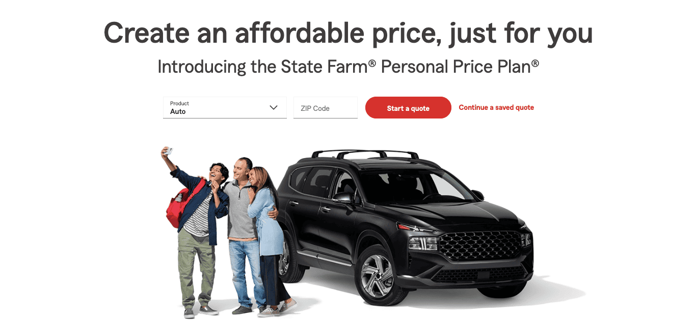
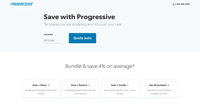
20. A Hero Section That Actually Helps, Not Hypnotizes
Most insurance hero sections look like giant billboards shouting into the void. But a good hero section makes its presence felt.
Keep it clean with a single CTA, a tight benefit-driven headline, and a subhead explaining your most immense promise: faster claims, lower premiums, and cashless hospitals.
A clutter-free hero improves scanability, anchors SEO keywords (like “health insurance online” or “motor insurance quotes”), and increases click-through rates.
Your visitors decide in under 5 seconds whether to stay or vanish.
A focused hero page, without carousels, flashing badges, or existential paragraphs, is CRO oxygen.
Treat this area like prime real estate, because it is.
21. Sticky CTAs: Your Safety Net for Wandering Shoppers
Insurance pages can be long. You’re explaining coverage, add-ons, exclusions, rider benefits, and claims, all necessary, none quick. That’s why sticky CTAs are invaluable.
No matter where the visitor scrolls, the “Get Quote” or “Calculate Premium” button follows gently like a polite but persistent butler.
Sticky CTAs dramatically increase quote-start rates because users never have to scroll back up to take action.
And they work brilliantly on mobile, where attention spans travel faster than fingers. Here’s a quick sticky CTA optimization checklist for your insurance website:
👉 Make it visible without being obnoxious: Sticky means always accessible, not always shouting. Keep it slim, unobtrusive, and easy to dismiss if needed.
👉 Optimize for thumbs, not cursors: On mobile, place the sticky CTA at the bottom with enough padding to avoid accidental taps or OS conflicts.
👉 Reassure before you ask: Add microcopy like “Takes under 60 seconds” or “No spam. No obligation.” Fear kills insurance conversions, reassurance revives them.
👉 Avoid multiple competing CTAs: One primary sticky CTA per page. Two CTAs don’t double conversions; they usually halve the number of decisions.
👉 Test color contrast, not brand loyalty: Your brand color is lovely. Your CTA color should still stand out from the rest of the page, especially on scroll-heavy layouts.
22. Quote Forms That Don’t Feel Like a Tax Return
Insurance forms have a reputation for being long, confusing, and soul-draining.
To improve insurance form conversions, you need to simplify and strip away anything non-essential.
Use smart defaults, auto-fill, real-time validation, and progress indicators.
Replace complex inputs with sliders, dropdowns, and pre-filled values.
Keep your language conversational, less “Provide nominee relationship” and more “Who should receive the benefit?”
When forms feel human, completion rates soar. Every field you remove improves CRO. Every complexity you eliminate adds warmth.
23. Policy Documents: Don’t Make Customers Dig for the Truth
Hiding policy documents is like hiding vegetables from a health inspector; it always backfires. Make policy brochures, coverage PDFs, T&Cs, and exclusion lists easy to access.
This increases trust, lowers the bounce rate, and boosts SEO for keywords such as “policy wordings,” “insurance brochure,” and “coverage details.”
Customers feel safer when they can verify information upfront.
You don’t need to shove documents into their arms; just make them easy to spot.
When transparency is built into your UX, users reward you with higher quote starts and deeper engagement.
If you truly want to win conversions, show you have nothing to hide.
24. Mobile UX: The Make-or-Break Moment of Your Conversion Funnel
In insurance, mobile isn’t an add-on; it’s the whole stage.
Most users compare premiums, check coverage, and start quotes on their phones.
A seamless mobile insurance experience means fast load times, tap-friendly buttons, readable text, quick forms, and zero horizontal scrolling.
If your site feels clunky on mobile, your conversions bleed. Google also prioritizes mobile-first sites in rankings, so a strong mobile UX gives you an SEO advantage.
A smooth mobile experience increases quote completions because users don’t get frustrated halfway.
25. Add Reminder Nudges at Key Drop-Off Points
If there’s one thing we know about insurance customers, it’s that they disappear mid-journey like socks in a hotel laundry.
Reminder nudges are your gentle “hey, you left the stove on” notifications that bring people back before they wander off for good.
Smart conversion rate optimization for insurance websites means using subtle, well-timed prompts: a pop-up reminding them they’re one step away from their quote, an exit-intent message that saves their progress, or a friendly email saying, “Your quote is ready when you are.”
These nudges reduce funnel abandonment, improve quote completion rates, and reinforce that you respect their time.
⚠️
Want to know the hidden barriers in your buying process?
Why visitors don’t trust your store within 3 seconds
Why shoppers can’t find what they’re ready to buy
What’s stopping 2-3x more shoppers from clicking “Add to Cart”
Where buyers hesitate right before purchase
Why high-intent shoppers still drop off
“The report was deep and super insightful. Can’t believe it’s free.”
Logan Christopher CEO, Empire Herbs
26. Provide Instant Chat or Callback Options at Pricing Moments
Pricing pages are where customers squint, hesitate, and mentally run the numbers like a game show contestant deciding whether to take the deal or open the mystery box.
This is also the moment when friction spikes and conversational commerce can come to your rescue.
Offering real-time support, live chat, instant callbacks, or even a quick explainer widget is one of the most effective CRO tactics for insurance websites.
When customers get stuck on premiums, deductibles, or add-ons, they abandon the journey altogether.
But if someone is there to answer questions right then, quote completion and lead conversion jump significantly.
27. Be Upfront About Exclusions
Insurance shoppers love transparency more than they love discounts, and that’s saying something.
Being upfront about exclusions is one of the best ways to build trust and reduce objections that tank conversions later in the funnel.
Instead of burying exclusions in dense policy PDFs, surface them in simple language: “Here’s what’s covered, and here’s what’s not.”
This clarity reduces call-center volume, increases quote completion, and boosts customer satisfaction before they even buy.
From a CRO standpoint, transparent exclusions reduce second-guessing, eliminate unpleasant surprises, and elevate your brand’s credibility.
28. Show Price Savings When Customers Bundle Add-Ons
People adore a good bargain, especially when it feels like they’ve outsmarted the system.
Showing price savings on bundled insurance add-ons, such as roadside assistance, riders, or extended coverage, is a conversion catalyst.
Instead of customers feeling nickel-and-dimed, they see a deal too good to pass up.
You can use simple comparison blocks: “Buy individually: $X. Bundle price: $Y.” And for good measure, add microcopy such as “Most customers choose this bundle.”
From an insurance CRO perspective, bundling increases average policy value while reducing friction during the quote process.
29. Offer Limited-Time Discounted Premiums
Limited-time premium discounts are the CRO world’s version of a fresh hotel breakfast: warm, inviting, and hard to turn down.
When customers see a time-sensitive offer like “Save 15% if you complete your quote today”, motivation spikes.
This taps straight into urgency psychology, helping insurance websites increase quote completion and policy purchases.
The trick is to keep it honest and useful: no fake countdown timers or exaggerated claims.
Instead, present a clear offer, an expiry date, and simple language explaining how the customer benefits.
Limited-time deals work particularly well in the auto, travel, and health insurance categories, where people already compare prices aggressively.
30. Make Your Claims Process Page Transparent
Insurance buyers want reassurance long before they file a claim, and nothing reassures quite like a crystal-clear claims page.
This is your opportunity to turn what is usually a terrifying mystery into a guided museum tour.
Lay out the steps, timelines, documents needed, average settlement times, and simple eligibility rules.
Add diagrams, customer testimonials, and short videos that explain how claims actually work.
Transparent claims pages improve trust, reduce customer anxiety, and increase conversions for people comparing insurers.
It’s a CRO win because transparency lowers abandonment and positions your brand as customer-first.
31. Show Fast Claim Settlement Time
In the insurance industry, “How fast will you pay me when things go wrong?” is the question that makes or breaks conversions.
Showcasing claim settlement time, whether it’s “98% claims settled in 48 hours” or “Instant digital approvals under $10,000”, is one of the most powerful CRO levers you can pull.
Customers want reliability, speed, and proof.
Put settlement stats on your homepage, product pages, and quote flow.
Use visuals, badges, and microcopy to make it unmistakable.
Fast claim settlement transforms hesitation into confidence, especially for shoppers of health, motor, and travel insurance.
It’s like telling a nervous traveller the train always arrives on time, and suddenly the journey feels far less daunting.
32. Highlight Your Claims Support Team
Behind every smooth claim is a helpful human being, and insurance shoppers love knowing who those humans are.
Adding a section that introduces your claims support team: names, photos, expertise, and response times, humanizes your brand and dramatically boosts trust.
From a CRO perspective, this reduces fear, improves engagement on claims pages, and increases quote-to-policy conversions.
People don’t buy policies from faceless corporations; they buy from professionals who look competent and kind. The reassurance it creates is priceless.
Final Thoughts
Insurance isn’t just about policies; it’s about confidence and the comforting knowledge that someone will help when life swerves unexpectedly.
Your website should embody exactly that feeling.
With thoughtful CRO tactics, simple copy, transparent claims communication, friction-free forms, trust badges, clear pricing, smart nudges, and a truly supportive quote flow, you create an experience that guides your customers.
As an insurance founder or marketer, every optimization you make is a signal: “We see you. We hear you. We make this easy.” When you combine empathy with innovative conversion strategies, you don’t just boost lead volume or policy sales, you build long-lasting customer belief in your brand.
Let this checklist be your compass, and may your conversions rise as steadily as your customer trust.
FAQs
1. What is Conversion Rate Optimization (CRO) for insurance websites?
Conversion rate optimization for insurance websites is the process of improving how effectively your site turns visitors into leads, quote requests, and policy buyers.
Most insurance shoppers arrive with one of two emotions: confusion or skepticism.
CRO helps remove both. It involves analyzing user behavior, identifying friction points, and improving the website journey so customers understand your products, trust your brand, and feel confident enough to take the next step.
For insurance, CRO often focuses on simplifying quote flows, clarifying coverage details, reducing form abandonment, improving mobile usability, showcasing trust signals, and clearly communicating claims processes.
These changes help users make decisions faster and with fewer doubts.
Conversion rate optimization for insurance companies isn’t about tricking customers into converting; it’s about designing a clearer, more helpful experience.
It builds long-term trust, which is the actual currency of the insurance world.
2. Why do insurance websites have high abandonment rates, and how can CRO fix that?
Insurance websites often experience high abandonment because customers feel overwhelmed by complex jargon, long forms, unclear pricing, or an opaque claims process.
When people encounter these barriers, they hesitate, leave, or postpone the decision altogether.
Another common issue is poor mobile usability, a significant problem since many insurance shoppers browse on their phones.
Slow pages, clunky drop-downs, and non-intuitive layouts push users away,
CRO solves this by smoothing out friction at every stage.
You can reduce abandonment by using shorter quote forms, adding autofill, showing progress bars, providing upfront pricing, and explaining products in plain language.
Offering instant chat or callback support during pricing moments can help prevent confused visitors from dropping off.
Trust signals, reviews, claim settlement ratios, awards, and testimonials help customers feel safe.
When the journey becomes clearer and more straightforward, users stay longer, complete quotes more often, and convert at a higher rate.
3. How can insurance companies build more trust on their website?
Trust is the backbone of every insurance purchase, yet many insurers unintentionally hide the very details customers need to feel confident. Building trust begins with transparency.
Show real customer reviews, claim success stories, ratings, awards, and your average claim settlement time.
These elements serve as social proof, telling visitors, “People like you have chosen us, and it worked out well.”
You can also increase trust by clearly explaining the claims process, listing exclusions in plain language, and breaking down premiums so customers know exactly what they’re paying for.
Using comparison tables and “Help Me Choose” tools helps users feel guided rather than pressured.
Humanizing the experience makes a big difference: introduce your customer support or claims team, show response times, and offer live chat or callback options.
Finally, ensure your site design looks modern and professional. People judge credibility in seconds.
When your site feels thoughtful, transparent, and helpful, trust naturally follows and conversions rise with it.
4. What CRO elements have the biggest impact on insurance quote funnel performance?
For most insurance companies, the quote funnel is the single most important part of the customer journey and also the most fragile.
The biggest CRO wins come from simplifying the form itself. Remove unnecessary fields, enable autofill, use a clean layout, and show customers exactly where they’re using a progress bar.
Sticky CTAs help mobile users move forward without having to hunt for buttons.
Transparency is another major lever: show price breakdowns, coverage summaries, exclusions, and bundling savings before customers enter payment details.
This eliminates surprises and builds confidence.
Support is equally critical. Adding live chat or instant callbacks during premium calculation moments dramatically reduces abandonment.
Finally, reinforcement signals such as trust badges, claim settlement times, customer testimonials, and ratings reduce anxiety and encourage users to complete the process.
Together, these CRO tactics create a quote experience that feels fast, friendly, and fully understandable, exactly what customers need to convert.
Subscribe for more articles like this!
Thank you - we'll see you in your inbox soon!
Oops! Something went wrong while submitting the form.
Read by 5000+ ecommerce store owners
Subscribe for more articles like this!
Thank you - we'll see you in your inbox soon!
Oops! Something went wrong while submitting the form.


.svg)

.svg)

.svg)
.svg)
