Oops! Something went wrong while submitting the form.
Conversion Optimization
What Design Mistakes Kill eCommerce Sales (And Proven Ways To Fix Them)
September 24, 2025
Insights in this post come from our CRO team's decade of experience working with eCommerce brands. Edited by our in-house content team.
Imagine this: 10 potential shoppers walk into your store, they walk around for a while, and 7 of them leave without speaking a word.
And it wasn't because they didn't like the products – it was the layout, they couldn't figure out.
That’s exactly what poor UX does to your online business. Here are 15 really common design mistakes that kill sales in your eCommerce store — and how to fix them fast.
15 Common Design Mistakes That Kill Sales In Most eCommerce Stores
Think about it: when someone’s ready to act, the button should feel like a no-brainer.
What would you do if you saw CTAs for “Add to Cart,” “Buy Now,” “Subscribe and Save 12%”, and “Wishlist.”, all in the same size and font?
You would stop and think, right? Well, that’s exactly what you don’t want a shopper to do.
They should see the options, but hierarchy is extremely important here.
How to fix this eCommerce design mistake fast:
✅ Offer two paths at max and ensure only one CTA stands out visually on PDPs. For example, “Buy Now” and “Add to Cart” or “Buy Once” and “Subscribe and Save”
✅ On mobile, anchor the main CTA in a sticky bottom bar. People shouldn’t have to scroll back up to act
✅ If there’s a “Wishlist” feature, tuck it quietly under the main CTA as a text link or an icon, not a full-fledged button
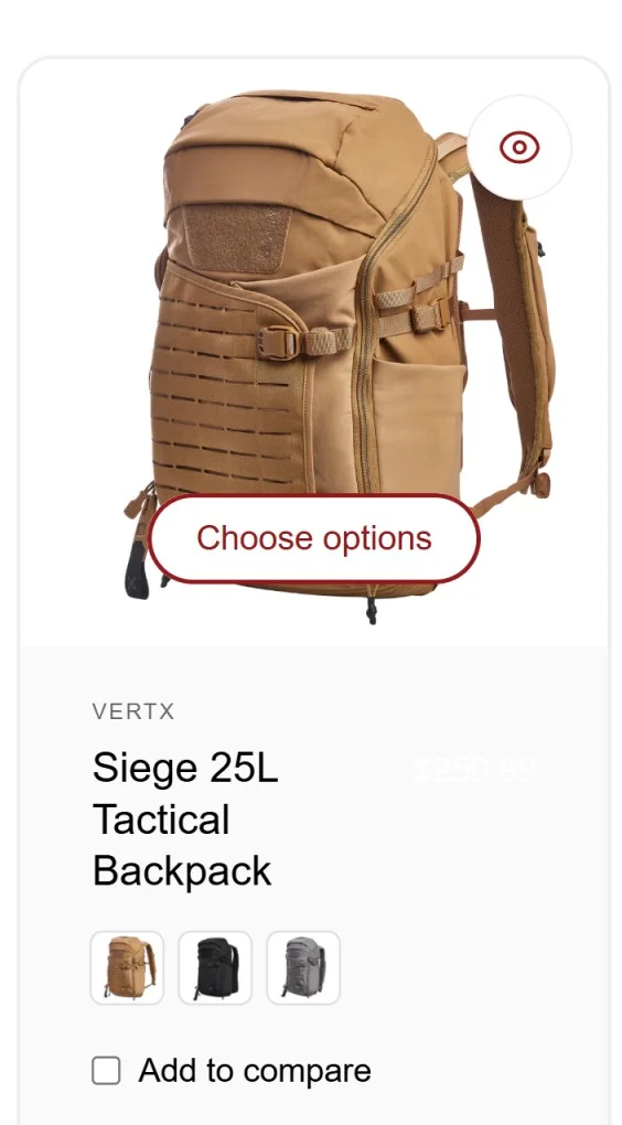
✅ Don’t offer irrelevant anchor text – here’s a great example of bad anchor text from Vertx – while all they’re asking is to choose colors, they write choose options, instead of writing “choose colors” – so when the quick view opens, a shopper doesn’t know what to really look for:
P.S. If you look really well, you’ll also see another design mistake: the color of the price has blended with the product listing. 🙂
High-intent shoppers know what they want. So, if they search and can’t find it, they might dig through menus. If they find it, great. If they don’t, buyers who came ready to spend are now gone. We’ve seen some site searches that only show results when shoppers press the search button.
That too, to populate irrelevant stuff from across the store.
Also, a site’s search bar can be a tool to recommend stuff.
How to fix this eCommerce design mistake fast:
✅ Audit top queries. Check your store’s analytics: what are people typing most often? Make sure those 10–20 terms always return products. If possible, keep ‘em as help text – like “search for power tools you have in mind: hole saw”
✅ Autosuggest matching products, categories, and even “related searches”
✅ Account for “no matches found” to show best-sellers, like: “No black running shoes — but here are top sellers under $100.”
✅ Suggest results that show extra features - like someone searching for jackets sees long jackets, twill jackets, half jackets, men’s jackets, women’s jackets (you get the drift)
Here’s a great example of how a store’s site search should be designed from Minnidip: note how they feature common policy links as well as customer support content:
A notification bar is supposed to be a quiet salesperson. But not too quiet. Here are some common mistakes we’ve noticed:
❌ The bar blends into the header because it’s the same color (or there’s little to no contrast)
❌ The messages go by really fast (so nobody really reads them)
❌ Too many offers (so again, shoppers don’t know which to read)
How to fix this eCommerce design mistake fast:
✅ Show one message at a time (if there are more offers, put ‘em in pop-ups, where shoppers will actually take notice)
✅ Contrast is non-negotiable. If the header is white, make the bar black or bright blue.
✅ Add actual urgency – even if you’re just using text - like “Free shipping ends in 7 days”
4. The Checkout Sends Shoppers Packing
Any eCommerce store might already have shoppers on checkout trying to give the store sales. What’s stopping them?
Can be anything. The cart isn’t there when shoppers switch devices.
Perhaps the coupon code box makes them leave the page to search for discounts.
Maybe the error messages don’t really explain what a shopper is doing wrong.
Or, they see a wall of trust badges that makes them think, “Why are there so many badges – what’s Norton?”
How to fix this eCommerce design mistake fast:
✅ Offer an option like “fetch your saved cart” – this way, if a shopper had entered an email on an exit intent (or welcome) pop-up, you can sync carts
✅ Display smart error messages on checkout – for example, if somebody types gnail.com, display “did you mean Gmail?” (for cards, Luhn Validation is the way to go)
✅ If there’s a ‘redeem coupon’ box, keep at least one coupon code visible below it (offer coupons with perks like extended warranty or 2 days of extra returns, etc.)
✅ Ensure shoppers can actually notice the cart icon update and the confirmation message when they add to cart (if it’s an animated one, ensure it lasts for at least 10 seconds)
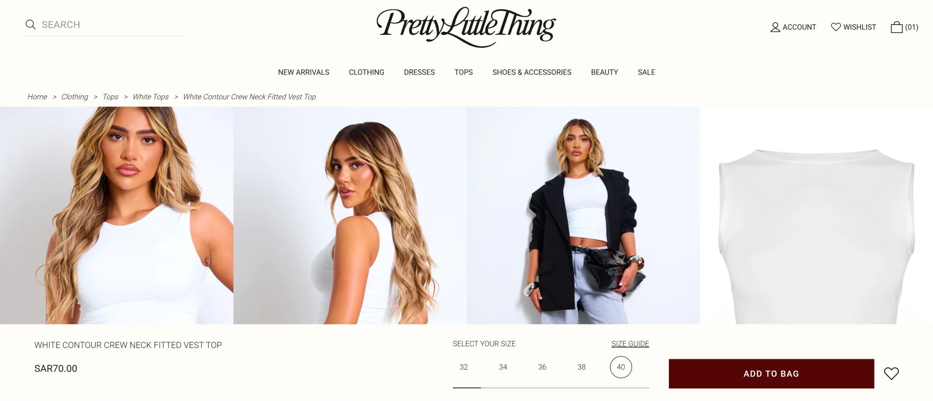
Example: Pretty Little Thing’s cart icon is easy to miss, and even after adding an item, the sticky bar still shows “Add to bag.” If it were updated to “Go to cart” or “Add more,” shoppers would know what just happened – and keep moving forward.
Often, the first page (and if designed wrong, it can be the last page for nearly 60% of shoppers).
An eCommerce site’s homepage should give people a clear path to products. Too often, it doesn’t. Why?
Maybe the promotions take too much precedence. So much so that the promos don’t differentiate between who’s visiting your store for the first time vs. who’s here for the 100th time.
Or maybe the brand story takes priority over products.
Meanwhile, the stuff that would actually get them buying: best-sellers, review snippets, video testimonials, press features, delivery promises, sits buried somewhere near the footer.
How to fix this eCommerce design mistake fast:
✅ Show them a path – like actual bestsellers first, new arrivals, and then perhaps a decision maker – like a product discovery quiz
✅ Feature a ‘who we are’ section within the first two folds (show brand promises, USPs, and review snippets) – keep the full story reserved for the bottom of the page
✅ Have service features loaded for returning shoppers – like “reorder in one click” or “redeem loyalty points”
✅ And if there are promotions, make one the hero. Not three at the same time
Example of how design mistakes can kill sales: Carnivore Club’s homepage just shows products, one really mistimed “holiday” promotion, and no clue as to what Carnivore Club’s actually about:
While most shoppers “window shop” just for kicks, it doesn’t take long before it all turns into an impulse buy. But if they get stuck at navigation, they’re leaving quicker than they arrived.
What stops shoppers here:
Menus overlapping, categories sounding the same, filters that matter being hidden behind an icon that no one clicks on. Or worse, browsing three menus to find one category.
For example, to a store owner, “Apparel → Tops → Knitwear” might make perfect sense. But a shopper may be thinking, “I want a sweater I want to wear to work.”
On a desktop, that may be mildly annoying. On mobile, however, it’s even worse.
They see a long list of accordions on mobile that lead to more accordions, which they don’t want to expand and see.
How to fix this eCommerce design mistake fast:
✅ Feature both types of navigation: the “shop by product” and one for the way shoppers think: “Workwear,” “Vacation fits,” “Gifts under $50.”
✅ Keep it lean: no more than 5–7 top-level categories.
✅ On mobile, give them predictive search or a single “Shop by…” filter. Nobody wants to tap open ten menus to find socks.
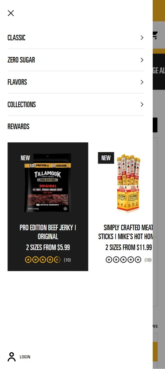
Here’s a great example of how a navigation’s design should be from Tillamook Country Smoker: note how the navigation doesn’t overload on choices, but also shows relevant new arrivals:
7. Product Pages Don’t Answer Questions About The Product
Or don’t really help shoppers glean what’s great about the product.
A description of the product, some reviews, and images aren’t enough for most shoppers.
Every PDP has certain triggers (micro-conversions). If those stop, a store’s sales most definitely will take a hit.
Some of those sales-killer PDP design mistakes:
Pixelated zooms. A size guide hidden two scrolls deep. Product description tabs that nobody opens. Worst of all? No proof that anyone else actually buys the thing.
How to fix this eCommerce design mistake fast:
✅ Ensure the images are actually of high quality – in terms of resolution, finish, and variety
✅ Pull size, shipping + return info right up near the price, not buried below the fold (or at least in the top two folds)
✅ Ensure the USPs are visible right within the first fold, without scrolling – that can mean using icons to sum product descriptions
✅ Ensure the page offers a few of the top-asked questions right near the product description (“What’s shipping like?”, “Does it fit true to size?”)
✅ Offer an option to share the product – like a “share this with a friend” and show options to share via WhatsApp, Facebook, Insta, SMS, etc.
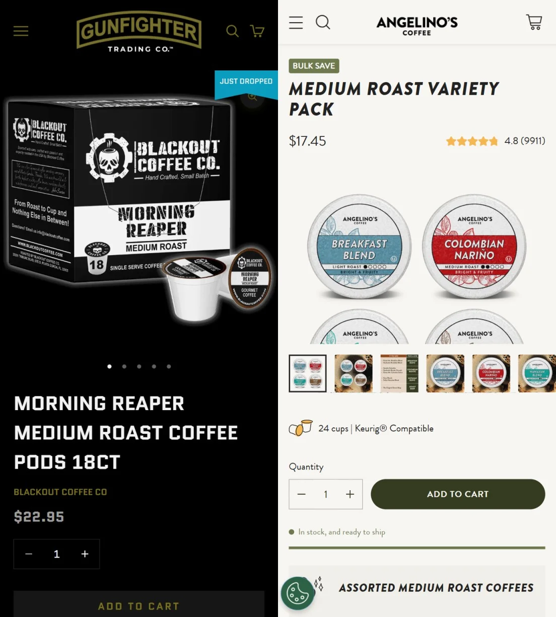
Example of a good PDP design and a bad PDP design: check these two first folds of PDPs – one from GunFighter Trading Co and one from Angelino’s Coffee.
Note how Angelino’s Coffee offers not only a gallery, but also a quick preview of reviews, savings, and product size, all in the first fold:
Designers often pile on extras that look great in a review but actually might be costing revenue in real life.
Research shows that sites with a load time of less than 2.4 seconds have a median conversion rate of about 1.9%, while those with a load time of more than 4 seconds have a conversion rate of less than 1%.
What slows eCommerce stores down: sliders, videos on autoplay, and multiple store features (including tracking) getting loaded on scripts.
How to fix this eCommerce design mistake fast:
✅ Compress the largest images (especially hero banners). It’s usually the single biggest culprit, especially if they’re animated.
✅ Lazy-load videos and secondary images, ensure the top fold populates really fast
✅ Push non-critical scripts (reviews widgets, tracking tags) to the end of the page load
✅ Don’t trust office WiFi speed tests. Test the site on 4G from a regular phone
9. The Pop-Ups Push People Out Instead of Pulling Them In
A pop-up can nudge a sale if it’s timed right. Most aren’t.
For example, the moment a shopper lands, half the screen is blocked. A cookie banner stacks on top of it.
They dismiss it and scroll a bit more – another pop-up fires. Instead of engaging further, they shut the whole thing down.
While one may argue “that isn’t the mark of a high value shopper”, it can be the “mark of a shopper who was just about to take a plunge - but a redesign shut it down.”
It’s even worse if forms across the store don’t convert.
How to fix this eCommerce design mistake fast:
✅ Add small, instant incentives (e.g., “5% off now” instead of a vague “sign up for updates”)
✅ Give people a chance to breathe. Delay any pop-up until they’ve scrolled at least 20% of the page or spent at least 20–30 seconds on the page (with at least one scroll)
✅ Trigger one pop-up per session – either the exit intent or welcome pop-up (only trigger two pop-ups when there’s actual shopping intent – i.e., microconversions, like browsing multiple categories, viewing descriptions, checking size guides)
✅ Collapse cookie banners into one slim bar, or show it as a non-intrusive one that doesn’t really block people from reading what’s on the page
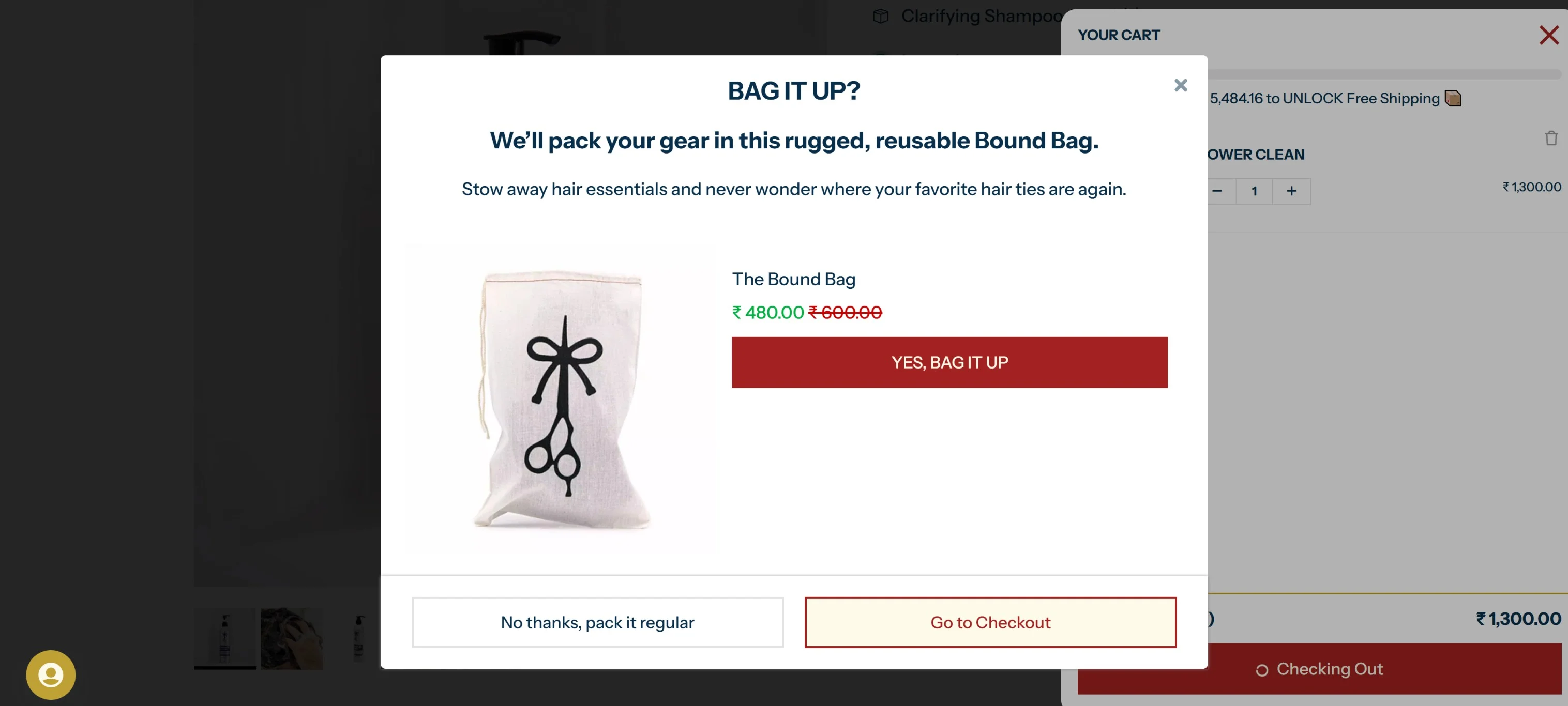
Example of how design mistakes can kill eCommerce sales: The Longhairs US’s checkout flow uses a cross-sell pop-up – not only is it utterly interruptive, but also confusing. Why? The cart itself is a slide-in one. Plus, the CTAs don’t really help.
Especially, the bottom CTAs – if the “Go to Checkout” CTA was “Yes, Bag It Up”, it would’ve made more sense:
10. The Store Speaks…To The Wrong Audience
Have you ever seen a Zara showroom decorated like a Decathlon outlet? Probably not. Why? Design’s instinctive.
And if you’re saying, “Wait, that’s just how Zara’s branded itself,” – ask yourself, why does branding exist in the first place?
The same logic applies to eCommerce stores as well. What appeals to shoppers varies by what country they are in. For example, in Japan, people prefer clutter. While in the US, minimal and cleanly designed websites perform better (in most industries).
However, that’s just scratching the surface of how wrong design can be:
For example, an eCommerce store can just as easily lose all kinds of shoppers between 18 and 80 if:
The text isn’t readable in the sunlight
Shoppers have to reduce the brightness to read at night
One has to squint to read text
Or maybe, the store’s design attracts “window-shoppers” who love aesthetics but don’t find buying triggers.
How to fix this eCommerce design mistake fast:
✅ Check who’s actually visiting. Look at your analytics by age and ethnicity. If 40% of your visitors are 50+, test your design with them. Ask:
Are the fonts legible?
Do your photos actually show people in their age group and ethnicity?
Is product discovery equally obvious across groups?
✅ Segment new vs. returning buyers to A/B test layouts and conversion nudges for each segment. For example, new shoppers may need trust-building nudges, easy product discovery, while returning shoppers may need more in terms of reasons to buy again (incentives, free delivery, etc.)
✅ Run device and environment checks. Dark mode vs. light mode. iOS vs. Android. Chrome vs. Safari. Outdoors in bright sun vs. indoors at night
✅ You don’t need to reinvent eCommerce design, your store can have the same cart icon and similar functionality – as long as it works and feels familiar to use
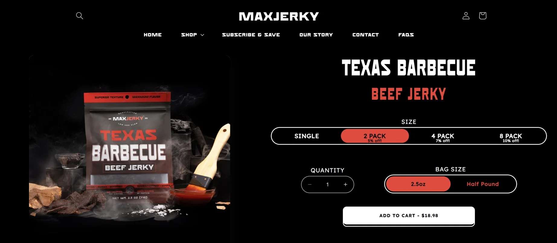
Example: MaxJerky shows an extremely clean product page, but fails at the clear basics: showing different product images for its pack sizes (which creates an extremely jarring experience for shoppers because no one knows what the package might look like):
Shoppers can’t touch what stores sell online, so the images do all the work.
A blurry photo, poor lighting, or a stock model shot that makes the product look cheap. What’s equally as bad: overly polished shots, no scale, no context, no zoom functionality. Why?
Because people can’t picture themselves with the product, or look at it really closely.
Or worse:
The models don’t match the audience — a 50-year-old shopper sees a 20-year-old wearing the product and thinks, “Not for me.”
How to fix this eCommerce design mistake fast:
✅ Keep clean studio shots, but add at least one lifestyle photo that shows scale: “Oh, that’s how big it actually is.”
✅ Show people like your buyers. If your analytics skew towards older shoppers, include models in that age range. Inclusivity is about the small things: age, body weight, height, hair color, etc. 🙂
✅ Zoom and rotate matter. Let shoppers get close — 360° views and zoomable details reduce hesitation and cut down on returns. Or you know, a pre-recorded video of this (both work)
✅ A/B test which type of image appears first. Some audiences convert faster when the first image is aspirational (model with product), others when it’s contextual (product in a real-life setting)
Pro Tip: On mobile, show nudges to scroll photos (like every three seconds, show a mini nudge, like the next photo in the gallery sneaking into view). Here’s a great example from Lange:
When something feels off, people look for help before they buy.
If contact details are buried in the footer, if returns are just a vague link, or if the site asks them to log in again and again, trust doesn’t stay long.
Even small bugs, like a size selector resetting, can make them think: “If they can’t support this, what good will they do anyway!!”
How to fix this eCommerce design mistake fast:
✅ Show your site has some form of customer support on standby – it can mean showing a cell number in the top menu, or a live chat
✅ Actually show that you’re a real business – even if you use the footer, do ensure there’s some form of address, email, or phone number
Here’s an example of how your footer should not be – note how there’s nothing to offer in terms of the people behind the brand, the country the brand’s from, or the contact details:
13. The Design Optimizes for First Sale, Not Repeat
Most stores celebrate the first sale like it’s the finish line. But if design stops there, they end up putting a close on customer lifetime value.
The funny thing is: this mistake is actually extremely easy to fix.
How to fix this eCommerce design mistake fast:
✅ Just feature re-order shortcuts, and ensure shoppers actually have the incentive to log in – say something like “Login To View Rewards” or “Returning Shopper? You may have rewards waiting for you”
✅ Have member pricing or some incentives only repeat shoppers can unlock (like: “Exclusive for Returning Shoppers: Add socks for free on any order”)
14. The Mobile Design Forgot About Thumb Reach
Most eCommerce shoppers are on mobile. And yet, a lot of stores still design like it’s desktop-first.
Here’s what that looks like on a phone:
❌ The “Add to Cart” button is buried halfway down the page
❌ Filters open as a slide-in drawer
❌ The site isn’t all that usable while using one hand
How to fix this eCommerce design mistake fast:
✅ On mobile, keep popular filters pre-set (like icons or images as filters) – and then keep the rest of the filters expandable as a slide-in
✅ Keep the add to cart button sticky at the bottom bar, and ensure it actually updates when shoppers add products
✅ Literally hold your phone in one hand and try to shop. If it feels clumsy, the design might be costing sales
15. The Design Isn’t CRO Driven
We’ve seen one too many stores redesign their entire store, overnight. The decision may be data-based, but the redesign? Complete guesswork – based on some best practices.
The questions remain:
- Which page to optimize first
- What changes should be made
- Should the entire page be redesigned, or just change individual elements
How to make your store’s design CRO-driven:
✅ Track where exactly shoppers drop off – which page, at what depth, and when
✅ Take the page with the biggest drop-offs and map elements on that page, where the drop-offs start (like which button is clicked the least, what is the time on page, the bounce rate, the scroll depth, etc.)
✅ Design the changes, and make a max of 4 changes at a time, and run A/B tests between segments of your audience – map the funnel conversion rate to check the efficiency of the design change
Design is two things: UI (how it looks) and UX (how it works). A clean UI won’t save a store’s sales if the UX is bad.
Online buying lacks touch, so shoppers always look for reasons not to buy (it’s only after the first purchase that some amount of trust appears)
Design needs to remove those reasons. It makes actions obvious, shows trust signals that answer real questions (shipping, returns, sizing), and negates some friction.
2. How often should I change my store's design?
Completely? Never (only as a last resort).
Partially? Not on a fixed calendar. Change elements of the design when the data says to. Set real-time alerts for spikes in drop-offs or conversion drops, and always lock down major changes before big seasons (BFCM, back-to-school).
Test specific pages or elements on specific audience segments, confirm conversion rate lift, then roll out.
3. Which design mistake should I fix first?
It depends on how much data a store has, which directly ties to the store’s traffic volume. For example:
✅ If you have enough traffic, map your funnel and fix the page with the biggest drop-off – that’s where you’ll see the fastest lift in conversions
✅If you’re new and don’t have data yet, fall back to intent. Start with checkout, because anyone who makes it there is already motivated to buy
✅ If you can’t even get shoppers to your checkout, then the issue is somewhere at the root — look at your landing/product pages first


.svg)

.svg)

.svg)
.svg)
