Conversion Optimization
The Silent Revenue Killer: How to Detect a Weak Checkout Process
September 11, 2025

Insights in this post come from our CRO team's decade of experience working with eCommerce brands. Edited by our in-house content team.


Insights in this post come from our CRO team's decade of experience working with eCommerce brands. Edited by our in-house content team.
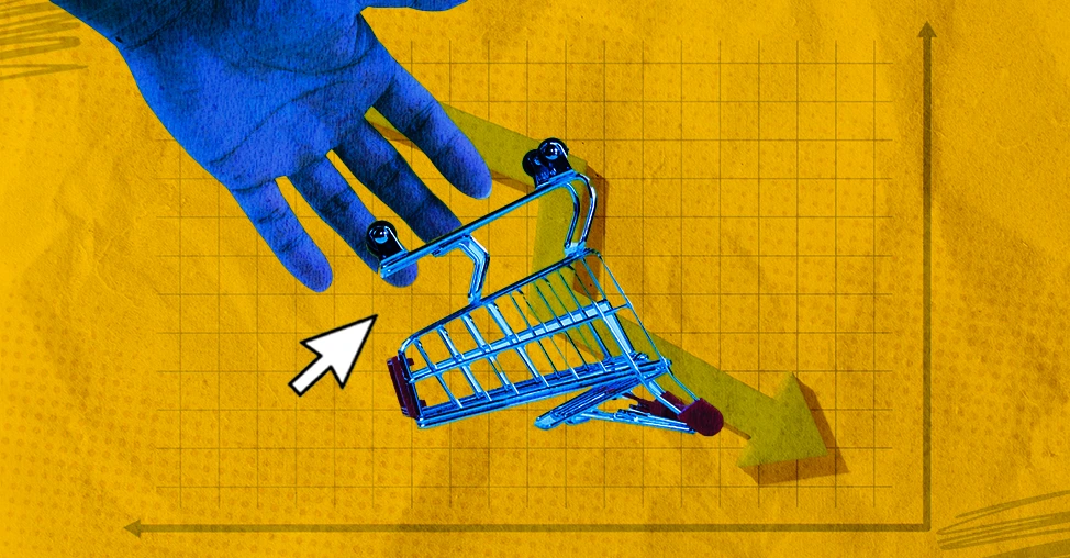
You can have perfect product photos, witty copy, and killer ads, but still lose sales at the very last second.
Why?
Because your cart has a personality. Some carts charm customers; others confuse, frustrate, or scare them away.
If you’re wondering what are the signs of a poorly optimized cart or checkout, you’re in the right place.
In this post, we’ll break down 13 “cart personalities” that quietly kill conversions and how to fix them before your next sale slips away.
Picture this: your customer is right there, credit card in hand. They’ve chosen, they’ve clicked, they’ve made it to checkout.
And then… they wander off.
Not because they changed their mind, but because your checkout felt like an empty waiting room. No music, no receptionist, no clock on the wall.
Just… silence.
Here’s the uncomfortable truth: sometimes it’s not that customers abandon carts, it’s that carts abandon them.
A lot of stores treat checkout like a static page, when in reality it’s a living moment that needs attention.
Think about when you’re chatting with someone and they stop replying mid-conversation.
That’s what your checkout feels like when it just sits there: flat, passive, almost shrugging at the customer.
The tell-tale sign? Your analytics show customers spending way too long on checkout pages before disappearing. They didn’t rage-quit. They just ghosted because nothing pulled them back in.
Here’s the twist most store owners miss: this isn’t a customer problem. It’s a store problem.
If your checkout isn’t designed to reassure, nudge, or entice during those 30–90 second pauses, you’re the one abandoning the sale.
Here are some ideas on how to fix your poorly designed checkout process:
✅ A subtle animation that reminds them their cart is waiting.
✅ A limited-time perk that appears if they idle too long (“Still thinking? Free shipping for the next 10 minutes”).
✅ A progress bar that makes finishing feel achievable, not optional.
The difference between abandonment and neglect? Abandonment is on the shopper. Neglect is on the store.
You know that one overly chatty store clerk?
The one who follows you around saying, “Can I show you this? Don’t forget our sale! Oh, and if you buy two, you get one free! By the way, we’ve got loyalty points, and wait, don’t go yet!”
That’s exactly what a “talks too much” cart feels like online.
Not because of extra form fields (everyone already knows to cut those down), but because of tone.
A cart that bombards your customer with pop-ups, stacked promotions, irrelevant add-ons, and last-second “please don’t leave me” messages creates pressure instead of confidence.
Here’s the irony: in trying to squeeze more out of checkout, you actually push people away.
Over-optimizing becomes suffocating. Customers don’t feel guided; they feel cornered.
The sign: Customers close out fast, not slow. If abandonment happens immediately after a promo stack or a desperate exit-intent pop-up, it’s not hesitation; it’s irritation.
The trick most stores miss? Checkout is supposed to feel like a quiet, private moment.
They’ve already made the decision; your job is to clear the path, not narrate every step.
Here are some ideas on how to fix your poorly designed checkout process:
A good cart whispers:
A bad cart yells:
Sometimes the most powerful optimization isn’t adding another conversion trick, it’s knowing when to shut up.
Imagine sitting at a restaurant. The waiter takes your order, nods politely… and disappears.
No “the kitchen’s still open,” no “your food will be right out,” nothing. You’re left staring at the table, wondering if anyone even heard you.
That’s exactly what the “silent treatment cart” feels like.
A checkout that gives zero reassurance, no delivery date, no return policy, no security cue, not even a “thanks for your order”, leaves customers filling in the blanks themselves. And people rarely fill blanks with good news.
Silence online reads as risk.
The sign: customers hover, hesitate, maybe even Google your brand mid-checkout just to make sure you’re legit.
Some even bail entirely, because if your cart won’t say what’s happening now, why should they trust what happens after payment?
Most store owners underestimate how much those little signals matter.
A simple “Your order will ship by Tuesday,” a badge showing secure payment, or a clear return window isn’t fluff; it’s the checkout equivalent of telling diners, “Your food’s on the way.”
The worst part? Silent treatment carts don’t even know they’re broken. On the surface, the flow works. Payments go through.
But the invisible tax is hesitation, the sales you almost had, lost because you forgot to say the digital equivalent of, “Don’t worry, we’ve got you.”
Because if you don’t speak up in checkout, your customers will go listen to a competitor who does.
Here are some ideas on how to fix your poorly designed checkout process:
✅ Show delivery certainty, “Ships by Tuesday” beats “Standard Shipping.”
✅ Surface return policy early. Don’t bury it in the footer, make it checkout-visible.
✅ Add a mini summary before pay (“Here’s what you’ll get and when”).
✅ Tone of voice matters. Even a friendly line like, “Almost done, your order’s safe with us,” makes the silence less awkward.
You know that weird dream where you’re stuck in the same room, opening the same door over and over?
That’s what a déjà vu checkout feels like.
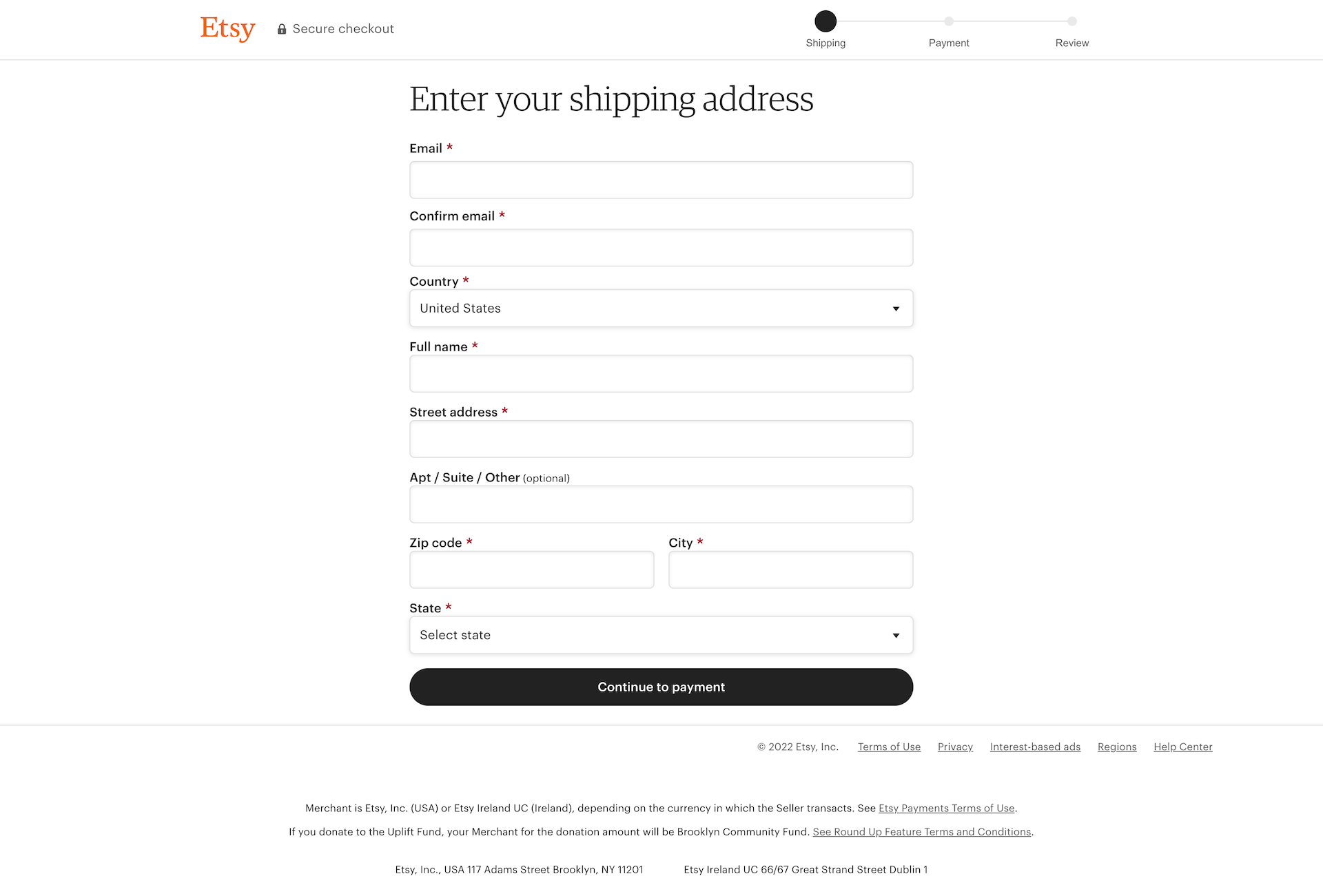
First, it requests your email address. Then, surprise, it asks again.
You enter your address, only to repeat it on the next page.
You confirm shipping, then confirm billing, and then confirm that you really do want to proceed.
By the end, your customer is thinking: Does this store even know who I am, or am I just yelling into a void?
Here’s the twist: most people chalk this up to “bad UX.” But repetitive steps are often a backend inefficiency showing its cracks.
The sign: checkout feels clunky, with fields and confirmations that look like safety checks but are really just your system not talking to itself. Maybe your cart software isn’t integrated with your CRM, or your payment processor doesn’t auto-fill info, so the customer ends up being the middleman.
A smooth checkout says, “We’ve got you covered.” A déjà vu checkout says, “We’re still figuring ourselves out, on your time.”
Here are some ideas on how to fix your poorly designed checkout process:
✅ Ensure your CRM, cart, and payment processor actually talk to each other so customers don’t retype what your system should already know.
✅ Use stored account data or browser autofill integrations instead of making people repeat addresses and emails.
✅ Collapse “review” steps into a single, clear summary page instead of scattering mini check-points across multiple screens.
✅ Run a checkout test yourself (and make your team do it) to catch spots where data is being collected twice because of poor integration.
Maybe your product pages are quirky and fun, but your checkout suddenly sounds like it was copied from a government form.
Or maybe your brand is sleek and minimal, but checkout bombards customers with exclamation points, neon badges, and cutesy copy.
Either way, the shift creates cognitive dissonance, and customers hesitate because something feels… off.
Here’s the subtle danger: checkout isn’t just a technical step, it’s a trust handshake.
If your voice changes, customers don’t just notice the mismatch; they question the consistency of your brand. And when trust wobbles, so does conversion.
Customers flow through product and cart easily, but drop off disproportionately at checkout, even though it “works fine” mechanically. What’s breaking isn’t the form, it’s the tone.
Here are some ideas on how to fix your poorly designed checkout process:
✅ Mirror the brand voice. If your product copy is playful, let checkout copy smile too (“Almost done, your new favorite mug is on the way”). If your brand is premium and serious, keep checkout clean and elegant.
✅ Design for continuity. Colors, fonts, and micro-interactions should feel like a natural extension of the store, not a different website stitched on at the end.
✅ Audit the tone shift. Read your product page and checkout page back-to-back. If it feels like two different companies wrote them, you’ve got work to do.
✅ Consistency builds confidence. Checkout should feel like the same person you’ve been talking to all along, just guiding you through the last step.

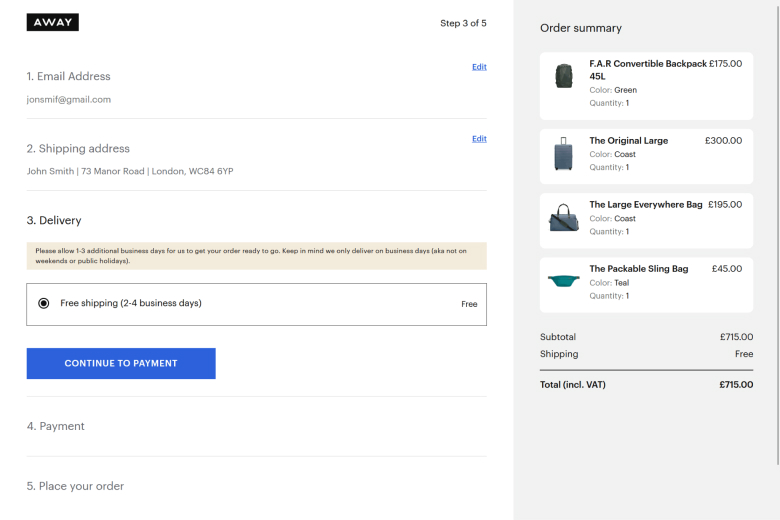
At first, everything feels fine, products look great, the price is right, and the vibe is good.
But then, just as the customer is ready to commit, the cart drops a “By the way, here’s $12 shipping and a handling fee we never mentioned.” Instant betrayal.
Abandonment spikes at the final checkout step, not earlier.
Customers don’t leave because of the product; they leave because they feel tricked.
And once trust cracks, it’s not just the sale that’s lost, it’s future loyalty too.
Here’s the part most store owners don’t admit: hiding costs doesn’t increase conversions.
It just delays the “no.” Transparency doesn’t scare people away; surprises do.
Here are some ideas on how to fix your poorly designed checkout process:
✅ Show the real price early. Estimate shipping and tax in the cart so customers aren’t ambushed at the finish line.
✅ Make discounts visible. If there’s a code, reflect it in real time. Don’t make customers wait until payment to know if it worked.
✅ Treat checkout like a relationship. Clarity builds trust. If you’d tell a date where things are headed, tell your customer where their money’s going.
✅ Customers don’t need perfection; they need honesty. If your cart won’t commit, they won’t either.
First impressions matter, but so do last impressions. Imagine meeting someone who goes in for a handshake and accidentally crushes your fingers.
Not catastrophic, but memorable in the worst way. That’s exactly how a clumsy checkout feels.
It’s not the big, obvious blockers; it’s the small, nagging frictions:
Each one seems tiny on its own, but customers don’t forget the sting. They associate your brand with hassle.
Customers attempt checkout multiple times in the same session, or switch devices to “try again.”
They wanted to buy, they really did, but your checkout made the handshake awkward enough to make them reconsider.
The danger is subtle: these aren’t lost carts from lack of interest, they’re lost carts from accumulated irritation. The kind that keeps customers from ever coming back.
Here are some ideas on how to fix your poorly designed checkout process:
✅ Design mobile-first testing. Run through checkout on different devices regularly—what feels fine on desktop might be torture on a phone.
✅ Replace vague “something went wrong” with specific, helpful feedback customers can fix.
✅ Auto-detect city/state from ZIP, pre-format credit card fields, and reduce typing. Every second saved is a point of goodwill.
✅ A smooth checkout is like a good handshake, firm, effortless, and leaves customers feeling they’re in capable hands.
Here’s what an all-or-nothing cart feels like:
It demands that customers play by its rules instead of accommodating real life.
Want to split a payment between a gift card and a credit card? Nope.
Want to ship part of the order to your office and the rest to your home? Forget it.
Want to put a deposit down and pay the rest later? Not here.
Most customers don’t leave at the browsing stage; they leave mid-checkout, often with full carts, because the cart doesn’t bend. And life is rarely all-or-nothing.
Here’s the trap: store owners sometimes see these as “edge cases.”
But for customers, those little bits of flexibility can be the difference between completing the order today or abandoning it altogether.
Here are some ideas on how to fix your poorly designed checkout process:
✅ Support split payments. Let customers mix gift cards, store credit, and credit cards without friction.
✅ Offer multi-address shipping. Especially during gifting seasons, this can save entire carts from being abandoned.
✅ Encourage partial or installment payments. Even simple “pay half now, half later” options reduce drop-offs for higher-ticket items.
✅ Customers don’t expect perfection, but they do expect options. A cart that only plays by its own rules isn’t strict; it’s forgettable.
Picture this: you’re hosting a dinner party. You’ve planned the menu, set the table, and counted the chairs.
Then a friend shows up, dragging five extra people you didn’t invite. That’s what a cart feels like when it sneaks in surprise add-ons or aggressive upsells during checkout.
Maybe it’s a pre-checked box for an insurance fee.
Maybe it’s an “optional” add-on that mysteriously appears in the total.
Maybe it’s a last-second upsell so pushy it feels less like a suggestion and more like a stowaway.
Customers who were ready to buy suddenly backtrack, staring at totals that don’t match what they saw earlier. And once trust wavers, the sale is rarely saved.
Here’s the mistake: some stores assume customers won’t notice a $5 bump.
But they do notice—and more importantly, they feel tricked. Checkout is the one place your brand should be most honest, because it’s the moment of greatest trust.
Here are some ideas on how to fix your poorly designed checkout process:
✅ Make upsells explicit, not sneaky. Show them as clear, optional choices—not hidden defaults.
✅ Match totals across pages. If the cart says $45, checkout should say $45 (until shipping/tax is transparently added).
✅ Respect the “yes”. Once a customer commits, don’t smuggle in surprises—make the path clean and consistent.
✅ Customers don’t mind offers, but they do mind ambushes. Your cart should feel like a well-planned dinner, not a crowded house party.
Imagine finishing a meal and instead of a simple, polite “Thanks for coming,” the waiter hands you a 10-page questionnaire, asks for feedback on every dish, offers loyalty cards, upsells desserts you didn’t order, and keeps guiding you to other tables. You leave the restaurant exhausted, not happy.
That’s what the long goodbye checkout does.
Customers complete their purchase, only to be dumped into a confusing post-purchase maze: too many links, too many “next steps,” too many options that feel like chores instead of rewards.
You might also have high post-purchase bounce rates, repeated customer emails asking “Where’s my order?” or “What just happened?”
This shows that customers aren’t abandoning mid-checkout, they’re leaving disoriented after it’s supposedly done.
The subtle danger? This doesn’t just hurt repeat purchases; it damages the emotional payoff.
Your checkout should leave customers smiling, not fatigued.
Here are some ideas on how to fix your poorly designed checkout process:
✅ Keep the thank-you page clean. Highlight order confirmation and next steps without extra noise.
✅ Prioritize essential actions only. Offer tracking info, customer support contact, or a single optional upsell, not a dozen distractions.
✅ Celebrate the purchase. A little visual delight, animation, personalized message, or branded image can turn “done” into a memorable moment.
Imagine walking into a store where everything is designed for someone else: the clothes don’t fit, the signage is confusing, and no one seems to speak your language.
That’s what a cart feels like when it ignores cultural nuances, regional quirks, or alternative addresses, even within the U.S.
Maybe your checkout refuses APO/FPO addresses, flags Puerto Rico or Guam as invalid, or only lets customers type standard ZIP codes in a rigid format.
Maybe language or formatting assumptions make certain shoppers feel like outsiders in a system that wasn’t built for them.
Higher abandonment from specific regions or customer types, repeated “contact support” emails, or low engagement from multicultural audiences. Even small barriers communicate, “You don’t belong here.”
The danger? Your store may feel inclusive in branding, but if checkout isn’t flexible, that message evaporates the moment a customer tries to buy.
Here are some ideas on how to fix your poorly designed checkout process:
✅ Support all U.S. territories, APO/FPO addresses, and alternative postal formats.
✅ Don’t assume every name, address, or phone number fits a single mold; allow extra characters, accents, and local variations.
✅ Offer language toggles, regional shipping hints, or currency cues if relevant, even subtle touches signal respect.
✅ Checkout should feel like a warm welcome, not a gated club. One size never fits all, and your cart shouldn’t pretend it does.
Imagine buying a thoughtful gift and the store refuses even to wrap it nicely or charge a little extra for express delivery.
That stingy feeling? That’s exactly what customers get when your checkout refuses to offer small, helpful perks.
It’s not about major features; it’s about little gestures that show you care:
Customers abandon the cart mid-checkout, not because the product isn’t valuable, but because the experience feels transactional, rigid, and impersonal.
When you withhold small perks, it communicates, “We won’t make this easy for you.”
The subtle trap? Customers remember the friction more than the product. Even if they buy elsewhere, the brand sticks in their mind as cold or uncaring.
Here are some ideas on how to fix your poorly designed checkout process:
✅ Offer small, optional perks. Gift wrap, priority shipping, or minor add-ons enhance perceived value.
✅ Show bundle or volume discounts clearly. Let customers see they’re saving by buying more without forcing it.
✅ Highlight perks at checkout. Don’t hide them; a subtle note like “Add gift wrap for just $5” feels thoughtful, not pushy.
Imagine visiting a store where the aisles are fixed, the shelves never move, and the lighting never changes. Even when the crowd grows, the weather shifts, or new products arrive.
That’s what a cart feels like when it doesn’t adapt to customer behavior, device type, or browsing context.
Maybe your checkout looks fine on desktop but breaks on mobile.
Maybe your cart ignores previously viewed items, recommended add-ons, or abandoned items.
Maybe it refuses to adjust for promo codes or loyalty points already earned.
Every rigid moment signals, “We don’t care how you shop, just follow our rules.”
Higher abandonment on certain devices, repeated cart edits, or frustrated customers contacting support mid-checkout.
A non-adaptive cart isn’t just inconvenient; it actively communicates that the store isn’t listening.
Here are some ideas on how to fix your poorly designed checkout process:
✅ Device-aware designs. Ensure checkout flows seamlessly across mobile, tablet, and desktop.
✅ Adapt offers, suggested items, and reminders based on prior browsing or cart activity.
✅ Update totals in real time for promo codes, loyalty points, or shipping changes, no surprises, no friction.

Related Blogs:
There are clear behavioral signs that your cart isn’t optimized. Customers may abandon their carts at the last step, repeatedly edit form fields, or exit mid-checkout when unexpected fees or unclear shipping info appear.
Slow-loading pages, poor mobile experience, and inconsistent branding between product pages and checkout also indicate friction.
Recognizing these patterns is key to understanding what are the signs of a poorly optimized cart or checkout so you can fix them before losing more sales.
Checkout design is a critical moment in the customer journey. A poorly optimized cart that’s confusing, slow, or inconsistent can make shoppers feel uncertain or mistrustful, even if your product pages are excellent.
Small frictions, like repetitive fields, unclear totals, or last-minute upsells- can subconsciously signal that your store isn’t professional or reliable, causing potential buyers to abandon their purchase.
To determine if your checkout is a bottleneck, analyze step-by-step abandonment rates, test the process across devices, and pay attention to customer complaints.
Recurrent issues like form errors, missing address options, or confusing promo code application are red flags.
If your analytics show high exit rates specifically at the payment or review stage, it’s a clear sign of a poorly optimized cart or checkout.
Mobile optimization is essential. A cart that works well on desktop but is difficult to navigate on smartphones or tablets frustrates users and leads to abandonment.
Signs of poor mobile checkout include tiny input fields, slow-loading pages, and improperly formatted address or payment fields.
Ensuring a smooth mobile experience directly improves conversions and reduces friction for on-the-go shoppers.
Absolutely. Offering shipping upgrades, bundle discounts, gift wrapping, or partial payment options signals care and adaptability to customers. Lack of these features can make your checkout feel rigid or transactional, which is another sign of a poorly optimized cart or checkout.
Even minor conveniences build trust, enhance user experience, and encourage shoppers to complete their purchase.
98% of visitors who visit an eCommerce site drop off without buying anything.
Even when you feature the best ecommerce promotions.
Why: user experience issues that cause friction for visitors.
And this is the problem Convertcart solves.
We've helped 500+ eCommerce stores (in the US) improve user experience and 2X their conversions.
How we can help you:
Our conversion experts can audit your site - identify UX issues, and suggest changes to improve conversions.
Subscribe for more articles like this!


Read by 5000+ ecommerce store owners
.svg)

.svg)

.svg)
.svg)
2026 Convertcart, All Rights Reserved
33/1, Castle Street, Ashok Nagar, Bengaluru, India
