Why Your eCommerce Store Isn’t Converting (Even With Traffic)


You’ve done the hard part. The ads are running. The SEO is working. People are showing up. And yet, the checkout is completely silent.
This is one of the most demoralizing situations in eCommerce: high traffic, low conversion. It feels like throwing a party where no one touches the food.
You can see the guests arriving. You just can’t figure out why they keep leaving before they buy anything.
Here’s the uncomfortable truth: traffic was never the problem. The problem is what happens after visitors arrive. Something, or more likely, several somethings, is breaking their confidence, clouding their judgment, or quietly nudging them toward the exit.
After auditing hundreds of eCommerce stores, we’ve found that every “traffic but no sales” scenario comes down to one of five core failure points. Visitors don’t understand what you’re offering. They don’t trust you enough to buy.
They’re overwhelmed by too many choices. The mobile experience is silently leaking revenue. Or they lose their nerve right at checkout.
We’ve mapped all 24 reasons stores fail to convert traffic into customers across these five core problems, with a diagnostic fix framework at the end. Find yourself in here, and you’ll find your fix.
This post covers:
The assumption baked into most eCommerce growth advice is that more visitors equals more sales. It’s intuitive. It’s also wrong, or at least dangerously incomplete.
Revenue is not a function of volume. It’s a function of fit, trust, clarity, and ease. You can have 500,000 visitors a month and a 0.1% conversion rate, or 50,000 visitors and a 4% conversion rate.
The second store makes more money and probably spends a fraction on acquisition.
The traffic-to-revenue gap widens when any of these things break down:
Here’s how to diagnose where your leak is and exactly what to do about it.
A visitor lands on your store. They have about three seconds before their brain renders a verdict. If they can’t immediately answer “What is this?”, “Is this for me?”, and “Why should I care?” They’re gone.
Not because they didn’t want to buy. Because you made it too hard to understand.
Clarity isn’t just a homepage problem. It runs through every touchpoint: your ads, landing pages, product descriptions, visuals, and navigation.
A clarity break anywhere in that chain can kill a conversion that was practically already made.
If your conversion rate is flatlining despite heavy traffic, you aren’t looking for more people; you’re looking for better people. Run a monthly intent audit: do visitors stay for more than a minute? Do they explore three or more pages?
Are fewer than 10% returning after a week of browsing? Those patterns point to an intent problem, not a volume problem.
The culprit is almost always the keyword strategy. One of our luxury fashion clients spent a fortune targeting the broad term “sunglasses for men.” They were swamped with traffic and starved of sales.
The moment they shifted to “designer sunglasses for men,” browsers became buyers.
Long-tail keywords carry intent. Broad keywords carry curiosity.
We once worked with a brand that promoted “50% off” in their ads, only for shoppers to land on a page that said, “up to 50% off.”
A small distinction on paper a bait-and-switch in the customer’s mind. When we aligned the landing page copy to the ad’s exact promise, sales spiked within the week.
The rule: every ad must deliver exactly what it promised: same offer, same language, same visual hierarchy. Remove sticky headers and extra navigation. They came for a specific reason; keep them focused on it.
As a store grows, its products often become harder to find. We’ve audited shops where the navigation is so layered with sub-sub-categories that finding a toaster feels like solving a puzzle. If a shopper can’t find what they want in seconds, they leave.
Nearly a third of visitors go straight to the search bar. Your site search needs to do more than correct typos:
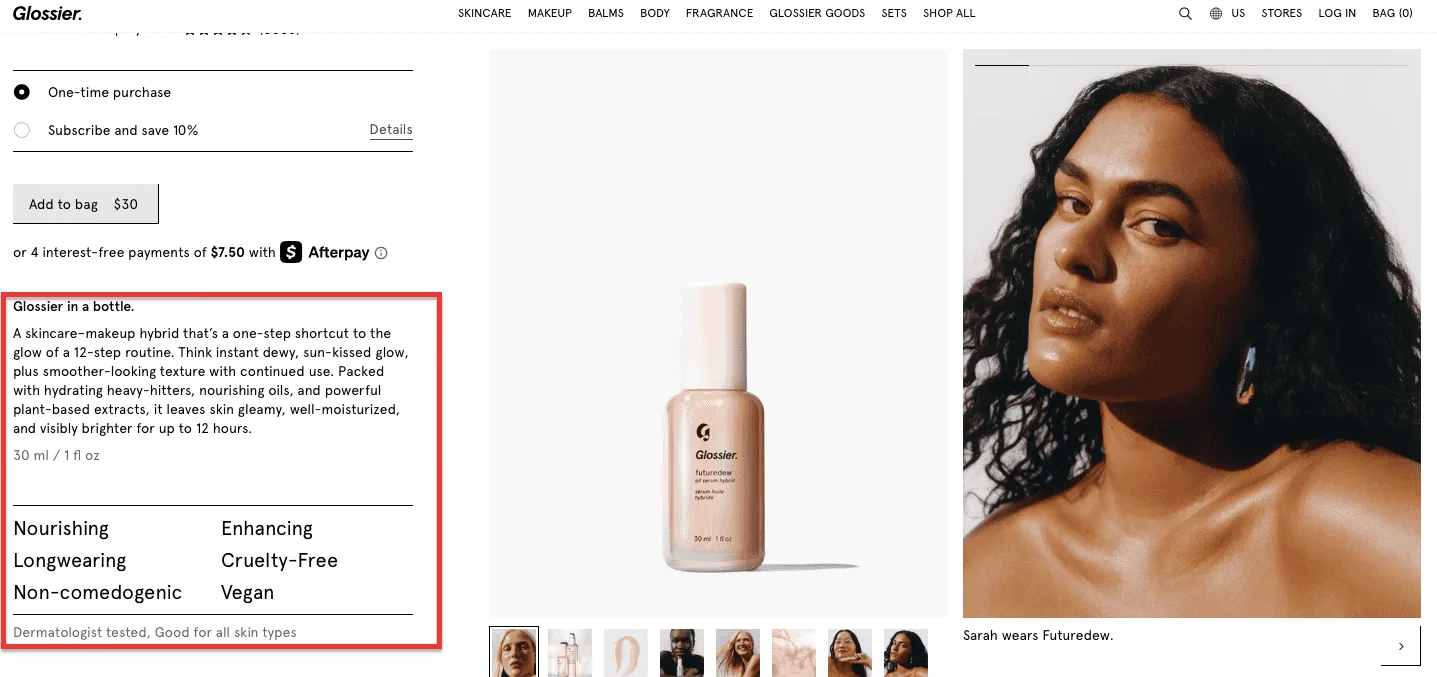
Writing for everyone means writing for no one. If your product descriptions are too polite, too generic, or simply too long, they’re not doing the job.
Use the inverted triangle to place the most vital information, use sensory language that makes visitors feel the product, and be specific about what typically causes hesitation.
Don’t say “noise-canceling.” Say “No distractions. Just you and the music.” On sizing, don’t just show a chart, say “runs small, order a size up.”
Strip policies to icons and microcopy. Nobody reads a peace treaty before buying a sweater.
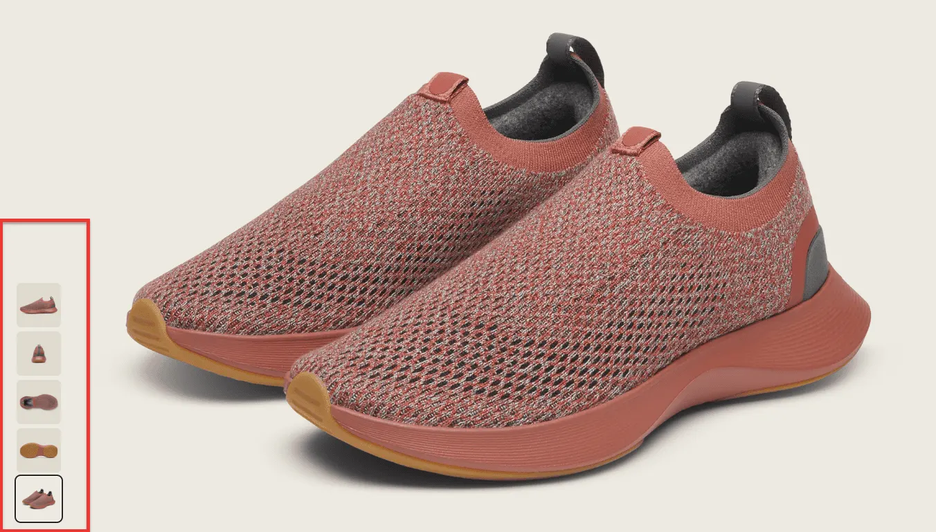
Nearly a quarter of all eCommerce returns happen because the item that arrived looked nothing like the picture. Failing the visual trust test costs you money twice: once on the lost sale, once on the return.
Since 2025, a meaningful share of eCommerce traffic comes from people arriving via AI overviews and smart feeds: often researching, not transacting. They inflate traffic numbers while contributing nothing to revenue.
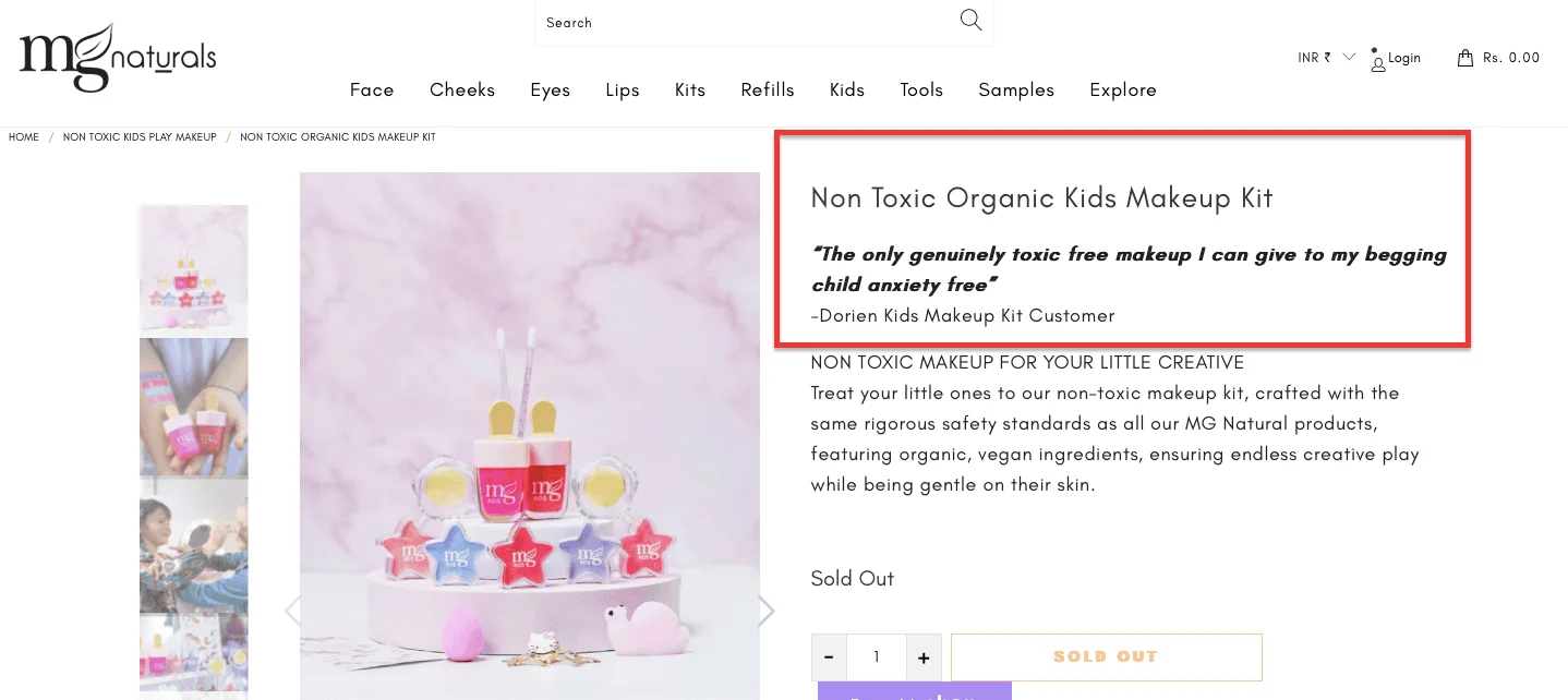
The fix isn’t more traffic, it’s more targeted landing pages built around specific, high-intent searches. MG Naturals doesn’t send a visitor who searched “vegan lipstick safe for pregnant women” to a generic homepage. They serve a page built exactly for that concern.
That’s how you convert the serious shoppers hiding inside your traffic data.
Over half of all online shoppers have experienced some form of online fraud. When a stranger visits your store, they arrive with their hand on their wallet and a default suspicion. High add-to-cart rates with low purchase rates are almost always a trust problem, not a pricing problem.
Trust isn’t built in one place. It accumulates or erodes across every interaction from the first ad to the final checkout click.
A trust gap anywhere in that journey is enough to lose the sale permanently.
Without context, an ad is just a digital stranger shouting in a crowded room. If paid clicks aren’t converting, you likely haven’t established a “reason to believe.” No discount corrects for a brand that doesn’t feel real.
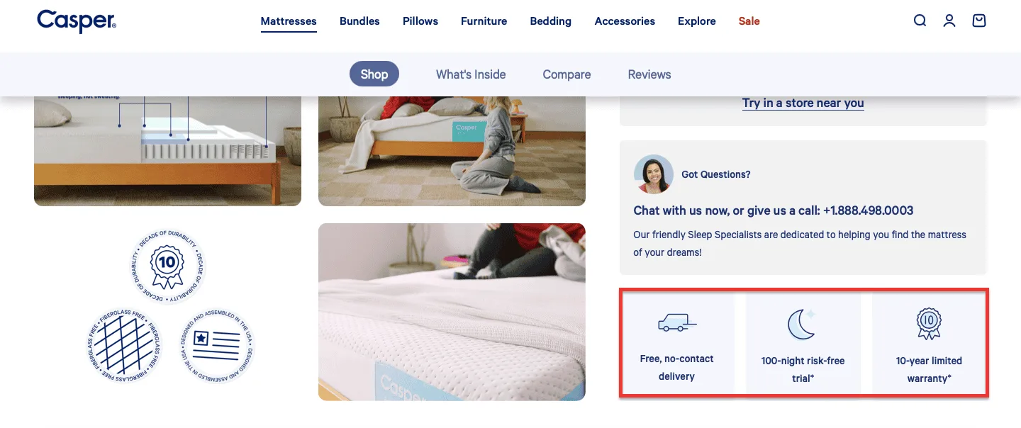
Trust signals must follow the shopper from the homepage to the order confirmation, not appear only at checkout, where they feel like a last-minute reassurance.
Secure payment icons, money-back guarantees, and clear delivery windows need to be consistent presences throughout the journey.
87% of shoppers won’t buy without first consulting reviews. If your reviews are buried, generic, or fail to speak to different buyer types, you’re wasting your most powerful conversion asset.
In 2026, personalization has crossed from “helpful” to “surveillance” for many stores. We recently audited a brand that greeted visitors with: “We noticed you were just looking at this on a competitor’s site!” The result was not conversions; it was customers backing away slowly.
Limit recommendations to what shoppers have actually done on your site. Use anonymous social proof, “Popular with shoppers viewing this item,” instead of personalization that makes people feel watched.
Three-quarters of your visitors decide whether you’re a trustworthy business based solely on your website’s UX. A stubborn button or a baffling menu is remembered far longer than a pleasant experience.
If you have high traffic and a ghost-town checkout, you likely have a usability leak you can’t see, because nobody is telling you about it.
Give visitors a simple, non-intrusive way to flag where they’re getting stuck. The ones who don’t report it simply leave.
A single technical error can lose a customer faster than anything else on this list. Ask yourself:
You can have the most beautiful products in the world. If the plumbing is broken, nobody will buy them.
A confused shopper doesn’t buy; they leave. And confusion is rarely dramatic. It’s the pop-up that ambushes visitors before they’ve had a chance to look around.
It’s fifty near-identical products with no way to compare them. It’s a CTA that says “Submit” when it should say “Get My Discount.” It’s pricing that doesn’t make its value obvious.
Decision friction is anything that interrupts the mental flow from “I want this” to “I’m buying this.” Your job is to identify and systematically remove every interruption.
Pop-ups are the most loathed element of modern eCommerce. Even Google penalizes stores that block content with intrusive interstitials. If your conversion rate is low despite strong traffic, you might be ambushing visitors before they’ve had a chance to look around.
Alternatives that inform without alienating:
It’s human nature to spend happily until the price feels “wrong.” If someone asked you to pay $80 for a taco, you’d decline, not because you can’t afford it, but because the value doesn’t match the reality. If high-intent visitors still aren’t buying, your value framing may be the problem.
Offering a mountain of options is not kindness; it’s a decision tax. Research consistently shows that more choices, beyond a certain point, lead to fewer purchases.
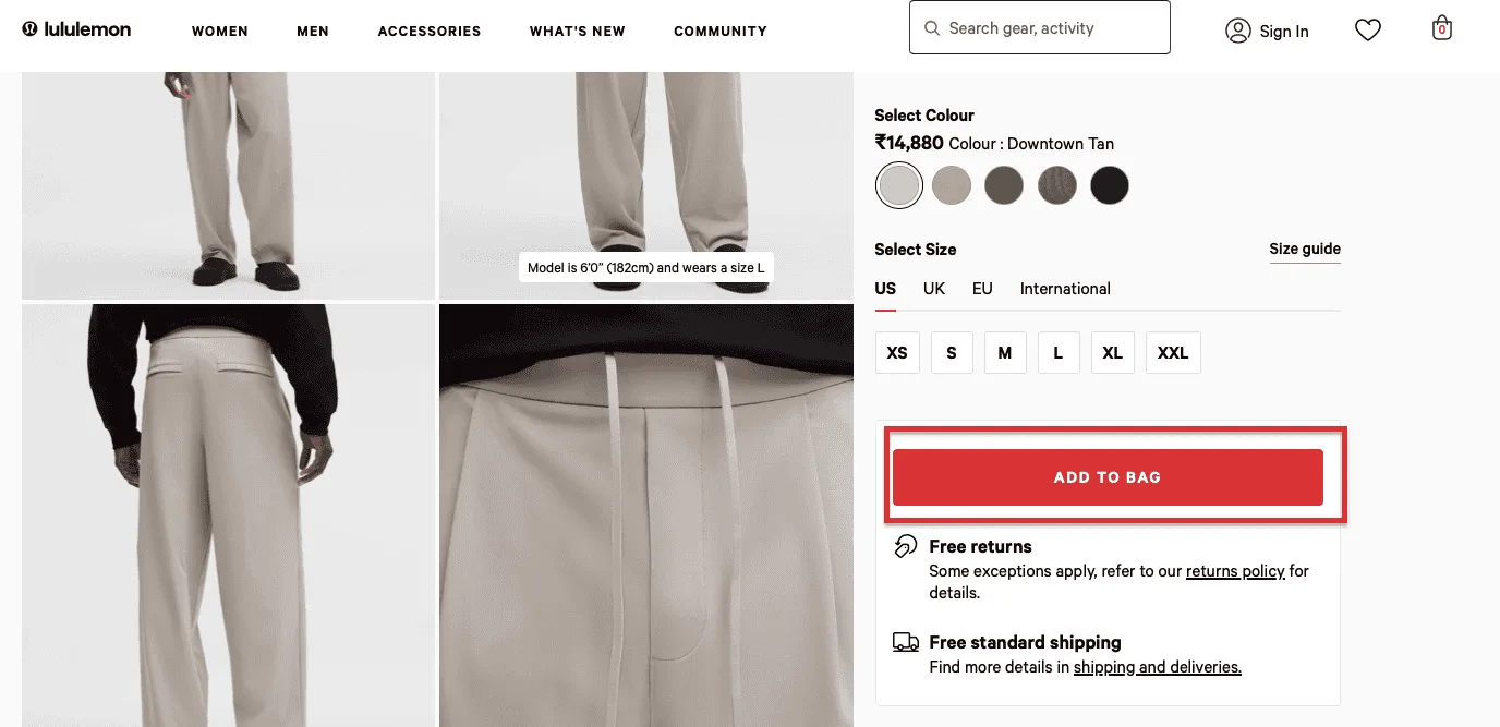
Your call-to-action is the final nudge. If it’s as uninspiring as a “Keep Off the Grass” sign, your conversion rate will reflect it.
Every word in a CTA is a micro-decision. You need to make each one work.
Many brands assume a “20% Off” banner is a universal trigger. But if a shopper has never heard of you, a discount is just a cheaper way to take a risk they aren’t ready for. You’re asking for commitment before you’ve introduced yourself.
Many stores waste months A/B testing trivial design changes with zero impact on purchasing decisions. Adjusting button colors while your checkout has four unnecessary steps will never move your conversion rate.
The five things actually worth testing:
Mobile now accounts for the majority of eCommerce traffic for most stores yet desktop still drives a disproportionate share of revenue. That gap is not a coincidence. It’s a symptom.
Somewhere between mobile browsing and desktop purchase, you’re losing customers who would have bought if the experience had felt safe, clear, and easy on the device they actually had in their hands.
The mobile UX problem is unique because it’s invisible on a desktop audit. You have to live it to see it.
Most stores with a mobile traffic problem don’t have a mobile design problem; they have a mobile trust problem. Two-thirds of shoppers still don’t trust mobile devices with their credit card details. The browsing happens on the phone. The buy happens on the laptop. And in between, you lose them.
The fix is a seamless cross-device experience:
The checkout flow that works fluidly on a desktop becomes an obstacle course on a 6-inch screen. Long forms with tiny input fields. Buttons that sit just below the fold. Payment methods that don’t support mobile wallets. Every one of these is a dropout.
A pop-up that’s mildly annoying on desktop is a full-on conversion killer on mobile.
On a small screen, an interstitial that covers the entire viewport, with a close button just 4 pixels wide, doesn’t just irritate visitors. It trains them to leave.
Google’s mobile interstitial penalty applies here too. If your mobile bounce rate is significantly higher than your desktop bounce rate, audit your pop-up triggers. Set them to fire only after 30 seconds or on exit intent never on page load.
A beautifully shot product image that fills a desktop screen with rich detail can become an unreadable thumbnail on mobile. If your product photography hasn’t been tested at 390px wide, you’re not selling what you think you’re selling.
A shopper on their phone at 11 pm has a question about whether the coat runs true to size. There’s no one to ask. The live chat widget is a tiny icon that opens a bot that doesn’t understand the question. They close the tab.
Mobile support needs to be frictionless to be useful:
A shopper who reaches checkout has already done the hard work. They found you, liked what they saw, and chose a product. And then they hesitated. Something as a surprise fee, a payment method they don’t use, a return policy they couldn’t find, a form they’ve filled out four times before broke the spell.
Checkout hesitation is the cruelest conversion killer because the customer was so close. Every friction point at this stage is expensive: not just a lost sale, but potentially a lost customer forever.
There’s a tempting logic in copying what the retail giants do at checkout. But your checkout must be a bridge, not a barrier, and the approach that works for Amazon doesn’t automatically work for a DTC brand with a different trust relationship with its customers.
We once helped a brand that offered guest checkout to keep things simple. While fast, it left them with no way to re-engage customers, as on a first date, when you forget to get their number. The fix: social media logins that let shoppers skip tedious forms while the brand captures the email it needs for future nurturing.
It is a uniquely sour experience to find a product at 50% off, only to watch the price inflate as you approach checkout. If a shopper’s journey ends with a surprise flurry of taxes and handling fees, they won’t reach for their wallet; they’ll reach for the close button.
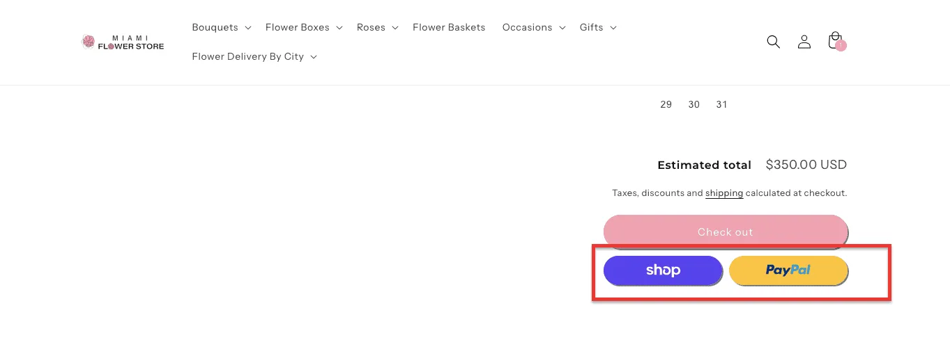
56% of shoppers believe a store should offer a wide range of payment methods. If a customer is chasing airline miles on their Amex and you don’t accept it, they don’t buy. Their loyalty is to their payment method, not your checkout page.
We expect shoppers to navigate a digital store entirely on their own. When in a physical store, we’d never leave a confused customer wandering the aisles without a “May I help you?” A high-intent buyer with one unanswered question at checkout is a lost sale.
84% of shoppers will never return to a store after a single bad returns experience. If your return policy reads like a legal threat, you aren’t protecting your profits; you’re destroying your conversion rate. A buyer who isn’t confident they can return something won’t buy.
Sometimes, checkout hesitation isn’t about the checkout at all; it’s about the relationship.
Visitors who haven’t been properly nurtured will add to the cart out of curiosity and abandon it the moment they see the total. The offer feels like too much to ask of a brand they barely know.
Segment your re-engagement by relationship depth. For someone who’s visited once: educate and build rapport before discounting.
For someone who’s visited multiple times without converting, a targeted, personalized incentive delivers the highest ROI.
56% of shoppers believe a store should offer a wide range of payment methods. If a customer is chasing airline miles on their Amex and you don’t accept it, they don’t buy. Their loyalty is to their payment method, not your checkout page.
Most eCommerce stores lose their revenue in three predictable places. Knowing where your specific leak sits determines which of the fixes above you should prioritize first.
The PDP is where a visitor decides, “I want this.” If that decision doesn’t happen here, it doesn’t happen. The most common PDP failures:
A customer adding to the cart is a statement of intent. The cart page is where that intent either hardens into a purchase or evaporates. Common cart killers:
Every second of friction at checkout costs more than friction anywhere else in the funnel because these are the visitors closest to buying.
The key diagnostic question: where exactly are people dropping off? Use funnel analytics to pinpoint whether your loss is at PDP, cart, or checkout because the fix is completely different for each stage.
The conversion problems that affect a store with 10,000 monthly visitors are not always the same as those affecting a store with 100,000. Scale introduces a different set of challenges and opportunities.
The 100K milestone question: “Why is my conversion rate lower than it used to be?” At scale, the answer is almost always traffic mix dilution, not that your store got worse, but that a larger share of your traffic was never going to convert on first visit. The fix is better segmentation, not a site redesign.
Knowing the 24 reasons is useful. Having a systematic way to diagnose which ones are costing you the most and in what order to fix them is what actually moves the needle.
Before changing anything, answer these four questions with data, not intuition:
Fix leaks from deepest in the funnel to shallowest. A checkout fix has a higher ROI than a homepage fix because it affects the visitors closest to buying.
For each fix, run a proper experiment before rolling it out site-wide. Test things that change how the customer thinks and feels, not how your site looks.
Conversion rate optimization isn’t a project with a finish line; it’s a practice. Build these into regular operations:
The most important thing: most eCommerce stores don’t have a traffic problem. They have an empathy problem. The stores that convert well are the ones that have put themselves in the customer’s position at every step — and systematically removed every moment of doubt, confusion, or friction. That’s not a one-time redesign. It’s a discipline.
98% of visitors to an eCommerce site leave without making a purchase. In most cases, it’s not because they didn’t want to, it’s because something in the experience gave them a reason not to.
We’ve helped 500+ eCommerce stores identify exactly where that reason lives and fix it. Our conversion experts audit your site, map your specific friction points, and recommend changes that have been tested across hundreds of stores in your category.
The audit is free. The results aren’t small.
Related Reading:
33 eCommerce Product Page Optimization Hacks (+ Examples)
32 Ways to Increase eCommerce Mobile Conversion Rate
What's Actually Reducing eCommerce Checkout Abandonment in 2026