How do you increase orders on your eCommerce store?
You fix three things at once: who arrives at your store, what makes them hesitate once they’re there, and whether they ever come back.
Chase traffic alone and the other two quietly cancel out the gain. Fix all three together, and orders stop depending on luck.
Most advice on the topic treats these as forty separate tips instead of three connected levers, which is exactly why so much of it doesn’t stick.
Zoom out, and those three fixes aren't separate tips at all, they're one framework
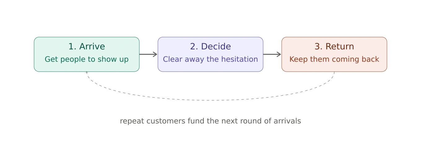
The Three-Lever Framework
Arrive: get the right people to show up on your site.
Decide: clear away whatever’s making them hesitate.
Return: turn today’s buyer into next month’s regular.
The three levers behind every order
Each lever feeds the next, and the loop only holds if all three keep turning.
Which Lever Should You Fix First?
Not every store needs the same fix, and that’s the part most advice skips entirely. Before you touch anything, look at your own numbers.
If your traffic is healthy but your conversion rate sits below industry norms, Lever 2 is your bottleneck.
Fix the friction, the pricing surprises, and the trust gaps before you spend more on ads.
If your conversion rate looks fine but your repeat purchase rate is low, Lever 3 needs the attention.
You’re winning the first sale and losing everything after it.
If both numbers look reasonable but revenue still feels flat, you likely have a Lever 1 problem, and the right people just aren’t finding you yet.
Diagnose before you prescribe. Fixing the wrong lever first wastes both time and budget.
If you’d rather have someone else run the diagnosis, a site audit will tell you exactly where yours is weakest.
Let's now get to execution part of this framework.
1. Getting the Right People to Arrive
Traffic gets most of the attention in marketing conversations, and it earns some of that. Without visitors, the other two levers never get tested at all.
But treating traffic as the fix for everything is a costly habit. A lot of owners pour budget into ads while their checkout bleeds money in the background, then wonder why orders barely move.
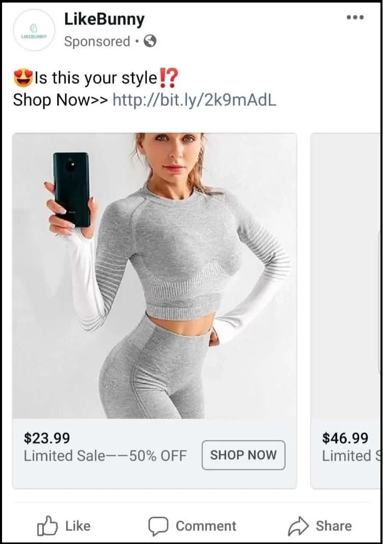
A display ad interrupts someone who wasn’t thinking about you. A search result answers someone who was already looking for exactly this.
That’s the whole reason search traffic quietly outperforms most paid channels: the shopper did the work of wanting something before you ever showed up.
Match your product and category page copy to the actual words a customer typed to find you, not the words your team uses internally to describe the product.
And show up where your buyers already trust someone else’s opinion, whether that’s Instagram, TikTok, or some niche forum nobody outside your industry has ever heard of.
A visitor who leaves without buying hasn’t walked away for good, whatever it might feel like.
Someone who looked at three products before closing the tab is a warmer lead than a stranger who has never heard of you. A retargeting ad doesn’t work because it reminds someone you exist.
It works because it answers the exact hesitation that made them leave in the first place, which is why a banner for your whole catalog does almost nothing and a banner for the one product they were actually looking at does almost everything.
That’s the whole difference between an ad that feels like a coincidence and one that feels like a nag.
Same budget, same audience, entirely different read on the shopper’s end.
A Bigger List Only Helps If Someone Opens It
An email list might be the one acquisition channel you own outright. No platform charges you for access to it, and no algorithm update can take it away overnight.
Every visitor who signs up, even the ones who don’t buy anything that day, becomes a channel you can return to for free, whenever you want.
Grow this list with a reason to join, not an interruption to escape. A popup that fires the instant someone lands is asking for an email before they’ve decided if they even like you.
Early access, useful content, or a modest incentive all work better because they get offered after some trust exists, not instead of it.
Case Study
How Convertcart Helped Best Online Cabinets
This Los Angeles cabinet retailer had decent traffic and an email list, but the list wasn’t earning its keep.
Instead of a generic discount popup, we rebuilt the opt-in around a reason people actually wanted to join, and the list grew tenfold almost immediately.
Growing the list was only half the job, though. We also personalized what landed in those inboxes afterward, and email traffic climbed 99.7 percent as a result.
A bigger list only pays off if you bother to say something worth opening once someone’s on it.
Getting people to visit your site solves only half the problem. The other half plays out inside their head, somewhere in the eight or ten seconds after they land on a product page.
That’s where you win or lose most orders, and in our audits, we’ve watched the same thing happen, store after store.
The Friction Shoppers Don’t Mention
Shoppers rarely complain about extra clicks.
They just leave. In our experience running tests across hundreds of stores, removing unnecessary steps from checkout and browsing paths improved conversion in 81 percent of cases.
That’s a bigger swing than most redesigns ever manage.
Stacking one popup on top of another cost stores conversions in 73 percent of the experiments we tracked, and cluttered navigation pulled shoppers away from buying in 72 percent of tests.
In our experience, navigation fixes only pay off once the product pages behind them are already doing their job.
Simplify the menu on a site whose product pages are still confusing, and shoppers just get lost somewhere else instead.
Think of a size selector on a product that only comes in one size, or a confirmation page nobody asked for.
Each of these moments chips away at momentum until the shopper shuts the tab and moves on.
Walk your own site like a stranger would. Count every click between landing and paying. If a click doesn’t answer a question or move someone closer to buying, cut it.
Across thousands of experiments, removing unnecessary decisions consistently outperformed adding persuasive elements.
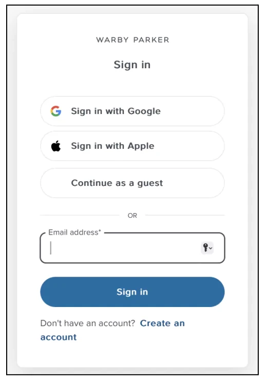
Stores often reach for stronger copy when the real problem is too many choices, and a guest checkout option is usually the fastest way to remove one of them.
Case Study
How Convertcart Helped Extreme Tactical Dynamics
Extreme Tactical Dynamics sells emergency lighting gear, the kind of purchase where a shopper wants to feel certain before committing.
Checkout was quietly bleeding people out on both desktop and mobile, and a lot of that abandonment traced back to unclear calls to action and last-minute confusion over final pricing.
We stripped the checkout flow down to what actually mattered and added trust seals at the exact points where hesitation tends to creep in.
Abandonment dropped 11 percent, not from a redesign, just from removing reasons to second-guess the click.
Product discovery – barriers that prevent shoppers from finding items
Category/collection pages – improvements that drive deeper product exploration
Product page – what to optimize to convert 2–3x more buyers
Cart – ways to ease hesitation and speed up purchase decisions
“The report was deep and super insightful. Can’t believe it’s free.”
Logan Christopher CEO, Empire Herbs
Price Surprises Kill Trust Faster Than Bad Reviews
Nothing sours a purchase faster than a total that jumps at the last second.
Taxes appear, shipping charges stack up, and a handling fee turns up that nobody mentioned earlier.
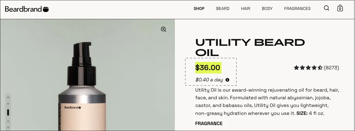
Showing the full cost sooner in the journey improved results in 78 percent of the experiments we ran, according to our audits. Shoppers don’t expect free shipping. They expect honesty.
Show the real number as early as you reasonably can, and you’ll lose fewer people at the finish line. For high-consideration purchases, the fix isn’t always a lower price.
In our experience, this trade-off shifts as the order gets bigger.
On higher-priced purchases, price transparency does more for confidence than trust badges ever do; shoppers scrutinize the total far more closely than they scrutinize a badge, and a clear number reassures them faster than any seal can.
Pure Diesel Power sells parts to people who already know exactly what they’re looking for: diesel mechanics and enthusiasts who care more about getting it right than getting it cheap.
Mobile product pages were quietly losing these shoppers, and the obvious fix, cutting prices, was never going to work on a store like this. A price match guarantee did the job instead.
It gave shoppers the confidence that they weren’t overpaying, without turning the brand into a discount bin, which is exactly the kind of reassurance a high-consideration buyer actually wants.
Reviews shown immediately before a buying decision consistently outperformed identical reviews placed further down the page, and the same held true for every other trust signal we tracked.
Building trust fast matters even more if you’re a newer or lesser-known brand without existing recognition to lean on.
Some stores treat trust like a single checkbox: slap a few badges near the footer and move on. Shoppers don’t think that way.
They want reassurance right before they pick a variant, again right before they click add to cart, and sometimes once more before they type in their card number.
In our experience, urgency messaging does very little for stores whose trust signals are still weak.
A countdown timer or a low stock alert only works once a shopper already believes you’re a legitimate business. Add it before that, and it just reads as desperate.
Layering trust signals throughout the journey, rather than dumping them all in one block, produced stronger results in roughly three out of four experiments we ran.
Case Study
How Convertcart Helped Extreme Tactical Dynamics
We came back to this same store later to dig into why checkout was still leaking shoppers even after the redesign.
It turned out 41 percent of that remaining abandonment traced back to one thing: weak trust signals right at the payment step, plus lingering doubt about returns.
Adding secure payment badges, clear return and warranty messaging, and visible product ratings throughout checkout lifted desktop conversions by 10.67 percent and mobile conversions by 5.10 percent.
Same store, second pass, a completely different lever than the one we’d already fixed.
Each trust signal is answering a different question, so it belongs wherever that question actually gets asked. A review answers “does this work.”
A return policy answers “what if it doesn’t.” A security badge answers “is this safe.”
Stack all three in the footer and you’ve technically included them, but you’ve answered zero questions at the moment anyone was actually asking.
The Question Every Shopper Is Silently Asking
Every product has one sentence that answers the question every shopper silently asks: why this, and why from you.
In plenty of stores, that sentence sits halfway down the page, buried under specs and shipping details nobody ever scrolls far enough to read.
Leading with your strongest value proposition improved outcomes in 74 percent of the experiments we tracked.
Find your best sentence and put it where people see it first, above the fold, before the scroll, before the doubt has time to creep in.
How Convertcart Helped a Subscription Brand
Sometimes the fix really is this small. A subscription brand we worked with had a “Sign Up” button doing nothing for anyone. It told shoppers what to click, not what they’d actually get out of clicking it.
Swapping it for “Start My Free Trial” reframed the whole ask as a reward instead of a chore, and click-through rate rose 22 percent. One word changed, and the button finally did its job.
Mobile Doesn’t Fail on Speed, It Fails on Decisions
Mobile failures were rarely caused by page speed alone.
More often, they came from forcing shoppers to make unnecessary decisions on small screens, the same friction problem showing up again in a different place.
Same fix, two very different payoffs, depending entirely on the device.
Case Study
How Convertcart Helped Greentoe
Greentoe runs a negotiation-based marketplace where shoppers make offers on electronics instead of paying a set price, which means their mobile visitors were already doing something unusual: haggling from their phones.
Product discovery on mobile was clunky enough that it was actively working against them.
When we improved the search bar to help people find products faster, the mobile version of that fix worked far harder than the desktop one.
Search usage rose 67 percent on mobile against 25 percent on desktop, and the conversion gain followed the same shape: 12.17 percent on mobile versus just 2 percent on desktop.
Same idea, same team, wildly different payoff, entirely because of the device it landed on.
Most teams design on a laptop and test on a laptop, then wonder why a mobile-majority site converts like an afterthought. The mismatch rarely shows up as one obvious bug.
It shows up as a dozen small taxes stacked on top of each other: a button just close enough to miss, a form that forgets what you typed thirty seconds ago, an image that makes someone wait just long enough to reconsider.
Test your own checkout the way most of your customers really experience it: thumb on a small screen, spotty connection, one hand holding a coffee.
If a step feels clumsy there, it’s costing you orders you’ll never spot in a spreadsheet.
In our experience, this gap shows up hardest in categories like apparel, where fit and browsing are naturally mobile habits.
It shows up far less in categories like electronics, where shoppers often still finish their research and their purchase on a desktop.
⚠️
Find out what's stopping your store visitors from buying
Product discovery – barriers that prevent shoppers from finding items
Category/collection pages – improvements that drive deeper product exploration
Product page – what to optimize to convert 2–3x more buyers
Cart – ways to ease hesitation and speed up purchase decisions
“The report was deep and super insightful. Can’t believe it’s free.”
Logan Christopher CEO, Empire Herbs
3. Getting Them to Come Back
A first order feels like a win, and it is one. But repeat orders are where the true economics of a store start working in your favor.
You’ve already paid the expensive part. Getting someone to buy once means covering ad spend, discounts, and every visitor who almost bought but didn’t.
A second purchase from that same person costs you almost nothing by comparison, which is the actual argument for retention, not the vague idea that it’s important.
Simple moves compound here. Send a genuine thank you after the first purchase instead of an immediate pitch for a loyalty program.
Earn the second sale before you ask for a long-term commitment; waiting until after a second purchase to pitch loyalty came out ahead in 66 percent of the experiments we tracked.
Case Study
How Convertcart Helped a Sustainable Apparel Brand
This brand had a common problem: every conversation with a customer ended the moment their card cleared.
The order confirmation said thank you and nothing else, then went quiet until the next sale email showed up out of nowhere.
We replaced that generic confirmation with a personalized styling video and an invitation to a loyalty program, treating the thank you page as the start of the next sale rather than the end of the last one.
Second purchase frequency rose 19 percent within 30 days. The moment right after checkout turned out to be worth a lot more attention than most brands give it.
Personalize recommendations based on what someone bought, not what you’d like them to buy.
Closely matched, relevant suggestions outperformed generic ones in roughly seven out of ten experiments.
Case Study
How Convertcart Helped a Subscription Beauty Brand
This brand had a version of the same issue in a different shape.
New customer traffic was strong, but the storefront treated every returning visitor like a stranger, showing the same generic picks to a first timer and someone on their tenth order.
We built dynamic recommendation grids around each shopper’s actual skin type and purchase history instead.
Repeat purchase rate climbed 24 percent, which tracks: people come back more often when the store remembers what they bought last time.
In our experience, this isn’t where every store should start, though. Smaller stores with lighter traffic tend to get more out of clarifying their product pages first.
Personalization only earns its keep once there’s enough traffic and purchase history to make the recommendations genuinely relevant instead of a guess.
Respond to negative reviews instead of hiding from them.
Shoppers spent more time evaluating a product once a brand responded to criticism, a trend that held in nearly three out of four experiments, and they read the response more closely than they read the complaint.
An Abandoned Cart Isn’t a Lost Sale Yet
A cart abandoned an hour ago is not a lost sale. It’s a shopper who got distracted, ran out of time, or wanted to think it over.
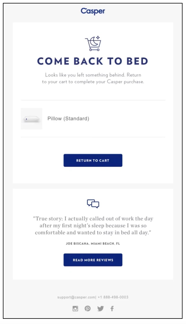
A short, well timed email brings a meaningful share of these shoppers back, often within the first day. Good cart recovery emails tend to follow a similar shape regardless of industry.
Case Study
How Convertcart Helped Air Oasis
Air Oasis makes American-made air purifiers, and their cart recovery emails were going out but barely getting opened.
The emails themselves weren’t wrong exactly; they just weren’t speaking to why someone had actually hesitated in the first place.
We rebuilt the emails around subject lines and timing that matched the real reason for the hesitation, not just a generic reminder that something was still in the cart.
Open rates rose 155 percent, which meant a lot more of those abandoned carts got a second look before they disappeared for good.
The first email only has one job: remind them the tab is still open. Product, price, one clear button back to checkout, nothing more.
Leading with a discount trains shoppers to abandon carts on purpose, waiting for the coupon that always arrives.
The Silence Right After Checkout Is the Real Mistake
Most stores go quiet the second a payment clears, right when the customer is paying more attention to the brand than they ever will again.
That silence is the actual mistake, not any specific email left unsent.
A shopper checking their inbox for a shipping update is reading everything else that lands there too, including whatever opinion of you they’re quietly forming while they wait.
Confirm the order clearly, tell the truth if something’s delayed, and once the product actually arrives, follow up with something useful instead of another pitch.
The trust you build here earns the second sale, and eventually the loyalty program you introduce down the line.
None of this needs to be complicated. It just needs to happen consistently, long after the first sale closes.
Closing Thoughts
More orders rarely come from one big change. They come from three levers pulling together instead of working against each other.
Get people to arrive, help them decide without hesitation, and give them a reason to come back.
In our experience, stores that treat this as one connected system, rather than a pile of disconnected tips, see results that hold up over time.
Start with whichever lever looks weakest in your own numbers, fix that one first, and let the other two catch up.
FAQs
How Quickly Can These Changes Increase Online Orders?
Some changes, like fixing checkout friction, show results within days of a test going live.
Others, like a retention strategy, take a few purchase cycles to prove themselves.
Expect the fastest wins in Lever 2, since it addresses shoppers who are already close to buying.
Do These Levers Apply to Delivery and Quick Commerce Orders Too?
Yes, the same three levers apply. Only the names shift a little, since delivery time replaces shipping cost, but the underlying logic holds.
Shoppers hesitate for the same reasons either way, and cutting friction works just as well.
What’s the Fastest Way to Find Out Which Lever Is Holding My Store Back?
Pull your conversion rate, cart abandonment rate, and repeat purchase rate side by side. Whichever number looks weakest compared to your industry average is usually where to start.
Is More Traffic Ever the Right First Move?
Sometimes, but rarely as often as store owners assume. If your conversion rate sits below 1 to 2 percent, more traffic just means more people leaving through the same broken door.
Subscribe for more articles like this!
Thank you - we'll see you in your inbox soon!
Oops! Something went wrong while submitting the form.
Read by 5000+ ecommerce store owners
Subscribe for more articles like this!
Thank you - we'll see you in your inbox soon!
Oops! Something went wrong while submitting the form.






.avif)
.svg)


.svg)

.svg)
.svg)
