Note from our CRO team: This article describes the actual framework that we've been using to help our customers recover abandoned carts. The key principle that drives it: not all cart abandoners are the same. Some leave because they’re distracted, others because they’re unsure, and some because of price. Treating them all the same with a single discount email is never a good idea.
This 4-step framework maps each email to the shopper’s intent—so you’re not just sending reminders, you’re addressing the real reason they didn’t buy.
The Convertcart Cart Recovery Email Framework (4-Step System)
Email Type
When to Send
Trigger / Behavior
What the Shopper Is Thinking
Goal of the Email
What to Include
1. Reminder Email
Within 1–2 hours
Shopper added to cart but left quickly (no checkout)
“I got distracted—I’ll come back later”
Bring them back before intent fades
Product image, simple CTA, minimal friction, no discount
2. Trust Email
~12–24 hours
Shopper explored deeply but didn’t buy
“Looks good… but can I trust this?”
Build confidence and remove doubt
Reviews, testimonials, guarantees, returns policy, social proof
3. Incentive Email
~24 hours
Shopper reached checkout but abandoned after seeing total
Convertcart insight: How Many Emails Should Be in a Workflow?
We noticed that most of our customers were defaulting to a single cart recovery email, usually a discount sent 24 hours after abandonment. But, our experiments made us realize that 3 emails is actually the sweet spot. While our master framework utilizes 4 distinct strategic email types (Reminder, Trust, Incentive, and Urgency), you should select the three that best address your audience's primary friction points. Sending more than 3 emails dramatically increases your unsubscribe risk.
The Anatomy of a Cart Recovery Email That Works
Element
What It Does
When to Use It
Underlying Psychology
How to Execute It
Reminding
Brings the shopper’s cart back into focus without pressure
When the shopper likely got distracted
Loss aversion
Show cart items clearly, use soft CTAs, avoid discounts
Convertcart Insight: We noticed that most stores try to do everything in a single email: remind, reassure, incentivize, and create urgency all at once. And the result is almost always the same: a cluttered email that doesn't do any one thing well. This is exactly why we started mapping each function to a separate touchpoint while consulting eCommerce stores; it keeps our team focused on solving one objection at a time and the recovery rates reflect that.
Build Your Sequence: Wireframes and Proven Examples (Remember To Pick 3 Out of The 4 Email Types Mentioned In This Section)
Here is exactly how to construct each message in your sequence, starting with the immediate fallback that catches distracted shoppers before they drift away.
Type 1: The Reminder Email
What it's doing: Recapturing attention without pressure. The shopper isn't objecting; they're just not thinking about you right now.
When to use it: Within 1–2 hours of abandonment. This is your highest-converting window.
The wireframe:
Subject: You left something behind / [First name], your cart is waiting
[Brand logo]
[Short, warm headline — not salesy. "Still thinking it over?" works.]
[Product image + name + price]
[Single CTA → Return to cart]
[Optional: One trust signal — free returns, customer rating]
What NOT to do: Don't offer a discount here. You're leaving money on the table if you lead with an incentive when a simple reminder would have converted them anyway.
How to approach your subject lines:
Focus: Distraction, helpfulness, low pressure.
Examples: "Forgot something?", "Can we help you finish up?", "Your cart is waiting."
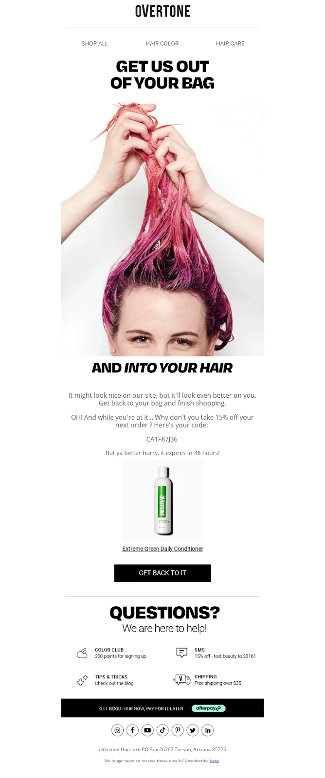
The brand that does reminder email the best:
Overtone
Takeaway:When discounting isn't an option, stack non-monetary benefits: free shipping, loyalty points, and a low-friction guarantee can shift the value equation just as effectively.
The key is leading with aspiration rather than guilt, framing the email around what the product does for the shopper rather than what they left behind.
You need to layer incentives quickly so that no single nudge dominates, and saying no starts to feel like the harder choice.
Type 2: The Trust Email
What it's doing: Reducing the doubt the shopper can't quite name. They wanted to buy. Something stopped them. Your job is to remove that something.
When to use it: 24 hours after abandonment, if the shopper spent meaningful time browsing before leaving (not reaching checkout).
The wireframe:
Subject: Still have questions? Here's what other customers say.
[Brand logo]
[Headline that addresses hesitation directly — not "complete your order"]
[Product image + name]
[3–5 customer reviews, preferably specific]
[Return policy stated plainly]
[FAQ link or answers to 2–3 common questions]
[Single CTA → Return to cart]
[Optional: Customer support contact]
What NOT to do: Don't bury the trust signals. If your return policy is the reason someone should feel confident, make it the headline, not a footnote.
How to approach your subject lines:
Focus: Social proof, reducing doubt, addressing hesitation.
Examples: "See why 5,000+ shoppers love this," "Still have questions? Here is what others say," "Our 100% satisfaction guarantee inside."
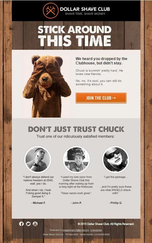
The brand that does trust email the best:
Dollar Shave Club
Takeaway:Lead with personality, not persuasion. Don't forget that a distinct brand voice earns trust before the sell ever begins. When social proof is embedded inside a tone the reader already enjoys, testimonials feel like confirmation rather than a pitch.
Build the character first, and the conversion follows naturally.
Type 3: The Incentive Email
What it's doing: Addressing price sensitivity directly. The shopper was interested. The product price, shipping cost, or both was the barrier.
When to use it: 24 hours after abandonment, particularly if the shopper reached checkout before leaving. Incentives like coupons can significantly boost cart recovery rates 57% of US customers who used an abandoned cart coupon confirm it influenced their purchase decision.
The wireframe:
Subject: Here's 15% off — just for you / Your cart + free shipping = done.
[Brand logo]
[Bold headline leading with the offer — don't bury it]
[Coupon code or auto-applied discount, clearly visible]
[Product image + name + original price crossed out / new price shown]
[Expiry date on the offer — makes it real, not open-ended]
[Single CTA → Complete your purchase]
[Optional: Free shipping threshold if applicable]
What NOT to do: Don't make the incentive hard to find. If a shopper has to scroll to discover there's a discount, you've already lost half of them.
Examples: "Here’s 15% off—just for you," "Your cart + free shipping = done," "Want an extra 10% off your order?"
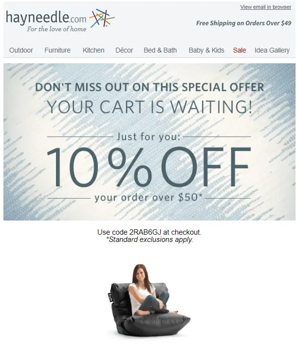
The brand that does incentive email the best:
Hayneedle
Takeaway:Know your category's specific friction point and address it head-on. For high-AOV products, shipping anxiety often kills the cart more than price does.
Framing the offer as personal rather than promotional makes the shopper feel chosen, not targeted. Pair that with a well-placed shipping threshold nudge, and you've removed the two objections most likely standing between browse and buy.
Type 4: The Urgency Email
What it's doing: Giving the still-considering shopper a reason to decide now rather than later. The indefinite "maybe later" needs a deadline.
When to use it: 48–72 hours after abandonment. By this point, the shopper has seen at least one email and hasn't converted. They need a push, not another reminder.
The wireframe:
Subject: Almost gone, your cart expires tonight / Only 2 left in stock
[Brand logo]
[Urgent but not panicked headline]
[Stock counter or offer expiry — make it specific, not vague]
What NOT to do: Don't manufacture urgency that isn't real. Shoppers notice fake countdown timers and low-stock claims that reset every time they visit. One experience of that and you've lost them permanently.
How to approach your subject lines:
Focus: FOMO, expiring offers, low stock.
Examples: "Almost gone: your cart expires tonight," "Only [X] left in stock—just so you know," "Final hours to claim your discount."
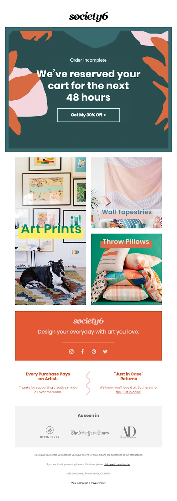
The brand that does urgency email the best:
Society6
Takeaway:Vague urgency is ignored and specific, verifiable deadlines inspire a real decision. You need to surround the countdown with genuine authority signals so the push feels earned rather than manufactured.
The goal isn't to pressure the shopper; it's to collapse "I'll decide later" into "I need to decide now."
BONUS: AMAZING CART RECOVERY EMAILS (THAT ARE NOT A PART OF OUR 4-STEP SYSTEM)
Brand Voice as Strategy: When Personality Is the Differentiator
Some emails don't fit neatly into Reminder / Trust / Incentive / Urgency; because the primary conversion mechanism is the brand voice itself. These are worth their own section.
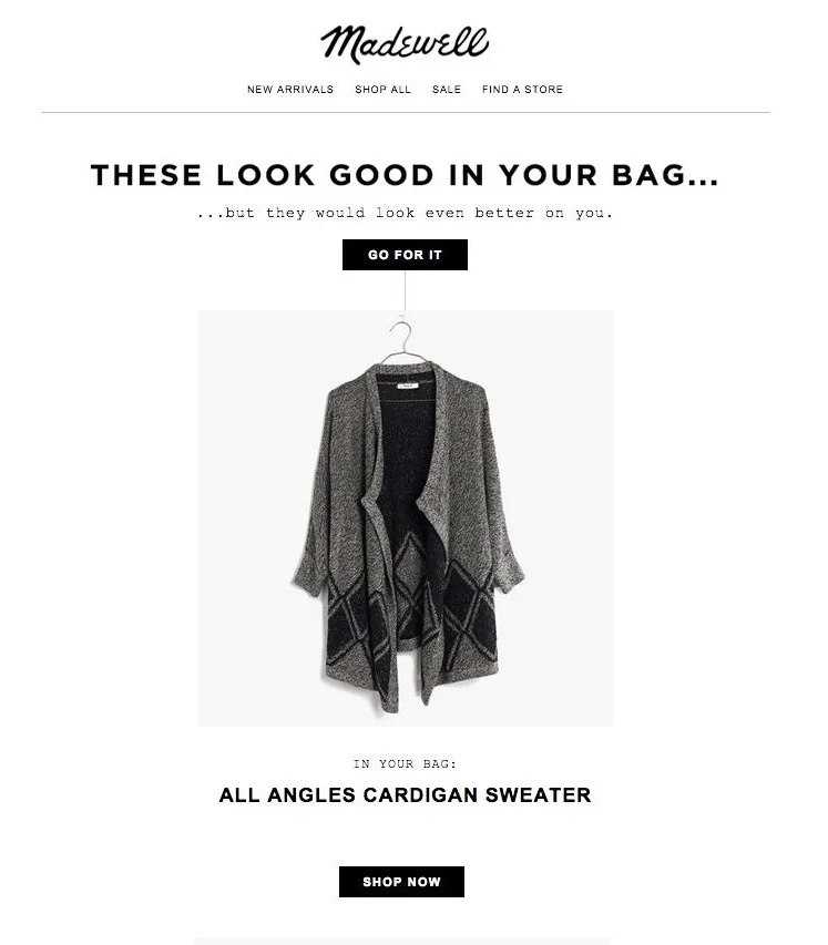
Madewell
Takeaway: Make the shopper the hero, not the product; a single line that says "you deserve this" does more conversion work than a well-placed discount.
Madewell's approach flips the emotional register entirely by providing the internal justification the shopper was missing. When the copy gives people a reason to say yes to themselves, the sale follows.
Design-Led Emails: When the Visual Carries Everything
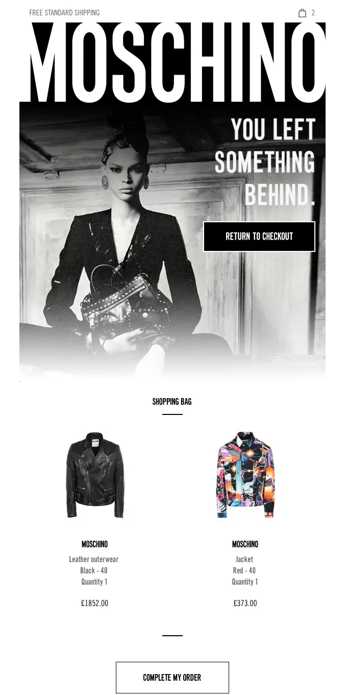
Moschino
Takeaway: For luxury brands, restraint is the message; an email that simply looks exactly like the brand is more persuasive than any stack of nudges or urgency copy.
Strong visual identity does the trust-building that copy can't, signaling confidence rather than desperation. If the shopper recognizes themselves in the design, the sale is already more than halfway made.
Transform Email Marketing Into A Revenue Machine
Most eCommerce store owners don’t see email as a serious revenue stream.
Ask them about the importance of email marketing, and you'll hear: “we don’t really have a major strategy,” “we mostly use generic templates,” or “we just send emails to people on our list.”
BUT AT THE SAME TIME:
There are stores out there that drive 30%+ of their revenue from email marketing.


.avif)
.svg)

.svg)

.svg)
.svg)
