Here’s some good news: Unsubscribes aren’t bad news!
Sure, it’s hard to say goodbyes.
After all, you’ve worked really hard to build an email list and got users to sign up.
But that doesn’t mean that unsubscribes are the end of the world. Unless an unsubscribe button is all you’ve for the customer.
That’s just reinforcing the customer’s decision to leave and not putting in enough effort to try and change their minds.
But, don’t admit defeat, just yet!
Let’s see what the numbers have to tell.
What is an acceptable unsubscribe rate?
As is the norm, 0.2-0.5% is the acceptable unsubscribe rate. Anything more than 0.5% means you need to fix your unsubscribe emails.
Certain non-negotiable details go into making an unsubscribe page that will be covered in the examples.
Enjoy reading!
24 Unsubscribe Page Examples That Get Customers To Re-Subscribe
Here are 24 unsubscribe pages that caught our attention for their flavor, attitude, authenticity, and ability to reel back customers.
1. BarkBox
What works:
Proactive by offering multiple other resources you can subscribe to. This helps build a long-term relationship and saves the brand from losing the customer.
Relevant copy that includes lots of dog lingo. It helps connect with the target audience right away and creates immediate brand recall.
Creative by adding a picture of the dog with a thought bubble. A smart way to keep their customers entertained.
2. Chubbies
What works:
Witty and humorous copy that’s very on-brand. They keep it subtle with “We can take a hint”. Their unsubscribe options also sound very relevant. The CTA is catchy and quirky.
Targets customer emotions with their copy. Both the unsubscribe options describe a feeling, which is an excellent way to move customers. Most people don’t want negative feelings. Hence there’s a high chance that customers will veer towards a positive feeling. Shows a good understanding of shopper psychology.
Friendly in the way they still keep communication channels open by sharing their social media handles.
Pro Tip: Consider sharing up some UGC on your unsubscribe page – with an added incentive – for example, “send us a DM saying “I unsubscribed”, and we’ll send you a surprise” (this way you can launch a win-back automation on your social DMs).
3. J. Crew
What works:
Corrective action is the flavor the copy contains right from the start. The sense is that the brand is keen on taking responsibility for having disappointed the customer. Courageous without getting too showy.
Choice-giving in a matter-of-fact way, the ‘how’ and ‘what’ of it are covered simultaneously so that it’s all up-front for the customer who has landed up on this page.
Emotional tonality stands out as one of the highlights of this page, especially where it matters. They say “we hate goodbyes”, which is essentially a universal truth, making it even more poignant for the customer to pause and think.
A bold approach without sounding like they know it all. The page displays the brand colors and motifs.
A clever arrangement of information with the copy easily becoming a part of the design language. This ensures “let’s open doors” is read more readily than “do you really want to unsubscribe”.
5. Top Shop
What works:
Straight and transparent always works. Without beating around the bush, they give the customer a both-ways scenario and let them make the decision.
Personalized and customizable options to continue the engagement. By offering the choice to select the specific subscriptions the customer would prefer, they aim at long-term customer retention.
Appeals to customer’s emotions with the lines “Is it really over”?
6. Charity: Water
What works:
Upfront honesty makes the words easy on the eye and the mind. The brand is clear that they’re calling a spade a spade. But what other brands can learn from this is the way to do it across age brackets.
Simple yet easy use of humor ensures customers don’t feel heavy about unsubscribing or re-subscribing. The point is that the brand doesn’t make anyone feel bad. On the contrary, it shows a funny video of its CEO under the attack of water balloons. A subtle way of saying: we’re a cool bunch doing some serious work!
7. Free People
What works:
Free, unconditional choice seems like a distinct feature here, where the brand offers the chance to stay opted in or to opt out. This a significantly smart move because this kind of allowance often makes customers feel they are acknowledged and cared for. Also, something that is totally in line with brand values (their name, free people, is a hint in itself!)
Fact and emotion come together beautifully in as simple a sentence as “we haven’t seen you for in a while!” It is wonderful how the brand is able to say so much in so little.
8. Moosejaw
What works:
A remarkable simplicity elevates how this brand looks and feels. The unsubscribe page carries those elements to the T, subtly reminding customers what they will miss if they are to leave for good.
(Moose)Jaw-dropping humor in fine print will have users strive harder to read. And when they do, they are greeted with something as cheeky as “33% of customers that opt out of Moosejaw emails have recurring possum nightmares. Just saying.” Humor that’s so memorable, many might just decide to stay back.
A focus on what’ll stop is something the content does really well, especially right before the submit/cancel buttons. A reminder works well for the average customer who might already be too inundated by everyday emails.
9. Groupon
What works:
A clever layering of information that quickly changes how a customer perceives this page – “oh yeah, just another unsubscribe page!” to “wait, what?”. The surprise element is strong and can be rewarding for someone all ready to leave.
A play on human emotion is something the page achieves through the “Punish Derrick” video. It plays to show the man actually going through a hard time. What this does is, creates a level of satisfaction in the customer. Derrick essentially represents the brand in some form and through this short but humorous gimmick, Groupon almost says “There you go! You punished us. Do you still want to leave?”
The unsubscribe page’s user interface. Buoy takes ownership of the fact that most unsubscribes happen on mobile.Instead of a plain “you've been unsubscribed” message, this page offers two key paths through the CTAs – “unsubscribe” or “update preferences” – with a really cheeky message “....be sure not to turn into a raisin!”
The love for detail as a brand ethic shows in the way this unsubscribe page seeks information (note how clean the UI is). Once a subscriber hits the “update preferences" button, the brand shows it cares enough about the subscriber, by asking for their birthday (apart from signaling “what” and “how often”).
Pro Tips:
Monitor your unsubscribe completion rates if you have a multi-step unsubscribe landing page. Compare the number of clicks on the ‘unsubscribe button’ vs. the no. of completions.
As a precaution, map ‘unsubscribe button clicks’ as a custom field in your ESP’s database – this way you can immediately stop all emails from being sent out (once a contact hits the unsubscribe button) and avoid getting marked as spam.
11. PetSmart
What works:
The brand recall nudge with ‘your favorite pet retailer’. Reminds the customer that they’ve had some great times together and may not want to entirely let them go.
Clear and concise messaging. They clearly explain how someone can still stay in touch while removing the clutter.
Pro Tip: Consider giving a heads-up about operational/mandatory emails. Always specify what “non-marketing emails” mean. Say something like “So, what if you unsubscribe, we’ll still see each other when you place an order!” – this way, you show the relationship between you and the unsubscriber is still intact.
12. Fitbit
What works:
The copy. No brainer. We love how it’s personalized and calls attention to the emotional appeal the brand is trying to create.
The social media icons. They draw attention to the fact that there are other ways to stay in touch with the brand without having your inbox cluttered with emails.
It’s easy to use. There is a simple form with clear instructions on how to unsubscribe and which emails one would like to opt-in for (all options are unchecked by default).
The subtle use of the Zeigarnik effect (people are more likely to tend to unfinished tasks). The unfilled checkboxes trigger exactly that.
Turning the unsubscribe button into a checkbox. What's genius is that it’s smaller and featured near the end, after the key CTA button (making the text on the page appear funnel-shaped).
Pro Tip:Always leave a link to the privacy policy page of your store (specifically the part that talks about unsubscribes). This will let people know how their data is being used and how the brand will respect their privacy.
14. Michaels
What works:
Highly personalized, builds an emotional appeal. This helps to create a sense of connection and reinforces the idea that the customer is important to the company.
Gives subscribers multiple options as per their needs. A good unsubscribe page will present several options that the subscriber can opt for if they decide they do want to continue receiving emails (all while reducing choice paralysis).
A verbal confirmation. This just helps the customer be 100% sure that the action they wanted to perform has been completed.
The witty copy with resubscribe. If customers change their mind, they should be able to easily resubscribe. Including a link or button makes it easier for them to go to your sign-up page.
Easy ways to unsubscribe any way the customer chooses. There are no hoops to jump through and the process is fairly straightforward and explains what’s needed.
Clear CTAs that keep everyone in the loop. Customers know exactly what’s happening and can choose either button to continue as per their preferences.
Saying thanks. This helps to create a feeling of good will and it may even persuade some users to change their mind and stay subscribed.
The unsubscribe page is very clear about what the process involves. There is no confusion about what the customer is unsubscribing from, how many emails are left, and how to stay in touch.
Social media icons & nudge. This makes unsubscribing easy while also encouraging customers to stay in touch by easily accessing the social media handles.
18. Yankee Candle
What works:
Single-page unsubscribe. The last thing you want is for the customer to have to click through a bunch of pages just to unsubscribe.
Limited form fields. This is very simple with just a couple of fields for the customer to enter their email address and confirm their unsubscribe request or choose to snooze.
19. Currys
What works:
Reinforces the benefits. The page lists the benefits of staying subscribed and calls attention to all the perks customers will receive.
Clear and obvious unsubscribe button. Again, this may seem like a no-brainer, but you'd be surprised how many companies make it hard to find the unsubscribe button.
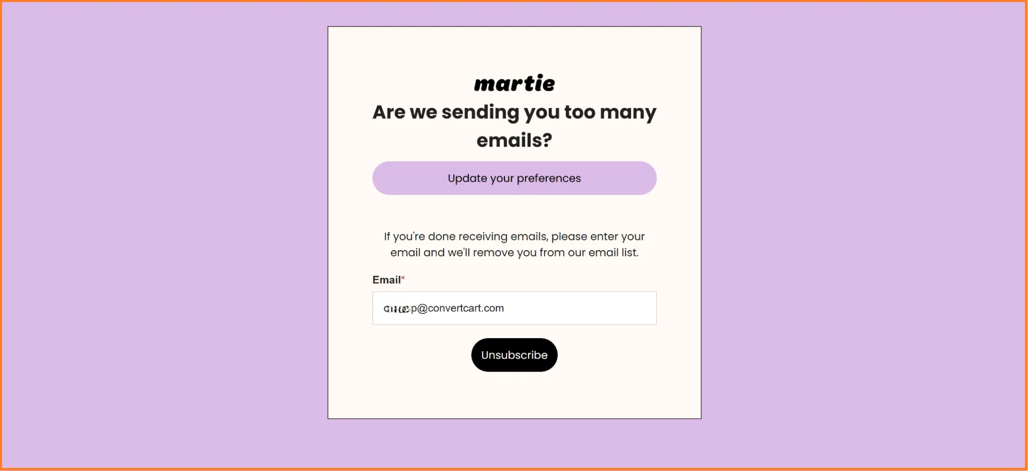
20. Martie
What works:
Straight to the point tone. No fluff, no guilt trips, just a clear question: “Are we sending you too many emails” – and a respectful yet considerate “if you are done…please enter your email and we’ll remove you.”
Insanely smart color psychology and visual hierarchy – The purple CTA for “Update your preferences” isn’t random – itgrabs attention first, while the black "Unsubscribe" button is kept at last. The result? The brand subtly leads users toward the less drastic option.
21. Pacsun
What works:
Greyed out mandatory email option. It gets unsubscribers to pause, which may sound bad, BUT it’s a really smart way to remind them they’re still in the loop—without forcing them to stay.
Dynamic preferences center instead of a static page. This preferences page shows the subscriber’s status – shifting the focus from “leave” to “customize.”
The subtle data collection. By asking for an email and phone number, Pacsun keeps the door open. What they're essentially saying is, “Maybe emails aren’t your thing, but SMS works better?”
22. Wayfair
What works:
Leads to another channel, the app. This prevents customers from churning – and gives shoppers a preview of what the app experience is like.
Covers the ground for accidental unsubscribes. How? By creating a 48-hour cooling period – note the "It may take up to 48 hours" unsubscribe confirmation message along with a “sign me back up!” button.
Pro Tip: Turn off your sitewide pop-ups on unsubscribe pages – what you can do instead is consider using a non-intrusive pop-up on the confirmation page to display one-time-only offers (like a 10% off with one-month validity).
23. Reitmans
What works:
Gives a clear timeline.10 days may seem like a long time – but it gives Reitmans just enough time to trigger a one-email ‘winback’ flow – without the risk of hitting spam.
Pops the question. Instead of ending things, Reitmans asks, "So, you wanna shop now, or what?” – and pairs it with imagery of two people hopping away into the distance – showing the relationship is still going (made us all warm inside, tbh).
24. Readymag
Now, we know this example isn’t technically eCommerce — but it’s still excellent, isn’t it?
What works:
The ‘Keep Me Subscribed’ button. Why? It’s catchy; it evokes a sense of urgency; and it’s in a nice contrasting color that stands out from the rest of the page.
The automation unsubscribe. It may sound like it works to the opposite effect BUT it’s actually a great way to remind customers they’re still subscribed and show that you actively care about what they’re reading.
BONUS: Bokksu
This email unsubscribe isn’t your typical opt-out – but, rather, one that’s impending – it covers ground on cancellations and paying shoppers who’ve vanished.
What works:
Shows exactly what a user will miss out on. Bokksu simply triggers the loss-aversion, by showing exactly what the shopper could have been a part of.
Gives off a level of exclusivity. The “see upcoming box” section drives an early-access type scenario, which will let the brand figure out which shoppers are actually interested in the product.
Pro Tip: If paying customers unsubscribe, consider sending out a 1:1 email from a different address, (like one of the founder) to ask for feedback – this strategy works wonders for smaller eComm brands, because it puts a face to the brand (and also understand what made a paying customer drop off).
How to Create An Unsubscribe Page Flow To Retain Shoppers?
If you’ve ever wondered, “what should I put on my unsubscribe page” – this is exactly what you’ve been waiting for:
Step 1: Map where opt-outs happen
Track which types of emails get the most opt-outs – this way you’d be able to craft custom unsubscribe pages for different types of campaigns (which leads us to step 2).
Step 2: Ask for a chance
Here the goal is to offer options like:
Frequency reduction (most preferred)
Content preference center
A temporary pause
Channel shift (SMS, Whatsapp, etc.)
Complete unsubscribe (last resort)
However, make sure you personalize the copy by campaign type – for example, if drop-offs happen for promotional emails – craft your copy like this:
“Before you go- go – take a chance on us?
(Or snooze us, honey)
☑ “Take a chance on me!” – Keep the best deals coming (we promise, no fluff)
☑ “Gimme, gimme, gimme… a break from emails!” – Pause us for 30/60/90 days
☑ “Knowing me, knowing you… I’ll be back!” – Just seasonal updates, please
☑ “So long, farewell… my inbox is free!” – Unsubscribe me completely”
Step 3: Say farewell with one last bang
Sure, the goodbye’s here – but, take that chance to drive ultimate value – here are some things that you can trigger along with an unsubscribe successful message (and, a ‘wait – I wanna go back’ type CTA):
Their discount history
Upcoming exclusives
Wishlist/cart contents about to expire
(Optional) Step 4: Implement a Triggered Win-Back
For those who fully unsubscribe, set up a retargeting ad campaign over search and social media:
A 3-day follow-up with a special offer
A 30-day "we miss you" campaign
A 180-day "come back" with a substantial incentive
Need an example of this flow in action? Here is how Eye Buy Direct creates a flow for their email unsubscribes:
Step 1: Opens up a preference center with an opt-out link
Step 2: Asks for confirmation regarding the opt-out
Step 3 (Optional): Asks to dial in the unsubscribe reasons
Step 4: Confirmation page that shows the unsubscribe request has been put through (with an option to reverse the process)
Unsubscribe Page 101
1. What is an Unsubscribe page?
An unsubscribe page is a web page that opens when an unsubscribe link is clicked in an email. The purpose of the page is to allow users to unsubscribe or choose their preferences.
2. What is an Unsubscribe email?
An unsubscribe email is an event where the user decides to stop receiving emails. This is triggered when the user clicks on the unsubscribe link of a promotional email leading to the unsubscribe page.
3. How should Unsubscribes be handled?
Unsubscribes don’t have to be bitter. Here’re four ways to handle unsubscribes without burning bridges:
a) Tickle your customer’s funny bone
Using humor will make customers reconsider their decisions to unsubscribe. Funny messages on your unsubscribe page trigger a positive sentiment and make you forget (at least) for a few seconds that you’re being sold.
b) Offer other ways to stay in touch
Not all subscribers part ways because of a bitter experience. They just don’t want their inbox to be clogged. Including social media handles can be a great way for them to stay updated with your eCommerce brand’s developments.
c) Offer a vacation
When your customers have made up their minds, there’s nothing much you can do unless….you can offer them a 30-day break from your emails. A rejuvenating break might just be the thing they need.
d) Be a sport
Not all customers are meant to be with you. Such is life. Instead, you can focus on the loyal customers who’re with you. Be a sport and take charge of things under your control.
3. Why do customers hit unsubscribe?
There are plenty of reasons driving the customer’s decision to unsubscribe. Marketing Sherpa’s study reveals these findings:
Here are the most important ones you should focus on:
a) Too many damn emails
It’s a fact that subscribers are constantly bombarded with emails. That’s why around 73% of subscribers use the unsubscribe link to stop the inflow of unwanted emails.
How to fix:
Regulate your email frequency
Offer flexible opt-in options so subscribers can choose what kind of emails they want to receive
b) What do these emails have to do with me?
74% of subscribers don’t like receiving irrelevant emails.
Your goal should be to send the right email to the right customer on the right channel at the right time.
Unless the emails are well-timed, personalized, and offer value—depending on which stage of the journey they are in—your customers are going to head over to the unsubscribe button.
How to fix:
Send personalized emails by factoring in demographics, behavior, and purchase history.
Leverage email segmentation to divide your audience and send each of those groups specifically targeted emails.
c) Oh no, is it a scam?
SpamLaws states that around 85% of all emails are spam—it’s a genuine worry for most customers. There’s a risk of falling prey to offers that won’t add up or information that’s essentially a hoax.
In these cases, the users will instantly unsubscribe and also feel angry towards the company sending these emails leading to the loss of future business opportunities.
How to fix:
Don’t use spammy and salesy buzzwords such as cheap, congratulations, gimmick cash, guarantee, won, rich, offer, and outstanding
Use a double opt-in process to improve the quality of your subscribers
d) The content and design are just boring
Your customers are already receiving a lot of emails. On top of that, if the design is bland and the content is uninspiring, its fate is almost sealed.
There are so many ways to make an email irresistible for customers: being interesting, informative, funny, sarcastic, helpful, or offering value. Boring is the last thing your email needs to be.
How to fix:
Don’t compromise on quality. Make the content short and easily skimmable. Don’t go overboard with the design.
Stick to an email marketing calendar and include a wide variety of original content. Use traditional and non-traditional holidays to send interesting email content.
Check out how M22 used the Polar Vortex event to craft an interesting email for their customers.
e) I just hate promotional emails
Some customers engage with a brand to explore and purchase at their own pace, and nothing more. So just because they’ve signed up for your email doesn’t mean they’re ready for purchase.
And then, there are those potential customers, around whom brands need to be really clever and trustworthy. One wrong move and they will unsubscribe!
In a world where most of us are inundated with choices, anything that is remotely irrelevant and annoying for the customer can backfire for an eCommerce business.
How to fix:
Offer email preference options so that subscribers can choose when, how, and what to receive.
Use email analytics to track user behavior and avoid sending promotional emails to the segment that hadn’t interacted positively with these emails.
4. Which elements make a compelling unsubscribe page?
In the most successful unsubscribe pages that we have reviewed, we’ve found 3 consistent elements that keep things not just interesting but authentic.
a) Strikes a chord to negotiate
The best unsubscribe pages convey that the business cares enough to negotiate. They communicate that it is clearly NOT “all or nothing”.
The copy on these pages actually goes one step beyond and starts a conversation, asks a question, or seeks permission. Would the reader be okay with reading fewer emails from your business per month? Would they want you to focus on contacting them only when there are relevant offers or deals coming up?
b) Shows courtesy and understanding
Most successful unsubscribe pages, even if they’re from businesses doing a terrific job, don’t sound cocky.
Instead, they ask if you’d want something different or list a few questions you could potentially answer to help them understand your standpoint.
c) Communicates more humanely
Most unsubscribe pages that work well typically aim their communication directly at visitors and customers. The copy doesn’t sound like a business but more like a friend.
Here are a few ways in which you can enhance your email communication by adding a human touch:
Say thanks. A simple “thanks” can go a long way to show your customer base that you aren’t taking them for granted.
Use questions like “Could you tell us how we’re doing?” and then follow them up with a simple, easy-to-fill feedback form.
Make the CTA crisp and clear. Copy that reads like “Grab this one-time opportunity” brings them back with just an extra dash of drama.
Add some ‘yes/no’/checkbox type unsubscribe survey questions. This way you know what gets people to leave (but don’t ask too many questions – check this unsubscribe page example below:
5. Why should you get an unsubscribe page?
As trivial as an unsubscribe page may sound compared to, let’s say, a landing page or a product page, it’s something that has various repercussions.
Here are a few reasons it’s best you get that unsubscribe page designed and written:
❌ On the downside:
You could end up with a heavy fine
Certain regulatory bodies and laws make it imperative that you give customers the choice to stay connected to you. Be it through General Data Protection Regulation (GDPR), the CanSPAM Act, or Australian spam laws, related fines can be a heavy flow.
You could receive a lashing on social media
In the active digital setting of today, every consumer is aware enough to exercise their voice. So, if customers get the whiff that your brand is somehow forcing them to stay connected with your content, they could react adversely.
✅ On the upside:
You could engage them for a little longer
As you may have already found out in the examples above, an unsubscribe page helps customer perception. The fact that they have a choice can make them stay and connect for just a little longer.
You could assess the rate of engagement in real time
With an unsubscribe page, it becomes a little easier to track audience engagement. With relevant data and information fields, you can actually inspire customers to give you a real picture. This can enable you to create more enriching marketing efforts in the future.
Here’re a few pointers that help you create an unsubscribe page:
Ask them the reason for leaving. By giving them a few options and listing a field to provide feedback, you’re taking action at the right time.
Email frequency. The type and number of emails customers receive matter. Provide options for frequency and type such as promotional emails and product updates.
Don’t ever forget to include the unsubscribe link. You don’t want to come across as a privacy intruder.
7. How do I write an unsubscribe message?
You first need to get rid of the ‘We’re sorry to see you go’. This has been done to death and needs a revamp.
The unsubscribe option must be clearly visible on the page. Don’t make it too hard for the customer. The 1-click unsubscribe option must be provided.
Remind them how they landed on your email list which will help them remember having subscribed to your email list. This might make them change their mind.
Before we say goodbye…
We have to say that every page on your eCommerce website or associated with your brand has the potential to retain customers.
An unsubscribe page can help you ensure that you transform this real estate to draw more conversions. The best way to know which elements to add or subtract from your unsubscribe page is through A/B testing.
This way, you know what’s more important for the customer. You may also be able to change their mind about unsubscribing and get them onboard. It’s sure to reflect on your conversion rates.
We have helped 500+ brands drive conversions by building efficient customer experiences and effective exit strategies. Get in touch with us to know more about how we can help your brand.
Subscribe for more articles like this!
Thank you - we'll see you in your inbox soon!
Oops! Something went wrong while submitting the form.
Read by 5000+ ecommerce store owners
Subscribe for more articles like this!
Thank you - we'll see you in your inbox soon!
Oops! Something went wrong while submitting the form.


.svg)

.svg)

.svg)
.svg)