BEFORE YOU READ THIS ARTICLE, ANSWER: Where in your funnel are shoppers actually stalling?
Most store owners answer "checkout" on instinct.
They're usually wrong. Checkout is where the drop-off shows up, but it's rarely where it starts. Fix the wrong stage, and you'll run three months of experiments that move nothing.
Somewhere in these five, you'll recognize your own store. Start there and the rest gets easier once you know your leak.
1. They browse products but rarely hit "Add to Cart."
Your traffic is fine. Your carts are thin. The stall is happening on the product page, before intent even forms.
2. They add to cart, then vanish before checkout starts.
Carts fill up. The checkout page barely sees them. Something between the cart and the first checkout field is breaking momentum.
3. They begin checkout, then drop at payment.
They typed their address. They got to the money. And they stopped. This is the most expensive group you have, because they were seconds from buying.
4. They come back two, three, four times and still don't buy.
Repeat visitors, no purchase. They're not confused. They're comparing you against a tab they have open somewhere else.
5. They save to wishlist but never move it to cart.
Interest is real. Something about price or urgency is telling them "not yet."
Here's the part that matters: each of those five behaviors traces back to a different friction layer, and the layers have a fixed order of priority.
Solving them out of order is why most stores plateau.
A store bleeding shoppers at behavior #2 doesn't need the payment fixes built for #3, and running them anyway wastes the quarter.
Key Reasons Why People Add To Cart But Don’t Buy: Fix Them In This Order
Priority
Friction Layer
The stall it causes
Where it hits in your funnel
Fix 1st
Intent Friction
Shoppers save carts they were never ready to buy
Before add-to-cart
Fix 2nd
Cost & Value Friction
The purchase stops feeling worth the price
Cart to checkout
Fix 3rd
Trust Friction
Hesitation right before handing over payment
At checkout
Fix 4th
UX & Decision Friction
Momentum dies under too many steps
During checkout
Fix 5th
Optimization Gaps
The store fails to help ready buyers finish
At payment
You will notice that the order isn't random.
You fix these top to bottom, because a payment fix means nothing if shoppers were never convinced to buy in the first place.
That's why we start at the top, with Intent Friction.
Layer 1: Intent Friction
“They were never fully ready to buy.”
1. Window Shopping
In the digital landscape, browsing has become akin to strolling through a mall.
People often add items to their carts not intending to purchase immediately, but rather as a means of bookmarking or saving items for future consideration.
Just like in physical stores, online shoppers enjoy the thrill of exploring options without committing to a purchase right away.
How to improve your add-to-cart to checkout conversion rate:
Encourage window shoppers to purchase with visual cues and urgency tactics.
And create a welcoming environment where shoppers can save the cart, save products to their wishlist, or share it with their friends and family for second opinions.
2. Price Comparison and Research
With many online retailers at their fingertips, consumers are more inclined to conduct thorough research before making a purchase.
Adding items to the cart allows them to compare prices, read reviews, and explore alternative options.
This phase of the buyer's journey is crucial for informed decision-making, even if it means abandoning the cart momentarily.
How to improve your add-to-cart to checkout conversion rate:
You can start by assuring shoppers that they are getting the best deal by offering a price-matching guarantee directly on the checkout page.
Display a clear statement indicating that if they find the same item at a lower price elsewhere, you'll match it, instilling confidence and encouraging them to proceed with their purchase.
3. Web Rooming
In the dynamic landscape of online commerce, a fascinating trend has emerged, a phenomenon known as web rooming, which is also known as ‘research online, buy offline’.
Unlike its counterpart, showrooming, which involves browsing in physical stores before purchasing online, web rooming flips the script, with consumers researching products online before making their purchase in-store.
However, the echoes of this behavior resonate throughout the digital realm, manifesting in the form of abandoned carts.
How to improve your add-to-cart to checkout conversion rate:
Provide information about how returns are handled, including any associated costs or restocking fees, to set clear expectations and minimize surprises after the purchase is made.
Also, offer how-to videos, product demonstrations, and buying guides that showcase the features, benefits, and uses of your products.
4. Distractions and Interruptions
Life happens, even during online shopping.
Whether it's a phone call, a notification, or a crying baby in the background, distractions can divert attention away from completing a purchase.
In such instances, the items in the cart are often left behind temporarily, to return later, which doesn't always happen.
How to improve your add-to-cart to checkout conversion rate:
Enhance the online shopping experience with virtual try-on tools and augmented reality (AR) features for potential customers.
This way, people can visualize products in their environment or experience them virtually before making a purchase decision.
Sometimes, the decision-making process takes time.
People may impulsively add items to their carts, only to reconsider their choices later.
Factors such as buyer's remorse, budget constraints, or changing preferences can lead to hesitation and ultimately, abandonment.
How to improve your add-to-cart to checkout conversion rate:
Use retargeting strategies, such as personalized emails or targeted ads, to gently nudge indecisive shoppers back toward completing their purchase.
Offer instant cashback rewards applied automatically at checkout. Impulse shoppers will appreciate the immediate savings, increasing the likelihood of completing their purchase.
Once intent is handled, the next thing that stalls a ready buyer is money.
Not whether they want the product, but whether it still feels worth the price at checkout.
That's Layer 2.
Layer 2: Cost & Value Friction
“The purchase stopped feeling worth it.”
6. Unexpected Costs at Checkout
One of the primary reasons for a high cart abandonment is the revelation of unexpected costs during the checkout process.
Whether it's exorbitant shipping fees, taxes, or hidden charges, such surprises can deter even the most enthusiastic shoppers.
How to improve your add-to-cart to checkout conversion rate:
You can include all applicable costs, such as taxes, shipping fees, handling fees, and any additional charges, and prominently display them on product pages or in the cart summary.
Free shipping isn't always the most practical solutions. Provide a shipping calculator or estimator tool where customers can input their location and see the estimated shipping costs for their order.
How do the best online retailers structure their carts to maximize average order value? Explore these real-world cart page designs to steal their cross-sell and trust tactics
7. Lack of Clear Promotions
When shoppers reach the checkout page and encounter a lack of clear promotions.
It may lead to disappointment or disillusionment, undermining their perception of value and reducing their willingness to complete the purchase.
How to improve your add-to-cart to checkout conversion rate:
Use eye-catching colors, fonts, and graphics to draw attention to the promotion and ensure it is the first thing customers see when they land on the checkout page.
You can display a last-minute promotion or offer in the pop-up window to encourage customers to reconsider and complete their purchase.
8. Lack of Urgency or Incentives
Incentives such as limited-time offers, discounts, or free shipping can create a sense of urgency and motivate customers to complete their purchases promptly.
Without such incentives, individuals may postpone their buying decision indefinitely, allowing items to languish in their carts.
How to improve your add-to-cart to checkout conversion rate:
Clever marketing tactics that leverage scarcity and exclusivity can instill a sense of FOMO (fear of missing out) and prompt action.
Highlight the exclusivity of being among the first to access special deals or limited-edition products, creating a sense of privilege and urgency.
Even when the price feels fair, a ready buyer can still stall at the last second, not over money, but over whether they trust you enough to hand it over.
Fair value gets them to checkout. Trust is what lets them finish. That's the next layer.
Layer 3: Trust Friction
“Something made the shopper hesitate.”
9. Security Concerns
In an age where cybersecurity threats loom large, trust is paramount for online consumers.
Fears of data breaches, identity theft, or fraudulent transactions can prompt individuals to hesitate at the final step of checkout.
How to improve your add-to-cart to checkout conversion rate:
Offer reassurances with secure payment gateways, SSL encryption, and trust badges to help alleviate these concerns and foster trust with customers.
Furthermore, display trust seals and certifications from reputable security providers on the checkout page to reassure customers of the security measures in place.
10. Lack of Trust in the Brand or Product
Trust is the bedrock of any successful transaction.
If customers need clarification about the authenticity, quality, or reliability of a brand or product, they're unlikely to proceed to checkout.
How to improve your add-to-cart to checkout conversion rate:
Build trust through social proof such as reviews and testimonials to instill confidence and foster loyalty.
You can offer responsive and accessible customer support options, such as live chat, email, or phone support, on the checkout page.
11. Mismatched Messaging
Consumers are enticed by the compelling narrative presented in an ad, and they arrive at the corresponding landing page with certain expectations.
However, when these expectations are not met, and the messaging on the landing page fails to mirror the promises made in the ad, it breeds confusion and dissonance.
The disconnect between expectation and reality erodes credibility, prompting consumers to hesitate before proceeding with their purchase or abandoning their carts altogether.
How to improve your add-to-cart to checkout conversion rate:
Maintain a consistent brand voice and tone throughout the checkout process, aligning with your brand's identity and values.
Ensure that any promotions or discounts mentioned on the checkout page are consistent with the promotions you advertised.
Here’s how Convertcart reduced checkout hesitation for Fastenere
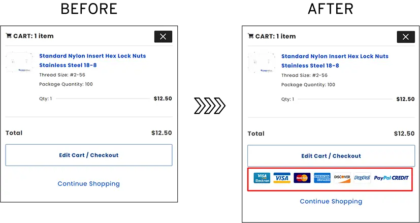
Fastenere sells industrial fasteners at scale, over a million products, and had a specific problem at the cart.
More than half of shoppers, 52.54%, hesitated to move from the mini-cart to checkout.
The pattern pointed at one thing: doubt about payment security at the exact moment they were deciding to commit.
The fix was deliberately small. Instead of redesigning the checkout, ConvertCart placed trusted payment badges directly inside the mini-cart view, so the reassurance showed up where the hesitation was happening, not a page later where it would arrive too late.
That single change increased conversions by 19.54%.
Key takeaway for your store: if shoppers stall right before checkout, the problem usually isn't your prices or your product. It's that nothing at that moment is telling them the transaction is safe. Trust signals have to sit where the doubt is, not buried on a policy page.
The payment seals were one of several trust experiments we ran for Fastenere, including a product-page change that lifted conversions 172% across devices. Read the full Fastenere case study.
Product discovery – barriers that prevent shoppers from finding items
Category/collection pages – improvements that drive deeper product exploration
Product page – what to optimize to convert 2–3x more buyers
Cart – ways to ease hesitation and speed up purchase decisions
“The report was deep and super insightful. Can’t believe it’s free.”
Logan Christopher CEO, Empire Herbs
So far, everything has been about how the shopper feels: unconvinced, overpriced, unsure.
Now we move to Layer 4. Here the shopper already wants to buy and trusts you enough to try.
What stops them now is the store itself: a checkout that asks too much, loads too slowly, or hides the next click.
This is where you lose people not to doubt, but to friction.
Layer 4: UX & Decision Friction
“The experience became harder than expected.”
This is where momentum dies from friction overload.
12. Complex Checkout Process
A lengthy or convoluted checkout process is a surefire way to lose customers.
People crave convenience and efficiency, and any friction in the transactional experience can lead to abandonment.
How to improve your add-to-cart to checkout conversion rate:
Implement guest checkout options so shoppers can check out faster.
Also, enable free shipping thresholds where customers qualify for free shipping once they reach a certain order value.
13. Technical Glitches and Poor User Experience
A seamless and intuitive user experience is fundamental to eCommerce success.
Technical glitches, website errors, or slow loading times can frustrate users and drive them away.
How to improve your add-to-cart to checkout conversion rate:
Conduct regular A/B testing on the checkout page w.r.t pricing strategies, CTA copy, and more.
Also, solicit feedback from customers to identify and rectify any issues that impede the shopping experience.
14. Too Much Clutter
The checkout process is where shoppers transition from browsing to purchasing.
However, when the checkout page is cluttered with unnecessary form fields, intrusive cross-selling prompts, and confusing shipping options, it creates friction in the transactional experience.
The cognitive load of navigating through a cluttered checkout page detracts from the sense of ease and convenience that consumers expect.
As a result, despite having items in their carts, consumers may abandon their purchase if the checkout process feels overwhelming or intrusive.
How to improve your add-to-cart to checkout conversion rate:
Use a single-column layout for the checkout page to guide customers through the checkout process in a linear fashion.
Also, combine similar elements, such as shipping and billing address fields, into a single section to streamline the checkout form and improve usability.
15. Misplaced and Unclear CTAs
One of the most common pitfalls on the checkout page is the misplacement of CTAs.
When CTAs are vague or ambiguous in their language or intent, it leaves users uncertain about the action they're supposed to take next.
Unclear CTAs, such as generic labels like "Continue" or "Submit," fail to convey the specific action or outcome associated with the button, leading to hesitation and indecision.
How to improve your add-to-cart to checkout conversion rate:
Provide clear, descriptive CTAs that articulate the intended action and its implications.
For example, "Proceed to Payment" or "Complete Purchase" CTAs can help online stores empower shoppers to navigate the checkout process confidently and decisively.
16. Slow Page Load Time
Cart abandonment is a persistent challenge for eCommerce merchants, with slow page load time cited as a common culprit.
When first-time shoppers experience delays during the checkout process, they may grow impatient or apprehensive, prompting them to abandon their carts.
How to improve your add-to-cart to checkout conversion rate:
Leverage browser caching to store static resources, such as images, CSS, and JavaScript files, locally on users' devices.
This allows returning visitors to load the checkout page more quickly by retrieving cached resources instead of downloading them from the server again.
How Convertcart recovered ready-to-buy shoppers for Emerald Struts
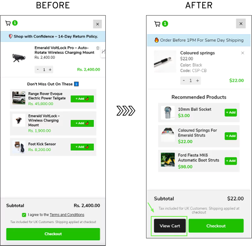
Emerald Struts, a UK brand selling automatic boot struts, had a problem at the last step. Shoppers who were ready to check out couldn't reliably find their way into the cart.
The access was there; it just wasn't visible enough to act on, so buyers who had already decided stalled hunting for the next step, and some left instead.
The fix stayed small. Rather than rebuilding the flow, Convertcart repositioned and redesigned the view-cart CTA so cart access was obvious the moment intent kicked in, instead of something shoppers had to search for.
This experiment increased conversions by 10.75%.
Key takeaway for your store: At this stage, the shopper isn't weighing price or trust anymore; they're trying to move forward. If the path to checkout takes even a second too long to find, that hesitation alone can lose a buyer who was otherwise done deciding. The fix usually isn't more persuasion; it's removing the half-second of "wait, where do I click?"
The cart CTA fix was one of five changes we tested for Emerald Struts, including one that improved a single campaign by nearly 40%. Read the full Emerald Struts case study.
Now you've cleared the big ones: intent, cost, trust, and the checkout friction that trips most stores.
The shoppers still dropping off got past all of it.
They wanted the product, accepted the price, trusted you, made it through checkout, and still didn't finish.
Layer 5 is about that last group, and the small gaps that fail them at the final step.
Layer 5: Checkout Optimization Gaps
“The store failed to help shoppers complete the purchase.”
17. Lack of Payment Options
On checkout pages, if shoppers don’t see multiple payment options, then it can significantly impact your revenue.
How to improve your add-to-cart to checkout conversion rate:
Provide alternatives such as credit cards, PayPal, or installment payments to accommodate window shoppers and make the checkout process more convenient for them.
Also, enable one-click checkout so shoppers can purchase without adding information.
18. Lack of Cross-Selling Opportunities
To minimize distractions and streamline the checkout process, eCommerce stores should prioritize conversion-focused elements on the checkout page.
It can include elements like order summary and payment options, as well as cross-selling opportunities.
How to improve your add-to-cart to checkout conversion rate:
Leverage customer data and browsing behavior to deliver personalized cross-selling recommendations tailored to each customer.
You can also present bundle discounts or package deals on the checkout page, where customers can save money by purchasing multiple related products together.





.avif)
.svg)


.svg)

.svg)
.svg)
