When designing product pages, the biggest challenge is how to make shoppers take action.
In other words, make shoppers click the add to cart button.
Many factors contribute to improving add to cart button clicks.
Let’s dive in.
14 Ideas on How to Design High-Converting Add to Cart Buttons
1. Create unique value propositions
Apart from the add to cart button, Amazon famously has a ‘Buy Now’ button.
This works for Amazon, as they promise fast deliveries if the product is purchased during the offered limited time.
Similarly, you can feature different USPs to support your add to cart button.
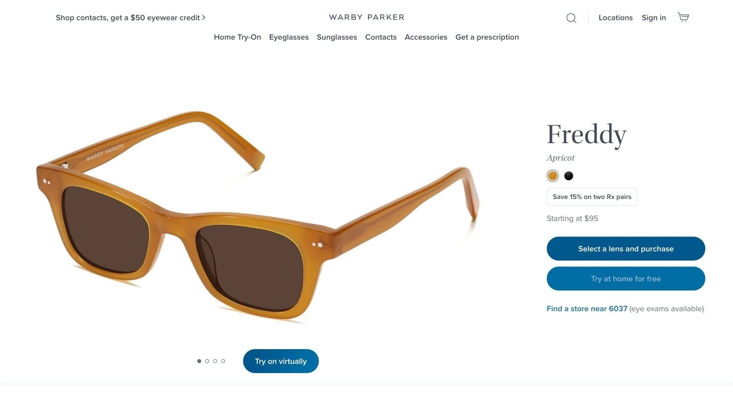
See how Warby Parker outlines a discount and a ‘try at home for free’ USP/
2. Use visual cues to attract attention to add-to-cart
92.6% of customers opine that visuals and imagery are the numero uno factor influencing purchase decisions.
On a product page, visual cues are signals such as symbols, techniques, nudges, and colors that influence where shoppers should look.
Here’s a visual cue for sizing right above the add to cart button used by Lush:
We love how when the size is selected, the price on the add-to-bag button changes accordingly.
3. Create urgency to fasten add-to-cart clicks
Urgency can make any shopper consider a product twice.
Real-time updates are great urgency tactics to support an add to cart button.
See how Etsy does it with product stock alerts by showing how many are left and :
4. Place your add to cart button where shoppers expect it
It’s important to place add to cart buttons where people can easily find them.
On desktop product pages:
✔️ Always place the add to cart button above the fold, usually under or next to the product description.
✔️ Design buttons with rounded corners Compared to buttons with sharper edges, buttons with rounded corners create a softening effect to display more text elements.
On mobile product pages:
✔️ Apply a sticky add to cart button. Even as the shopper scrolls the page, the add to cart button is always accessible.
✔️ Place the add to cart button in the ‘thumb zone’ so it’s easy to click.
✔️ Make sure the font size on the add to cart button is legible on a mobile screen.
5. Arouse curiosity with different add to cart button text
Experiment with add to cart button text to suggest exclusivity, imply scarcity, and gauge demand.
You can also relate to your brand’s voice. We love how 100% Pure uses ‘Add to tote’ that might attract more attention than a generic ‘add to cart’.
Some add to cart button text alternatives:
Add to basket
Add to my bag
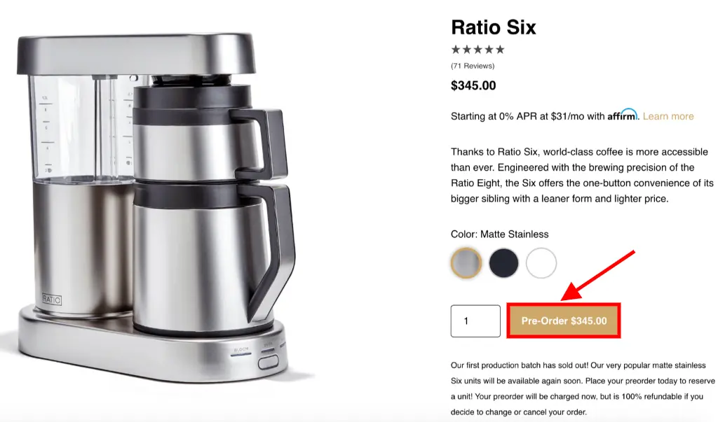
Some add to cart button text examples for early orders:
Pre-order now
Join a waitlist
Add to wishlist
If you have products available in brick and mortar:
Find in-store
Click and Collect
6. Use numbers to make an impact
Numbers trigger different emotions in a shopper’s mind.
In the example below, see how the price is displayed on the add to cart button:
7. Design with rounded edges
A study shows that rounded edges are more pleasing to the eye and more likely to draw a shopper’s attention.
Rounding the edges of an add to cart button might seem like a small tweak, but it can increase the add to cart button clicks.
8. Automate button changes for out-of-stock items
When products go out of stock, automate the add to cart button color fade.
Although this will technically not improve the add-to-cart rate, it’s important from a user experience perspective.
9. Apply upselling strategies to increase AOV
According to a study, upselling drives an average of over 4% of sales for an eCommerce business.
While most stores upsell in a different section, you can choose to do things differently.
See how Harry’s has outlined upselling tactics right above the add to cart button:
We love how they have also used the color red to their advantage.
Apart from the add to cart button, the color red is used to highlight prices and savings which contribute to a better order value.
10. Easy payment options add to cart button
Multiple payment options can make it convenient for any shopper to checkout.
So use it to your advantage to get more add-to-cart clicks.
See how Tala offers not one, but two easy payment options with Shop Pay and Klarna:
11. Display social proof to support the add to cart button
Showing social proof with the add to cart button can nudge a shopper to make a purchase.
You can show a review or star ratings to summarize the product’s usability and popularity.
See how Acure highlights the reviews through star ratings and a supportive text that says ‘100% respondents would recommend this to a friend’.
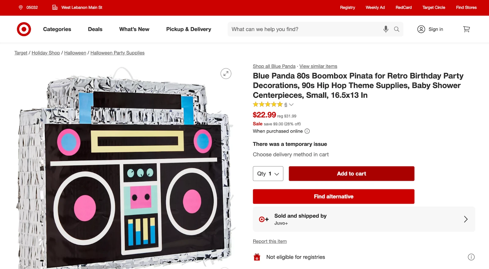
12. Consider a button hover effect
The hover effect is an upgraded version of a ghost button.
Responsive buttons, especially those that change colors or move when you hover over them can draw more attention to your add to cart button.
Hover effects can tell a shopper that the button is usable and will take them to the next step in the buying process when clicked.
See how Target's add to cart buttons turn a darker shade of red when you hover over it.
It's a subtle change that makes their product pages feel more engaging and interactive and makes their buttons feel more clickable.
13. Tappable design for multiple product options
If a product has many variants, we have noticed stores recommending them under a different section.
Instead, anchoring all the variants on the same product page can make it easy for shoppers to select and click on the add to cart button faster.
For instance, see how Allbirds displays the price on the add to cart button which changes with variant type.
14. Regularly test for usability
The add to cart button needs to stand out from the rest of the product page.
Make sure it’s easy to find in under 5 seconds.
The best way to find out what resonates with your users is by testing different versions of your add to cart button and getting data on what performs well.
You can then iterate on your add to cart button to create more effective versions.
When A/B testing your add to cart buttons, remember to only change one element of your add to cart button at a time.
If you have multiple elements that are different between version A and version B, you won’t be able to know which element resulted in the change in performance.
What color should my add to cart button be?
While many eCommerce stores ask us the best color for add to cart buttons, no single color is better than another. What matters is how much a button color contrasts with the area around it.
Here are a few reasons why the color of the add to cart button is important:
Color is a powerful visual cue that can help to grab attention and signal to users that they can take action.
Influence emotions and create a sense of urgency. For example, red is often associated with excitement and passion, while green is often associated with safety and trust.
Consider the overall design of your website or landing page to choose the color of your add-to-cart.
Most eCommerce stores use red for their add to cart button. A study has proven that a red add to cart button resulted in a 21% increase in conversions compared to a green button.
However, it’s important to choose an add to cart button that works for your brand.
Start with a color that complements your brand color. A contrasting color will make it pop off the page and instantly attract attention.
Furthermore, test the different colors to see which one performs the best for your specific website or landing page.
Remember: Many studies online suggest a certain color always converts the better. But, more often than not, these studies show previously that either there was no add to cart button, or the button was not as prominent. The positive results are due to a high-contrast color on the add to cart button, than any single color.
BONUS: FAQs on add to cart button
1. What is an add to cart button?
An add to cart button is a clickable button on an eCommerce store.
When a customer clicks on the add to cart button, the product is added to their cart, and the customer is taken to the checkout page.
2. What makes a great add to cart button?
Here’s what makes a great add to cart button:
Visible and easy to find: The button should be prominently displayed on the product page, and it should be clear what action it will take when clicked.
Convenient to use: The add to cart button should be easy to click, and not require the shopper to fill out any additional information before adding the product to their cart.
Persuasive: The add to cart button should have clear and concise language that encourages the shopper to add the product to their cart.
Trustworthy: The button should be secure and reliable, and it should give the shopper confidence that their purchase will be processed smoothly.
Measurable: The add to cart button should be trackable so that you can see how many people are clicking on it and how many are adding products to their carts.
3. Why does your add to cart button matter?
The add to cart button is a critical part of the checkout process.
It is the final step before a customer purchases a product, and it is important to make sure that it is easy to find and use.
A well-designed add to cart button can increase conversions and help businesses sell more products.
Before you go...
98% of visitors who visit an eCommerce site—drop off without buying anything.
Why: User experience issues that cause friction for visitors.
And this is the problem ConvertCart solves.
We've helped 500+ eCommerce stores (in the US) improve user experience—and 2X their conversions.
How can we help you:
Our conversion experts can audit your site—identify UX issues, and suggest changes to improve conversions.
Subscribe for more articles like this!
Thank you - we'll see you in your inbox soon!
Oops! Something went wrong while submitting the form.
Read by 5000+ ecommerce store owners
Subscribe for more articles like this!
Thank you - we'll see you in your inbox soon!
Oops! Something went wrong while submitting the form.


.avif)
.svg)

.svg)

.svg)
.svg)
