Conversion Rate Optimization Ideas For Online Sports Stores
HOMEPAGE
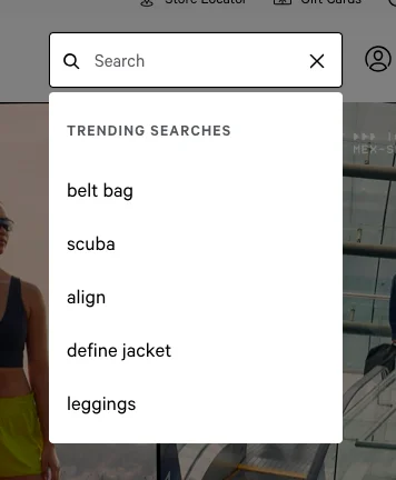
1. Use “trending searches” to drive product discovery
If someone decides to search, give them a gentle nudge to actually check out something.
eCommerce technical apparel brand Lululemon does this effectively—even before a shopper has begun typing:
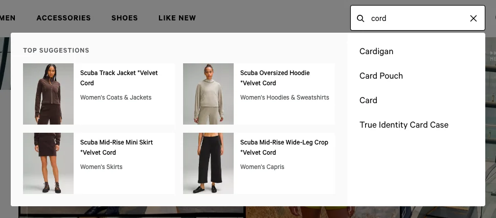
If that’s not enough, when a shopper does key in a word or phrase, product suggestions come up along with relevant accompanying visuals:
Key Takeaway 💡
Use a short list—up to 6—trending search terms even before the shopper has begun typing—this is especially helpful for shoppers who’re still discovering your brand.
2. Make it more compelling to visit your category pages
Though your category pages might showcase some great products, shoppers may still think it’s too much hassle to visit them individually.
This is why it helps to create a theme that can club multiple categories for showcase on the homepage—create a theme based on:
✅ Exercise type
✅ Fitness concern
✅ Audience-specific discount event (let’s say you’re celebrating Labor Day)
✅ Color
✅ Season
✅ Gifting
✅ Flash sale
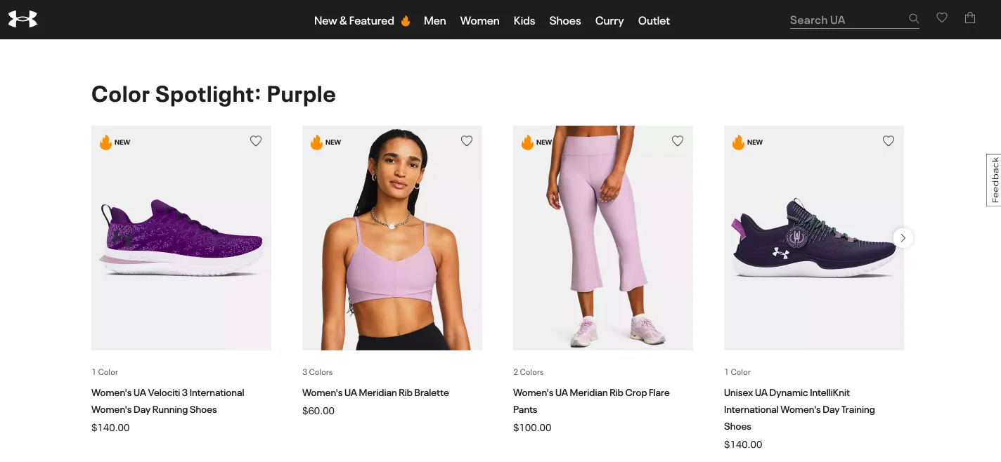
eCommerce sporting brand Under Armour features products across categories under a single theme as one of the conversion optimization ideas for online sporting goods stores:
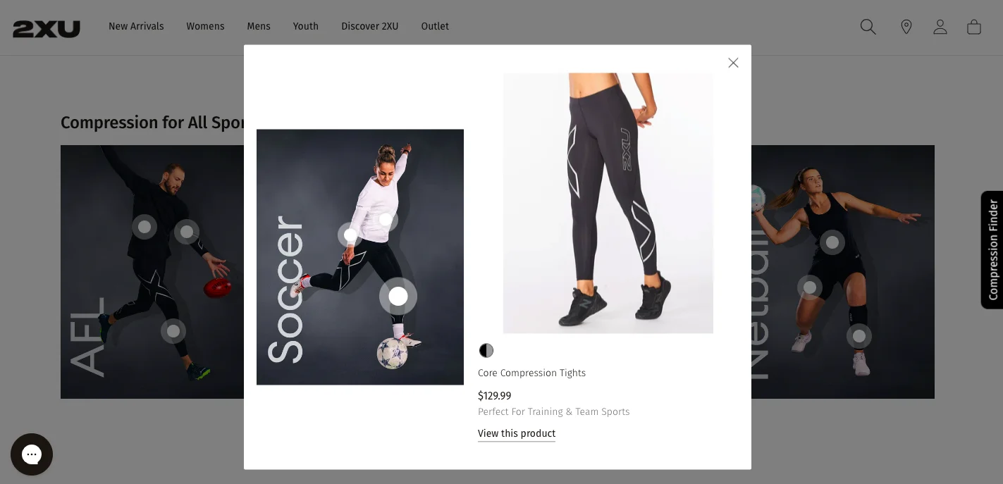
You could also follow the example of 2XU—they feature clickable category images on the homepage, but also show hotspots that will make the products jump out:
If this isn’t possible, you can even do what Red Equipment does: ramp up your blogs to feature great content, right inside your navigation, and link them to your category pages:
Key Takeaway 💡
Use compelling category page nudges on your homepage for shoppers to want to explore more—feature categories based on a theme, make them stand out in your content, or even make your showcase images shoppable.
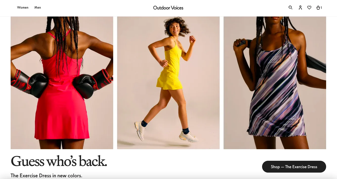
3. Make your hero products stand out
Your hero products may just be 20% of your products, but they generate 80% of your revenue or even more.
And this is why, if you’re running an eCommerce sports goods brand, you need to amp up their presence on the homepage.
✅ Outdoor Voices highlights the “comeback” of their exercise dress, which is versatile and simple, in the first fold itself:
✅ Athleta uses a short GIF and a great product description to bring out the UVP of the product:
Other ways to position your hero products?
✅ Call them “Must Haves”
✅ Feature a separate section on “Top Buys This Month”
Key Takeaway 💡
Ideally, use the first fold to draw attention to your hero product(s)—use powerful copy and images to create interest and anticipation.
4. Offer choice competitors don’t
It’s easy to think your sports store USP will do your heavy lifting against competitors.
Wrong.
You’ve got to create experiences that no one else (or very few) is creating in the space—this includes:
✅ Being able to create their own bundle on the homepage itself
✅ Getting a discount on creating a kit with products across categories
✅ Receiving access to exclusive product drops from time to time
✅ Being able to exchange worn out sports equipment for new ones
Women’s performance wear brand Sweaty Betty, for example, allows shoppers to build a set and get a flat 30% discount:
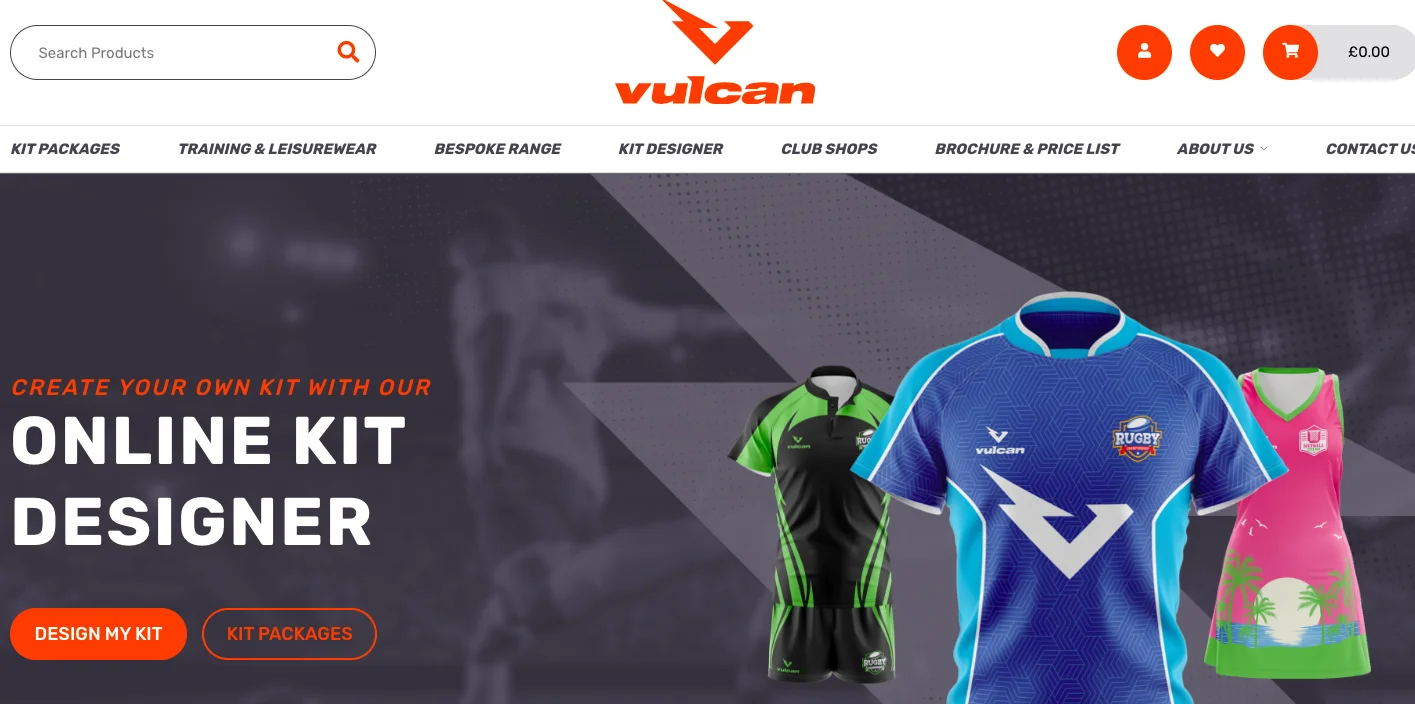
Vulcan Sports, on the other hand, enables shoppers to design their own kit apart from featuring pre-decided kit packages:
Key Takeaway 💡
Make an interesting action possible on your homepage, something that gives shoppers the “power of choice”—be it taking a quiz funnel or creating a bundle of their choice.
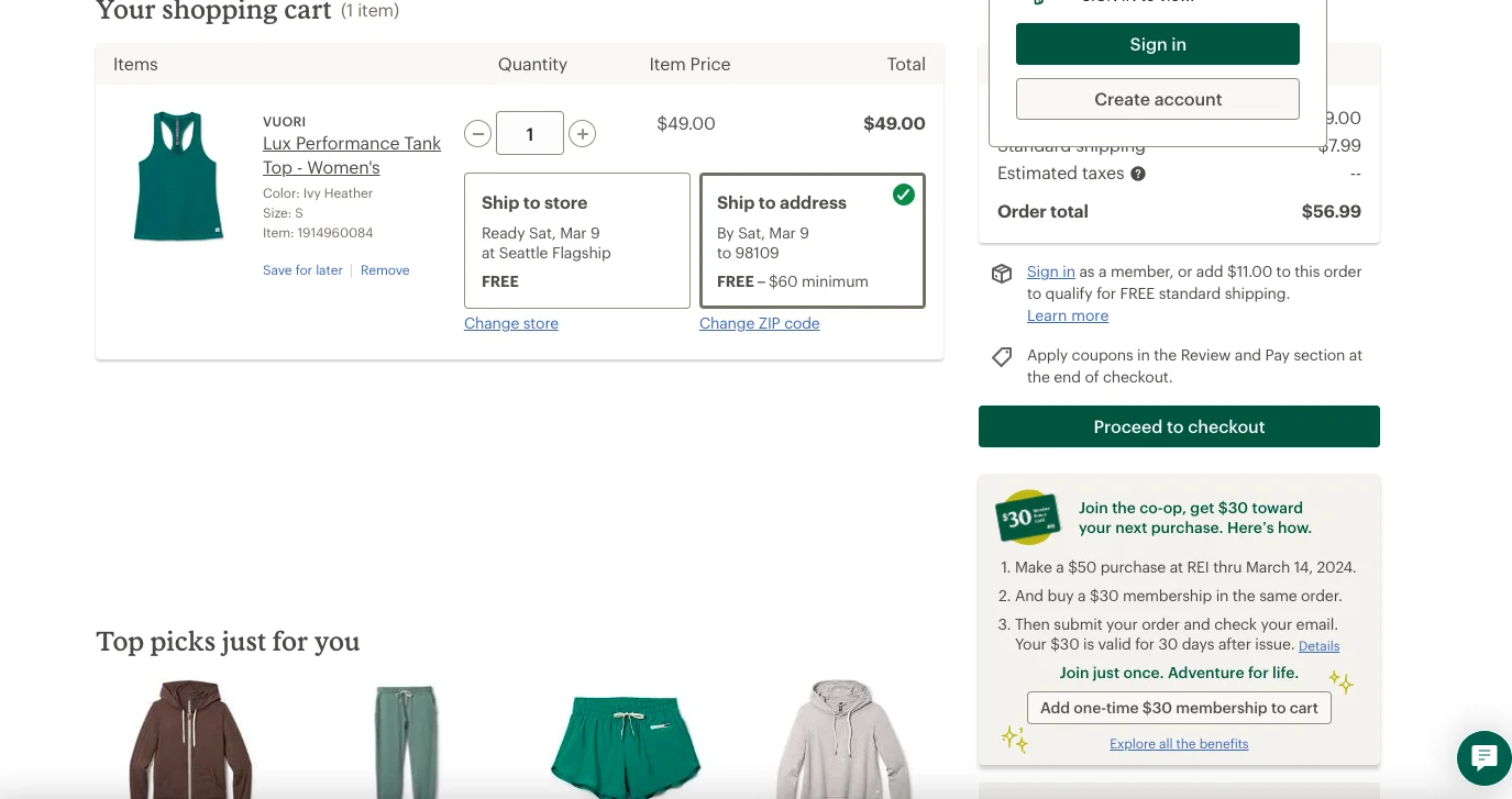
5. Actively promote your membership program
Interestingly, we’ve noticed many sports eCommerce stores retain membership program info for later on the product page, or even the cart or checkout. Bad idea.
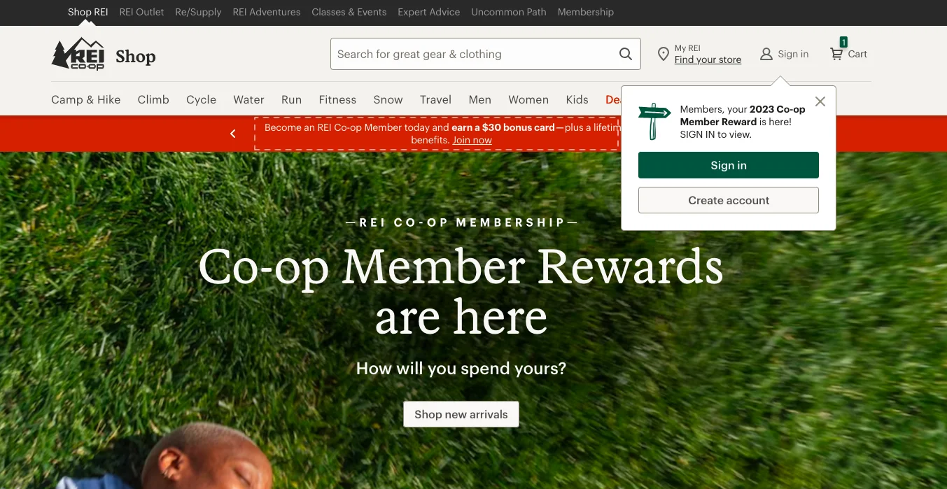
Do instead what REI does with their numerous loyalty program nudges on the homepage:
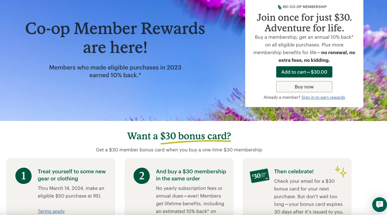
What’s even better, REI also features a separate detailed page on their membership program:
Key Takeaway 💡
Offer interesting (and non-annoying) membership nudges to take shoppers towards longer & more fruitful engagement—ensure you highlight the biggest benefit involved.
6. Drive sales through “shop the look” nudges
Product listings work because they’re effective—but in an overcrowded sports eCommerce space, you’ll have to think beyond listings on the homepage for conversions.
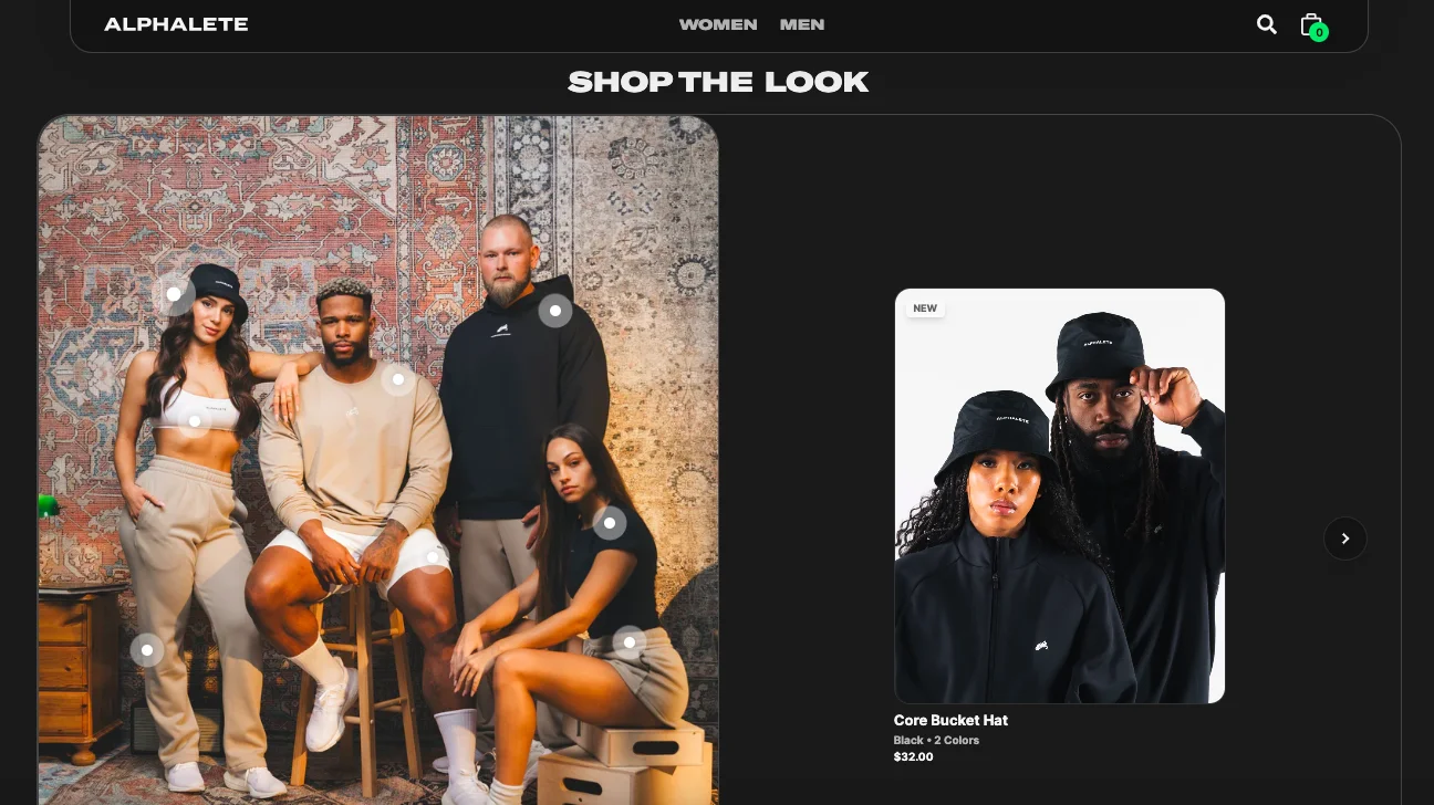
One such way is to feature a “shop the look” nudge, which creates an awesome way for shoppers to visualize how different products look together—Alphalete does just this to spike their sporting store conversion rate:
Another great way to do this: feature the best UGC looks wall and make the images shoppable as one of the conversion optimization ideas for online sporting goods stores.
Key Takeaway 💡
A “shop the look” section right below your first fold helps shoppers visualize how your products come together in real life—instead of featuring multiple images, use one image with multiple models carrying off your products.
7. Feature a separate “Sale” category in the main menu
We’ve noticed many eCommerce sports brands feature their sale discount information on notification bars.
But the truth is, if you consider the average customer, they’re not usually noticing these fast-changing highlights or updates above the main navigation.
The way out of this problem is to feature “SALE” as a separate category altogether in the navigation—just like activewear brand Bandier does:
Golf apparel brand Bad Birdie also uses this best practice:
Key Takeaway 💡
Feature “Sale” as a category in your main navigation—to draw attention to it, color code it differently than the other categories featured.
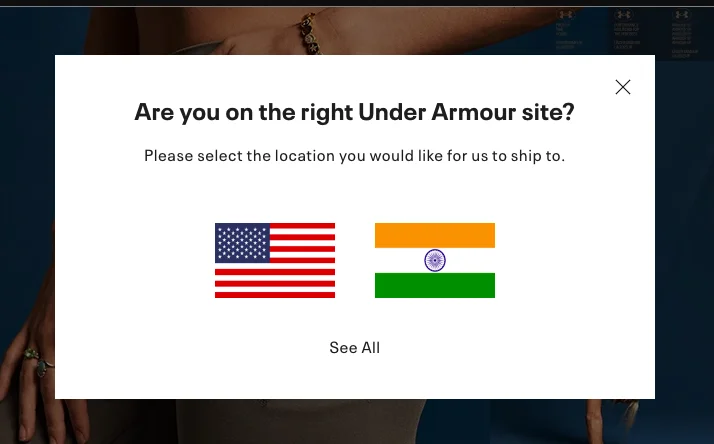
8. Use geolocation to show more precise content
Activating geolocation capabilities in your sports goods eCommerce store has multiple advantages—from being able to serve up content in different languages to showing up recommendations based on weather or cultural preferences.
Check out what Under Armour does as soon as a shopper lands on their site:
Key Takeaway 💡
Feature your geolocation prompt 2 to 3 seconds after a shopper arrives at your site—you can either show a pop-up or use a dialog box that is triggered of on the notification bar at the top of the page.
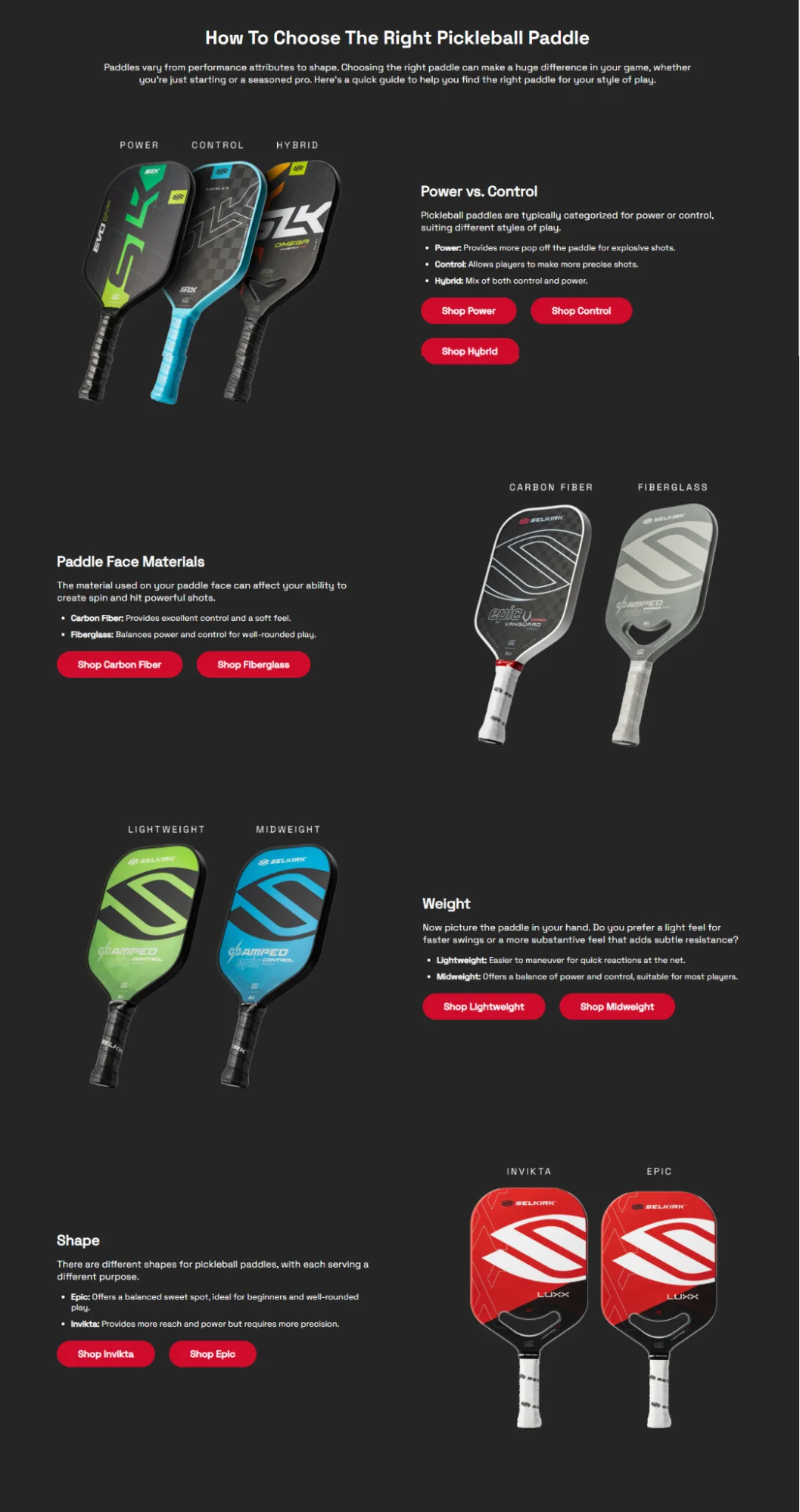
9. Add "How To" content to your key pages
Someone who's just discovered your paddle range won't be able to tell which one is right for them. The way out?
Easy: Show ‘how to pick’ sections on your homepage, category, and product pages – here's how:
✅ Feature maintenance tips (like “how to maintain your equipment”) or reviews and tests (like “wood vs. alloy for baseball bats”)
Here's a perfect example of this conversion strategy from Sell Kirk, a sports eCommerce store – they curate a section called ‘how to pick the right pickleball paddle’ on their homepage:
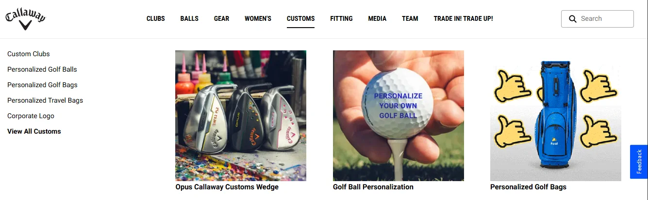
10. Help shoppers customize their merch
Give shoppers the experience of being a star: having their own name on a jersey.
Throw in a discount, on top of that, and you’ll see your sporting goods store converting traffic into sales.
Callaway, a golf eCommerce store, does this – right off the bat, they feature a “customs” product category in their navigation, so shoppers can shop personalized gear:
They even throw in a ‘corporate logo’ option, which opens them for bulk orders.
Use this strategy to add a “bulk order for your team” banner near the end of your homepage (or in your notification bar) – link it to a landing page that highlights ready-to-order options like:
✅ Custom merch for corporate team-building
✅ Custom-branded gear for youth leagues and merch for local tournaments
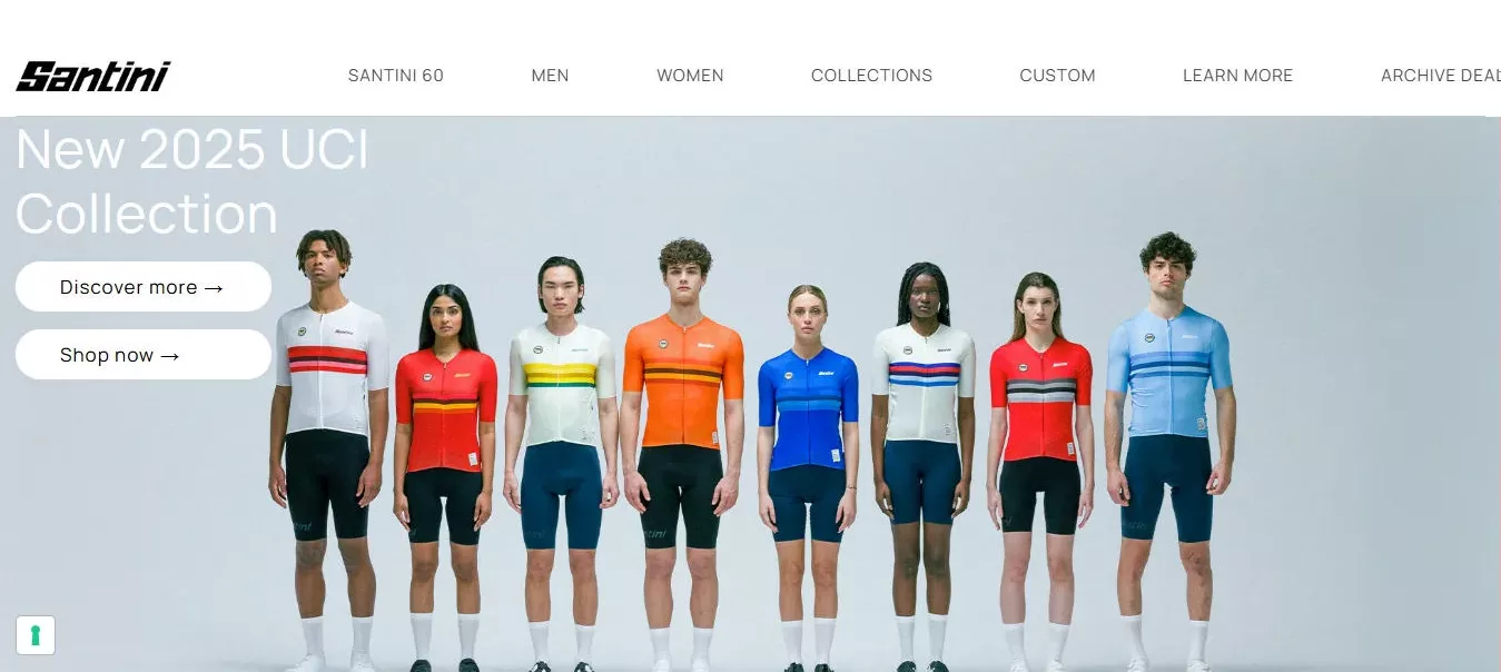
11. Keep promotions around sports events—near the top of the fold
Already selling F1 merch collections before the race season or marathon prep gear before major city races? Great. Do shoppers know about it, the moment they arrive on the homepage? Probably not.
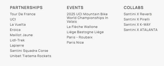
What you can do is: take inspiration from how eCommerce sports brand, Santini, shows their 2025 UCI mountain bike championship collection as a banner on their homepage:
And they don't end there, they show it in the navigation menu as well:
Note how they have multiple collections available to show not only collaborations, but also real-world events they'll be sponsoring.
Key Takeaway 💡
If you’re backing big events, don’t bury it – promote loudly, right from the homepage. Make sure your seasonal merch, timely promos are visible across your store as well, so shoppers can jump on the trend. 🤩
CATEGORY PAGE
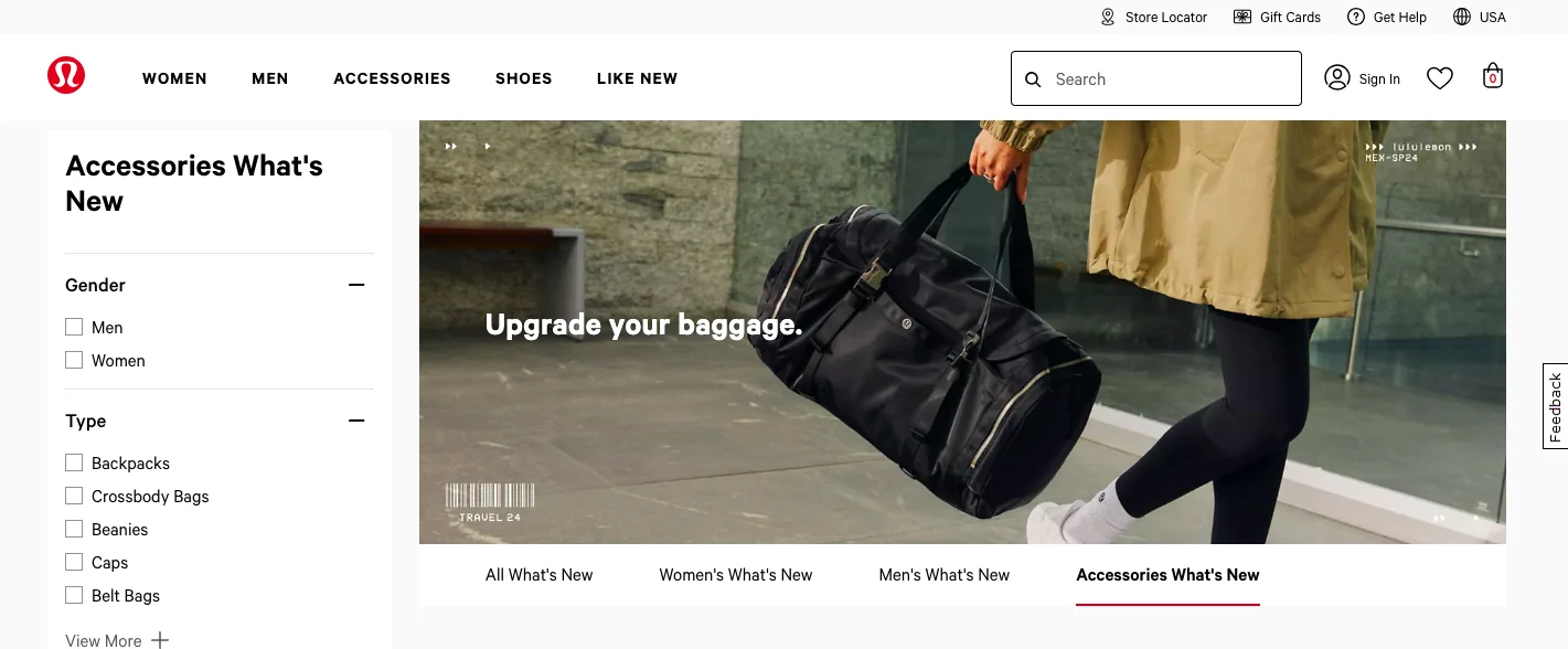
12. Create a separate category page for what’s “new”
While labeling your product images with “new” is just fine, your conversion game will change when you introduce a completely separate category page with that label.
The idea is to make this page category-agnostic and feature everything that comes “new” into your store.
This is exactly what Lululemon does with great effect:
Key Takeaway 💡
Ensure the “new” category page comes with effective filters like type of product, type of use, gender, look etc. to make navigation easier.
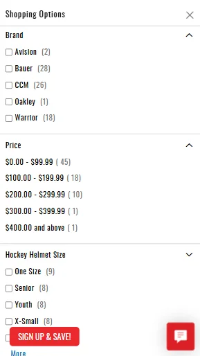
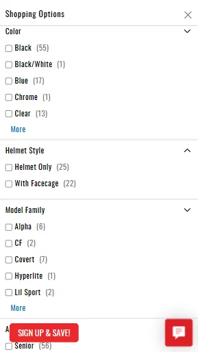
13. Make your filtering system top-notch
When you’re exploring conversion optimization ideas for online sporting goods stores, focus on your category page filtering system.
Using filtering that brings in many more nuances for a category type drives better conversions—that’s exactly what sports goods brand Hockey Monkey does to ensure a wider audience gets their needs met:
Key Takeaway 💡
Run your filtering system on one side of the page—preferably on the left—instead of the top to help shoppers make real-time changes to their preferences as they scroll.
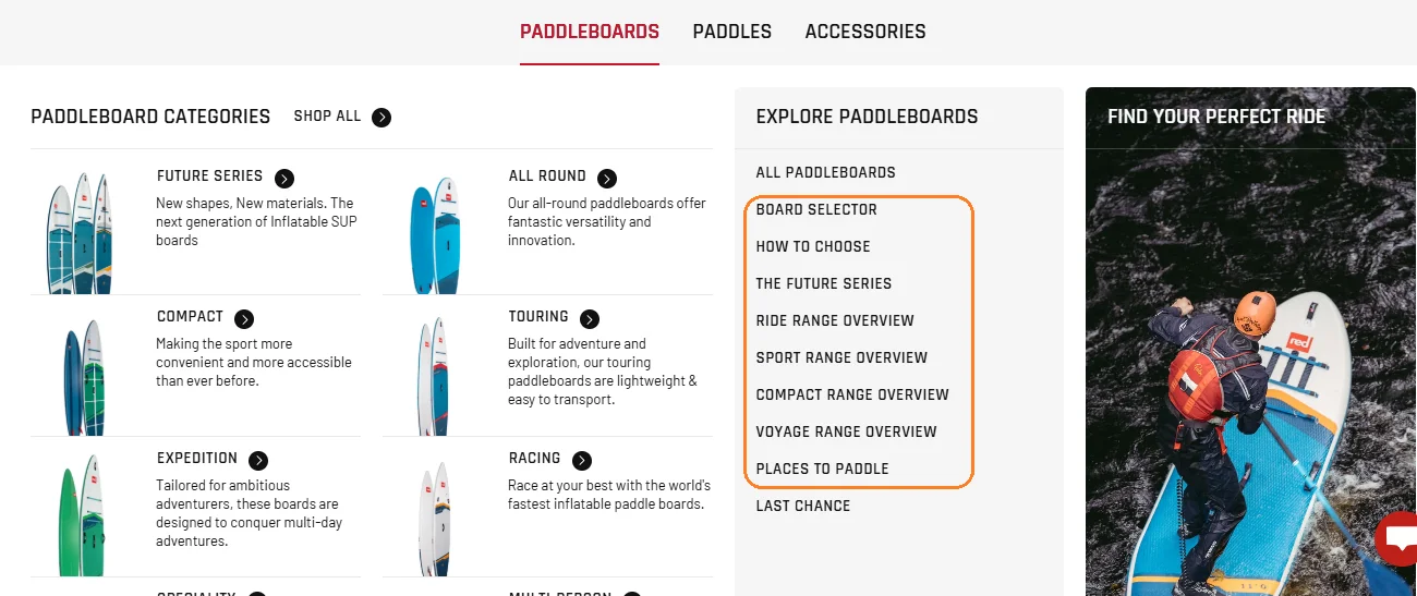
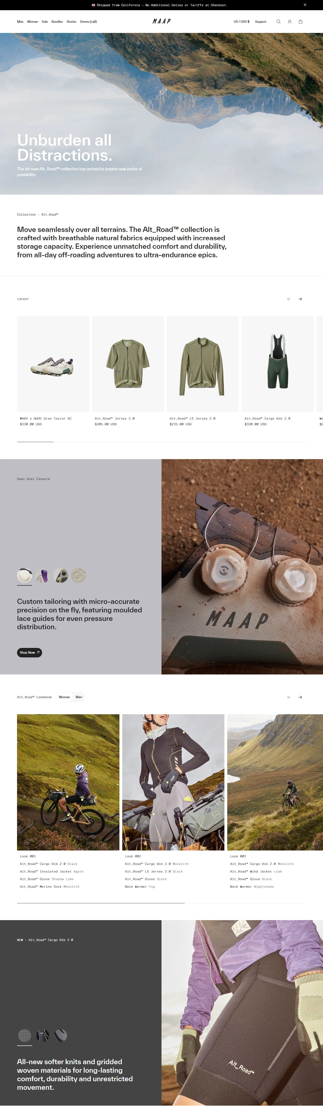
14. Leverage an “intermediary” category page
Since most eCommerce sports stores have a variety of products across categories, using an intermediary category page works well for conversions.
It is basically a category landing page that offers a glance at all the categories, sub-categories and any associated links to blogs and guides.
Intermediary category pages are especially helpful for converting shoppers at the top of the funnel.
Here’s how eCommerce sporting goods brand Maap features one—under this they cover their core franchise categories as well as those that are limited edition:
Key Takeaway 💡
Make your sub-category page feature all the different collections of products you feature through themes like core brands, brand collabs etc.
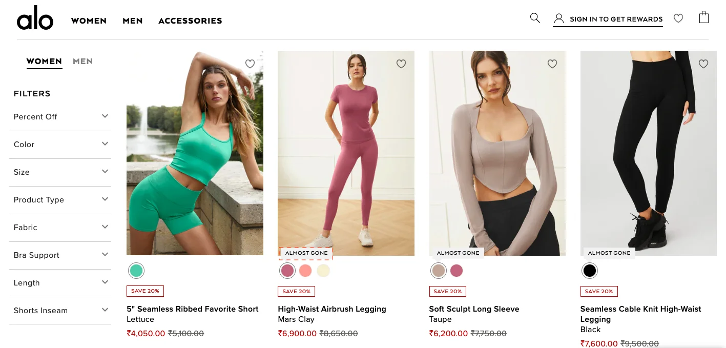
15. Highlight bestsellers with urgency labels
Many eCommerce sporting goods brands have been using “limited time” as a label for a while now.
And maybe that’s why it’s important for you to take the urgency game a notch further—qualify the level of urgency to improve your conversions.
Here are a few urgency labels that can work wonders:
✅ Never back again
✅ Almost gone
✅ Stocks super low
✅ Last chance
eCommerce athleisure brand Alo Yoga uses “almost gone” as an urgency label:
Key Takeaway 💡
To make the most of your category page urgency labels, scatter them across the page—too many in one row may not have the intended effect on the shopper.
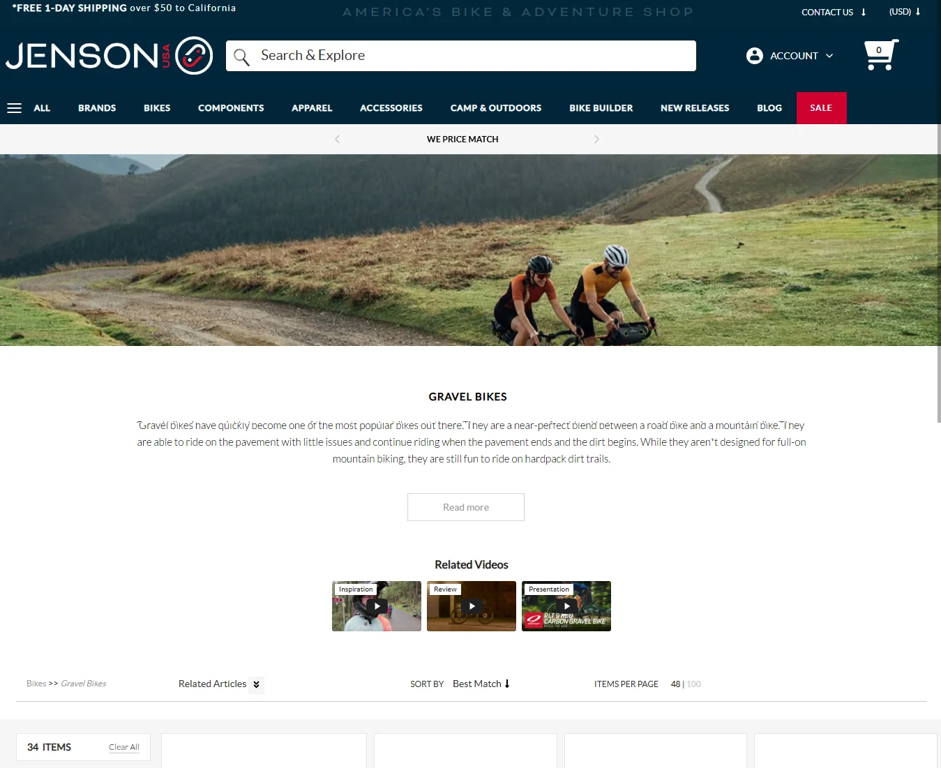
16. “Visualize” the whole category above the fold
In a time-strapped world, it’s difficult to anticipate if most shoppers will explore a category page fully.
To improve engagement and increase conversions in the process, offer a visual glimpse of what kind of products the category features.
That’s exactly what Jenson USA does—and this incites the curiosity of shoppers to keep scrolling & exploring:
Key Takeaway 💡
For the visual snapshot at the top of the category page, consider representing your bestsellers to create better recall.
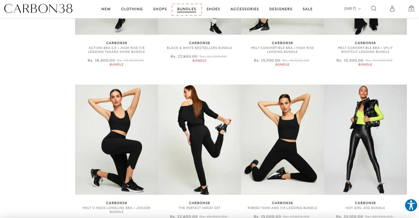
17. Feature a standalone “bundles” category page
While bundling can be a major marketing strategy for most sports goods stores in eCommerce, many make the mistake of hiding them away under larger categories.
And then the inevitable happens: the onus falls on the shopper to notice them, consider them, and then add to cart.
A faster, more seamless way of doing this is to create a standalone bundles category page where you feature every possible bundle combination your store features—for lesser confusion, you can create separate themes within the page and club them together in a relevant way.
Athleisure brand Carbon38 features all their bundles in a separate category page and even clearly labels them with “bundle”:
Key Takeaway 💡
Feature “bundles” as a separate category in your main navigation—for better impact, some stores go for “bundle & save” to trigger more clicks.
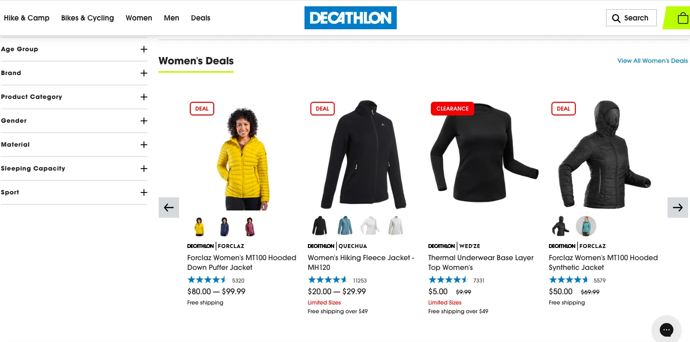
18. Colorblock “clearance” items distinctly
Many eCommerce sports stores make the mistake of clubbing fast moving and slow moving products under “SALE”—this prevents shoppers from considering the former more urgently, and they skip converting.
What eCommerce brand Decathlon does is ideal: they create a color code differentiation for what’s a “deal” and what’s a “clearance” item:
Key Takeaway 💡
Make your clearance items stand out through a label that either screams for attention (like “LAST CALL”) or use a color that shoppers won’t be able to ignore.
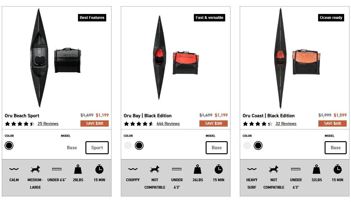
19. Reduce choice paralysis
Sports goods have this capacity to create choice paralysis, especially because it's hard to make out the subtle differences when there are about a hundred variants of the same product category.
How to solve it:
✅ Show different product colors on listing images (so they all don't look the same)
✅ Feature badges with varying copies
✅ Call out skill levels, product USPs, and other features visually
✅ Don't show extremely similar products side-by-side
eCommerce sporting goods store, Oru Kayak, shows a perfect example of this in action – note how all three kayaks in a row are different from each other – colors, badges, models, and benefits wise:
20. Make comparing mobile-friendly
We’ve seen many eCommerce sports stores offer comparisons, but a shocking number of them provide a horrible UX on mobile.
Some screens scroll horizontally, images break, and worse, it’s hard to close the comparison chart.
Here are some things to keep in mind:
✅ Don't allow shoppers to select more than two products on mobile
✅ Show clean columns with ample white space
✅ Avoid horizontal scrolling
✅ Feature ready-made comparisons (term it as ‘frequently compared’)
✅ Keep a top or bottom bar sticky, so shoppers can return to the category page
✅ Feature clear ‘explore in detail' pathways
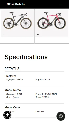
eCommerce sports goods brand Cannondale, puts this strategy into practice:
PRODUCT PAGE
21. Integrate first-time discount nudge with sticky cart
Almost every sports eCommerce store has a sale going on—and this usually makes shoppers feel less convinced even after a lower price.
After all, there’s so much choice and plenty always causes choice paralysis.
The antidote is to give them a better deal—where they find a lower price to buy the product and see a good reason to sign up to your email list.
Check out what high intensity sports brand Threo does—after the first scroll which contains the product details & primary CTA, they show up a sticky menu CTA plus a discount prompt to sign up:
Key Takeaway 💡
Combine your sticky cart and email sign-up prompt for more shoppers to join your email list & make a purchase!
22. Use clever microcopy around the CTA
In the typical sports eCommerce store scenario, businesses fuss more about headlines than about microcopy.
But it’s often what you feature in the latter, especially around the primary CTA on the product page that decides conversions.
Here are a few ideas you could explore:
✅ A BNPL payment prompt
✅ A reduced price if the shopper signs up as a member
✅ A desirable urgency nudge like “Get free shipping if you order in the next 2 hours”
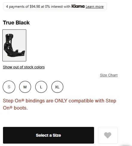
Ski gear brand Burton features microcopy below their product sizing, so shoppers know which shoes they need:
Key Takeaway 💡
Featuring compelling microcopy around the primary CTA gets more attention than when you feature it in other places on your product page.
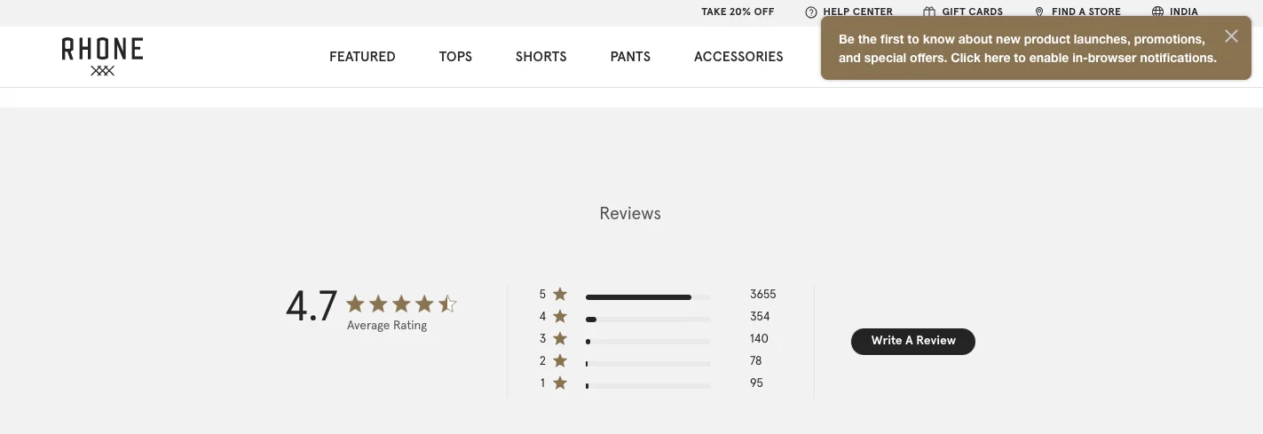
23. Feature review snapshots for quicker conversions
Feature the snapshot within the first fold itself, right beneath the product name—make it possible to hover over the star ratings and a pop-up shows the snapshot.
Make each component of it clickable, and you’ve got a highly navigable review section.
eCommerce men’s activewear brand Rhone shows this section right after the first fold as one of the conversion optimization ideas for online sporting goods stores:
Key Takeaway 💡
Use a review snapshot for shoppers to see both the average score of your reviews, as well as independently click on various star ratings.
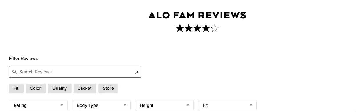
24. Use a search bar alongside review filters
The next step to making your review section highly accessible & navigable is to introduce a search bar.
This makes it easy for shoppers to key in words or phrases that they’re looking at reviews around.
This is what athleisure brand Alo Yoga does—to make it even more UX friendly, they have the most popular search terms appear as buttons right beneath:
Key Takeaway 💡
Use a search bar to make your review section more navigable—to increase the chances of being used, feature hint text that shoppers will relate to: “Type to know a fellow shopper’s opinion.”
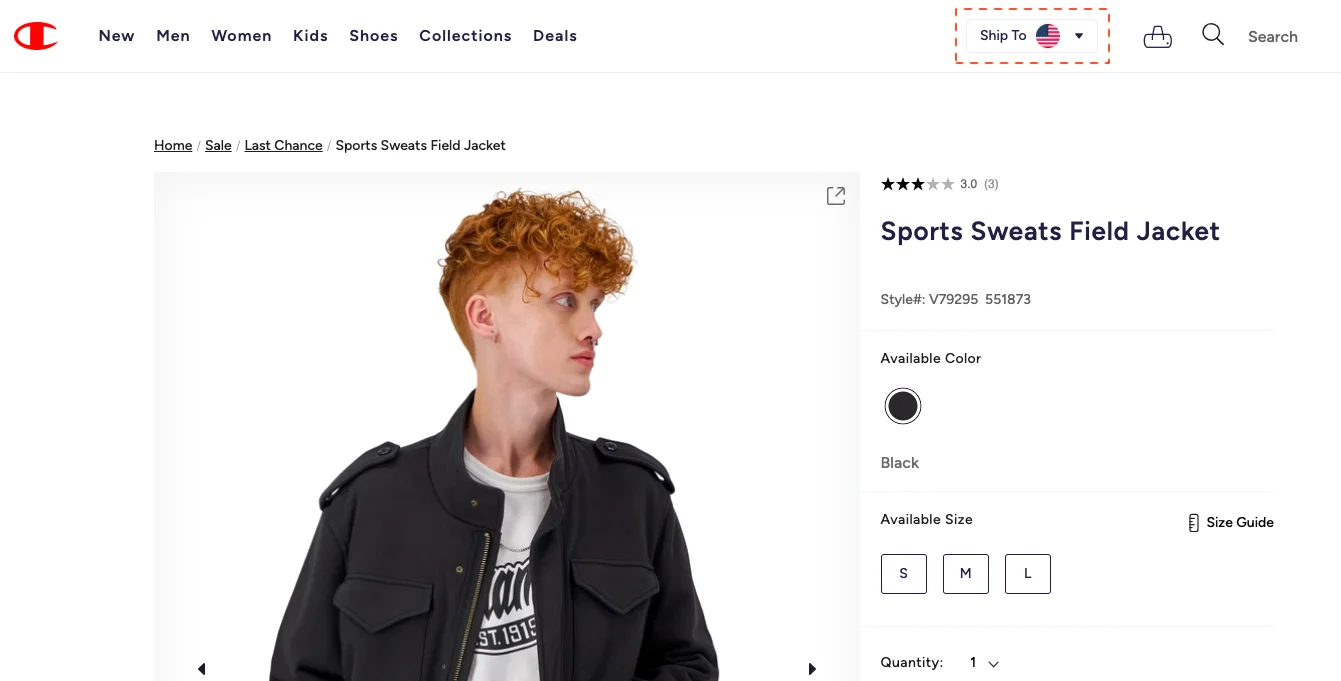
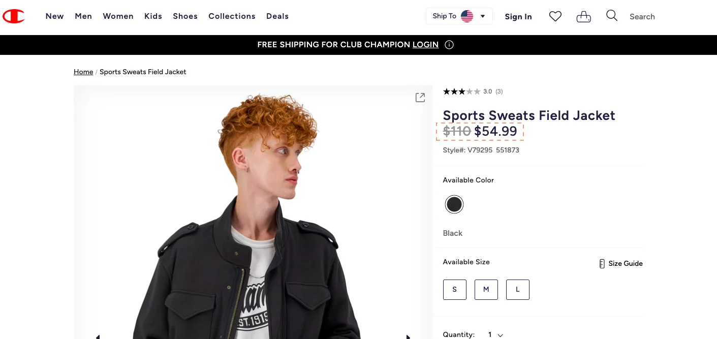
25. Show the final price on the product page (& no checkout surprises please)
The usual practice for most sports DTC eCommerce brands is to put the product price and keep the shipping calculation for later.
But what if you did it a different way? What if your total price could be calculated in one shot inclusive of the shipping cost?
That’s exactly what Champion does—they keep a “ship to” price calculator on the top bar and mention price under the product name only after the price is calculated:
Once you key in where the product is to be shipped, you can view the price like this:
Key Takeaway 💡
Make the shipping calculator highly visible—since the first fold is the first choice for obvious reasons, keep it in the main navigation or right above the CTA.
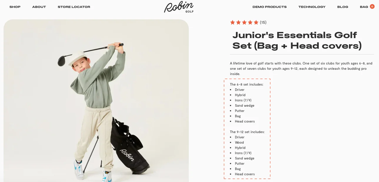
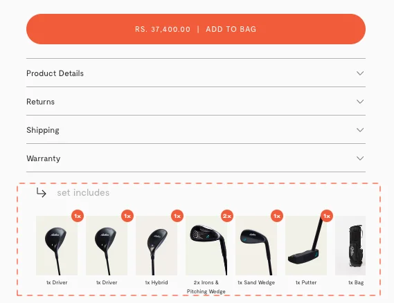
26. Specify what a bundle contains
You have to do this to create more trust on your bundle product pages—if shoppers don’t get “this bundle contains…” information, they may not convert after all.
This is what you’ll need to include:
✅ List of items, any variations of the set (if there are many, offer links that can pop out into dialog boxes)
✅ List of items the main product bundle contains
It’s a practice that golf goods store Robin Golf follows with aplomb—they not only list out what the product variations contain but also offer thumbnails of the items the present bundle contains, mentioning the number as well:
Key Takeaway 💡
Offer copy and visual cues to show what your bundled products contain—this drives quicker trust and faster decision-making in shoppers.
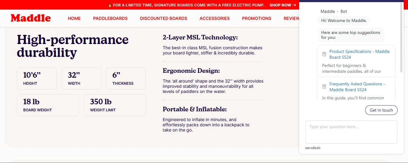
27. Feature more targeted live chat FAQ
To inspire more conversions, your sports store's live chat button has to do more.
While working on A/B testing ideas, we found the following to be effective:
✅ Focus on being exact about the time of attending to customers (for example, if it’s a holiday or outside of working hours, mention that)
✅ Feature instant post-purchase information (including tracking, managing orders & even refunds / cancellations etc.)
✅ Talk directly to the audience that’s most likely to buy from you or already forms the mass of your loyalists
✅ Show product manuals in your live chat when shoppers browse through your product page (also works for retargeting cart abandoners)
When we looked around, we discovered sports goods brand Maddleboard seems to put all the above into practice—here’s how:
Key Takeaway 💡
Make your FAQ section highly relatable to your primary TG—ask questions based on common behavior, usual discount preferences etc.
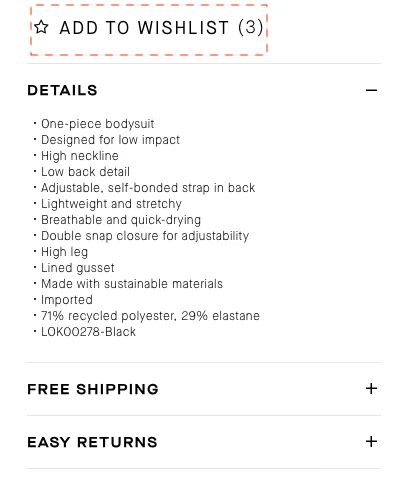
28. Show how many people have “wishlisted” or “referred”
Social proof isn’t just about how many people have already tried and tested your products—but also how many are looking to put faith in you while they decide.
This is why how many have wishlisted a product becomes a conversion-driver on any product page—something that DTC sports brand Bandier understands well:
Other ways to convey the same message:
✅ 3 people have favourite’d the (insert name of product)
✅ 20 people have added this to their cart
✅ 15 people have referred this product to family & friends
Key Takeaway 💡
Feature the prompt either below the product name, below the CTA, or bring it in as a label on your primary product image.
Pro Tip:Use the ‘add to wishlist’ feature to create an ‘add this product to your school shopping list’ option during ‘back to school’ season. This’ll help you create and feature ‘most ordered for schools’ badges, so shoppers know which products to shop for during school shopping.
29. Show off trust badges while they see the product
Many sports brands, like other eCommerce brands, make the mistake of trying to build customer trust at checkout.
Since trust is a process, farther back in the journey on the product page, becomes more effective in driving conversions.
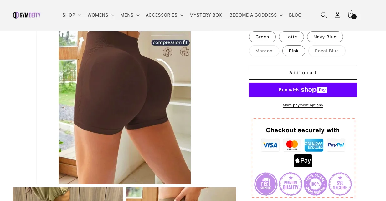
eCommerce brand Gym Deity knows this well, applying it as one of the conversion optimization ideas for online sporting goods stores:
Key Takeaway 💡
Show off your payment trust symbols in the same scroll as your CTA to trigger a quicker purchase decision.
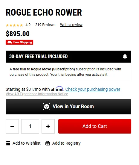
30. Offer something complimentary (and display it prominently)
Freebie t-shirts and water bottles are cool. But you know what really gets shoppers to convert? Guidance, for free.
Turns out, 1 in 5 people shop for sporting goods when they’re starting something new—think routines, habits, or hobbies.
Nudge shoppers with:
✅ A month of ‘free’ guided workouts, tailored to their sport
✅ Free gym memberships (team up with local/national chains)
✅ Arena access—skating rinks, basketball courts, you name it
✅ Free trial sessions with local coaches or trainers
Rogue Fitness runs with this idea—offering pro-led, free learning paths that feel more like a journey than a transaction:
Key Takeaway 💡
Don’t just sell gear—sell the transformation. Show up with free learning paths in your nav, homepage, and emails. That’s how you convert shoppers into loyalists in your sports store.
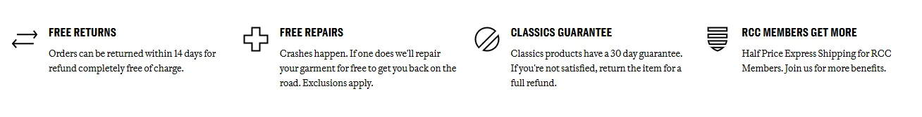
31. Let shoppers know you offer ancillary services
Let’s face it—sports gear gets used and abused. But most eCommerce sports stores stop at shipping and returns, leaving shoppers hanging when the wear and tear kicks in.
Want to stand out? Offer peace of mind right on the product page, before they even order.
✅ Free repairs or extended warranty (especially for high-ticket gear) ✅ Trade-in programs that let shoppers upgrade without guilt ✅ Easy exchanges for gear that doesn’t quite fit or perform
Sportswear brand Rapha does this right—baking in repair services directly into their product pages, so shoppers know they’re covered, long after checkout.
Key Takeaway 💡
Highlight services like repair, trade-in, or exchange at the point of purchase—it builds trust and keeps them coming back.
32. Offer same-day shipping options
Not every shopper’s buying a $1,000 road bike—sometimes, it’s just a football valve or a pair of replacement laces. Research shows nearly 8% of all sports store orders in 2024 were bought online and picked up in store.
That’s exactly why offering same-day shipping (or pick-up) for smaller, lighter items can help increase your sports store’s conversion rate.
Here’s where to focus:
✅ Spare parts and accessories ✅ Lightweight gear (gloves, paddles, water bottles, resistance bands) ✅ Replenishables (tape, energy gels, socks)
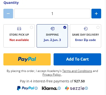
Academy Sports + Outdoors gets this right by spotlighting same-day delivery options on the product page itself:
But, that’s not the only place – they let shoppers know in their navigation too:
Key Takeaway 💡
Speed sells. Highlight same-day delivery or in-store pick-up clearly on your navigation, product, and checkout pages—especially for smaller essentials.
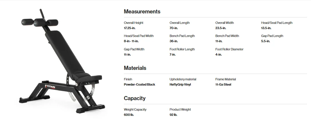
33. Make product specs visually digestible
We’ve seen many sports goods stores create pages with so much text that even a legal contract feels easy to read. Especially when it comes to product specs.
What you need is:
✅ Use short GIFs or animated images to show features in action
✅ Add 360° product views with tap-to-reveal highlights
✅ Tuck longer text into accordion dropdowns (but keep it scannable)
✅ Format measurements into clean, categorized tables
eCommerce sporting goods store, Titan Fitness, shows their product measurements in an easy-to-scan table format, with clear text hierarchy:
Got more to say? Offer a downloadable manual or product guide—or add an FAQ section to tackle pertinent questions (like “do I need anyone to install this?”).
Key Takeaway 💡
Specs shouldn’t feel like spreadsheets. Break them down visually—think scroll-stopping GIFs, expandable sections, and spec tables that even skimmers can follow.
CART PAGE
34. Feature recommendations across price points
It’s not enough that you do segmentation only when it comes to your sports store emails or the location-based content you show up across the site.
In your cart recommendations, you need to bring in variety in terms of price points to appeal to a larger audience and improve AOV in the process.
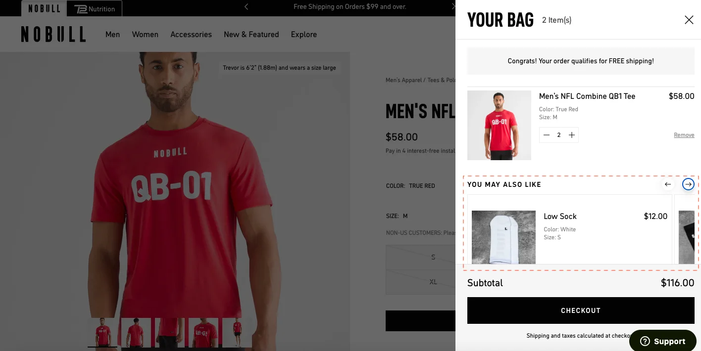
Just like athletic wear & accessories brand No Bull Project does—in this instance, though the main product is $58, the cart recommendations feature products that are as high as $159 and as low as $12:
Key Takeaway 💡
Use a combination of price points across your recommendations—to drive decision-making consider labeling one of them as “best paired with cart pick.”
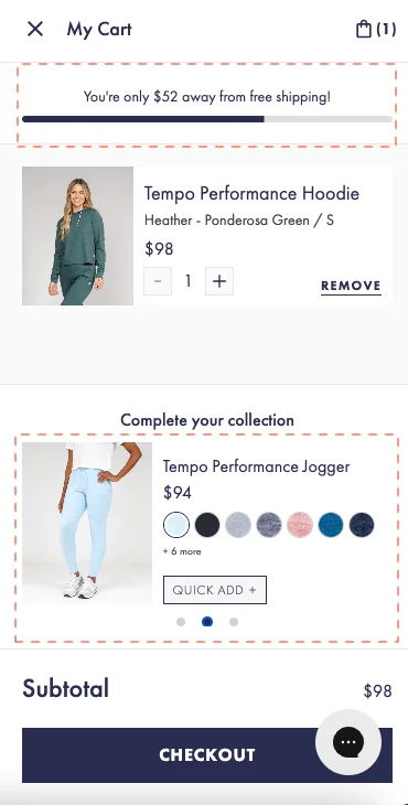
35. Feature a separate cart page to offer extra conversion nudges
Though many eCommerce DTC sports brands have moved to featuring cart drawers, to trigger conversions a separate cart page may still be best practice.
It’s simple: with more space, you can show nudges that’ll be most relevant for the shopper both for the short and long term.
That’s exactly what REI does—and reaps conversion rate dividends—notice how they just don’t talk about recommendations but also feature information about their loyalty program:
Key Takeaway 💡
Instead of a long scrolling mini cart, a separate cart page can feature your order summary, recommendations and other nudges like membership more effectively.
36. Use recommendation labels that drive action
It isn’t just price that’ll drive your shoppers to look at suggested cart recommendations a little harder.
It’s also how you label them and convince your shoppers to consider them.
Confused about what cart recommendation labels to use—here are some that we’ve seen get results:
✅ Limited edition
✅ Unisex
✅ Expert Pick
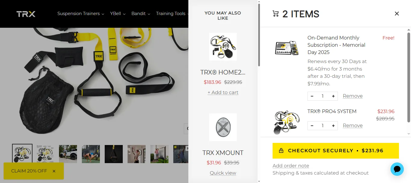
Sports equipment brand TRX Fitness does this on their cart page, just to apply this conversion optimization idea for online sporting goods stores – they highlight some of their “most relevant products to buy”:
Key Takeaway 💡
Label some of your in-cart recommendations to inspire customers to add them to cart—ensure you don’t label all though, as this can create cognitive load.
37. Help them get “free shipping” without effort
While running free audits, we’ve come across many eCommerce sports stores that show a free shipping threshold progress bar—but feature recommendations that won’t quickly help shoppers get free shipping.
It’s a tiny UX detail that can either reduce or heighten cognitive load, and you need to be careful.
Athletic wear brand Rhoback ensures their recommendations are super complementary to the main product, and the price points make free shipping instantly possible:
Key Takeaway 💡
Feature in-cart recommendations that’ll help get free shipping as soon as they add one—just make sure they’re either complementary to the main product or the best add-ons possible.
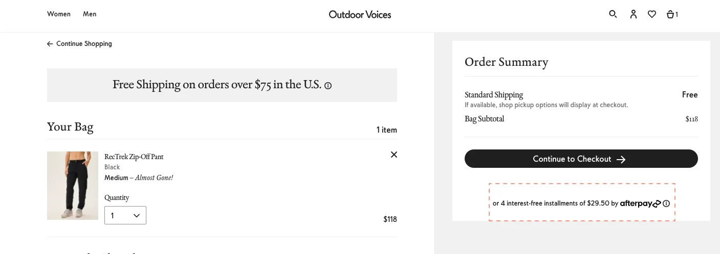
38. Use easy pay options within the order summary
Since moving your shoppers through the checkout flow is your ultimate goal, your cart page needs to show how easy paying up can be.
So, even if you’ve mentioned easy pay options on the product page, bring them back here like Outdoor Voices does—note that “afterpay” is clickable here to add to their conversion optimization ideas for online sporting goods stores:
Key Takeaway 💡
Don’t wait for the checkout to show your express pay options—one in your order summary can nudge people to proceed in the checkout flow.
CHECKOUT
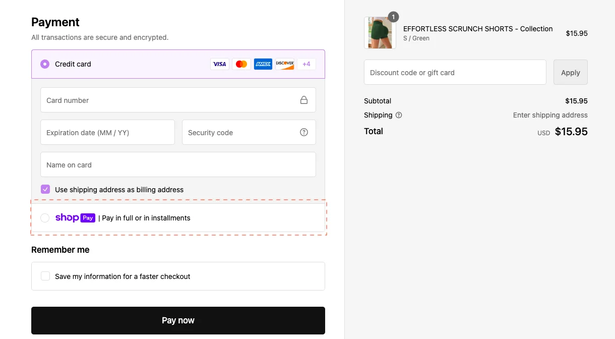
39. Offer a reminder of your most popular payment method
This is especially if your most popular payment method allows shoppers to pay in installments or in full, based on what their preference is.
Gym Deity, for example, features ShopPay as one of their express checkout options—however, they bring back the nudge as a choice against credit card payment later in the page:
Key Takeaway 💡
Feature the popular pay nudge along with a more conventional mode of payment to drive shopper choice.
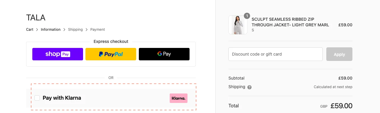
It’s awesome you have multiple express checkout options—but you have to consider that 13% still abandon their cart thinking they wish they had more payment methods.
One way out of this is to feature your BNPL payment method clearly—just like sportswear brand TALA does:
Key Takeaway 💡
Feature your BNPL nudge as early on in the checkout page as possible—you can always bring it back later in the payment flow section.
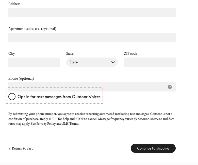
41. Make the marketing material opt-in super prominent
We all know how some brands sneakily keep the marketing material radio button auto-checked.
Terrible conversion optimization idea for online sporting goods stores, if you ask us.
Shoppers are supe diligent by this stage and if they’re buying from your sports brand especially for the first time, this isn’t something they’d appreciate.
So do what Outdoor Voices does on their checkout page:
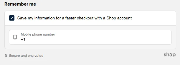
Or you can also feature an option to “Save information to create an account” – this way, shoppers don’t have to work extra to create an account:
Key Takeaway 💡
Use a different font to write this microcopy so that it does not get lost in other details—alternatively use a different color from the rest of the form field text.
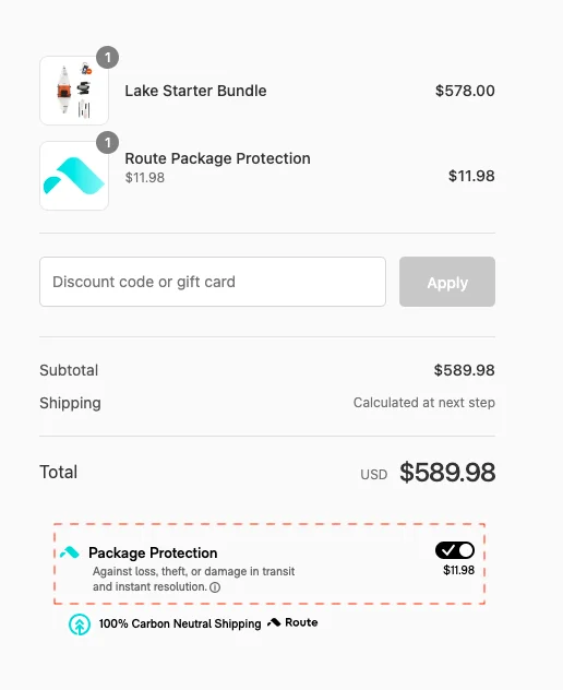
42. Offer a package protection nudge
By the time it comes to the checkout page, shoppers really want brands to state non-verbally that they care.
This is where they’re most alert about online fraud and shipping damages—so offering a package protection nudge for your more fragile sporting goods may be a great idea.
Caveat: Keep the microcopy highlighted and don’t keep the option auto-checked—this can quickly become an irritant.
Here’s an example from Oru Kayak:
Key Takeaway 💡
Don’t auto-check your package protection nudge, as this increases the total amount—if a shopper catches this, they might bounce off.
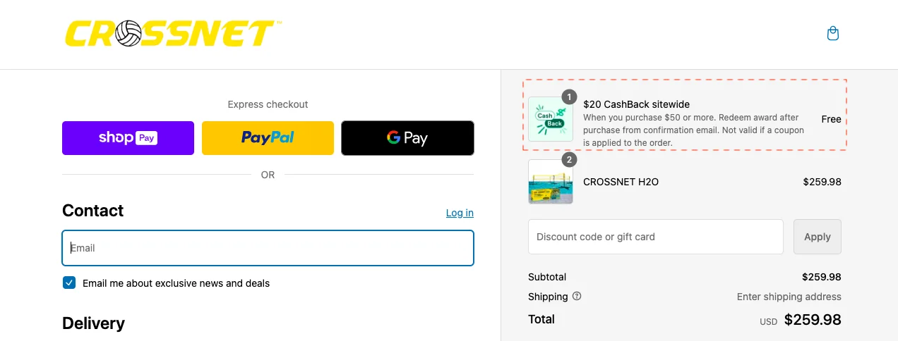
43. Automatically apply freebies
On the checkout page, the last thing you want is customers looking for a way to apply discounts or cashback possibilities.
Do it for them, highlight it, and you’ll increase the possibility of getting better conversions on your eCommerce sports store.
eCommerce brand Crossnet auto-applies freebies to reduce friction:
Key Takeaway 💡
Ensure you have some microcopy about the freebie you add, whether it’s a cashback or a gift—this way shoppers won’t feel it’s unrelated to their main purchase.
6 Top Sports eCommerce Trends in 2025
Only about a third of the total number of sporting goods brands have widened margins as well as increased revenues since 2017—this trend will continue this year
Only about 12,000 eCommerce sporting goods stores are able to sell 1000 to 10000 products per month
The US accounts for maximum app spend in the sporting goods category—it stands at 58.37% of the total expenditure, amounting to $66.87 million
Topics like sustainability will continue to influence innovation in the eCommerce sports goods market
Salesforce Commerce Cloud is the No. 1 platform in terms of sports eCommerce sales revenue generation—standing at $116 trillion
Women-led sports and teams gain more footfall in the US than anywhere else in the world
6 Customer Behaviors Every Sports eCommerce Store Needs to Optimize For
Shifting away from organized sports to more accessible & social sport forms
Older generations seem to have both time & money to spend on more fitness—so eCommerce stores need to gear up for age-inclusive optimization strategies like accessibility
Brand loyalty is decreasing as a result of more options, with more pricing benefits cropping up
More shoppers are preferring to shop across multi-brand environments
More shoppers are looking for sports eCommerce brands that don’t just sell but also guide them through activities, trails, performance etc.
A huge number of mid to young shoppers look for third spaces to interact with and build a healthy living (meaning that Live commerce and social commerce will be the future of sports eCommerce)


.svg)

.svg)

.svg)
.svg)
