Most eCommerce brands treat one click checkout as a simple speed feature.
But during CRO audits, my team at Convertcart has noticed that advanced brands use express checkout very differently depending on shopper psychology, purchase intent, and funnel stage.
In this breakdown, we’ll analyze the 4 strategic ways leading eCommerce brands reduce checkout friction and why some implementations convert significantly better than others.
The 4 Intent-Led One-Click Checkout Archetypes
Checkout Model
What Advanced Brands Optimize For
Psychological Trigger
Best Funnel Placement
Friction Removal Checkout
Reduce effort for returning shoppers already ready to buy
"Don’t make me repeat steps."
Checkout stage
Impulse-Optimized Checkout
Preserve emotional buying momentum before hesitation sets in
"Buy before doubt enters."
Product page (PDP)
Trust-Supported Checkout
Reduce purchase anxiety around high-ticket orders
"This feels safe enough to purchase."
Near express checkout CTAs
Momentum-Driven Checkout
Reduce friction only after shopper intent becomes mature
"I’m already committed, help me finish."
Cart stage
Friction Removal Checkout
OPTIMIZES FOR
Reduce effort for returning shoppers already ready to buy
PSYCHOLOGICAL TRIGGER
"Don’t make me repeat steps."
BEST PLACEMENT
Checkout stage
Impulse-Optimized Checkout
OPTIMIZES FOR
Preserve emotional buying momentum before hesitation sets in
PSYCHOLOGICAL TRIGGER
"Buy before doubt enters."
BEST PLACEMENT
Product page (PDP)
Trust-Supported Checkout
OPTIMIZES FOR
Reduce purchase anxiety around high-ticket orders
PSYCHOLOGICAL TRIGGER
"This feels safe enough to purchase."
BEST PLACEMENT
Near express checkout CTAs
Momentum-Driven Checkout
OPTIMIZES FOR
Reduce friction only after shopper intent becomes mature
PSYCHOLOGICAL TRIGGER
"I’m already committed, help me finish."
BEST PLACEMENT
Cart stage
1. Friction Removal Checkout
The best checkout flows don’t remove friction universally. They remove the right friction at the right stage.
During retention and checkout audits, my CRO team at Convertcart has consistently noticed that returning customers behave very differently from first-time shoppers.
They usually don’t need more persuasion. They need fewer interruptions.
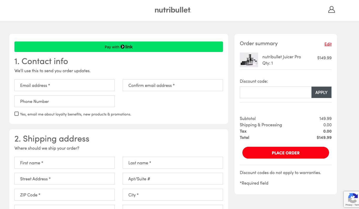
That’s what makes Nutribullet’s one-click checkout strategy effective.
The brand prominently surfaces its Link by Stripe option right at the top of the checkout experience, making it immediately visible to shoppers who have likely purchased before or already trust the brand.
Instead of forcing repeat customers through unnecessary form fills or multi-step navigation, Nutribullet prioritizes speed, familiarity, and reduced effort.
This is a strong example of friction-focused eCommerce checkout optimization.
Advanced brands understand that once trust already exists, the role of the checkout flow changes completely.
The goal is no longer convincing the shopper to buy. The goal becomes helping them complete the purchase before momentum fades.
My CRO team has especially seen this pattern work well for:
replenishment brands,
consumable products,
appliance brands,
and stores with strong repeat purchase behavior.
In these categories, reducing wasted time often improves the customer experience more than adding additional persuasion elements.
What Nutribullet also does well is reduce friction without removing reassurance entirely.
Even within its express checkout environment, the brand continues reinforcing confidence through warranty messaging and familiar payment logos near the CTA.
That balance matters.
Many brands assume one-click checkout means stripping away context.
But advanced eCommerce brands know returning shoppers still want subtle confirmation signals; they just don’t want unnecessary effort.
That’s why Nutribullet’s implementation works.
The brand uses one click checkout not as a novelty feature, but as an acceleration mechanism for high-intent repeat buyers already psychologically committed to purchasing.
2. Impulse-Optimized Checkout
During PDP audits, my CRO team at Convertcart has repeatedly noticed that some brands benefit from surfacing one-click checkout much earlier in the funnel, especially when the purchase decision is fast-moving, price-sensitive, and emotionally driven.
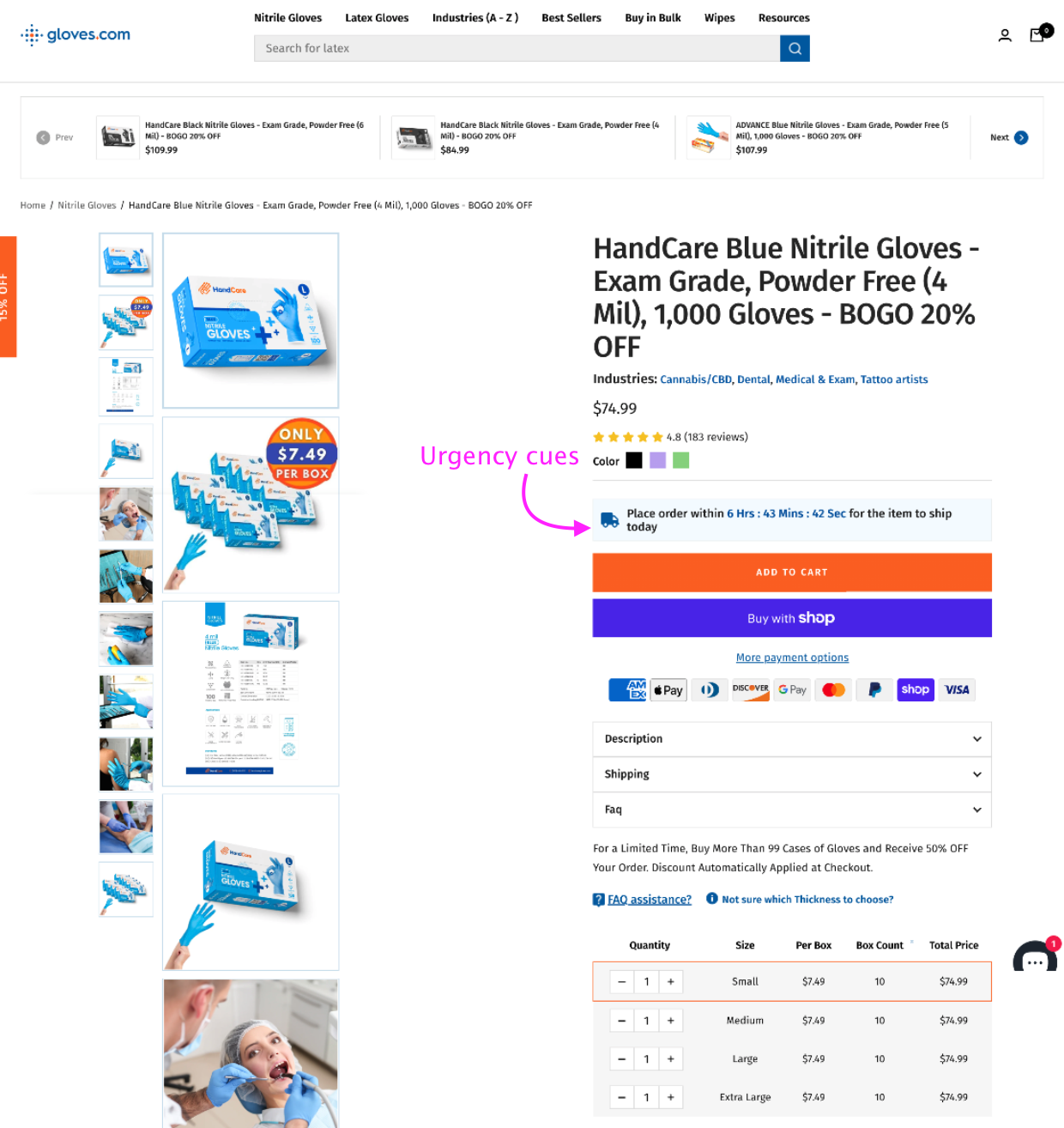
That’s exactly what we did with Gloves. (Read the full case study here.)
The page is designed to compress decision-making before hesitation or comparison behavior sets in.
By surfacing a familiar one click checkout option directly on the PDP, the brand reduces cognitive effort at the exact stage when purchase intent peaks.
During the audit, my Convertcart CRO team also noticed an additional friction point: uncertainty about delivery timelines was discouraging purchases, with nearly 87% of drop-offs linked to shipping hesitation.
To reduce this anxiety, the team introduced a real-time shipping countdown timer directly on desktop product pages.
The experiment resulted in a +13.68% increase in website conversions, while the number of users who moved ahead and placed an order increased by 22%.
What makes this especially interesting is that the countdown timer wasn’t functioning as a generic urgency tactic alone.
It worked because it reduced uncertainty while preserving emotional buying momentum, which is often what separates advanced eCommerce checkout optimization from surface-level CRO tactics.
3. Trust-Supported Checkout
Most one click checkout implementations fail because they optimize for speed before purchase confidence exists.
Through checkout audits, my CRO team at Convertcart has consistently noticed something else with premium eCommerce brands:
High-ticket shoppers rarely hesitate because the checkout flow is long. They hesitate because the purchase still feels risky.
Instead of treating express checkout like a speed feature alone, the brand builds reassurance around the checkout experience before the shopper even commits.
Right above the Shop Pay, PayPal, and GPay options, shoppers immediately see signals that reduce buying anxiety, strong ratings, free shipping reassurance, a money-back guarantee, lifetime warranty messaging, and even authority validation from Gordon Ramsay.
This is what advanced eCommerce checkout optimization actually looks like.
The best premium brands don’t just accelerate checkout. They reduce perceived purchase risk first.
My CRO team has repeatedly seen this pattern across luxury, premium cookware, technical apparel, and high-AOV Shopify stores.
In these categories, fast checkout alone rarely improves checkout conversion rates.
What works better is combining:
accelerated checkout
trust reinforcement
and authority-backed reassurance
into the same buying environment.
HexClad also positions its one-click checkout options at the exact moment shoppers are evaluating risk.
That timing matters. The shopper isn’t just seeing faster payment methods; they’re seeing reasons to feel confident moving forward.
That’s a far more sophisticated strategy than simply adding more online checkout options or pushing shoppers into a shorter checkout experience.
One-click checkout reduces effort, but it can also reduce the evaluation time that shoppers still psychologically need.
In checkout audits, my team has noticed an interesting pattern.
Most eCommerce brands don’t always push one click checkout as early as possible.
Sometimes, delaying express checkout actually improves the buying journey.
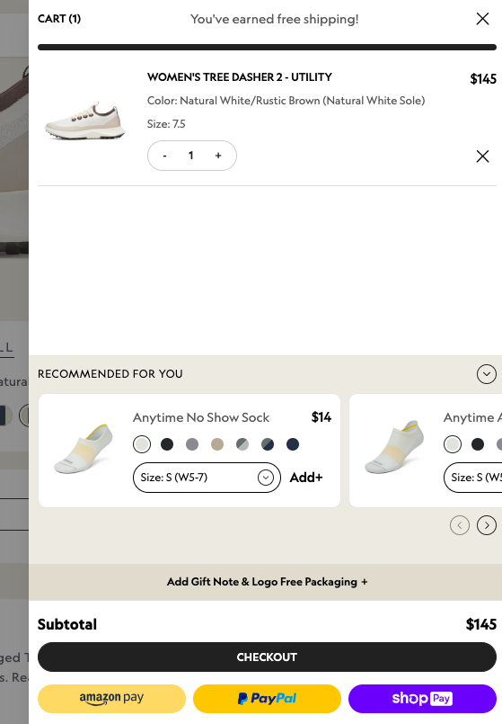
That’s exactly what Allbirds does.
Instead of aggressively surfacing accelerated payment methods across the product page, the brand introduces its express checkout options within the cart itself.
Psychologically, this is important because the shopper has already crossed several micro-commitments by this stage, selecting a product, choosing variants, and entering the cart.
At that point, intent is far more mature.
This is what makes Allbirds’ approach strategically sophisticated.
The brand reduces perceived checkout friction after buying momentum already exists, instead of interrupting the shopper too early in the funnel.
My CRO team has repeatedly seen that introducing too many online checkout options early can sometimes create a distraction rather than acceleration, especially for shoppers who are still comparing products or evaluating fit.
Allbirds avoids that problem by revealing Shop Pay, PayPal, and Amazon Pay later in the journey, when shoppers are psychologically closer to completing the purchase.
The payment mix itself is also smart. Different shoppers naturally gravitate toward payment methods they already trust and recognize.
Amazon users often feel comfortable with Amazon Pay, while older online shoppers may prefer PayPal because of familiarity and perceived security.
That familiarity lowers resistance inside the checkout flow without requiring additional persuasion.
Another subtle but strong optimization is that Allbirds continues showing live chat support even after shoppers move into fast checkout.
This keeps reassurance accessible during the final decision-making stage, helping resolve last-minute hesitation without forcing shoppers to leave the purchase flow.
That’s what makes this a strong example of momentum-driven eCommerce checkout optimization.
The brand isn’t simply trying to shorten checkout. It carefully reduces friction only after purchase intent is already emotionally committed.





.avif)
.svg)


.svg)

.svg)
.svg)
