Ecommerce Growth
5 Powerful Ways to Drive Conversions via Microsites (eCommerce)
June 8, 2023


While most brands obviously want a spike in eCommerce conversions through their main site, sometimes business goals require them to build something separate.
This is where an eCommerce microsite can come in handy and allow them to funnel based on audience’s interests & attention levels.
However, a microsite makes it necessary that the target audience faces zero distraction and cognitive load—so that they can find exactly what they’re looking for and buy instantly as well.
And this piece tells you how to do that—along with examples from brands that have already done it.
Here are the sections we’ll cover:
What is an eCommerce microsite?
5 ways to drive conversions through a microsite
3 eCommerce microsite examples for inspiration
An eCommerce microsite is pretty much what it claims to be—a smaller brand or product specific site that stands separate from the main brand’s site, allowing for experimentation with templates and more.
Here’s an example from the Alex & Ani failover microsite that the brand has built on Shopify so that if their Magento hosted main site crashes, they can retarget the traffic here.

Notice how it looks different from Alex & Ani’s main marketing site.

Microsites can be included within the main marketing site but in most instances are offered a completely separate domain.
This allows it to have a distinct and unique existence away from the noise that the main site generates—also perfect for a focused message or offering to shine through.
If this sounds a lot like how landing pages work, then we hear you, except that there are a few key differences.
One of the key differences between a landing page and a microsite is that the former can either be a single page or multi-paged, while the latter is always a single page.
Another difference is that while a landing page is always published as part of the larger marketing site, a microsite can be published separately.
Yet another aspect that is often different in microsites is that they can adopt an entirely new tone of voice from the parent brand, and even feature a navigation system that’s unlike the main marketing site.
The need of a microsite arises when you have a targeted message to reach your audience.
It could be about a new product launch, a high-profile tech upgrade or even a collaboration that you’re doing with another brand.
The main intent of a microsite is to capture your audience’s attention with singular focus and minus all the other distractions like offers, other products etc.
Here are a few instances that can make it necessary for you to develop your own eCommerce microsite:
A microsite helps the target audience for a new product launch to be zoomed into the details of the launch, the team behind it, how it was made etc.—away from other digital action that the parent brand may be responsible for.
Clearly this is one way to ensure your shoppers don’t suffer from cognitive load, which research proves can become so overwhelming that they can “abandon a task” (in this case, getting to know more about the product and finally paying for it.)
While many would say a landing page would be great for a limited edition product, we urge you to think why you might need a microsite after all.
Let’s say your brand deals in luxury and other high-value products (think jewelry, for instance). This is the kind of scenario a microsite would come to use because for high-value products, your audience would need to be thoroughly convinced.
In this case, multiple pages elaborating on why this product is exclusive, can result in a spike in conversions.
It’s a known fact that successful brand collaborations thrive on great communication. And for this purpose, a microsite might just be ideal because it can throw light on why the collab is happening in the first place, the kind of work each of the branding partners has already done to get together etc.
Plus a chat feature can be established just for the purpose of the brand collaboration, which can effectively funnel out people interested specifically in it—thereby informing datasets that each brand can draw more inferences from.

Since a microsite’s very purpose is to channel your target audience towards very specific messaging, make sure the message is broken down into easily understandable sections (or pages, if the amount of detail demands it.)
For example, if it’s for a limited edition dress for pregnant mothers, talk about how it’s differentiated from products out there, how it’s made and why the price you’re charging is justified (for example, you’re working with rural women who bring their indigenous knowledge into the process.)
The Chipotle Farmers’ Market microsite offers transparency through their copy and ensures visitors know why they exist & what kind of action they’re taking.

Be they press mentions or customer reviews or even a social wall that links to the social handle that you’ve created just for the launch—social proof should feature without being too distracting (research says conversions on sales pages can go up by 34% with social proof present.)
If we’re to go by research, more than 54% of shoppers claim to have stopped engaging or buying from a brand because choosing became very difficult.
The thing is choice paralysis isn’t just limited to product suggestions—it can also reach over to CTAs whenever they’re too many vying for attention.
That’s why from a UX conversion-driving perspective, it’s ideal to stop at one primary CTA after you’ve established the point about the product or the campaign.
Immersive experiences have already proven to be a great conversion driver for eCommerce.
So you’ll have to factor this in when you’re building a microsite for a product launch or brand event.
Here are a few ways you could consider making your microsite more engaging and focused on a singular goal:
- Quizzes (where shoppers need to essentially engage with their own preferences to move forward)
- Virtual shopping assistant (this enables the shopper to ask questions even as they move towards the conversion)
- 3D visualization of the product or event space (this is a great way to create anticipation for the eventual conversion)
- Virtual try-on (research points to the fact that this results in an “augmented self” where shoppers experience greater freedom in being able to try out and take risks they otherwise wouldn’t have taken)
A highly functional microsite becomes a conversion driver when more people see it—so apart from ads and mentions on your social handles, ensure shoppers can share the whole site as well as separate landing pages on their own social handles.
Patagonia developed the Blue Heart microsite to drive interested audiences to support the brand’s cause:
That of petitioning against some of the world’s biggest banks and institutions that drive money into hydropower development in Balkan river region in Europe.
Why it works:
- Comes with a neat layout and displays what focused, no-nonsense copywriting looks like
- Displays two connected CTAs (once you “Watch the Film” you’re more likely to “Take Action”)
- Displays social sharing buttons (including a linked “Get the Word Out” which tells visitors of the associated hashtag)
- Only upon scrolling does one find secondary CTAs that then lead to other parts of the microsite

This microsite came into being in 2014 when Ikea decided to deepen their research into what shoppers thought about their lives at home and what the brand was already doing/could do differently to enrich that.
This microsite literally throws light on Ikea’s behind-the-scenes work to create differentiated home solutions that directly benefit shoppers and improve their living condition.
Why it works:
- Each section is easy to scan and read
- One CTA per section, wherever relevant (this removes distractions)
- Creates brand recall (despite looking different from the main marketing site, the microsite still retains the earnest tone and feel that the brand is known for)
- Offers a CTA and a download icon for the report download (this caters to both shoppers who’re keen to explore as well as to those who want to download & exit)
- Features a sticky social sharing button

This microsite, which came into being first in 2006, has been developed and maintained by Office Depot as a way to reach out to consumers for brand-level engagement.
The microsite comes alive close to Christmas and stresses upon the theme of elves—where shoppers can upload up to 5 pictures of friends and family to create elf versions for sharing & bonding.
Why it works:
- The timer creates instant anticipation (though the microsite isn’t functional through the year, it tells visitors when it’ll be)
- Offers a reason to add to the email list (the email is taken to offer reminders for when the elves will be back—not letting shoppers miss out on the opportunity to engage with the brand)
- Features social buttons (where visitors can take a trip and see what has already been said about ElfYourself—works as great social proof, doesn’t it, especially when the microsite isn’t functioning?)

Microsites have clear advantages including making more room for targeted traffic, generating focused leads, creating brand awareness and allowing a business to focus on certain markets (without veering away from the content of the main marketing site).
It however has a host of disadvantages too, and those include complexity of maintenance, confusion that shoppers of the main brand undergo seeing a separate asset and typically a short life (that doesn’t go beyond an event announcement or product launch).
Since microsites are a subset of the main brand or parent company, it’s usually less than ten pages long.
However, when you’re creating a microsite for eCommerce conversions, it might be ideal to keep it only up to three pages—by doing this you talk about the most important elements and make it less distracting for the shopper to move towards a conversion.
The speciality of microsites is that they typically feature focused content—this makes them effective for businesses to leverage specific and relevant keywords.
However, a microsite alone can’t help in elaborate SEO efforts.
3 eCommerce SEO mistakes to avoid and get more conversions
Low form conversions? Making any of these 10 mistakes?
11 brilliant ways to get More micro-conversions (Updated 2023)
18 brilliant ways to use microcopy to boost eCommerce conversions
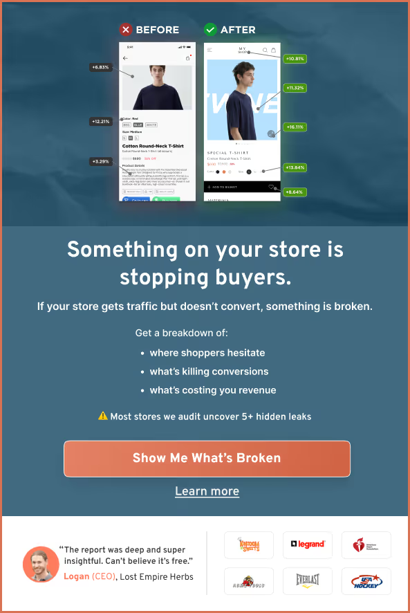
98% of visitors who visit an eCommerce site—drop off without buying anything.
Why: user experience issues that cause friction for visitors.
And this is the problem Convertcart solves.
We've helped 500+ eCommerce stores (in the US) improve user experience—and 2X their conversions.
How we can help you:
Our conversion experts can audit your site—identify UX issues, and suggest changes to improve conversions.
Subscribe for more articles like this!


Read by 5000+ ecommerce store owners
.svg)

.svg)

.svg)
.svg)
2026 Convertcart, All Rights Reserved
33/1, Castle Street, Ashok Nagar, Bengaluru, India