Only about 1 in 4 people who arrive at your eCommerce store have actual buying intent.
So, how do you make that number go up? Well, that's exactly what a pre-sell page can help with.
How? That's what this article answers – we start with:
What is a Pre-Sell Page in eCommerce
A pre-sell page to an eCommerce store is essentially what a trailer is to a movie. Essentially a type of intermediary landing page, a pre-sell page is meant to warm potential shoppers up to the value of the product/offer they’re about to encounter.
By value, we literally mean how the product/offer will help make their lives better. Also known as a pre-cart, pre-lander, pre-sale, or advertorials – pre-sell pages are often used between ads and product/cart pages, to nudge shoppers towards the next step (in most cases conversions).
Here’s how:
Educates first, then shows – pricing isn’t often the focal point (at least from the get-go)
Shows proof to build trust, and then asks to take the next step (which is most often a conversion)
A conversion can have many goals – for example, view the product details, register interest, buy in advance, or opt-in for a particular offer
But are all landing pages actually pre-sell pages?
No, here’s the core difference: a landing page can serve purposes other than selling (think trade-in program landing pages), but pre-sell pages are meant to push shoppers deeper, ideally towards a purchase.
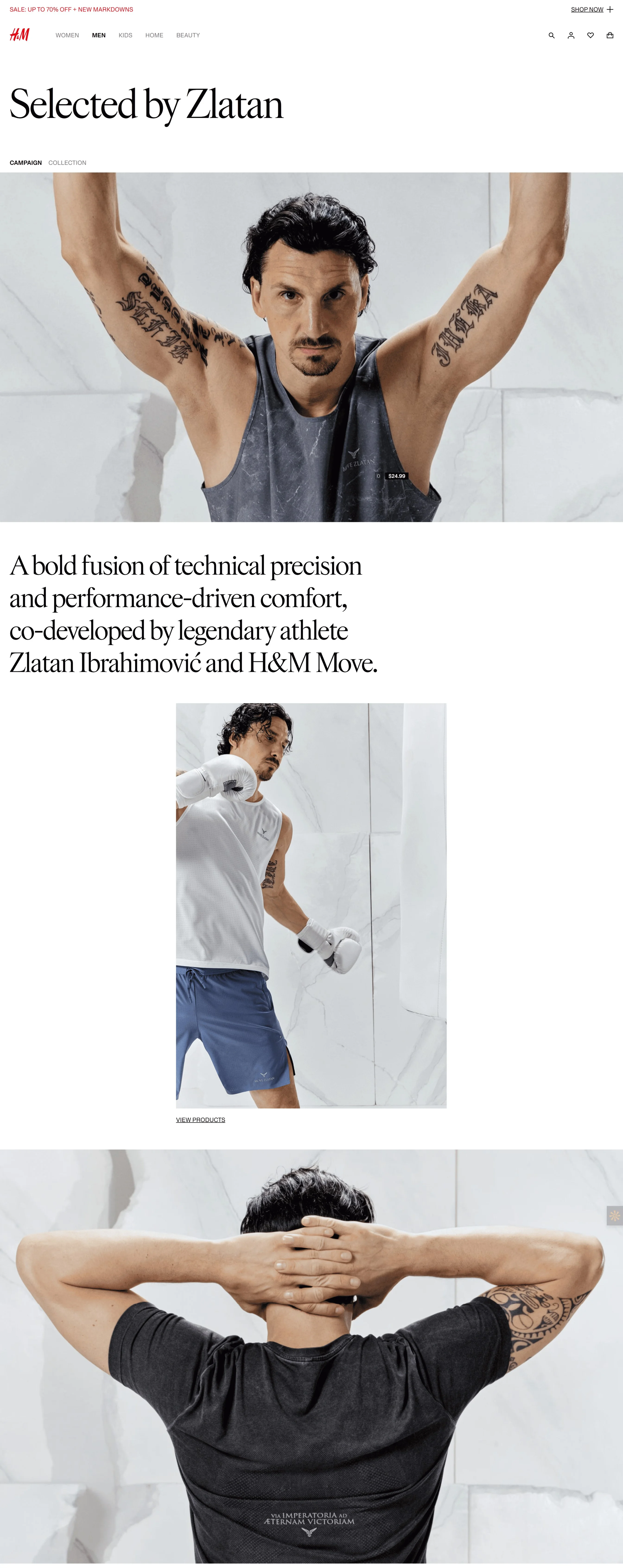
This is exactly why some category page designs are also great examples of pre-sell pages. Take this example from H&M, showing an influencer collab collection:
Note how the imagery and text weave together to showcase fine product details in the first 3 folds, and only then do the product links show up.
⚠ Remember: Pre-sell pages for eCommerce stores can collect interest as well – here’s why: if you’ve brought someone to the page, does it even make sense to let them go, without collecting some data? 🙂
Where to use a pre-sell page in an eCommerce store
Presell pages are great for retaining any form of ad traffic – as well as organic and email traffic.
So, a pre-sell page can work for all these areas on your eCommerce store:
- Product pages with a high bounce rate (means people arrive and don’t see the value immediately)
- Influencer/UGC campaigns or product launch build-up
- Pre-order pages (shoppers can register interest or place orders in advance, but they need to know the details)
- To show some product categories that house a large number of products – intended for a particular audience or use case
Pro Tip: In addition to bounce rate, look for spikes in your site search volume for a particular product. Plus, if the same product has a lower number of add-to-carts compared to product views (less than 30% add-to-cart rate), you know that the product needs a pre-sell page.
How to build a pre-sell page: 11 things to keep in mind (+ examples)
1. Start with a story, stat, or problem in your hero section
The biggest problem with almost all product pages: most shoppers leave, because they can’t decide if they’re willing to pay for the pricing – it’s all because they don’t see the value the pricing holds.
And this happens irrespective of whether the price is low or high. 🙂
This is exactly why your pre-sell page should continue the pitch from your ad that your shoppers just saw (or dissect a problem they didn’t realize they had).
We mean:
Start with a broken belief (“You’ve been told you need keratin. Here’s why that’s wrong”)
Or a stat with a twist (“3 out of 5 women think their hair is thinning. Only 1 is right. Here’s what the rest are missing”)
Or maybe a real-world problem (“Can’t trust your car in a parking lot anymore? Neither could we. Until this”)
Show images with the product in use, over lifestyle images – the goal here is to create an impression of effectivity
Use icons to replace text where possible (e.g., “5K+ reviewed” with a badge icon)
Below the hero section, display a sticky nav with anchors like “Why it works,” “See how,” “What people say”
Pre-Sell Page Example:
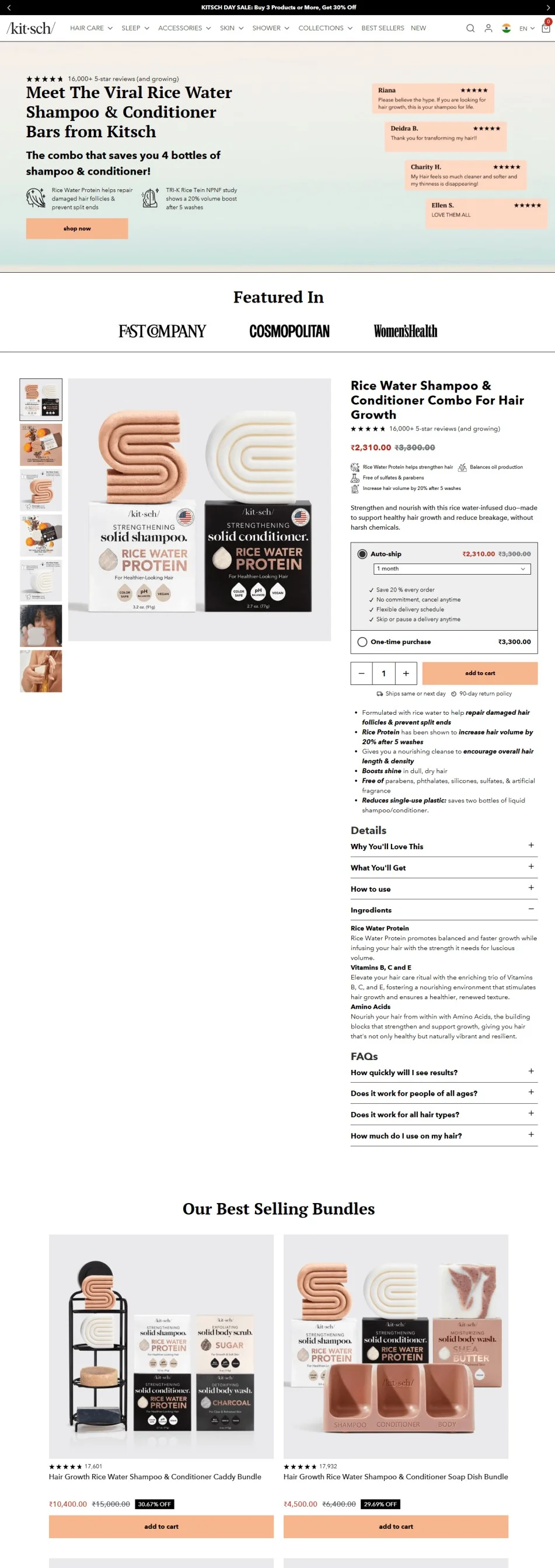
Start with a quantifiable win: savings, results, stats – because logic, backed by undeniable social proof, helps sway even the harshest of critics. Kitsch does this brilliantly on their pre-sell page (do take good note of the first two folds):
Pro Tip: Use images that fit your product. For example, if you sell things whose benefits are only felt after usage, show features with visual callouts (like shampoos, gadgets, etc.) – but, if it's something like shirts (show it on a model, as well as with visual callouts).
Product discovery – barriers that prevent shoppers from finding items
Category/collection pages – improvements that drive deeper product exploration
Product page – what to optimize to convert 2–3x more buyers
Cart – ways to ease hesitation and speed up purchase decisions
“The report was deep and super insightful. Can’t believe it’s free.”
Logan Christopher CEO, Empire Herbs
2. Bridge the gap between the value and emotions
One scroll isn’t enough to convince shoppers. On pre-sell pages, the “value bridge” here is all about providing context – it’s about showing “why do you need it now”.
What you need to show: what shoppers will gain (instead of diving into product specs or the price).
But this bridge changes, and it all depends on what you want the shopper to do on a pre-sell page.
For example, if you want shoppers to buy, show even more social proof as Kitsch does in the previous example, by showing press mentions (and then does it show the product listing).
Or, you can also:
Affirm emotions, continue the story from your hero banner, for example, if it's a routine you're showing, say, “You’re not lazy. You’re just tired of fixing what keeps breaking”
Use benefit blocks (with icons or videos) like “Less hair fall,” “No plastic waste,” or “Fits in travel bags”
Highlight values over features; for example, say something like “Meet the {product}. Powered by titanium. Free of forever chemicals, always”
Pre-Sell Page Example:
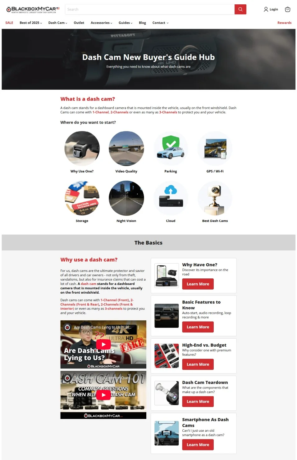
Looks like a blog page, but BlackboxMyCar’s dashcam buying guide leads with why a shopper might need it, and what they need to know. It provides clear guidance first – instead of diving into specifications or which dashcams are best:
Pro Tips:
If your product requires understanding (tech, wellness, skin), use toggle cards: “Tap to reveal more” (this helps keep the page from feeling dense)
If your pre-sell page gets returning buyers, use an exit-intent pop-up, like: “Curious how we make hair feel thicker, without sulfates? Give it a try with your next order for just $X more.”
But there’s one thought still holding them back: “Sure, it worked for them – will it work for me?”
That’s why your social proof needs to go beyond ratings. Because people read less, see more – here’s what helps them decide:
Visual demos over written praise (preferably in videos)
Carousels showing use cases (“For color-treated hair,” “For high heat cooking,” etc.)
Before-after sliders (the more interactive a page is, the more sticky it is in the shopper’s mind)
Super relevant reviews (“I was skeptical because…”)
Expert callouts like quotes from chefs/dermatologists/instructors, review snippets, and videos from influencers
Pre-set filters for reviews (sort by skin tone, concern, or device model)
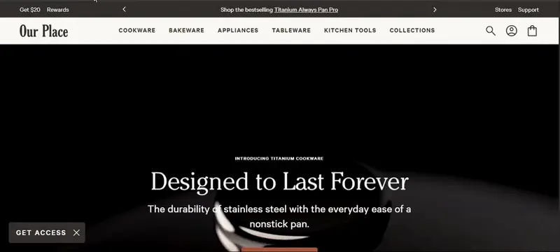
Pre-Sell Page Example: Our Place doesn’t just show 5-star reviews for its Titanium Pans – it starts with an animated hero, and goes on to show videos of the pan on fire – then drives it home with review snippets (and videos) from Tim Ferriss (the celeb chef).
But what truly makes this pre-sell page excellent is the structure – it has everything: a full display of the range to FAQs:
Pro Tip: Consider using a floating CTA bar that changes copy once the user scrolls past the proof section. Like: before the shopper sees the product demo, show “See how it works” in the bar. Once the shopper scrolls past, switch it to: “Try it now.”
4. Dive deep into features, but not too much
An unaware audience wouldn’t really care for “natural ingredients.” Instead, they would care more about why it will work for them, as compared to everything else they tried.
This is why you need to pair product specs with pain points – without causing information overload. For example, if you’re a food brand, go beyond “our food is healthy” or “our supplement is effective.” Zoom in on how your product helps solve:
“I’m tired of spending $165 weekly on greens that expire in 3 days”
“I want to lose weight without skipping dinner with my family”
“I don’t wanna cook too much, but I also get bloating from takeout”
Here are two examples of eCommerce pre-sell pages that showcase this idea:
Pre-Sell Page Examples:
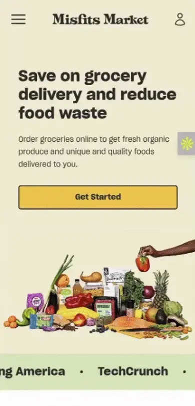
a) Misfits Market turns their homepage into a pre-sell page
The core promise is simple: savings + reduce waste (an excellent cause). However, do take note of how it shows each feature – for example, see how the page shows Misfits Market’s inventory picks plus examples. Then take note of the prices, followed by their guarantee, social proof, and then the FAQs:
b) Lilyrhyme’s blog-style pre-sell page
It shows the product specs and what the product is made of. But makes it read like a story. There are 7 clear reasons, with each point diving into a unique aspect of the product – plus comparison charts, Facebook comments acting like FAQs, and a solid deal at the end:
Pro Tip: Use your store’s live chat option to trigger a live chat, especially if a shopper who’s scrolled and clicked on your presell page goes inactive (make sure you’ve got a browser sound added to new messages, this way, you really catch attention).
5. Nudge with different CTAs across the pre-sell page
Most pre-sell pages lose steam because they ask for too much, too soon.
Instead, use CTAs like checkpoints – each one nudging the shopper to take the next action as they scroll through. Here’s what we mean:
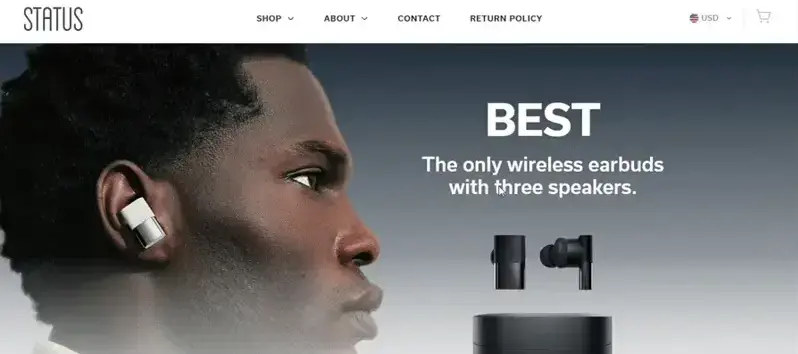
Top of page > “Shop the Edit” / “Browse the Routine”
Status Audio pre-sell page (which can also act as a great template for a pre-order page) starts with a price-based “shop now” CTA, but by the end of the page, it incentivizes shoppers to leave their email to win free ear tips:
Pro Tip: Avoid these mistakes on pre-sell pages:
Don’t make the funnel longer by placing quizzes in the first few folds (instead, place near the bottom or on exit intent, so you can loop in hesitant buyers)
Always match CTAs with page purpose (a blog-style pre-sell doesn’t need an ‘add to cart’ CTA at the get-go)
Most brands compare features. The smart ones compare outcomes.
An audience that isn’t fully engaged doesn’t want an exhaustive feature comparison; instead, they just need to see one area where you excel, and then you can zoom in on that.
This way, your audience feels like a smart friend who has discovered a better option.
Here’s one in action 👇
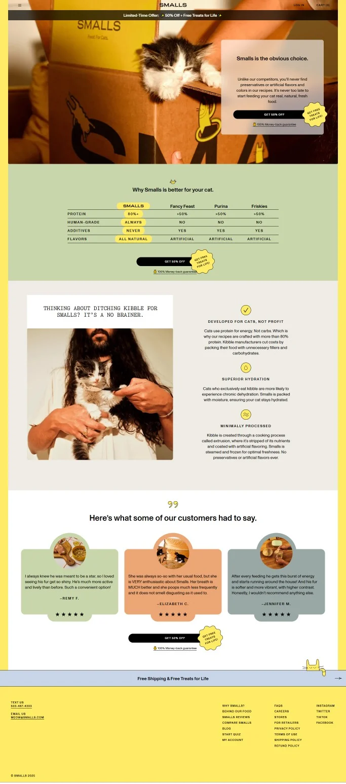
Pre-Sell Page Example: Take a look at Smalls’ pre-sell page. It directly addresses traditional kibble brands, branding itself as “the obvious choice.” The page continues to compare competitors based on whether their cat food is produced with the same standards as human food, including nutritional aspects like additives, flavors, and protein content.
The true brilliance lies however, is how Smalls backs up its claims. It subtly includes a “100% money-back guarantee” and “free treats for life,” along with a section that explains how Smalls benefits cats by providing pure protein, hydrated food, and steamed cooking:
7. Use countdown timers sparingly
Unaware shoppers don’t care about a limited-time 30% discount for a product that holds no value for them.
Countdown timers convert only when they are grounded in reality. Which means you can use them in two cases: pre-launch countdowns for new collections – or – for returning shoppers.
This is why, on pre-sell pages, show countdown timers based on:
Inventory: “Only 23 left from this week’s fresh batch”
Access: “Hear! Hear! Pre-orders close in 47:00:23”
Season/Sale: “Ends midnight. Sunday, May 12”
Holiday/Shipping cut off: “Gifts ship in time for Mother’s Day if you order in the next 05:32”
⚠️
What’s preventing more shoppers from completing their order?
Why visitors don’t trust your store within 3 seconds
Why shoppers can’t find what they’re ready to buy
What’s stopping 2-3x more shoppers from clicking “Add to Cart”
Where buyers hesitate right before purchase
Why high-intent shoppers still drop off
“The report was deep and super insightful. Can’t believe it’s free.”
Logan Christopher CEO, Empire Herbs
8. Target seasonality
Got Mother’s Day coming up? Don’t just show a notification bar with a 10% discount.
Build a pre-sell page that tells them why your product fits the moment (and you can keep doing this for all seasons).
Here are some things you can use to build pre-sell pages to target seasonality:
Gift guides (“For moms who skip spa days,” “For dads who never buy themselves anything”)
Event bundles (“Festival skincare kits,” “Summer gut reset”)
Holiday exclusive pre-orders (“Limited Mother’s Day edition – lavender packaging, same formula”)
Trial sets before high reorder periods (“Try it now, reorder in 21 days before our New Year waitlist opens”)
Create wishlists (nearly 50% of shoppers in the US wait for Amazon Prime Day to check out their wishlist, so why not build a page where you ask shoppers to build a wishlist for your biggest sale, with a dash of inspiration, ofc)
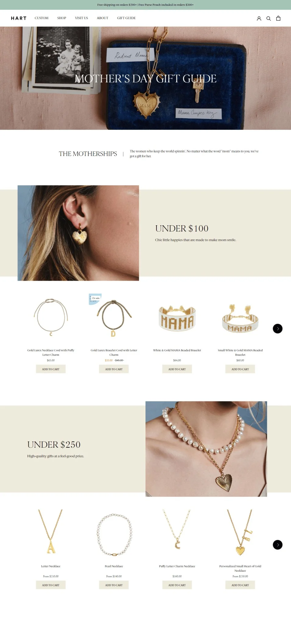
Pre-sell Page Example: Hart’s Mother’s Day gift pre-sell page isn’t just a showcase; it’s also a sale page. It deeply personalizes the curation by showing different kinds of gifts for each type of mom out there. Near the end of the page, there’s also a showcase of Instagram posts showing gifts actual shoppers have given – plus an option to design a custom gift.
Note how the visual on the hero banner fits the occasion – with subtle yet nostalgic callbacks to heirlooms passed down by generations:
9. Personalize pre-sell pages by lifecycle
Pre-sell pages can cater to existing shoppers as well, so the presell page that works for your unaware audiences may be a bit much for your existing audience.
For example, if you’re pitching a pre-order to an existing shopper, you need not repeat why your brand is great – instead, the focus should be on the benefits and what’s new about the new product.
And the offer? Instead of a standard ‘register interest’ – offer options, like “try for $X” along with ‘try these as add-ons’ bundle (since repeat shoppers are more likely to buy).
Here are two examples of this pre-sell page strategy, in action:
Pre-Sell Page Examples:
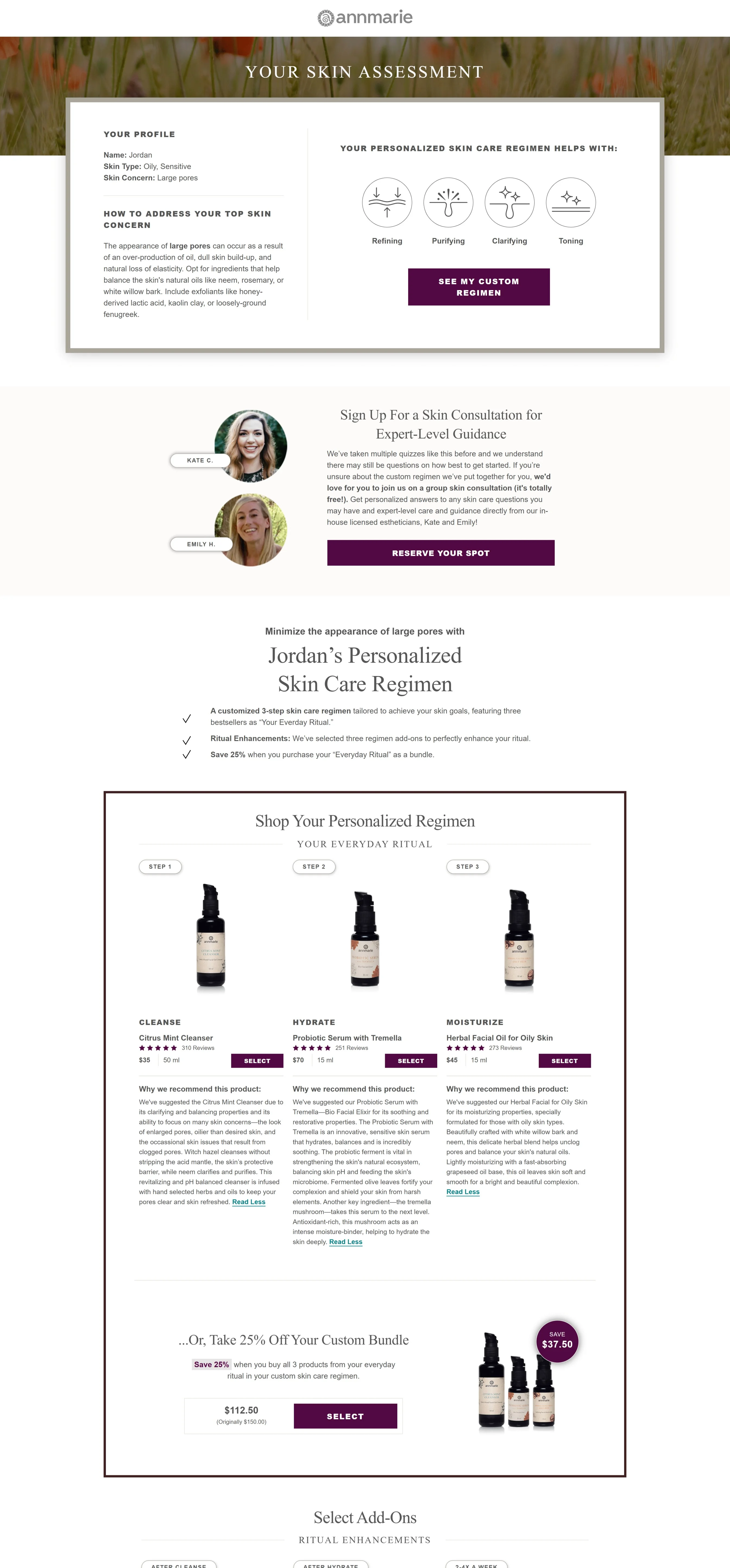
a) Annmarie Gianni’s Skincare Quiz Results
Instead of showing just recommendations, Annmarie creates a full pre-sell, showing not only the why, but also how their recommendations work + some massive savings.
However, the true genius of this page is the level of personalization on offer. Apart from using the shopper’s name, Annmarie shows different pre-sell pages to aware and unaware audiences (which is exactly why the about-us section appears after the FAQs):
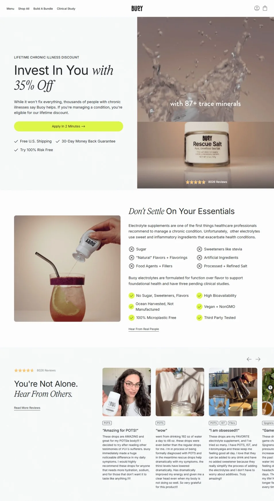
b) Buoy’s Chronic Disease Discount
People with chronic diseases are Buoy’s best target audience. Why? Because Buoy can potentially help manage the quality of living (making them potential lifelong customers).
This is exactly why Buoy uses a pre-sell page here. However, the buyers here need more convincing. Note how this page creates a whole story around Buoy, and how it specifically helps manage chronic conditions. But how does this page adjust for new and existing customers? The number of reviews on offer. The reviews keep loading as shoppers keep scrolling:
10. Have 5 key blocks to hook, educate, prove, tease, and retain
When people usually encounter a pre-sell page, they don’t usually think: “How much is this?”
What they usually think is, “Now, what’s this supposed to be?”
Here’s how you should structure your pre-sell pages on your eCommerce store:
Hook – Use a statistic, a pain point – the goal is to make viewers feel, “Oh, this is about me”
Educate – Break the value into details – it can be done visually (comparison bars, visual callouts) or with the help of text – the goal here is to evoke, “Hmm, I didn’t know that”
Prove – Use demo videos, reviews, quotes – the only response here, “Okay, that def. makes sense”
Tease – Show a “This offer’s for you” type deal – it can be a bundle preview, more testimonials, or a CTA with an offer
Retain – Or, to put simply, the exit path. This step exists to create zero to no friction, so you don’t lose the audience. You can show a call to action with additional copy like “Not ready yet? <Sign up and we’ll give you a taste>” – this way, once a viewer does sign-up from the pre-sell page's exit CTA, you can continue nurturing over email
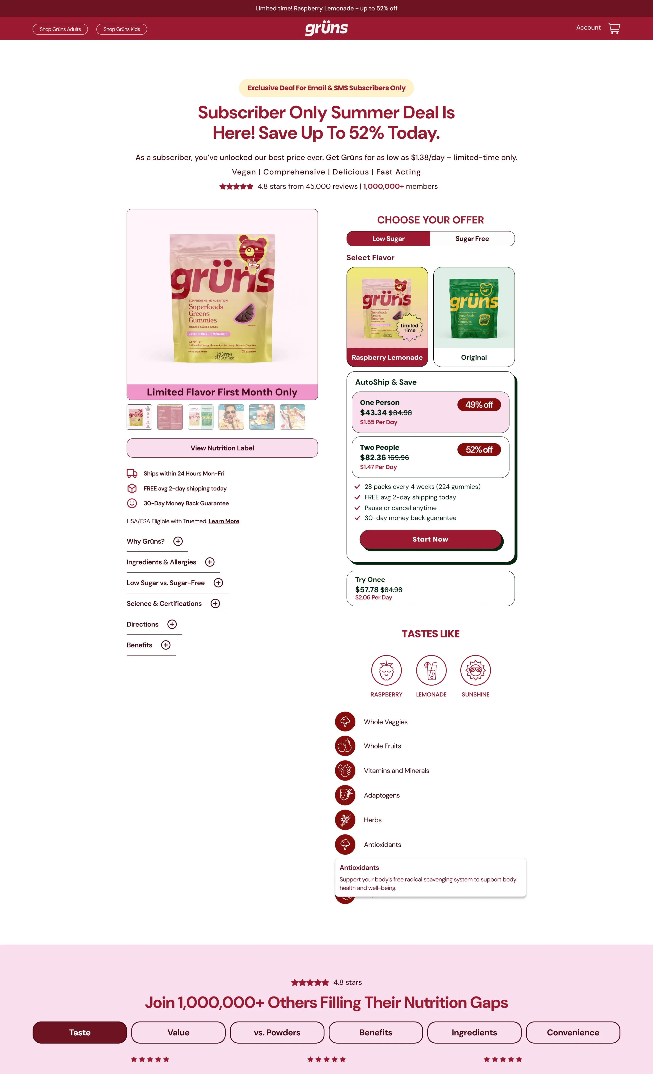
Pre-Sell Page Example: Gruns’s subscription pre-sell page follows this exact structure to the T. It looks like a product page, but note how the page starts with a clear exclusivity hook, and then continues to educate (the product details), prove (the review quotes, expert testimonials, comparisons), tease (the limited-time offer), and the exit path (the CTA in the FAQ):
Pro Tip: Always A/B test:
Where to place the first CTA (above fold vs below proof)
Long-scroll page vs click-to-expand blocks
Whether “prove” before “educate” increases time on page for cold traffic
11. Don’t just track success metrics
The ultimate metric to determine the success of pre-sell pages is the number of microconversions (think form fills, quiz completions, product page views).
But here’s what else you can track:
Bounce rate: If this is high, it means your hero section feels off to shoppers
Scroll depth and CTR: Collate button clicks on key sections (e.g., quiz clicks, free gift CTAs), with the percentage of your page that gets scrolled on average – this way you know exactly where shoppers leave (and also know which sections to A/B test)
Retention rate: Are shoppers who saw the pre-sell page more likely to buy later (via email, retargeting, SMS)?
Time on page vs engagement: If shoppers spend two minutes on average with little to no clicks (anything less than 5% CTR), it often means they’re confused
Pro Tip: Set up UTMs that separate cold traffic from returning traffic (this way, you can trigger two different versions of your pre-sell pages; one can educate more, while the other can push for add-to-carts).
(BONUS) How to optimize pre-sell pages for mobile devices?
Most pre-sell pages are going to be triggered on mobile first. Why? Since most of these pages are either used on ads or to pull organic traffic from SERPs.
Here’s what you need to keep in mind when optimizing pre-sell pages for mobile UX:
a) Use sticky bars
Either to show a CTA button (so shoppers won’t miss out on the offer) – or – to motivate them to complete scrolling (like a video game walk-through). For example, you can display an in-page navigation within the bar along with microcopy like “You’re 50% closer to choosing your perfect skincare set.”
b) Enable horizontal scrolling for key sections
Like product benefits, UGC galleries, comparisons – this way, the length of your pre-sell page remains in control. But do ensure you have navigation buttons (◀▶), to act as cues and as scrolling aids (this helps improve the mobile UX, because shoppers know which sections are actually scrollable).
c) Show tappable icons that expand
For example, you can have dropdown callouts explaining the process behind your “Made in USA” and “30-day trial” badges
d) Keep only the first FAQ expanded
This helps reduce cognitive overload, as shoppers can take notice and tap to expand the FAQs they feel are relevant
Pre-Sell Page Example: Alala’s Spring Edit pre-sell nails mobile: no bulky CTAs, visual-first page, maintaining a minimalist yet color contrast to pull shoppers in (all while keeping a bottom bar showing a free shipping offer):
Final Checklist: Is Your Pre-Sell Page Ready to Launch?
✅ Does the hero section speak to a problem, not a product?
✅ Are you making them feel smart before they buy?
✅ Does your proof speak to the most common objection?
✅ Will a cold visitor scroll at least 3 folds without seeing a price?
✅ Is there a reason to return to your store / would you buy without visiting the product page?
✅ Is there more than one CTA, with different goals (ideally one to dive deeper and one to collect data)?
✅ Have you used at least one video on the pre-sell page?
✅ Do you mention proof before pushing action?
✅ Does each block move the user one step forward?
✅ Are different audiences seeing tailored offers?
✅ Are you collating the percentage of the page scrolled with CTA clicks on sections?
PEOPLE ALSO ASK
Why use a pre-sell page on an eCommerce store?
Primarily to retain more shoppers. By giving them some sweet sweet context. For example, if you’re showing an ad about a bestseller coming back in stock to an entirely new audience, they will most likely know little to nothing about what the product is.
Here’s how a pre-sell page fits in the shopper journey:
What are the best uses of pre-sell pages on eCommerce stores?
You can use pre-sell pages for anything, as long as you lead shoppers closer to the purchase. For example, pre-sell pages are great for kits, bundles, new collections, exploring swatches, trial packs, samples, customizing routines, new collections, comparing products, custom influencer collabs, as well as search results.
What is the difference between a squeeze vs. a pre-sell page?
A squeeze page is just meant to collect data and move on.
A pre-sell page does the work of convincing the shopper of the product/offer/ad.
For example, an eCommerce brand can use a squeeze page to register interest for a new collection. But as the launch nears, it can retarget people who visited the squeeze page (and registered) – to show a pre-sell page that educates why the product will fit their lives.


.svg)

.svg)

.svg)
.svg)
