Conversion Optimization
How to Build High Converting eCommerce Sale Pages (+ Examples)
July 29, 2025


Haven’t we all searched for the word “on sale” a bit too many times? Only to be met with pages that just show products on sale, without giving any sort of context about:
If you understand what we mean, you will also understand why using a standard product listing page template as a sale page is definitely not a good idea. So, what’s a great ‘on sale’ page look like?
That’s what this article is covering:
We start with 👇
A sale page shows what products on an eCommerce store are currently on discount. Not to be confused with pre-sell pages or landing pages, a sale page typically houses products and collections that a store has marked down. Also called the ‘shop the sale’ page, most eCommerce stores just use a category page design to show collections on sale.
But you can do more – here’s what you need to keep in mind when building an eCommerce sale page:
Most eCommerce brands just create a new category/collection called “sale” and call it their sale page. But here are some ideas on how you can optimize your ‘shop the sale’ pages so they convert better:
JUMP TO:
1. Big & bold discounted price
2. State the discount boldly—in the headline
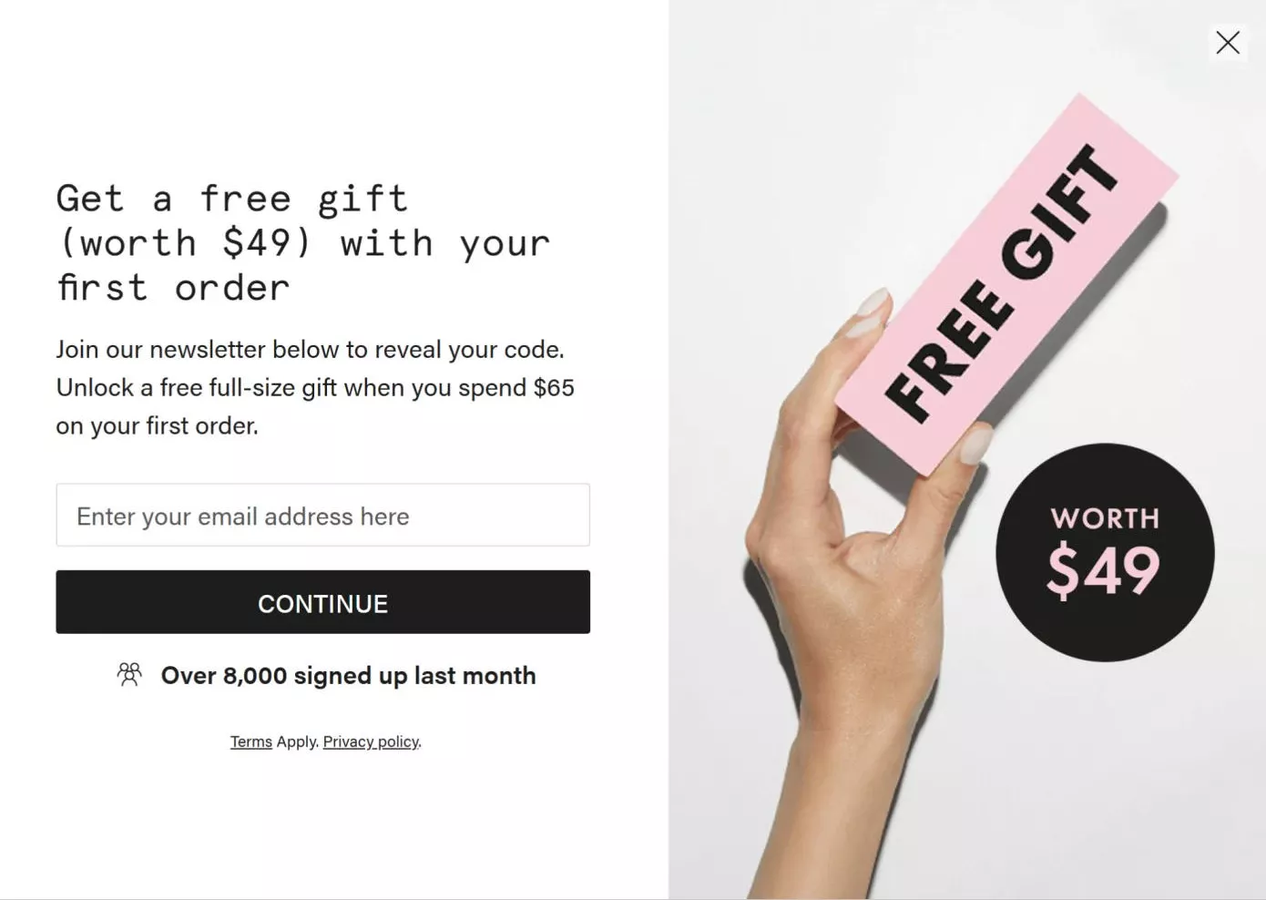
3. Lead people to the page by exit intent (people who were leaving from cart)
4. Show the lowest price first
5. Personalize which products get seen first
10. Don’t forget to make it mobile-friendly
13. Make sure shoppers know about your sale pages
14. Have ready to copy coupons
15. Make it really easy to add to cart
16. Have really vivid descriptions (and microcopy)
Not too big, though, or else it will be perceived as a huge number. If needed, make your original price smaller and slashed through, with the discount price taking the size of your normal pricing (but in a different color).
Here’s how Kohl’s does it: by placing the discounted price right above the slashed price, but in red:
Pro Tip: Do A/B test what color works best for your discounted pricing – while red does grab attention, green works equally well (but please don’t just slash the prices and leave the discounted price the same color as your original price).
Also read: 153 A/B Testing Ideas for eCommerce (Homepage, PDP, Cart, Checkout)
This way, you have the max possible impact. Numbers get noticed before words. All you have to do: make the headline visually contrasting – bigger font – different colors.
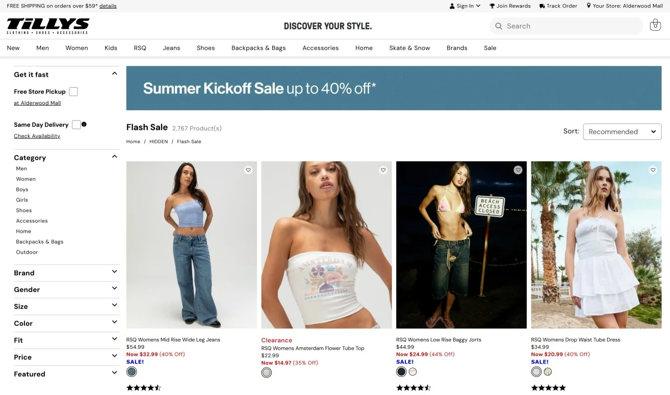
Here’s Tilly’s “Summer” sale page (note how the words “summer kickoff sale” are in bold to pull eyes to the discount, that too on a cool teal background):
For someone leaving your cart page, show something like, “Don’t like this? Check what’s on sale!”
Yep, it’s as simple as that – this way, you increase discoverability, as well as recover carts better. Here’s one example of this sale page strategy in action from Beauty Pie:
Also read: 28 powerful ways to reduce shopping cart abandonment (w/ examples)
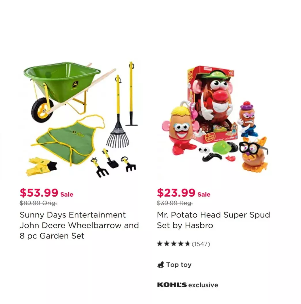
You show prices starting as low as $3.99 and then show a $30 product. That’s the easiest way to increase the bounce rate on your sale page.
So, use the decoy effect like this example does: there are two types of products on sale in one row, note how the first listing shows the lowest price first, i.e., $7.97 but the second listing makes is priced so closely ($9.97), that it feels like a steal (or rather an upgrade):
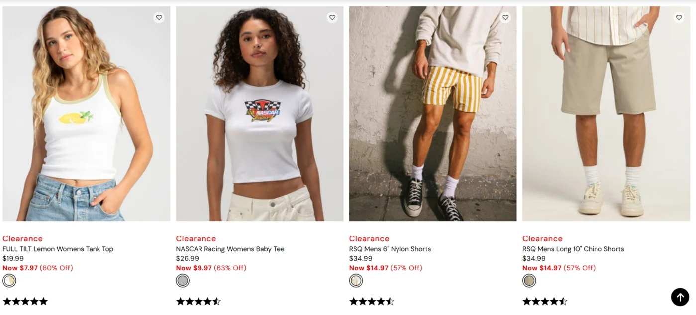
The decoy effect is also in the works for the shorts too (even though they've got the same price) – note how the product listing image is just better for the first shorts from the left (has more visual contrast), leading more shoppers to just click on the listing (even if they miss the sizes in the description).
Pro Tips:
- A/B test the order of the listings as well – like most expensive to least expensive (this way everything after feels like a deal) – grouped by product categories – or against pairings (like tops with shorts)
- Also, test “Low to High” vs “Recommended for you” as the default sort (and also in filters, price filters first vs. product category filters first)
Just because something is on sale, does not mean they’ve to work extra extra hard to find it. 🙂
Simply show those products first that they’re more likely to consider. For example, a shopper on your all sale page should see those product categories on top that they’ve interacted with.
And, if you’ve no user history whatsoever, just show what’s popular in that region. The same logic applies in sub-sale pages as well. The personalization logic should also factor in variants – like sizing, color, breed, hair color, etc. For example, if a shopper buys 2XL more, highlight microcopy like ‘available in your size - 2XL.’
Also read: 31 Brilliant Examples of eCommerce Personalization
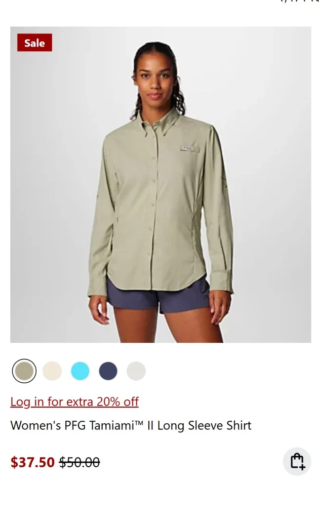
Yes, you can’t give away member prices down to the last detail. But you can give unregistered users a hint, do it like Columbia does. All they do is say “login for an extra 20% off”, which of course, helps drive more micro-conversions:
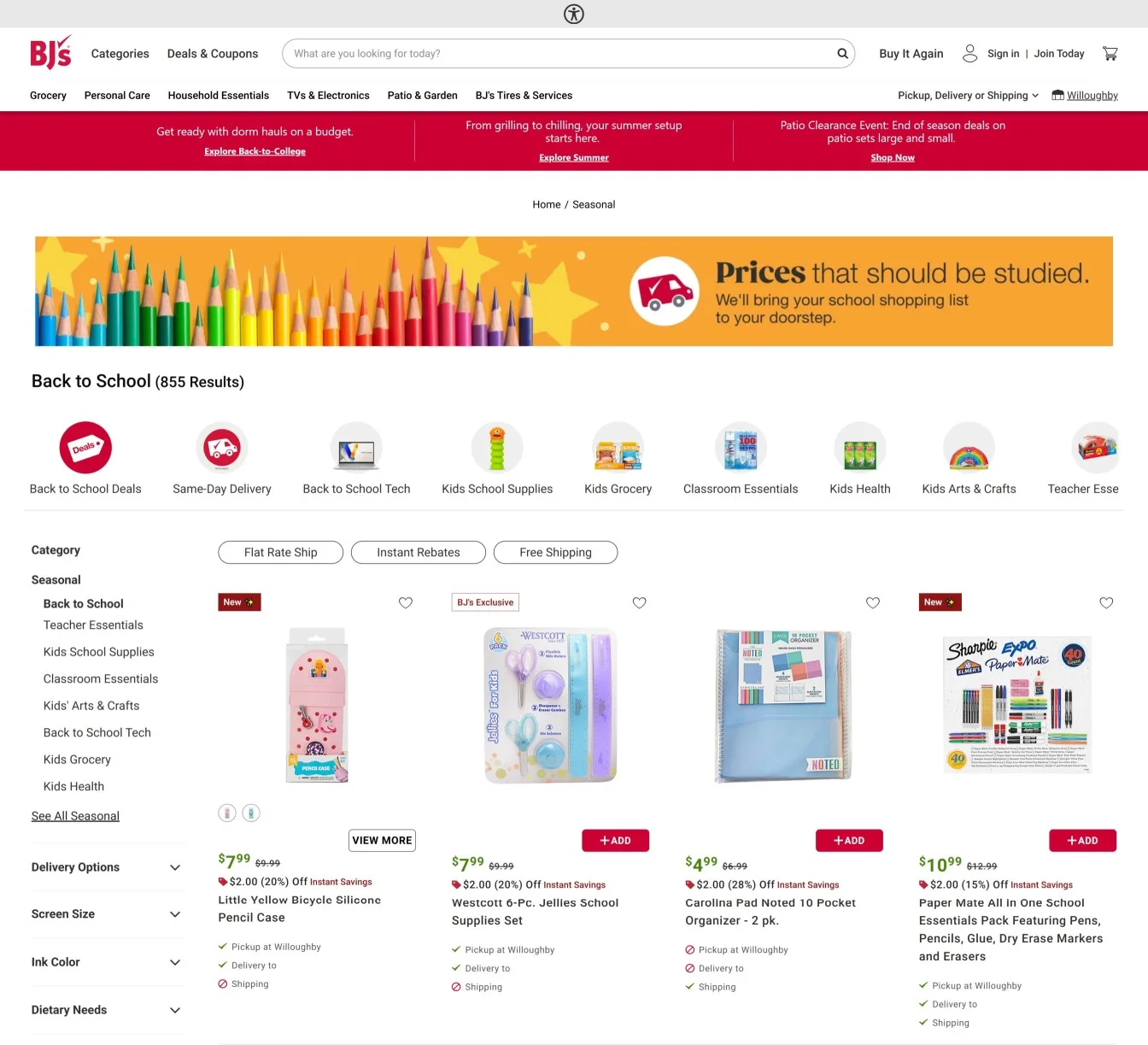
Dropdown filters are great for desktop. Top bar visual filters, however, are way more accessible (as most category page filters get hidden on mobile).
The best part? They get an idea of what they’re looking for in the first fold (instead of just reading words). Here’s how BJs Supermarket does it on their Back to School sale page – note the icons to denote shipping speed, different types of deals on products:
If your sale ends soon, don’t expect one little banner to do the work. Take inspiration from how 260 Sample Sale does it (because limited time sales are kinda their thing):
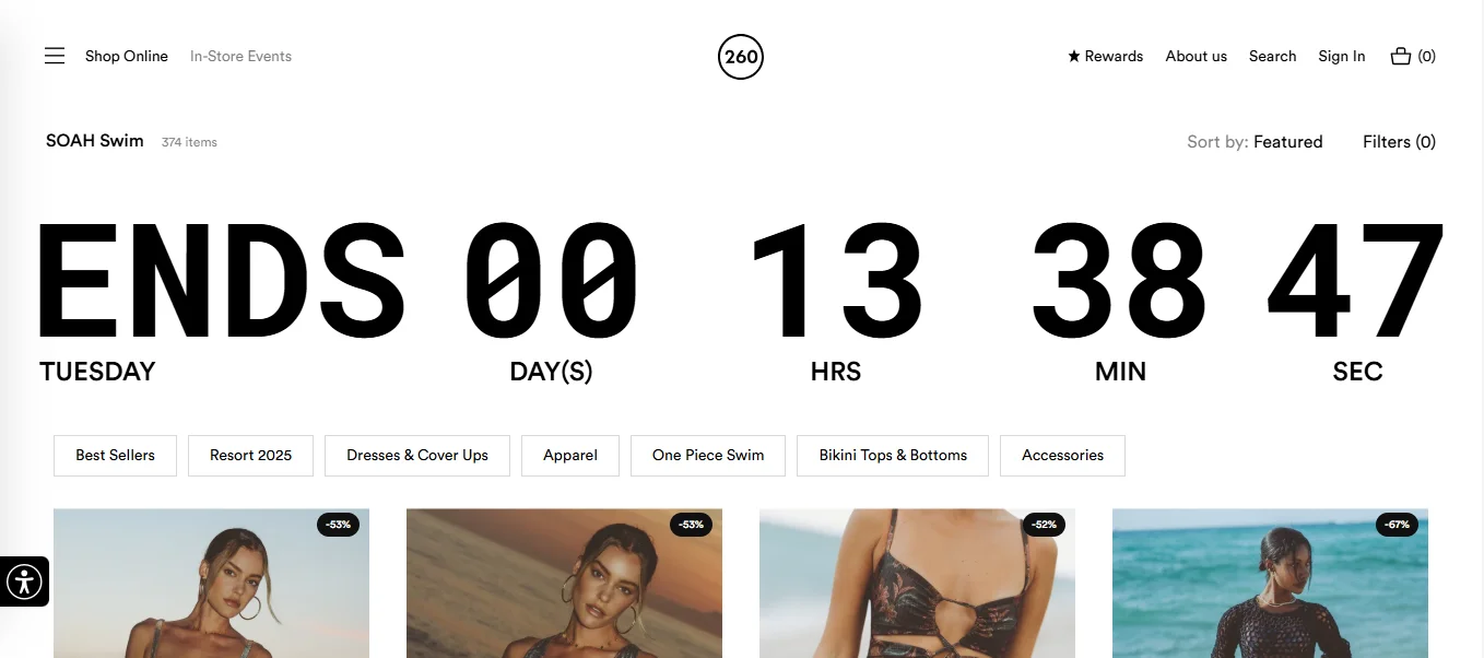
Pro Tip: Keep the countdown sticky as a bottom/top bar as the shopper scrolls through (but make it much smaller, and remember, it shouldn't take up more than 3% of screen space).
A static badge gets ignored fast. Add a shimmer, a soft bounce, a pulse, anything that will make the shopper want to click through. Take inspiration from how Aloha does it:
Pro Tip: Also use animations to explain how to apply or extract discounts within your sale page – for example, “how to add bundles and avail the discount.”
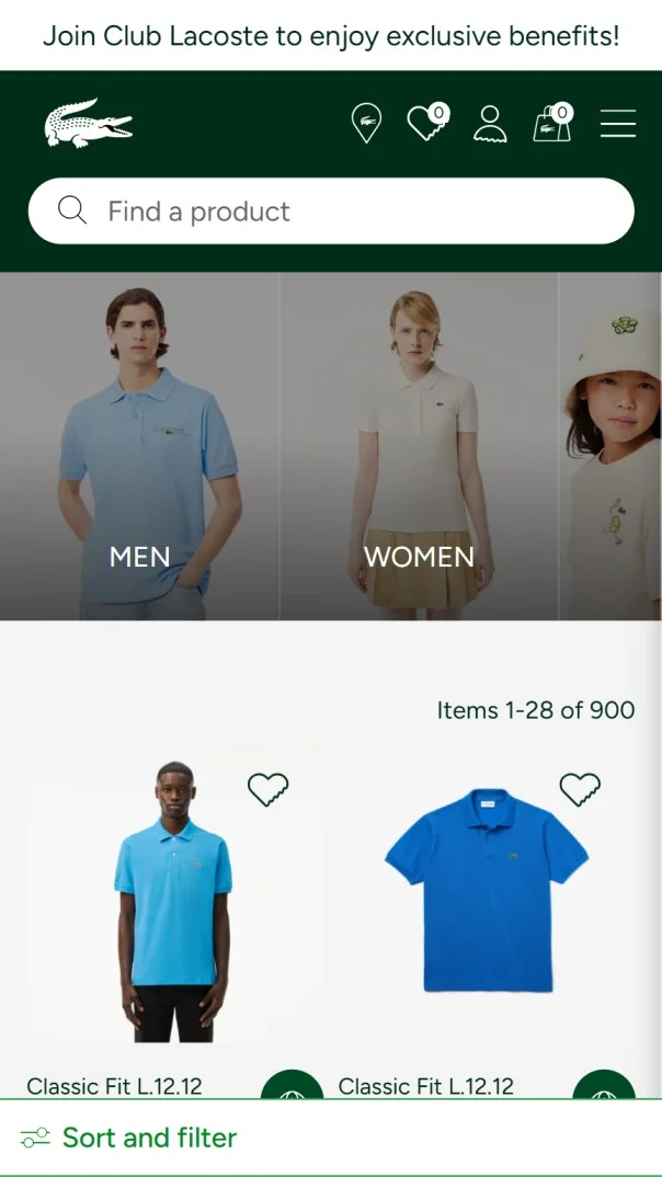
More than half of your traffic to your sale pages will most likely be from mobile. This is why your mobile sale page has to induce the scroll.
Take inspiration from how Lacoste does it with impeccable mobile UX. Note the horizontally scrolling hero banner, showing visual filters to help shoppers find what categories they’re looking for – also note the sticky filter option on the bottom bar:
Also read: eCommerce UX: 20 Common Mistakes (The Unnoticeable Ones)
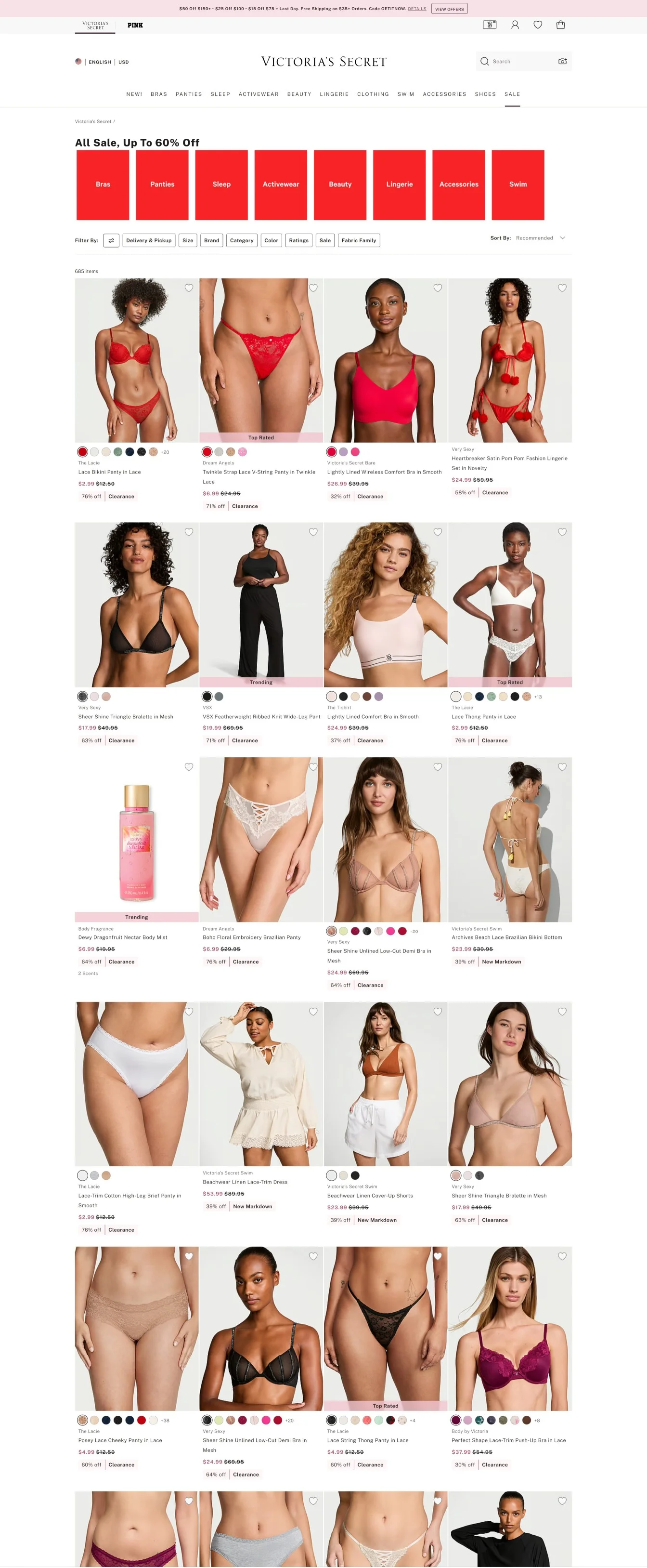
Or, in simple words, you need to cater to window shoppers, too. This way, shoppers find it easier to visually differentiate. Also, if every product is of a different color, it gets visually jarring.
Take Victoria’s Secret’s sale page as an example – note how each row shows different colors, just enough to maintain a visual contrast, making it easy to scroll through:
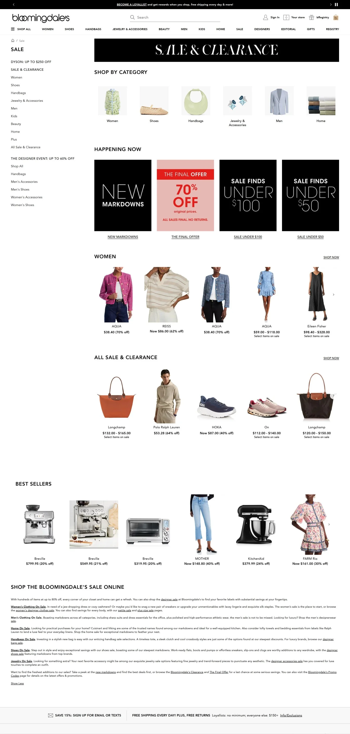
Most eCommerce stores make shoppers scroll through infinitely scrolling category pages with 1000s of listings. Instead, pre-qualify them, as Bloomingdale’s does:
If someone has to hunt for your deals, they’re not deals — they’re Easter eggs (this could be an awesome idea for an Easter egg hunt campaign).
However, in all seriousness, do ensure people can find your sale pages on the:
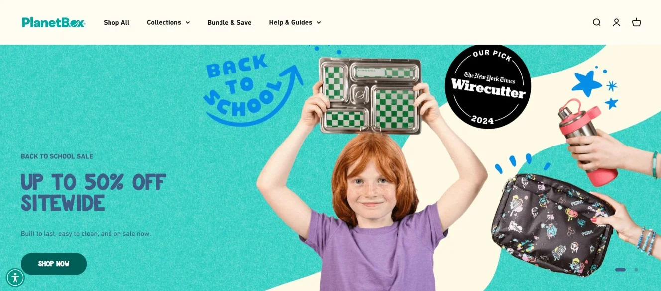
The hero banner is always the best place, especially for in-season sales, sitewide, and flash sales. Make sure you show previews of what products are on sale, the discount amount, and some best picks – here’s how Planet Box does it, with a PR badge on the sale banner:
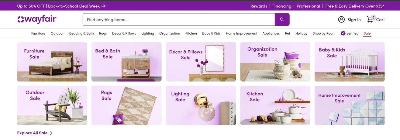
After that, the second-best place is the navigation. Note how Wayfair shows the sale menu in red, and once a user hovers over, it shows a full screen drop down menu with representative images for each product category (but all of them are designed to have the same feel):
Also read: 15 Website Navigation Menu Examples for eCommerce Stores
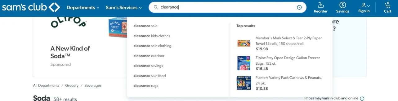
As always, search results are always a great place to pull shoppers into ongoing sales promotions. Or, you can do one better, and show search suggestions, as Sam’s Club does:
We’ve already covered how to use exit intent pop-ups to lead shoppers to sale pages. But your copy’s got to frame it as an opportunity, not as a ‘cheap’ option.
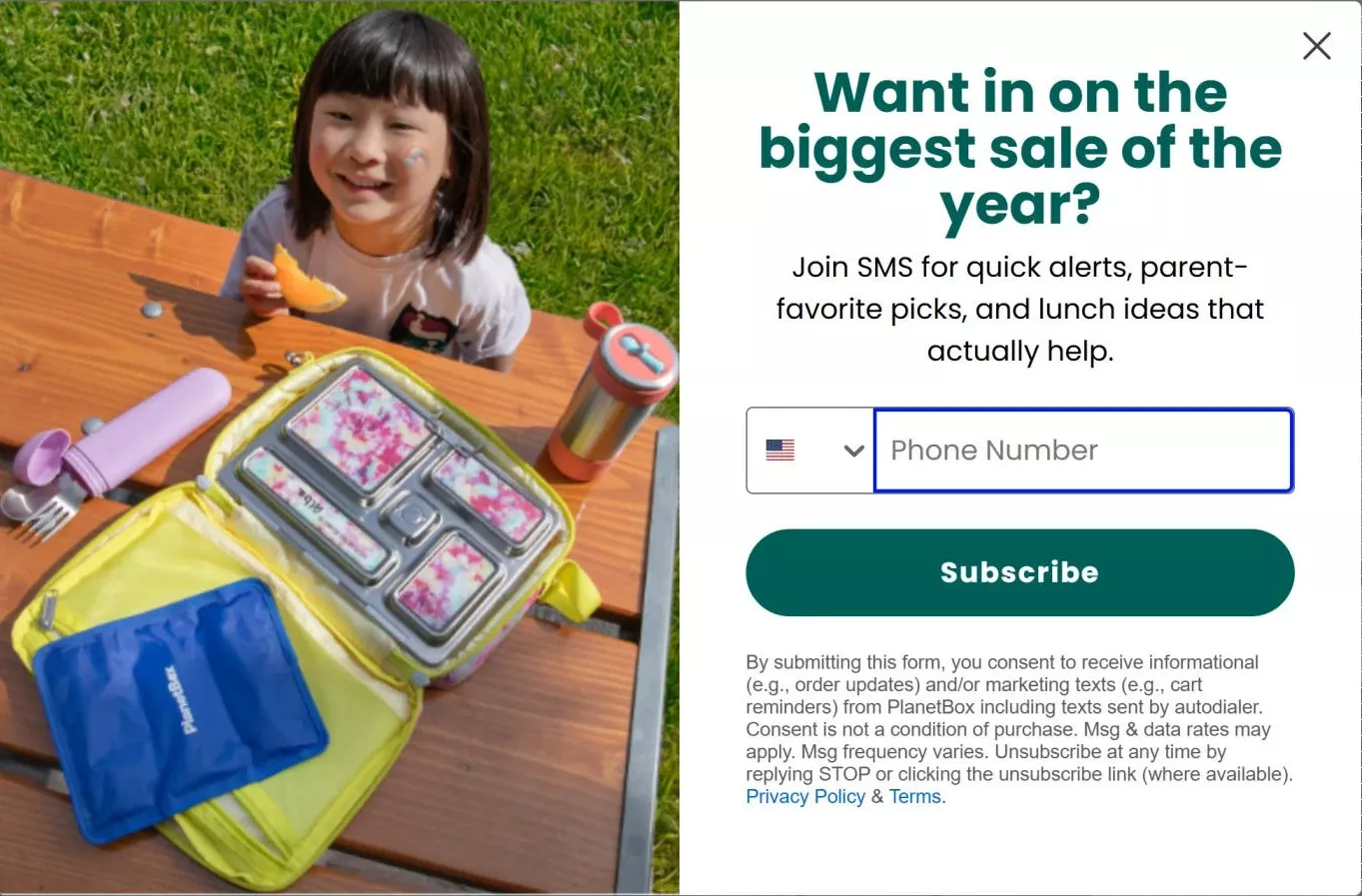
Check out how Planet Box calls their ‘Back to School’ sale the biggest sale of the year (but doesn’t exactly spell it out, as back-to-school season is close, but not quite here, when we were writing this piece):
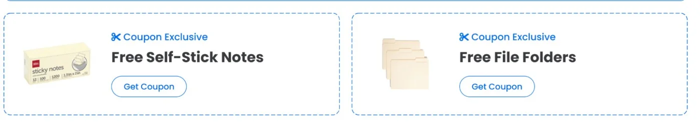
Forcing people to remember discount codes is a BAD idea. But you know that. Either you let them auto-apply at checkout. Or, let them ‘copy’ the code. Here’s a great example from officesupply.com:
Don’t make users click into the product page just to buy.
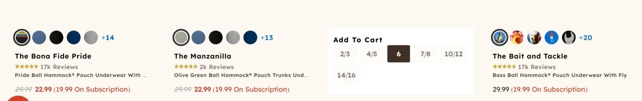
If it’s a deal or a bundle, let them add it from the sale page itself. Note how Shinesty allows users to select sizes, right from the product listing:
Also read: How to Increase Add-to-Cart Conversion Rate: 32 Brilliant Ideas
Yeah, the item’s on sale. Is the product any good? That’s what your sale page listings have to answer and prove.
Take inspiration from how Only Natural Pet shows descriptions on each product listing as a user hovers – along with badges that show the impact quickly, for shoppers who are just scrolling through:
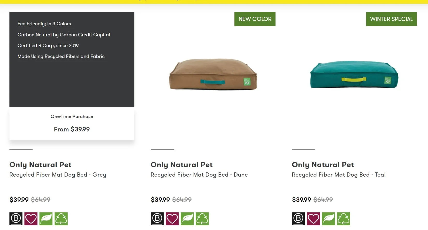
Pro Tip: Always mention which products don’t have returns (or else, shoppers might just click through, only to be disappointed, leading to an unnaturally high cart abandonment rate).
FOMO – the only goal these sale pages have. The biggest difference between all other types of sale pages and flash sale pages: the countdown timer. Often lasting between 3 and 120 hours, flash sale pages exist to keep people around.
Here’s an awesome example from Peloton Apparel – note how they keep the countdown timer nested in the hero banner along with a mention of the discount figure:
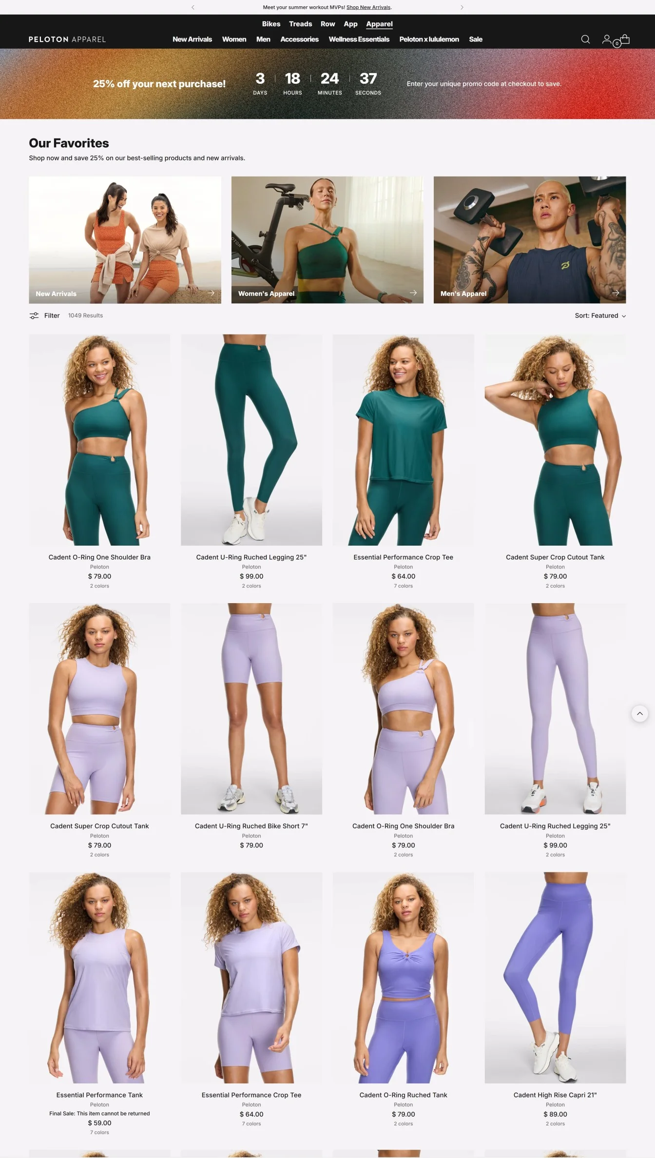
Pro Tip: Once a shopper scrolls through, keep the timer sticky, either in the notification bar or as a floating button.
Commonly used for any event – be it Back to School Season or Christmas – these sale pages often house gifts, clearance items, and even newly launched items (that aren’t always on sale).
Pottery Barn’s ‘End of Season Sale’ page shows an awesome example of this page in action. Other than the muted visuals for spring, note how there’s a category for holiday as well as options to filter by use-case pricing, and shipping options:
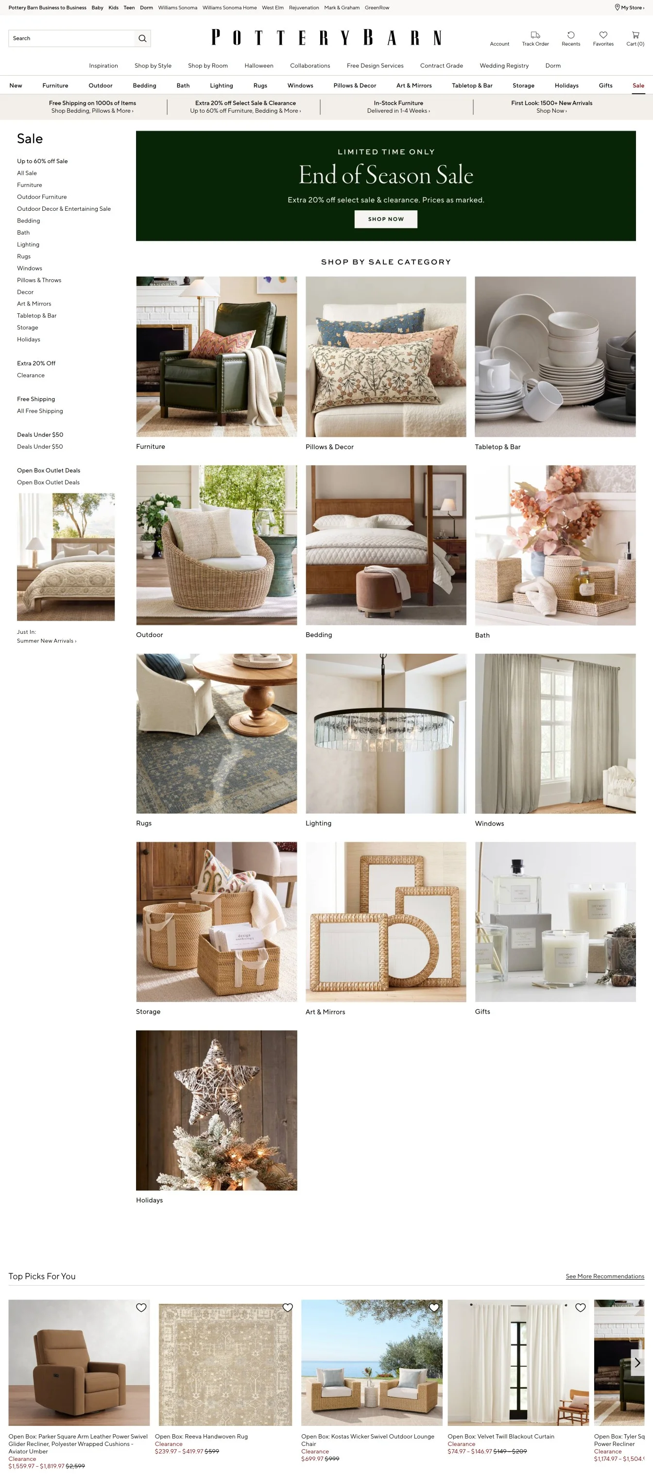
Pro Tip: Always build a reusable page URL – so you can repurpose it annually.
You don’t have to create new page designs to showcase bundles – just make sure shoppers know how to get access to the bundle.
Aloha does exactly this, within their bundle sale page – they do explain the steps in the hero banner, but also follow-up with a larger animation callout, below the fold, to show the steps.
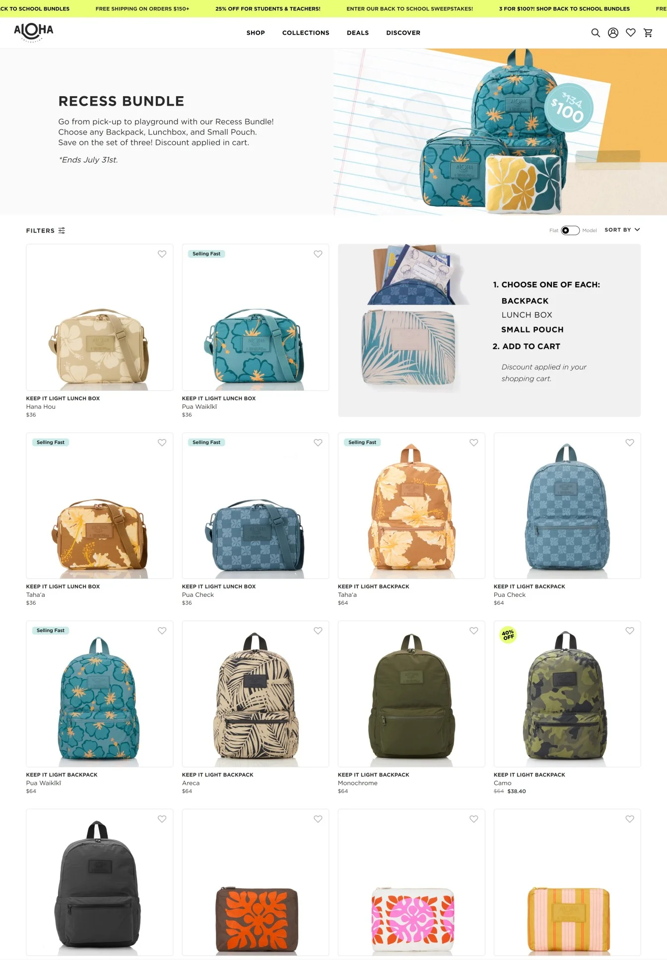
Pro Tip: Show real savings: “$72 if bought separately – $59 in this bundle.” – note how Aloha does the same thing in the product badge on the hero banner.
What can you do with sweaters in the mid of July? Or any slow-selling or seasonal inventory, for that matter?
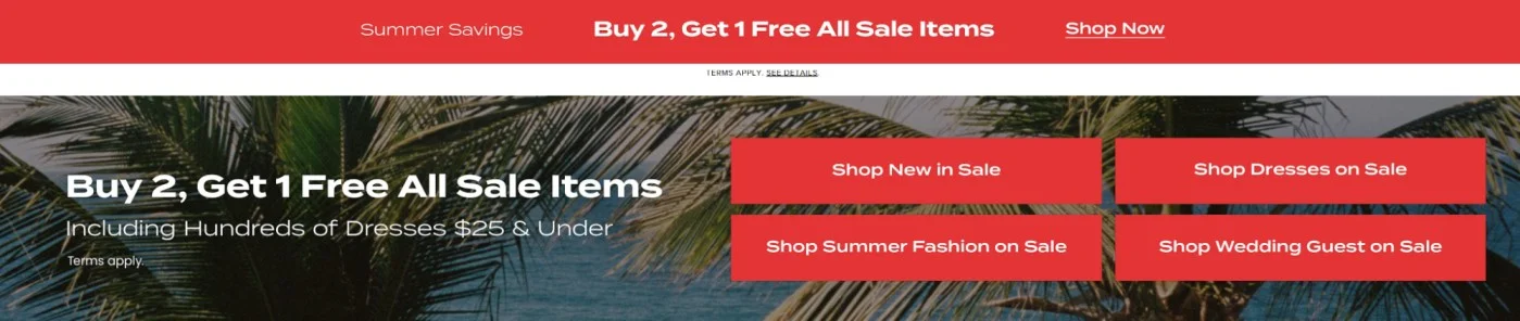
Put them up for BOGO – the simplest way out comes from Lulu’s BOGO sale page example. They simply use a banner to announce it on their homepage as well as their sale pages:
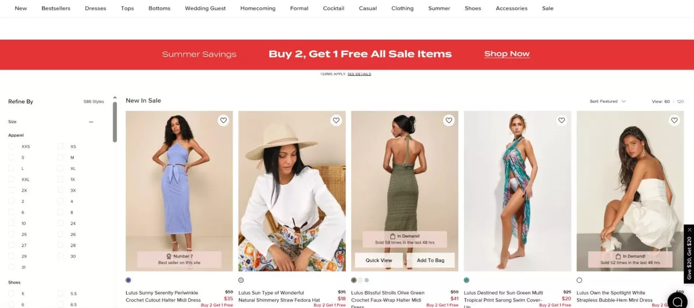
But that’s not the true genius of their sale pages – they show extremely intelligent microcopy to tackle possible objections about discounted items. Note how the product listings show badges to speak to the demand as well as the status of the products (also note how the notification bar remains sticky):
Pro Tip: Auto-apply logic for the BOGO in your cart. Don’t make users think. Use progress bars with copy, like, “Add 1 more to unlock your freebie.”
Your “not everyone gets this” page. The goal is to drive email sign-ups as well as people who’ll participate in your loyalty program.
Take this sale page, for example, from Tote & Carry – they keep the discounted pricing available only on sign-in. And the cherry on the cake? The social feed acts as a motivator, creating a need for shoppers to belong:
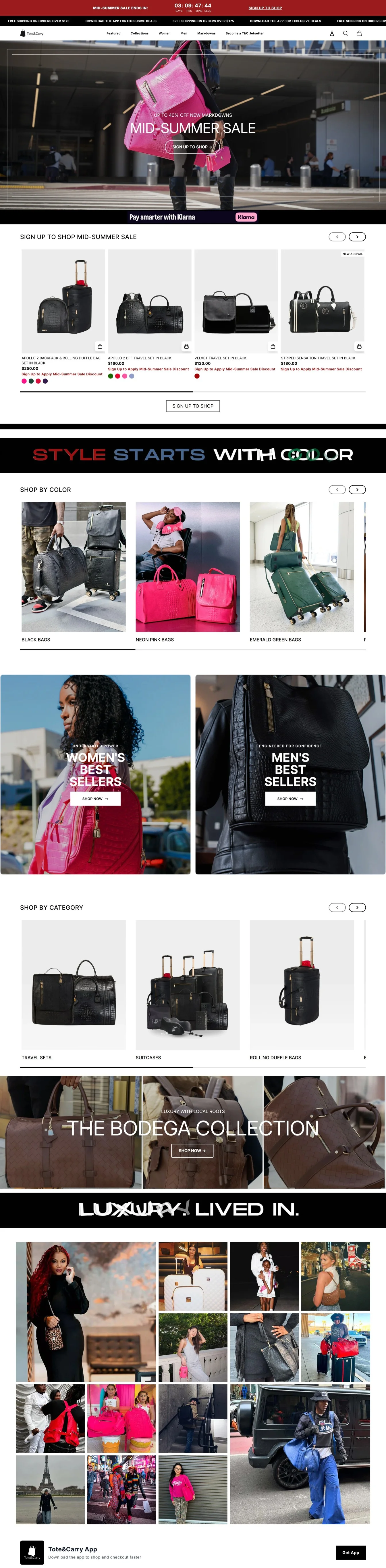
Pro Tip: A sale page may be the first place a shopper interacts with your brand, so it’s always a good idea to have shopping paths open – note how the above example shows new collections and a shop by category option (along with extremely interactive brand statements).
Perfect for multi-brand, multi-product, and grocery eCommerce stores – ‘daily deals’ pages are THE holy grail for clearing stock, product discovery, and everything in between.
See how Chewy sets up their ‘Today’s Deals’ sale page. They start with a free gift card banner, then provide visual navigation options by pet, some top-selling medication deals on subscriptions, some more product category-wise navigation options, and then the category page layout with all products:
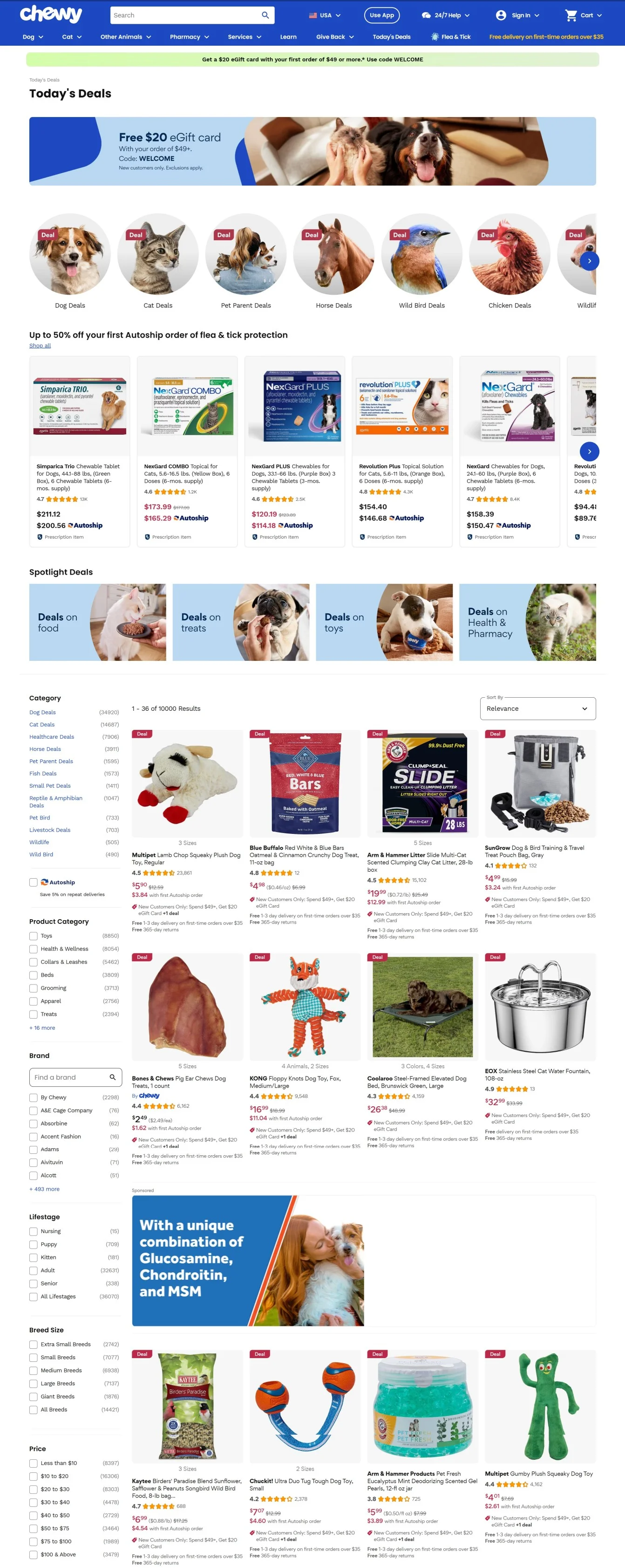
Pro Tip: Instead of making infinitely scrolling pages, have smart pre-set filters to guide shoppers to the most relevant deals – like filters based on shipping speeds, easy adds to existing subscriptions, amount of discount, use-case (like Chewy using breed sizes and lifestages).
The final curtain. No restocks. Just a genius way to clear out slow-selling SKUs and convert impulse buyers.
Note how AE converts on-the-edge buyers by showing savings badges as well as options for same-day delivery (along with urgency nudges on listings like “Going fast! 52 added to bag”):
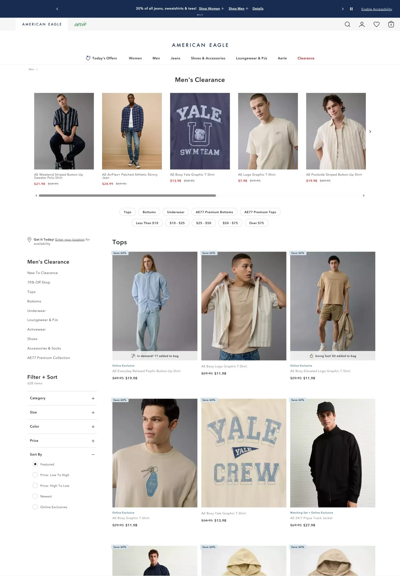
Pro Tip: Make sure shoppers are the first to know if you’ve no return policy for clearance items. Or else, you might just lead to a huge cart abandonment rate for traffic coming in from your sale pages.
If Doritos brought back their Pizza Cravers flavor, what would you do? Throw all your money at it, right?
That’s what archive sales do – awesome for cult favorite or retired products/collections, brands with a strong repeat customer base should take advantage of this kind of sale. The goal here isn’t a discount. It’s mostly about creating demand for a product with a very niche audience. But that doesn’t mean smaller eCommerce brands can’t use this type of sale.
Here’s one example from Eagle Creek 500 – they use storytelling to connect to the emotional angle of the shopper – note how the hero image shows an Eagle Creek bag in use – and a crisp copy below the fold, calling for adventures:
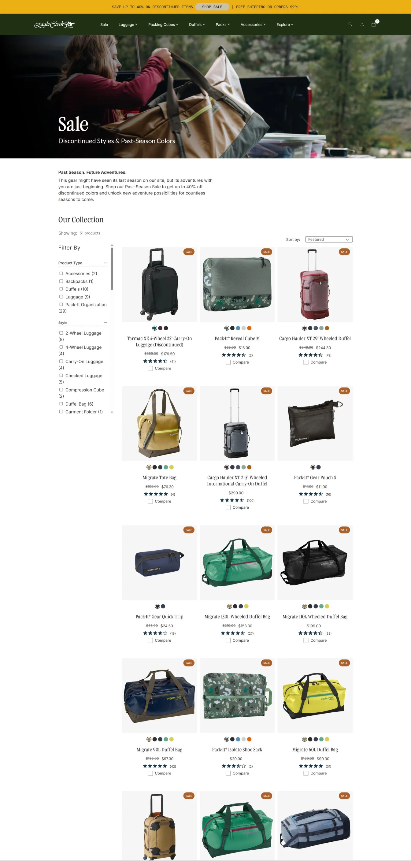
Pro Tip: The difference between a clearance sale and an archive sale page is the way the page is positioned. For archive pages, use email waitlists to decide which products come back. And when you do bring them back, position the archive as a fan-led decision, instead of a clearance angle – here’s one more example of emotional storytelling in action from IDYL – note the pre-sell page like structure:

If people land on your sale page, only to bounce away, what’s the use?
A quiz on a sale page is just sensible, because:
a) lower decision paralysis
b) makes people feel, “this sale’s for me”
c) helps you show the products that are most likely to sell/catch attention (even when the sale’s not there)
This is exactly the sentiment SourceBMX’s sale page creates. While providing shoppers with the options to find products for themselves, they also feature options to take a quiz and find the perfect BMX on sale:
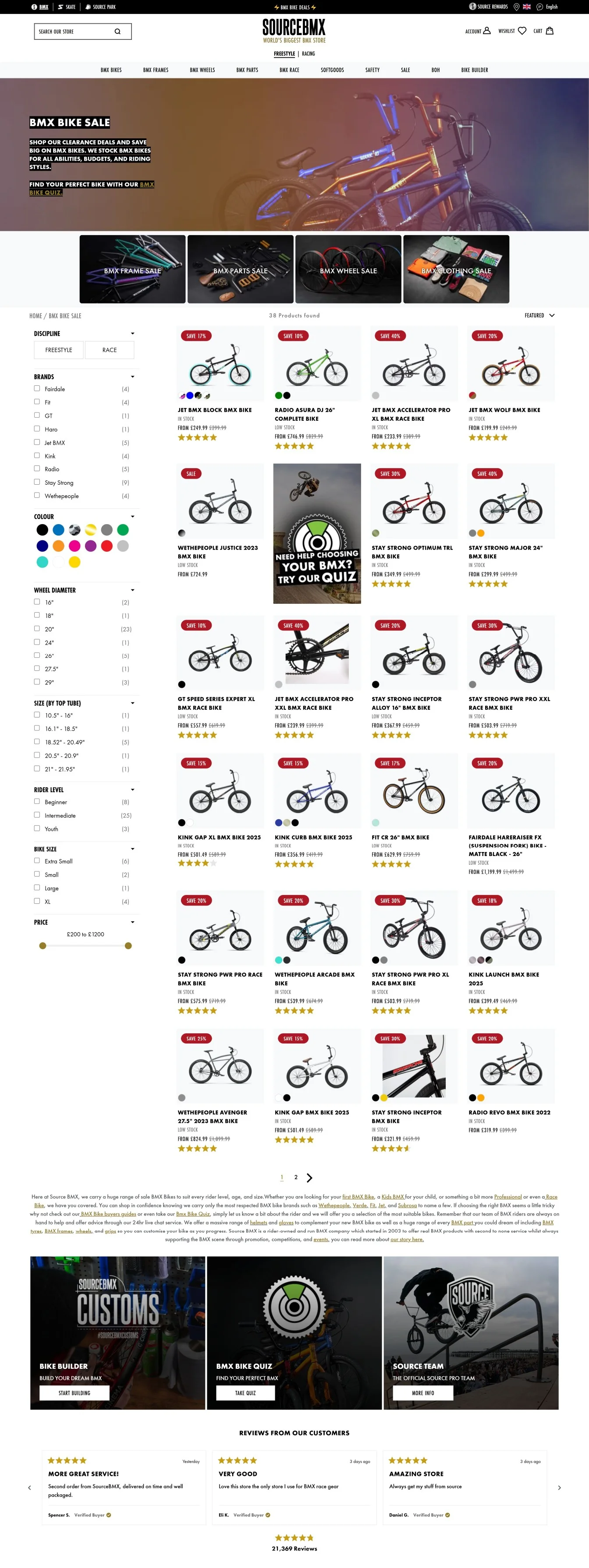
Pro Tip: Don’t use way too many questions, or the shopper may just bounce – if needed, break the quiz into two parts – offer an option like “make your recommendations even more accurate?”
Treat it like a pre-sell, but with actual options to buy. By this, we mean: you’ve to explain why this sale is special and exactly how you’re rewarding shoppers.
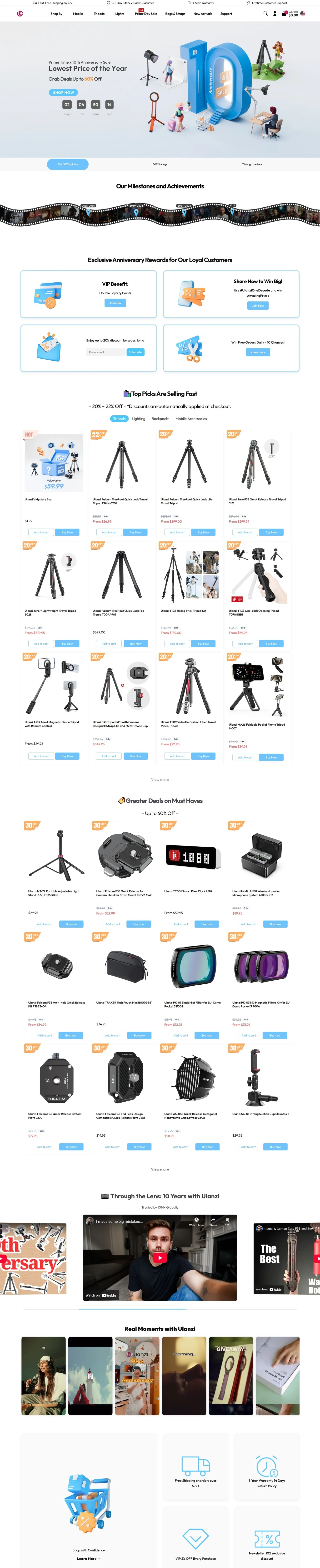
Note how this sale page from Ulanzi features a hero banner with a countdown, sticky navigation bar, top selling picks, and YouTube videos showing reviews of the brand’s products:
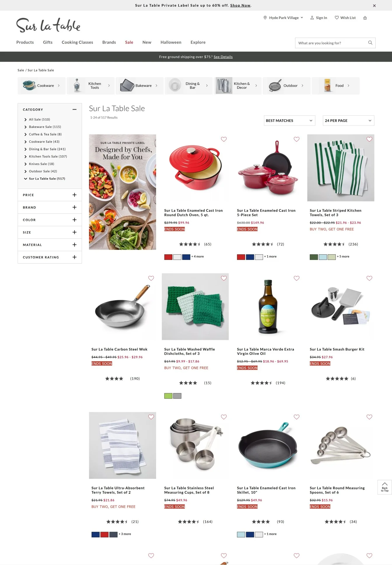
A sub sale page – this page is the second step from your all sales page – ideal for highlighting products on a theme or use-case. Take this sale page example from Sur La Table, highlighting products that go with a table.
Note how the merchandise is pre-set, showing different types of deals – some expiring, some BOGO, and some bundles:
Also read: Lessons From 6 Kickass Pre-Order Campaigns (eCommerce)
Subscribe for more articles like this!

Read by 5000+ ecommerce store owners
.svg)

.svg)

.svg)
.svg)
2026 Convertcart, All Rights Reserved
33/1, Castle Street, Ashok Nagar, Bengaluru, India