27 Practical Ways To Reduce eCommerce Bounce Rate


For eCommerce sites, 20-40% is an acceptable bounce rate range.
Well, the good news is that reducing your bounce rate doesn't involve moving mountains–you just need to be obsessed with providing a great user experience 🙂
As the first step, you'd want to build a list of things that lead to a high bounce rate on your eCommerce store:
Now that you know what could be causing shoppers to bounce, let's get into ways of solving it.
Problem:
The user sees your ad–likes the product in it–and lands on the ‘Collections’ page on which they can’t find the product they clicked for.
Solution:
Always link the product page of the product that you are advertising in your ads.
So that when the shoppers click on the ad they land right on the product they liked.
Problem:
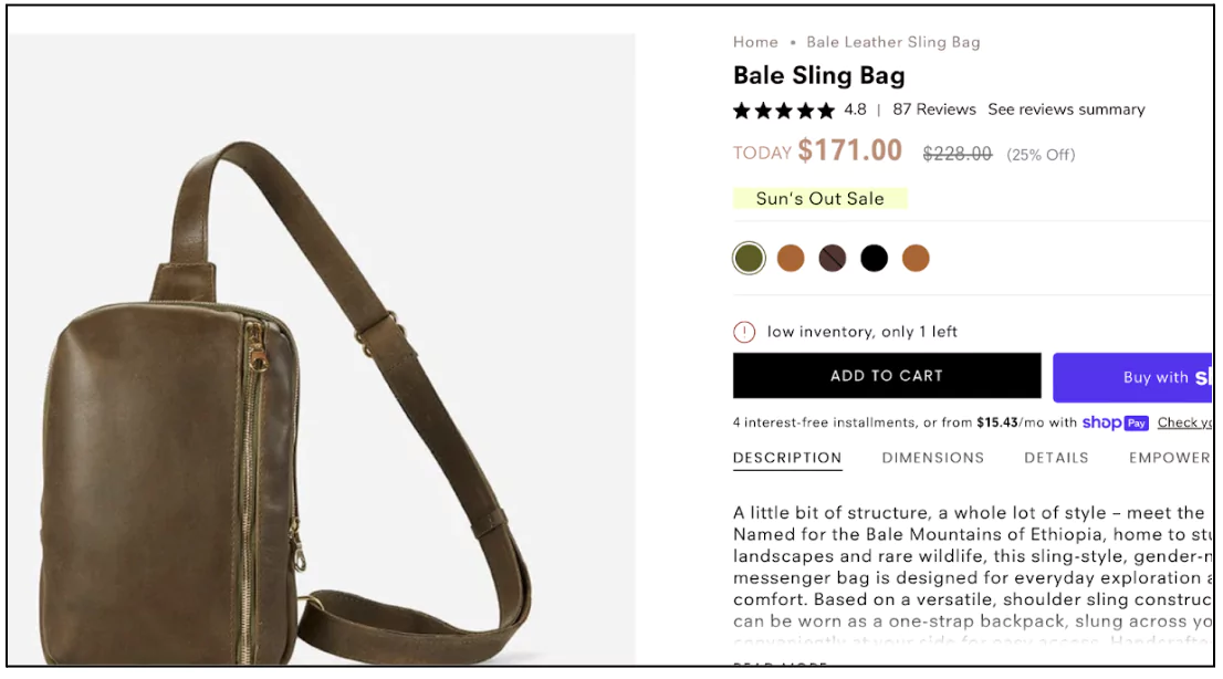
You create offers for shoppers to go ahead and make purchases–but what if these offers get missed? A lot of effort down the drain.
Solution:
Here’s how you can make sure that your offers don’t go unnoticed:


Problem:
Shoppers are not excited about shopping on your site–they can probably find similar products at a better price elsewhere.
Solution:
Free gifts always get shoppers excited.
The most common way of executing the free gift strategy is by making it conditional–provide a free gift above a certain threshold.
Another great way of implementing it is by getting your shoppers enrolled for a loyalty program by adding a free gift to your rewards–this will help you not only reduce bounce rate but also increase repeat sales.
There are numerous shoppers who sign up for Sephora’s loyalty program only because they know that they will get a free gift during their birthday month.
Lancome also offers fancy gifts with purchases. They promote their conditional offer in a different section on the homepage–so that shoppers notice it.

Problem:
Users want help but don’t want the ‘help’ to disturb them.
Solution:
Your shoppers are new to your store and they might have questions–be there for them but be sure to not disturb them while they browse.
Some points that will be helpful in implementing the live chat are:
To make your chat more efficient–consider adding some common FAQs to your chat so that customers don’t have to wait to get basic information–like return and refund policy, product specifications, shipping details etc.
Goodwin and Goodwin place a prominent live chat feature which doesn’t popup until clicked on.

Problem:
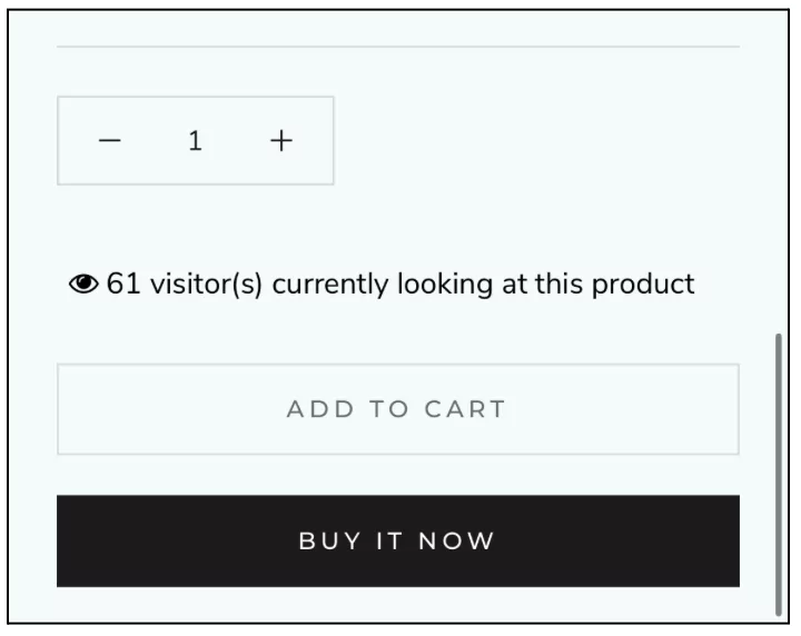
Even when customers like a product, they procrastinate on buying it because they tend to believe that it is not going anywhere–they can come back and buy it anytime–and we know what happens after that.
Solution:
Limit the availability–let your customers know that the product they liked might not be there when they come back later. For this, add visual cues and induce FOMO.
Problem:
When your shoppers can’t figure out–what’s so special about your product–in the first 30 seconds of looking at it–they will not buy.
Solution:
Add a section just below the buy section–the second fold of your product page–highlighting the key benefits of your product.
Make it catchy and readable–add images and icons and keep very little text on it.

Problem:
Well, they have already decided to leave your site–that’s enough of a problem for us.
Solution:
Give them a last-minute lucrative hook–to stay back–through exit intent popups.
Make sure to capture the email IDs of your visitors to nurture them through emails.
Give an offer that entices shoppers–make it limited-time–let’s say for the next 2 hours or so.
Write an actionable copy on the CTA like ‘Claim your discount’ or ‘Get your free gift’.
Always add pictures of your most popular product/s on the popup.
Problem:
A user lands on a product but doesn’t like the product–the price, design, variants etc.
Solution:
Recommend other popular and similar products under the buy and benefits section.
This will help shoppers navigate to other products and find something that will suit their needs.

Problem:
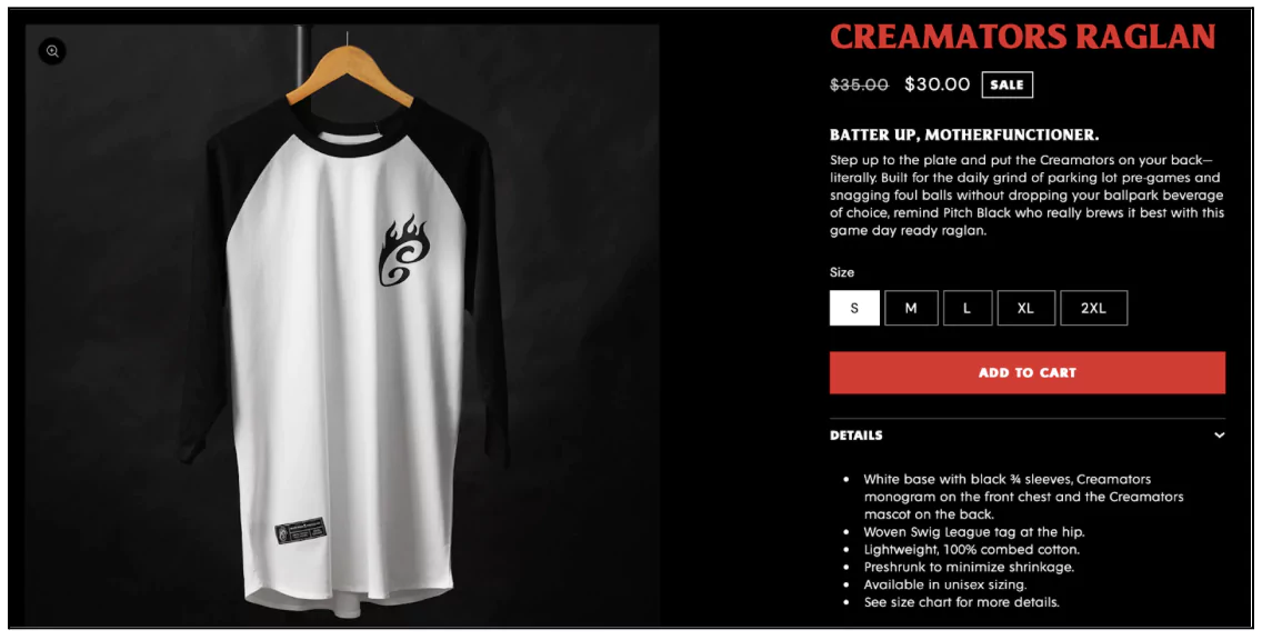
Your CTAs are not powerful enough to push visitors to the next step.
Solution:
The first step–the intent of the button should be crystal clear–the microcopy should tell users exactly where they will land after clicking.
Make your buttons stand out:

Problem:
The problem here again is–there is no urgency to take the next step.
Solution:
Install a timer–could be for a limited period offer, flash sales, reserved stock (how long the stock will be reserved in the cart) or shipping deadlines (to order within a specific time period to qualify for next-day delivery).
Put this timer on a banner on top. Include seconds as well–the constant change in the countdown builds urgency.
Add a subtle animation too–say, a slight pulse to draw attention.
Also read: Why Are People Adding To Cart But Not Buying?
Problem:
When there are a bunch of links together, it is very natural that some important links–that hold shoppers on your website–get missed.
Solution:
Place links based on shoppers’ eye-scanning patterns.
Online shoppers either follow a Z-shaped scanning pattern or an F-shaped pattern.
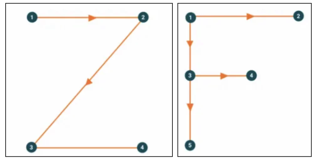
Either way, it is the top left side where eyes fall first–and that’s where you should place the most enticing link.
Consider placing the ‘New arrivals’ and ‘Sales’ as the first link and the last link on your navigation bar–and other links in between.
Mack Weldon places ‘New and Trending’ as the first link and highlights ‘Sale’ in their navigation bar–making both highly noticeable.

Problem:
Shoppers sometimes can’t see a part of the query that they are typing in the search bar–making the search experience distasteful.
Solution:
When shoppers are typing in a search query, they want to be able to edit or review before hitting the search button. For this, ensure that your search bar is about 27 characters wide.
Also, make your search bar prominent–let it cover 60% of the header space–nudging shoppers to use the search bar to find the products they are looking for instead of bouncing.
If there are space constraints on your website or for optimizing for mobile–let it expand automatically when the shoppers start typing.
Consider making the search bar sticky, especially on mobile (Trust us, it helps!)

Problem:
The variety of products online is just overwhelming–choosing the right product from a huge catalog at times frustrates shoppers.
Solution:
Suggest a product just for them through quizzes–add the link to the quiz on your homepage.
When you ask specific questions to your customers and recommend a product–it is not just any other product for them–it becomes THE product for them–a product that will cater to their exact needs.
In the quiz, get personal and specific as much as possible–the more the personalisation, the more the interest of the shoppers.
At the same time, do not go overboard with the number of questions and options–stick to 5-8 questions and 3-5 options. You can also provide visual options for better clarity, wherever needed.
While suggesting the product, make sure to give all the relevant details like price, rating, offers (if any) etc–to ease the decision-making process.

Do check out: 17 Proven Ways To Perfect eCommerce FAQs
Problem:
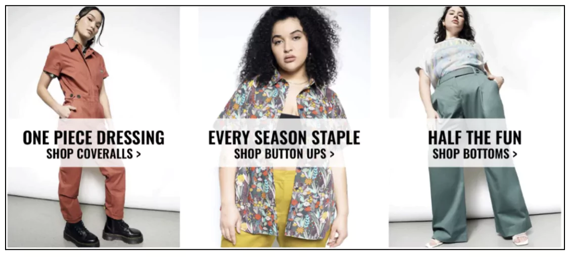
Returning shoppers generally bounce when they can’t find anything “new” in your collection–and the irony is that most of the time they don’t even try to find the new items. If the homepage doesn’t change, they assume nothing in your store has changed.
Solution:
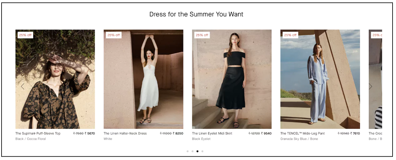
Update your first fold image routinely–add the images of new collections or seasonal products. Also, change other pictures on the homepage to pictures of newly added products.
Additionally, add a section only for new arrivals–link it to the “New Arrivals” category page.
You should also add a ‘New Arrivals’ tab in the navigation bar.
Everlane adds products as per the season and features them on its homepage. Check how:
Problem:
Customers are oftentimes unsure of the look and feel of your products–how will it be outside of product images.
Solution:
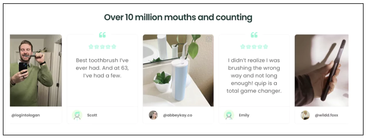
User-generated content.
Here’s a checklist of adding UGC that will make all the difference:


Problem:
More clutter, more confusion.
Solution:
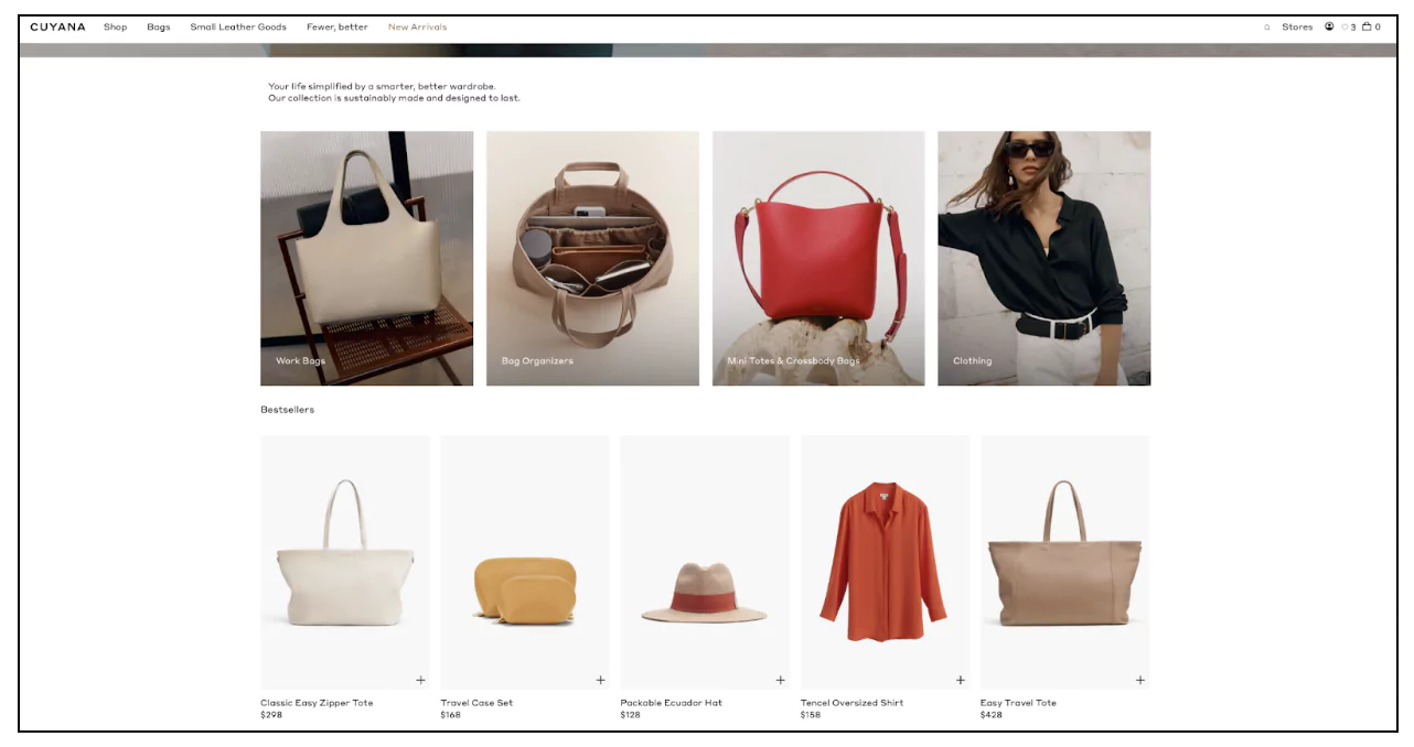
Your shoppers are not on your website for the design–they are there for the products–and anything that takes their attention away from the products should be removed–could be fancy design elements or extra clutter.
Make sure to take the following homepage best practices into account:
Also read: eCommerce Website Design: 17 Conversion-Boosting Principles
Problem:
The copy on the site is generic and dry.
Solution:
Copy that appeals to the emotions of your audience–makes them stay.
Focus on benefit-driven headlines and product descriptions that address the needs and desires of your audience.
Instead of simply listing features, emphasize how your products can improve their lives.
For instance, rather than saying "This blender has a 500-watt motor," say "Effortlessly create your favorite smoothies and soups with our powerful 500-watt blender."
Another method to consider is–storytelling.
Share customer success stories, usage scenarios, or personal anecdotes that resonate with your audience’s experiences.
For example, if you sell shoes, include–a story about how a top-rated pair helped someone train for and complete their first marathon.
This not only makes the content more engaging but also builds an emotional connection with your readers–decreasing the chances of them bouncing.
Problem:
Solid paragraphs and large chunks of information–instant turn-off. Shoppers tend to skip such descriptions and ultimately bounce.
Solution:
Make your product descriptions more readable:

Example: Fastest pizza delivery in town vs We deliver pizza faster than anyone in town–do you see it?
Problem:
The website visitors are unsure whether they really need the product or if their need will be satisfied by the product that you are offering.
Solution:
Create additional content for them in the form of guides and product manuals.
Place these in the third or fourth fold of the product page.
For guides and manuals, you will have to redirect shoppers to a different page–make sure there is a ‘Buy Now’ CTA on these pages as well.

Problem:
For many shoppers product videos garner more trust–just pictures are not enough for them to make a decision.
Solution:
Product videos–that highlight features, functionality and quality.
Keep in mind:

Problem:
“What if the product doesn’t arrive when I need it?” A question that leads to site abandonment.
Solution:
Mention the estimated time of delivery.
Place it in the buy section.

Don't forget to check out: eCommerce Bounce Rate By Industry (+Tips To Improve)
Problem:
Let’s say a customer wants to buy a pair of sunglasses from your website–the biggest issue is that he won’t be able to gauge the overall appearance of it–the result is that shoppers bounce.
Solution:
Add a try-on feature on your product page.
Just put a small button at the bottom right corner of your product images for shoppers to virtually try out your product.

Problem:
Websites without any product review or social proof may come across as slightly shady 🙃
Solution:
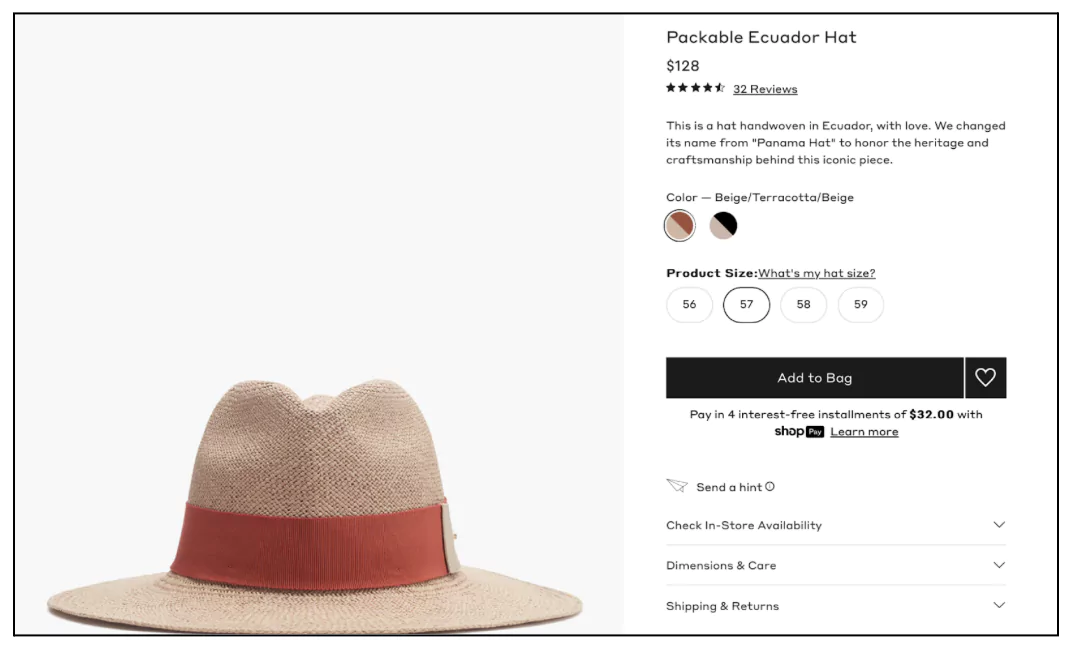
Add star ratings and reviews to your product pages (preferably with images).
Place your star ratings in the buy section–preferably right under the heading–link the ratings to the reviews.
Always add the number of ratings next to the average star ratings.

Kettle and Fire displays a couple of their reviews as a carousel along with star ratings and verified buyer badge–also talks about their total happy customer base–really strong social proof.

Problem:
Paying for shipping feels like an “extra” cost of which the shoppers feel like they don’t get any benefit.
Solution:
Give free shipping and make sure to highlight it.
Mention it explicitly on the product page.

Problem:
Sometimes the perceived value of the items in the cart is not high enough–makes shoppers hesitant to go ahead and make the purchase.
Solution:
Mention the loyalty points getting added to the wallet.
Also, mention the amount they are worth.

Problem:
Shoppers will never wait around if your pages load slowly.
Solution:
Improve your site speed by checking for the following:
Problem:
73.72% of people who end up on an empty or standard 404 error message with no design or other links will leave your website and not return.
Solution:
First of all, don’t have them–get rid of all your 404 pages.
But it might happen that shoppers might still land on some broken links–don’t lose them there–customize the 404 pages.
When someone lands on an error page–tell them what to do.
Look at how creatively Academy has designed its 404 page.

98% of visitors who visit an eCommerce site—drop off without buying anything.
Reason: User experience issues that cause friction for visitors.
And Convertcart solves for exactly that.
We help eCommerce brands optimize their websites to boost their conversions.
We've helped 500+ eCommerce stores (in the US) improve user experience—and 2X their conversion rate.
How do we do this?
Our conversion experts can audit your site—identify UX issues, and suggest changes to turn more of your visitors into customers.
Targeted marketing and promotions tailored to specific customer segments or user behavior can help reduce bounce rate by attracting relevant traffic to your site. By offering personalized discounts, creating targeted email campaigns, and displaying relevant ads, you can increase the likelihood of visitors staying and making a purchase.
Bounce rate data can be accessed through website analytics platforms like Google Analytics. Within Google Analytics, you can find bounce rate metrics by navigating to the Audience Overview report, where it is displayed alongside other key metrics.