Conversion Optimization
older version - 33 eCommerce Product Page Optimization Hacks (+ Examples)
April 22, 2024

Insights in this post come from our CRO team's decade of experience working with eCommerce brands. Edited by our in-house content team.


Insights in this post come from our CRO team's decade of experience working with eCommerce brands. Edited by our in-house content team.
.jpg)
One of the key ways to get your product naming conventions right is to work with a template.
It then becomes easy to apply this across categories and products to come up with names that are unique but also sound like they stem from the same brand.
Here are some product page optimization hacks to try:
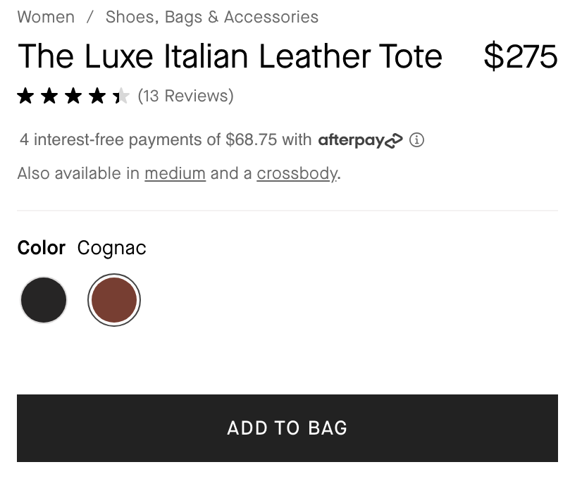
✔️ To templatise names, you can follow: Brand name + Product Type + USP.
If you’re a fashion or cosmetic brand, bringing in a fourth element of Color, Shade, or Tint also makes sense.
✔️ Define the key product attributes. This will help you differentiate every product from every other product super clearly.
Here’s a quick look at how Everlane names its products – clearly mentioning the product material and product type.
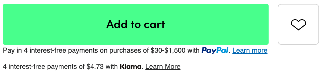
To make your add-to-cart buttons really pop out on the product page, here are some hacks to try:
Even if it’s a slight shift from the primary color, the hover effect makes it easy to register what needs to be clicked on.
See how the primary CTA subtly changes color upon hovering on Wayfair’s product page.
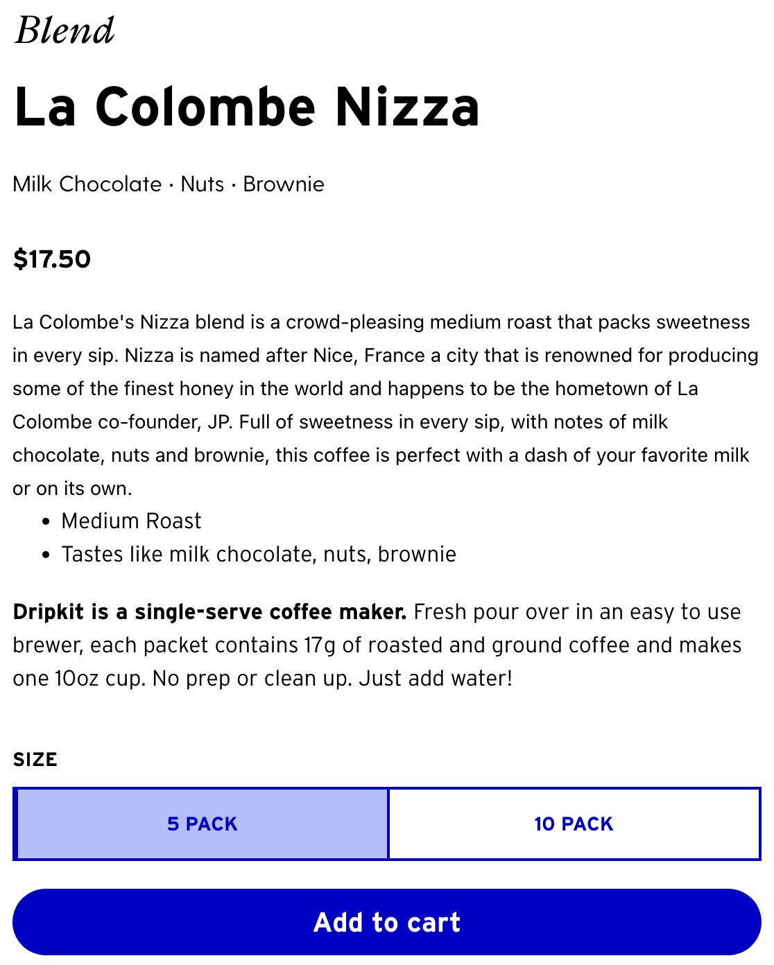
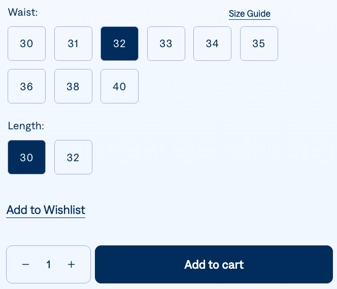
See how Dripkit has two add-to-cart buttons based on different product sizes.
When selected, the button has a subtle color change so shoppers can know which size they have chosen.
See how Mavi, an eCommerce apparel brand adds a sizing qualifier to their CTA.
When a shopper lands on the product page, they see a copy that says ‘select a size’ which compels them to select their choices.
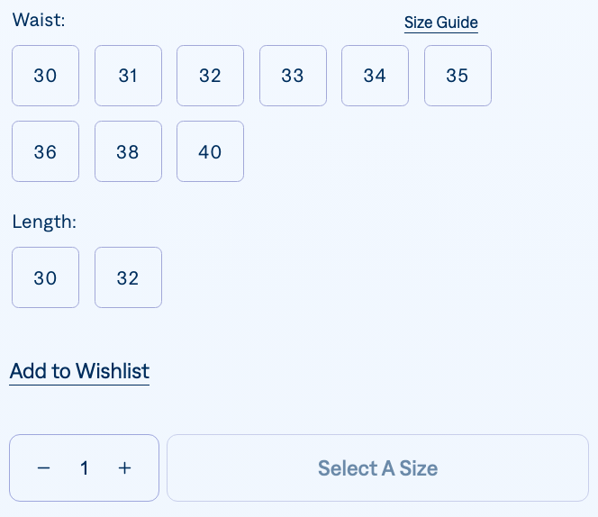
Then the selections and the add-to-cart button are highlighted with a dark blue color.
This way, shoppers can validate their choices.
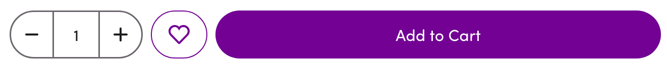
While many product pages feature a wishlist option through a heart-shaped icon, you can experiment with a secondary CTA button.
To make this product page optimization hack effective, you can feature this button in a different color.
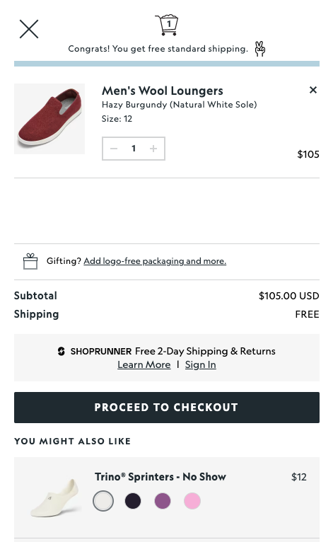
A sticky add to cart button or panel is helpful for mobile shopping experiences.
This feature can do two things at the same time:
See how fashion brand Lazy Oaf introduces this feature product page hack on it’s desktop site as well.
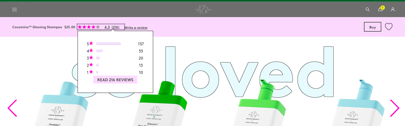
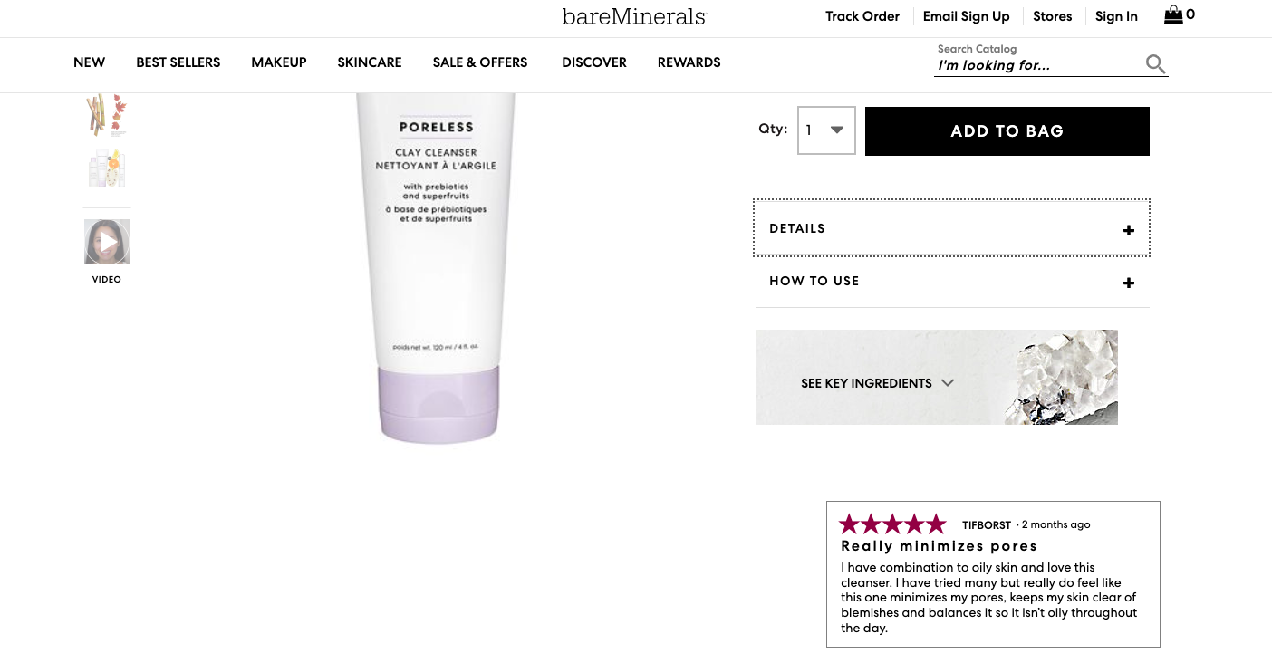
On product pages, shoppers have to often scroll down to read reviews.
See how skincare brand Drunk Elephant introduces reviews in the top sticky bar with a drop-down snapshot.
Here are a few product page optimization hacks to explore:
✔️ Showcase detailed reviews. The more granular, the better.
✔️ Offer proof through valid certifications & badges.
If a higher authority or standard has recognized your business to be highly ethical or responsible, then that will need to show up.
✔️ Make research findings a part of the mix.
This especially makes sense if you’re a brand that shoppers will look up to for evidence or awareness generation.
Confirmation bias is real amongst eCommerce shoppers.
If a shopper is exploring a product page, it’s generally because they somehow want to be told the product would make a good choice.
Highlighting a favorable review to convert a shopper who is already close to taking a positive call.
The quality of the social proof is very important.
And this is why the more detailed your reviews are, the more they’ll convince shoppers to first explore and then convert.
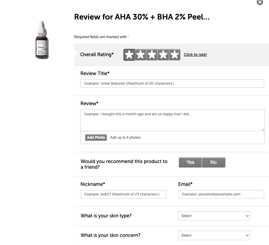
Here’s a quick product page optimization hack to try:
Introduce relevant fields for “write a review”.
Most brands ask for the review title and the review paragraph.
It can be a good practice to ask for some information on customer demographics, customer concerns, etc.
Here’s an example from The Ordinary
For this to happen, a business has to ensure product variants find a place on the product page through swatches.
Here’s a quick example from travel luggage brand Away.
Some color psychology product page optimization hacks:
✔️ Highlight variants on sale.
✔️ Highlight new launches or introductions.
✔️ Highlight seasonal variants.
Choice paralysis is real in eCommerce – and that means on your product pages, you’ll have to offer just the right amount of choices to reduce distraction.
Topicals ensure they limit their number of product recommendations to only 4.
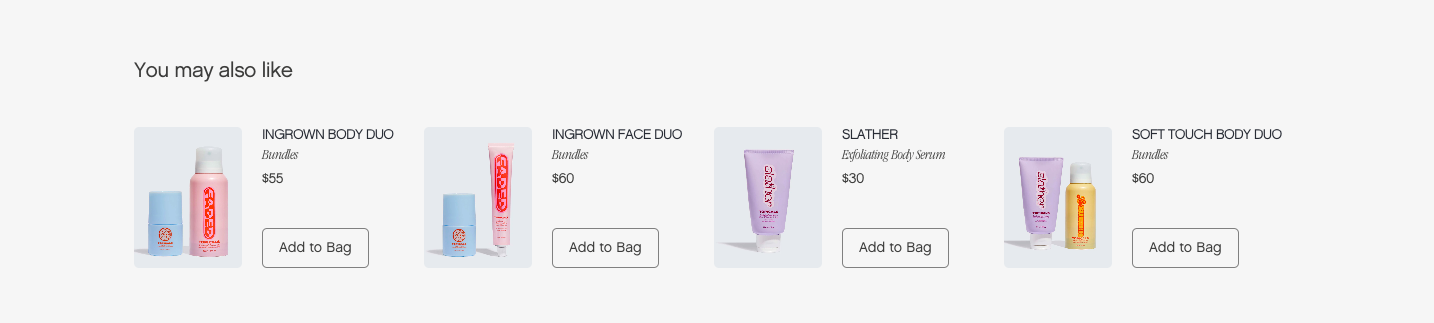
A couple of product page optimization tips to implement:
✔️ Bring the recommendations in like a “piece of advice”. (For example, recommend complementary products that are often used together)
✔️ Suggest what other shoppers are doing. (For example, recommend the “frequently bought together’ products)
Shoppers checking out their mini cart – after clicking on the cart icon on the top right – are usually just checking their order before they checkout.
This is why introducing recommendations in the mini cart on the product page, especially products with a smaller value.
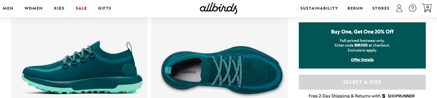
Allbirds does this across their product pages, introducing complementary products and increasing their AOV in the process.
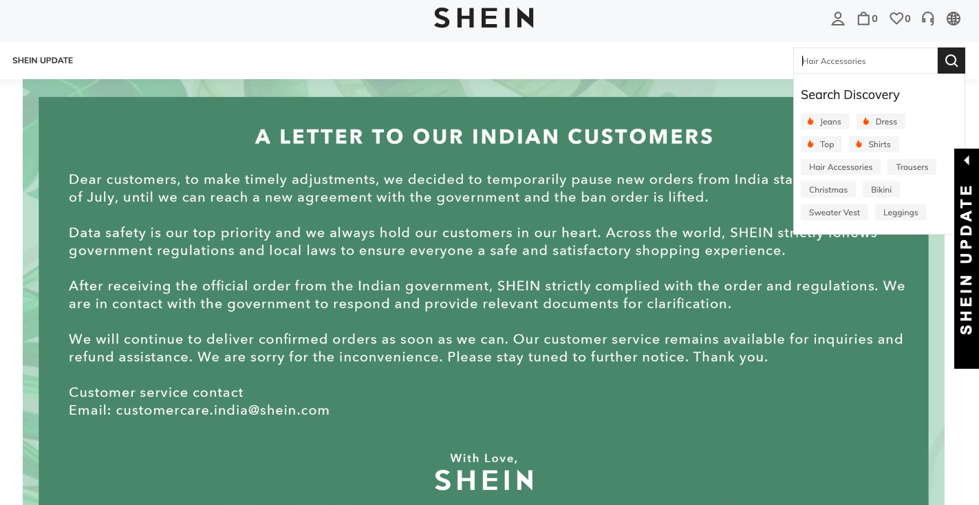
To draw the attention of shoppers who may not exactly know what they’re looking for, you can leverage visual cues in the dropdown menu.
For example, if the items on ‘Sale’ are flying fast, you could either introduce a ‘🔥’ or a ‘hot selling’ label to highlight it.
Here’s how to implement this product page optimization hack:
Add icon highlights to your search function as well.
For example, when someone tries to search on Shein, they introduce a dropdown from the search bar, which features popular/best-selling categories.
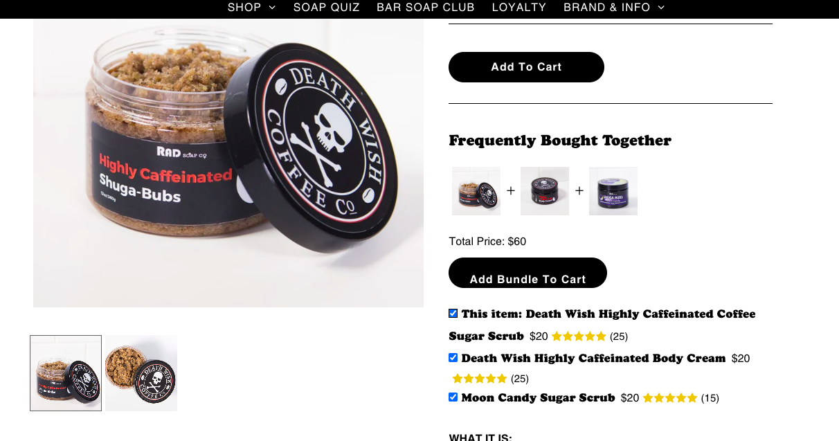
When you bring in a super relevant bundle of associated products, ensure it’s easy for shoppers to:
Soap brand Rad Soap makes bundle adding and editing a cakewalk.
Sizing issues are amongst the most predictable reasons behind shoppers returning products.
An internationally recognized and understood size guide is the answer.
Here’s a look at how detailed Bonobos is with their size guide.
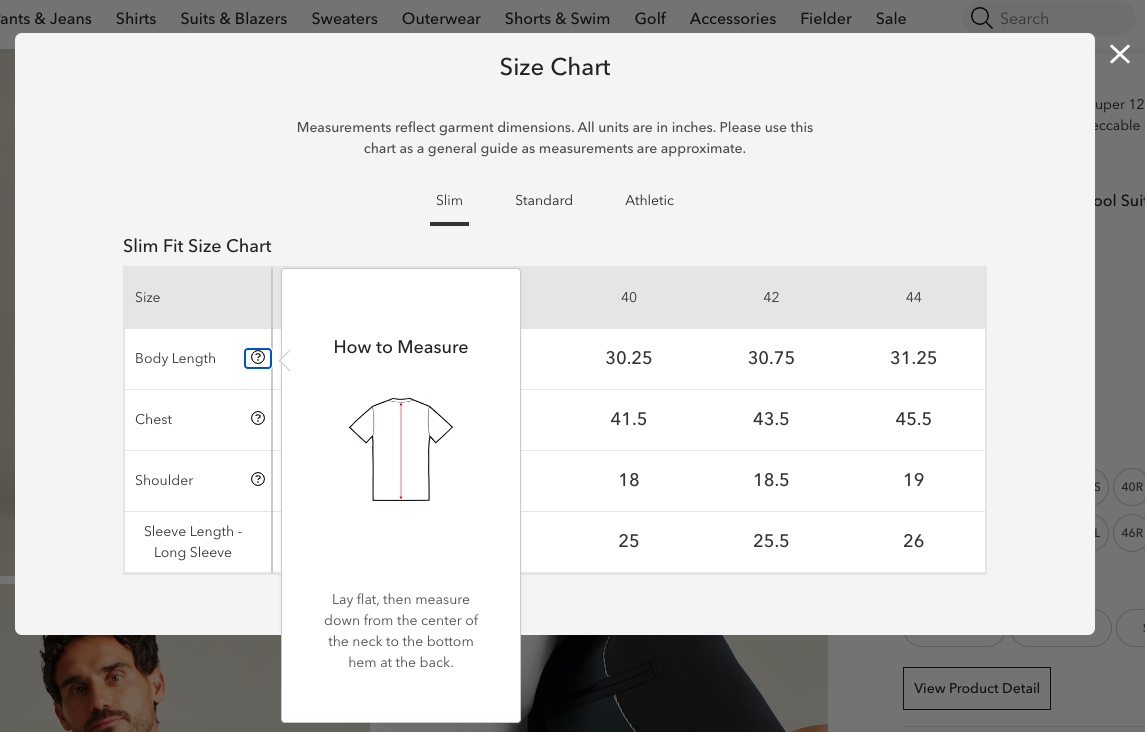
Additionally, they offer a fit guide to help shoppers understand their body shape even better.
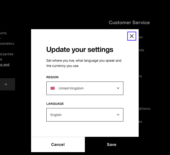
Many online stores prefer to keep their entire storefront in the internationally understood language of English.
However, to increase international conversions, feature some of the most important aspects of a product page in other languages.
Enable shoppers to change their settings and view the whole product page in a language of their choice.
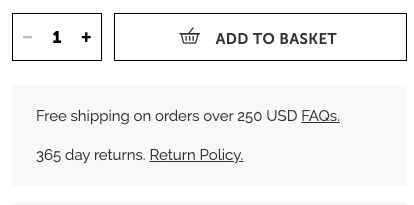
Put any discount information, sitewide or category-specific, upfront.
In the following example, notice how Allbirds places discount information right above the primary CTA button.
Make the applicable code also apparent so that shoppers know they won’t need to hunt for it if they do decide to buy.
If there’s no code needed, put the discounted price higher up as a priority.
The most spottable position is right beneath the product name, above the fold.
Here are a couple of additional product page optimization hacks:
✔️Position discount and code information within the first scroll.
✔️Use the tag “on-sale” if you just want to quote a price and not show the difference from the original price.
With a simple tweak from $100 to $99, the subconscious message is relayed that something is no more priced at a three-digit number.
Here are a few product page optimization tips to consider:
✔️Use price anchoring to drive the effectiveness.
If you display a price slash and then apply charm pricing on the new price, it often has a doubled edge.
✔️Apply charm pricing to attract buyers to subscriptions.
This typically works because buyers look at the long-time savings thanks to slightly slashed pricing.
✔️Use a “pro price” feature to drive customer loyalty.
Price slashes on the product page are great conversion drivers.
But the “pro price” feature drives another additional advantage – it makes people sign up and become members.
Showing payment logos Since having a shopper convert essentially means they’ll have to pay up, it’s ideal that you show them their trusted methods and modes are payment are available.
See how Beauty Bay shows popular & familiar payment options right under the add to cart button.
This is a way to lure shoppers from your category pages to your product pages.
And even when they’re on the product page, they immediately relate the benefit with the visual.
Here’s a quick product page optimization hack:
Label the main product image with quick “sale” highlights.
This could involve the % off and whether it’s a final sale.
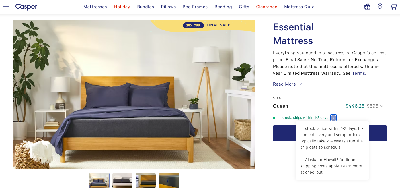
Giving real-time stock updates to your customers is a great way to ensure conversions.
See how RipRacer shows clear out-of-stock alerts with an option to sign up for stock alerts.
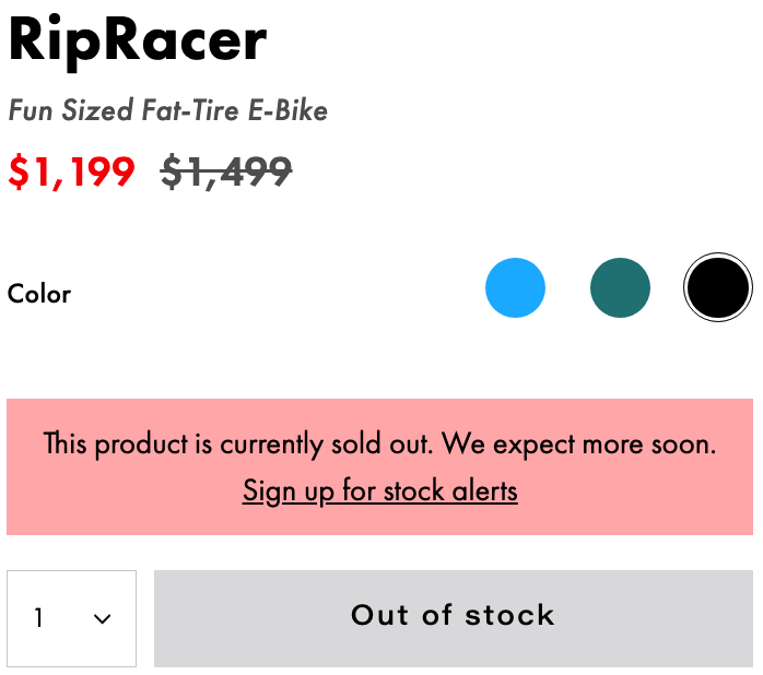
You can also use this space to recommend other products.
Here are a few relevant product page optimization hacks:
✔️ Notify for “low stock” – putting a textual signal right above or next to the add-to-cart CTA button
✔️ Increase urgency by declaring the low number – “only X left”
✔️ Show how fast stock of a product is moving – “In the last X minutes, X people bought this”
Urgency in your exit-intent popups can offer that extra push for shoppers to stay on your product page and finish that purchase.
Here are some product page optimization hacks to put into action:
✔️Highlight limited time (seasonal offers can become more relevant with this approach).
✔️Offer a long-awaited solution. You can drive urgency without being blatant about it.
✔️Leverage seasonal goals. For example, come January, shoppers will be led by resolutions and goals for the new year.
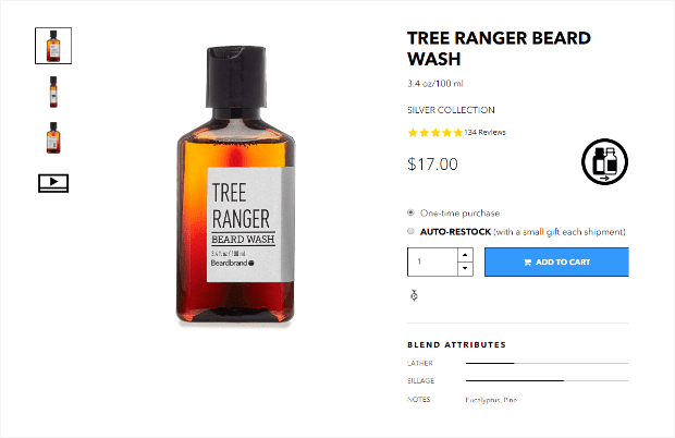
Replenishment triggers are a type of behavioral marketing tactic meant to remind customers to stock up on something they have bought already.
In the example below, Beardbrand has a nudge above the CTA that asks customers to choose between a ‘one-time purchase’ or ‘auto-restock’.
If the customer purchases with the ‘auto-restock’ option, they receive the product at regular intervals.
Here are a few product page optimization hacks you can try:
✔️Offer time-frame choices for the frequency of re-stocking.
The idea is to offer shoppers more control while offering them enough incentive.
For example, offers multiple time-frame options and also declares a flat discount to all those who choose “auto-delivery”.
✔️Offer higher discounts for higher quantities chosen for re-stocking.
Make a higher discount applicable for longer time windows chosen (for example, 6 months as against 3 months.)
To ensure your navigation is easily accessible and ready to be used anytime, it’s ideal to feature a sticky header on the product page.
Here’s a super quick product page optimization idea:
Leverage the sticky bar to announce new offers.
This of course goes beyond the standard ease of navigation – but that’s also kind of the point right?
Here’s an example from wellness brand Golde.

This might seem like a longer route to converting a shopper instantly – but the long-term conversion benefits are immense.
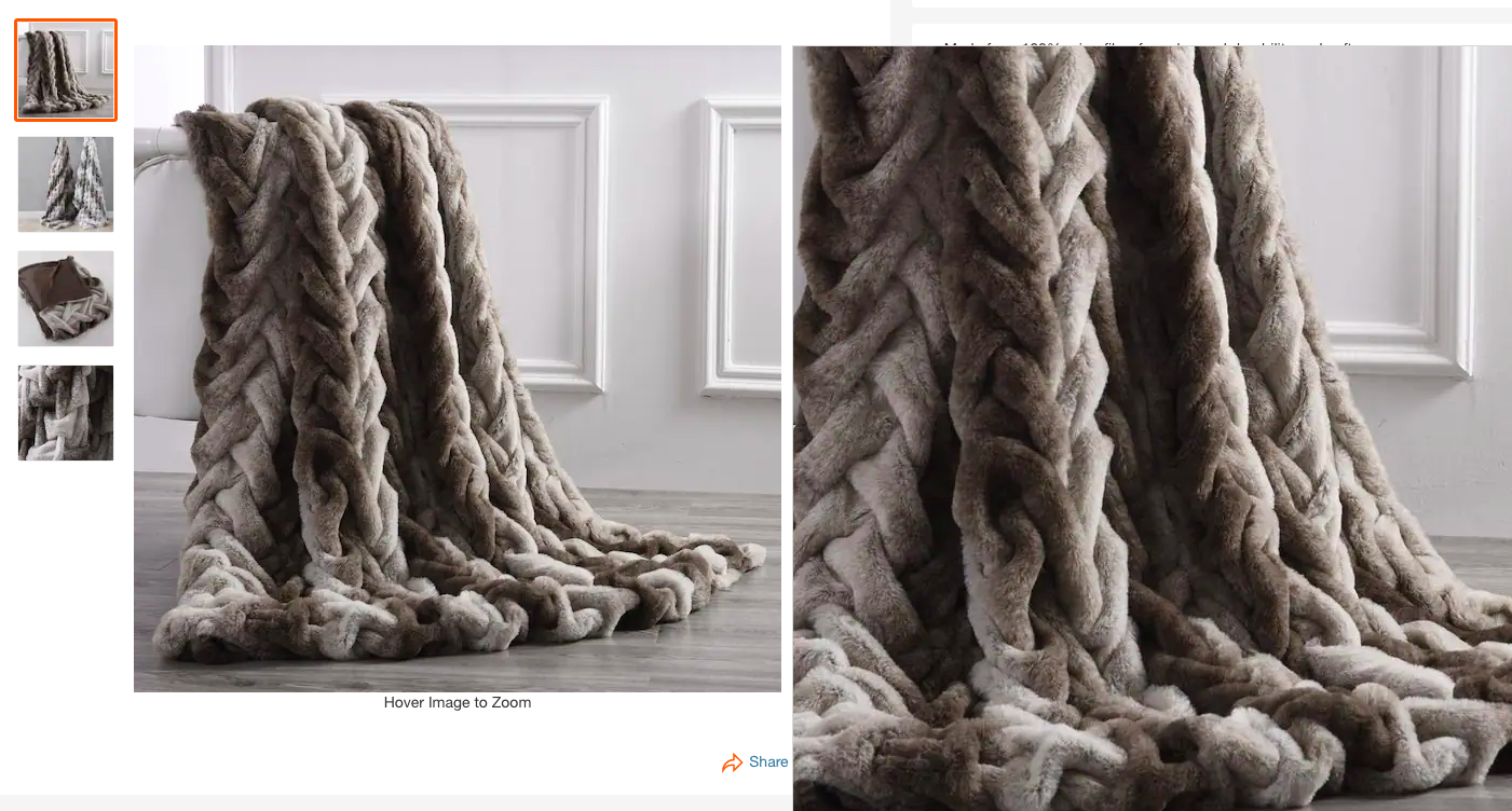
For more expensive products, allow shoppers to “order a sample” for a small fee – in our example only $1!
The idea is to offer your shoppers a granular experience of a product.
Home Depot ensures a “hover over to zoom” function and then shows the zoomed-in image separately from the main image.
Process micro conversions are tiny steps by shoppers who’re very close to (macro) converting, that is, paying for something they’ve bought.
This is naturally different from secondary micro-conversions, which relate to buyers engaging with your brand (for example, commenting on a blog post) but not quite close to converting.
To ensure product page conversions, several points of micro conversions may need to be tracked.
Here’s a quick checklist:
✔️ Secondary buttons clicked (for example, “load more” in the reviews section, “add to wishlist” just beneath or next to the primary CTA, etc.)
✔️ Email entered (either to access a product page-specific discount or as a response to a pop-up alerting about news & offers)
✔️ Video watched (either a click on the play button on the product page or on the link that takes the main video page on Youtube etc. Also check for new follows and “subscribe” clicks on the Youtube channel)
✔️ Content chunks opened from the dropdown (if a visitor hasn’t just scrolled through the page but has actually paused to expand on content sections like “description”, “FAQ” etc.)
✔️ Product swatches clicked (this indicates the shopper is trying to get a better idea of the color, variant, size, and price options available to them to make a decision)
✔️ Social media buttons clicked (clearly, the shopper is trying to discover more by engaging and seeing how others have engaged on Facebook, Instagram, etc.)
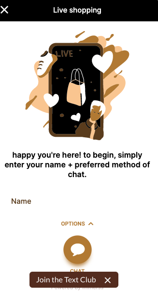
Live shopping enables shoppers to watch the live streaming of a few products from a brand.
The stream allows them to get to know about the product and even ask questions on the spot.
This has been seen to have a direct impact on product page conversion rates.
Tinge, for example, makes live shopping super accessible across their product pages.
While it’s ideal to have the buyer bag a product or two, what’s better is to give them a big picture of the price advantage they can possibly enjoy.
Sparing a line to talk about your membership benefits around your primary CTA helps.
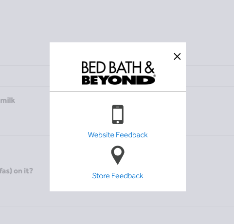
Shoppers need to feel your brand is approachable for feedback.
If it’s a shopper who has landed in your store for the first time and sees a feedback option, you have portrayed a trustworthy image.
Bed Bath & Beyond allows shoppers to offer feedback on the store and website separately.
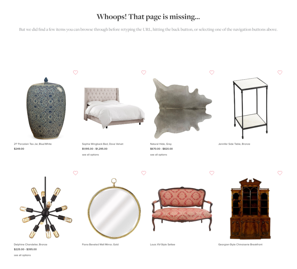
It’s possible to have error pages either because you’ve discontinued a product or because you’re migrating.
Under these circumstances, it’s still possible to offer your shoppers an experience by recommending relevant products on these error product pages.
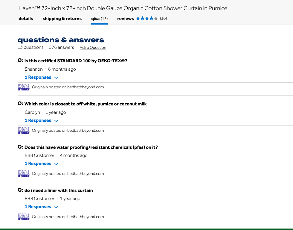
Sometimes the information contained in the product page, no matter how exhaustive, is still not enough for a buyer’s questioning mind.
That’s why it’s essential to make your FAQ section as upfront as possible.
Here’s how The Ordinary implements product page optimization hack:
And when the link is clicked, it takes the shopper straight to their full-length FAQ page which features multiple relevant topics.
Every new shopper is essentially looking for more reasons to experience and trust a product.
A Q&A section lets them have a peek at the questions existing customers have already asked and what the brand has answered.
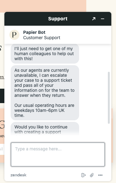
This is especially helpful if a shopper is accessing your chat feature beyond your working hours.
Canned responses don't just need to be about ‘yes’ or ‘no’ options – they can also lead the customer in the right direction if the query is too complex.
Here are a few product page optimization hacks you could try:
✔️Introduce links to important policies – privacy, returns and refunds
✔️Offer help with categories that a shopper might want to explore
✔️Offer the ability to track & manage orders – without the need for human assistance
An eCommerce product page is a webpage on your eCommerce store designed to display your products.
An eCommerce product page is a place where you can sell your products online. It contains all the essential information about the product, its features, and more.
Product pages are often the first point of contact between businesses and their customers.
First impressions last, which is why your product images and content can make a big difference in swaying potential buyers to make a purchase.
Product page optimization is the process of improving the performance of a product page by making it more relevant, engaging, and persuasive to potential customers. This can be done by optimizing the page's content, design, and layout.
According to reports, the average eCommerce conversion rate is 2.5% to 3%.
A good place to start is by setting a baseline of 2.5% and then working to optimize your conversion rate with tactics such as improving your website's design and usability, offering discounts and promotions, and collecting customer feedback.
A good product page is direct, simple, and informative.
The main objective of a product page is to present a great value opportunity to a customer and increase the chance of making a sale.
The most important thing is to display a set of clear, clickable images with all the relevant information that’s needed for the user to make a decision about whether or not to buy your product.
From the content on your product page to the final nudge that gets customers to checkout, everything on your product page can have a significant impact on conversions.
You optimize product pages for conversions by ensuring that each detail on the product page is of high quality and relevant and that images are properly optimized to drive attention.
Some common product page optimization techniques include:
Product page optimization can help to increase conversion rates, improve customer satisfaction, and boost sales.
A product page is the largest opportunity to engage with customers through their browsing experience, so it's important to optimize your page for conversions.
The first step is to identify your product's competitive advantage.
Are you better at price, design, or delivery? Then decide how to display that advantage with the aim of driving more sales online.
You may want to consider previous customer reviews, industry trends, competitors & their relative advantages, and the SWOT analysis of your brand.
98% of visitors who visit an eCommerce site—drop off without buying anything.
Why: user experience issues that cause friction for visitors.
And this is the problem ConvertCart solves.
We've helped 500+ eCommerce stores (in the US) improve user experience—and 2X their conversions.
How we can help you:
Our conversion experts can audit your site—identify UX issues, and suggest changes to improve conversions.
How we can help you:
Subscribe for more articles like this!


Read by 5000+ ecommerce store owners
.svg)

.svg)

.svg)
.svg)
2026 Convertcart, All Rights Reserved
33/1, Castle Street, Ashok Nagar, Bengaluru, India
