

Trusted by 500+ companies


Glossary
A repository of acronyms, jargon, and useful definitions perfect for eCommerce founders & marketers like yourself.
A product comparison chart compares multiple items or similar products which have different features.
Customers are likely to browse around. It's what they do best. When people are searching online to buy something, they want information and they want a comparison of the different options. After they've settled on a certain product, they'll open 10 tabs to compare 10 eCommerce stores, but initially, they'll compare inside a product category. It's crucial that you give them a chance to flourish on your website. When people get to choose what they want, they'll be more likely to stick with you.
For many individuals, having a list of all the top items, along with prices, reviews, features, and more, right in front of them on one page is the easiest method to compare the benefits, negatives, and overall differences of a product. As a result, if you can provide all of the relevant information for the consumer with a product comparison tool, they'll be much more inclined to do their research and purchase through your website.
In this procedure, a shopping comparison chart is invaluable. As a result, your buyer conversion rate may improve. A chart is a simple and effective way to accomplish this. It provides all of the information in a single glance and eliminates the need for users to flip between pages or scroll up and down.
It is used by most services to compare their various account levels (e.g. free, pro, business). This is known as an internal product comparison table. It is also used by some to compare their products and services to those of their competitors.
This is what you may term an external product comparison table. Both are extremely valuable to me and to you, the customer. And, for the most part, if you can make it relevant to your selling message, you'll find it's an effective strategy to boost website conversions.
While product comparison charts can be a godsend for customers, even the slightest discomfort can affect readability. Just so you don’t make them, here are 10 best practices you'd want to follow.
More than 5 items should not be compared in a product comparison chart. Keep it short to make it easier to glance.
Stick to 5 or 6 prominent features when making a product comparison chart. Makes it easier for the brain to process without getting overwhelmed by too much information.
You will have to work on making your chart crisp. Include what’s necessary while selecting a dimension compatible with a laptop(standard size is 800 x 1200 px).
.Here are a couple of things you must do:
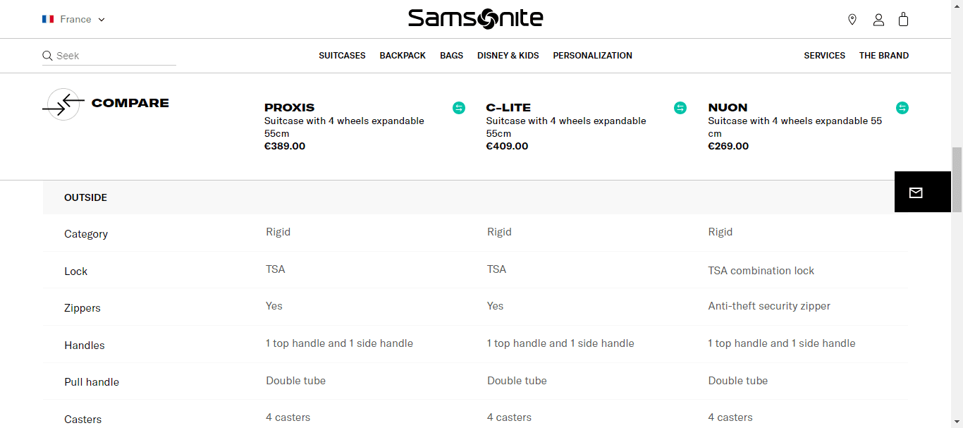
Imagine your customers are comparing products and as they scroll, they realize they have forgotten the names of the products.
This creates an endless loop of scrolling up and down creating cognitive load. Simply put, it puts the mind under unnecessary stress.
Using a sticky header can solve this problem, something Samsonite does well.
Humans tend to compare lower-priced options first and then move to higher-priced products. This aligns with the basic pattern our subconscious minds have been endowed with.
Something you’d want to add to your product comparison design. It helps customers in rational reasoning based on value assessment or in other words ‘value for money’.
Monos puts this into practice making mental calculations easier. Not to forget, customers often perceive higher-priced products to be of excellent quality.

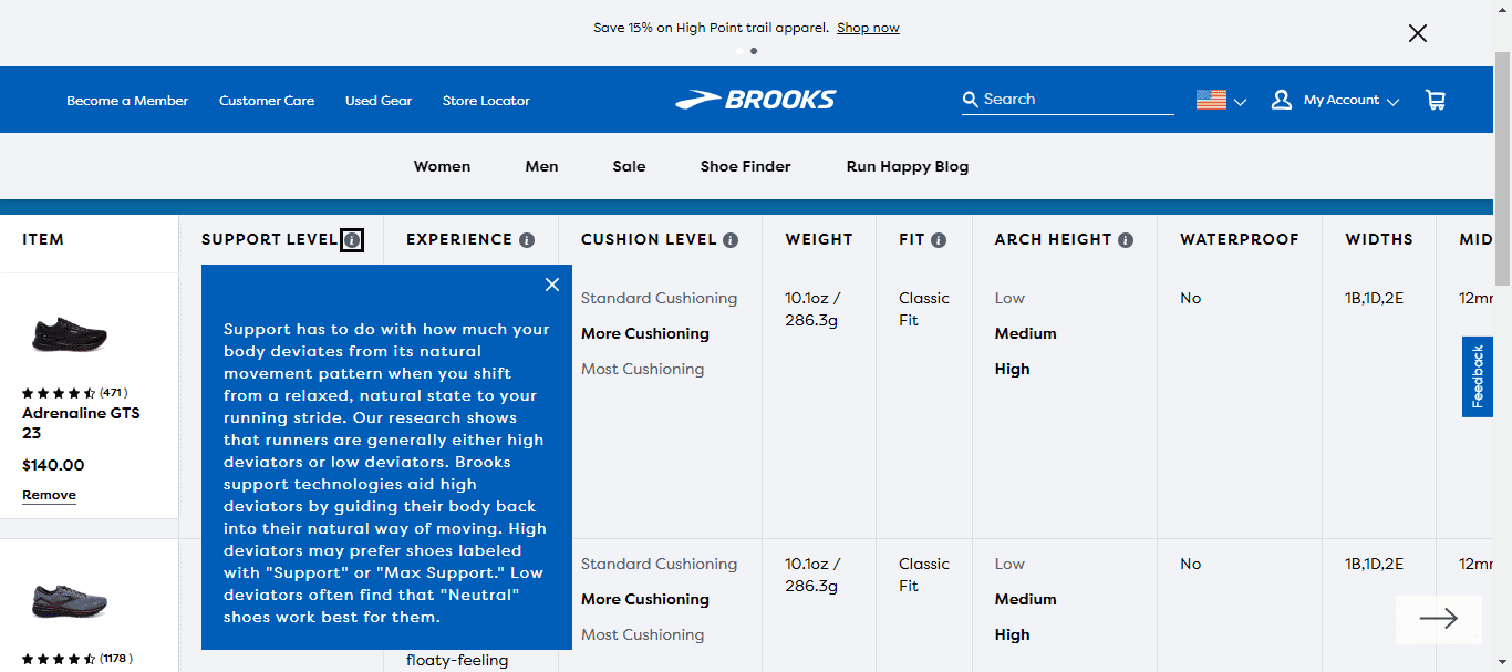
Not all customers are well-informed or for the lack of a better word—savvy.
What might not seem important info, can help a sizable number of your customers make better decisions. Enter information icons that provide customers with a reference point.
Not only do they help customers evaluate options based on the right parameters but are intuitive—a visual cue that grabs attention in a jiffy. Notice how Brooks has implemented this.
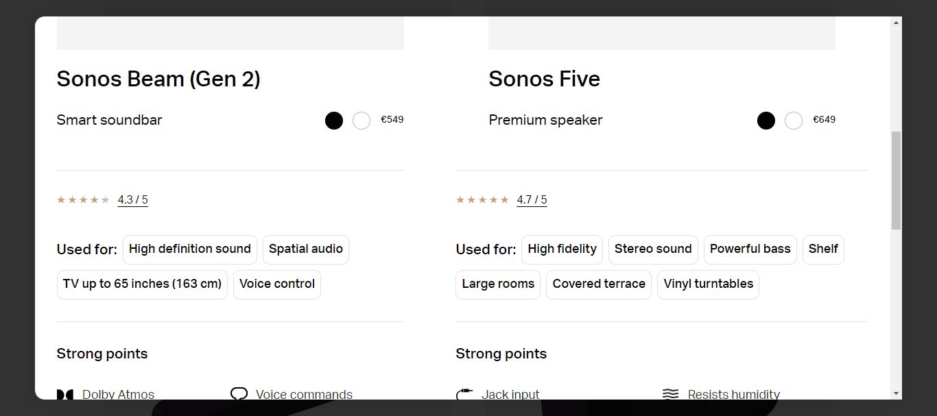
The goal of a product comparison chart is to help customers make the right decisions without the help of customer support.
In layman’s terms, it helps customers understand why they should buy the product with minimal help.
With that out of the way, you’d benefit from adding features or benefits that help customers zero in on their choices.
Sonos does this brilliantly which brings forth heuristics—mental shortcuts that lead to quick decisions.
Here’s a pro tip—take help from your reviews and add the major sentiments to answer your why.
Not all eCommerce stores are the same when it comes to the range of products in a category. If you had to compare every product, say 10 products, you’d have to go back and forth between product pages. That’s overwhelming and so it is for your customers.
Yeti offers a dropdown on its product comparison chart making comparison easier. This is a dealbreaker.

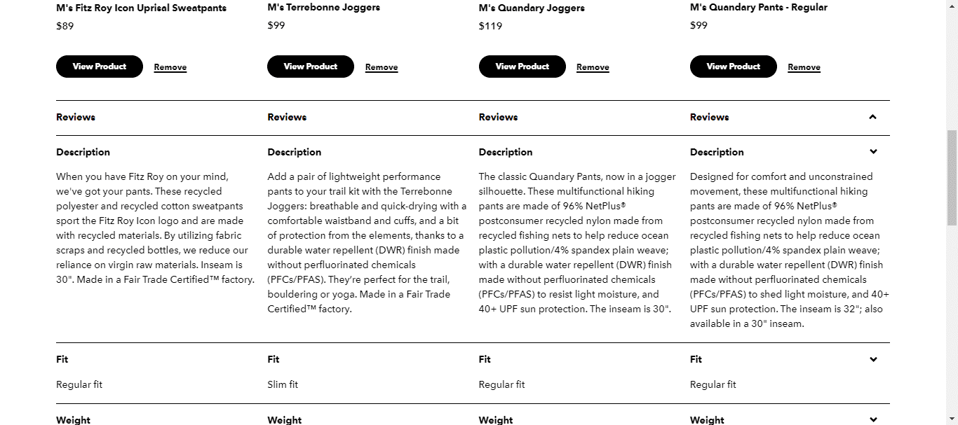
If we had a dollar, every time we saw a product comparison chart lacking a product description, we’d never go out of business.
Not only does it serve as a primary reference, but paints a picture of what makes it worth buying aka possession utility. Besides, it helps sell the tangible value via a benefit-led approach.
All while helping customers make side-by-side comparisons easier.
Patagonia follows this best practice making their product comparison chart a one-stop solution.
Here’s a pro tip—use bullet points to enhance readability on mobile devices.
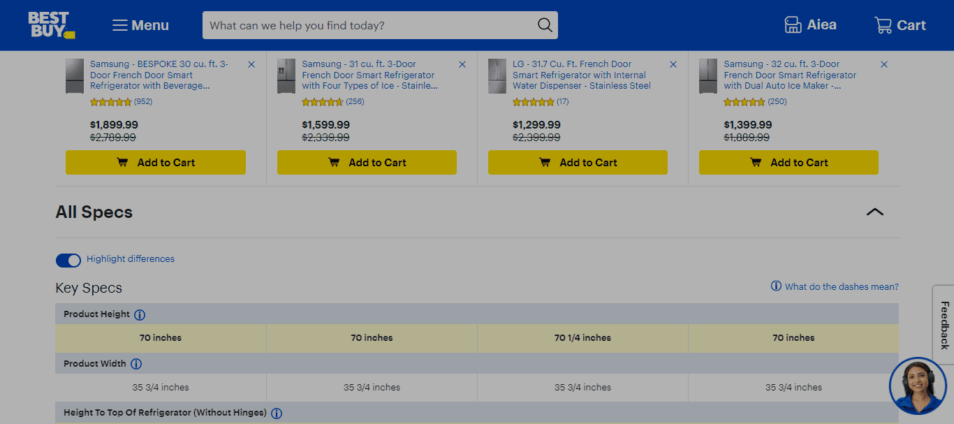
While product comparison charts can be conversion drivers, missing or incorrect information can cause blowbacks.

You can easily reduce this by adding an option to report missing or incorrect information. Best Buy does this on its product comparison page paving the way for continuous improvement.
While this enables a smooth user experience, it also helps build trust and credibility. This is a byproduct of compliance and transparency.

.svg)

.svg)

.svg)
.svg)
2026 Convertcart, All Rights Reserved
33/1, Castle Street, Ashok Nagar, Bengaluru, India