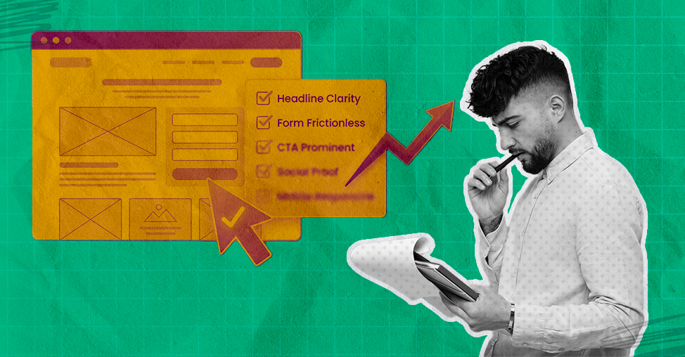
After reviewing hundreds of landing pages, we've found that the biggest conversion killers are rarely design flaws. They're message mismatches.
In many campaigns, the majority of visitors leave before reaching the halfway point of the page, not because the offer is weak, but because the page fails to answer three questions quickly enough: "What is this?", "Is it for me?", and "Why should I trust it?"
This checklist is built on the patterns we repeatedly see in real landing page audits.
TL;DR: Your Landing Page Should Make Visitors Feel Like They’ve Come to the Right Place
A high-converting landing page isn’t magic.
It’s a series of small, thoughtful choices that make people feel confident, curious, and ready to act.
Start with an explicit promise above the fold, one that tells visitors they’ve arrived exactly where they meant to be.
Use simple language, generous spacing, and friendly design to guide them down the page. Keep every element focused on one goal, no rogue links or distracting detours.
Give visitors a smooth, delightful path: fast load times, scannable sections, trustworthy proof, and a CTA that always knows what to do.
Test relentlessly, fix friction as soon as it appears, and treat the whole experience like a helpful conversation rather than a sales pitch.
When you design for clarity and human comfort, conversions stop feeling like a chase and become the natural conclusion of a well-told story.
Before you start working through the checklist, it helps to know what you're actually aiming for. The numbers below show exactly how much conversion potential most landing pages leave on the table.
What Is a Good Landing Page Conversion Rate?
Conversion rate benchmarks
Here's where the benchmarks currently stand:
Average conversion rate: 2.35%(Wordstream)
Cross-industry average: 6.6%(Unbounce)
Top 25% of pages convert at 5.31% or above(Wordstream)
Top 10% reach 11.45% or higher(Wordstream)
Remember: before measuring yourself against industry benchmarks, measure yourself against your own historical performance.
Now that you have a number to beat, the question is how to beat it. The checklist below breaks the work into four areas drawn directly from real audits our CRO team has run across eCommerce brands.
This checklist focuses purely on landing pages. If you're looking to optimize your entire store from navigation to checkout, use our eCommerce UX Checklist instead.
Landing Page Design Checklist for Conversion Optimization
1. Is the page free from clutter?
A clear, spacious layout helps visitors focus on what matters rather than wade through visual noise. A clean, spacious layout isn’t just a design preference; it’s conversion science.
The Nielsen Norman Group, in one of their long-running UX studies, found that users typically read only 20–28% of the text on a page; they ignore the rest.
When your page is crowded with competing elements, the brain decides, “Maybe later.”
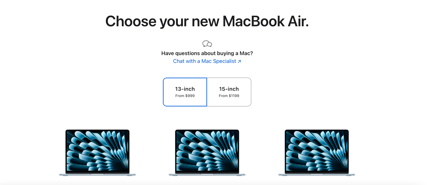
A great example is Apple’s product landing pages. They rely heavily on white space, minimal copy, and a single focal point: the product.
By stripping away everything that’s not essential, they reduce cognitive load and put the customers at ease.
2. Are your sections clearly structured so users can process information in the correct order?
A landing page should behave like a polite tour
guide, showing visitors where to look first, what to understand next, and when to take action.
According to the Baymard Institute, poor content hierarchy is one of the top UX problems that directly contributes to drop-offs, mainly because it introduces unnecessary mental effort.
In short, when users have to think too hard, they leave. Here’s a simple example of a structure that works for most landing pages:
Start with the core promise
Follow with benefits
Add social proof
Close with a decisive CTA
You want to make your landing page feel like a storybook, with each section teeing up the following like chapters in a guidebook you actually want to finish.
3. Is whitespace doing its job, or is it taking a vacation?
Strategic spacing guides the eye, making your core messages stand out without overwhelming the visitor.
And this isn’t just aesthetic fussiness. A study by Human Factors International found that improving whitespace around text and titles can increase comprehension by up to 20%.
4. Is your CTA button lounging confidently above the fold?
Because if visitors have to scroll to find it, you’ve already lost half their enthusiasm and most of their clicks.
Nielsen Norman Group reports that users spend 57% of their page-viewing time above the fold, and attention plummets like a dropped bowling ball as they scroll downward.
This means anything mission-critical, like “Add to Cart,” “Get Started,” or “Book a Demo”, should be visible right from the start, not buried somewhere in page purgatory.
5. Are your visuals high-quality and attention-grabbing?
Crisp, clear images make customers feel confident about what they’re buying, reduce hesitation, and turn casual browsers into eager buyers.
Also, attention-grabbing doesn’t mean loud or gimmicky; it means instantly communicating value.
Such images create a tiny dopamine hit, just enough to pull a casual scroller into the story your page is trying to tell.
6. Is your branding consistent across the page?
A unified look and feel reassures customers, builds trust, and makes your store feel professional, with small cues that quietly nudge them toward a purchase.
Lucidpress’s Brand Consistency Report found that consistent branding can increase revenue by up to 23%.
Why? Because a unified look builds familiarity, familiarity breeds trust, and trust is the real conversion catalyst hiding behind every “Buy Now” button.
7. Does your CTA stand out with clear contrast?
A boldly visible call-to-action grabs customers’ attention, guides them effortlessly, and dramatically increases the likelihood they’ll click “buy” rather than wander off.
In fact, Campaign Monitor reports that using a high-contrast CTA button can increase click-through rates by up to 28%.
That’s not a rounding error, that’s the difference between “nice traffic” and “actual sales.”
Product discovery – barriers that prevent shoppers from finding items
Category/collection pages – improvements that drive deeper product exploration
Product page – what to optimize to convert 2–3x more buyers
Cart – ways to ease hesitation and speed up purchase decisions
“The report was deep and super insightful. Can’t believe it’s free.”
Logan Christopher CEO, Empire Herbs
8. Do you use visual cues, like arrows, to guide customers to your CTA?
A subtle arrow or directional graphic serves as a gentle nudge, guiding customers toward the action you want them to take and making conversions feel effortless rather than forced.
And the effect is surprisingly measurable. Eye-tracking research from the Nielsen Norman Group shows that directional cues (such as arrows or gaze direction) significantly increase fixation on the targeted element, meaning users notice and process CTAs faster when their eyes are gently guided to them.
In UX terms, that’s free real estate.
9. Is your CTA large enough to grab attention from across the room?
A boldly sized button, roughly twice the size of your body text, ensures customers spot it immediately, right after the headline.
Fitts’ Law, a foundational principle in human–computer interaction, states that larger, more prominent targets are faster and easier for users to click.
A CTA that’s roughly 1.5–2x the size of your body text is simply more “clickable,” especially on mobile, where thumbs behave like well-meaning but clumsy oafs.
10. Have you limited the number of CTAs on your page, or scattered them like confetti at a parade?
Call-to-action buttons are wonderfully powerful things, but they’re a bit like espresso: one or two will perk people up beautifully, while a dozen will send you into a sweaty panic.
You’d want a couple of well-placed call-to-action buttons to spare your customers the visual chaos.
Jam study researchers Sheena Iyengar and Mark Lepper found that reducing the number of options from 24 to 6 increased conversions by a staggering 10x.
Too many decisions freeze people; a few clear ones move them forward. That same principle applies directly to your landing page: more CTAs = more thinking = more abandonment.
11. Is your design optimized for mobile-first experiences?
When pages function seamlessly on mobile devices, customers navigate with ease. Here are the top 5 things to check on mobile:
👉 Ensure that buttons are large enough, spaced well enough, and placed where a human hand can reach them.
👉 Your content should be clean and easy to scan.
👉 Nothing tanks a mobile experience like tapping “Buy Now” when you meant to open the size guide. Check that interactive elements have breathing room so users feel in control, not trapped in a tap-happy minefield.
👉 Make sure your visual hierarchy is the same as on desktop.
What looks elegant on a desktop can turn into a clown car on mobile. Verify that hero images don’t crop awkwardly, CTAs remain above the fold, and key benefits appear before decorative fluff.
👉Trim down all the distractions. Make sure you strip away anything that steals attention from the CTA or the next logical step.
12. Does your landing page look professionally designed?
A page with clean spacing, consistent typography, high-resolution visuals, and a layout that guides the eye naturally signals instant credibility.
When your design feels intentional, nothing misaligned, nothing noisy, nothing that looks like it was glued on during a lunch break, customers trust you faster, feel safer exploring, and are far more likely to complete a purchase.
Landing Page UX and Technical Checklist for Conversion Optimization
13. Does your page load quickly across all devices?
Fast-loading pages keep customers engaged, prevent frustration, and significantly reduce abandonment, turning visits into conversions rather than lost opportunities.
Google’s own research shows that as page load time increases from 1 second to 3 seconds, the probability of a bounce increases by 32%, and if it hits 5 seconds, that risk jumps to 90%. In other words, every extra second is taxing your revenue.
Mobile is even more brutal. Akamai found that a 100-millisecond delay in mobile load time can reduce conversion rates by 7%.
That’s 0.1 seconds, about the time it takes to blink, and it still hurts your bottom line.
14. Are all your links actually… linking?
Broken links frustrate visitors and sabotage conversions, so make sure every click lands where it should.
A study by SEMrush found that 42% of websites have broken internal links, and those issues consistently correlate with higher bounce rates and lower conversions. Why?
Because trust evaporates the moment something doesn’t work.
If the link to your size guide fails, shoppers may wonder whether other parts of the site are broken, such as returns, checkout, or even customer support.
15. Do you offer multiple ways for customers to contact you?
Providing options like chat, email, or phone makes it easy for customers to reach you, builds trust, and prevents potential buyers from abandoning their purchases due to frustration.
Microsoft’s Global State of Customer Service Report found that 90% of consumers expect brands to provide multiple support channels, from chat to phone to email to social.
Even more importantly, 58% said poor customer service (including hard-to-reach support) makes them stop doing business with a company.
Don’t forget that it’s not about adding ten channels; it’s about offering enough avenues to make your business feel human, available, and genuinely helpful.
16. Is your exit pop-up relevant to the page content?
When exit popups offer timely, context-specific messages, customers are more likely to engage rather than feel interrupted, reducing abandonment and boosting conversions.
For instance, if the landing page is about a specific product, say a skincare serum, your exit pop-up shouldn’t offer a random “10% off your first order.”
Instead, it should say something like:
“Still thinking about the Vitamin C Serum? Here’s a quick comparison guide + a 10% off boost to help you decide.”
This way, the pop-up feels like a continuation of the conversation, not a clumsy interruption.
17. Did your form ask only for what’s necessary?
By keeping forms short and relevant, customers breeze through with minimal friction, boosting completion rates and conversions.
Imagine a landing page offering a free ebook on email marketing.
To deliver it, you technically only need one thing: an email address.
But many marketers get greedy and throw in:
First name
Last name
Company name
Phone number
“How did you hear about us?”
Job title
Company size
This turns a simple, low-friction offer into a chore. A smart, high-converting version would ask only:
Email address
Optional) First name — if it genuinely improves personalization
Result: The visitor thinks, “Ah, this is easy,” breezes through, and completes the action.
18. If you have a multi-step process, do you make it delightfully obvious, or does it feel like wandering into a bureaucratic hedge maze?
Breadcrumbing isn’t a good idea when it comes to real-life romance. On landing pages, however, it’s a public service.
When you show customers where they are in a multi-step process, Step 1, Step 2, Step 3, that sort of civilized order reduces uncertainty and makes the whole thing feel friendlier.
Baymard Institute’s checkout research reports that step indicators significantly reduce abandonment, especially in forms and multi-stage conversions, because users hate not knowing how long something will take.
19. Are you helping visitors complete your form as quickly as possible?
Reduced-form fields, plus autofill, turn a tedious chore into a near-effortless moment. Google’s UX research shows that autofill can speed up form completion by 30%, and every bit of friction you remove (confusing labels, unclear error messages, weird field requirements) reduces abandonment.
Also, according to a HubSpot study, reducing the number of form fields from 11 to 4 increased conversions by 120%.
That’s not a subtle lift, that’s a “we-should-tell-the-board” kind of improvement.
You shouldn’t forget that the fewer decisions a person has to make, the faster they move forward.
Landing Page Messaging Checklist for Conversion Optimization
20. Does your headline shout “Here’s what this page is about”?
A crystal-clear headline immediately tells customers why they’re here, grabs attention, and steers them toward action without hesitation.
Let’s understand this with the help of an example:
Weak headline: “Glow Starts Here.”
It’s pretty, poetic… and completely unhelpful. Glow what? For whom? Why should I care?
High-converting, crystal-clear headline: “Vitamin C Serum for Brighter Skin in 14 Days.”
At a glance, the visitor knows:
What the product is (Vitamin C Serum)
What it does (brightens skin)
When they’ll see results (14 days)
This clarity acts like a green light, no mystery, no cognitive gymnastics, just a simple, confident message that tells people exactly why they’re on this page and what to do next.
21. Does your page spotlight the benefits your product or service delivers?
Showing customers how your offering makes their lives easier, better, or more fun motivates them to act and boosts their confidence in conversion.
23. Does your landing page laser-focus on a single purpose?
A landing page is not a buffet; it’s a single, satisfying dish. When the page tries to do too many things (“Buy this,” “Join our newsletter,” “Browse our catalog,” “Watch this video,” “Look at our blog”), the visitor faces decision overload and backs away.
But when the messaging is sharp, singular, and unmistakably aligned to one goal, the customer’s brain relaxes.
There’s no ambiguity. No detours. No “Wait, what do you want me to do here?”
24. Is your lead-gen giveaway impossible to ignore?
A great giveaway doesn’t just exist on the page; the value jumps off the screen. Visitors should instantly think, “This is too good to miss,” or “I’d be silly not to grab this.”
When the payoff feels big, specific, and clearly useful, people sign up because it feels like they’re getting the better end of the deal.
👉 For instance, don’t say “Free Guide.” Say “27 Proven Email Scripts Used by 8-Figure Brands.”
25. Have you used lightboxes to share extra info without making customers leave the page?
Lightboxes pop up when triggered, displaying extra content without a full-page reload, keeping customers in the flow while providing the details they need.
It’s like handing them a magnifying glass without asking them to leave the museum.
A Baymard Institute usability study found that forcing users to navigate to new pages for supporting details increases abandonment, especially on mobile, because each new page adds friction, load time, and the mental burden of “How do I get back?”
Lightboxes solve that beautifully by letting shoppers peek at sizing charts, ingredient lists, shipping info, or guarantees without losing their place.
26. Have you included a privacy policy or terms and conditions statement?
Showing customers you respect their privacy and follow the rules reassures them, builds credibility, and, bonus, keeps you out of legal hot water.
A study by the UK Information Commissioner’s Office found that 93% of people check a company’s privacy practices before sharing personal data, and unclear or missing policies are among the top reasons users hesitate to submit forms.
In other words, transparency isn’t optional; it’s a conversion booster.
Even major platforms know this.
LinkedIn, Stripe, and Notion prominently display privacy policy links right alongside signup forms.
Not because the legal team insisted (though they probably did), but because real users feel safer when they know what happens to their information.
27. Have you repeated your offer in the form area?
Reminding customers of the value they’ll get keeps the purpose clear, reinforces the benefit, and nudges them gently toward completing the form like a polite tap on the shoulder that says, “Yes, this is worth it.”
28. If your offer is time-limited, have you shouted it from the rooftops (politely)?
A ticking clock does wonders for human motivation. If your page doesn’t make the urgency plain through clear copy, visual cues, and a gentle nudge that “this won’t last forever,” customers won’t feel the need to act now rather than someday, which often means never.
According to a recent industry roundup of “scarcity marketing statistics,” campaigns using scarcity tactics typically see up to a 50% increase in conversion rates.
Scarcity triggers a primal urge: the fear of missing out (FOMO), combined with loss aversion.
People often fear the loss of an opportunity more than they value equivalent gains, and that’s what makes them act quickly.
29. Have you shown visitors that someone like them has already succeeded with your product?
People feel braver when they’re not the first to try something. A strong case study lets a potential customer see their own problem reflected and solved through someone else’s experience.
It replaces abstract promises with real results, shows that your solution works.
30. Have you showcased customer testimonials on your site?
A good testimonial acts like a friendly nudge from someone who’s already crossed the bridge your visitor is still standing on.
According to studies, 72% of customers say positive reviews make them trust a business more.
When people see honest, specific praise from real users, names, faces, and results, it reduces doubt and builds instant trust.
31. Have you shown prospects that your page is safe, secure, and backed by real authority?
Trust badges work like a handshake from a reputable brand, such as Visa, Mastercard, Norton, Shopify, BBB, or any brand your audience recognizes instantly.
When placed naturally near forms, CTAs, or payment sections, they reassure visitors that their information is protected and that your business is legitimate.
32. Have you ended your video with a call to action, or just let viewers drift off like wandering tourists?
If you’ve gone to all the trouble of filming, polishing, and uploading a video, don’t let it trail off into oblivion.
End with a clear, confident call to action that nudges viewers, pleasantly but firmly, toward the next step while their interest is still warm and wiggling.
Why visitors don’t trust your store within 3 seconds
Why shoppers can’t find what they’re ready to buy
What’s stopping 2-3x more shoppers from clicking “Add to Cart”
Where buyers hesitate right before purchase
Why high-intent shoppers still drop off
“The report was deep and super insightful. Can’t believe it’s free.”
Logan Christopher CEO, Empire Herbs
Landing Page A/B Testing Checklist for Conversion Optimization
33. Are you dreaming up a hypothesis or just poking your landing page with a stick?
A/B tests shouldn’t feel like you’re wandering around in the dark, tapping random elements to see what squeaks. A great test starts with a hypothesis, a simple, tidy statement that connects what you’re changing to why you think it will improve results.
It forces you to think like a scientist, not a gambler.
A strong hypothesis does three things:
Identifies the problem
Proposes a change
Explains the expected outcome
Let’s understand this with the help of an example:
Scenario:
A brand has a landing page for a $49 skin-care serum. Lots of people scroll, but few click the CTA.
❌ Poking the page with a stick:
“Let’s make the button blue.”
“Maybe change the font?”
“What if we add emojis?”
“Let’s move the image to the right side because… why not?”
These are random tweaks disconnected from customer behavior. You might stumble into a win, but it’s basically digital coin-flipping.
✅ A proper hypothesis-driven test:
Observed problem: Heatmaps show visitors spend time reading reviews, not the product description. They may not understand the product’s results quickly enough.
Hypothesis:
“If we rewrite the headline to clearly communicate the main result (‘Brighter skin in 14 days’), then more visitors will click the CTA because they’ll immediately understand the benefit without needing to scroll.”
Test:
Control: “Glow Starts Here.”
Variant: “Vitamin C Serum for Brighter Skin in 14 Days.”
Why this works:
It’s tied to real user behavior.
It identifies a specific bottleneck (unclear value).
It predicts an outcome tied to a metric (higher CTA clicks).
The cause-and-effect logic is sound.
This isn’t guesswork; it’s structured, measurable, and based on user insight.
34. Are you treating your analytics like a treasure map or ignoring them like an instruction manual?
Heat maps, scroll-depth trackers, and form analytics are the closest thing we have to X-ray vision for landing pages. They show where customers click, hesitate, rage-click, and ultimately abandon ship.
Use those insights to tidy up trouble spots, smooth out friction, and nudge more customers lovingly toward conversion.
👉 Where users actually click (and where they never do).
👉 How far people scroll before giving up.
👉 Which form fields cause the most rage, hesitation, or drop-offs?
👉 What paths users take before they disappear.
👉 Which devices or screen sizes perform suspiciously poorly?
35. Are you starting with the high-impact, low-effort wins first?
Before you roll out the metaphorical bulldozers and redesign your entire landing page, start with the tiny fixes that famously deliver outsized results. For instance:
Changing a headline can lift conversions by 10–30% in many A/B tests because it reframes the entire value proposition in one stroke.
CTA button tweaks (wording, color, placement) regularly produce 20–90% lifts, according to case studies from Unbounce, VWO, and HubSpot.
Reducing the number of form fields can increase conversions by up to 120%, as HubSpot famously found when cutting an 11-field form to 4.
These are “move a piece of furniture and suddenly the whole room feels bigger” moments.
36. Are your variants identical except for that one precious change?
A proper A/B test requires clones of perfectly matched versions of your page with just one variable swapped. Anything else is chaos masquerading as science.
Have you completed the tedious but essential QA rounds?
Yes, it’s a chore. But test variants across browsers and devices, and double-check that your analytics, pixels, and tags are actually firing.
Nothing is more tragic than a well-run experiment that collects… absolutely nothing.
37. Are you studying supporting KPIs, not just conversions?
Conversion rate is the star of the show, but the supporting cast, bounce rate, time on page, and click-through rate tell you why the star behaved the way it did. Ignore them at your peril, or you’ll miss the plot entirely.
38. Are you implementing winners and then immediately plotting your next test?
CRO is a continuous adventure. Studies show that companies that run 50+ tests per year see significantly higher conversion lifts than companies that run fewer than 10 tests.
Once a variant wins, deploy it with a cheerful nod, and then start thinking about the following hypothesis.
One test leads to another, and before long, your landing page becomes a finely tuned, conversion-scented machine.
Landing Page Product Section Checklist for Conversion Optimization
If you sell physical or digital products, your product page is doing the heaviest lifting of any page on your site. Everything before it, the homepage, the category page, the search result, is simply the journey to get someone here. The product page is where the decision actually gets made.
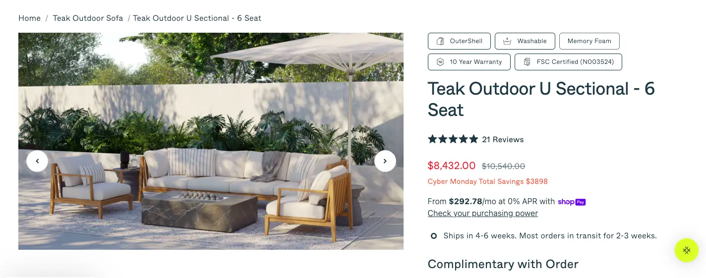
39. Do your product images do the work that human hands cannot?
Online shoppers cannot pick up your product, feel its weight, or check whether the colour matches their kitchen tiles. Your images have to do all of that. Use professional photography that shows the product from multiple angles, at zoom-worthy resolution, and in a real-world context.
A jacket photographed on a white background tells someone what it looks like. The same jacket photographed on a person hiking through autumn leaves tells them what their life looks like wearing it. Short product videos, especially for your bestsellers, remove more doubt than any paragraph of copy can. Visitors who watch a product video are significantly more likely to add it to their cart than those who only see static images.
40. Does your product description lead with benefits rather than specifications?
"Waterproof upper" is a feature. "Stay dry on the way to work without carrying an umbrella" is a benefit. Your product description should open by addressing the customer's situation and desired outcome, then follow with the technical details for anyone who wants them.
Keep the copy scannable with short paragraphs and clear subheadings, because most people read product pages the way they read menus: scanning for the thing that catches their eye rather than reading every word from top to bottom.
41. Does your page remove uncertainty before it becomes an objection?
Every unanswered question in a customer's mind is a reason to close the tab and think about it later, which almost always means never. Show the price immediately. State stock levels clearly, because "only 4 left" is both honest and quietly persuasive. Display your shipping estimate before the customer reaches checkout.
Put your returns policy somewhere visible rather than buried three clicks deep in the footer. Size guides, comparison charts, and ingredient lists all belong here, too. Use accordion menus or lightboxes to keep the page clean while still making this information easy to find. Customers who feel informed buy with far more confidence than customers who feel they're taking a guess.
42. Is your Add to Cart button the most visually dominant element on the page?
Your Add to Cart button should be impossible to miss above the fold, in a colour that contrasts clearly with everything around it, with copy that states precisely what clicking it does. Fitts' Law, a foundational principle in human-computer interaction, tells us that larger and more prominent targets are faster and easier to click.
On mobile, where thumbs are doing the navigating, this matters even more. A button that blends into the background or sits below a wall of text is quietly costing you sales every single day.
43. Does your page use social proof specific to this product rather than your brand in general?
A testimonial that says "Great company, fast shipping!" builds mild goodwill. A testimonial that says "I've had plantar fasciitis for six years and these are the only running shoes I've worn without pain" sells shoes.Display reviews and ratings prominently on the product page itself, not on a separate reviews tab that requires an extra click to find.
According to research, 72% of customers say positive reviews make them trust a business more. Specific, believable feedback from real customers with names, photos, and verifiable results reduces doubt far more effectively than polished marketing copy.
44. Does your page suggest complementary products without distracting from the primary conversion?
A well-placed "Complete the Look" or "Customers Also Bought" section increases average order value without requiring a visitor to go hunting through your catalogue. The keyword is well-placed: these sections belong below the fold, after the primary CTA, so they enhance the buying journey rather than compete with it.
Position them as helpful suggestions rather than desperate upsells, and make sure every recommendation is genuinely relevant to what the visitor is already looking at. A customer browsing a yoga mat does not need to see your bestselling protein powder appearing in their eyeline before they've decided to buy anything at all.
45. Does your page hold up on mobile with the same clarity it has on desktop?
More than half of eCommerce traffic now arrives on mobile devices, and a product page that looks elegant on a desktop can turn into an obstacle course on a phone. Check that your images load quickly and display correctly at smaller sizes, your Add to Cart button sits within comfortable thumb reach, your text is readable without pinching and zooming, and your size guides or specification tables don't spill off the edge of the screen.
Constantly review your mobile versus desktop engagement data. If mobile visitors are abandoning your product pages at a noticeably higher rate than desktop visitors, the page layout needs a tighter and more vertical-friendly focus before anything else.
How to Audit Your Competitor's Landing Pages
Competitor landing page audit
Studying your competitors' landing pages is not copying. It's the same research process a good architect uses when they study great buildings before designing their own. Do this exercise quarterly and work through each step below:
Search as your customer does
Search for the keywords your customers use to find products like yours and note which landing pages appear at the top of the results.
Work through your own checklist on their pages
Visit each competitor page and ask: what does their headline promise, is their CTA clear and prominent, what trust signals do they show, how fast does the page load, and does the mobile experience hold up?
Look hardest at what they are not doing
If none of your competitors show customer testimonials with specific results, showing them gives you an immediate advantage. If everyone in your category uses generic stock photography, real product photography sets you apart instantly. Gaps in the competitive landscape are opportunities dressed in someone else's oversight.
Schedule this as a quarterly exercise, not a one-time task
Competitors update their pages, test new approaches, and occasionally stumble onto something that works very well. Staying aware of what's changing in your market costs nothing except a couple of hours and a willingness to learn from people you'd rather be beating.
Frequently Asked Questions
What is a good landing page conversion rate?
The cross-industry average sits somewhere between 2.35% and 6.6%, depending on which dataset you consult, with Wordstream putting the typical figure at 2.35% and Unbounce's broader analysis landing closer to 6.6%. The top 25% of landing pages convert at 5.31% or above, and top-10% pages reach 11.45% or higher. What counts as "good" depends heavily on your industry, your price point, and what action you're asking visitors to take.
A page asking for an email address will convert at a very different rate than one asking for a credit card number. Measure yourself against your own historical performance first, then against industry benchmarks second.
How do I calculate my conversion rate?
Divide your number of conversions by your total number of visitors and multiply by 100. If 500 people visited your page and 25 converted, your conversion rate is 5%. Track this number consistently over time and use it as the baseline against which you measure every change you make.
How is eCommerce landing page CRO different from lead generation CRO?
The mechanics are the same, but the stakes and friction points differ. Lead generation pages typically ask for an email address in exchange for something free, so the barrier to conversion is relatively low and the primary challenges are clarity of offer and relevance of messaging. eCommerce pages ask for money, which means trust signals, pricing transparency, returns policies, product imagery, and checkout friction all matter enormously.
An eCommerce CRO checklist needs to account for the full purchase journey, from the landing page through the product page and into checkout, rather than treating the form submission as the finish line.
What CRO tools should I use for landing pages?
For most teams, a sensible starting stack looks like this: Google PageSpeed Insights for technical performance, Google Analytics 4 for traffic and funnel data, and Hotjar for session recordings and heatmaps.
Once you have enough traffic to run meaningful tests, add an A/B testing tool such as VWO, Optimizely, or Unbounce. Start with what's free and add paid tools only when your traffic volume makes testing statistically reliable.
How often should I audit my landing page?
Run a full checklist audit whenever you launch a new page, after any significant change to your traffic sources or ad campaigns, and at least once per quarter for your highest-traffic pages. Between audits, let your analytics and session recordings flag problems as they emerge.
A sudden rise in bounce rate or a drop in form completions is the page telling you something has changed and deserves attention.
How do I reduce my landing page's bounce rate?
Bounce rate problems usually trace back to three culprits: the page loads too slowly, the headline doesn't match what the visitor expected based on where they came from, or the design feels cluttered and hard to navigate. Fix page speed first since it affects everything else.
Then check your message match between your ads and your landing page headline. Finally, simplify the layout so visitors can find what they came for within the first few seconds of arriving.
How long should a landing page be?
Long enough to answer every question a hesitant visitor might have, and not a word longer. Simple low-risk offers like newsletter signups need very little explanation. Complex or expensive products need room to build trust, demonstrate value, and address objections.
The practical test is this: if removing a section would leave a visitor with an unanswered question, keep it. If removing it would make the page sharper and faster to read, cut it.
How do I improve my landing page conversion rate?
Start with your headline, because it does more work than any other element on the page. Then check whether your offer is genuinely compelling or merely adequate. Make sure your CTA tells visitors exactly what happens when they click it. Reduce form fields to the absolute minimum your process requires.
Then run structured A/B tests, one change at a time, and let your actual visitors tell you what works. Conversion rate improvement is less about inspiration and more about systematic elimination of the things that make people leave.
Subscribe for more articles like this!
Thank you - we'll see you in your inbox soon!
Oops! Something went wrong while submitting the form.
Read by 5000+ ecommerce store owners
Subscribe for more articles like this!
Thank you - we'll see you in your inbox soon!
Oops! Something went wrong while submitting the form.


.svg)

.svg)

.svg)
.svg)
