
.avif)


We work on more than 300 eCommerce sites and run something like 11,000 experiments a year, across 35-plus industries.
So when we say AI traffic is a big deal, that's not a hunch. It's what the data keeps telling us, month after month (jump to case studies: how we improved conversion rate for AI traffic for 3 brands).
Right now, traffic that comes from tools like ChatGPT, Claude, and Perplexity converts about 50% higher than traffic from anywhere else. Let’s face it: that’s not a small difference.
It's the kind of number that should make a merchandising team stop mid-meeting.
The reason isn't complicated; why? Because this traffic doesn't arrive curious; it arrives decided, or close to it.
For example, a prospect asked a question, got an answer, and is now checking whether your store has the right product.
Once you accept that, most of what follows starts to make sense on its own.
For years, the path to a purchase looked roughly the same for everyone. A shopper searched, poked around a few options, learned about a product, and compared it against alternatives.
Then they looked for some kind of validation, and eventually bought it.
AI compresses most of that into a single conversation. A shopper asks a question, gets a recommendation, and only then shows up on your site to confirm the choice and buy.
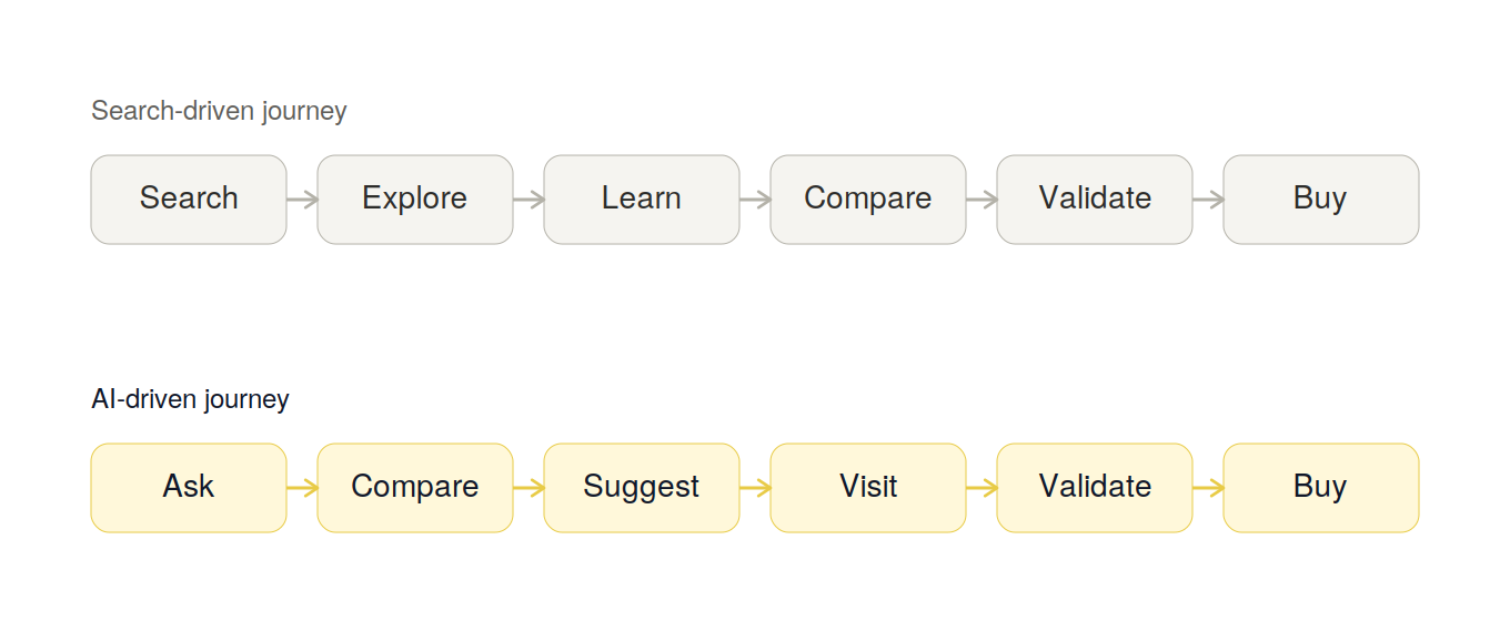
If you look at the second row in the image above, you’ll find that the exploring and learning already happened somewhere else.
It happened inside a chat window, long before your website entered the picture.
The truth is that your site does not own the whole purchase journey anymore.
A lot of the time, it only owns the last two steps: confirming a decision that's already been made, and closing the sale.
Isn’t that a sign that your pages must start communicating differently?
Before AI, your website had to do the whole job by itself: educate the shopper, help them compare, validate the choice, and close the sale.
An AI-referred shopper skips most of that work before they ever land on your site. The AI has usually already educated them and helped them compare.
That leaves a more useful question for every page and every line of copy: could AI already have told them this?
If yes, that content isn't doing much work anymore, and it can move down the page or disappear.
The AI Shopper Gap is the distance between what an AI-referred visitor already knows and what they still need to know before they're comfortable buying.
Your job is to close that gap as quickly and clearly as you can. That gap doesn't look the same on every page. The gap on a homepage isn't the gap on a high-consideration product page.
It's the lens behind everything we're about to walk through, the ratio, the score, the page-by-page framework, and the test we'll come back to at the end.
Once you're thinking in terms of the AI Shopper Gap, it's easy to make one specific mistake trying to close it.
Here's a mistake we run into constantly, and honestly, we get why it happens. The moment people hear that AI traffic converts well, they want to optimize for AI.
But optimizing for conversions from AI traffic is a different exercise entirely.
It's about building trust, showing proof, answering objections, and clearing friction for the human who lands on your page after the AI already pointed them your way.
We've watched brands double their AI-driven traffic through pure technical work, only to see conversion rate sit completely flat. Why? Because they never touched conversion optimization.
Here's what that looked like in one audit we ran. A specialty retailer spent six months on schema markup, structured product data, and AI-focused FAQ content.
AI referral sessions on their site doubled in that time frame. Conversion rate on that same traffic moved from 3.1% to 3.3%, close enough to flat that nobody on their team could call it a win.
All that technical work made the store easier to find and cite. It did nothing for the shopper who showed up.
You need to keep this in mind: AI is your referrer, not your customer. The right way is to optimize for your customers, not the algorithm that sent them your way.
Once you're thinking in terms of the AI Shopper Gap, the next question is how much of your page is actually built to close it.
AI-referred shoppers are more likely to arrive with a few questions already answered: what the product is and what it costs. When that's already settled, explaining it again from scratch doesn't help much.
What they need instead is confirmation and validity of the choice they’re going to make. We use a simple framework for this internally: the Validation vs. Education Ratio.
Take your homepage or product page and count the sections. Now sort each one into two sections.
We saw this play out clearly in an audit for a supplement brand last quarter. Their homepage had eleven sections. Nine of them covered founder story, sourcing philosophy, and lab process.
Only two contained anything a shopper could use to validate a purchase: a small reviews carousel and a certification badge buried near the footer.
That gave us a strong hypothesis for why the page was losing visitors. A traditional, SEO-first page usually lands somewhere around 70% education and 30% validation.
In our audits, the pages that convert AI traffic best flip that almost entirely, closer to 30% education and 70% validation.
From our experience, we can tell you that it doesn't mean deleting your brand story. It means you stop leading with it.
This score tells you how well a page is closing the gap for a real shopper.
We call it the Validation Depth Score™, and it tells you whether, if an AI-referred shopper landed on a page, they would find enough proof to buy without leaving.
It runs from 0 to 100, and we build it from three inputs.
Page Checklist Pass Rate: This measures how many items from that page's audit checklist pass, weighted by how much each one matters at that stage.
Proof Proximity: This measures how many scrolls or taps it takes to reach the first real proof point, a review, a guarantee, a specific delivery date, counted from the moment the page loads.
Validation Share: It’s the measured split between validation and education content on a page.
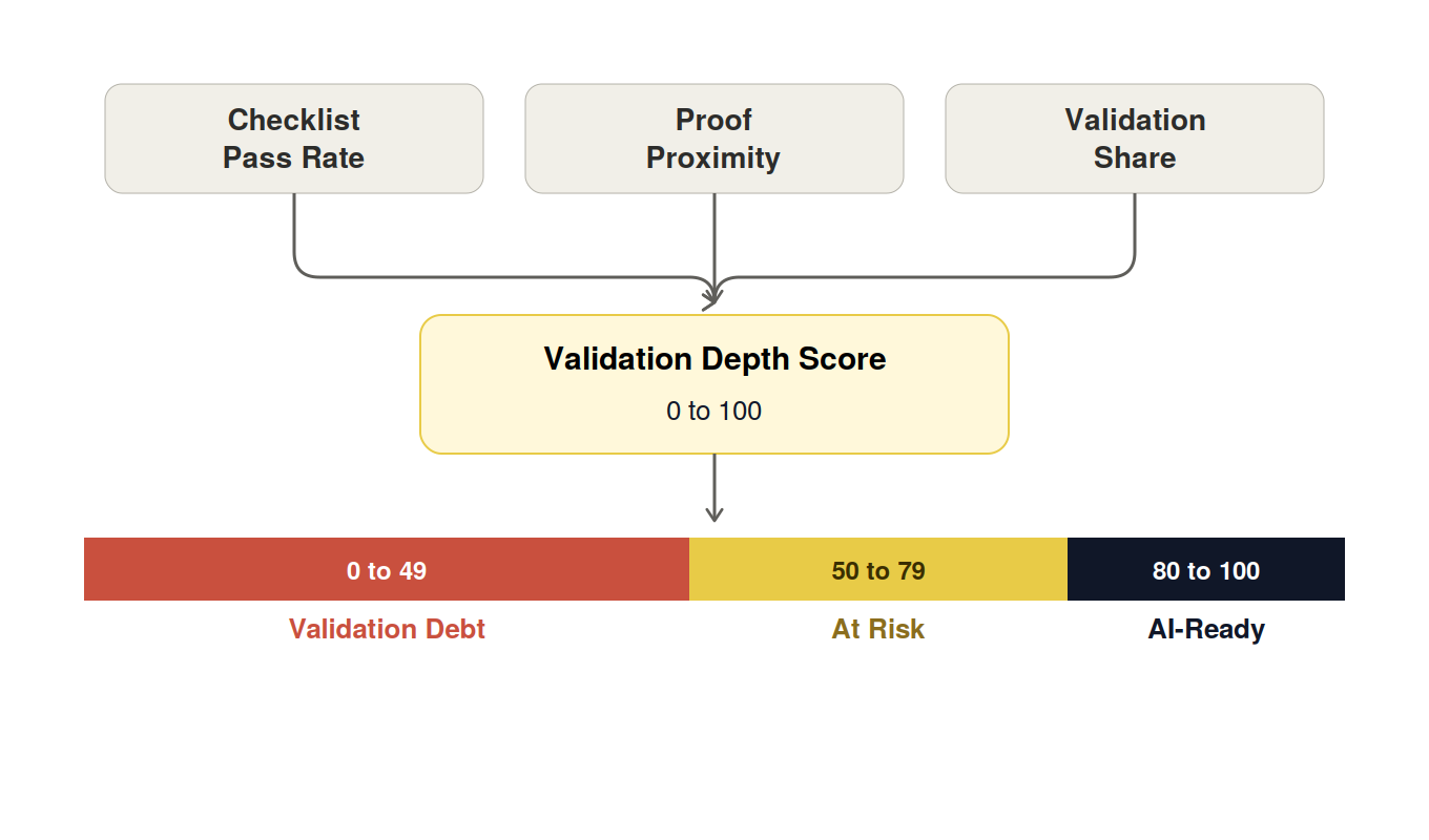
We weight these three roughly equally and arrive at a single score. Here’s what each score means for a page on your store:
This is, of course, an internal metric. We track it before and after every change we make on your store, which is how we know a fix worked well before the conversion numbers start showing results.
Here’s an example of an at-risk PDP:
Checklist Pass Rate: 62/100
Proof Proximity: 40/100
Validation Share: 73/100
Validation Depth Score: 58/100
Every page on your site is trying to answer questions your customers are asking. Once you notice it carefuly, it's easy to figure what you need to fix.
We use a checklist at each stage, so you can run the same pass on your own store.
From our experience, we can tell you that the homepage must answer this question every customer is asking now: "Why you, and not the other option I was just shown?" So the best way is to move the proof up and the brand story down.
Here's what we check on a homepage audit:
On the category page, shoppers aren't browsing so much as narrowing down. They want to know which option is right for them, not just what's in stock.
So, here's what we check on a category page audit:
Here comes the most important page on your store. It has to answer, convincingly, "should I buy this one, right now?"
Here's what we check on a product page audit:
Then there's the cart, which most teams forget about entirely.
It's answering a more defensive question: is there any reason I shouldn't go through with this?
Here's what we check on a cart and checkout audit:
Let’s now understand how we worked with three stores and helped them improve their conversion rate from AI traffic.
Are you ready to learn from real-world examples of AI traffic CRO? Here they are:
Problem: For this client, the session recordings showed AI-referred visitors scrolling past the first fold in under four seconds, then leaving before they reached a product.
The homepage looked polished. However, it wasn't answering anything a decided shopper needed to hear.
Hypothesis: Our working theory came from watching the recordings.
The first fold was entirely brand story: "founded in a garage," "our mission," three full screens of it. Up until then, no social proof showed up.
Change: We ran our homepage checklist against the page and found it failing on four of five points.
We rewrote the first fold around "why shoppers choose this brand," and added review counts and a guarantee badge above the fold.
Next, we called out the best-selling product by name, and pushed the founder story down below the main call to action instead of cutting it.
Validation Depth Score™: Before the rewrite, the page scored a 34. But after the changes, the score climbed to 78.
Result: The homepage-to-product click-through rose 23%. Conversions followed and climbed 12% over the next month.
Problem: This store had an issue on their category page.
They had a 700-word SEO introduction that sat above every single collection grid.
It wasn’t a surprise that heatmaps showed almost nobody scrolling past it, and AI-referred sessions were bouncing off quickly.
Hypothesis: Our first instinct was that the SEO copy itself was the problem, that shoppers just didn't want to read it. But when we looked closer at the heatmaps, the real issue was where it sat.
It occupied the entire top of the page, above every filter and every product. The problem was there on both desktop and mobile.
Change: Running our category page checklist, we tucked that SEO introduction into a collapsed accordion instead of deleting it outright.
Next, we replaced the generic top-of-page filters with problem and use-case-based filters, and added "best for" labels to the product cards so shoppers could tell what a piece suited without clicking in.
Validation Depth Score™: The category pages started at a 41, dragged down mostly by proof proximity and a validation share. After the fix, the score reached 82.
Result: The bounce rate fell 18%, and revenue per visitor climbed 11% in under a month.
Problem: The cause here ran almost opposite to the other two: too much selling, not enough proof. On mobile specifically, reviews and star ratings sat two full screens below the fold, well past where most AI-referred visitors were dropping off.
Hypothesis: Moving proof higher on the page would keep shoppers from leaving. We'd seen this in a handful of other mobile audits.
The moment reviews sit below the fold on a small screen, most visitors never scroll far enough to find them.
Change: We worked through our product page checklist and focused on the two items it was failing hardest: review visibility and delivery clarity.
We pulled star ratings, review counts, and real customer photos up into the same fold as the buy button, and replaced a vague "ships in 2 to 3 days" line with an exact delivery date.
Validation Depth Score™: This page had the lowest starting score of the three, a 29, and proof proximity was almost entirely to blame. After the change, the score reached 76.
Result: The Add-to-cart rate rose 15%, and completed purchases rose 10%.

In all of these cases, we simply focused on what deserves to go on the first fold.
Earlier we introduced the AI Shopper Gap, the distance between what AI already told a shopper and what your site still needs to answer.
Here's the test we use to find that gap on any page, in about ten minutes.
You need to pull up one of your product pages, then open a chat with an AI tool and ask it every question a shopper might ask before buying that exact product.
Set the AI's answers next to your page, line by line, and see what overlaps.
You'll probably find a lot of it. Basic specs, general descriptions, and common comparisons. The thing is AI already handles those well.
If your page just repeats that same information, it isn't adding value; it's adding scroll length.
Now look at what's left over.
In our audits, the same things show up every single time: exact delivery timing, current inventory, variant and size availability, your specific return policy, proof from a customer with your shopper's exact use case, and today's actual price or offer.
If you show these at the right places, you are doing what AI can’t do. And that’s what will get you the conversions.
You don't need us in the room to start finding these opportunities yourself. Try the following this week.
Let’s get this straight: none of the individual tactics in this piece are new.
Reviews, trust signals, and clear shipping information have been best practice for years, and nobody's claiming otherwise. What's changed isn't the tactic. It's the job that tactic is doing now.
A shopper who arrives through a Google search often uses reviews to figure out whether a product is even good in the first place.
A shopper who arrives through AI already believes it's good, because something already told them so.
What that shopper needs from your reviews is much narrower than that. They need an answer to one specific question: does someone with my exact situation agree with the recommendation I was just given?
And that’s why you need to stop teaching and start confirming. And the right way is to ensure that every page on your site reflects that difference.
Everything in this piece comes down to one question. When AI sends someone to your store already convinced, does your site close the gap, or does it get in the way?
Most teams can't answer that without a second pair of eyes, and that's fine. But you don’t need to worry; it's exactly what we do all day.
So, do sign up for our free store audit, and we'll walk your homepage, category pages, product pages, and checkout the same way we walked through the examples in this piece.
Subscribe for more articles like this!

.svg)


.svg)

.svg)
.svg)
2026 Convertcart, All Rights Reserved
33/1, Castle Street, Ashok Nagar, Bengaluru, India