38% of customer journeys begin on the eCommerce brand’s website. To smoothen their customer journey, an introductory page called the eCommerce Splash Page can come in handy.
This sets the tone for a friction-free user experience by setting the right expectations.
In today’s post, we’ll go over what is a splash page plus 17 examples you can’t help but admire.
What is a Splash Page?
A splash page is an entry-level page that visitors see before they move to the other main pages.
The splash page is designed to guide visitors to the right site location, show disclaimers, give instructions, giving visitors a sense of direction for a friction-free shopping experience.
Here are some examples we love:
1. MyProtein—Make shopping easier for international customers
Foreign transactions and currency conversion fees discourage customers from buying from an overseas brand.
76% of customers look for online shopping sites that offer all products in their home currency.
Myprotein uses a splash landing page guiding visitors from India to their Indian site and using the Indian currency.

What stands out
The headline is in a larger font enabling cognitive ease—the ease and fluency of the brain to process information. The flag is a visual cue that immediately directs the attention of the users. The single CTA is prominent and doesn’t distract customers from completing the action.
Takeaways
White space: Using white space helps improve legibility and readability and helps the content easily scannable. It ensures visual hierarchy.
2. Blume—Direct attention to your new arrivals
Blume promotes its new arrivals on its marketing splash page. This works because new arrivals demonstrate recency in perceived value.
.png)
What stands out
With the use of Hydration, customers can sense the nature of the product. This is because it is a concrete noun—a person, place, or thing, that can be sensed by one of the five senses.
Takeaways
Emojis: Using emojis in your CTAs sparingly, can lead to an increase in CTR as they trigger a subconscious urge to click.
3. RXBAR—Welcome first-time customers with a discount
RXBar offers a 20% discount for first customers using a website splash page. Offering a discount to first-time visitors encourages new product trials by lowering loss aversion.

What stands out
The headline Feeling hungry? invokes sensory marketing by addressing hunger. The image of the protein bar is a visual cue to convey healthy snack options featuring ingredients such as egg whites, almonds, etc.
A single-step form works best in encouraging customers to submit email addresses. Shorter form fields work better when the least amount of information is required.
Takeaways
Privacy policy: 81% of Americans express problems with brands collecting personal data. A privacy policy on your website splash page can help assure users about data privacy.
4. Brooklinen—Offer discounts on experience-driven products
High-involvement products carry a higher sense of perceived risk and high price. Brooklinen uses a marketing splash page offering customers 10% off on mattresses.

What stands out
The headline is conversational helping build a one-to-one connection. It is an emotional trigger that drives customers into thinking about buying.
The font for the logo and the CTA is Brandon Text which works best on screens and improves readability. The Toledo font for the headline helps in distinguishing the important element from the rest.
Takeaways
Full-screen splash page: When used correctly, a full screen splash page helps direct the users attention to a single element such as promotions and new product sales.
5. Filson—Nudge them with a giveaway
Filson offers a giveaway on its splash landing page bringing forth the principle of Motivating Uncertainty Effect.
Customers are twice as motivated when the reward is uncertain as opposed to when the outcome is positive. It makes them work harder in the pursuit of achieving the reward.

What stands out
The use of the contraction WE’RE in the central copy makes it conversational. It helps simplify the message and communicate the same to users. Center alignment makes the copy short, and scannable, guiding the natural eye movement. A practice that improves readability when the text is within 2-3 lines.
Takeaways
Monochrome: Using monochrome colors such as black and white sends a unified message to the users. It creates visual cohesion emphasizing the areas of importance in your splash page design.
6. Eight Sleep—Offer a dollar off discount on high-consideration products
High-priced products require significant investment in terms of money and time. Eight Sleep offers $100 off to customers in this splash page example.
.png)
What stands out
If you observe the copy is the first thing that visitors see. This elicits Attentional Bias—the tendency to overly rely on one piece of information to make decisions ignoring other rational factors.
The microcopy talks about a problem followed by a solution. This is a rational trigger nudging users to take action.
Takeaways
CTA: Using words like Now and Today triggers implied urgency. A single prominent CTA dismisses any scope of interference in completing the action.
7. Pai Skincare—Demonstrate authority by being specific
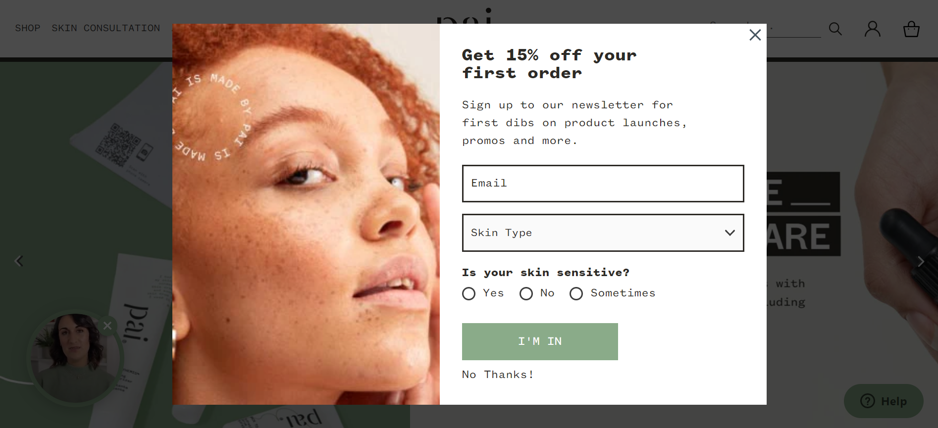
Pai Skincare demonstrates authority by asking the right questions on its website splash page. Authority refers to the tendency of people to follow the advice of credible and knowledgeable experts.

What stands out
This splash page example keeps the image on the left and the text on the right since the sensory information is absorbed by the left brain and processed by the right brain. This triggers preattentive processing—the subconscious accumulation of information from the environment.
The image is a suggestive cue directing the users’ attention to the form field.
Takeaways
Dropdown list: Using dropdowns can help you save space and make the information less overwhelming. They help customers choose the optimal option reducing the form field size.
8. Fabletics—Be the navigational guide
Fabletics guides customers based on their preferences using their website splash page. This evokes Heuristics—mental shortcuts that help customers make decisions and solve problems.

What stands out
The exclamation mark reinforces the emotion of the copy. The modal splash page directs the users’ attention to the CTA. This increases the chances of conversions by reducing friction.
Takeaways
CTA Button: Using a CTA button with rounded edges indicates openness as they draw attention toward the message inside the button.
9. Kizik—Make a FREE offer to build an email list
Kizik leverages the psychological power of free in these eCommerce splash examples.
It elicits the Zero Risk Bias—the human tendency to prefer complete certainty to eliminate risk. The subconscious mind always opts for zero percent risk even when there is an option with a greater risk reduction.

What stands out
The offer encourages customers to try since the risk-to-reward ratio is less. The free socks encourage new product trials by reducing the risk. The copy communicates a sense of exclusivity by offering customers the latest updates.
Takeaways
CTA: Using uppercase letters in your CTA stresses the importance of the same nudging users to take action
10. YETI—Direct customers to choose the convenient location
International customers will find it helpful when there's a next best option available. Yeti offers visitors directions to its US and Canada stores on its eCommerce splash landing page.
This can help reduce shipping costs, taxes, and other expenses in comparison.

What stands out
The distinction between the headline and the microcopy ensures visual hierarchy. It reduces cognitive strain and helps users read easily. The flag options induce intrinsic bias—subconscious stereotypes affecting the way people make decisions since the US and Canada are first-world countries and their products must be good.
Takeaways
Close-down button: Keeping your close-down button 40x40 px makes for an intuitive user experience.
11. Mode Chocolate—Offer an irresistible reward
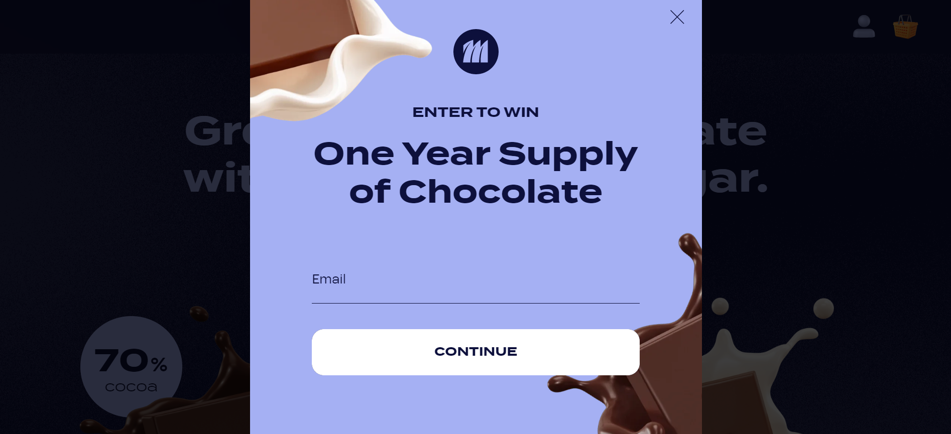
Mode Chocolate offers a year’s supply of chocolate on its website splash page making it irresistible. This is effective due to Anchoring Bias—the inclination to rely heavily on the first piece of information presented to customers.

What stands out
The copy stands out because it incites curiosity. The font Termina Bold makes the copy legible and easy to read since it is designed for headings. Another reason this splash page example works is that the images in a diagonal manner keeps the readers focused on the copy.
Takeaways
CTA button on hover: Using the hover effect enhances the user's ability to navigate and interact with the website.
12. Adore Beauty—Make curated recommendations
Adore Beauty’s marketing splash page is something you’d want to replicate to make product discovery easier.

What stands out
The main copy helps users find products by ending infinite scrolling. It provides customers with a sense of direction as the interaction cost is less. It helps users complete a series of steps in fewer steps.
Takeaways
Interactive content: Using interactive content such as quizzes leads to a 30% higher conversion rate as opposed to static splash pages.
13. Ella Bache—Encourage in-store visits with a dollar off discounts
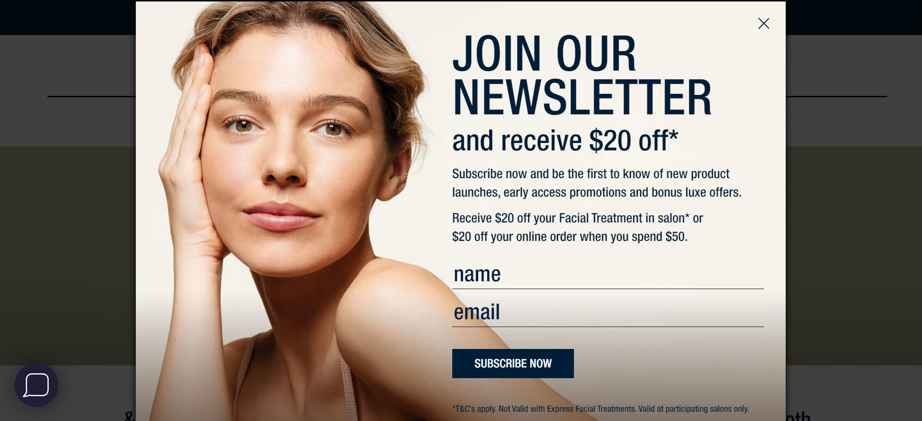
71% of customers spend more in-store than online. Here’s an eCommerce splash page from Ella Bache driving in-store experience using a $20 off discount.

What stands out
The image brings forth the Halo Effect, a cognitive bias where customers base their beliefs about a product, or service based on a single trait overlooking other traits. The model depicts beauty making a compelling case for facial treatment.
Takeaways
Terms & Conditions: Underlining the terms and conditions sets clear expectations and rules out ambiguity. This is important because it reduces returns, exchanges, and refunds when specified beforehand.
14. ZALORA—Apply Interactive cues on hover
The hover effect is a vital aspect of improving user experience. Zalora uses a hover effect on its splash page design giving visual feedback to customers.

What stands out
With six Asian countries on its splash page, Zalora justifies its tagline Asia’s Online Fashion Destination. The images of the male and female models communicate ensure a fair representation.
Takeaways
Minimalist design: White space can be an effective aid in minimalist design since it allows room for elements and minimizes the overwhelming feeling due to clutter.
15. Alleyoop—Use the limited-time offer nudge
A limited-time offer reinforces real urgency. Alleyoop uses a countdown timer and its splash page design as a reference for customers to evaluate the offer.

What stands out
With a 20% discount, customers have an incentive to take the quiz. The line It takes less than 1 minute! is a persuasive trigger nudging users to take action.
Takeaways
Curiosity Gap: Hold the interest of your user by withholding information till the end and only revealing minimal information such as BOGO, discount, etc.
16. James Perse—Offer international shipping at attractive rates
22% of customers wanted to make purchases from brands abroad only to be turned down by the lack of international shipping.
James Perse in its marketing splash page design offers international shipping and other benefits that make international shopping easier.

What stands out
The bullet points help users scan information easily drawing attention to the areas of importance. It breaks the text by highlighting the specific aspects of the copy.
Takeaways
Brand logo: Using capital letters in your brand logo leads customers to perceive a brand as competent.
17. Harry’s—Let them know they’re in the right place
Geographic segmentation can help provide a rich experience for your site visitors. It can also help brands identify which geography not to sell to.
Harry’s uses a splash page on its website to communicate with users about the markets they serve.

What stands out
The copy Worth the wait? invokes Instinctive Elaboration—a mental reflex that takes over the mind driving customers to think about the question. The brain can only process one question at a time, which is why it can’t think of anything else.
The website splash page collects email addresses and countries of the international visitors which can help in evaluating the product-market fit.
Takeaways
Visual Cues: Use visual cues such as your brand elements and color to direct the attention of the users.
eCommerce Splash Pages 101
1. What is the difference between a splash page and a landing page?
A Splash page is limited to the above the fold portion of the website and conveys limited information.
On the contrary, a landing page is a dedicated page on a website with the intent to persuade customers with benefits, solutions to a specific problem, product descriptions, and other nudges. It extends to beyond the fold.
2. What is the difference between a splash page and a popup?
Splash pages serve as screen navigation aids and appear every time a user lands on the eCommerce website. A splash page can be a popup but the inverse isn’t true.
Popups appear a few seconds after an activity on a website such as scrolling and clicking. It is mostly used in promotions and to reduce cart abandonment.
3. What are the benefits of a splash page?
A splash page on your eCommerce website can:
- Enable heuristics and intuitive navigation
- They make the shopping experience pleasant
- Help customers interact better with the site
- Inform them about the privacy policy
- Helps in analyzing user intent based on their response to the splash page
4. Does Shopify have a splash page?
There are two ways to do it:
- Edit the index liquid code file
- Use apps on the Shopify store such as Shogun, PageFly, GemPages, and Hypervisual page builder
5. What makes a great splash page?
Here’re a few crucial elements that make a great splash page:
- A visual cue in the form of an image
- Copy highlighting the pain point and offers a solution
- Psychological triggers such as FOMO, urgency, and scarcity
- A trust badge from an authority to send trust signals
Closing Thoughts
Splash pages can help but aren't the solution for all the underlying problems.
98% of visitors who visit an eCommerce site—drop off without buying anything.
Why: user experience issues that cause friction for visitors.
And this is the problem ConvertCart solves.
We've helped 500+ eCommerce stores (in the US) improve user experience—and 2X their conversions.
How we can help you:
Our conversion experts can audit your site—identify UX issues, and suggest changes to improve conversions.


.svg)

.webp)
.jpg)


.svg)


.svg)

.svg)
.svg)
