


.svg)
In 2022, the average conversion rate across sectors happened to be 2.1%.
And while low conversion rate is a complex subject to tackle, tests have proven that it can go up when certain crucial elements are optimized effectively.
In this piece, we round up suggestions from experiments we’ve run and succeeded with businesses that run on the BigCommerce platform.
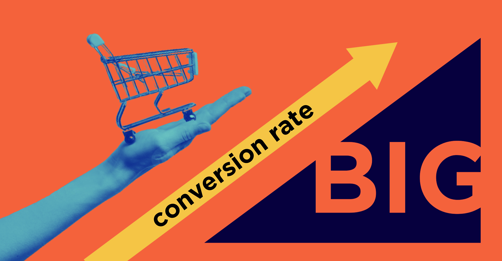
Improve BigCommerce conversion rate: 20 proven ideas
1. Optimize the “first fold” across crucial pages
The first five seconds after a shopper lands up on your site are crucial.
This is when they’ll find themselves looking at the “first fold” before scrolling.
In fact, research proves that shoppers spend 57% of their page-time above-the-fold.
So, this needs to do the following:
- Offer a sense of what the brand is about
- Create a context around products and offers
- Serve up reliable information
- Introduce a way (read: CTA) to act
Here are a few quick considerations to follow while optimizing the first fold for your BigCommerce storefront:
- Offer a CTA on the homepage and product pages
- Showcase the hero image (or carousel) on homepage
- Feature (at least a part of) the gallery for product pages
- Give context about the specific category on category pages
- Keep filters and sorters in view on category pages
- Feature a quick takeaway on the about us page
Here’s a quick snapshot of how Bliss World manages to give shoppers a peek into their origins in the first fold of their about us page.

Here's a good read: Above the Fold: 10 ideas for better conversions (+ amazing examples)
2. Establish targeted landing pages for paid ads
A big part of your BigCommerce store conversions going up is to have deep alignment with user intent.
This is why your paid ad campaigns need to lead shoppers to very targeted landing pages.
This immediately puts higher focus on messaging, highlighting a specific product or line of products, improving loading speed and reducing unnecessary distractions.
A Hubspot study in fact found that an addition of segmented landing pages with targeted messaging (say 10-12), increased sales by 55%.
Here are a few to-dos when you’re attempting to optimize paid campaign landing pages for your Bigcommerce store:
- Keep ad and landing page copy aligned through the messaging
- Ensure the primary message is short and crisp
- Include JUST ONE catchy CTA
- Put the product(s) you're promoting at centrestage
- Offer a detailed description to match user intent
- Get rid of all other distractions (like site navigation, other offers etc.)
Check out the following landing page from FabFitFun.
We love it because its messaging is focused, design is clean and it cites only links that are aligned with the messaging.

Looking for inspiration? Read: 33 High-Converting Landing Page Examples (Updated 2022)
3. Go on a form simplification mission
Whether it’s to finish a purchase, to sign up for a user account or offer personal details to access gated content, eCommerce forms are crucial means for converting shoppers.
While trying to improve your BigCommerce store conversions, it’s absolutely essential that you simplify your forms.
Here’s a checklist of elements that you need to consider:
- Retain ONLY those fields that are immediately necessary (for example, if you ask for a shopper’s address details to sign them up for gated content, this might seem irrelevant)
- Limit the amount of scrolling one needs to do to get to the end of a form
- Split longer forms into sections with focused headers (to offer greater direction for next steps)
- Focus on optimizing your forms for mobile devices (opt for vertical alignment, leverage data persistence, make use of dropdown lists & menus etc.)
- Add all the relevant shortcuts to reduce effort (this includes auto suggesting addresses while shoppers begin to type & enabling the shopper to mark the shipping address as the billing address)
Using a BigCommerce specific form building tool like Form Builder Pro can take the hassle of building forms through coding out.
If you've been seriously thinking about optimizing forms on your website, you've got to read this.
4. Activate live chat features based on shoppers' on-site behavior
According to an Intercom study, it became clear that with just one live chat message exchanged, the chances of a shopper converting increases by 50%.
So, it’s clear that if you have to drive your BigCommerce conversions, you’ll have to specifically focus on live chat – while also focusing on shopper on-site behavior.
Here are a few considerations for you to make:
- Assess visitor analytics in segments (for example, assess out of all the chats that took place, how many converted. Also observe engagement levels with proactive chats and instances where shoppers initiated chat – assess how many from these groups converted)
- Look for connections between conversions & behavior patterns (for example, is there a pattern to something being said to shoppers and them converting. Or even, the pages they seem to initiate chats on – what’s happening there differently?)
- Refine your chat language content based on target audience (for example, if it’s a younger audience, you may want to pique on their curiosity, while if it’s older you may want to address their existing way of doing things)
Using a third-party app like JivoChat will let you leverage some great chat features (including multi-channel communication, enabling the team to act on important task updates etc.). JivoChat also offers businesses just starting off, with a free first 5 agent plan.
5. Create frequent reassurances through your website copy
When shoppers decide to buy from a brand, the unsaid motivation often is that they consider this brand an authority in the category.
Now, that needs to reflect in the way your BigCommerce storefront reads, if you want your conversion rates to rise consistently.
What shoppers, old and new, want is support and reassurance to explore, buy, offer feedback and ask questions.
Here are a few non-negotiables you’ll need to ensure in your website copy:
- Convey that you understand your audience
- Talk about problems but make the solutions prominent
- Weave a narrative around how shopping with your brand improves lives
- Offer support reading material or key resources (like links) at critical junctures
- Ensure transparency around ingredients, shipping & returns, prices & offers as well as how you use UGC
However, ensure your copy is succinct and appearing in the most strategic points – for every additional 100 words on a page, visitors spend only an additional 4.4 seconds – which means they can read just about 18 of those 100 words!
One BigCommerce brand that takes its copywriting very seriously is Design Essentials.
They introduce educational and supportive resources on their homepage itself.

And their product pages offer unambiguous information that will instantly help interested shoppers decide whether they want a product or not.

Here's a helpful read: eCommerce copywriting: 23 inspiring examples from the US
6. Make your emails establish brand authenticity
While your website can do a splendid job at promoting products, featuring offers and making recommendations, it’s your emails that need to step up to build your brand consistently.
If your BigCommerce store conversions have to grow, your email marketing needs to nail the following:
- Set the brand tone through a welcome series (done effectively, welcome emails can spike user engagement by 500% more)
- Meet customers where they are in their journey (for example, if it’s a repeat buyer with preferences you already know about, offer suggestions across product categories they haven’t explored yet)
- Go beyond the transactional in some emails (offer tips, suggestions or links to your blog etc.)
- Tie up key aspects like rewards & brand values in your email communication
- Introduce the why & how behind your business (be it how you source your ingredients or a new innovation that has helped you upgrade your product line)
- Offer reasons to engage with your brand more deeply (drive information on how they can join your loyalty program, why it can be beneficial and how much they can save if they subscribe)
An eCommerce brand that has long been known for communicating its values is Patagonia.
Here’s an example of them reaching out to customers after they pledged 100% of their sale proceeds to a cause.

Need more food for thought? Here's: 16 proven ideas for improving email conversion rate (+ examples)
7. Offer personalized experiences across channels
Research says that 77% of shoppers expect their shopping experience to be personalized.
When it comes to your BigCommerce storefront, one way to ensure a higher conversion rate is to create personalization across channels.
The more data you’re able to collect for shoppers on their journey with you across, the sharper the way you personalize can be.
Here are a few considerations you may find handy while optimizing for this aspect:
- Display content based on geolocation, language preferences and demographics
- Introduce a tiered discount system (so let’s say, you make a rule that shoppers on their third purchase will enjoy an additional 10% off)
- Offer customer-curated content by leveraging segmentation (for example, show shoppers reviews by customers in the same segment as theirs – to cater to preferences and points of view better)
- Ask for feedback over frequently engaged channels (for example, if you use WhatsApp to offer most of your updates & quick support, you could send a quick feedback survey over this channel)
- Offer recommendations over channels with two-way communication (for example, some eCommerce businesses send bundle updates over Whatsapp so that customers can get back with questions if necessary)
Here are a list of tools that fully integrate with BigCommerce, to help you offer deeper personalization across different channels:
GeoTargetly: This suite offers a number of tools including enabling geo location, geo blocking, geo content and geo browse.
Dynamic Yield: This tool helps BigCommerce businesses match content, products and offers to shoppers for hyper=personalization based on behavior.
Fynd: This is a tool that’ll help you personalize your site search for every shopper & visitor – based not just on purchase & browsing history but also fine-tuned behavioral recommendations.
eCommerce personalization on your mind? Read this for more actionable ideas!
8. Analyze most visited landing pages to refine site navigation
Analyzing which of your landing pages are doing well, be it through paid or unpaid means, is crucial.
This will tell you more of how interested searchers are behaving and what categories & products they’re looking for on your BigCommerce storefront.
Use the following path to start assessing the reports from your landing pages:
Home > Reports > Behavior > Site Content > Landing Pages
A few metrics that can help you get closer to what’s working on your landing pages (or not) are:
- Average time spent on page (let’s say if a visitor is spending more than 2 minutes on a page, they’re most likely considering it seriously but more than 10 minutes could mean that they’ve become idle)
- Form abandonment rate (it’s been seen that limiting the number of form fields to between 3 and 5 can prevent form abandonment)
- Conversion rate
- Bounce rate
Once you have a sense of which landing pages are doing well, you can include those categories and sub-categories in the primary site navigation – consider labeling them as “bestselling” or “fast-selling” to make more out of the inclusion.
A tool like CRO360 can improve the way you assess and analyze your landing page data.
A read right up your alley: Boost eComm landing page conversions: 12 scientific strategies
9. Refine popular categories based on in-site search analytics
To improve how well your BigCommerce store browsers convert into paying buyers, you’ll also have to focus on the most popular search terms.
These will tell you what your shoppers are looking for the most.
Here’s the pathway you can consider following:
Google Analytics > Account > Behavior > Site Search > Search Terms
Consider using search keywords for both the quick search feature as well as on-page search.
Evaluate the search terms used most by visitors and shoppers interacting with your website.
Consider integrating these search terms at the product level to return more precise search results.
A tool like Fynd can offer you real-time reporting on what visitors are searching for, how search queries & results are performing and what kind of revenue search is bringing you.
Dive in deep with: eCommerce site search: 18 improvements that prevent drop-offs (+ actual examples)
10. Choose from the most effective payment integrations
When you have your eCommerce store hosted on BigCommerce, you can look at one of the following for ease of customer payment:
- Leverage a pre-made BigCommerce payment integration
- Customize payment integrations supported by the platform
- Integrate a third-party payment app not supported by BigCommerce
When you choose pre-made integrations, you’re able to tap into established providers and advantages of scale – in this case, providers include Amazon Pay, Apple Pay, PayPal and Stripe amongst others.
In fact, shoppers are being seen as using digital wallets more and more – by 2025, as the prediction goes, the market share of digital wallets will be 53%.
Apart from embedded checkout, multi-currency transactions and refunds, these integrations require lesser effort in setting up & guarantee BigCommerce support.
For larger businesses, the second option might be more beneficial, as they may need to offer a more brand-centered payment experience (for which additional customization is often needed).
For businesses attempting to customize payment integrations supported by BigCommerce, the platform’s API documentation can be of great value.
If you’re opting for the third kind of payment integration, you have to pick a tech partner that’s ideally certified by BigCommerce to ensure security of the gateway is ascertained through PCI compliance.
11. Leverage social proof across the most high-intent pages
In a study conducted by SimplicityDX, results showed that 74% of shoppers prefer checking out a brand site before making a purchase.
This puts the spotlight on how shoppers are keenly looking to be reassured before deeper engagement.
This makes it essential to feature social proof not just on product pages (as a reviews section), but across ALL high-intent pages.
Here are some ideas:
- For the homepage: a note from the founder about the origin of the company; media mentions; a section on select customer reviews
New Chapter, for example, uses a panel to feature select customer reviews on their homepage.

- For category pages: here you may want to highlight star ratings or offer a link to the reviews of every product
- For about us page: both customer testimonials & media mentions can be valuable here – for a change you may want to bring in the team behind the brand (especially if it’s a small brand)
- For product pages: a live ticker that talks of how many people have already bought that product and/or how many are viewing it
To make the most of your customer reviews, read: 15 EASY ways to get customer reviews and boost sales
12. Anticipate shopper intent to call out crucial information
When you’re trying to improve your BigCommerce conversion rate, it’s important to ask:
“What kind of information is my target audience looking for so that they can make the decision to buy?”
After all, this can help you leverage the fact that the #1 reason shoppers buy online is that they can make purchases all around the day.
Typically, shoppers are looking for informational support in the following areas:
- What the brand’s USP is
- Why the products are worth considering
- What other buyers (and experts) are saying
- Why the brand can be trusted (over other competitor brands)
- What offers & discounts are active at the moment
Beer Cartel, offers some great cues to how a business can call out crucial information through a combination of textual and visual elements.


13. Drive the need to act through your product pages
The quality of product content is often the main reason why shoppers get persuaded to buy.
And where else can shoppers find all relevant information about a product other than the product page?
So to ensure higher BigCommerce conversions, you’d need to weave in content (87% shoppers admit this is what counts as a primary feature before they decide on a purchase) & urgencies that are effective at guiding shoppers towards a purchase.
One BigCommerce brand that consistently creates all the right reasons for shoppers to act is Solo Stove.
From highlighting price slashes to bringing out persuasive details around warranty and highlighting the most fundamental features of a product, this brand excels.
The brand also features product photography that’s bound to inspire shoppers who’re serious about outdoor cooking.


For better ideas, read: Product page UX: 22 data-backed secrets for high conversions
14. Create product recommendations to specifically increase AOV
Since your shoppers are on the lookout for familiar products, they naturally gravitate towards you.
However, through deeper personalization, you can also accelerate their process of discovering unfamiliar products and making them buy anyway.
More meaningful recommendations spread across some key high-intent pages can help you move up your AOV gradually.
Here are a few BigCommerce specific recommender apps that can come in handy:
Super Recommendations: Helps you showcase automatically chosen as well as manually chosen recommendations across the homepage, product page, cart page and thank you page.
Comes with an effective “product exclude” option that helps you select products that you want to exclude from being recommended.
RecCommerce: Offers more flexibility around where you want to feature chosen product recommendations.
In fact, this app allows businesses to position their recommendation sections anyway they like and across any page of their liking.
Go deeper with: eCommerce Product Recommendations: Strategies, Examples, Do's/Don'ts
15. Ensure product information is a balance between detailed & scannable
Given that eCommerce shoppers are looking to make sense quickly when exploring multiple products, your product information needs to be scannable.
In the ideal scenario, your product information is both detailed enough to support decision-making and can be read effectively across any device.
The way to achieve this balance is to:
- Ensure you use a limited number of words to highlight the best aspects of a product
- Arrange the text in sections or in a dropdown list which can be visually categorized quite easily
- Use bullets and short sentences to break the monotony of information flow while scrolling
Burrow, a BigCommerce brand, makes sure their product information is snackable and highlights the facets that can help shoppers decide on a purchase.

Something to reflect on: How to write product descriptions for mobile: 22 proven ideas (with examples)
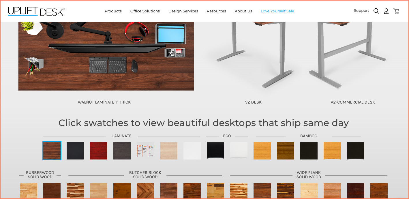
16. Include all related product swatches under the same product page
While shoppers don’t expect most brands to present them with the advantage of product comparison, they definitely expect products of the same kind to be clubbed under the same product page.
The way to do this for your BigCommerce business is to have product swatches from the same variant featured on the same page.
This instantly improves ease of experience and discoverability.
Here’s how BigCommerce brand UpliftDesk does it:
17. Create call-outs for brand USP across the store
A big reason why a shopper may want to buy from you (as against a competitor), is because they believe in what your brand has to offer.
This means if you want your brand to create a trustworthy perception in a shopper’s mind, you’ll have to make your brand USP stand out: across the storefront.
Belli Skincare is a BigCommerce brand that excels because of its pregnancy-safe offerings.
The brand ensures they highlight this feature in multiple places across their website.
Here are some snapshots:


Here's a relevant read: Build an eCommerce Brand without Splurging: A Founder's Guide
18. Get all the fineprint around “add to cart” right
The primary CTA on the product page is meant to drive shoppers to the act of purchasing.
However, what details are showcased around the “add to cart” button define how persuaded shoppers might feel to actually hit the button.
Here’s a quick conversion-driven checklist:
- Installment methods of payment (ensures the product becomes affordable to a wider audience even if it’s inherently expensive)
- Price drops (where both the original price & reduced price are stated clearly)
- Guarantee & warranty information
- Size & fit info
- Free shipping (if it’s available; if not, then bring in free shipping threshold)
- Average of star ratings
- Number of reviews already given
- The option to wishlist (for those who’ve noted the product but aren’t ready to buy yet – this can enable you to send those email nudges as well!)
BigCommerce brand Tommie Copper makes their primary CTA persuasive by incorporating most of the above-mentioned suggestions.

19. Prioritize usability across the site
The easier it becomes for shoppers to use the various sections of your storefront, the likelier it will be for them to convert.
They’ll be able to explore more easily, discover products aligned with their tastes and become more inclined to buy.
To leverage usability across your BigCommerce storefront, focus on:
- Making navigation easy (whether it is through categories, breadcrumbs or filters)
- Reducing distractions (limit the amount of text around images, having too many offers jostling for space or even linking to irrelevant pages when you want your shoppers to move towards buying)
- Highlighting offers, discounts & bundles (make the most of the fact that almost every shopper is looking for a good deal or combo)
- Incorporating intuitive search (so that no matter where they are on your site, customers only have to start typing for the most predictive search results to appear)
Be a usability champ with: 20 UX principles for higher conversions (Updated 2023)
20. Optimize UX specifically for mobile
Given that the estimates claim 187 million active mobile shoppers in US alone by 2024, this is the time to get your BigCommerce store’s mobile UX right.
Here’s a quick list of elements you’d want to look into:
- Touch optimization for the “thumb zone”
- Make room for multiple hand gestures used specifically on mobile devices (pinching, zooming etc.)
- Introduce auto-suggestions and auto-detection
- Improve error call-outs for forms
- Utilize built-in payment systems for faster checkout
Some great ideas right here: Make your mobile payment page “conversion-friendly” (13 UX hacks)
Made CRO a part of your larger eCommerce business strategy yet?
98% of visitors who visit an eCommerce site—drop off without buying anything. Why: user experience issues that cause friction for visitors.
And this is the problem ConvertCart solves. It has helped 500+ eCommerce stores (in the US) improve user experience—and 2X their conversions.
How we can help: Our conversion experts can audit your site—identify UX issues, and suggest changes to improve conversions.
And they won’t charge for this one. <Get a free UX audit today>
Subscribe for more articles like this!
500+ brands across 35 countries, including Everlast, USA Hockey, American Heart Association use ConvertCart to boost traffic-to-sales conversion rate—without having to break the bank.
.webp)
.jpg)


.svg)

.svg)

.svg)
.svg)
