Trust & Influence: Win confidence through reviews, social proof, expert endorsements, and consistent brand signals.
Value Framing & Ownership: Highlight savings with price anchoring, smart defaults, and personalization that makes offers feel “theirs.”
Action Triggers: Spark decisions with urgency, novelty, convenience, and small engagement nudges at key moments.
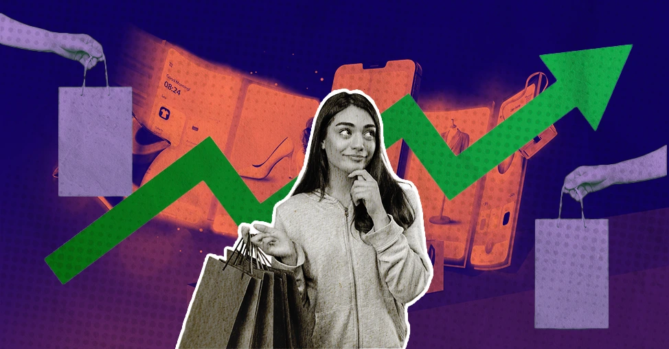
Why do some online stores instantly grab your attention while others make you click away?
The answer isn’t always discounts or flashy graphics; it’s psychology.
Every color, button, and headline on a website subtly influences shoppers' decisions, nudging their brains before they even realize it.
From sparking curiosity to creating urgency, the right psychological triggers can turn casual visitors into eager buyers.
In this blog, we’ll uncover proven and lesser-known psychological triggers that increase eCommerce sales, triggers that go beyond common advice and actually tap into human behavior in ways most brands overlook.
You’ll see real-world examples from top eCommerce brands and learn practical tips to apply these insights directly to your store.
Psychological triggers are the invisible forces driving eCommerce sales.
In just 50 milliseconds, visitors judge your site’s credibility.
A clean, familiar layout makes them feel comfortable and builds trust instantly.
Don’t try to reinvent the wheel; use design patterns that shoppers subconsciously expect, such as visible carts, simple navigation, and clear product grids.
Beyond design, product pages must go beyond specs. Instead of listing features, tell a mini-story that helps customers imagine using the product.
For example, “Enjoy a fresh smoothie every morning while getting the kids ready for school” triggers an emotional connection and makes the product relevant.
Understanding how human behavior impacts online shopping is key.
People hate losing more than they enjoy gaining; this is loss aversion in action.
Rather than generic “limited stock” alerts, personalize scarcity: “You’ve viewed this item 3 times today. Only 2 left in your size!” creates a personal nudge. And these same urgency cues show up in flash-sale posts and countdown stickers on Instagram, where brands recreate that same scarcity in real time for their followers.
Also, tap into social identity.
People don’t just want products; they want to feel they belong.
Simple statements like “Join thousands of busy parents who trust us” can skyrocket conversions.
Small psychological tweaks lead to big eCommerce results.
What Psychological Triggers Increase eCommerce Sales? 9 Strategies to Implement
1. Guided Product Search and Loss Aversion Prevention
Ever start typing in a search bar and get… nothing?
Frustrating, right?
That’s where one of the smartest eCommerce psychology tricks comes in: auto-suggest or predictive search.
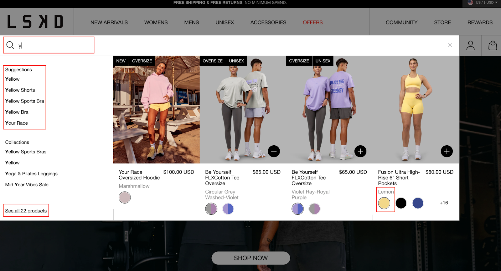
Brands like LSKD get it right.
Their search covers everything from A-Z, numbers, and odd keywords.
No matter what you type, you’re always guided somewhere useful.
We typed the letter “y.”
Instead of staring at an empty box, you instantly see product images and suggestions, like yellow shorts, and more. It feels fast, easy, and helpful.
That’s instant gratification and perceived ease of use working in your favor.
But here’s the really clever part. We tried typing “16” just for fun.
Guess what happened?
Instead of “no results found,” the search suggested relevant collections anyway.
This prevents that gut feeling of loss, you know, the one where you think, “Why even bother?”
That’s loss aversion prevention in action.
👉 Pro tip: Add playful or unexpected suggestions in your auto-suggest dropdown, like “Most popular right now” or “Hidden gems you’ll love.” It turns the search experience into a mini-discovery adventure and keeps shoppers curious instead of frustrated.
2. Novelty + Authority = Urgency
Ever wonder why some eCommerce sites make you feel like you have to buy right now?
It’s not magic, it’s smart psychology.
One powerful trigger combines novelty and authority to create a sense of urgency.
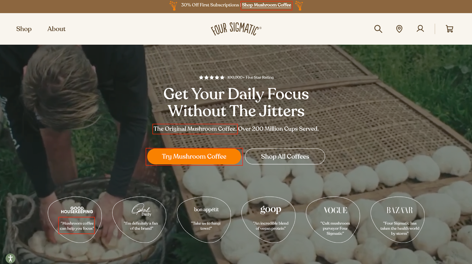
Take Four Sigmatic as a perfect example.
Their homepage doesn’t just say “Buy coffee.” Nope.
The first thing you see is a bright orange CTA: “Try mushroom coffee”, paired with a more standard option: “Shop all coffees.”
Why mushroom coffee? Because it’s new, different, and feels exciting. That’s “novelty” working.
But it doesn’t stop there.
The headline boldly calls it “The original mushroom coffee.”
And if you’re still skeptical, there’s a review from a trusted publication like Good Housekeeping telling you that mushroom coffee helps you focus.
That’s authority in action, a subtle yet powerful nudge that says, “This isn’t a random fad. Experts vouch for it.”
👉 Pro tip: Use scarcity-focused micro-copy alongside novelty and authority, like “Limited time trial” or “Exclusive launch offer”, to subtly increase urgency without sounding pushy. It makes customers feel they’re part of something special and temporary.
Product discovery – barriers that prevent shoppers from finding items
Category/collection pages – improvements that drive deeper product exploration
Product page – what to optimize to convert 2–3x more buyers
Cart – ways to ease hesitation and speed up purchase decisions
“The report was deep and super insightful. Can’t believe it’s free.”
Logan Christopher CEO, Empire Herbs
3. Strategic Price Placement & Anchoring
Ever notice how some eCommerce sites make deals feel irresistible?
That’s not by accident; it’s strategic price placement and anchoring, a powerful psychological trigger that helps shoppers feel they’re getting a great deal.
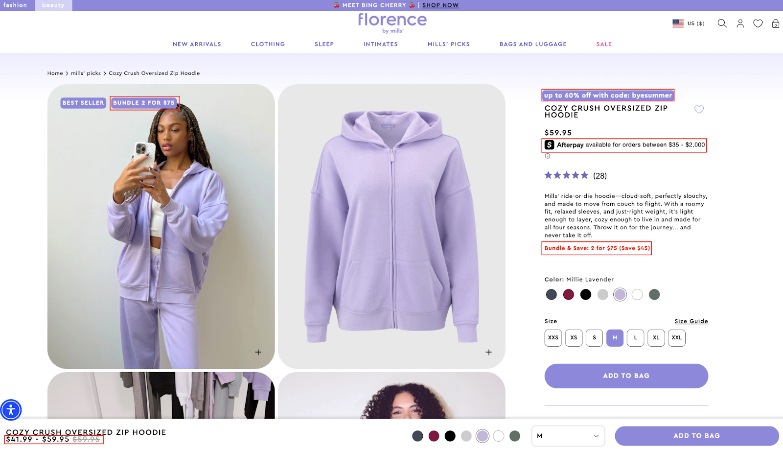
Take Florence by Mills, for example.
On their product page, the moment you see a product image, there’s a bold badge saying “Bundle and save.”
Above the product name, in eye-catching purple, they highlight “Up to 60% off with code.”
Right below the price, there’s an Afterpay option, making it feel even more affordable.
But the real kicker?
Right under the description, they repeat the value proposition in red: “Bundle and save 2 for $75.”
This creates a strong anchor; your brain compares the bundle deal to the original price and immediately thinks, “That’s a steal.”
👉 Pro tip: Test showing the higher original price crossed out next to the current offer to strengthen anchoring. Even if the original price isn’t super high, showing it briefly (without clutter) makes the discounted price feel more valuable, because our brains instinctively compare “before vs now.”
For a concrete walkthrough of decoy pricing in action — exact price points, what to anchor against, and how many options to show — see our home decor conversion rate guide.
4. Peer Influence & Visual Social Proof
Nothing builds trust faster in eCommerce than seeing real people using a product.
That’s peer influence and visual social proof working their magic.
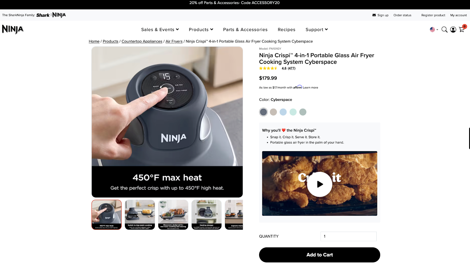
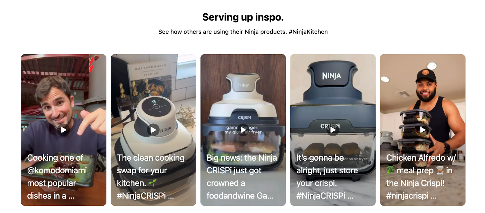
Take Ninja Kitchen as a great example.
Instead of burying the product description in text, they place a video right under the CTA button showing the 4-in-1 Glass Air Fryer in action, real people using it, cooking meals, and enjoying the process.
It feels relatable, not corporate.
But it gets better.
Further down the page, they feature videos from TikTok creators showing genuine, unscripted reviews.
This shows shoppers that real customers, not just the brand, love the product, which reduces hesitation and boosts confidence.
👉 Pro tip: Add a live counter showing how many people are currently viewing or have recently purchased the product. This subtle real-time social proof creates a sense of popularity and urgency, tapping into the idea that people don’t want to miss out on what others are enjoying right now.
Expert endorsement in particular is evolving fast — see why brands are shifting budget from generic influencers to credentialed experts in our 2026 eCommerce trends breakdown.
5. Endorsement Heuristic
When shopping online, we don’t just rely on facts; we look for signals that others have already decided for us.
That’s the power of the endorsement heuristic in action.
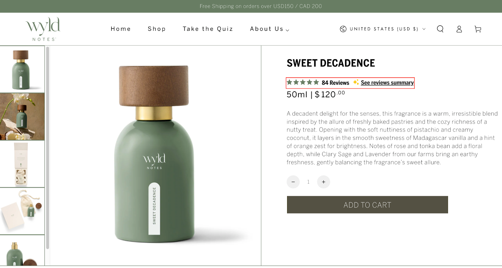
Take Wyld Perfume as a perfect example.
Right under the product title, you see a star rating and a note like: ⭐️⭐️⭐️⭐️☆ | 84 reviews | See reviews summary.
This small but powerful badge immediately tells your brain, “Other people trust this product.”
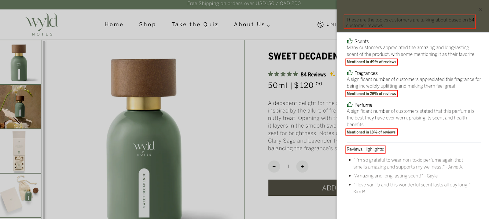
But here’s where it gets clever.
Instead of just dumping a long list of reviews, clicking “See reviews summary” opens a side panel highlighting key insights like “Mentioned in 76% of reviews: Long-lasting scent” or “Loved for subtle, non-overpowering fragrance.”
This turns vague testimonials into digestible, meaningful proof that helps customers decide faster.
👉 Pro tip: Rotate the highlighted review insights periodically based on seasonal trends or top-performing benefits. For example, in summer, emphasize “Fresh and light scent” if that’s trending. This keeps the social proof feeling timely and relevant, rather than static and stale, which increases its persuasive power.
6. Micro-Engagement Loop
Empty carts don’t have to mean lost sales.
With the right psychological trigger, they can turn into powerful opportunities.
Enter the micro-engagement loop, a simple but genius way to keep shoppers interacting and guide them toward a purchase.
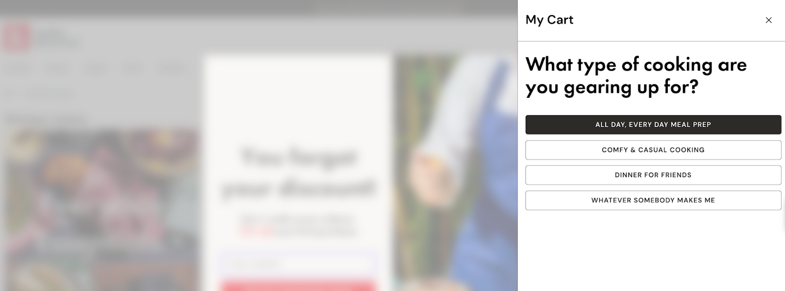
Take Hedley and Bennett as a great example. Instead of showing a boring “Your cart is empty” message, they ask:
“What type of cooking are you gearing up for?”
Then they offer clickable options like “All day, every day meal prep” or “Dinner for friends.”
Once you click, the empty cart doesn’t stay empty; it redirects to a landing page full of relevant product suggestions based on your choice.
This small interaction keeps the customer engaged and subtly moves them closer to a purchase without feeling salesy.
It taps into a key part of human psychology: we like making decisions, even small ones, because it gives us a sense of control.
👉 Pro tip: A/B test offering personalized micro-engagement questions based on visitor behavior. For example, if someone browses baking tools before visiting the cart, show: “Baking something sweet today?” This makes the suggestion feel tailored, not generic, boosting the chance they’ll click through.
7. Default Effect + Recommendation Heuristic
Ever notice how some choices feel easier than others?
That’s the power of the default effect and the recommendation heuristic, a psychological hack that reduces decision fatigue and boosts conversions.
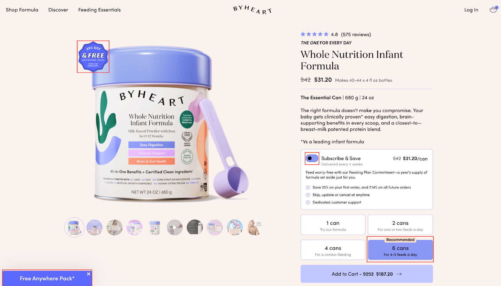
Take ByHeart as an example.
On their product page, shoppers see options like 1 can, 2 cans, and 4 cans.
But the default selection? 6 cans, labeled with a “Recommended” tag.
Right next to the product image, a badge says “25% off & free anywhere pack,” highlighting extra value.
This setup does two things:
It makes the default choice feel like the smart, worry-free option.
It subtly guides shoppers toward the higher-value package without feeling pushy. By reducing the number of decisions the customer has to make, it prevents choice fatigue and increases the likelihood of a purchase.
👉 Pro tip: Rotate the default recommendation based on real-time stock or seasonal trends. For example, if a smaller pack is selling out faster, make that the default temporarily. It leverages the default effect while subtly managing inventory and maximizing perceived value.
8. Personalization & Endowment Effect
Humans value things more when they feel personally theirs; that’s the endowment effect in action.
Pair it with personalization, and you have a powerful way to nudge shoppers toward purchase.
Take PVOLVE as an example.
On their cart page, they don’t just show the total price; they highlight “Your Price” in a different color and show “Your Savings” with the amount in negative format.
It feels personal, like this deal was made just for you.
Add to that a digital membership bundled with the Total Transformation package, and suddenly the shopper feels they’re not just buying a product, they’re claiming a customized, exclusive experience.
This approach taps into ownership and personalization at the same time.
When shoppers see “their” price or “their” benefits, they feel attached and are more likely to complete the purchase.
👉 Pro tip: Let shoppers see how long their personalized offer will last, e.g., a countdown for exclusive savings or bonus content. Creating a sense of temporary ownership, “this personalized deal is yours for 24 hours,” strengthens the endowment effect and drives urgency without being pushy.
9. Urgency & Convenience Effect
Nothing drives quick decisions faster than combining urgency with convenience.
When shoppers feel they can get what they want right now, they’re far more likely to complete a purchase.
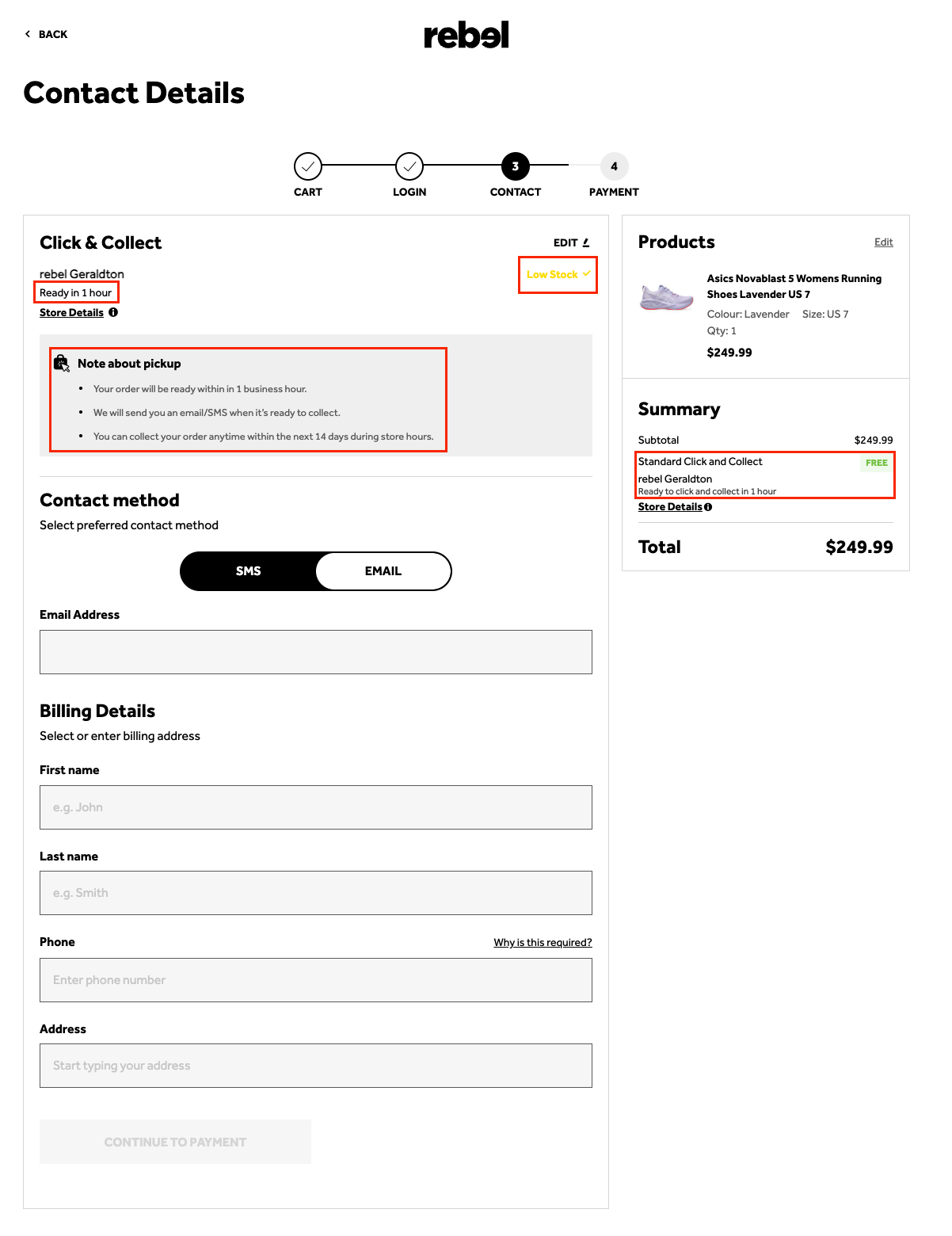
Take Rebel, for example.
On their checkout page, they highlight a “Click and Collect” option with bullets explaining the benefits, like email/SMS notifications.
Next, a bold “Ready in 1 hour” notice reinforces speed, while a subtle low-stock alert in yellow adds urgency.
Together, these cues make shoppers feel the product is both valuable and fleeting, perfectly nudging them to act fast.
This approach works because it taps into human behavior: we naturally prioritize solutions that save time and avoid missing out.
👉 Pro tip: Test combining convenience with a small reward for acting fast, like “Pick up in 1 hour and get a free in-store accessory.” The added incentive leverages urgency while making the convenience feel even more rewarding, turning hesitation into action without pressuring the shopper.
Why visitors don’t trust your store within 3 seconds
Why shoppers can’t find what they’re ready to buy
What’s stopping 2-3x more shoppers from clicking “Add to Cart”
Where buyers hesitate right before purchase
Why high-intent shoppers still drop off
“The report was deep and super insightful. Can’t believe it’s free.”
Logan Christopher CEO, Empire Herbs
The Role of Emotion vs Logic in Buying Decisions
When it comes to ecommerce sales, the role of emotion vs logic in buying decisions is far more important than most think.
While many store owners focus on listing specs and prices, the real driver of purchases is emotion.
Studies show that 95% of buying decisions happen subconsciously.
Logic steps in later to justify what the heart already decided.
Great eCommerce sites don’t just explain what a product does—they show why it matters.
Instead of “This vacuum has 2000W power,” try:
"Spend less time cleaning and more time with your family.”
That simple emotional shift taps into desires for convenience and freedom.
But don’t ignore logic completely. Offer clear comparisons and transparent pricing to reassure skeptical shoppers. The secret is balance:
Let emotion spark interest and desire, and logic close the deal by reducing uncertainty.
Here’s an uncommon insight: Emotions are highly personal.
Two people may see the same product but have different triggers.
The smarter strategy? Utilize customer segmentation to deliver emotion-driven messages tailored to your target audience.
Example: Young parents respond to time-saving benefits. Outdoor enthusiasts care about durability.
Mastering this balance turns casual browsers into loyal customers and boosts ecommerce sales like magic.
How Consistency Builds Long-Term Customer Loyalty
In eCommerce, consistency is one of the most powerful yet overlooked psychological triggers that builds long-term customer loyalty.
Many store owners chase the next flashy marketing tactic, but what really keeps customers coming back is simple: consistent experience.
When your brand tone, design, and service remain reliable, customers start to associate you with trust and predictability.
Every interaction, whether it’s your homepage design, product descriptions, or checkout process, should feel familiar and easy. This taps into a deep part of human psychology: the need for stability.
Here’s the unique insight few talk about: consistency doesn’t mean rigidity.
It means consistent values and promises. If your brand promises fast delivery, consistent product quality, and friendly support, don’t just aim for occasional success; build it into your system.
Small inconsistencies like changing your tone randomly, missing delivery windows, or offering unclear policies create subconscious doubt.
Over time, this erodes trust far faster than one-time bad reviews.
Pro tip: Create micro-moments of consistency. Use the same reassuring language (“We’ve got you covered”) throughout emails, ads, and product pages. These tiny, repeated cues stick in the customer’s mind, making your brand feel like a reliable choice. Consistency isn’t boring, it’s powerful.
Upgrade your online store conversions
98% of visitors who visit an eCommerce site drop off without buying anything.
Even when you feature the best ecommerce promotions.
Why: user experience issues that cause friction for visitors.
And this is the problem Convertcart solves.
We've helped 500+ eCommerce stores (in the US) improve user experience and 2X their conversions.
How we can help you:
Our conversion experts can audit your site - identify UX issues, and suggest changes to improve conversions.
Subscribe for more articles like this!
Thank you - we'll see you in your inbox soon!
Oops! Something went wrong while submitting the form.
Read by 5000+ ecommerce store owners
Subscribe for more articles like this!
Thank you - we'll see you in your inbox soon!
Oops! Something went wrong while submitting the form.


.avif)
.svg)

.svg)

.svg)
.svg)
