The stores that win at conversion rate optimization aren't the ones running the most A/B tests. They're the ones asking a better question before they run any.
Not "what should we change?" but "where does the doubt actually peak?"
Every friction point in eCommerce maps to a moment. A specific place on a specific page where a shopper's confidence stalls, and the sale either happens or doesn't.
The CRO experiments that move the needle are the ones that meet the doubt exactly where it lives.
If you're running CRO experiments on your store or trying to make the case for it, here's what 8 A/B tests across industries actually look like when the psychology is right.
1. Do clickable color thumbnails improve engagement?
When we ran A/B tests on PeachSkinSheets (a bedding and sheets store), insights showed that shoppers landed, scrolled for roughly 8 seconds, then left.
Session recordings showed the same pattern every time: they weren't reading product descriptions. They were scanning for a colour they liked and finding nothing to help them act on it.
The static colour swatches were purely decorative. Clicking one triggered a slow, full-page filter reload. By the time results appeared, the shopper had bounced.
Our hypothesis
If we add clickable color thumbnails on product pages, more users will engage, leading to a lower bounce rate.
This change leverages the Von Restorff Effect.
On a grid of near-identical product thumbnails, standout clickable swatches become the visually dominant element that draws immediate attention.
What we changed
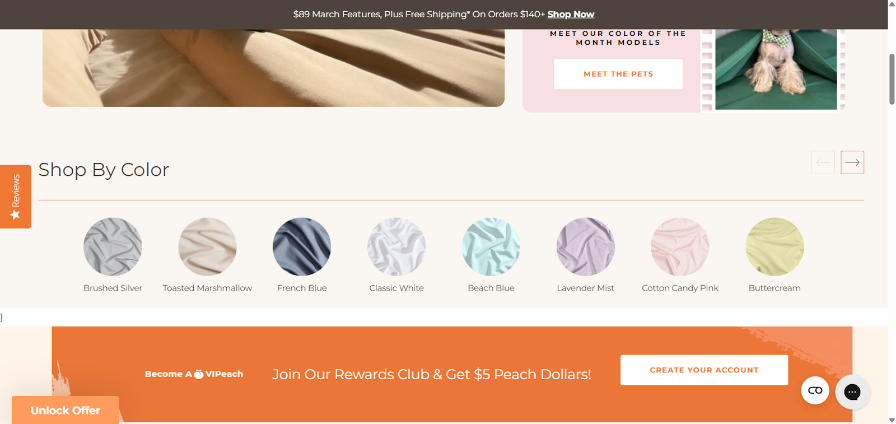
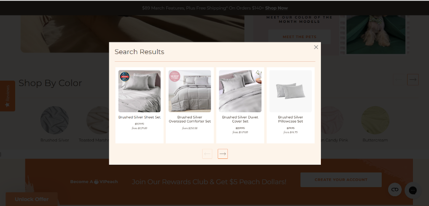
We moved a prominent "Shop by Color" swatch row to the top of the page.
Clicking any colour opened an instant modal, no page reload, showing 3 to 5 curated matches with quick Add to Cart buttons.
Shoppers stayed in context the entire time.
The control in our A/B test saw the original static swatches. The variation got the interactive modal. We ran it across two high-traffic sources simultaneously.
The result
Website-wide conversion rate increased by 2.3%
Mobile conversion rates performed even higher
Insight
Shoppers responded strongly to the clickable colour swatches and modal experience.
The change made colour selection faster and more intuitive, leading to quicker decisions and higher conversions, especially on mobile.
Learning from this CRO experiment
Making key product attributes (like colour) immediately actionable and focused beats forcing users to navigate slow full-page results.
Guided, prominent choices can significantly improve both engagement and sales.
2. Does smart site search improve conversions?
If there's one A/B test in this post you should read twice, it's this one.
While auditing multiple eCommerce stores, our team kept seeing the same thing: site search was barely used (around 1% of visitors) and nearly useless when it was.
No predictive suggestions, no smart filters, no sense of direction. Shoppers who tried it gave up fast. Everyone else browsed blindly, hoping for the best.
The irony: search users are your highest-intent visitors. They know what they want.
A broken search experience doesn't just fail them, but it actively costs you conversions.
Our hypothesis
If we show categories alongside products in search results and enable filtering within search, users can quickly refine and navigate to relevant results without restarting their search.
This change is based on Information Foraging Theory.
Shoppers behave like foragers. They follow strong “information scent” cues and abandon searches when the effort exceeds the likely reward.
Currently, our basic search provides almost no scent, causing users to leave quickly. Improving it will make the search far more intuitive and rewarding.
What we changed
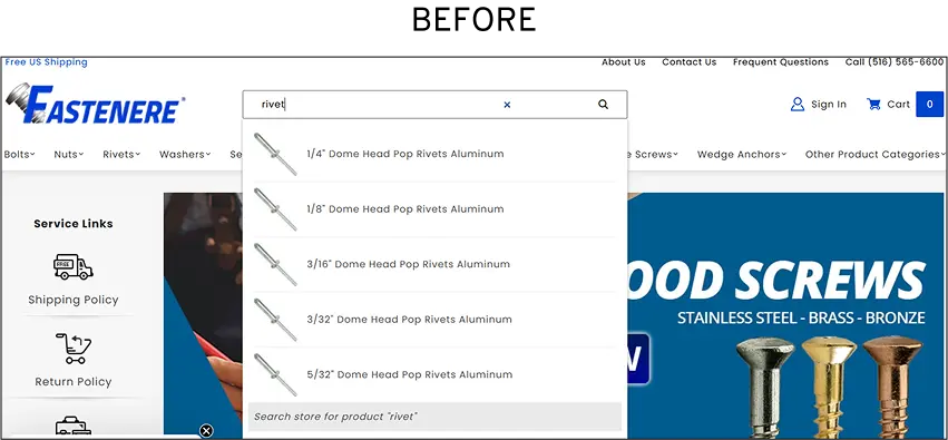
The earlier search on Fastenere (read the full case study) was minimal, static, and provided no guidance.
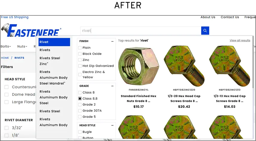
The variation introduced what we call Intellisearch smart autocomplete that activates as you type, refined filters across category, specs, and stock availability, and a results algorithm tuned to surface high-converting products first.
We ran this A/B test across live stores over several weeks with tens of thousands of sessions.
The result
Search engagement tripled, rising from 1% to 3.07% of all visitors.
Conversion rate for search users increased by 1,107.8%
Revenue per search user increased by 1,975%
Search users were 11x more likely to convert and generated 20x more revenue per visitor than non-search users.
Additional improvements: Page views per session +180.8%, CTR on search results reached 34.22%, and average click position moved 5.6% closer to the top result.
Insight
Even though only a small percentage of visitors used search (3.07%), improving the search experience had an outsized impact.
Shoppers who used the enhanced search found products much faster, engaged far more deeply, and converted at dramatically higher rates.
Learning from this CRO experiment
Strong information scent in search turns casual browsers into high-value buyers.
When users can quickly find what they’re looking for, even a small group of search users can drive massive revenue gains. Investing in better search delivers disproportionately high returns.
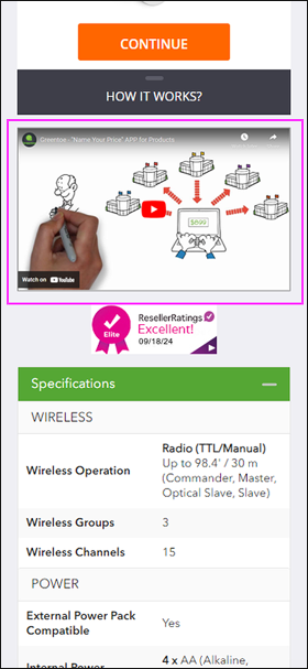
3. Does an explainer video boost conversions?
Greentoe runs a "Make an Offer" bidding model genuinely different from standard eCommerce. (Read the full case study)
Shoppers name their price, Greentoe works with retailers to match it.
Great concept. Confusing experience.
Session data showed visitors hesitating at the exact moment the bidding mechanic was introduced, and post-purchase surveys pointed to the same culprit: people didn't fully understand what they'd agreed to until the item arrived.
The result was a return rate problem rooted not in product quality, but in expectation mismatch.
Our hypothesis
If we add a short, well-produced explainer video on the product and checkout pages, then shoppers will place more trust the store, leading to higher conversion rates.
Based on the Context Principle, people don’t evaluate offers or processes in isolation. Instead, they interpret them through the surrounding cues.
Without a clear context, uncertainty takes over, and trust drops.
The explainer video provides rich, timely context that “shows” rather than just “tells,” reframing the entire bidding experience and reducing hesitation at critical decision points.
What we changed
The earlier page explained the bidding mechanic through text alone.
The variation embedded a mobile-optimised explainer video, concise, clearly narrated, visually walking through the full offer journey from submission to fulfilment.
We placed it prominently on both product pages (even tested it on checkout pages), and ran the A/B test over several weeks across Greentoe's mobile traffic.
The result
The new explainer video increased purchases by 4%.
Even more importantly, returns on bid items dropped noticeably, a key outcome that most CRO tests don’t even measure.
The combined impact was so strong that Greentoe made the video a permanent part of the website instead of testing more variations.
Insight
Shoppers were forming their own (often wrong) understanding of how bidding worked on the site.
This mismatch between what they expected and what actually happened led to returns weeks later.
The video closed that gap right before they placed their bid, not after the item arrived.
Learning from this CRO experiment
Clarity before purchase is one of the most effective (and cheapest) ways to reduce returns.
Most teams focus only on getting more people to buy and ignore what happens after.
This test proves that setting the right expectations at the moment of decision creates both higher conversions and happier customers long-term.
4. Does instant hover size info increase add-to-cart rates?
On Lighthouse Clothing (fashion apparel store), session recordings showed a consistent pattern.
Shoppers would land on a product page, pause at the size selector, and either abandon or add to cart with visible hesitation, the kind that shows up later as a size-related return.
The sizing information existed on the page. It was just buried inside an accordion two scrolls down, behind a click.
That one extra step was doing serious damage.
Our hypothesis
If we display accurate size information directly at the size selector (exactly where shoppers hesitate), we can reduce purchase anxiety and increase add-to-cart and conversion rates.
This CRO experiment was based on Uncertainty Reduction Theory.
When shoppers face uncertainty, especially the question "Will this actually fit me?", it creates real psychological discomfort.
People don’t like sitting with that anxiety, so they either search for answers or simply abandon the purchase.
What we changed
Earlier, the original product page: size details in CM and inches were available only inside a collapsed accordion, further down the page.
Shoppers had to notice it, scroll to it, click it, and then translate the numbers, four steps to answer one question.
The variation brought that information directly to the size selector.
Hovering over any size option instantly displayed measurements in both CM and inches, with a toggle to switch units on the spot.
Zero additional clicks. We ran this A/B test across key product pages in the apparel and furniture categories over several weeks of high-traffic sessions.
The Result
On desktop, the new hover interaction on the size selector delivered strong results:
Add-to-cart rate increased by +10%
Overall website conversion rate increased by +1%
Session recordings showed shoppers hesitating much less at the size selector.
The store also saw fewer size-related returns, the same positive downstream effect we saw in the Greentoe video test.
Insight
The old design forced people to go through a four-step detour to find the answer.
Most didn’t bother, or they guessed (and later returned the item) or abandoned the purchase.
The new hover design removed that friction completely. The exact information they needed appeared instantly, right at the moment of highest doubt.
Learning from this CRO experiment
In CRO, we often focus on adding more information to product pages.
This test shows the smarter approach is to ask: "Where does the customer’s anxiety actually peak, and is the most important information right there when they need it?"
Placing critical details exactly where hesitation happens reduces uncertainty, boosts confidence, and improves both immediate conversions and long-term metrics like returns.
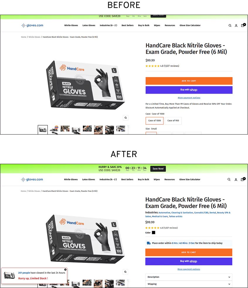
5. Does a real shipping countdown reduce drop-offs?
Across store audits in multiple industries, our team kept seeing hesitation at the delivery section of product pages.
Shoppers who'd made it past the price, past the reviews, past the size selector, engaged, interested, close to buying, were stalling on one question: "When will I actually get this?"
On Gloves’s store, we put a number to it. At that exact point in the page, 87% of visitors were dropping off. (Read the full case study.)
Not bouncing from the page, abandoning specifically at the delivery information block, where the answer to their question should have been.
The copy there read like most eCommerce delivery messaging: estimated ranges, vague conditionals, no specificity. It answered nothing.
The hypothesis
If we replace vague delivery messaging with a clear, time-bound deadline, then shoppers will feel a stronger urgency to buy now, increasing conversion rates.
This CRO experiment was built on Loss Aversion from Prospect Theory.
People are roughly twice as motivated by the fear of losing something as by the chance of gaining the same thing.
What we changed
The earlier delivery copy estimated ranges with no specificity.
The variation added a real-time countdown, "Order within the next X hours for delivery by [date]" displayed prominently on the product page and updated dynamically against actual warehouse cutoff times.
No fake scarcity. No manufactured deadlines. The timer reflected a real operational constraint.
We ran this A/B test on high-traffic desktop product pages over several weeks.
The result
The clear, time-bound delivery deadline significantly improved performance:
Add-to-cart rate increased by 22%
Checkout completion rate increased by 22%
Session recordings showed shoppers moving through the funnel much faster, with less hesitation and fewer exits at the delivery section.
The big 87% drop-off point didn’t vanish completely, but it stopped leaking as many customers.
Insight
Vague delivery messages left shoppers in a passive “I’ll get it eventually” mindset.
The specific deadline (“Order in the next 3 hours for same-day dispatch”) changed the frame from a potential gain to a potential loss.
Because the deadline was real and verifiable, it created genuine urgency without triggering distrust.
Shoppers felt they would actually miss out if they waited, so they acted.
Learning from this CRO experiment
Loss Aversion works best when it’s authentic.
Fake urgency (like countdown timers that reset) may give a short boost, but often damages trust.
Real, verifiable deadlines turn anxiety into action and deliver strong results without the usual backlash.
This test proves that the right message at the right moment can dramatically speed up decisions while keeping customer trust intact.
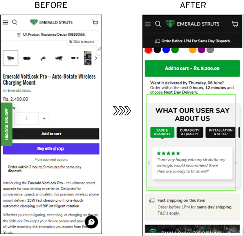
6. Do structured review summaries improve conversions?
During an audit of Emerald Struts, user testing revealed something that shows up on almost every eCommerce product page. (Read the full case study.)
Shoppers were reading reviews and were still left uncertain.
Not because the reviews were bad.
But finding the specific reassurance they needed meant scrolling through a wall of mixed comments and hoping the right one appeared.
Our hypothesis
If we show highly specific, targeted customer reviews right where shoppers have doubts, then we can reduce purchasing uncertainty.
This CRO experiment was built on Informational Social Influence.
When people feel uncertain, they look to others for guidance, but not for generic reassurance.
They want evidence that directly answers their specific concern.
A shopper worried about durability doesn’t need 50 average reviews.
They need real feedback from people who bought the same product, talking about how long it lasted.
The easier and more relevant the information is to access, the faster doubt turns into confidence.
What we changed
Earlier, the standard review module: all comments in one long chronological list with an overall star rating.
The variation restructured the entire section into factor-wise summaries, dedicated blocks for Quality, Durability, Delivery Experience, and other relevant categories, each with its own rating and curated highlights.
Clean, scannable, and organised around the questions shoppers actually ask rather than the order reviews that happened to arrive.
We ran this A/B test across live product and category pages on both desktop and mobile simultaneously.
The Result
The restructured, topic-based customer reviews delivered a clear improvement:
Desktop: Website conversion rate increased by 2.80%
Mobile: Website conversion rate increased by 3.67%
Desktop saw stronger gains because users there tend to read reviews more carefully.
The new format gave them exactly what they were looking for. Mobile users scan faster, so the improvement helped but had a smaller impact.
Insight
Shoppers don’t want generic reviews. They want answers to their specific doubts (durability, fit, quality, delivery speed, etc.).
The old wall of mixed reviews forced them to dig through the noise.
The new structured format turned reviews into a targeted “answer engine” that shoppers could instantly jump to the exact section they cared about and get relevant social proof in seconds.
Learning from this CRO experiment
Informational Social Influence works best when social proof is made specific and low-effort.
Instead of showing more reviews, we should focus on organizing them so they directly match the customer’s biggest questions.
When doubt meets the right evidence at the right moment, confidence rises, and more people buy.
7. Does cart reassurance copy increase checkout clicks?
Cart abandonment is usually framed as a pricing problem or a friction problem.
This A/B test points to a third cause that gets far less attention: ambiguity about the product itself, surfacing at the worst possible moment.
On Rugged Rosaries' store and across other stores selling beads and rosary-related products, our team kept seeing the same pattern.
Shoppers who had browsed, chosen a product, and added it to cart were still abandoning.
Not because of shipping costs or a complicated checkout.
Because the cart page gave them nothing to hold onto when the final doubt arrived: "Is this actually going to last?"
Our hypothesis
If we add reassurance messages next to the checkout button in the cart, then we will reduce ambiguity at the final decision point and lower cart abandonment rates.
This CRO experiment was grounded in Ambiguity Aversion, the strong human preference for options with known, clear outcomes over uncertain ones.
Even if the ambiguous option might be better, uncertainty itself pushes people away from committing.
What we changed
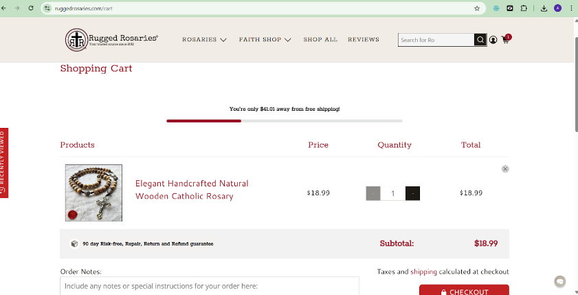
Earlier, the cart page showed product image, price, quantity selector, and checkout button.
No information about build quality, materials, or product longevity anywhere in view.
The variation added a concise copy block near the checkout CTA, not a badge, not a generic "secure checkout" line.
But specific benefit-focused language addressing the exact concerns, like what the product is made from, how long it's built to last, and what quality standards back that up.
It was placed prominently on both desktop and mobile cart pages, and tested across cart pages showing collections rather than single items.
The result
The reassurance messages placed next to the checkout button delivered strong results:
Desktop checkout CTA click rate reached 67.5%
Mobile checkout CTA click rate reached 61.4%
Hesitation at the cart stage dropped significantly.
Shoppers who had already added items to their cart were now far more likely to complete checkout because their final doubts were resolved exactly when they needed them.
Insight
Even when shoppers had made it all the way to the cart with high intent, one lingering uncertainty was enough to make them abandon.
The product felt right, and the price was acceptable, but unanswered questions created discomfort strong enough to override their decision.
By placing clear, benefit-focused reassurance right next to the checkout button, we removed that ambiguity at the exact moment doubt peaked.
Learning from this CRO experiment
Cart abandonment often isn’t about the product. It’s about unresolved uncertainty at the final step.
Trust signals on the product page are useless if the doubt hits hardest in the cart.
The best CRO fix isn’t always adding more information, but moving the right reassurance to the precise moment when hesitation is highest.
This turns high-intent visitors into actual buyers.
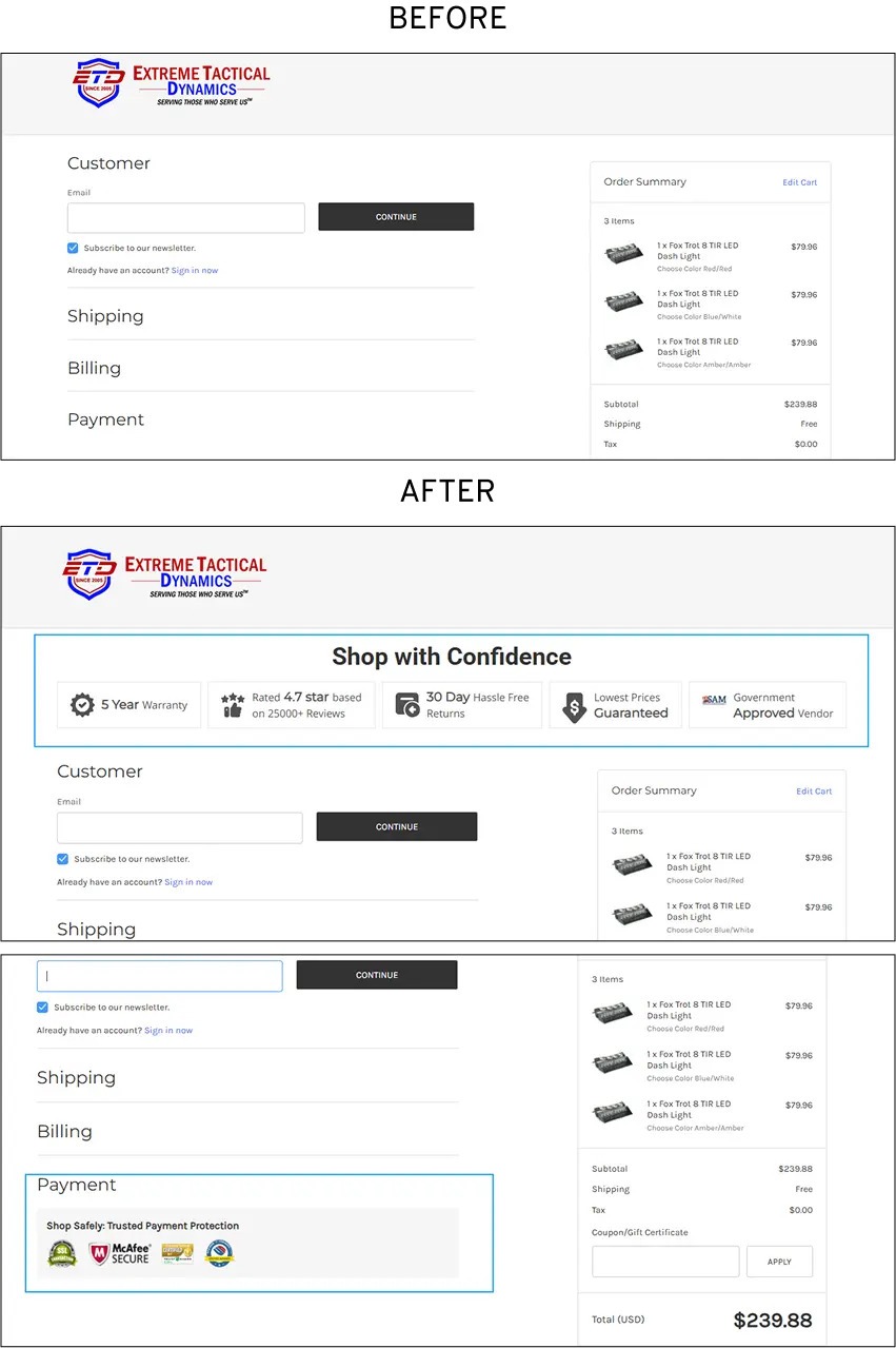
8. Does “prominent trust signals” at checkout reduce abandonment?
On the Extreme Tactical Dynamics store, checkout abandonment analysis pointed to clear culprits, which were weak or absent trust signals at the payment stage. (Read the full case study.)
Nearly 41% of users who reached the one-page checkout were leaving without completing, and exit survey data tied the drop-off directly to concerns about payment security and uncertainty about what would happen if something went wrong.
The checkout page itself was functional. The problem was what it wasn't saying.
Our hypothesis
If we place prominent, credible trust signals directly at the payment step, then we will reduce hesitation and lower abandonment rates.
This CRO experiment was based on Signaling Theory. In situations where buyers know far less than the seller (especially at checkout), people look for visible, trustworthy signals to reduce risk.
At the payment page, information asymmetry is at its highest. Shoppers are about to share card details with a store they may have only just discovered.
Without strong, credible signals that the transaction is safe and protected, hesitation is the natural response.
What we changed
The earlier checkout displayed payment fields, order summary, submit button, and nothing that addressed the questions a first-time buyer inevitably asks at that moment.
The variation added three specific trust elements near the payment section: a prominent secure checkout seal, clear return and warranty messaging, and a visible ratings indicator.
Placed on both desktop and mobile, positioned deliberately close to the payment CTA rather than in the footer or header, where they'd be easy to miss.
We ran this A/B test on the live one-page checkout experience across desktop and mobile traffic.
The result
Adding prominent trust signals at the payment step delivered strong results:
Desktop conversion rate increased by 10.67%
Mobile conversion rate increased by 5.10%
Overall, checkout abandonment dropped by 11%.
Shoppers who had reached the payment page were now completing their purchases at a much higher rate.
Insight
At the payment step, shoppers face maximum uncertainty.
They’ve decided to buy, but suddenly hesitate because they can’t easily verify that the transaction is safe or protected.
The old design left this doubt unaddressed.
The new variation placed clear, credible trust signals (security badges, guarantees, etc.) exactly where hesitation peaked right next to the payment fields.
This gave shoppers the reassurance they needed at the exact moment they needed it.
Learning from this CRO experiment
Trust signals only work when they’re visible at the moment of highest risk.
This test shows that the real power comes from placing them where information asymmetry is strongest at the payment step.
When you reduce doubt right before the customer hands over their card, more people complete the purchase.
Questions eCommerce Stores Often Ask Us
1. Which CRO experiment should I run first?
The honest answer is to run whichever CRO experiment maps to your biggest drop-off right now.
Most stores rush into checkout optimization because that’s where the sale is lost, but by the time shoppers reach checkout, they’ve already survived your product pages, cart, and navigation.
Fixing the final step without addressing earlier leaks is like patching the end of a broken pipe while ignoring the source. Pull up your funnel analytics, identify the stage with the steepest drop-off, and ask whether that drop-off is caused by friction, anxiety, or missing information.
Then pick the experiment that directly solves that problem. If you’re early in your CRO journey and don’t have clear funnel data yet, start with the checkout trust signals experiment.
It’s the lowest-effort test on the list, works for almost every eCommerce store, and targets the stage where abandonment hurts the most, you’ve already paid to bring the shopper this far. The ROI is immediate and easy to measure.
2. How long should I run an A/B test before reading results?
Run your A/B test longer than you think.
The biggest mistake that invalidates most CRO experiments is peeking at results too early, checking the dashboard the next morning, declaring a win if the variation is up, or killing it if it's flat. Both decisions are usually wrong.
The real threshold isn’t time alone but statistical significance at 95% confidence, which ensures the result reflects a true behavioral difference rather than random noise.
Most tools calculate this automatically, but it depends on sample size. A rough rule: don’t read results until each variant has at least 100 conversions. A 50% increase on 20 conversions is noise; a 5% increase on 2,000 is actionable.
In 2026, also account for the novelty effect.
When you launch a change, returning visitors often react more positively simply because it feels new.
This temporary boost usually fades after one to two weeks. Stopping the test too early risks shipping something based on a short-term bump instead of a lasting improvement. Run it long enough for novelty to decay so you can trust the real, sustained signal.
3. How much traffic do I need to run a valid A/B test?
You don’t need huge traffic for valid A/B tests, but be realistic about timing.
What matters most is conversions per variant. For 95% confidence, aim for 200–400 conversions per variant.
At a 3% conversion rate with a 20% expected increase, you’ll need about 4,800 visitors per variant, roughly ten days at 1,000 daily visitors.
If your conversion rate is low and expected gains are small, tests can drag on for months. In that case, test micro-conversions like add-to-cart rate or checkout initiation instead of final purchases.
They reach significance faster, letting you iterate quicker and avoid unreliable results.
4. How is scientific CRO different from regular conversion optimization?
Most conversion rate optimization is just opinions dressed as strategy. A designer wants a bigger CTA button, a marketer pushes for discount-heavy headlines, or a founder demands better product photos.
Someone decides, the change goes live, and months later no one knows if it actually improved sales because nothing was properly measured.
That’s regular conversion optimization, driven by intuition, borrowed best practices, and the loudest voice in the room. It creates changes, but rarely delivers real results.
Scientific CRO follows a disciplined process. Observe user behavior, build a hypothesis based on psychology, run a controlled A/B test with enough traffic for statistical significance, analyze the outcome, and truly understand why it worked.
It tracks not just conversion rate but downstream metrics like return rates, revenue per visitor, add-to-cart rate, and repeat purchases.
In 2026, stores that treat CRO as a systematic discipline are the ones compounding gains and staying ahead.
Ready to stop guessing and start converting more of your existing traffic?
We didn’t guess. We didn’t rely on “best practices” or gut feel.
Instead, we designed and ran rigorous, data-backed CRO experiments across real eCommerce stores, testing everything from product page layouts and trust signals to checkout friction, urgency elements, and personalization triggers.
If you’re tired of throwing money at traffic while watching too many visitors leave without buying, this is for you.
Our team will identify your biggest conversion leaks and give you a clear, prioritized list of quick wins and high-impact tests.


1--Blog-Covers-Duo-tone.webp)


.avif)
.svg)

.svg)

.svg)
.svg)
