Insights in this post come from our CRO team's decade of experience working with eCommerce brands. Edited by our in-house content team.
If you search on the net, you’ll find a lot of advice on how to improve WooCommerce product pages to drive more sales.
While all the advice might sound generic, it’s important to cover the basics. However, if you’ve already laid down the foundation and still struggle to see significant results, then it’s time to take it up a notch.
In this article, let’s explore some unusual ways to optimize WooCommerce product page, and compel shoppers to add more products to carts and checkout.
The Best WooCommerce Product Page Conversion Tactics
1. Optimize page copy for translation
Most brands stop at optimizing their website copy for local search queries. While this helps you get customers nearby, you’d continue to be limited as a small business. This means you’ll always run your store on a local level leaving very little room for expansion.
What you can do:
Avoid using location-based innuendos or sayings that a foreigner wouldn’t typically understand
Don’t just focus on word-for-word translation as that has certain inaccuracies—instead, use a multilingual plug-in that allows for translations with context
Add relevant global keywords for faster product discovery
See how thomp2 an American store ensures that each word in their product page copy is optimized for language translation—here’s what the product page looks like in French
Plug-in to use:
The Webis Multi-lingual for WooCommerce helps with product translation across multiple languages.
2. Optimize product info in the inverted pyramid form
A lot of WooCommerce merchants make the mistake of piling all their product info within the first fold of the product page—but this seldom works because most shoppers want to find out more about the product as they scroll!
Lack of information hierarchy = bad product page UX.
What you can do:
Highlight the most important stuff first and then recede to less important ones (WooCommerce brand Karmin Professional features a snippet descriptor to highlight what the product is in the first fold, and then bring in a longer description in the second)
Use a expandable-collapsible layout to create the hierarchy
Offer a quick view option so that users can easily add items to cart without viewing the entire product page
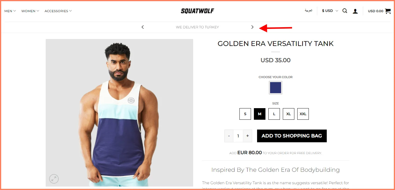
Squatwolf uses the header to answer the most important question - do they deliver to my location?
The product page shows the most important information above the fold and as you scroll, it shows other features including a product video.
Unclear pricing, product recommendations that can’t be instantly added and swatches that won’t work smoothly—WooCommerce product pages can potentially have a number of issues that lead to poor conversions.
What you can do:
Distinguish clickable elements clearly
For dynamic product variations, make the image intuitive based on the user-selection
Feature linked microcopy for additional policy / pricing info—the link can then expand into a box, which will prevent shoppers from leaving the page
Use directional arrows to make seeing recommendations, reading reviews easier
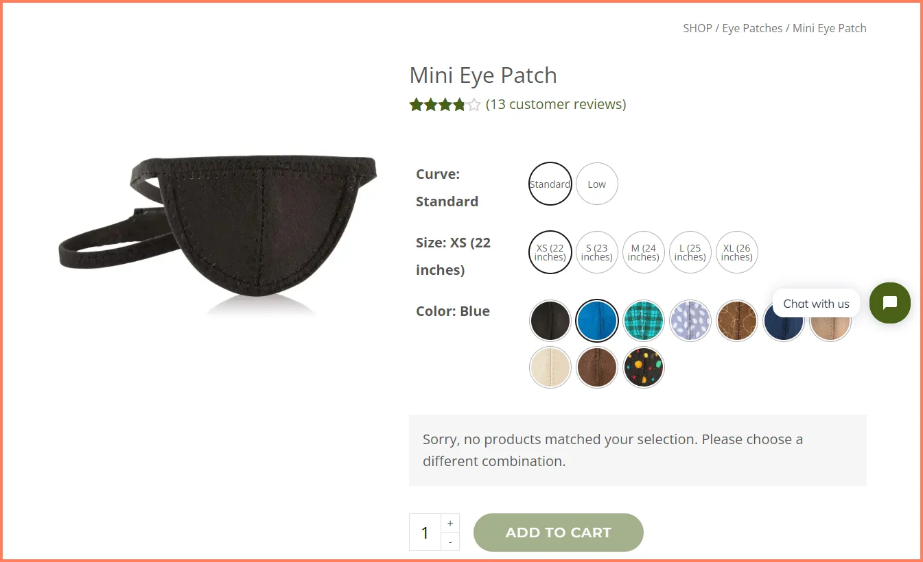
For example, NWeyedesign sells eye accessories. In the eye patch section, they don’t use the convention size and color bar. Instead, they opt for clear round buttons that depict each available option. The color drops also show what the colors look like.
The error message declaring the out-of-stock product offers crucial info without the shopper having to leave the page:
A chunky paragraph stuffed with all that’s good in your product will likely go unread, because of the sheer effort that it’ll need for a shopper to sift through.
What you can do:
Figure out the most important sections based on questions shoppers are likely to ask
Separately feature specifications & instructions so that they don’t get lost
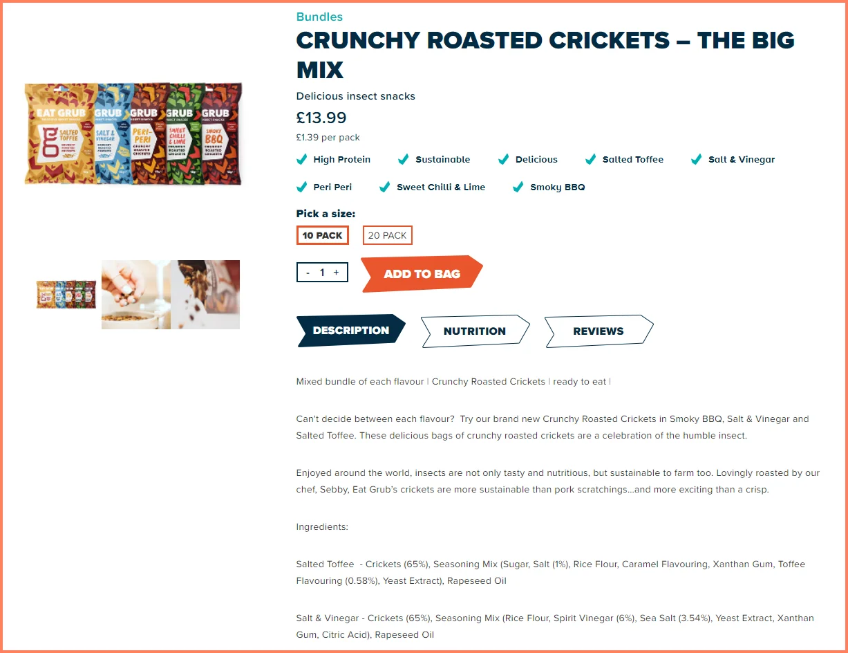
Eat Grub structures their product description by positioning the nutritional info right at the start. Next, the clickable and horizontal sections reflect their brand identity.
Unlock 2x sales using your product page. Read this definitive product page guide.
5. Don’t prioritize images over shopping experience
In a bid to show off the quality of products through high-resolution images, brands tend to focus on loading those images immediately - thereby causing a lag in the page speed and overall website experience.
What you can do:
Lazy load your high-resolution images
Do not lazy load images located above the header as they are critical assets
Use good image placeholders like dominant colors from the image
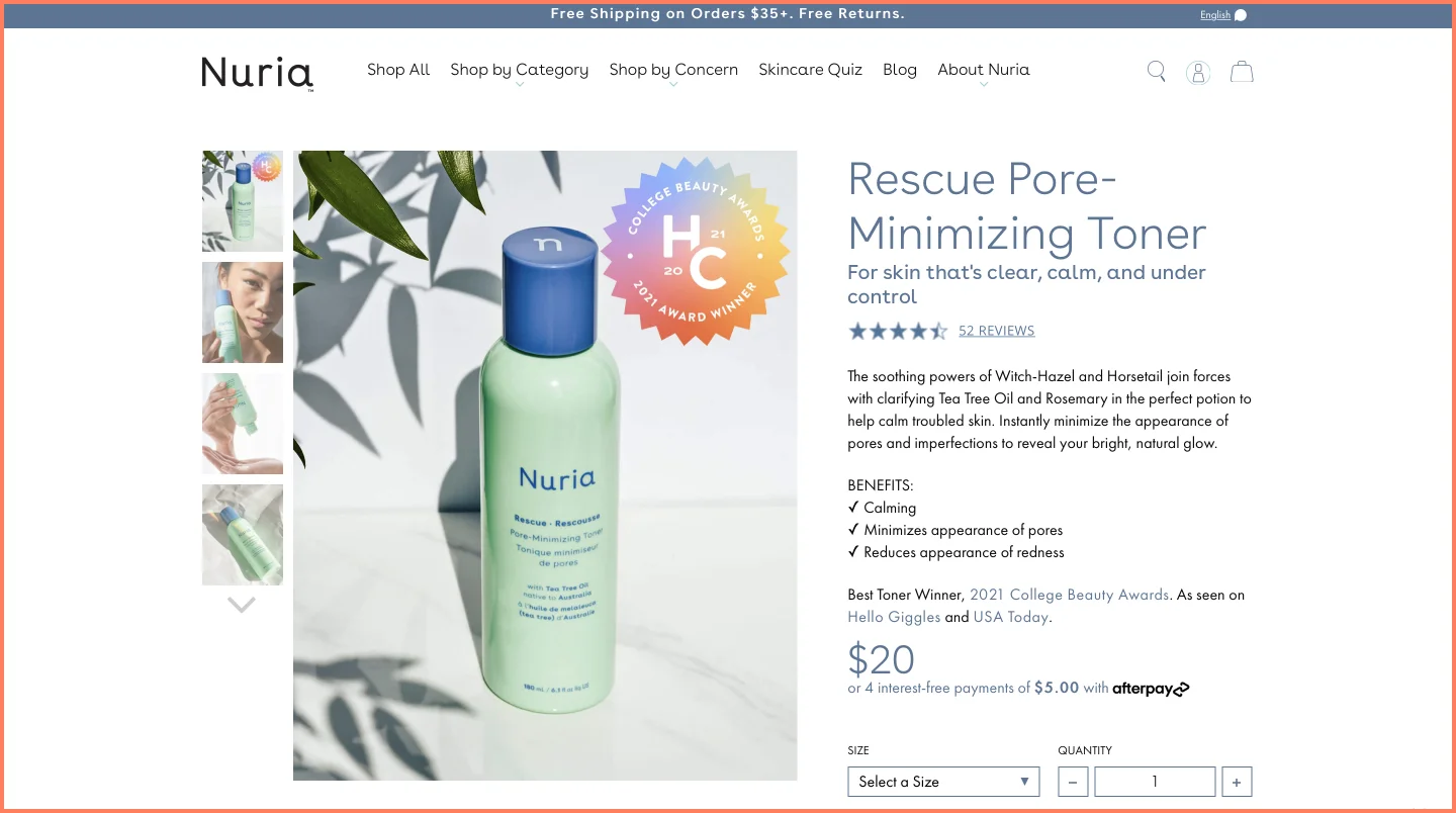
Nuria Beauty loads the main image and then lazy loads the rest of the gallery. They also use a white background which is the dominant color of this image as the image placeholder.
Plug-in to use
You can add multiple image variations of a product with this WooCommerce Additional Variation plugin. This ensures only the main image loads first and all other images are hidden once a variation is selected.
6. Switch to enhanced customer reviews
While some brands don’t bother with using reviews on their product pages, others simply leave a generic text field to collect reviews—this is bad UX and doesn’t establish additional trust.
What you can do:
Feature an option for customers to add media (photo, video etc.)
Ensure users can search or filter through reviews whenever they need to
Integrate reviews from other sites like Google, Facebook, and third-party listings
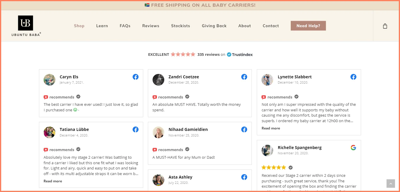
Ubuntu Baba spends time importing reviews across all marketing channels for more diverse feedback. There’s also an option to read more lengthy reviews through a structured layout:
Plug-in to use
To receive detailed product reviews with text, photos, videos and social handles, we recommend using the WooCommerce product review pro plugin. With this, you can also create searchable filters for customers, set product qualifiers so you get detailed feedback, and avoid review duplicates.
7. Eliminate hesitation by making product comparison easy
A break in the customer journey is imminent if shoppers have to leave the product page to browse similar products and make sense of what’s an upgrade, what carries a deal etc.
What you can do:
Offer multiple sizes or colors of a product (and label the swatches differently to create more distinction—calling out “sold out” or “just dropped” helps)
Experiment with nudge labels for promoting specific functionalities users would resonate with
Use a comparison chart at after the main product description section—this can also be helpful to recommend products w/o appearing pushy
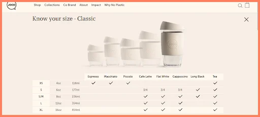
See how Jococups subtly nudges their leads into converting by showing first-hand what each size variation will look like—once you hover, it highlights what size of the cup it is and the specifications in coffee.
Brands often make the mistake of sharing an email address or leaving a simple ‘message us’ bubble. While it’s a good approach, it’s not able to directly address pain points and personalize the experience.
What you can do:
Start with an interactive quiz on your live chat to better understand their journey and pain points
Offer an FAQ section so they can immediately scan for related queries and solutions (use a microcopy link in the product page first fold and in the first screen of the live chat)
Offer personalized help centers for specific problems instead of crowding up one line for all inquiries
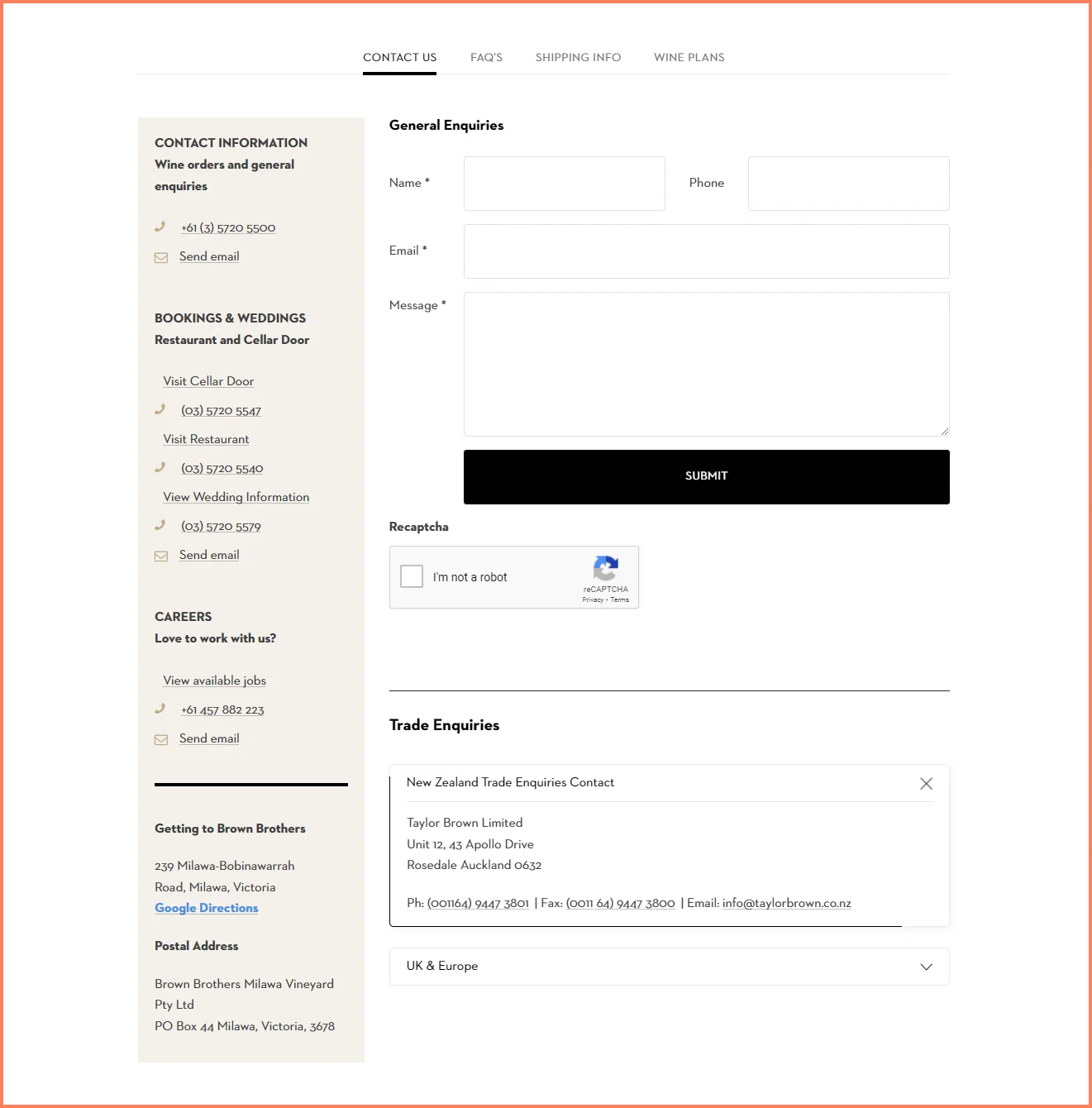
Brown Brothers uses sticky navigation that contains their contact page. Next, they offer personalized help contact for specific problems:\
Plug-in to use
With the WooCommerce Freshdesk plugin, you can connect your WooCommerce with your Freshdesk account. This helps address inquiries quickly, create tickets for each issue raised and feature a knowledge base center.
9. Redirect customers from out of stock products
What you see in most eCommerce stores is an out-of-stock label on the product page that tells you that an item is out of stock. However, in this case, potential customers end up leaving the store to find other alternatives.
What you can do:
Offer alternate but related product recommendations on the product page
Feature a secondary “Notify Me” CTA that can also help potential shoppers opt-in
Use dynamic messaging like banners and pop-ups to let users know when a highly requested product is available
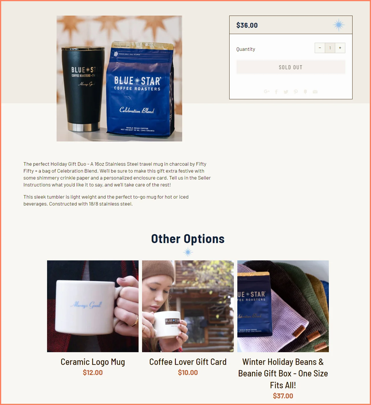
Blue Star Coffee recommends similar options for customers who’d like to purchase a mug that’s sold out:
Your WooCommerce product page design has to find a way to help shoppers orient themselves within the scope of your storefront.
What you can do:
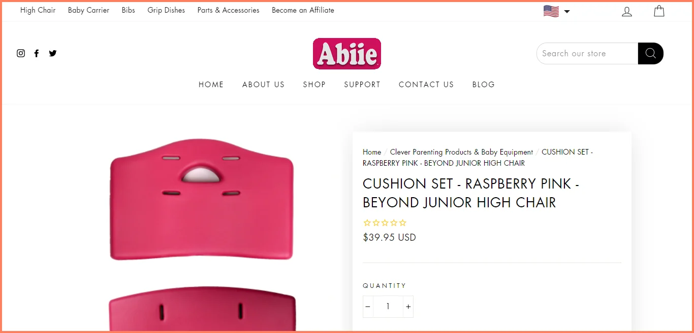
Breadcrumbs that are linked to specific areas of your store (think category ➤ subcategory ➤ sub-subcategory)
Have a clear URL that shows all the paths of the user's journey
Keep your horizontal menu uncluttered to enhance exploration to other parts of your site
Abiie has a horizontal menu to help users find whatever they need across the store.
They also use clear breadcrumbs on the product page so you can easily return to a category in one click.
Plug-in to use
Create custom URL paths for your product page URL with this custom permalink plugin. You can now change your URL structure in a way that works for you.
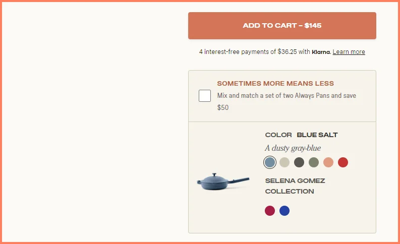
11. Offer extra incentives for faster checkouts
Offering a 10% discount doesn’t exactly make your product page unique. Some brands offer coupons for the next purchase, which can come off as presumptuous.
What you can do:
Feature an incentive that’s really convincing—for example, free shipping
Offer alternate cheaper options to users who might have issues with the price factor
Create milestones to increase order value—stagger the incentives at different price points to gamify the experience
Our Place offers a mix and match set which is a cheaper alternative to getting the original set—a great conversion magnet for price-conscious shoppers:
Plug-in to use
With the bulk discounts plugin, you can set conditions for your incentives and discounts across your WooCommerce store. This could be gift items, a flat discount, or buy X and get Y type of incentives.
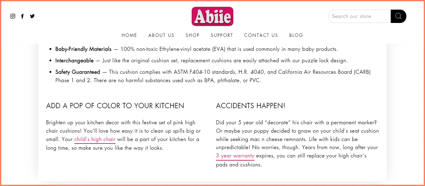
During the pandemic, a lot of stores didn’t give upfront details about their shipping delays or a time frame at least. Even up till today, there are still some websites that aren’t clear about their return or exchange terms.
What you can do:
Ditch the legal jargon when crafting your return policy—your customers need to understand what the terms are in one read
Offer store credit for refunds—it’s a way to avoid fraud and ensure that you still convert unsatisfied customers (just make sure the return policy mentions this!)
Feature warranty / guarantee info under a separate section
The Abiie store makes it to our list again. Under the ‘Accidents Happen’ section, check out how they use typical mom-dad language to make their policy easy-to-follow:
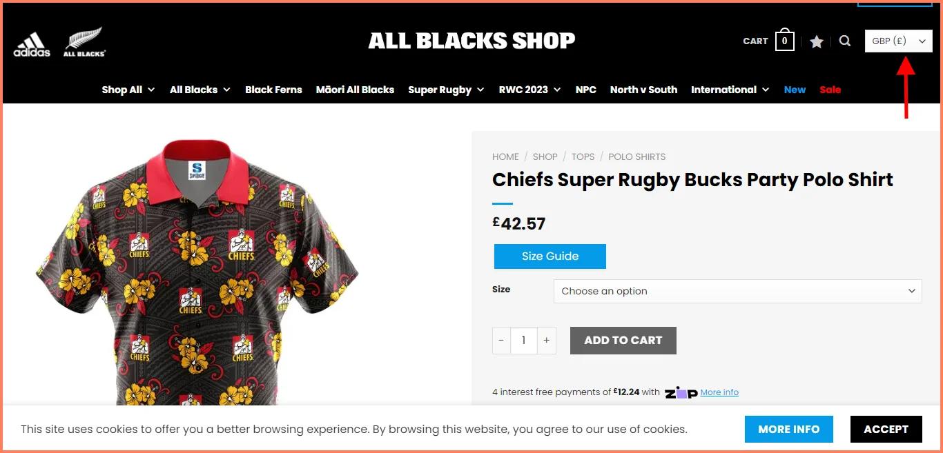
13. Customize payment options for location & security
Many eCommerce sites have a default currency in USD and a static price for products across their store. So irrespective of the location of their customers, or the competition, the pricing doesn’t reflect change—this can create doubts about price reliability and conversions may suffer.
What you can do:
Use a currency switcher (this helps easy selection & price conversion)
Offer dynamic pricing based on product demand, sales, and competitors
Implement trust badges to address security concerns across your stores
All Blacks Shop offers a currency converter in five different currencies—and customers can pick from the dropdown:
Plug-in to use
Use the currency converter widget to allow your customers to see the prices of your products in their preferred currency.
14. Recommend products based on buying behavior
Your bestsellers may be selling like hot cake, but why would they make great recommendations to someone that doesn’t want to see them?
After all, 38% of shoppers frankly admit they’d stop buying from a brand that offers poor recommendations.
What you can do:
Generate a product bundle based on items frequently bought together and offer a discount for the bundle
Inject social proof into your recommendations to motivate users
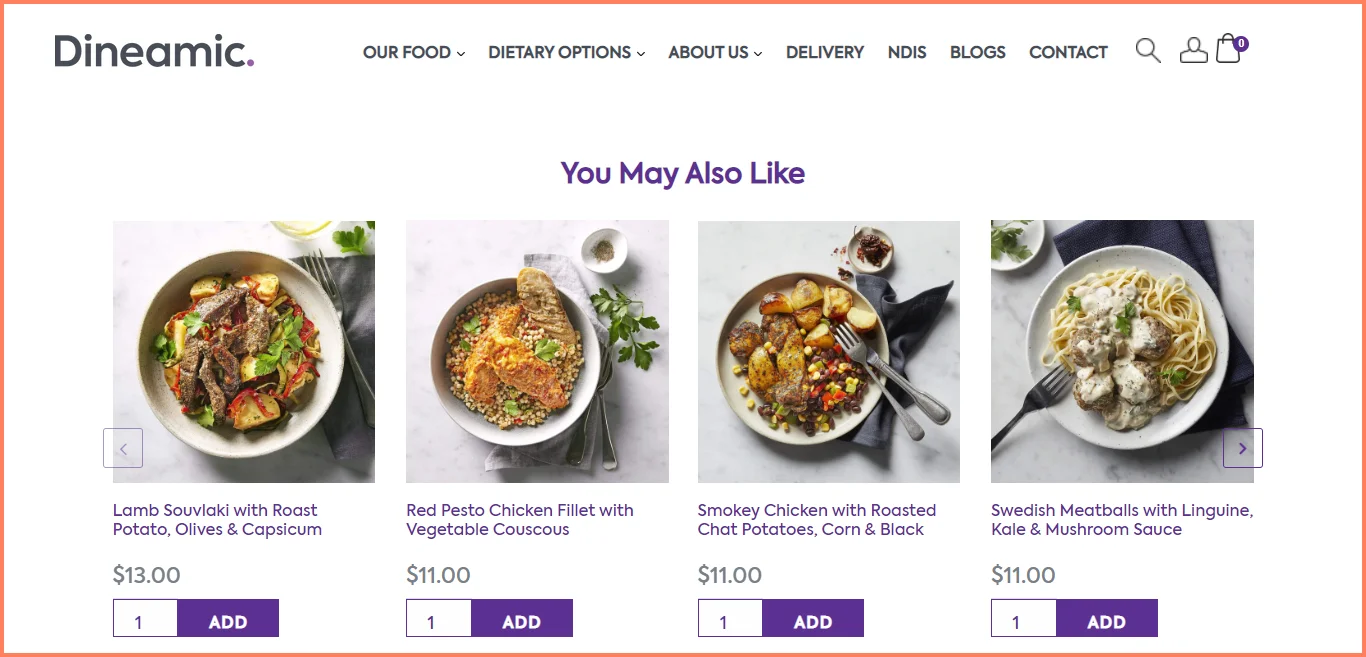
Feature “Quick Add” buttons to your recommendations (and show instant price updates in your mini cart):
Dineamic offers similar suggestions—they also make it easy to add these to cart & reflect the updation immediately:
Many stores spend lots of time marketing on social media to drive conversions. And while this is important, it just means spending a lot of resources investing in social media marketing and referrals.
What you can do:
Integrate your social media pages directly into your product pages
Embed videos for complex products, customer onboarding and so much more
Use only relevant social media channel links like Pinterest and Facebook
See how All Blacks Shop offers social media icons so customers can share this product page with their network.
Bundles fly off the shelves only when shoppers perceive them to be more ideal to spend money on than their singular counterparts—something you’ll have to prioritize while optimizing your WooCommerce product page template.
What you can do:
Design labels that help differentiate between the bundle price & individual product price
Pair only those products that’ll offer a great experience when used in combination
Create mix bundles that can help shoppers address multiple problem areas
Simply Charlotte Mason offers a sales bundle that pairs two complementary products - a book and a DVD. You’d also clearly see the price anchor used to emphasize just how much a customer would be saving.
No matter how exciting a product is, shoppers need to know it’s going to elude them in order to act fast—that’s the true power of FOMO.
What you can do:
Show the last date a product will be available in the store
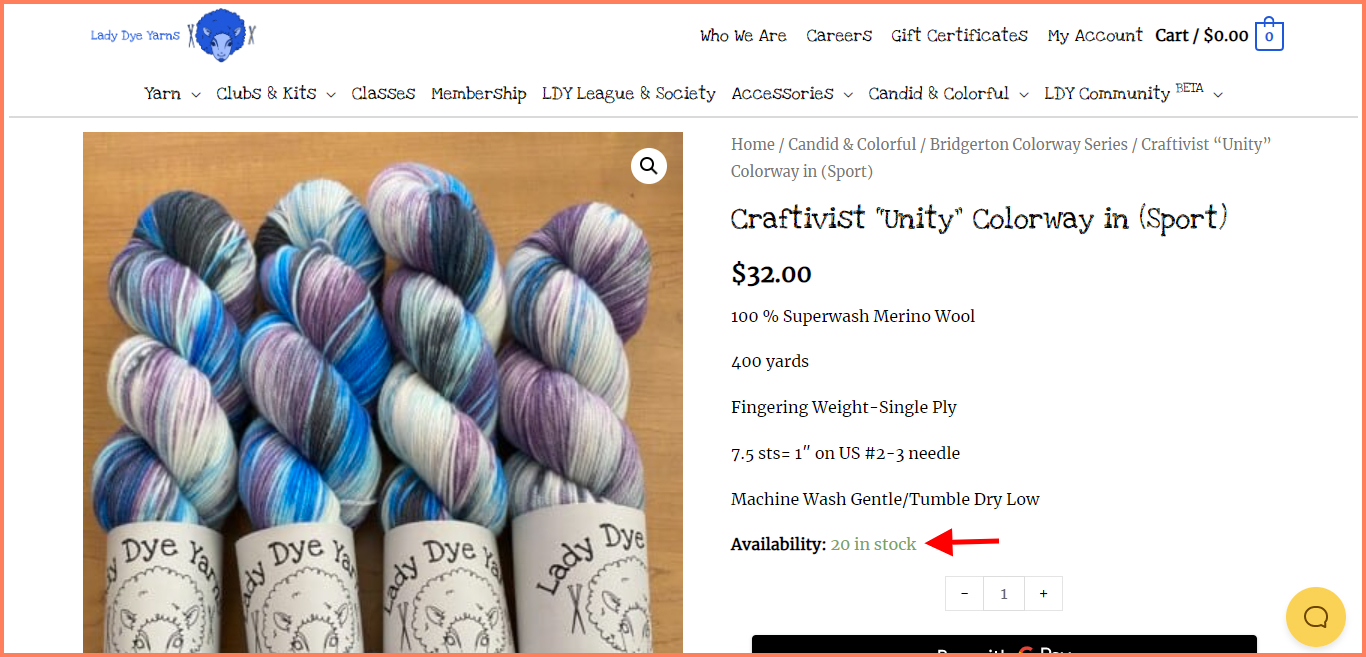
Display how many items are left in stock, how many people are adding this item to their cart, or using a countdown timer to mark the end of a sale
Lady Dye Yarn uses a scarcity nudge by showing how many items of this product are left in stock. Now since people tend to purchase yarn in bulk, 20 isn’t a large number to have left. So a customer would be motivated to check out even faster so they can get enough.
18. Improve the experience for cross-device shoppers
Smaller screen size, lower wireless connection speed and a bunch of other challenges plague non-desktop shoppers—so if your WooCommerce product page design doesn’t take a multi-device approach, conversions will likely suffer.
What you can do:
Reduce the number of pop-ups and intrusive messaging—mobile screens cannot accommodate the same number of pop-ups your desktop screen can
Keep the important stuff above the fold so customers don’t have to scroll before converting
Bring in mobile gestures - like pinch to zoom, swipeable features etc.
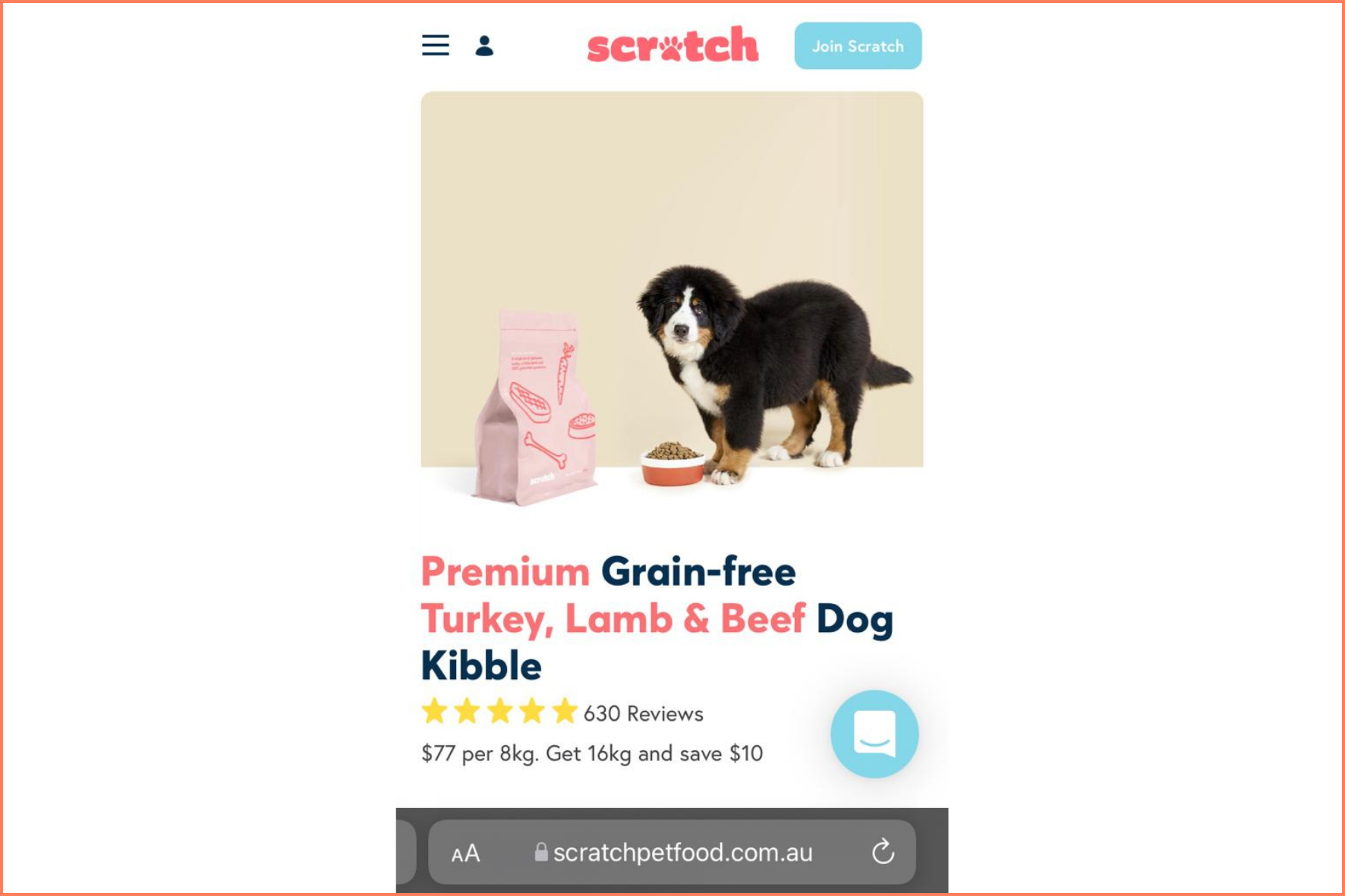
Scratch Pet Food offers a clean mobile user experience. Unlike its desktop counterpart, there’s no sales pop-up on this product page:
Plug-in to use
List your products with dimensions that work perfectly for every screen—start with this product table plugin extension.
Some brands wait until the customer gets to the cart or checkout page before showing that they offer alternative payment options and installment payments.
However, not all customers make it to that point and it's a lost opportunity to nudge customers into proceeding to the checkout page.
What you can do:
Instead of waiting until the cart page or checkout page, provide alternative options that can convert a user;
Offer a guest checkout option and clearly state that on the product page
Use popular and secure payment alternatives like Paypal, Google pay, etc
Ensure that if you do offer payments in installments, you clearly state it on the product page along with its terms
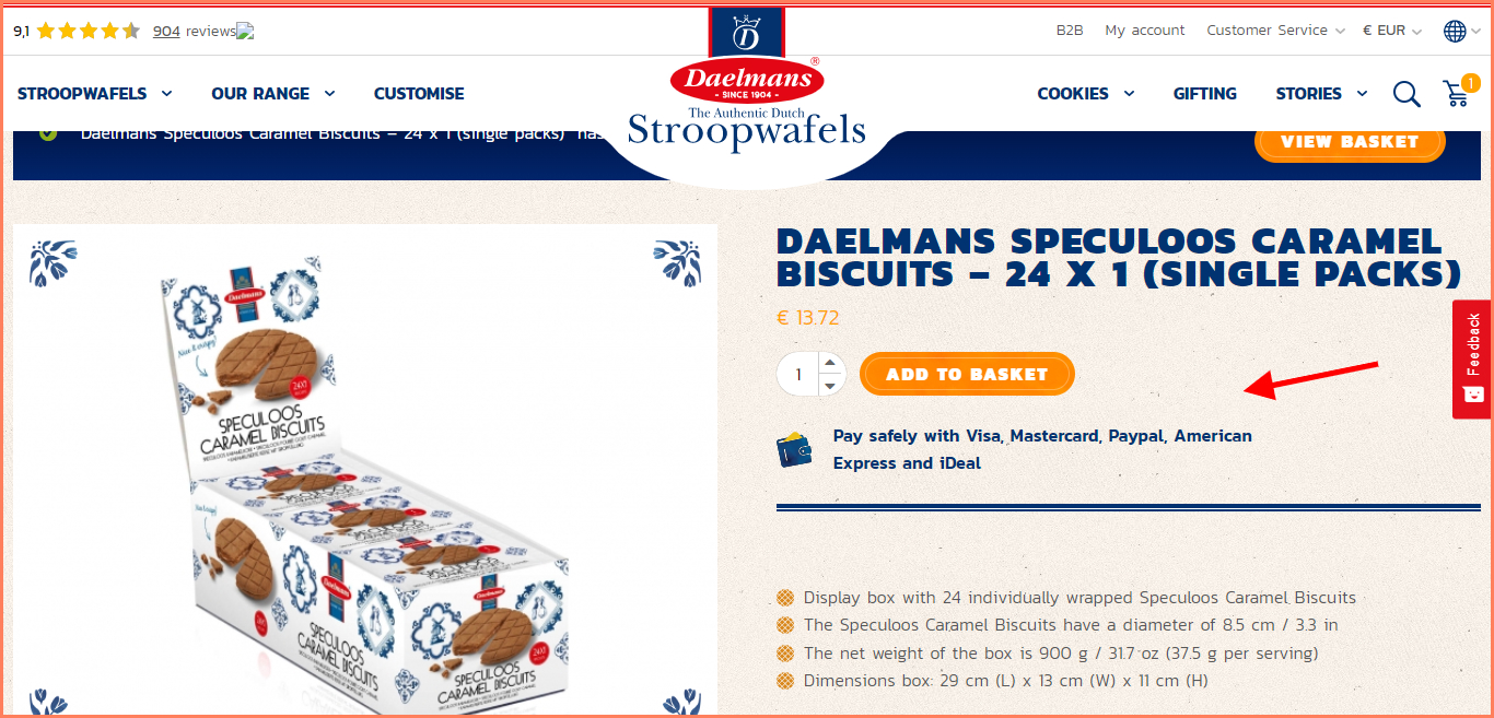
Check out how Daelman's makes their payment options super clear, thus creating greater trust as well:
20. Load pages faster for a better shopping experience
Brands tend to focus on their overall site aesthetic and other elements without taking time to study just how long it’ll take a single page to load.
What you can do:
This is why you should spend time evaluating the individual product pages on your site for page speed. Some of the unusual ways to increase your page speed include:
Leverage browser caching especially to reduce the number of times you have to load a page for a returning user
Load your files asynchronously so that wait time is rewarded
Take out plugins that are currently not in use
21. Display product variations
Many WooCommerce brands make the mistake of showing product variations only on the product page—the justification? Less space on a category page, which makes truncating a good idea.
Wrong.
What you can do:
Feature all available variations & enable horizontal swiping
Use clear and easy to understand labels for attributes e.g instead of just saying Blue, be clearer with Navy Blue, Sky Blue, etc.
22. Enable easy image swipe
This is a fundamental aspect to make your WooCommerce category pages more optimized for exploration—which is also one of the surest ways of converting shoppers.
What you can do:
Use directional arrows to show that you have more images on the left or right
Keeping the product images between 3-5 to avoid continuous swiping—if you have too many types, do what Gymshark does - they feature all products of the same category separately, calling out the discount & sizes available clearly
Make the variants tappable & enable the main product image to change with every tap
23. Make filtering easy
Many WooCommerce stores offer a filter option on the category page that allows you to find product types. However, the filters are often preset and not very helpful in finding specific product categories.
What you can do:
Study search queries for keywords your users typically use to find product types
Offer advanced filtering options with more relevant markers like categories, attributes, price, discount, occasion etc.
Ensure the results paginate and sort without having to reload the entire page
In the following example, Roberto Coin shows advanced filtering by type, collection, metal, stone, and price.
24. Consider creating custom category pages
By default, the category of your store is dependent on the theme you choose on WooCommerce. However, many store owners just stick to these categories regardless of whether they convert or not. Many times while the theme looks great, it still needs optimization so your store can maximize every action taken on the site.
What you can do:
Create custom templates to replace the theme you currently have—page builders like Elementor and Divi can help out with that
Add a newer design using a short code snippet you can inject into your WooCommerce current code
25. Enable quick checkout
It’s not uncommon for WooCommerce brands to make account sign-ups mandatory. But while this promises more people in the list of subscribers, it results in a broken experience for those who just want to buy and get out.
What you can do:
Make sure you feature fewer form fields—name, address and email are often the only info you realistically need
Offer a guest checkout as an option - that way you can convert customers who’d want to register and customers who wouldn’t
Use a commerce-enabled single sign-on like Google—this way, customers can easily sign in and you still get access to data for personalization
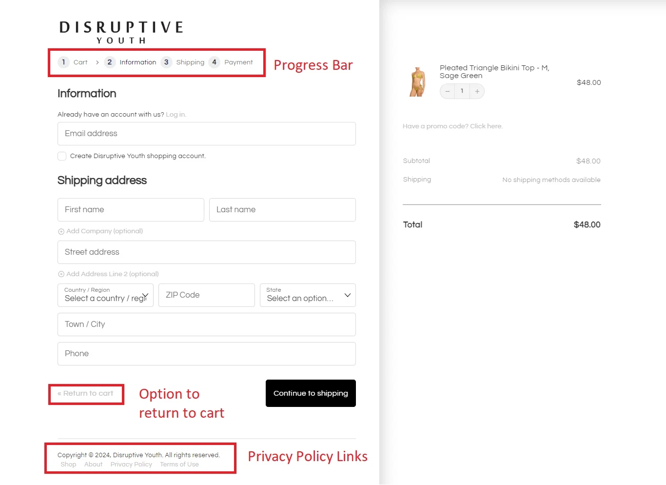
In the following example, Disruptive Youth offers a quicker way to checkout with the single PayPal option.
26. Consider Before / After checkout customization
Stores tend to always stick to the default checkout page on whatever WooCommerce theme they are using. However, this page doesn’t always convert for all products, especially since it's a template.
What you can do:
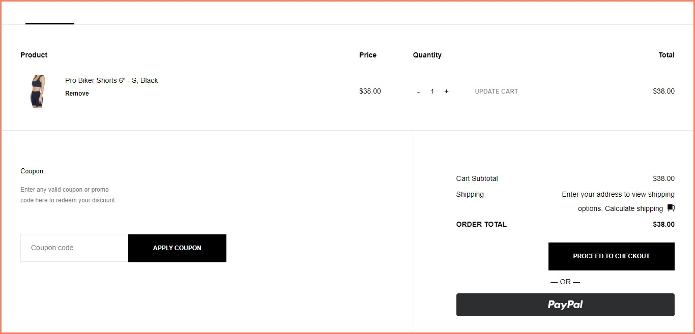
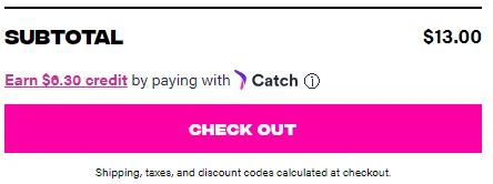
Remove the cart page and allow customers to checkout straight from the product page
Add a coupon field using the Gutenberg editor
Upsell product add ons like gift wrapping, priority delivery, etc
How many WooCommerce plugins should you have on the product page
It is recommended to use as few plugins as necessary because having too many can not only slow your site speed down, but they can start conflicting with each other.
While there’s no specific number of plugins you should have on your product pages, there are a few items you can look out for to ensure they don’t mess up your user experience. Some of these include;
Previous reviews that discuss bugs, vulnerabilities, and functionality issues
Detailed documentation for setting it up
Source for plugins with multi-functional features so you can use less of them
Deactivate plugins that are no longer in use
Generally, all plugins on the WooCommerce Store are secure and reliable. So we recommend customizing your product pages directly from there.
Along with a great WooCommerce product page, you need other high intent pages to be equally optimized for the conversions to turn in.
11 Amazing WooCommerce Cart Recovery Strategies
1. Ditch the ‘template’ – improve your cart and checkout design
Most WooCommerce cart abandonment stems from a single reason: the checkout flow looks entirely different from the rest of the store.
This especially happens if you are using the holy trinity: WooCommerce – Elementor – Astra.
This is why the first step towards WooCommerce cart abandonment recovery starts with simple (yet effective) hacks like:
✅ Enabling customizable block Cart & Checkout pages – skip this, if you have a custom-coded short code cart and checkout pages
✅ Matching your brand colors and fonts – check if your Theme Customizer and Elementor Global Colors match
✅ Treating your checkout flow like a landing page – disabling intrusive elements like headers, sidebars, and links
✅ Sticking to great UX formats that induce trust and reduce frustration – like adding progress bars on multistep checkout:
Quick Tip: Consider adding a short description of your product and ratings in your order summary in your checkout flow – this helps reduce pre-purchase anxiety.
Want more inspiration for your checkout UX design? You’ll love reading:
Cart fragments allow users to view cart contents when hovering over the cart icon (all without refreshing the page).
But, they can be conversion killers and boosters – it all depends on your hosting plan.
Here’s why: This AJAX functionality can slow your loading speed by quite a few minutes if you’ve got slow(ish) hosting and some generous traffic coming in.
Remember: users don’t exactly love it when the loading speed simply increases by 2 seconds (and we’re talking minutes here). What you can do instead is:
✅ Make the add to cart button sticky on mobile product pages – and redirect after adding, for great UX
✅ Turn on the mini-cart page for desktop viewing – this is to keep the product page in view
Quick Tip: If you disable AJAX, always redirect users to the cart page once they click add to cart – or else your page will keep refreshing, which will cause more cart abandonment.
3. Avoid unnecessary urgency triggers
Customers do see through urgency tactics – which is why it’s always better to turn on options like:
✅ Turn off ‘only show stock left when inventory is low option’ – turn on “never show quantity…stock” – simply write/show ‘in-stock/out-of-stock’ as needed:
✅ Avoid tactics like a timed checkout – only apply this for limited edition products, flash sales, or products that are low in stock and won’t be in stock for some time
✅ Enable wishlists and out-of-stock forms – to collect user information without using urgency tactics
4. Auto-apply coupon codes during checkout
Nearly 46% of customers abandon carts because the coupon didn’t auto-apply.
Coupon fatigue is a real thing – which is why, here are some ideas you can apply to enhance your checkout experience:
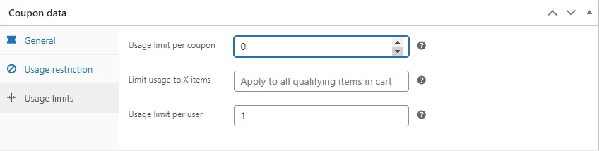
✅ Leave one-time usage per user codes on checkout – or, on your store notice/around your order summary:
✅ Auto-apply coupons by adding a bit of code to your functions.php – this ensures users don’t leave your checkout in search of coupons
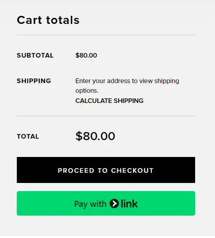
✅ Hide the coupon field altogether on checkout – disable coupons by unchecking “Enable coupons” in WooCommerce settings
If you’re a bit code-savvy, here’s a helpful guide on auto-applying coupons in your WooCommerce store.
5. Feature express checkout for mobile
Would you want to fill up 20 form fields for an $8 product you found at 3 AM – while scrolling through a TikTok reel?
Probably not, right? Mobile users abandon carts faster than desktop users, solely because they have to work harder to checkout.
Even if your WooCommerce cart recovery email was really powerful, you would once again lose the sale because nearly half of all emails are first opened on mobile phones.
This is where you need to get started on optimizing your checkout experience on mobile:
✅ Make sure your flow has a mobile-friendly payment gateway – use a clear but differently colored CTA button to make the payment option stand out:
✅ Reduce the number of form fields like 'Appt No.' – use a single field for address – autofill country and ZIP form fields by detecting user IP
✅ Offer guest checkout from WooCommerce settings – ensure billing address is the same as the shipping address – ask for deets during post-purchase:
✅ Enable Single Sign On (SSO) to let users sign in with platforms like Google – and help you verify user accounts:
WooCommerce provides a lot of payment options that are bordering on obsolete – when was the last time you heard a millennial using RTGS?
Even cards are going out of style – because of the entering details part. This is why it’s always a good idea to have one-click payment options like Affirm, Klarna, Apple Pay, or Amazon Pay on offer alongside your CTA for your payment at checkout.
This helps build trust – help out with impulse purchases – and convert window shoppers into customers in one go:
Quick Tip: If you offer BNPL options, show the savings/incentive above/below the ‘add-to-cart/checkout’ CTA button like “pay X in X installments” to handle the objections.
7. Remarket across FB/Insta/TikTok Ads
This is a step that most brands skip – because their cart abandonment numbers may not be severely high (above 100).
The way out here is quite simple: retarget users by browse and cart abandonment.
Doing this will ensure that people who’ve viewed certain products or added to the cart are served retargeting ads. Here are some ideas to ensure your ads help you recover abandoned carts:
✅ Make sure your pixels are measuring events correctly – and sending data like landing page URL, source, date, page URL, product ID, amount of products in cart:
8. Send cart recovery emails at the “right” time 👇
Email marketing basics ask you to send emails within 2 hours, 24 hours, and 48 hours.
Reality is far more different (and wild) – there are wayyy more touchpoints than what used to exist when those rules were written.
This is why we recommend putting these ideas into practice:
✅ Send the first email within 2 hours of abandonment – so that you can remind them in the first go
✅ Create segments out of engagement/non-engagement – send offers to non-engages – and reminders to those who opened (and repeat)
✅ Increase the gap between your emails gradually – till 30 days – after which it’s time to call it quits
9. Send timed coupons over emails/SMS
This tactic is a bit last-minute as it relies on time to recover the abandoned cart. However, instead of a traditional timed coupon, you can create two coupons:
→ One-time use coupon meant for a single-user and single-use, which is massive in amount like “FLAT 50% off, No Minimum” (but set the cap to prevent huge order values)
→ Another low-value coupon like “Flat 10% Off on First Order” which is also for 'single-user–single-use'
Tease the larger discount in exchange for spending on the first order – and this is how you can recover abandoned carts for your WooCommerce store.
Quick Tip: Make sure you do send the larger discount coupon – but make it have an expiry date, like a gift card 😉 (you can trigger a reminder flow on this too).
10. Create a custom checkout link for faster cart recovery
If you’re redirecting people to the same place where they left off – you may be losing the sale (yet again). This is why we recommend sending people directly to your checkout page. Just make sure that you’ve:
✅ Applied all discounts –as promised within your communication
✅ Enabled personalization – to remind the user you care about their order, like ‘hey {name}, welcome back’
✅ Removed most unnecessary form fields – your goal is to get the address and the payment
11. Use custom exit-intent pop-ups during checkout
Exit intent pop-ups are extremely overused – but, can be just what it takes to stop a complete cart abandonment.
You can time your pop-ups to do the following:
✅Ask for feedback during exit intent – trigger when the cursor is taken outside the tab – ask why they’re leaving
✅ Offer an option to save cart or add to a wishlist – but frame it rightly like “do you want us to save this for you – you can come back anytime”
✅ Provide a coupon code depending on cart value – for example, a 20% discount on $8 is not feasible for your AOV – but a 10% OFF (80 cents)
Quick Tip: Use the rule of 100 when framing your discounts, if the monetary value of the discount is below $100 just use percentages – but if it’s above that write the value.
Better UX elevates the WooCommerce store experience
98% of visitors who visit a WooCommerce site—drop off without buying anything.
Why: user experience issues that cause friction for visitors.
And this is the problem Convertcart solves.
We've helped 500+ eCommerce stores (in the US) improve user experience—and 2X their conversions.
How we can help you:
Our conversion experts can audit your site—identify UX issues, and suggest changes to improve conversions.
Subscribe for more articles like this!
Thank you - we'll see you in your inbox soon!
Oops! Something went wrong while submitting the form.
Read by 5000+ ecommerce store owners
Subscribe for more articles like this!
Thank you - we'll see you in your inbox soon!
Oops! Something went wrong while submitting the form.


.svg)

.svg)

.svg)
.svg)
