Oops! Something went wrong while submitting the form.
Conversion Optimization
eCommerce Checkout Optimization Framework: What to Fix First for More Conversions
July 8, 2025
Insights in this post come from our CRO team's decade of experience working with eCommerce brands. Edited by our in-house content team.
Most eCommerce brands don’t have a traffic problem, but they have a checkout problem.
Shoppers arrive with intent, add products to cart, and even click “checkout”… only to disappear right before payment.
Not because they changed their mind, but because something in the experience made them hesitate.
The truth is, not all checkout optimizations are created equal.
Some fixes unlock immediate conversions, while others only add polish afterward.
That’s where the Checkout Impact Tiers Framework comes in.
Instead of guessing what to improve, it helps you prioritize what actually moves the needle, starting with friction, then building trust, and finally optimizing for revenue and long-term growth.
The Checkout Impact Tiers Framework
Not all checkout optimizations deliver equal impact.
The fastest way to increase checkout completion is to fix the points where shoppers are most likely to abandon, starting with friction at the moment of purchase, then reinforcing trust, and finally optimizing for value and long-term growth.
Prioritize your checkout improvements using this 3-tier impact model
Most checkout abandonment happens because the process feels harder than expected, and not because shoppers suddenly stop wanting the product. Even small friction points compound quickly at checkout.
Once you reduce friction, the next biggest conversion killer is uncertainty. Shoppers need reassurance that the purchase is safe, validated, and easy to complete.
Revenue-expanding tactics work best only after your checkout experience already feels frictionless and trustworthy. Otherwise, upsells and rewards can become distractions instead of conversion drivers.
TIER 1: Immediate Conversion Blockers (Fix first — highest impact)
1. Give Your Users the Freedom of a Guest Checkout
Forcing a first-time visitor to create an account before they can give you money is a bit like a shopkeeper demanding your dental records and your mother’s maiden name before he’ll sell you a loaf of bread.
It’s an unnecessary barrier that kills your checkout completion rate.
By offering a guest checkout, you provide a frictionless exit while still gathering the data you need to keep the relationship alive.
If you want to optimize your checkout process while keeping things friendly, consider these subtle maneuvers:
The Social Shortcut: Enable social media logins or autofill options. Most shoppers would much rather click a single "Log in with Google" button than type their life story.
The Digital Mind Reader: Use the shopper's IP address to pre-fill their country and region or to present local payment methods. It’s a small, thoughtful touch that says, "I know where you are, and I’ve made this easy for you."
The Short-Term Memory: Temporarily saves guest details during the session. If a customer decides to grab one more item immediately after paying, don't make them re-introduce themselves; it’s polite to remember a face.
The Post-Purchase Hook: Instead of badgering them at the start, wait until they’ve finished. Offering a temporary loyalty code, something like "10% off your next purchase"—at the very end of the guest checkout is a marvelous way to turn a fleeting visitor into a regular.
2. Remove Form Friction
There is a certain annoyance that comes from wrestling with a digital form that refuses to cooperate.
In fact, more than 67% of visitors will abandon a form and your shop forever if they encounter even a moment of unexpected friction.
If your checkout page feels like a bureaucratic exam, you’re inviting your customers to leave. To improve checkout conversion, you must make the act of giving you information as effortless as a downhill slide.
Implementing smart form-filling is one of the most significant best practices for eCommerce checkout flows.
It’s about being helpful before the customer even realizes they need it. Here is how to optimize your checkout process for maximum speed:
The Address Oracle: Use shipping address, predictors. As soon as a shopper types the first few letters of their street name, the system should offer to do the rest of the heavy lifting. It saves them a dozen keystrokes and ensures the parcel actually ends up on their doorstep rather than in a neighbor’s hedge.
The Google Assist: Encourage the use of tools like Google Autofill. By allowing the browser to populate the name, email, and zip code fields, you transform a two-minute chore into a two-second click, speeding up checkout.
The Clear Labeling Rule: Ensure your form field labels are always visible. Nothing is more baffling than a label that disappears the moment you start typing, leaving the shopper wondering if they were supposed to enter their phone number or their blood type.
By removing these tiny, irritating hurdles, you create a seamless checkout experience that keeps the momentum moving toward that final, satisfying "Order Confirmed."
3. Real-time Error Correction
There’s nothing quite so draining as spending five minutes meticulously typing your life story into a series of boxes, only to hit "Submit" and have the page scream back at you in red ink because you forgot a digit in your phone number.
It’s almost like being sent to the back of a very long queue for a minor clerical error. To keep your checkout completion rate from plummeting, you must employ real-time form field validation.
Instead of waiting for the grand finale to deliver the bad news, tell your shoppers the moment they’ve gone off the rails. It’s a simple tweak, but providing instant error suggestions is a remarkably effective way to improve your average checkout conversion rate.
To make your forms feel less like a test and more like a conversation, consider these adjustments:
The Instant Nudge: If a shopper skips a required field or enters an invalid ZIP code, highlight the field immediately. It’s much kinder to point out a mistake while their cursor is already there than to make them hunt for it later.
The Helpful Hint: Don't just tell them they're wrong; tell them how to be right. If a password requires a special character or a date needs a specific format, show a small, friendly prompt. This reduces the "trial and error" frustration that leads to a high conversion drop-off in checkout.
4. Make Edits Painless
There’s panic that sets in when a shopper realizes, at the very last second, that they’ve accidentally ordered three dozen garden gnomes instead of one.
If you make it difficult to fix that mistake, they won't hunt for the "edit" button; they’ll simply flee.
Providing a clear way to review and adjust an order is one of those essential eCommerce checkout best practices that quietly coaxes people toward the finish line, significantly boosting your add-to-cart-to-checkout conversion rate.
To keep your checkout process from feeling like a rigid contract, try these strategies for easy last-minute tinkering:
The Accordion Effect: Use collapsible cards for shipping, payment, and the order summary. It keeps the page looking tidy while allowing a shopper to expand a section, swap a credit card, or fix a typo in their zip code without being whisked away to a different page entirely.
The "Recently Updated" Nod: When someone does make a change, acknowledge it. Small tags like "Recently Updated" serve as a digital thumbs-up, confirming that the system has listened and adjusted the price accordingly. It’s a subtle way to improve checkout process usability and build a bit of trust.
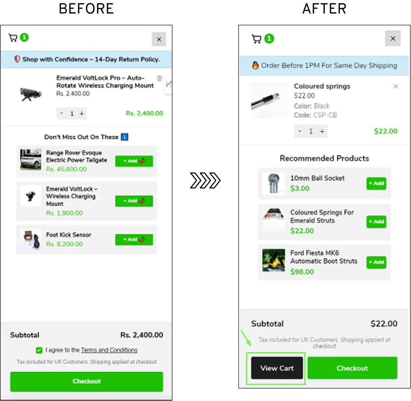
Convertcart Case Study - Emerald Struts
In the case of Emerald Struts, shoppers weren’t abandoning because they didn’t want the product.
They were leaving because they couldn’t easily find their way back to review or adjust what they had already selected.
The cart itself, arguably the most important checkpoint before checkout, wasn’t visible enough.
So instead of adding more features or reworking the entire flow, the team made a simple, almost obvious change in hindsight.
So we repositioned and redesigned the cart CTA to make it unmistakably visible.
No hunting. No second-guessing. Just a clear path back to review and edit.
This increased their website conversions by +8.39%. Because when shoppers feel like they’re in control, able to fix, tweak, and double-check without friction, they don’t abandon the journey. They complete it.
5. Clear All Distractions
When you are within spitting distance of a sale, the last thing you want is for your customer to get distracted by a shiny object or a link to a blog post about your company’s history.
If you want to see a spike in your checkout conversion rate, you must treat the final checkout page like a quiet, well-lit corridor leading to a single door. Any exit that isn’t the "Pay Now" button is a potential leak in your bucket.
To optimize your checkout process for a truly focused exit, you should ruthlessly eliminate anything that doesn't help the customer finish their task:
The Great Navigation Purge: Get rid of the main menu, footer links, and any "continue shopping" buttons that might lure shoppers back into the endless loop of your product pages. At this stage, they’ve made their choice; don't give them an excuse to second-guess it.
The "No Interruptions" Rule: Avoid showing any pop-ups. Whether it’s a newsletter sign-up or a feedback request, it can wait until after the money has changed hands. A pop-up at the final hurdle is like someone tapping you on the shoulder just as you’re about to sign a mortgage—it’s startling, annoying, and potentially deal-breaking.
The Last-Minute Silence: Say a firm "no" to featuring new, last-minute offers. If you have a discount to offer, make it auto-applied and appear quietly in the summary. Forcing a shopper to go hunting through their inbox for a coupon code is a marvelous way to increase your conversion drop-off in checkout, as they’ll likely find a dozen other distractions along the way.
By stripping away the clutter, you ensure a seamless checkout experience where the only thing left for the customer to do is click that final, glorious button.
6. Design for the Small Screen
Nowadays, many people do their shopping while waiting for a bus or lounging on a sofa with a smartphone in hand.
If your checkout page treats these thumb-scrolling pioneers like they are sitting at a massive desktop computer with a precision mouse, you are essentially asking for a high drop-off rate at checkout.
Making your checkout flow mobile-responsive is no longer a luxury; it is one of the most vital eCommerce checkout best practices for any founder who actually wants to make sales.
To optimize checkout page performance for the mobile crowd, keep these design principles in mind:
The Tap, Not the Click: Ensure every button and form field is designed for human thumbs, not tiny digital cursors. If a shopper has to zoom in three times just to hit "Next," they’ll likely decide they didn't really need those new shoes after all.
The "Bite-Sized" Journey: On a small screen, a single, towering wall of form fields is terrifying. Break the checkout process into a few short, manageable pages—and, for heaven’s sake, keep that progress bar visible so they know the end is near.
The Need for Speed: Use a Content Delivery Network (CDN) to host your logos and trust badges. This ensures they pop up instantly rather than loading with the agonizing slowness of a Victorian steam engine, which is key to a faster checkout.
The "Press Me" Button: Give your call-to-action buttons a slight gradient. It’s a subtle visual trick that makes them appear more "tappable" and three-dimensional, practically begging for a thumb-press to move toward checkout completion.
7. Offer Multiple Payment Options
Interestingly, people are as particular about how they pay as they are about what they are buying.
In fact, 56% of shoppers believe a website should offer a variety of ways to pay.
Whether they’re chasing airline miles on a specific credit card or prefer the snug security of a digital wallet, giving them options is a surefire way to improve the checkout experience and bolster your checkout completion rate.
Most platforms now allow you to customize your dashboard to include multi-currency preferences.
You should use this to your advantage; forcing a customer to perform mental long division to figure out an exchange rate is a marvelous way to ensure they abandon their cart midway.
However, choice is nothing without security. Checkout abandonment often spikes at the finish line because shoppers get a sudden, prickly feeling about handing over their financial secrets.
To increase checkout conversion while keeping the hackers at bay, consider these professional safeguards:
The Digital Substitute: Use tokenization. It replaces a card’s actual numbers with a unique, randomized string of digits, ensuring the real details never come into contact with the open air.
The Invisible Guard: Implement robust fraud protection and third-party secure payment forms. It’s the digital equivalent of having a very large, very polite bouncer standing by the till.
The "Welcome Back" Key: For your repeat customers, offer to securely save their payment method. The next time they visit, they can bypass the typing entirely and enjoy a truly seamless checkout experience.
8. Transparency as a Sales Tool
There is a particular kind of heart-sinking disappointment that occurs when a $40 pair of wool socks suddenly becomes a $65 ordeal at checkout, thanks to a host of previously unmentioned fees.
Most checkout abandonment occurs right here, fueled by the sting of unexpected charges. If you want to increase checkout conversion, you must be as honest as a village vicar.
Break down the total price: subtotal, taxes, delivery, and any surcharges, long before the customer reaches for their wallet.
To keep your checkout-to-purchase rate healthy and your customers happy, try these straightforward tactics:
The Shipping Face-Off: Offer a side-by-side comparison of delivery speeds. Whether it’s "Standard Shipping: $5.99 (3-5 days)" or "Express: $9.99 (1-2 days)," giving the customer the power of choice makes the cost feel like a decision they’ve made, rather than a tax they’ve been served.
The "Victory" Shout: Don't just deduct a discount; celebrate it. Use a bold, colorful section to highlight exactly how much they’ve saved, something like “You’ve saved $25.00 on this order!” It transforms the act of spending money into a savvy financial win.
The Global Guest: For your international friends, always display the total in their local currency. It saves them the mental gymnastics of calculating exchange rates and proves you’ve built a seamless checkout experience with them in mind.
A Bit of Digital Whimsy: When the order is finalized, a tiny animation, perhaps a brief dusting of confetti over the savings, can help the shopper feel a genuine sense of accomplishment. It’s a small, charming touch that makes the eCommerce checkout feel less like a transaction and more like a treat.
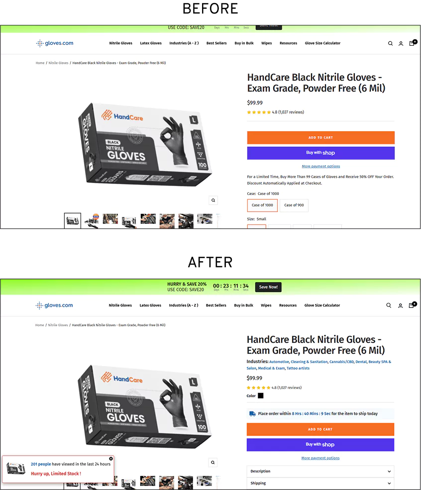
Convertcart Case Study - Gloves
In one such instance, Gloves noticed a troubling pattern.
Shoppers weren’t necessarily objecting to the price, they were hesitating because delivery timelines felt vague and uncertain.
In fact, nearly 87% of drop-offs could be traced back to this ambiguity.
So instead of tweaking prices or redesigning the entire checkout, the team focused on clarity.
They introduced a simple but effective element: a real-time shipping countdown, prominently displayed on product pages.
This small addition did two rather clever things at once.
It removed uncertainty by clearly communicating when the product would ship, and it introduced a gentle sense of urgency, nudging shoppers to act before the window closed.
The results were difficult to ignore. The experiment drove a 13.68% overall increase in website conversions and a 22% increase in shoppers who moved ahead to place an order.
When it comes to checkout architecture, eCommerce founders often find themselves in a heated debate: do you put everything on one page or spread it out like a leisurely Sunday brunch?
It turns out, there is no universal law.
A furniture retailer with a high average order value found that a multi-page checkout boosted conversions by 38%, likely because people buying a sofa want to feel they are making a serious, carefully considered decision.
Conversely, the Vancouver 2010 Olympic Store switched from a multi-step checkout to a single-page layout and saw a 21.8% jump in sales.
The trick to finding your best checkout threshold is to match the layout to the shopper’s device and mindset. Here is how you can optimize your checkout process without losing your mind:
The Mobile Sprint: For the thumb-scrolling crowd, optimize checkout page layouts by keeping them on a single page. It minimizes navigation and, when paired with tap-friendly buttons and autofill, keeps the momentum moving toward a seamless checkout experience.
The Desktop Deep-Dive: If someone is sitting at a desk, they might appreciate the breathing room of a multi-page flow. It provides clarity and space for detailed input fields, making the whole ordeal feel a bit more organized.
The "Choose Your Own Adventure": If you really want to improve the checkout experience, let the customer decide. Offering a choice between a "Fast Checkout" and a "Step-by-Step" flow at the very beginning is a marvelous way to cater to both the hurried and the hesitant.
TIER 2: Conversion Boosters (Fix next — improves completion rate)
10. Use Social Proof as a Digital Nod
Human beings are, by and large, a social species; we find a strange comfort in knowing that several thousand other people have already taken the plunge and survived to tell the tale.
While most brands relegate their glowing testimonials to the homepage, the savvy founder knows the checkout page is the most critical spot for reassurance.
Sprinkling social proof across your high-intent pages is one of those eCommerce checkout flow best practices that acts like a supportive friend whispering, "Go on, you’re making a great choice."
To effectively optimize checkout page trust without cluttering the view, try these subtle cues:
The "Live" Update: A small, discreet notification, something like "Joined by 1,200 happy customers this month", proves that your shop is a bustling hub of activity, not a ghost town.
The Star Treatment: Including a tiny row of five-star icons near the "Place Order" button serves as a visual shorthand for quality, helping reduce checkout conversion drop-off.
The Expert Stamp: If a reputable magazine or a well-known expert has said kind words about your wares, don't be shy. A small logo or a one-sentence snippet can be the final nudge needed to improve checkout conversion.
Convertcart Case Study - Hubman and ChubGirl
When Hubman and ChubGirl examined their checkout, they noticed a familiar hesitation, particularly among first-time buyers who had yet to experience the product for themselves.
The issue wasn’t price or usability; it was a quiet lack of validation at the exact moment it mattered most.
So, instead of overhauling the entire experience, they made a more surgical adjustment: they brought social proof into the spotlight.
Testimonials, subtle reassurance cues, and validation signals were introduced and refined across both desktop and mobile experiences, right where purchase decisions were being made.
The effect was rather telling. Making the purchase feel less like a leap of faith and more like a well-trodden path, customers saw a +3.95% increase on desktop, along with a notable 90% increase in overall completion rates across devices.
Let’s be perfectly honest: the internet can be a bit of a lawless frontier.
Since 2011, global payment fraud has ballooned from a modest $9.84 billion to a staggering $32.39 billion, a figure so large it’s difficult to even visualize without a headache.
It’s no wonder, then, that shoppers get a bit twitchy when asked to type their credit card details into a blank white box.
To reduce checkout abandonment, you must prove that you aren't just some fly-by-night operation running out of a basement.
Displaying recognized security badges, the digital equivalent of a sturdy deadbolt and a very large dog, is a marvelous way to boost customer trust.
The Heavy Hitters: Visual seals from McAfee, Norton, or specialized e-trust badges serve as a universal shorthand for "Your money is safe here."
The "Green Lock" Logic: These small icons indicate that your checkout process is encrypted and secure, providing the psychological peace of mind that nudges shoppers to complete the purchase.
When a customer sees that you’ve invested in their safety, they are far more likely to reward you with their business rather than bolting for the exit at the first sign of a security concern.
12. Neutralize Doubts with a Clever FAQ
Buying something online, especially a high-ticket item like a vintage camera or a particularly plush velvet sofa, often comes with a side of mild anxiety.
Shoppers start to wonder about the return policy or whether the courier will simply leave their precious cargo in a rain-soaked driveway.
An FAQ section, when handled with a bit of grace, is a marvelous way to create a seamless checkout experience by answering these questions before they become reasons to leave.
To improve your eCommerce checkout without cluttering the place, consider these rather practical tips:
The Contextual Helper: Instead of exiling your answers to a lonely page in the footer, use expandable boxes right next to the fields that cause the most head-scratching. If they are hovering over the "Shipping" section, that’s exactly where they should see your delivery times.
The "Top of Mind" List: Don't make them hunt through a forest of text. Place the most common concerns, usually about payment security or return windows, at the top. It’s all about removing friction before it has a chance to heat up.
The Digital Search Party: If you have more than a handful of questions, add a small search bar. Whether they are worried about checkout services with high abandonment rates or have specific delivery questions, they should be able to find answers faster than they can say "abandoned cart."
The Soul of Wit: Keep your answers brief and entirely free of corporate fluff. Instead of saying, "Our enterprise utilizes a multifaceted array of digital payment architectures," just say, "We accept credit cards, PayPal, and Apple Pay." It’s direct, it’s clear, and it helps ensure a faster checkout.
13. Tell Them You’re Always There to Help
It’s a sobering thought that 69% of online carts are abandoned not by strangers, but by existing customers, people who already know your name but have hit a snag at the very last moment.
One of the most criminally underrated eCommerce checkout best practices is simply making your customer support information impossible to miss. If a shopper has to hit the "back" button to find out how to talk to you, you have already lost them.
They need to know that help is standing by, right there in the trenches with them.
To bolster your cart-to-checkout conversion rate and keep those returning customers happy, consider these direct approaches:
The Instant Assistant: A live chat bubble is worth its weight in gold at this stage. Unlike a toll-free number that might leave them listening to elevator music or an email that disappears into a void, live chat offers immediate solutions. It’s the digital equivalent of a shop assistant appearing at your elbow just as you’re looking puzzled.
The "Zero-Search" Support: Place your contact details, or a link to a quick-help portal, directly on the checkout page. When a customer realizes they can get an answer without abandoning their progress, their confidence in completing checkout drops significantly.
14. Showcase the "Are We There Yet?" Bar
One of the mysteries of human psychology is that we are surprisingly willing to endure a long journey as long as someone tells us exactly how much more of it there is to go.
By introducing a progress bar, you transform a potentially endless slog through form fields into a manageable stroll with a visible finish line.
To really improve the checkout experience and keep your customers from wandering off, consider these rather effective tweaks:
Be a timekeeper: Tell your shoppers precisely how long the ordeal will last, something like "Approximately 2 minutes left," because we are all much more patient when we know the end is in sight.
Offer the easy way out: Suggest shortcuts like "Use saved address for faster checkout" to bypass the repetitive typing that makes most people want to throw their computers out of a window.
Stir the pot of urgency: A gentle nudge like "5 other shoppers are currently completing their orders" reminds them that the world is moving fast and their chosen items might not wait forever.
Provide a safety net: When they reach the payment step, a simple note saying "You can review everything before final confirmation" serves as a reassuring pat on the shoulder, reassuring them you aren’t about to snatch their money and run.
15. Thumbnail Images Matter
If the product page is where a customer falls in love with an item, the checkout page is where they decide if that love is worth the cold, hard cash in their wallet.
It’s the final moment of reckoning. From a UX standpoint, you’d be surprised how much a simple visual cue can do to steady a wavering hand.
Seeing a crisp, high-definition thumbnail of the very thing they’re buying acts as a reassuring anchor, reminding them exactly why they wanted it in the first place.
Of course, the checkout page is a crowded bit of digital real estate. You have addresses to collect and credit card numbers to verify, so you can’t exactly plaster a full-sized poster in the middle of it.
However, high-quality thumbnails are the ideal solution for eCommerce checkout optimization:
The Reality Check: A blurry, pixelated blob doesn't inspire confidence. Use HD thumbnails that show the item's correct color and style in the cart. It confirms that the system hasn't glitched and they are indeed about to buy the right blue sweater.
The Emotional Nudge: These tiny images serve as a final "visual treat," making the eCommerce checkout feel less like a clinical form-filling exercise and more like the exciting final step of a shopping trip.
By the time a shopper reaches the checkout, they’ve already navigated the labyrinth of your category pages and made the big decisions.
Barging in now with a dozen "You might also like" banners is a bit like a waiter trying to sell you a side of mashed potatoes while you’re already swiping your credit card. It’s distracting and slightly annoying.
However, a single, well-placed suggestion can feel less like a sales pitch and more like a helpful reminder that they might have forgotten the batteries.
To optimize your checkout process with recommendations that actually convert, follow these polite rules of engagement:
The Low-Profile Placement: Tuck your suggestion neatly below the order summary or in a quiet corner of the sidebar. You want it to be there if they look for it, but not so loud that it disrupts the seamless checkout experience.
The "Pocket Change" Add-on: This isn't the time to suggest a second sofa. Instead, recommend small, low-cost "impulse buys", things like socks, a screen protector, or a tin of shoe polish. These are the digital equivalents of the chocolate bars at the supermarket till; they are easy to say "yes" to and won't cause a significant drop-off in checkout conversions.
The Relevant Companion: Use what’s already in the cart to make a smart guess. If they’re buying a camera, suggest a memory card; if they’re buying a teapot, suggest a box of Earl Grey. Personalizing these eCommerce checkout nudges makes them feel like expert advice rather than a desperate grab for a few extra pounds.
17. Offer a Free Sample
There’s an old, undeniable truth: people absolutely adore getting something for nothing.
For decades, the free sample has been the secret weapon of the savvy merchant.
In beauty and skincare, a tiny sachet of moisturizer isn't just a gift; it’s a brilliant seed planted for a future repeat purchase.
If your margins are looking a bit thin, you might consider raising your prices by a few pennies to cover the cost, because the psychological "win" of a freebie often encourages a hesitant shopper to commit, helping you increase checkout conversion in the process.
To make the most of this generous gesture and reduce checkout abandonment, keep these points in mind:
The Choice is Yours: Instead of just tossing a random item in the box, let the customer choose their samples on the checkout page. It makes them feel curated for, rather than just marketed to.
The "Coming Soon" Tease: Use samples to introduce new product lines. It’s a low-risk way for a customer to try something bold, and it helps build a bridge to their next visit.
18. Offer Gifting Options
There’s a kind of stress that comes with buying a gift online, the nagging worry that the price tag will be left in the box, or that the recipient will receive a plain, uninspiring brown parcel instead of something celebratory.
When a customer is shopping for a birthday or holiday, offering thoughtful gift options is a great way to prevent checkout abandonment.
It turns a logistical task into a generous gesture, making it far more likely they’ll see the transaction through to the end.
If you want to increase checkout conversion rates by being the ultimate gift-giving concierge, consider these flourishes:
The Digital Plan B: Offer digital gift cards directly at checkout. It’s the perfect safety net for the shopper who suddenly realizes they're not sure of their nephew’s sweater size but still wants to send something meaningful.
The "Secret's Safe" Toggle: Place a simple, prominent toggle on the checkout page that asks, "Is this a gift?" When clicked, the system should automatically suppress the billing details on the packing slip and ask for the recipient’s address. It’s a small bit of eCommerce checkout optimization that saves the customer a great deal of worry.
The Group Effort: For grander occasions like weddings or graduations, enable a group-gifting feature. Allowing multiple people to chip in for a single high-ticket item is a brilliant way to improve checkout conversion by making expensive dreams more affordable.
19. Turn Transactions into Rewards
It’s all well and good to shout about your loyalty program on the homepage, but neglecting it at the final hurdle is like a waiter forgetting to mention the free dessert until after you’ve paid the bill.
You’ve done the hard work of building a community; now you must remind the shopper that by clicking "Purchase," they aren’t just losing money, they’re gaining status.
Highlighting these perks is a masterclass in eCommerce checkout optimization that transforms a cold transaction into a warm, ongoing relationship.
To ensure your checkout conversion optimization strategy properly honors your regulars, consider these maneuvers:
The Real-Time Bounty: Don’t make them do the math. Clearly display exactly how many points or which specific rewards will be awarded the moment this order is placed. Seeing a "You’re earning 500 points!" banner on the checkout page acts as a delightful little dopamine hit that makes the "Pay Now" button much easier to press.
The "Just One More" Nudge: Offer tiered rewards based on their current cart value. If they are $10 away from a "Gold Member" status or a significant discount, tell them. It’s a brilliant way to improve checkout conversion while simultaneously increasing your average order value.
The Mobile Invite: If they’re shopping on their phone, suggest joining the loyalty program through your mobile app to unlock an exclusive perk. This not only secures the current sale but ensures you’re tucked away in their pocket for future shopping trips, significantly boosting your long-term checkout rate.
Convertcart Case Study - Hubman and ChubGirl
When Hubman and ChubGirl examined their checkout behavior, they noticed something rather telling.
Shoppers weren’t fully grasping the value of their loyalty program in the moment that mattered most. The rewards existed, but they were too quiet, too easy to overlook.
Hesitation crept in, and abandonment rates climbed as high as 66%.
So instead of redesigning the entire experience, they made a focused adjustment.
We introduced a clear, visible “Pineapple Points” messaging directly within the checkout on desktop, ensuring shoppers could immediately see what they stood to gain from completing their purchase.
It was a small shift in placement but a meaningful shift in perception.
The outcome was rather a persuasive 2.53% increase in website conversions, along with a 17% reduction in drop-offs.
Because when customers can clearly see the reward waiting on the other side of the transaction, the decision no longer feels like a cost. It feels like progress.
20. Offer Personalized Shipping
We live in an age of varying degrees of urgency.
One customer might be perfectly content to wait a week for their new yoga mat if it saves them five dollars, while another might need those leggings by tomorrow morning with the desperation of someone who has just realized their laundry machine is on strike.
When you improve the checkout experience, you must give shoppers control over their delivery speed.
If you force every customer into a "one size fits all" shipping bracket, you are essentially daring them to leave.
Instead, providing a range of choices is a simple yet powerful way to increase checkout conversion.
The Patient Saver: Offer a "Standard" or "Economy" option for those who value their pennies more than their time.
The "Need It Now" Sprint: Provide an "Express" or "Overnight" service for last-minute gift-givers or naturally impatient customers.
21. Engage After Purchase
Once a customer clicks that final button, the air usually fizzes with a bit of "buyer's high", a fleeting moment of satisfaction that you would be wise to capitalize on.
Rather than simply showing a cold, clinical "Order #402 Success" screen, this is the perfect time to solidify the relationship.
Engaging with them right after they’ve optimized your checkout process by completing it can turn a one-off buyer into a lifelong fan.
To maintain a seamless checkout experience even after the payment is processed, try these neighborly gestures:
The Sincere Thank You: Don’t just confirm the transaction; express some genuine gratitude. A personalized thank-you message makes a customer feel like a person rather than a line item on a spreadsheet, setting a positive tone for everything that follows.
The "How Was It for You?" Inquiry: Ask for a quick bit of feedback or a brief survey while the experience is fresh in their mind. It shows you actually care about their journey and provides you with the raw data needed to improve checkout conversion for the next person further.
The Invitation to the Club: Invite them to join your social media community or subscribe to your blog. It’s about moving the relationship from the "transactional" phase to the "belonging" phase, where repeat purchases begin.
The "Easy Button" for Next Time: Offer a text-to-order option. In our hurried world, the ability to reorder your favorite coffee beans or laundry soap with a quick SMS is the ultimate in eCommerce checkout optimization.
FAQs on eCommerce Checkout Processes
1. Does recognizing returning customers at checkout make a real difference?
Absolutely, it’s one of those quiet Tier 1 wins that feels like a warm handshake instead of a security pat-down.
Forcing a repeat shopper to retype their credit card details or shipping address is like making your regular customer show ID every time they grab their usual order.
No wonder roughly 30% of shoppers abandon when asked to re-enter card info, and another 25% bail over shipping details.
The fix is pure friction removal: enable the “Welcome Back” key by letting repeat customers securely save their payment method, so the next visit is truly one-click.
Pair it with guest checkout’s short-term memory that temporarily holds details during the session, plus the Digital Mind Reader that pre-fills country and region via IP.
Your shoppers feel remembered, not interrogated.
This results in higher checkout completion rates, happier repeat buyers, and a seamless checkout experience that quietly turns one-time visitors into lifelong fans—exactly what the Checkout Impact Tiers Framework rewards you for doing first.
2. Is the promo code field always a problem, or only sometimes?
It depends entirely on how you present it, and most brands get this one wrong in the most innocent-looking way. A big, always-visible promo code box is basically an open invitation for coupon-hunting.
Shoppers without a code start digging through their inbox or second-guessing whether they’re missing a deal, and suddenly the distraction-free checkout you worked so hard to build turns into a side quest.
The blog’s advice is crystal clear: keep the field collapsed by default behind a friendly “Have a promo code? Click here” link.
That way, the majority of shoppers stay laser-focused on the Pay Now button. For those who do have a code, make it auto-applied and celebrate the savings loudly in the order summary (just like the Victory Shout).
This simple tweak respects pricing transparency without breaking momentum, keeps abandonment low, and still rewards the deal-hunters, pure Tier 1 magic that protects your checkout conversion rate instead of sabotaging it.
3. How much do fewer form fields actually move the conversion needle?
More than most founders realize, trimming unnecessary fields is one of the highest-ROI moves in the entire Checkout Impact Tiers Framework.
The average eCommerce checkout still asks for 11.3 fields when most only truly need about eight.
Every extra box adds friction, and more than 67% of visitors will abandon a form the moment it starts feeling like a bureaucratic exam.
Start with smart form-filling: the Address Oracle that predicts the rest of the street as soon as they type a few letters, Google Autofill for name/email/zip, clear labeling that never disappears, and real-time error correction that gently nudges them the instant something’s off.
Combine that with guest checkout so first-timers aren’t forced to create an account, and you’re suddenly looking at roughly 12% lower abandonment from fewer fields alone, plus another 8–20%+ increase when autofill and mobile optimization kick in. On mobile, especially, every keystroke hurts.
Fewer fields don’t just speed things up; they make the whole experience feel effortless and respectful, exactly what keeps shoppers marching toward “Order Confirmed.”
4. Does post-purchase communication affect future conversion rates?
Yes, and it’s one of the most underestimated levers in Tier 3: Revenue Expansion & Experience.
The moment a customer clicks “Place Order,” you’ve got their full attention and a fresh dose of buyer’s high. This is your golden window to turn a one-time transaction into a relationship.
Instead of a cold “Order #402 Success” screen, deliver a sincere, personalized thank-you that makes them feel seen.
Follow it with a quick “How Was It for You?” feedback request while the experience is still warm, invite them into your loyalty club, and offer the Easy Button for next time, text-to-reorder their favorites with a single SMS.
Brands that invest in thoughtful post-purchase sequences see first-time buyers return at 45% higher rates and report 15–25% overall revenue lifts compared to acquisition-only strategies.
It’s the perfect post-purchase hook: you’ve already removed the friction and built the trust in Tiers 1 and 2, now you compound the gains by making every customer feel like they belong.
That’s how you turn checkout completion into long-term loyalty, exactly the way the framework is designed to work.


.svg)

.svg)

.svg)
.svg)
