Conversion Optimization
Real World Examples: Preventing D2C Cart Abandonment
November 20, 2015


If you’ve ever watched shoppers wander around your online store, poking at products, adding them to their cart, and then disappearing like they’ve slipped into a parallel universe, you’re not alone.
Cart abandonment is your typical e-commerce shopper’s favorite pastime.
One minute, a customer is lovingly selecting a $38 candle, and the next, they’ve vanished without so much as a “maybe later.”
But here’s the good news: most of these near-purchases aren’t lost forever.
In fact, many D2C brands are quietly (and quite cleverly) rescuing sales right at the brink.
And not with complicated algorithms, but with simple, real-world nudges that actually help shoppers.
In this post, we’ll walk through some smart, true-to-life examples of how D2C brands are keeping carts alive and kicking.
It’s your practical guide aimed squarely at helping you stop good revenue from slipping away. Let’s get into it.
This post covers:
Mokwheel Showcases Five-Star Ratings and Customer Reviews
Free Shipping Plus a Cool Discount Offer by Jupiter
BOOM Beauty Offers a 100% Money-Back Guarantee
Matrix Offers Easy Finance Options and a 5-Year Warranty
Brooklenin Nudges Customers to Join Their Loyalty Program
Beauty Pie Offers a 10% Discount to First-Time Buyers
Taos Bakes Highlights Social Proof
Mila Offers the Option to Write a Gift Note
If your D2C store is losing customers right at the finish line, you’re not alone; cart abandonment is a universal pain point.
But the easiest way to fix it is to learn from brands already crushing it.
This post breaks down real-world examples of how successful D2C companies reduce abandonment with smart, simple tweaks.
What you’ll see is that most drop-offs come from predictable issues: surprise shipping costs, clunky mobile checkout process, limited payment options, or just a lack of trust-building elements.
The examples in this guide show how brands tackle these problems through transparent pricing, frictionless UX, stronger trust signals, and better personalization.
By studying what real D2C champions are doing, whether it’s optimized forms, faster pages, or smarter nudges, you’ll walk away with actionable tactics you can apply immediately.
Small improvements, inspired by real brands, can dramatically lower your abandonment rate and recover more revenue than you think.
Cart abandonment in D2C isn’t a mystery so much as a trail of small annoyances adding up to a big “maybe later.”
So, let's now look at real-world D2C brands that reduced cart abandonment by fixing the obvious friction points, and a few sneaky ones customers rarely articulate but always feel.

The Oodie is an Australian-born D2C brand that sells oversized, soft, wearable blankets.
They’ve done something wonderfully smart at checkout that adds a little burst of excitement right when shoppers are deciding whether to leave or buy.
As soon as you add something to your cart, you see a tracker showing how many entries you’ve earned toward their $50K Giveaway.
Spend more, get more entries. Simple math but surprisingly effective psychology.
This works because it reframes the purchase.
You’re no longer just buying a cozy wearable blanket; you’re also getting a shot at a big reward. That tiny dopamine hit, “Oh hey, 69 entries! ”keeps shoppers leaning toward completing the order instead of drifting away.
And the best part? It doesn’t feel pushy. It’s just a fun, gamified nudge that turns the checkout page into something a little more rewarding,
For brands, it’s a clever way to inject extra perceived value without slashing prices.
For shoppers, it’s a “might as well” moment that keeps carts from being abandoned.
Further Reading: Reducing Fashion Ecommerce Cart Abandonment: 12 Proven Strategies

Vessi, the Canadian D2C brand, is famous for its lightweight, waterproof everyday sneakers.
The brand offers genuine help as soon as a shopper lands in the shopping cart.
As soon as you add a pair of shoes to your cart, Vessi pops in a contextual upsell: Get 15% off beanies and gloves with any shoe purchase.
It’s not random or pushy, and it’s not the usual “You might also like…” clutter. It’s a clean, well-timed offer that actually makes sense based on what you’re buying.
The real win is the way it’s presented:
It’s smart because it works with shopper momentum instead of interrupting it. Someone buying waterproof sneakers is probably already thinking about the weather, so adding gloves or a beanie at a discount feels natural, even satisfying.
This well-placed incentive nudges buyers to increase their cart value without making them feel like they’re being upsold.
Further Reading: The Smartest Upsell & Cross-Sell Examples In eCommerce

Mokwheel is a D2C e-bike brand known for its rugged, adventure-ready electric bikes.
Instead of waiting until checkout to reassure shoppers, they’ve dropped a prominent Trustpilot rating badge directly below the order summary.
It’s simple, but wildly effective.
Right as customers are mentally calculating their spend (Mokwheel bikes aren’t cheap!), they’re greeted with a bold “Excellent” 5-star Trustpilot score. It’s placed exactly where hesitation usually kicks in.
Why do we love it:
It’s a reminder that sometimes the easiest way to reduce cart abandonment is simply showing customers that plenty of others have already made the leap, isn’t it?
Further Reading: 27 Brilliant User-Generated Content Examples (eCommerce)

Jupiter, the D2C brand known for its lightweight, foldable electric bikes, uses a smart one-two punch inside its cart to keep shoppers moving toward checkout: instant free shipping paired with a timely discount offer.
Here’s why it works so well:
We like it because it’s a simple setup that hits two of the biggest cart-abandonment pain points, unexpected costs and deal FOMO, without cluttering the experience.
Further Reading: How To Offer Free Shipping — And Recover Costs Too
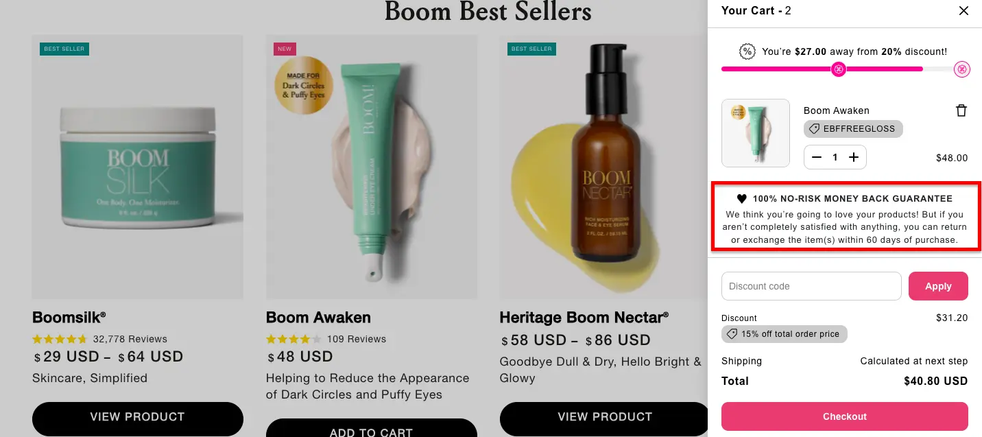
BOOM Beauty, known for its pro-age skincare loved by women over 50, does something incredibly effective on its cart page: it removes the risk of purchase.
Shoppers see a bold 100% No-Risk Money-Back Guarantee, promising a full refund or exchange within 60 days if they’re not completely satisfied.
It’s the kind of assurance that makes a prospective customer think, “Well, why not?”
This tactic works because it lowers the anxiety of money wasted on something a buyer may not use.
For D2C brands, especially in beauty, where results vary from person to person, this type of confidence signal can dramatically lift conversions and reduce cart abandonment.
It tells shoppers, “We stand behind our products, and we stand behind you.”
Further Reading: 40 High-Converting Health/Beauty "Product Page" Examples

Matrix Kids, a popular furniture store, has made an excellent effort to reduce financial stress and the fear of “what if” for its customers.
Right beside the checkout button, shoppers can see clear financing options from Affirm, Shop Pay Installments, and Afterpay breaking a big-ticket purchase into bite-sized monthly payments.
For parents shopping for quality furniture, that’s a huge psychological relief.
But Matrix goes a step further. Just below the financing panel, they highlight their 5-year warranty, a trust-builder that speaks directly to long-term value.
Kids can be rough on furniture, and Matrix knows it, so showcasing durability and protection right at the point of purchase helps hesitant shoppers move forward with confidence.
This combination of flexible payments + long-term assurance turns a potentially nerve-wracking checkout moment into a calm, “we’ve got you covered” experience.
Further Reading: 20 Reasons Why Your Online Furniture Store Has Low Conversions (+ ways to fix)

Wuffes is a popular healthcare brand that sells joint supplements for dogs.
They’ve used an intelligent value-add tactic on their cart page that we found super-interesting.
When shoppers add the Daily Probiotic to their cart, they also receive a free Joint Health Guide. What an incredible gift for pet owners, isn’t it?
This kind of cart freebie works well because:
For brands looking to reduce cart abandonment without relying solely on discounts, a relevant, knowledge-based freebie like this is a powerful, very low-cost conversion booster.
Further Reading: Top 29 Cart Page Designs For 2025 (Examples)
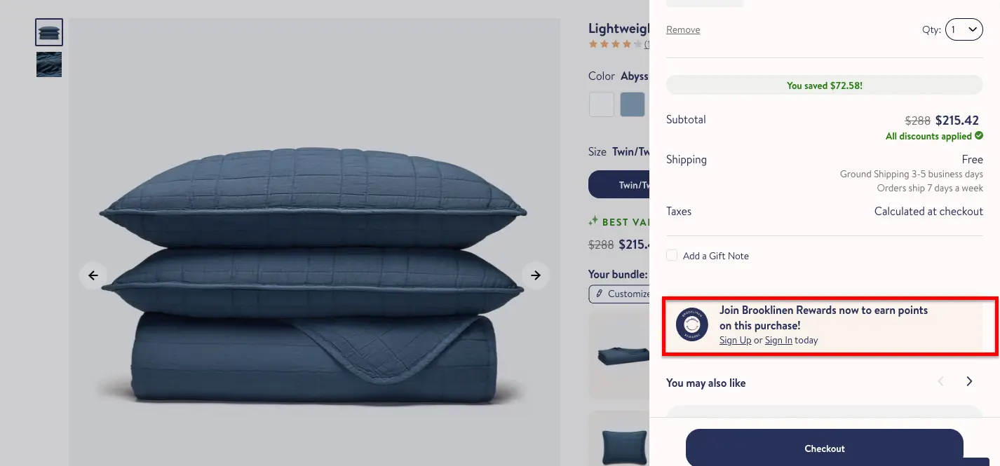
Brooklinen, a luxury bedding company, takes a low-friction approach to reducing cart abandonment.
They showcase a gentle nudge to join their loyalty program on the product page and also when you enter the cart.
What makes this tactic effective is how seamlessly it fits into the moment. Shoppers are already in a buying mindset, so the idea of “getting more for what you’re already spending” feels like a no-brainer.
It adds value, builds long-term customer retention, and doesn’t require the brand to throw in discounts or freebies every time.
For D2C brands looking to improve conversions and loyalty simultaneously, this is a subtle move that turns a one-time purchase into an ongoing relationship, and it works like magic; what do you think?
Further Reading: 14 eCommerce Loyalty Programs Backed By Science (Examples)

Beauty Pie is a well-known luxury makeup D2C eCommerce brand.
They know shoppers sometimes get cold feet right before checkout, so they’ve deployed a smart little safety net: an exit-intent pop-up that offers 10% off for first-time buyers.
It’s the brand’s way of having a pleasant conversation with customers before they abandon their carts.
This tactic works because it meets the shopper at the exact moment they’re about to abandon ship. Instead of shouting, Beauty Pie simply sweetens the deal and gives new customers a reason to stay.
The strategy captures more first-time conversions and offers a soft, friendly entry into the Beauty Pie ecosystem.
For D2C brands, it’s a great reminder that sometimes all it takes to save the sale is a well-timed nudge, not a full-blown promotion.
Further Reading: 18 Brilliant Ways To Convert First-Time Visitors Into Buyers (eCommerce)

Taos Bakes is popular in the D2C space for its healthy snacking options.
They take the “don’t just take our word for it” approach and run with it.
Right on their cart and product experiences, they showcase glowing reviews and real-world praise that instantly reassure shoppers they’re making a solid choice.
It’s social proof with a bit of swagger.
What makes this tactic so effective is how quickly it cuts through hesitation.
When a shopper sees that hundreds of other snack-obsessed humans swear by the same bar sitting in their cart, the decision suddenly feels much easier.
Taos Bakes uses this moment to build trust, reduce uncertainty, and remind people that these aren’t just snacks; they have a fan club just like human celebs.
For D2C brands, it’s a masterclass in using social validation to close the gap between “should I?” and “oh absolutely.”
Further Reading: 15 Ways To Get The Most Out Of Social Proof (eCommerce)
.webp)
MìLà, the D2C brand bringing restaurant-quality Chinese dumplings and noodles into your freezer, makes gifting feel more thoughtful.
When you send their food as a gift, you can add a personalized note at checkout. It’s not just a package of soup dumplings or vegan noodles, it’s a little message wrapped in warmth and flavor.
This feature works beautifully for a few reasons:
For a food brand, this isn’t a gimmick; it’s a genuine gesture. It reduces cart abandonment by fostering a deep connection to their purchase.
Further Reading: 33 Ways To Grow F&B eCommerce Sales (+ Real-World Examples)
For D2C brands, cart abandonment tells a very different story compared to what you see on giant marketplaces like Amazon or Flipkart. On your own D2C site.
As a D2C brand, you own the entire customer journey from product discovery to the checkout flow to the trust-building, all of it.
That means when shoppers abandon carts, it usually points to fixable issues in your checkout experience, pricing transparency, page speed, or overall UX.
The good news? You also have the freedom to fix them quickly.
Simple, high-impact touches, such as personalized recommendations, clear shipping information, multiple payment methods, and a streamlined mobile checkout, can dramatically reduce abandonment rates.
These kinds of checkout optimizations don’t just recover lost revenue; they build long-term customer loyalty.
When D2C brands take the time to understand user behavior, polish the interface, and remove friction at every step, conversion rates start climbing.
It’s more about tuning a high-performance engine: the smoother the ride, the more profitable the journey.
D2C shoppers abandon their carts for a handful of familiar reasons, most of which boil down to friction or uncertainty in the checkout experience.
The biggest drivers are unexpected shipping costs, forced account creation, and clunky mobile checkout flows that make completing a purchase feel like a chore.
Limited payment options, unclear delivery timelines, and a lack of trust signals such as reviews, guarantees, or secure-payment badges also put off shoppers at the last minute.
Add in slow site performance, confusing form fields, and the tendency for customers to compare prices with marketplaces, and it’s easy to see why carts get abandoned.
Simply put, when the path to purchase isn’t smooth, transparent, and fast, even the most excited D2C shopper will think twice before clicking “Buy Now.”
Shopping cart abandonment rate is the percentage of shoppers who add items to their cart but leave your site before completing a purchase.
Think of it as a pulse check on how much revenue is slipping through the cracks in your checkout flow.
A high abandonment rate usually signals friction; anything from unexpected shipping costs and confusing forms to slow load times or missing payment options.
For D2C brands, tracking this metric is crucial because it shows exactly where customers hesitate, giving you a roadmap to optimize the shopping experience and boost conversions.
To calculate the shopping cart abandonment rate for a D2C brand, you simply compare how many shoppers added items to their cart versus how many actually completed the purchase.
The formula is: (Total Carts Created – Completed Purchases) ÷ Total Carts Created × 100.
For example, if 1,000 shoppers added products to their carts and only 300 completed checkout, your cart abandonment rate would be 70%.
This metric helps D2C brands pinpoint where customers drop off in the funnel and identify friction areas, whether it’s pricing surprises, slow checkout pages, or missing payment options.
This way, they can optimize user experience and recover revenue more effectively.
D2C brands can dramatically reduce cart abandonment by using personalized communication that meets shoppers where they are in the buying journey.
Instead of generic reminders, well-timed, personalized messages, such as abandonment emails, WhatsApp nudges, or SMS alerts, can be helpful.
Even simple touches like using the shopper’s name, reminding them of limited stock, or showcasing customer reviews for the items in their cart help rebuild intent and trust.
When communication feels human, contextual, and helpful (not pushy), customers are more likely to return and complete their purchase.
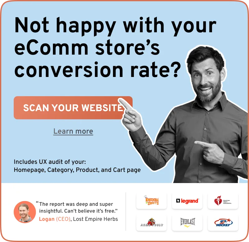
98% of visitors who visit an eCommerce site drop off without buying anything.
Even when you feature the best eCommerce promotions.
Why: user experience issues that cause friction for visitors.
And this is the problem Convertcart solves.
We've helped 500+ eCommerce stores (in the US) improve user experience and 2X their conversions.
How we can help you:
Our conversion experts can audit your site - identify UX issues, and suggest changes to improve conversions.
Subscribe for more articles like this!


Read by 5000+ ecommerce store owners
.svg)

.svg)

.svg)
.svg)
2026 Convertcart, All Rights Reserved
33/1, Castle Street, Ashok Nagar, Bengaluru, India