In the time it takes you to blink, a visitor has already judged your eCommerce brand. It’s no surprise that the average ecommerce conversion rate hovers around 2.5% to 3% (Source). This means 97% of your effort is effectively disappearing.
At Convertcart, we spend our days auditing sites and understanding how to make them work better for your business.
And our biggest learning while helping eCommerce stores has been: not all conversion tactics deliver equal impact.
Allow us to first show you the framework we use while working with our customers:
PART ONE - The Convertcart Framework For Increasing eCommerce Conversion Rate
They require the least coordination to implement and tend to show measurable results within weeks, not quarters. In our experience, fixing one checkout bottleneck consistently outperforms months of top-of-funnel work.
Product descriptions, landing page alignment, live chat, pricing, none of these are difficult in isolation, but they each require more coordination across copy, design, or paid channels to do properly. Done right, they compound the gains from the first group significantly.
They take longer to show results, require more infrastructure, and need the earlier work to already be solid. Attempting these before fixing your checkout is like optimizing a leaky bucket.
PART TWO - Deep Dive Into The 3 Tiers (High to Low impact)
We've grouped all 20 strategies by the combination of two factors we track across every audit: how directly the tactic affects revenue, and how much time and coordination it realistically takes to implement.
1. Create a Frictionless One-Page Checkout Experience
Science behind this: Transparency Principle + Zero Price Effect - Checkout is where uncertainty peaks. When shoppers feel unsure about costs, steps, or errors, they pause or abandon.
We audit numerous eCommerce checkout flows every week. And the most common flaw is that many of them feel like a grueling interrogation. Some of them have multi-page forms that are an ordeal for prospective customers.
Research shows that 17% of shoppers abandon their carts solely because the checkout process was too long or complicated (Baymard Institute, 2024).
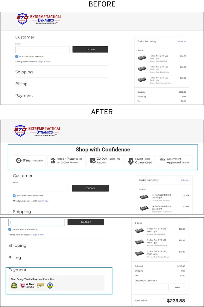
Here's how we improved conversions for Extreme Tactical Dynamics:
For LED emergency light brand Extreme Tactical Dynamics, we took on the work of streamlining checkout both on desktop and mobile. This also included bringing in trust seals at key moments to reduce the kind of decision friction that often leads to checkout abandonment.
2. Make Your Cart Page More Persuasive & Profitable
Science behind this: Choice Architecture - When options are presented (or the flow in which people see them), shoppers decide how they will choose and act on them.
We always recommend you focus on reinforcing value on the cart page.
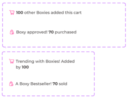
Here's how we improved conversions for Boxhill:
To improve cart turnovers for women’s clothing brand Boxhill, we experimented with urgency-led social proof for any two products in the cart that sold more than the others. We used AI to make auto-rotation between messages possible.
3. Stop Cart Abandonment with Smart Exit-Intent Popups
Science behind this: Loss Aversion - People are essentially more afraid of losing something than of gaining something else.
Do your popups feel like a desperate digital "Wait, come back!" cluttered, poorly timed, and ultimately annoying? However, when executed with precision, these are conversion frontliners.
Studies show that exit-intent overlays can recover up to 10%-15% of visitors who abandon (OptinMonster, 2024). The secret is relevance, not just a generic discount code. In our audits, we move away from "one-size-fits-all" popups.
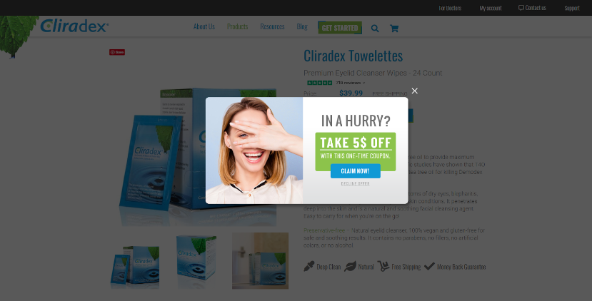
Here's how we improved conversions for Cliradex:
The case in point is preservative-free cleanser brand Cliradex. The problem at hand was converting new shoppers and first-time visitors. Cart anxiety is naturally high among these segments, even if price is a non-issue.
So, if shoppers added to cart and left, we began to show an exit-intent pop-up. The idea was to give them an extra last-minute incentive to continue with their cart momentum and reduce abandonment:
4. Add Relevant Social Proof & Personalized Reviews
Science behind this: Sequential Trust Building - Shoppers don’t trust everything at once. At each funnel stage, the brain looks for the most relevant proof it can easily recall.
When our experts audit an eCommerce site, they look for the "lonely restaurant" effect. No matter how sleek your design is, if it lacks visible human validation, shoppers feel like they’re the first to walk through your doors.
Data shows that 95% of consumers read online reviews before making a purchase (PowerReviews, 2024).
However, generic reviews are no longer enough. We help you focus on contextual social proof.
5. Build Trust with Clear & Visible Return Policies
Science behind this: Commitment Escalation - Shoppers invest in microcommitments first before macro-converting.
Is your return policy hidden in the footer, written in a dialect of "legalese" that would baffle a lawyer?
If yes, this is a critical error.
You must know that shoppers don't view a return policy as a way to leave; they view it as a safety net that gives them the confidence to stay.
In fact, 67% of shoppers check the return policy before making a purchase, and a staggering 92% will buy again if the return process is easy (Invesp, 2024).
We recommend moving this "anxiety-killer" front and center. Make your policy clear, generous, and easy to understand. In our experience, it’s one of the most effective ways to improve your website conversion rate.
6. Write High-Converting CTAs That Motivate Action
Science behind this: Frogg Behavior Model - Behavior is a result of motivation multiplied by ability multiplied by prompt.
Have you come across a CTA on your site that feels like a limp handshake? Buttons like "Submit" or "Buy Now" are functional, but they are utterly devoid of motivation.
They tell the user what to do, but they don't tell them what they’re getting. Data indicates that personalized CTAs convert 202% better than basic ones (HubSpot, 2024).
In our audits, we suggest clients to move away from generic commands toward "benefit-driven" language. We recently worked with a subscription brand and we changed a "Sign Up" button to "Start My Free Trial."
This shift from a chore to a reward helped drive a 22% increase in click-through rates. A high-converting CTA should spark desire. That’s why you need to examine every CTA on your site with that perspective.
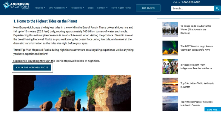
Here's how we improved conversions for Anderson Vacations:
As a travel site, Anderson Vacation gets a fair amount of traffic spanning all kinds of intent. But despite enough readership and traffic to Anderson’s blog pages, tour option discovery was low. Session recordings also showed a fair amount of anxiety amongst new users. We brought in bold, brand-aligned CTAs to deepen discovery and intent.
7. Use Authentic Urgency Tactics
Science behind this: Loss Aversion - People are more motivated to avoid losing something than to gain something new.
The bitter truth is that shoppers have developed a keen nose for fake countdown timers and perpetual "last chance" sales. However, when urgency is authentic, it’s a psychological powerhouse; research shows that genuine scarcity can increase sales by as much as 226% (ConversionXL, 2024).
The key is transparency. In our audits, we focus on "inventory-driven" urgency.
Authentic urgency shouldn't feel like a trap; it should feel like a service, ensuring your customer doesn't miss out on something they truly want.
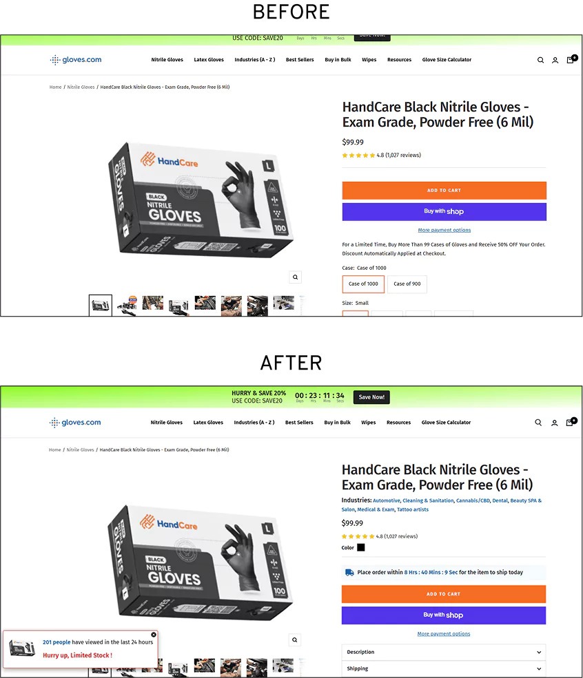
Here's how we improved conversions for Gloves:
Here it’s worthwhile to mention our CRO work for Gloves. The client was fighting 87% drop-offs on account of uncertain delivery timelines. So we experimented to see if this would be a viable area to introduce authentic urgency.
Bringing clear shipping timeline microcopy along with real-time countdown helped bring a spike in orders.
8. Simplify Navigation & Speed Up Product Discovery
Science behind this: Cognitive Load Theory - Shoppers subconsciously try to get the maximum value with minimum effort.
When we audit a store, we often find navigation menus that resemble the flight deck of a Boeing 747: dozens of options, nested sub-menus, and "clever" labels that leave shoppers paralyzed.
Human beings are notoriously bad at making decisions when faced with too many choices; in fact, 54% of shoppers have abandoned a brand because the site was too difficult to navigate (Gartner, 2024).
If a visitor has to think about where to click, we’ve already lost them.
The ideal strategy is to move a user from "searching" to "finding" in under three seconds, which requires ruthless pruning.
Here's what we did for a Convertcart customer:
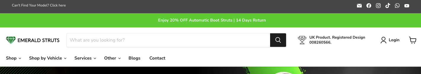
We improved homepage conversions for automatic boot struts brand Emerald Struts by fine tuning their navigation panel. The idea was to create an easy hub for the most transactional & non-transactional pathways. Without shoppers needing to wander about or scroll too much:
Remember: Your navigation shouldn't be a map of your internal company structure; it should be a fun-filled slide toward the "Add to Cart" button.
9. Optimize Mobile UX for Better Shopping Experiences
Science behind this: Change blindness, a visual phenomenon, can cause shoppers to miss key elements in their mobile journey, leading to lower conversions. We’ve also experienced that mobile storefronts are little more than "squished" versions of the desktop site.
In reality, mobile devices account for roughly 77% of all retail site traffic (Adobe Analytics, 2024), yet mobile conversion rates consistently lag desktop conversion rates by nearly half. The culprit is usually "thumb fatigue."
We see sites where buttons are so small they require the precision of a watchmaker. And there are pop-ups that effectively hijack the entire screen.
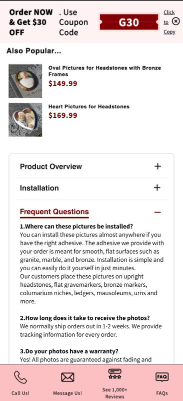
Here's how we improved conversions for PhotosforHeadstones:
For ceramic photo plaque brand PhotosforHeadstones, we seriously looked into content organization for mobile shoppers. An accordion-style layout focused on knocking down the most critical objections meant lesser scrolling and more time on page:
To win on mobile, you must design for the distracted thumb: make the "Add to Cart" button impossible to miss and ensure the page loads in under two seconds.
10. Write Product Descriptions That Convert Better
Science behind this: Cognitive Fluency - The brain prefers information that’s easy to process and emotionally engaging. Research indicates that 20% of purchase failures are due to poor or incomplete product information (Nielsen Norman Group, 2024).
Unfortunately, on many eCommerce stores, product descriptions read like a dry technical manual or, worse, a series of vague marketing superlatives.
We advise our clients to stop listing features and start solving problems. Ideally, an expert description should do three things: mirror the customer’s language, answer their unspoken "Will this work for me?" and remove any excuse to click away. Not that complicated, or is it?
Here's how we helped a Convertcart customer optimize descriptions:
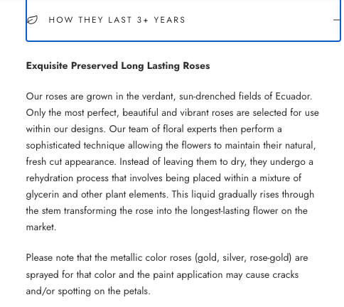
For The Million Roses, enriching product page descriptions from the shopper's POV was key. Most people know about roses, but very few know about preserved roses. Educating the high intent buyer was the first step to converting them quicker across the store’s product pages:
Here’s the bottom line: If you show your product the way they are, your customers love buying from you!
11. Use High-Quality Images & Videos to Reduce Returns
Science behind this: Context Principle - When shoppers can’t physically interact with a product, the brain looks for visual context to fill the gap.
We’ve seen that high-resolution zooms and 360-degree videos aren't just "nice-to-haves"; they are risk-reduction tools.
Offering high-quality video and images in your eCommerce store enhances a real, believable experience. In fact, 22% of returns happen because the product looks different in person (Invesp, 2024).
Here's what we did for one of our customers:
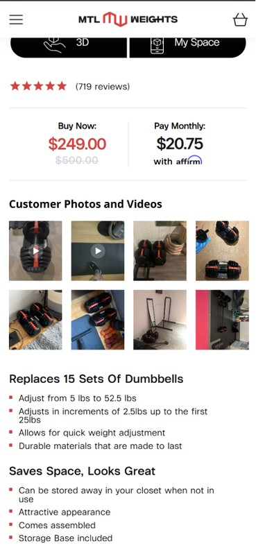
Canadian home gym brand Montreal Weights are in that space where a purchase is naturally lined with doubt. “How do I know this is for me?” is a question that the brand has to frequently deal with. Reason why wecurated and included the most high-quality customer photos and videos in a strategic location. This allowed shoppers to compare visuals with copy — and arrive at an integrated understanding about the product.
Here’s the bottom line: If you show your product the way they are, your customers love buying from you!
12. Match Landing Pages to Ads for Higher Conversion Rates
Science behind this: Expectation Confirmation Theory - When incoming information doesn’t match, it creates cognitive friction and exit behavior.
Now, this is something very common: A shopper clicks a specific ad for "blue linen shirts," only to be dumped onto a generic homepage. This message mismatch is a conversion killer.
In our audits, we focus on scent-trail optimization.
If the ad promises a specific solution, the landing page must echo that exact headline and imagery.
For a luggage retailer we recently helped, aligning landing page copy strictly with their Meta ad creative reduced bounce rates by 22%.
Hence, ensuring that your landing page messages match your ad creative is an essential way to improve your eCommerce conversion rate.
13. Improve Live Chat to Boost eCommerce Conversion Rate
Science behind this: The principle of interactivity, which is especially relevant in Web 2.0, treats clear & real-time communication as a cornerstone of customer experience.
Do your eCommerce live chat windows behave more like polite ghosts, either unresponsive or manned by bots that aren’t good for anything?
This neglect is costly.
Research shows that shoppers who use live chat are 2.8x more likely to convert than those who don't (Invesp, 2024).
In our audits, we prioritize speed and human touch.
For a specialty home-decor brand, we implemented "proactive triggers" to offer assistance when a user spent more than 60 seconds on a complex technical specs page.
By shifting from a reactive "wait-and-see" model to a proactive expert-led chat, we saw a 21% lift in average order value. Live chat shouldn't be a secondary support ticket system; it should ideally be a high-performance sales tool that kills hesitation in its tracks. Do you agree?
14. Localise Your Store to Increase International Conversions
Science behind this: Cultural Fluency Effect - Stimuli that align with cultural norms are processed more easily and trusted more, leading to faster decisions and higher conversion likelihood.
Let’s face it: Selling to a customer in Tokyo or Berlin using a "US-centric" store is a recipe for high bounce rates.
Data suggests that 76% of online shoppers prefer to buy products in their native language (CSA Research, 2024), and even more will abandon a cart if they can't pay in their local currency.
At Convertcart, we look for "cultural friction" in our audits. From local trust seals to favored payment methods, there are a bunch of ways to resolve such friction.
Here's how we helped a Convertcart customer sharpen their "local" edge:
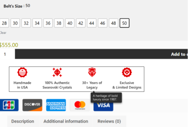
For BB Simon, the challenge was to solve the perception customers had of the brand. It lacked distinct character and was indistinguishable from what other similar brands stood for. So, we brought in a product page section, which in a jiffy, conveyed more than a block of content could. This solved the value proposition problem that the store was facing earlier.
15. Smart Pricing Strategies to Increase Average Order Value
Science behind this: Psychological pricing hits the “sweet spot” the shopper finds appealing (based on competition, perceived value, etc.) and convinces them to buy more.
As an eCommerce store, if you’re competing only on price, you’re effectively competing in a race to the bottom. Pricing isn't just a number; it’s a communication tool.
According to recent data, 73% of consumers say they are more likely to buy when a brand offers a "bundle and save" option (McKinsey, 2024), yet many stores leave these potential gains on the table.
At Convertcart, we believe in the power of anchor pricing and tiered incentives.
For a high-end supplement brand we recently audited, we introduced a "Good, Better, Best" pricing tier.
By highlighting a "Most Popular" mid-tier option that offered slightly better value than the base unit, we shifted 31% of their customer base to a higher price point overnight.
Here's how we improved price perception for a Convertcart customer:
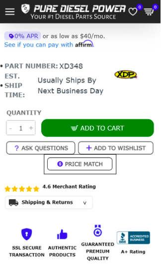
Pure Diesel Power features products that diesel mechanics and enthusiasts go after. The client had been seeing a steady increase in mobile product page drop-offs. And since they’re into selling high-consideration products, it became clear that a simple price advantage wouldn’t work. On the other hand, a “price match guarantee” created an instant confidence boost for shoppers.
16. Personalize the Full Customer Journey for Higher Retention
Science behind this: Cognitive Ease - Shoppers convert faster when every step in the journey feels easy, relevant, and predictable.
You need to understand that your eCommerce store has a "leaky bucket" problem if it has plenty of new traffic, but a complete failure to recognize the customer when they return. Research shows that personalization can deliver five to eight times the ROI on marketing spend and lift sales by 10% or more (McKinsey, 2024).
In our audits, we push beyond basic "First Name" email tags.
For a subscription-based beauty client, we implemented dynamic product grids that displayed "Recommended for Your Skin Type" based on previous purchases.
This shift from a generic storefront to a curated experience drove a 24% increase in repeat purchase rates.
Personalization isn't about surveillance; it's about relevance.
When you tailor the journey, you’re building a relationship that survives the next competitor's discount. And that matters a lot.
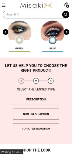
Convertcart Case Study - Misakicon
For British Columbia based contact lens brand Misakicon, we had to split the customer journey and view the stages closely. We noticed that conversions amongst those who traveled from the homepage to the product page were already higher.
This prompted us to optimize this part of the journey so that shoppers were able to narrow down their search more quickly. The experiment generated an additional 39 orders for the brand.
17. Turn Post-Purchase into Repeat Buyers & Loyalty
Science behind this: Peak End Rule - People judge an experience largely by its emotional peak and how it ends. A strong post-purchase phase disproportionately shapes memory and future buying behavior.
This is true for many eCommerce stores we’ve audited in the past: all communication dies the moment the credit card clears. The ideal strategy is to treat the "Thank You" page as the beginning of the next sale, not the end of the current one.
For a sustainable apparel brand, we replaced the generic confirmation with a personalized "How to Style" video and an invitation to a tier-based loyalty program.
By transforming a transactional email into a value-add touchpoint, we saw a 19% lift in second-purchase frequency within 30 days. Here’s the lesson: don’t just ship a box; ship a reason to return.
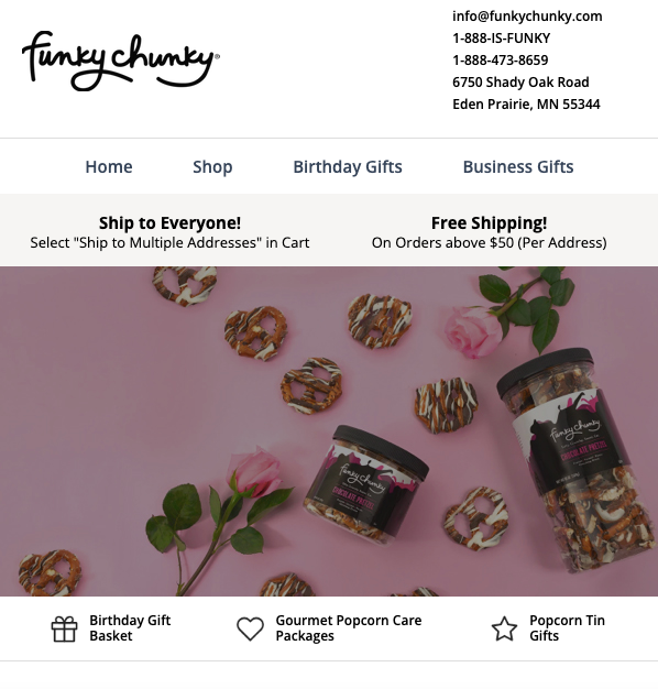
Convertcart Case Study - FunkyChunky
For gourmet snack brand FunkyChunky, we ran a number of highly relevant experiments. Amongst them were shopper behavior based email workflows. This led to a 59% increase in revenue from emails alone, which included winners like purchase anniversary emails like this one.
18. Data-Driven A/B Testing to Boost Conversion Rates
Science behind this: Behavioral Empiricism - Observed behavior is more reliable than self-reported preference. Controlled experiments reveal what truly influences decision-making.
Let’s get real.
Is your conversion strategy based on data, or are you just "throwing spaghetti at the wall"?
When we audit eCommerce stores, we frequently find that million-dollar decisions are being made on the whims and fancies of what some people think might work.
In our audits, we replace guesswork with clinical precision.
For a high-volume electronics retailer, we A/B tested a standard "Buy Now" button against a "Check Compatibility" CTA on complex product pages. That single shift in psychological framing triggered a 22% increase in checkout starts.
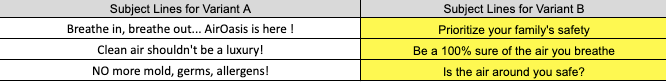
Convertcart Case Study - Air Oasis
For US-based air purifier brand Air Oasis, the attempt was to target the demographic of 25 to 65 years of age and see which browse recovery subject line wins. The context is a niche where men are usually the buyers, but women have the final say in the decision. So, appealing to these decision-makers became highly critical. (
Running the tests ensured a 145.6% improvement in browse recovery open rates and 872% improvement in browse recovery click rates.
19. Turn Wishlists & Micro-Conversions into More Sales
Science behind this: The design of micro-conversions relies on developmental milestones, the idea that a set of markers along a journey must be met before final maturation or the destination (in this case, a macro conversion).
Did you know 88% of shoppers research online before making a purchase (Salesforce, 2024)? That’s why we shouldn't view a non-purchase as a failure.
But sadly, most brands treat the "Wishlist" as a graveyard, a place where products are forgotten. Instead, we should view it as a "micro-conversion" that signals high intent. Your goal is to bridge the gap between "just looking" and "buying now."
Here's how we created micro-conversions for a Convertcart customer:
For Rugged Rosaries, the work was two-fold. First, we had to detect that their blog attracts pretty high-intent traffic.
Next, we placed a band of recommendations at the top of their best performing blog pages to drive that traffic towards the most relevant product pages. This was able to drive more organic traffic naturally towards conversions, especially on mobile:
20. Use Pre-Orders to Drive Early Sales & Hype
Science behind this: Pre-orders relate to the psychology of hype that amplifies any announcement of a scarce resource, and they become a marketing tactic in their own right.
When we audit eCommerce brands launching new collections, we often find that they wait until the inventory is physically in the warehouse before starting to sell. This is a massive waste of momentum.
Research indicates that pre-orders can account for 15% to 20% of a new product launch's total lifetime sales (Shopify, 2024).
For a consumer electronics client we audited, implementing a "limited-run" pre-order strategy complete with a countdown timer and exclusive "early bird" updates resulted in a 24% increase in Day 1 revenue.
The idea is to turn a “Coming Soon” page into a revenue-generating channel. This strategy also allows you to build a community of early adopters.
Here's how we optimized a Convertcart customer's product pages:
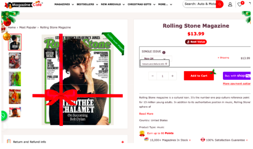
When Magazine Cafe ran a customer satisfaction survey, it became clear that shoppers were having a tough time finding info on refunds & returns. So we did two things: 1) introduced a separate return / refund section under the image gallery that opened up into a modal and 2) included a tooltip just under the issue data & pricing.
Optimization isn't a one-off project; it’s a relentless pursuit of clarity. We’ve shown you where the leaks are; now it’s time to plug them. Start with one audit, test one hypothesis, and stop letting 97% of your traffic slip away. Your customers are waiting; don't make them work for it.
Before great conversions comes memorable UX...
98% of visitors who visit an eCommerce site—drop off without buying anything.
Why: user experience issues that cause friction for visitors.
And this is the problem Convertcart solves.
We've helped 500+ eCommerce stores (in the US) improve user experience—and 2X their conversions.
How we can help you:
Our conversion experts can audit your site—identify UX issues, and suggest changes to improve conversions.
Subscribe for more articles like this!
Thank you - we'll see you in your inbox soon!
Oops! Something went wrong while submitting the form.
Read by 5000+ ecommerce store owners
Subscribe for more articles like this!
Thank you - we'll see you in your inbox soon!
Oops! Something went wrong while submitting the form.


.svg)

.svg)

.svg)
.svg)
