Conversion Optimization
How Should Your Order Confirmation Page Look in 2026
March 5, 2026


.jpg)
A peculiar thing happens the moment a customer clicks "Place Order." They're suddenly anxious. Did it go through?
Did they give the right address? Are their $$$ floating somewhere in the digital sky, never to be seen again?
It's the modern way of dropping a letter in the post and wondering if the postman actually exists.
The order confirmation page is supposed to fix all of this.And yet, in 2026, many of them still do the bare minimum — a limp "Thanks for your order!" and an order number nobody asked to memorize.
That's not good enough anymore. Customers expect more.
And the brands that treat this page as an afterthought are leaving loyalty, revenue, and trust on the table. Let's fix that and learn about how your order confirmation page should look in 2026.
This post covers:
1. A Customer Intelligence Engine
2. A Representation of Your Values
3. A Curation of The Relevant Product Recommendations
4. A Collection Retention Triggers
5. A Showcase of Your Loyalty Program
7. A Place That Offers Rewards
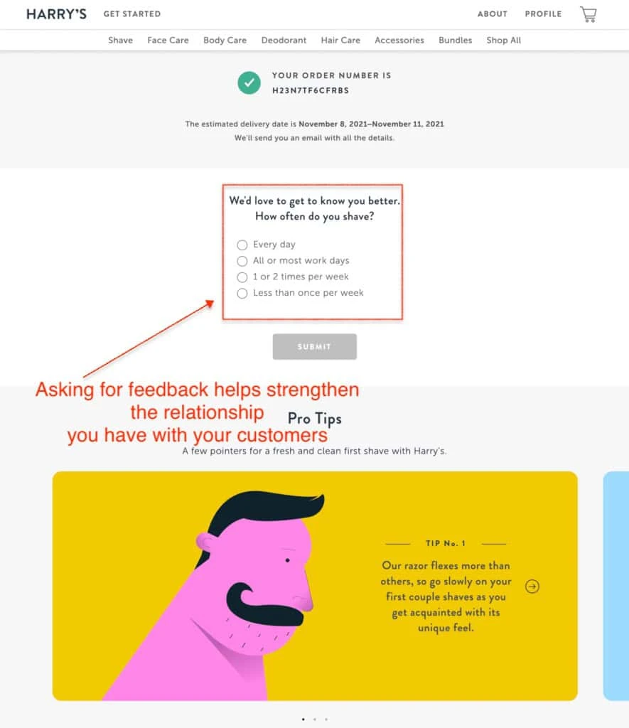
Harry's does something most US eCommerce brands never think to do: ask a question.
The quiz is disarmingly simple, and the goal is to collect data for future marketing communication. And the Pro Tips are geared towards reducing buyer's remorse and return rate.
What to steal from Harry's: Pair a one-question post-purchase survey with onboarding content. You reduce anxiety, collect first-party data, and make the customer feel looked after, all in one scroll.
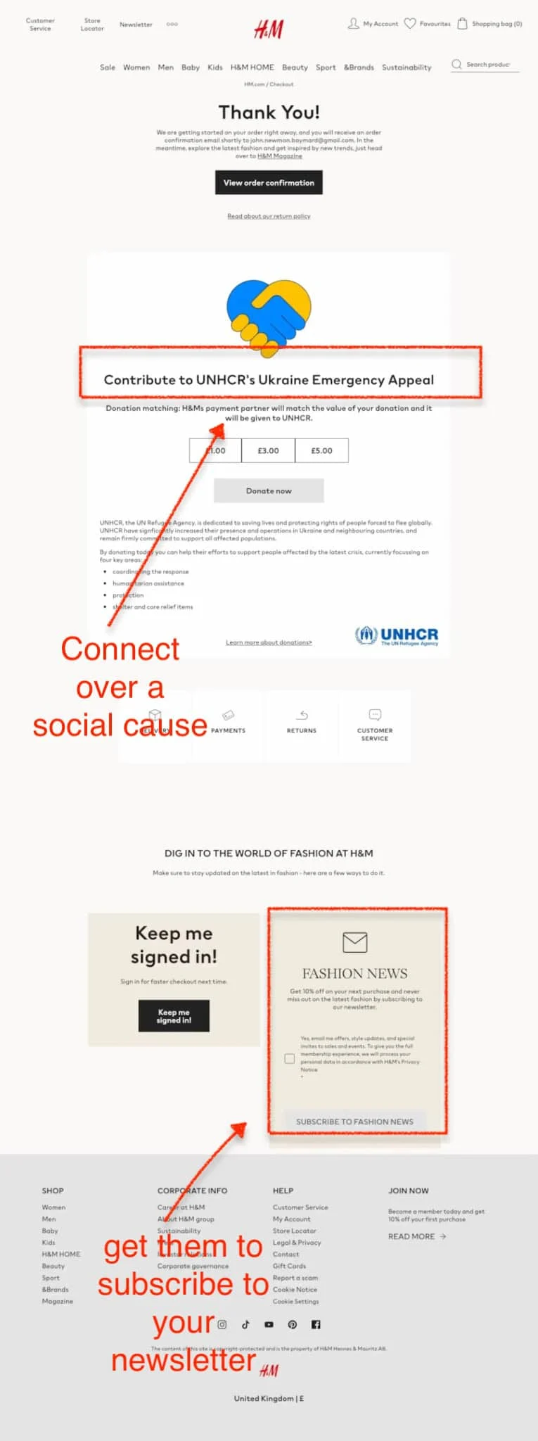
H&M understands something that most American eCommerce brands are still catching up to: in 2026, customers don't just buy products, they buy into brands.
And the order confirmation page is a surprisingly powerful place to demonstrate what your brand actually stands for. A social cause, for instance.
From working with hundreds of eCommerce brands, we've consistently seen this pattern: customers who engage with a brand's values on the confirmation page have significantly higher lifetime value than those who don't.
Purpose isn't a soft metric anymore.
H&M then doubles down with a newsletter subscription offer: 10% off your next purchase for signing up. Clean, simple, high-converting.
What to steal from H&M: Pair a cause-driven moment with a self-interest incentive. One speaks to the customer's heart, the other to their wallet.
Together, they're hard to scroll past.
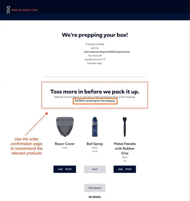
Dollar Shave Club does something brilliantly devious on its confirmation page. The order isn't just confirmed, it's still open. What’s the real weapon?
Below a timer, contextually relevant add-ons appear: a Razor Cover, a Metal Handle, and accessories that genuinely complement the purchase.
This is exactly how you’re supposed to upsell on your order confirmation page.
What to steal from Dollar Shave Club: Combine urgency with relevance. A countdown timer alone feels gimmicky, but pair it with a free shipping hook and curated product suggestions, and you've built a post-purchase revenue engine that runs itself.
Do you wish to learn how eCommerce recommendations work? Read more here: eCommerce Product Recommendation: Examples, Ideas, Do's/Don'ts
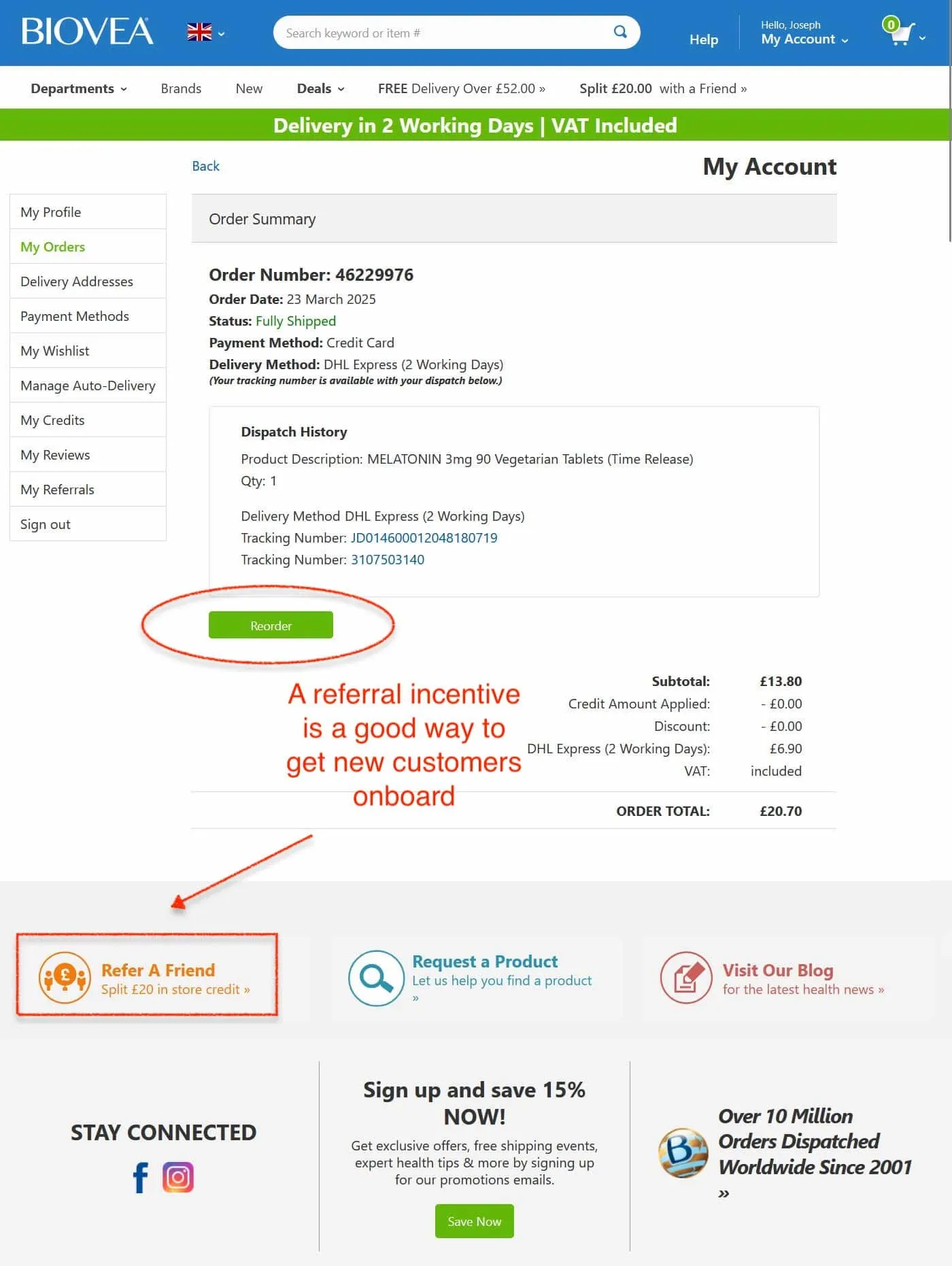
Biovea's confirmation page is a masterclass in doing a lot without feeling cluttered. Every element earns its place, and from a CRO standpoint, that's exactly what you want.
The page opens with full order transparency: order number, status, payment method, delivery timeline, and live tracking numbers. No anxiety, no guesswork. But Biovea doesn't stop at reassurance; they immediately pivot to growth.
A prominent "Reorder" button sits right inside the dispatch summary.
For a health supplements brand selling consumables, this is razor-sharp thinking.
The customer is at peak satisfaction, that's precisely when the next purchase should be made frictionlessly available.
Then comes the referral prompt: "Refer A Friend — Split £20 in store credit." Splitting the reward between the referrer and the friend is a proven CRO tactic; it removes the guilt of "selling" to a friend by making it mutually beneficial.
Rounding it out: a 15% newsletter sign-up offer, social follow prompts, and a blog link. That's acquisition, retention, and engagement all on one page.
What to steal from Biovea: Stack your confirmation page with layered retention triggers, but give each one a distinct job. Reorder for repurchase, referral for acquisition, newsletter for nurture. No overlap, no waste.
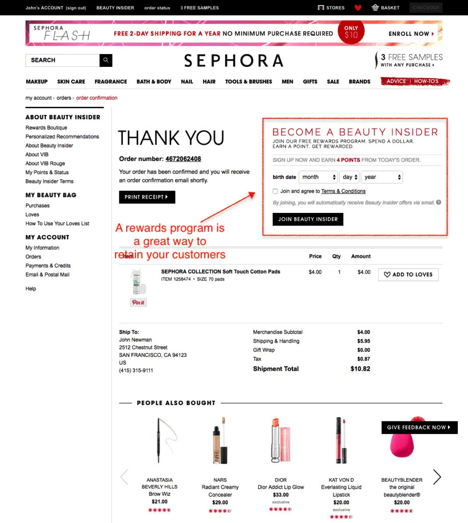
The moment right after a purchase is the single highest-trust moment in a customer's journey.
Sephora knows this, and they use it to do something most brands save for email sequences: recruit loyalty members.
Right alongside the order confirmation, Sephora's "Become a Beauty Insider" prompt invites customers to join their rewards program, earn points on their just-placed order, and enter their birthday to unlock future perks.
It's frictionless, timely, and genuinely valuable.
In our experience working with eCommerce brands across categories, loyalty program sign-ups on confirmation pages consistently outperform those on homepages or product pages.
It’s because the customer's intent and goodwill are already at their peak.
What to steal from Sephora: You need to make joining your loyalty program feel like a natural next step, not an interruption. Anchor it to points they can earn today, and watch your sign-up rates climb.
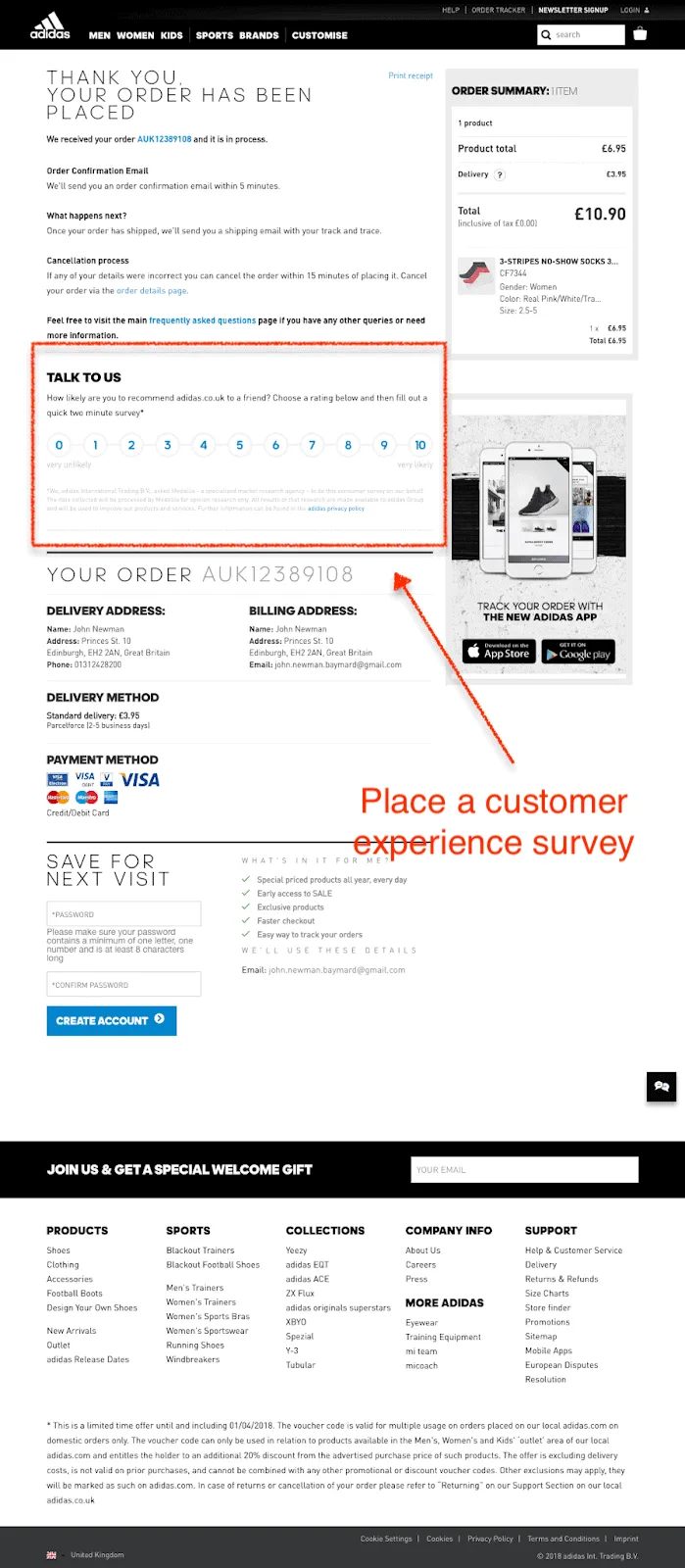
Adidas treats its confirmation page like a seasoned conversion optimizer would.
The page opens with complete order clarity: confirmation email timeline, next steps, and even a cancellation window("cancel within 15 minutes").
That last detail is counterintuitive but brilliant, giving customers an exit reduces anxiety and builds trust, making them less likely to use it.
Then comes a Net Promoter Score survey: "How likely are you to recommend Adidas to a friend?" placed at peak satisfaction.
This is an excellent example of correct third-party data collection. No pop-ups, no email follow-ups needed. The answer arrives while the customer's goodwill is still warm.
In the right sidebar, Adidas promotes its mobile app with a bold "Track Your Order" hook, turning a functional need into an opportunity to download the app. And below the fold, a "Save For Next Visit" account creation prompt lists concrete benefits: sale access, exclusive products, and faster checkout.
In our experience, confirmation pages that convert guests into account holders at this stage significantly reduce future cart abandonment because the next checkout becomes nearly effortless.
What to steal from Adidas: Layer your NPS survey, app promotion, and account creation as three distinct conversion goals, each targeting a different part of the customer relationship funnel, all on one page.
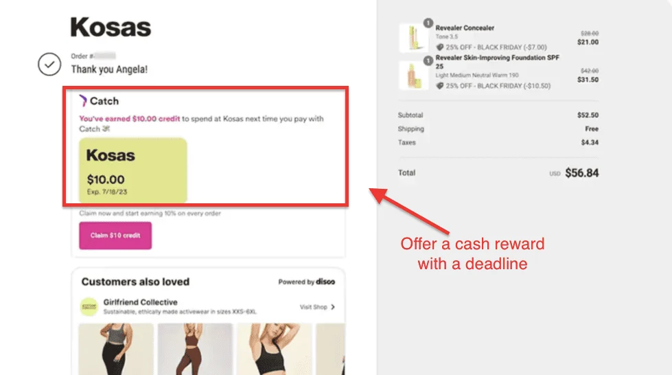
Kosas understands one of the most underutilized truths in eCommerce: the hardest purchase to win is the second one.
Get that right, and lifetime value takes care of itself.
Their confirmation page leads with a Catch-powered $10 credit framed not as a discount but as $$ already earned. "You've earned $10.00 credit to spend at Kosas" hits differently than "here's 10% off."
It's psychologically yours. And the expiry date of July 18 creates a natural urgency without feeling aggressive.
Below that, a "Customers Also Loved" carousel powered by Disco surfaces complementary brands like Girlfriend Collective.
This is smart ecosystem thinking; cross-brand discovery keeps customers engaged even when Kosas itself has nothing more to sell in that moment.
The order summary on the right is clean and transparent, with Black Friday discounts clearly itemized, reinforcing that the customer made a smart financial decision.
What to steal from Kosas: Frame post-purchase credits as earned rather than as an offer. Add an expiry date to create urgency, and use third-party discovery tools to fill gaps in your own product catalog.
Most US eCommerce brands treat the confirmation page as a receipt.
The best brands treat it as a relationship. What separates the two isn't budget or technology, it's intention.
In 2026, that's no longer acceptable. tr
Your confirmation page should be working as hard as your homepage. Audit it today because the brands that do are winning the retention game while everyone else fights over acquisition.
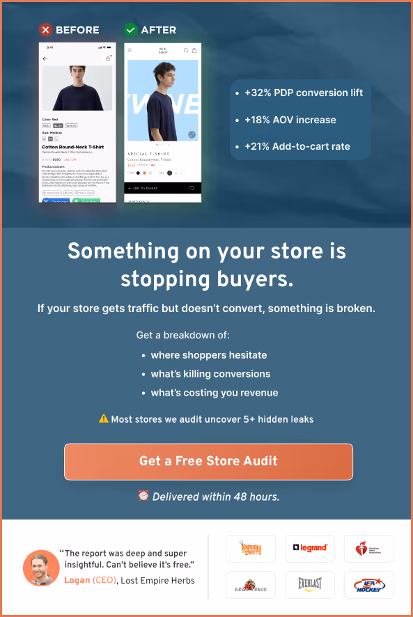
Not sure where your confirmation page is leaking revenue?
Our eCommerce CRO specialists will identify exactly what's working, what isn't, and what to fix first, completely free. Claim your free site audit.
Take the next step in optimizing your eCommerce storefront for more conversions:
How These 7 eCommerce Brands Reduced Bounce Rate on Shopify
How Do I Increase My Website’s Checkout Rate? (21 Proven Ideas)
eCommerce Category Pages: What Still Converts (And What's Old News)
Subscribe for more articles like this!


Read by 5000+ ecommerce store owners
.svg)

.svg)

.svg)
.svg)
2026 Convertcart, All Rights Reserved
33/1, Castle Street, Ashok Nagar, Bengaluru, India