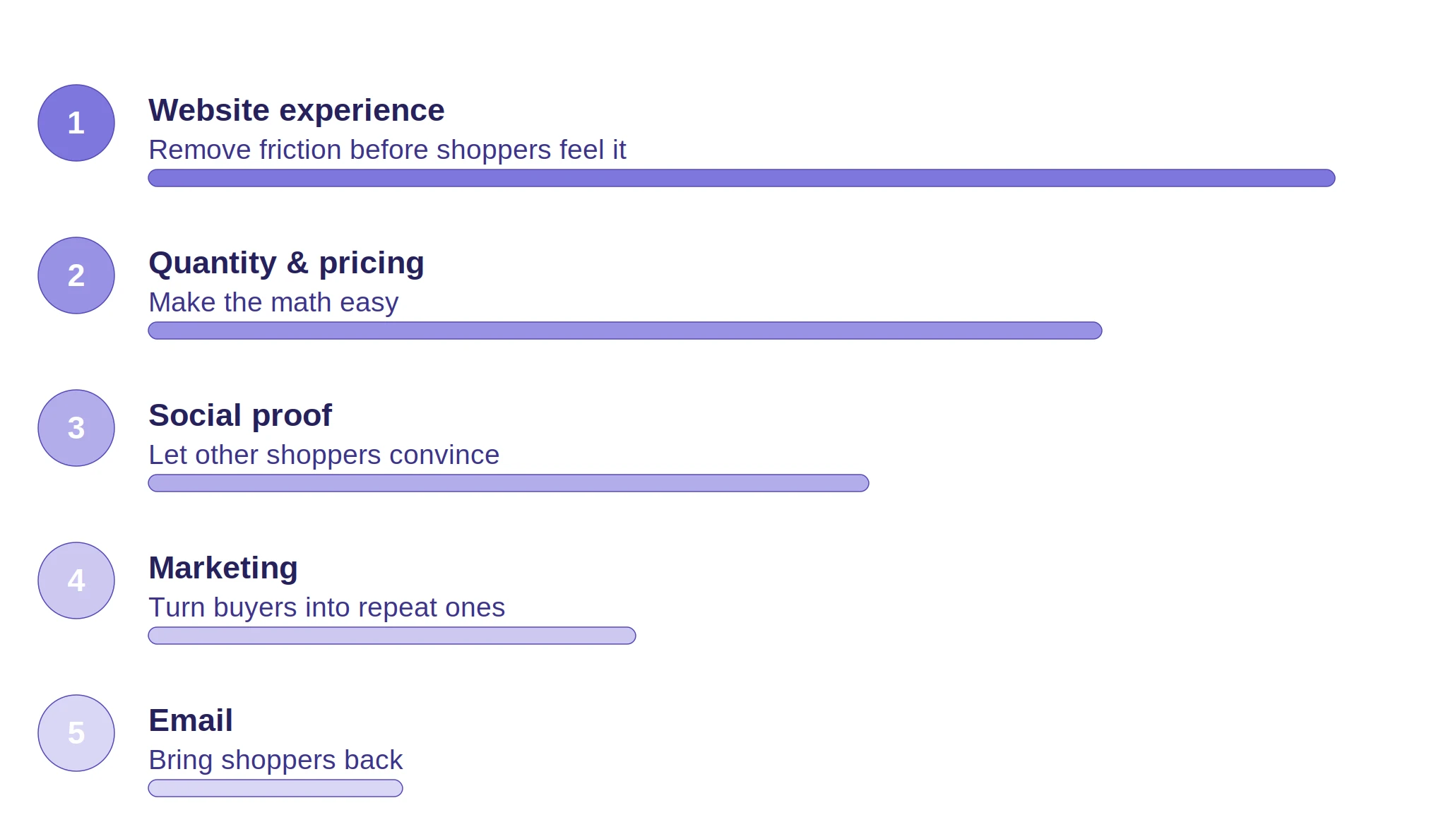
You can improve DTC conversion rate fastest by working through five drivers: website experience, quantity and pricing, social proof, marketing, and email.
The next step is to validate each change with a controlled test instead of a hunch.
We ran eight of those tests on DTC stores in apparel, fashion, home goods, hardware, food, and specialty retail.
The biggest wins in these experiments came from tests that showed shoppers key information or visuals, like price, delivery time, product detail, or product imagery, earlier in their path to checkout.
Conversion rate improvements ranged from 1.19% to 14.97%.
What moves the needle on a DTC store's conversion rate? Is it a full redesign, or something smaller? In our experience, it's rarely the redesign.
Most of the time, the biggest improvement comes from a specific, testable fix to one point of friction.
The right way is to find that fix, test it against a control group, and measure exactly what happens. No guessing involved.
In this post, we take you through the five-driver framework behind those fixes.
Then we report eight of those tests in full: what we changed, why we changed it, and exactly how much the conversion rate improved as a result.
Our 7 DTC Conversion Rate A/B Tests, at a Glance
Brand
Problem
Change Tested
Conversion Rate Improvement
Apliiq
Top category missing from homepage, low visual appeal
Homepage visibility + visual redesign
+14.97%
Lathams Steel Doors
Static category images, no way to preview detail before a click
Interactive category images
+14.1%
Sisal Rugs
Weak filters, default sort buried the best-fit products
Across eight A/B-tested DTC stores, conversion rate improvements ranged from 1.19% to 14.97%.
The strongest result came from a category page visual redesign for print-on-demand apparel brand Apliiq, which produced a 14.97% conversion rate improvement.
7 DTC Conversion Rate Case Studies: How These Tests Were Run
Here's what actually happens behind the scenes on every one of these tests. We'd spot a specific point of friction on a store, something a shopper had to click, scroll, or guess their way past, and build a real variant of that page to fix it.
Then we split live traffic evenly between that variant and the original and waited.
No peeking early and calling it a win, no cutting a test short because the early numbers looked good. Each one ran until we hit statistical significance, not a moment sooner.
Once a test finished, we rolled the winning version out across the whole store and measured what happened next.
The number we report for every test is conversion rate improvement, the change in the store's overall conversion rate once the winning variant went live everywhere.
That's the number that matters to a reader. Not what happened in an isolated test segment, but what happened to the business as a whole.
1. Fixing a Homepage Visibility Problem Delivered a 14.97% Conversion Rate Improvement for Apliiq
Apliiq is a California-based print-on-demand apparel company. When we audited their site, two things jumped out about their top-selling product category.
It wasn't featured prominently on the homepage at all, and where it did show up elsewhere, the visual treatment scored low on aesthetic appeal next to the rest of the site.
So we rebuilt the interface specifically to pull that category into view and give it visual weight that matched how well it actually sold. Then we ran the change as an A/B test within a longer optimization program.
The fix produced a 14.97% conversion rate improvement, the strongest result across all eight tests in this post. Additional orders from that category rose 42% alongside it.
This result backs up the same pattern you'll see in Test 3 below. Shoppers respond disproportionately well to stronger product visuals in the categories they browse most, and that effect compounds when the category is already a top seller.
Lighthouse Clothing is a fashion DTC brand. When we sat down with their cart page, the issue was obvious pretty quickly.
The checkout button sat below a row of product recommendations, so shoppers scrolled right past the reason they'd come to the page in the first place.
We moved the checkout button above the fold and pushed recommendations below it, then ran the change as a straight A/B test.
The redesign produced a 5.17% conversion rate improvement. Cart page clarity is one of the more repeatable drivers we've tested. It tends to transfer across store types, not just this one.
3. Making Lathams Steel Doors' Category Images Interactive Grew Conversion Rate by 14.1%
Lathams Steel Doors is a home and hardware DTC brand, and their session recordings told the story fast: shoppers weren't engaging with the product imagery at all.
The images sat there static, with no way to preview any detail without loading an entirely new page.
We made the images interactive so shoppers could see more product detail before they ever clicked through.
The change produced a 14.1% conversion rate improvement, the second-strongest result in this set. The result ran unusually high for what looks like a cosmetic change.
When products look visually similar at a glance, giving shoppers more information before they click matters more than a static thumbnail ever could.
⚠️
Find out what's stopping your store visitors from buying
Product discovery – barriers that prevent shoppers from finding items
Category/collection pages – improvements that drive deeper product exploration
Product page – what to optimize to convert 2–3x more buyers
Cart – ways to ease hesitation and speed up purchase decisions
“The report was deep and super insightful. Can’t believe it’s free.”
Logan Christopher CEO, Empire Herbs
4. Rebuilding Sort and Filter for Sisal Rugs Produced a 9.69% Conversion Rate Improvement
Sisal Rugs is a home goods DTC brand with a wide catalog. When we audited their site, the filter system stood out as a bottleneck right away.
Too few options, and a default sort order that buried the products that actually fit what someone was looking for.
We rebuilt it around the attributes shoppers searched for, like material, size, and color, and changed the default sort.
The rebuild produced a 9.69% conversion rate improvement.
The larger a store's catalog gets, the more this driver tends to move the needle. Browsing without functional filtering becomes a genuine chore once a catalog passes a certain size.
5. Adding Trust Seals to Ramona Larue's Cart and Checkout Grew Conversion Rate by 6%
Ramona Larue is a fashion DTC brand. When we walked through their checkout flow ourselves, nothing reassured us that the site was safe to buy from right when it mattered most.
No badges, no visible trust signals, nothing. We added recognizable trust seals, including secure checkout badges and payment provider logos, directly into that flow.
The change produced a 6% conversion rate improvement. This is one of the cheapest tests on this list to implement, and it's also one of the most consistent performers across the stores where we've tested it.
Trust signals close the hesitation gap right at the highest-friction moment in the funnel.
6. Putting Estimated Delivery Time on Boxhill's Product Page Delivered a 6.8% Conversion Rate Improvement
Boxhill is a fashion DTC brand.
When we traced a shopper's path to find shipping information, it took several clicks to an FAQ page buried away from the product itself, far more effort than it should take for a question that basic.
We surfaced an estimated delivery date directly on the product page, right next to the add-to-cart button. The change produced a 6.8% conversion rate improvement.
This result held up cleanly across the whole store, not just the shoppers who saw the test directly. Shoppers want to know when something will arrive before they buy it, not after.
7. Adding Bestseller Tags for Millican Pecan Produced a 1.19% Conversion Rate Improvement
Millican Pecan is a food DTC brand. When we looked at their category pages, every product looked equally weighted, with nothing to tell a new visitor which ones other customers actually loved.
We tagged bestselling products directly on the category grid and left everything else about the page's layout and design alone.
The change produced a 1.19% conversion rate improvement, the smallest result across all eight tests.
Bestseller tags are close to a free win to implement, but this result is a good reminder that they don't replace structural fixes like filtering, pricing visibility, or product visuals.
They're worth adding. Just don't spend more time on them than the bigger drivers on this list deserve.
Those are the eight tests in full. What follows is the broader framework they fit into five drivers we track across every DTC conversion rate engagement, ranked by how much tested impact we've actually measured rather than by instinct.
The DTC Conversion Framework: 5 Drivers, Ranked by Impact
DTC conversion rate improvements come from five drivers. We've built the following framework considering those five drivers.
1. Website Experience: It's simply the biggest conversion driver we've found, so it earns the top spot.
2. Quantity & Pricing: Making the price feel fair came in a close second in our testing.
3. Social Proof: Trust matters, but it moved the needle less than the first two in our tests.
4. Marketing: It's ranked fourth honestly, since we haven't run a direct test on it yet, not because it doesn't work.
5. Email: Ranked last for now. We just don't have the numbers yet to say otherwise.
So let's understand each of these drivers in greater detail:
Website Experience: The Least Exciting Driver Wins the Most
No one budgets for it, and it never shows up as a single line item anywhere.
But across five separate tests, website experience produced the largest, most consistent conversion rate improvements of any driver we measured.
In practice, this driver comes down to a short list of vital decisions every founder should take:
Put key information where a shopper can see it. It should not be buried in an FAQ several clicks away
Write product descriptions around what a product does for someone. It should not just be a list of features
The right way is to make your product search return what people are typing. It should not be something your catalog's internal naming happens to use
You need to organize category and navigation structure around how shoppers browse, not around how the backend catalog happens to be organized
Surface your bestsellers and most-visited pages early, so a new visitor isn't left guessing where to start
None of these changes require a redesign. In fact, most are a single, testable change to one page, the kind of change an eCommerce UX audit checklist can help you find before you commit engineering time to it.
Social Proof: Perfect Reviews Are a Red Flag
A suspiciously perfect five-star average doesn't read as trustworthy; it reads as fake. We've found a mixed, honest rating in the 4 to 4.5 range builds more trust than a flawless one ever could.
Here are places where this driver matters most:
Reviews with customer photos and an honest rating, filterable by the attributes shoppers care about, not just a generic star average
Customer content over polished brand content, since it reads as more credible
Direct, human availability, since the option to reach a person is itself a signal shoppers register
Each of these earns trust incrementally. None of them work as a single, one-time fix.
Quantity & Pricing: Unproven, but Still Ranked This High
We haven't run a direct test on this driver yet, and we're ranking it third anyway, because pricing psychology sits closer to the purchase decision than anything below it.
Your shoppers don't need a lower price. They need the price they're already seeing to feel obviously fair, without doing the math themselves.
Here are the mechanics worth paying attention to:
The right way is to show the discount applied, not the sale price in isolation. A struck-through original price next to the new one registers instantly; a sale price by itself requires the shopper to do the comparison themselves
Don't forget to make a free shipping threshold visible, with an easy way to close the gap from the cart itself
Do add a low-cost trust signal at checkout, like package protection, that tells a shopper the brand stands behind what it sells
You can use a quick, low-friction question instead of a blanket discount to learn what a shopper wants, then personalize what you show them next
The bottom line is that you need to remove the arithmetic a shopper would otherwise have to do in their head, and also layer in a bit of urgency, the kind covered in 20 powerful FOMO marketing examples for eCommerce, to turn hesitation into action.
Marketing: The Growth Channel You Already Paid For
You already paid to acquire that customer once. Reaching them again costs almost nothing, yet most DTC budgets keep chasing new traffic instead.
We haven't tested this driver directly yet, which is why it sits fourth, not because it matters less.
The moves that tend to compound over time:
Build loyalty around access and exclusivity rather than a flat discount, since that's what most repeat shoppers want
Structure referrals formally, with a genuine incentive on both sides, instead of leaving word of mouth to chance
Keep policies like returns visible through checkout, not just on the product page, since that reassurance matters most right before someone commits
Personalize the experience for international shoppers if you already ship to them, down to showing costs in their own currency
Ask for preference data directly through a quiz or short survey, then use the answers to personalize what follows
The common thread is patience. None of this shows results in a single campaign cycle.
Email: The Channel You Own and Still Waste
You own this channel outright, no algorithm, no ad platform standing in the way, and most brands still reduce it to one function: announcing a discount.
Same list, same send cost, wildly different results, depending on whether every message reads as a pitch.
What separates an email program that works from one that gets ignored:
Content that helps a subscriber use what they've already bought, not just another reason to buy something new
Abandonment sequences that resell the product, with proof it works, rather than leading with a coupon code
Occasional messages that aren't selling anything at all, since that's what makes the promotional messages land better
Partnerships with complementary newsletters or communities, extending reach without paying for a takeover
Done consistently, email becomes a channel a subscriber opens on purpose. Done carelessly, it becomes the first thing they unsubscribe from.
⚠️
Find out what's stopping your store visitors from buying
Product discovery – barriers that prevent shoppers from finding items
Category/collection pages – improvements that drive deeper product exploration
Product page – what to optimize to convert 2–3x more buyers
Cart – ways to ease hesitation and speed up purchase decisions
“The report was deep and super insightful. Can’t believe it’s free.”
Logan Christopher CEO, Empire Herbs
Business Impact
Look across all eight experiments and a broader pattern shows up.
Conversion rate improvements came from moving information or visual clarity earlier in the shopper's path, not from redesigning something just to make it look nicer.
For any DTC store, that turns into a repeatable audit question: where does a shopper currently have to click, scroll, or guess to get information, like price, delivery, or product detail, that they'd rather have up front?
Every point of friction like that is a candidate for a test.
The tests here show the resulting improvement can range from a small, low-effort gain, like Millican Pecan's bestseller tags, all the way up to a near 15% conversion rate shift, like Apliiq's category page visual redesign.
FAQ
Which Test Produced the Biggest Conversion Rate Improvement?
The category page visual redesign for Apliiq produced the largest conversion rate improvement in this data set, at 14.97%.
How Were These Tests Run?
Each test ran as a standard A/B experiment. We built a control page and one variant, split live traffic across them, and ran the test until we reached statistical significance.
You can find the full detail in the "7 DTC Conversion Rate Case Studies: How We Ran These Tests" section above.
Do These Results Apply to Any DTC Store, or Only the Ones Tested?
The specific percentages are tied to each store's own traffic and starting conversion rate, so they won't transfer exactly.
But the underlying pattern held across all eight stores we tested, spanning six different verticals: apparel (Apliiq), fashion (Lighthouse Clothing, Ramona Larue, Boxhill), home and hardware (Lathams Steel Doors), specialty retail (Midstate Firearms), home goods (Sisal Rugs), and food (Millican Pecan).
Surfacing information or visual clarity earlier in the shopper's path beat cosmetic changes every time.
What Should a DTC Store Test First if Starting From Scratch?
Start with website experience. It's our top priority driver because it produced the largest and most consistent conversion rate improvements in this data set, up to 14.97%. From there, move to quantity and pricing, then social proof.
Marketing and email come after that. We're not downgrading them on purpose; we just don't have direct A/B test data yet for ranking them against the other three.
How Does the Priority Ranking Relate to the Eight Tests?
We ranked website experience, quantity and pricing, and social proof using results from the eight tests in this post: Apliiq's category page visual redesign,
Lighthouse Clothing's cart page redesign, Lathams Steel Doors' interactive category images, Sisal Rugs' filter rebuild, and Boxhill's delivery estimates all fall under website experience. Midstate Firearms' savings visibility falls under quantity and pricing.
Ramona Larue's trust seals and Millican Pecan's bestseller tags fall under social proof. Marketing and email sit fourth and fifth simply because we haven't run a direct A/B test on either one in this data set yet. Call it a data gap, not a verdict on their value.
Subscribe for more articles like this!
Thank you - we'll see you in your inbox soon!
Oops! Something went wrong while submitting the form.
Read by 5000+ ecommerce store owners
Subscribe for more articles like this!
Thank you - we'll see you in your inbox soon!
Oops! Something went wrong while submitting the form.





.avif)
.svg)


.svg)

.svg)
.svg)
